What is Hiroshige — Tokaido Road?什么是 Hiroshige — Tokaido Road?
Hiroshige's Tōkaidō prints turned a five-hundred-kilometer road into fifty-five lessons in color, cut, and the beauty of weather.广重的东海道版画把五百公里的驿道,变成了五十五堂关于色彩、裁切与天气之美的课。
Hiroshige — Tokaido Road in briefHiroshige — Tokaido Road 速览
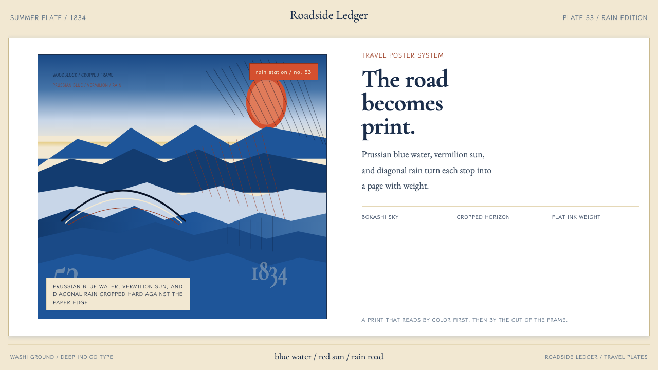
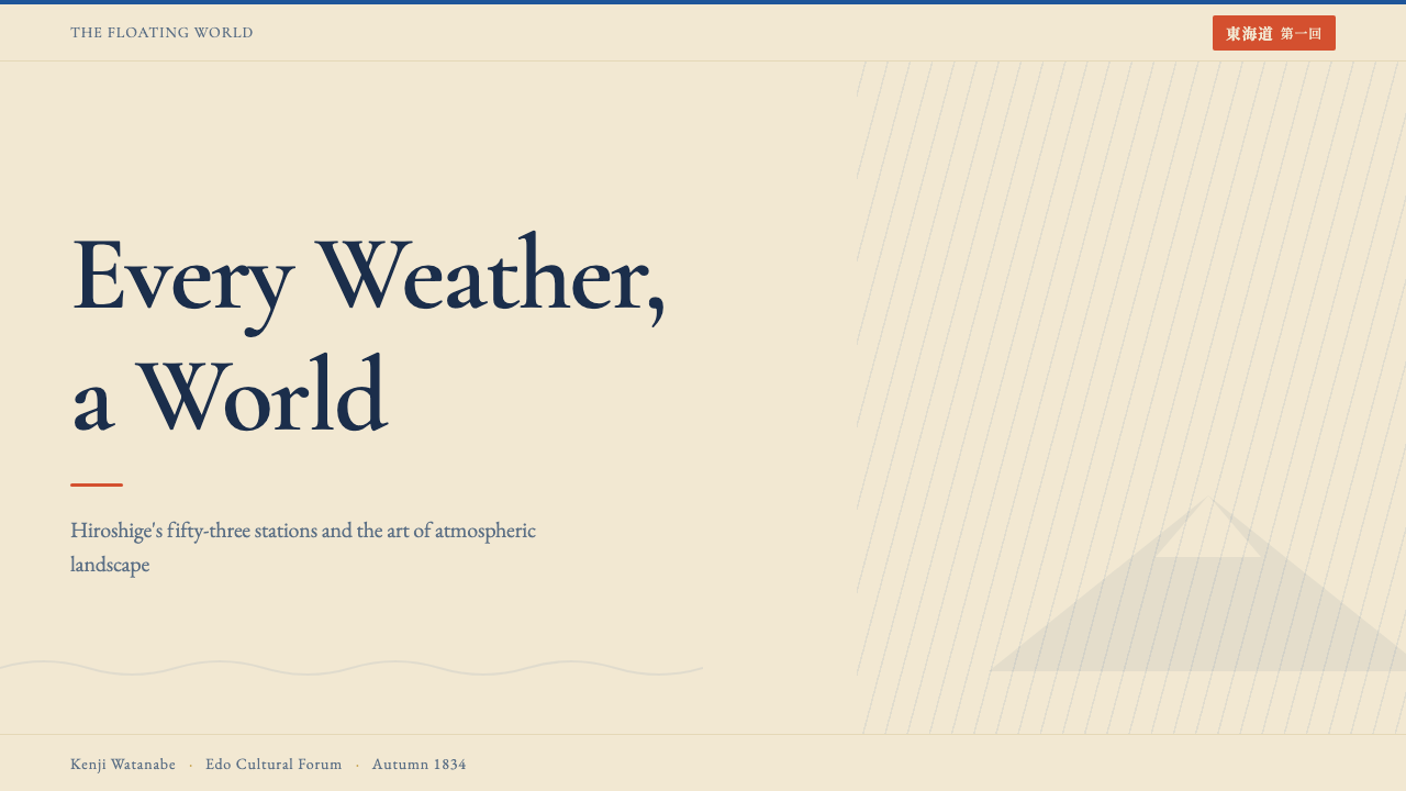
Utagawa Hiroshige's *Fifty-Three Stations of the Tōkaidō* is a woodblock print series produced between 1833 and 1834 that documents each post-station along the great road connecting Edo to Kyoto. The series comprises fifty-five plates — fifty-three stations plus the two terminus cities — and is remarkable not for topographic accuracy but for its emotional, meteorological, and compositional intelligence. Each print is a self-contained composition: a cropped, almost cinematic view of a station in a particular season, weather condition, and time of day.歌川广重的《东海道五十三次》是1833至1834年间创作的木版画系列,记录了连接江户与京都的东海道沿线每一处驿站。全系列共五十五幅——五十三处宿场加上两端终点——其价值不在于地理精确,而在于情感、气象与构图上的高度智识。每一幅都是独立的构图:对某个驿站在特定季节、天气与时刻的裁切,几乎具有电影镜头感。
The visual language Hiroshige developed for this series became the template for modern landscape printing worldwide. Its defining qualities are saturated, flat color fields applied in smooth graduated washes called bokashi; strong diagonal compositional forces — rain rendered as parallel ruled strokes, roads receding at sharp angles — that create motion within a static frame; and a color palette anchored by deep Prussian blue, warm vermilion, and the natural cream of unprinted washi paper. These qualities were not merely beautiful: they were the product of the woodblock printing process itself, exploiting the physical properties of rice paper, water-soluble pigments, and hand-carved keyblock lines.广重为这个系列发展出的视觉语言,成为全球现代风景版画的范本。其标志性特质包括:通过「晕(ぼかし)」技法印制的平涂渐变色块;强烈的斜向构图力——雨水化为平行细线,道路以锐角消退,在静止画面中制造运动感;以深沉的普鲁士蓝、温暖的朱红与未印刷和纸的天然奶油色为骨干的色彩系统。这些品质并非单纯美学选择,而是木版印刷工艺本身的产物——充分利用了稻草纸、水溶性颜料与手刻主线版的物理特性。
The Tōkaidō series arrived at a moment of mass travel literacy in late Edo Japan. The Tōkaidō road was the most traveled in the country, used by merchants, pilgrims, and official processions alike, and meisho-e — pictures of famous places — were a popular tourist genre. Hiroshige's series became both a cultural phenomenon and a commercial success, spawning dozens of imitations and subsequent series by the artist himself. When Japanese prints reached Europe in the 1860s and 1870s, the Tōkaidō compositions directly influenced Monet, Van Gogh, and Whistler, igniting the Japonisme movement.《东海道五十三次》诞生于江户晚期大众旅行文化蓬勃兴起之际。东海道是全国最繁忙的道路,商人、朝圣者与官方队伍皆由此行进,「名所绘」(描绘名胜的版画)正是当时流行的旅行纪念品类型。广重的系列既成文化现象,亦是商业成功,引发了大量仿制,画家本人后来也创作了多个续系列。1860至70年代,日本版画传入欧洲,东海道的构图直接影响了莫奈、梵高与惠斯勒,点燃了「日本主义」运动。
See the Hiroshige — Tokaido Road design system查看 Hiroshige — Tokaido Road 完整设计系统
Where does Hiroshige — Tokaido Road come from?Hiroshige — Tokaido Road 从何而来?
The Tōkaidō road had existed as an official highway since the Nara period, but it reached its cultural peak during the Edo era (1603–1868), when the Tokugawa shogunate required all daimyo to make regular journeys between their domains and the capital at Edo — the system of sankin-kōtai, or alternate attendance. The road's fifty-three official stations were spaced roughly one day's walk apart, each with inns, teahouses, and the dense human activity of a functioning waypoint. This traffic created both an audience for pictures of the road and the commercial ecosystem to distribute them.东海道作为官方驿路自奈良时代便已存在,但其文化顶峰出现在江户时代(1603—1868年)。德川幕府的「参勤交代」制度要求所有大名定期往返封地与江户,使这条道路成为政治动脉与商业要道。五十三处官设宿场大约以一日步行距离为间隔,每处配备旅馆、茶屋与熙攘的驿站活动。这股人流既制造了版画受众,也构建了分发版画的商业生态。
Hiroshige first traveled the Tōkaidō in 1832 as part of an official shogunal procession delivering tribute horses to Kyoto. He was in his mid-thirties and already an established ukiyo-e artist — trained in the lineage of Toyohiro and working primarily in the warrior-print tradition — but the journey transformed his artistic direction. He made sketches along the route, capturing conditions of light, weather, and local character that no earlier meisho-e series had attempted with such documentary intent. The resulting plates, published by the Edo bookseller Hōeidō Takenouchi Magohachi beginning in late 1833, were an immediate sensation.广重初次踏上东海道是在1832年,作为向京都献纳贡马的官方幕府队伍成员之一。彼时他三十五六岁,已是成熟的浮世绘画师——师承丰广、主要从事武者绘创作——但这次旅行彻底改变了他的艺术方向。他沿途写生,捕捉光线、天气与地方风物的状态,达到此前任何名所绘系列从未企及的实录精度。1833年末由江户书商「保永堂」武内孙八陆续出版,立刻引起轰动。
Hiroshige did not invent the Tōkaidō as a subject: his contemporary Katsushika Hokusai had already published landscape print series including *Thirty-six Views of Mount Fuji* (from 1831), and Keisai Eisen had collaborated with Hiroshige himself on a *Sixty-nine Stations of the Kisokaidō* series. What Hiroshige brought to the Tōkaidō was a specific sensitivity to atmospheric conditions — mist, snow, rain, the flat gray light of an overcast dawn — rendered through technical innovations in the bokashi gradation process. His rain scenes in particular, notably the Shōno and Kambara plates, created a visual vocabulary for precipitation that remains influential.广重并非第一个以东海道为题材的画家:同时代的葛饰北斋已出版了《富岳三十六景》(始于1831年),溪斋英泉也曾与广重合作《木曽街道六十九次》。广重带给东海道的,是对大气状态的独特敏感——雾、雪、雨、阴天黎明的扁平灰光——并通过「晕ぼかし」渐变技法的创新加以呈现。他的雨景尤为突出,以庄野与蒲原两幅为代表,创造了描绘降水的视觉词汇,影响延续至今。
The Prussian blue that defines the series' palette entered Japan through Dutch trade in the early nineteenth century, and its adoption by ukiyo-e printers was rapid and transformative. Unlike the traditional ai-blue derived from indigo, Prussian blue offered depth, saturation, and resistance to fading under natural light. Hiroshige used it not as a direct substitute but as a structural element: the blue grounds of sky and water against which warm earth tones and vermilion accents read with exceptional clarity. The Hōeidō Tōkaidō is widely considered the finest printing of the series; later reprintings, including those by other publishers after the initial plates wore down, show perceptibly lower bokashi quality and less precise registration.定义本系列色调的普鲁士蓝于十九世纪初经由荷兰贸易传入日本,被浮世绘印刷师迅速大量采用。与传统靛蓝相比,普鲁士蓝提供了更深的饱和度与更强的抗光褪色性。广重并非简单替换,而是将其作为结构性元素:蓝色天空与水面的底色,使温暖的土色调与朱红点缀呈现出异常清晰的可读性。「保永堂版」普遍被认为是本系列印刷质量最高的版本;此后其他出版商翻刻时,原版木已磨损,晕染质量与套色精度皆明显下滑。
What defines the Hiroshige — Tokaido Road look?Hiroshige — Tokaido Road 的视觉特征是什么?
Flat Color with Graduated Wash平涂色块与渐变晕染
The defining technical mark of the Tōkaidō palette is bokashi — a graduated wash applied by dampening the woodblock and wiping pigment unevenly across its surface before printing, so that color fades smoothly from dense to absent. In Hiroshige's skies, the Prussian blue deepens toward the top of the plate and dissolves to bare paper near the horizon. In water passages, the same technique creates the sense of reflective depth without depicting waves literally. The rest of each composition uses flat, unmodulated color fields for landforms, figures, and vegetation — no blending, no highlights — giving the work the compressed visual weight of ink on paper rather than paint on canvas.东海道色彩体系在技法上的核心是「晕(ぼかし)」——印刷前将木版润湿、不均匀抹涂颜料,使色彩从浓到无平滑淡出。广重的天空中,普鲁士蓝在画面顶部最深,向地平线方向溶入裸纸。水面段落以同样技法制造反光深度,而无需描绘具体水波。其余构图部分——山形、人物、植被——全部使用无层次调变的平涂色块,无混色、无高光,赋予作品墨印于纸而非画布上的压缩视觉重量。
Prussian Blue as Structural Anchor普鲁士蓝作为结构锚点
Prussian blue is the load-bearing element of the Tōkaidō system. It appears in skies, water bodies, distant mountains, and shadow passages, occupying the largest total area of most plates. Against this deep, slightly cool blue, warm tones — the vermilion of a torii gate, the ochre of a straw raincoat, the buff of a dirt road — read with exceptional clarity and vibration. This warm-cool opposition is not accidental: it mirrors the complementary color relationships that make traditional woodblock prints legible at a distance in dim indoor lighting, where the series would typically have been displayed or sold.普鲁士蓝是东海道色彩体系的承重元素。它出现于天空、水域、远山与阴影区域,在大多数版面中占据最大总面积。以这种深沉、略带冷感的蓝色为底,暖色调——鸟居的朱红、蓑衣的赭黄、土路的浅褐——呈现出异常清晰而充满震动感的可读性。这种冷暖对立并非偶然:它照应了传统木版画在昏暗室内光线下——也就是这套系列通常被展示或销售的环境中——能被远距清晰辨读的互补色关系。
Diagonal Composition and Framing Cut斜线构图与画框裁切
Hiroshige consistently uses diagonal lines — roads, rivers, rain, tree lines, coastlines — to drive the eye through the picture plane from one corner toward another. This creates a sense of transit that is appropriate to the subject: every scene is a place you are moving through, not a static monument. The frame itself actively cuts landscape features: a mountainside disappears behind the right edge, a procession of figures exits the lower left corner, a pine branch enters from the top-right. This aggressive cropping, which anticipates modern photography, gives each print a sense of arrested motion — as though the viewer arrived at exactly this spot at exactly this moment.广重始终运用斜线——道路、河流、雨水、树冠线、海岸线——驱动视线从画面一角穿越至另一角。这制造了符合主题的过境感:每一处场景都是你穿行而过的地方,而非静止的纪念物。画框本身主动裁切地景:山坡在右边缘后消失,人物队列从左下角退出,松枝从右上方伸入。这种具有预示现代摄影感的激进裁切,赋予每幅版画一种静止运动感——仿佛观者恰好在这一刻抵达这一地点。
Weather and Atmosphere as Subject天气与大气作为主题
Unlike earlier meisho-e that depicted famous places under ideal, generic lighting, Hiroshige made weather conditions the actual content of each plate. Rain is drawn as dense parallel diagonal strokes — a woodblock innovation that became so strongly associated with the series that it entered the visual vocabulary of every subsequent Japanese print. Snow turns rooftops and hillsides into unmodulated white forms. Fog dissolves mountain outlines into bare paper. The time of day is specific: a station scene at dusk shows a sky at the moment of color change; a morning departure captures the flat gray-lavender light before full sunrise. These meteorological observations make each plate a record of experience rather than a description of place.与此前在理想化通用光线下描绘名胜的名所绘不同,广重使天气状态成为每幅版画的真实内容。雨水被画成密集的平行斜线——这一木版创新与本系列如此深度关联,以至进入了后来所有日本版画的视觉词汇。雪将屋顶与山坡变成无层次的白色形态。雾将山的轮廓溶解进裸纸之中。每幅的时刻也是具体的:黄昏时分的宿场场景展示天空色彩转换的瞬间,清晨出发捕捉日出前扁平的灰紫色光线。这些气象观察使每幅作品成为体验的记录,而非地点的描述。
Red-Orange Cartouche as Typographic Anchor红橙色题签作为字体锚点
Each plate carries a title cartouche — typically placed in the upper left or upper right corner — printed in warm red-orange against a lighter field, with the station name in strong black brushwork within it. This cartouche functions as the page's typographic keystone: it is the highest-contrast element in many plates, drawing the eye first, and it introduces warm red into compositions that might otherwise be dominated by cool blue. The cartouche's rounded, almost shield-like form echoes the physical road markers of the Tōkaidō. In contemporary applications derived from this tradition, this anchoring of text in a distinct warm-ground label in a corner of the composition is one of the most immediately recognizable stylistic signatures.每幅版画都带有题签——通常置于左上或右上角——以温暖的红橙色底面印出,其上以浓黑毛笔书写宿场名称。这个题签在版面中充当字体基石:在许多版画中它是对比度最高的元素,首先抓住视线,同时在可能被冷蓝主导的构图中引入暖红色。题签圆润、近似盾形的外廓,与东海道实际路标的形态呼应。在当代衍生应用中,在构图角落以独立暖色底标签锚定文字,是最具立即辨识度的风格签名之一。
Layered Spatial Depth Without Perspective无透视法的层叠空间深度
Hiroshige synthesizes two spatial systems that are technically incompatible. From the Western tradition — which entered Japan via Dutch imports and Dutch-style copper engravings — he borrows the logic of a vanishing-point perspective for roads and buildings, particularly in the post-station courtyard scenes. From the ukiyo-e tradition, he retains overlapping flat color planes to indicate depth: a near hill in medium blue, a far mountain in a lighter, cooler blue, the sky above in the deepest Prussian. Objects are sized by narrative importance as much as by spatial position. The result is a pictorial space that reads as simultaneously flat and deep — compressed like a theater backdrop but spatially legible at multiple levels.广重融合了两套技术上互不相容的空间体系。从西方传统——经由荷兰贸易及铜版画进入日本——他借用了道路与建筑的消失点透视逻辑,尤其在宿场庭院场景中。从浮世绘传统,他保留了以重叠平涂色面表示深度的方式:近处山丘用中等深度的蓝,远山用更浅、更冷的蓝,上方天空用最深的普鲁士蓝。物体的尺寸由叙事重要性与空间位置共同决定。结果是一种同时读出平面感与深度感的图画空间——压缩如舞台布景,却在多个层级上可读。
Human Figure as Scale and Story人物作为尺度与叙事
Unlike the panoramic grandeur of Hokusai's Fuji views — where human figures are often absent or microscopic — Hiroshige's Tōkaidō plates consistently include travelers, porters, merchants, and villagers at a scale that makes them co-protagonists with the landscape. A porter adjusting a load, a pilgrim caught in rain, a group of travelers resting under a pine — these figures are never merely staffage. They establish the human rhythm of the journey: the weight of walking, the relief of shelter, the sociality of roadside inns. Rendered in a few confident strokes, they carry the emotional texture of the series without ever becoming its focal subject.与北斋富岳全景的宏大——其中人物常常缺席或微不足道——不同,广重的东海道版画始终以能令人物成为风景共同主角的比例,纳入旅人、搬运工、商人与村民。调整货担的苦力、被雨淋湿的朝圣者、在松树下休憩的旅队——这些人物从不只是点缀。他们确立了旅程的人性节奏:步行的重量、得到庇护的宽慰、路边旅馆的社交性。用几笔确定的线条勾勒,他们承载着系列的情感质地,却从未成为聚焦主体。
See the Hiroshige — Tokaido Road design system查看 Hiroshige — Tokaido Road 完整设计系统
Who shaped Hiroshige — Tokaido Road?谁塑造了 Hiroshige — Tokaido Road?
Hiroshige entered the Utagawa school of woodblock printing as a teenager and worked initially in the warrior-print genre. His Tōkaidō journey of 1832 reoriented him toward landscape, and the resulting series transformed him from a well-regarded craftsman into the defining figure of late ukiyo-e. He went on to produce hundreds of landscape series — a second Tōkaidō, *One Hundred Famous Views of Edo*, *Sixty-nine Stations of the Kisokaidō* — consistently deepening his experiments with atmospheric light, rain, and snow. He died in 1858 during an Edo cholera epidemic, still at work.广重少年时入歌川派学习木版画,起初主要从事武者绘创作。1832年的东海道旅行使他转向风景主题,由此诞生的系列将他从一位受人尊敬的工匠,变为浮世绘晚期的定义性人物。此后他继续创作数百个风景系列——第二版东海道、《名所江户百景》、《木曽街道六十九次》——持续深化对大气光线、雨与雪的实验。1858年他在江户霍乱疫情中去世,生命最后时刻仍在创作。
The Edo bookseller and publisher who commissioned and first released the Hōeidō Tōkaidō series beginning in 1833. Takenouchi's publishing house had a reputation for high production quality, and the initial Hōeidō printings are distinguished by their careful bokashi gradations and precise color registration — qualities that deteriorated in later reprint runs as the woodblocks wore. The commercial success of the Hōeidō series created the market conditions for the explosion of landscape print series that followed throughout the 1840s and 1850s, and Takenouchi's instinct to pair Hiroshige's sketches with superior printing craftsmanship was decisive in establishing the series' canonical status.江户书商与出版商,自1833年起委托并首次发行「保永堂版」东海道系列。保永堂以高质量印刷著称,初版的晕染渐变与套色精度皆属上乘——这些品质随着木版磨损在后来的翻刻中明显退化。保永堂版的商业成功为1840至50年代风景版画系列的爆发式增长创造了市场条件,武内孙八将广重写生与顶级印刷工艺相结合的判断力,对确立本系列的经典地位起到决定性作用。
Hokusai is the figure against whom Hiroshige's achievement is most usefully measured. Where Hokusai's landscape prints — particularly *Thirty-six Views of Mount Fuji* — are architecturally bold, structurally dramatic, and dominated by the monumental presence of a single geographic subject, Hiroshige's are experiential, atmospheric, and human-scaled. Both artists adopted Prussian blue as a structural element and both worked within the meisho-e tradition of famous-place prints, but they represent opposite temperaments: Hokusai the visionary geometer, Hiroshige the empathetic traveler. European Japonisme drew on both, but Hiroshige's diagonal rain and graduated skies left the more direct trace in Monet and Van Gogh.北斋是与广重成就最有对照价值的人物。北斋的风景版画——尤其是《富岳三十六景》——构图大胆、戏剧化,被单一地理主题的纪念性存在所主导;广重的版画则是体验性的、大气性的、以人为尺度的。两人都采用普鲁士蓝作为结构元素,都在名所绘传统中工作,但代表着截然相反的气质:北斋是有远见的几何学家,广重是感同身受的旅人。欧洲日本主义从两人汲取,但广重的斜线雨与渐变天空在莫奈与梵高身上留下了更直接的印记。
Eisen was a contemporary of Hiroshige's who collaborated with him on the *Sixty-nine Stations of the Kisokaidō* series, an alternative mountain road connecting Edo to Kyoto via the interior. Eisen began the series and Hiroshige completed it, producing a joint work that reveals both artists' contrasting sensibilities side by side. Eisen's contribution to the Tōkaidō design tradition is less visible but real: his figure work, particularly his bijin-ga (pictures of beautiful women) adapted to travel scenes, influenced the integration of human narrative into landscape prints in ways that Hiroshige extended and deepened.英泉是广重的同时代人,两人合作了《木曽街道六十九次》系列——连接江户与京都的内陆山道版画。英泉开始本系列,广重将其完成,由此产生的联合作品将两位画家截然不同的感性并排呈现。英泉对东海道设计传统的贡献较不显著,但真实存在:他的人物描绘——尤其是美人绘被移植到旅行场景中的方式——影响了人性叙事与风景版画的融合,广重在此基础上进行了延伸与深化。
Monet is the most direct Western conduit through whom Hiroshige's compositional strategies entered European painting. He collected Japanese prints — his home at Giverny displayed over two hundred — and the influence on his late work is specific and traceable: Hiroshige's diagonal rain strokes appear in Monet's own rain studies; the layered atmospheric washes of Tōkaidō skies are legible behind Monet's dissolving water-lily surfaces; the practice of painting the same subject under different weather conditions across a series is Hiroshige's working method directly translated. Monet did not simply admire the prints — he internalized their compositional logic and used it to solve problems in Western plein-air painting.莫奈是广重构图策略进入欧洲绘画最直接的西方渠道。他收藏日本版画——吉维尼故居陈列了逾两百幅——其影响在晚期作品中具体可追溯:广重的斜线雨笔触出现在莫奈自己的雨景研究中;东海道天空层叠的大气晕染在莫奈溶解的睡莲水面之后清晰可辨;以系列形式在不同天气下描绘同一主题的工作方式,直接移植自广重。莫奈不仅仅欣赏版画——他将其构图逻辑内化,并用以解决西方户外写生的问题。
How do you use Hiroshige — Tokaido Road today?今天怎么用 Hiroshige — Tokaido Road?
The Tōkaidō design system translates into contemporary work through its structural principles rather than its historical iconography. The goal is not to produce something that looks like a woodblock print — it is to apply the system's rules about spatial layering, color opposition, typographic anchoring, and atmospheric gradation to screens, slides, and editorial layouts. Used correctly, the result feels grounded and visually deliberate without resembling a museum reproduction.东海道设计系统通过其结构原则进入当代工作,而非通过历史图像志。目标不是制作看起来像木版画的东西——而是将这套系统关于空间层叠、色彩对立、字体锚定与大气渐变的规则,应用于屏幕、幻灯片与编辑版面。正确使用时,结果感觉扎实且视觉上有主张,同时不会像博物馆复制品。
For presentation slides, the system works exceptionally well for both cover compositions and content pages. A cover benefits from the layered spatial approach: a background field of deep blue graduated toward the lower portion, a mid-ground element in a warm neutral — landform, horizon, architectural silhouette — and a title block set in strong, clean type within a warm red-orange cartouche anchored to one corner. The compositional diagonal should guide the eye from the cartouche toward the central image. Content slides work best with strict horizontal banding: information layers mapped to color layers, with Prussian blue reserved for headers or key data, warm ochre for supporting content, and the cream of the slide background doing structural work as a third neutral. Data visualizations take on the character of landscape elements — bar charts become ridgelines, area fills become color-field strata.在演示文稿中,这套系统在封面构图与内容页上都表现出色。封面适合层叠空间方式:背景是向下方渐变的深蓝色块,中景是暖中性调元素——地形、地平线、建筑剪影——标题以简洁有力的字体设置于锚定在某个角落的暖红橙色题签中。构图斜线应引导视线从题签向中心图像移动。内容页以严格的水平分带效果最佳:信息层级映射到色彩层级,普鲁士蓝保留给标题或关键数据,暖赭色用于辅助内容,幻灯片背景的奶油色作为第三个中性调承担结构工作。数据可视化取得地景元素的特质——柱状图变成山脊线,区域填充变成色彩地层。
For web interfaces, the system is well-suited to editorial platforms, cultural institution sites, travel applications, and any dashboard where a sense of depth and considered atmosphere is preferred over the flat utility of standard design systems. The approach uses a strict two-to-three-color palette derived from the Tōkaidō anchor colors, with the blue-green of deep water as a primary field, warm cream or light buff as a secondary background, and a single vermilion-adjacent accent reserved for interactive elements and calls to action. Navigation labels and headings should use the cartouche principle: text in a distinct, warm-ground container that reads at a glance against a cooler background. Gradients, when used, should evoke the bokashi technique — smooth, directional, moving from dense to absent rather than between two saturated hues.在网页界面中,这套系统适合编辑平台、文化机构网站、旅行应用,以及任何偏好深度感与精心大气感而非标准设计系统平板实用性的仪表板。方法是使用从东海道锚点色衍生的两到三色严格色板:深水的蓝绿作为主体色域,暖奶油或浅褐作为次级背景,单一近朱红色强调色保留给交互元素与行动号召。导航标签和标题应遵循题签原则:文字置于独立的暖色底容器中,在较冷背景上一目了然。渐变在使用时应唤起晕ぼかし技法——平滑、有方向性,从浓至无渐退,而非在两种饱和色之间过渡。
For editorial and marketing work, the series' poster logic translates directly. A feature spread uses the full-bleed blue field as its opening visual field, with warm-toned imagery or typography occupying the lower third — replicating the ground-to-sky spatial division of the prints. Marketing materials work well with the rain-stroke device adapted as a directional texture: parallel lines at a consistent diagonal that give motion to otherwise static fields. Pull quotes and callouts should carry their own cartouche container, in warm red or ochre, that signals importance the way the station-name labels signal location in the original series. The principle of weather-as-content translates to seasonal or contextual variation: a product launch for winter might lean into cold blue and near-white; a summer campaign into the warm amber and haze of an afternoon station scene.在编辑与营销工作中,本系列的海报逻辑直接适用。特辑跨页以全出血蓝色色块作为起始视觉场域,暖调图像或字体占据下三分之一——复制版画从地面到天空的空间划分。营销素材适合将雨线设备改造为方向性纹理:固定斜向的平行线条,为原本静止的色块注入运动感。引语与重点内容应有自己的题签容器,用暖红或赭色,以标注名称的方式标注重要性。天气即内容的原则转化为季节或情境变体:冬季产品发布可倾向冷蓝与近白;夏季活动则倾向午后驿站场景的暖琥珀色与薄雾感。
A common mistake when working with this system is treating the Prussian blue as a background default and adding warm accents on top — this produces a competent but inert result. The actual power of the Tōkaidō palette comes from the tension between its fields: the blue must be deep enough to carry structural weight, and the warm accents must be warm enough to vibrate against it. A second common error is eliminating the cream or near-white of unprinted paper from the palette entirely, filling all areas with solid color. The ground tone — whether expressed as a slide background, a card surface, or a hero section — carries as much visual information as the saturated fields. Its presence creates the breathing room that prevents the composition from reading as heavy or overworked.使用这套系统时最常见的错误,是将普鲁士蓝当作默认背景,然后在上面添加暖色点缀——这产生尚可但惰性的结果。东海道色板的真正力量来自各色域之间的张力:蓝必须足够深才能承载结构重量,暖色点缀必须足够暖才能与之产生震动感。第二个常见错误是完全从色板中删除未印刷和纸的奶油色或近白色,以实色填满所有区域。底色——无论体现为幻灯片背景、卡片表面还是主视觉区段——承载的视觉信息与饱和色域同样重要。它的存在创造了防止构图读起来沉重或过度填充的呼吸空间。
A third failure mode is applying the diagonal compositional logic mechanically — rotating elements by a fixed angle without considering the directionality of the full composition. In Hiroshige's prints, the diagonal is always purposeful: it carries the eye toward a destination, implies movement along a route, or introduces the sensation of weather falling through a scene. In layout work, the equivalent means that diagonal elements — rain-stroke textures, slanted dividers, angled type — should move in a consistent direction that reinforces the reading path, not compete with it.
See the Hiroshige — Tokaido Road design system查看 Hiroshige — Tokaido Road 完整设计系统
Hiroshige — Tokaido Road — FAQHiroshige — Tokaido Road · 常见问题
Is this style suitable for dark-background applications?这种风格适合深色背景应用吗?
The Tōkaidō palette is historically a light-ground system — the cream of unprinted washi paper is structurally essential, not optional. A dark inversion is possible but requires care. On a near-black ground, Prussian blue loses its structural dominance because it no longer contrasts against a light field — it merges with the darkness. The warm accents then take on more visual weight than the original compositions intend. A successful dark variant typically replaces the Prussian blue field with a deep indigo-adjacent tone, uses a light warm cream as the primary text and highlight color, and reserves the red-orange cartouche element for its original purpose. Avoid dark versions where you need the full three-color tension of the original; they work best as two-color compositions.东海道色板历史上是浅色底面系统——未印刷和纸的奶油色在结构上不可或缺,而非可选项。深色反转版本可行但需谨慎。在近黑底面上,普鲁士蓝失去了结构主导地位,因为它不再与浅色场域形成对比,而是与暗色融合。暖色点缀随之承担比原始构图预期更重的视觉分量。成功的深色变体通常以深靛蓝邻近调取代普鲁士蓝色域,以浅暖奶油色作为主要文字与高亮色,将红橙色题签元素保留用于其原始功能。避免在需要原版完整三色张力的场合使用深色版本——它在双色构图中效果最佳。
How does this style differ from other ukiyo-e visual traditions?这种风格与其他浮世绘传统有何不同?
Ukiyo-e encompasses a wide range of subjects and visual strategies. The Tōkaidō tradition is specifically landscape-oriented (meisho-e), making it distinct from the figure-focused bijin-ga (beautiful women pictures), the dynamic kabuki-actor prints of Sharaku and Kuniyoshi, or the erotica of shunga. Even within landscape, Hiroshige's approach differs from Hokusai's: where Hokusai's compositions are architecturally constructed and his color use bold and confrontational, Hiroshige's are experiential and atmospheric. The Tōkaidō system's particular design signature — bokashi sky gradations, diagonal rain, layered spatial depth, the corner cartouche — is specific to this series and its derivatives, not a property of all Japanese woodblock printing.浮世绘涵盖广泛的题材与视觉策略。东海道传统专属于风景题材(名所绘),有别于以人物为中心的美人绘、写乐与国芳笔下动态的歌舞伎演员版画,以及春画。即使在风景之内,广重的方式也有别于北斋:北斋的构图具有建筑性逻辑,色彩运用大胆对抗;广重的是体验性与大气性的。东海道系统特定的设计签名——晕染天空渐变、斜线雨、层叠空间深度、角落题签——是这一系列及其衍生作品独有的特质,而非所有日本木版画的共同属性。
Can Hiroshige's rain-stroke device be used purely as a decorative texture?广重的雨线设备可以纯粹作为装饰纹理使用吗?
It can be used that way, but doing so usually weakens rather than strengthens the composition. In Hiroshige's plates, the rain strokes are not texture — they are weather. They create a specific sensation of being inside a storm: the diagonal direction implies falling, the density implies force, and their relationship to the scale of figures in the scene establishes the rain as a physical presence larger than any human element. When the same stroke pattern is applied as a background fill or a decorative surface treatment without this spatial and scalar logic, it becomes wallpaper. The rain device works in contemporary applications when it carries directional force across the composition — moving the eye, implying motion — not when it fills a space because it looks Japanese.可以这样用,但这样做通常削弱而非强化构图。在广重的版画中,雨线不是纹理——它是天气。它制造了身处暴风雨中的特定感觉:斜向暗示下落,密度暗示力量,与画面人物尺度的关系将雨确立为大于任何人类元素的物理存在。当同样的笔触样式被当作背景填充或装饰性表面处理应用,没有这种空间与尺度逻辑时,它就变成壁纸。雨线设备在当代应用中有效,是当它携带跨越构图的方向力量——移动视线、暗示运动——而非因为看起来像日本风格而填充空间。
What types of products and brands does this style suit best?这种风格最适合哪类产品与品牌?
The Tōkaidō system is strongest where a sense of journey, contemplation, and considered atmosphere adds direct value to the user experience. It suits travel platforms, cultural institutions, publishing brands, slow-content editorial products, premium hospitality, and any brand that wants to signal deliberateness and visual intelligence rather than velocity and novelty. It works well in educational contexts — particularly where complex information benefits from the clarity of layered spatial organization. It is less well-suited to fintech products where speed and precision are the dominant values, e-commerce contexts requiring dense product grids, or consumer apps whose primary users are children or teenagers for whom the historical resonance is not legible.东海道系统在旅程感、沉思感与精心大气感直接为用户体验增值的场合最为强大。适合旅行平台、文化机构、出版品牌、慢节奏内容编辑产品、高端酒店,以及任何想传达深思熟虑与视觉智识而非速度与新颖感的品牌。在教育场景中效果良好——尤其是复杂信息受益于层叠空间组织清晰度的场合。不太适合速度与精确度是主导价值的金融科技产品、需要密集产品网格的电商场景,以及主要用户是历史共鸣不可读的儿童或青少年的消费者应用。
Why is the cream or buff ground color so important — can I replace it with pure white?为什么奶油色或浅褐底色如此重要——可以用纯白替换吗?
Pure white is technically compatible but changes the character of the system in ways that matter. In Hiroshige's plates, the unprinted washi has a warm, slightly textured tone that sits between the cool Prussian blue and the warm vermilion, mediating the temperature opposition rather than sharpening it. Pure white has no temperature — it is a neutral that sharpens all contrasts equally, making the blue read cooler and the vermilion read more aggressive. The result is a palette that feels more modern and graphic but less atmospheric. If you choose white for functional reasons — accessibility contrast, screen legibility — compensate by warming the blue slightly (toward teal) and softening the red slightly (toward coral) to preserve the color temperature balance that the original cream ground provided.纯白技术上兼容,但会改变系统的气质,且改变方式不可忽视。在广重的版画中,未印刷的和纸带有温暖、略有质感的色调,介于冷感的普鲁士蓝与暖感的朱红之间,调和色温对立而非加剧它。纯白没有色温——它是一个中性色,等量锐化所有对比,使蓝色显得更冷、朱红显得更具攻击性。结果是感觉更现代、更平面设计风格,但大气感降低。若出于功能原因选择白色——无障碍对比度、屏幕可读性——应补偿性地将蓝色略微温暖(向蓝绿方向)并略微柔化红色(向珊瑚色方向),以保留原始奶油底色提供的色温平衡。
Related design styles相关设计风格
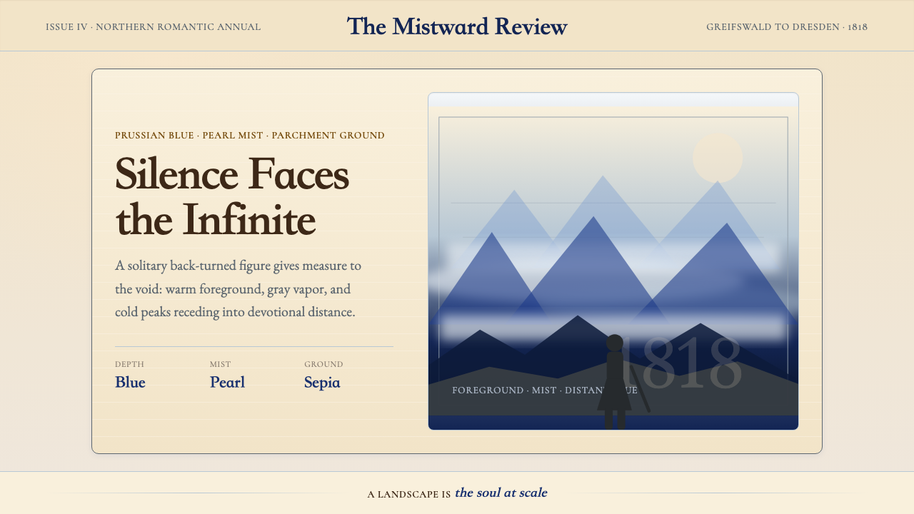 Caspar David FriedrichSilence becomes vast. Prussian blue depth, pearl mist, and parchment framing…寂静变得辽阔:普鲁士蓝纵深、珍珠雾与羊皮纸框层层后退。
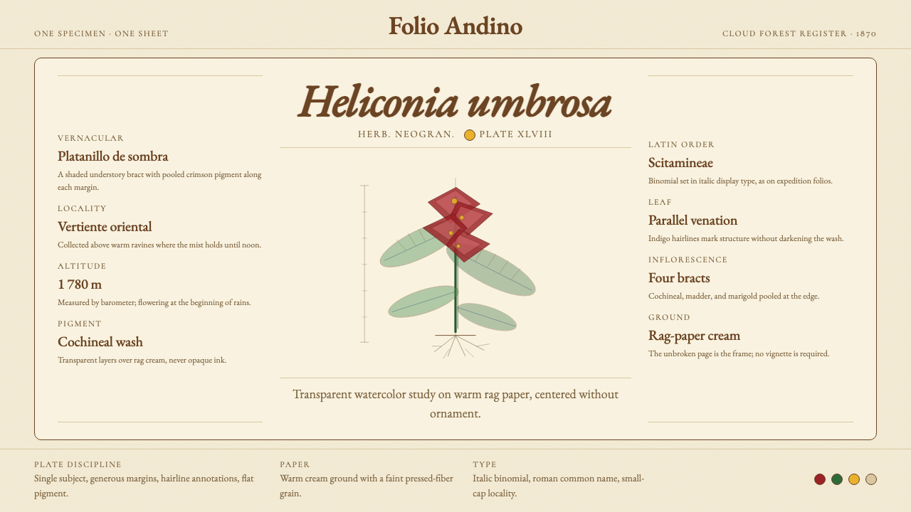 Colombian Botanical (Triana)Observation becomes ornament. Crimson watercolor specimen breathes on cream r…观察即装饰。绯红水彩标本静置于奶油破布纸。
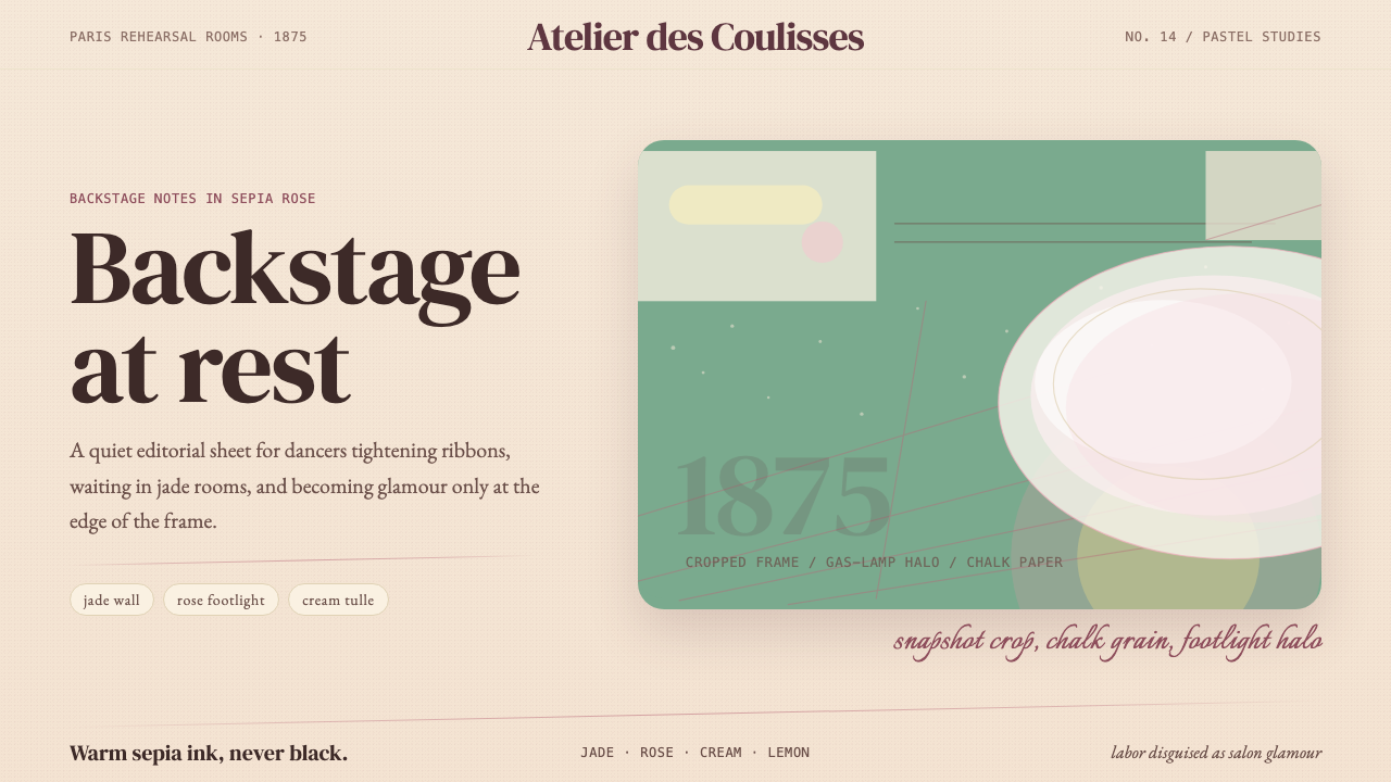 Degas Ballet PastelsBackstage glamour is labor. Jade walls, rose footlights, cropped serifs on cr…后台华丽即劳动。玉墙、玫瑰脚灯与裁切衬线落在奶油纸上。
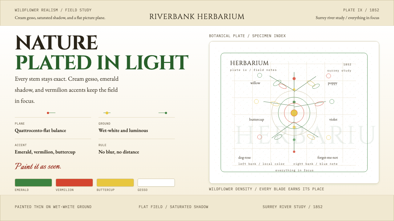 Millais — Ophelia / Wildflower Pre-RaphBotany, rendered with conviction. Cream gesso, emerald, and vermilion stay in…植物画得极其笃定。奶油底、祖母绿、朱红始终清晰。
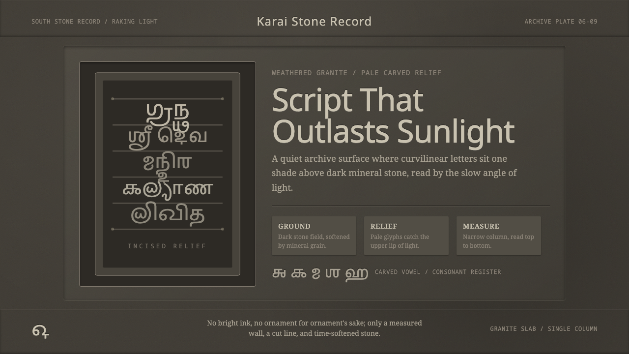 Tamil Grantha InscriptionSacred stone, quietly lit. Pale Grantha glyphs float on dark granite in a nar…肃穆如石:浅色格兰塔字浮在暗花岗岩上,窄列静读。
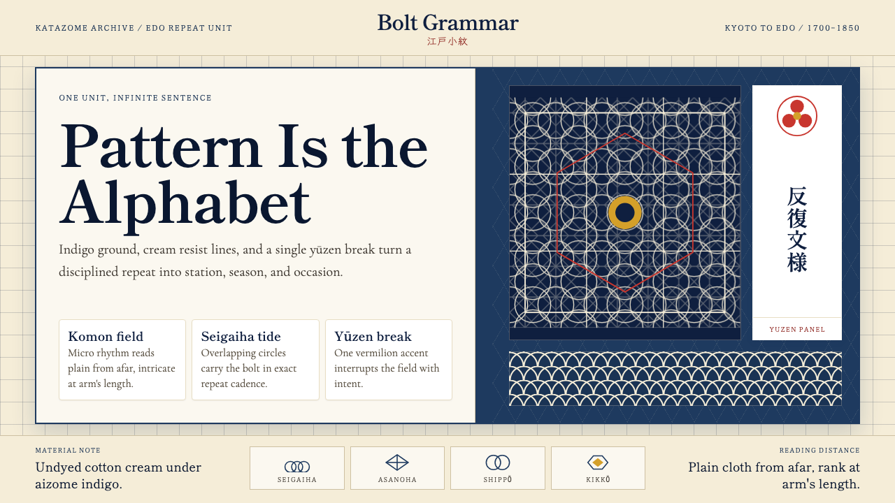 Edo Kimono TextilePattern becomes language. Indigo repeats, cream resist lines, one vermilion p…纹样即语言:靛蓝循环、米白留线,一块朱红破局。