What is Penny Black Stamp?
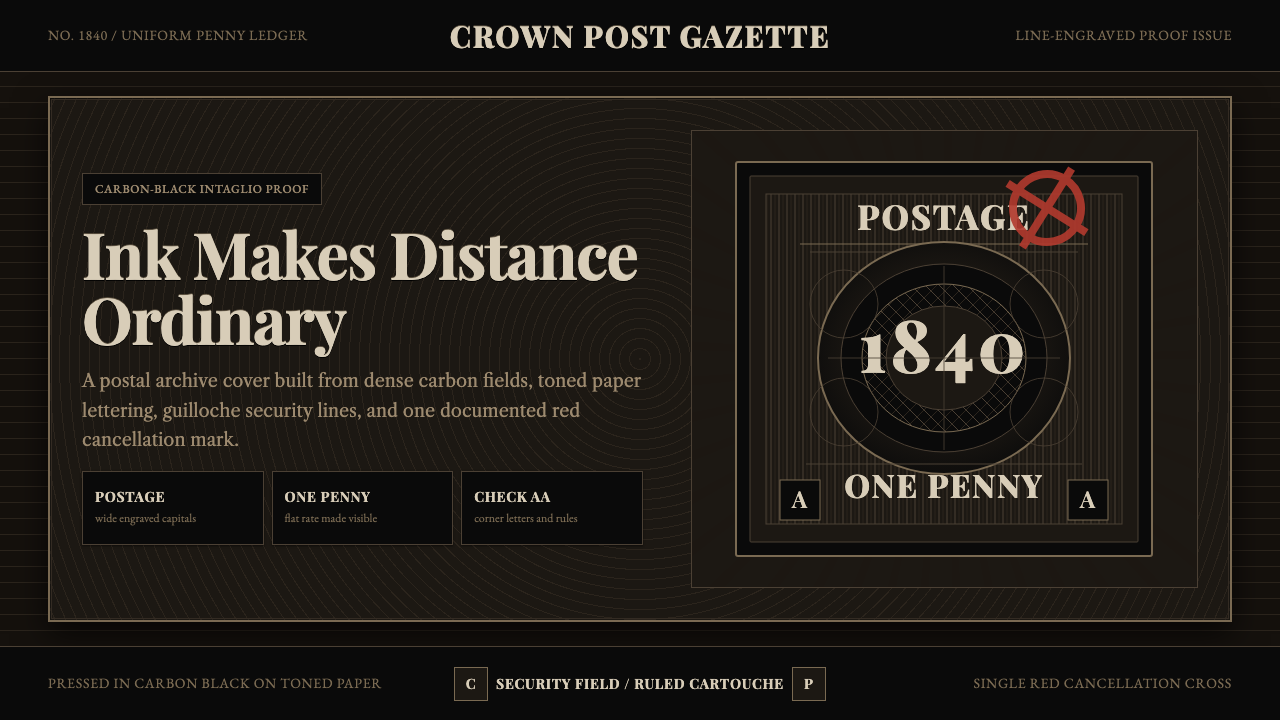
The Penny Black turned a scrap of gummed paper into a legal instrument — engraved in carbon black, laced with anti-forgery patterning, and proven genuine by a single red mark.
Penny Black Stamp in brief
Penny Black Stamp is a design system built around the world's first adhesive postage stamp, issued in Britain on 6 May 1840. The original object is a line-engraved intaglio image roughly the size of a large coin: Queen Victoria's profile set against an engine-turned guilloché field of interlocking curved lines, framed by engraved serif capitals reading POSTAGE across the top and ONE PENNY across the bottom, with a small check-letter square inked into each lower corner. Everything is printed in a dense, near-black carbon ink onto pale, slightly toned paper.
The system treats this near-monochrome discipline as its entire visual grammar rather than a decorative flourish. Black is not a background choice here — it is the substance of the thing, the way ink sits heavy in an engraved line rather than sitting flat on a printed surface. Warm brown ink and toned period paper soften that black just enough to keep it from reading as modern digital ink; the single documented exception is the red of a Maltese Cross cancellation mark, the postal date-stamp that proved a letter had actually been sent.
Every surface in the system is built to look like it came off an intaglio printing plate rather than a screen. Lines are fine, deliberate, and slightly irregular in the way hand-guided engraving tools produce; ink pools noticeably at line intersections the way it does when a steel plate is wiped and pressed rather than photographically reproduced. There are no flat vector shortcuts, no even gradients, no soft drop shadows — depth comes from line density, the same way an engraver builds a shadow out of hundreds of parallel cuts rather than a single tonal wash.
Where does Penny Black Stamp come from?
The Penny Black was the product of a specific, well-documented reform. Before 1840, British postage was charged by distance and by the number of sheets in a letter, and it was paid by the recipient, not the sender — a system so expensive and so easy to game (senders coded secret messages into the address itself so the recipient could refuse the letter and read the message for free) that reformer Sir Rowland Hill argued in an 1837 pamphlet, Post Office Reform: Its Importance and Practicability, for a radical alternative: a single flat rate of one penny for any letter under half an ounce sent anywhere in the country, prepaid by the sender. Parliament adopted Uniform Penny Postage in 1839, and the adhesive stamp — a small prepaid receipt the sender could stick to an envelope — was the mechanism that made prepayment practical at national scale.
The printing contract went to Perkins, Bacon & Petch, a firm whose expertise came not from stationery but from banknote engraving. Jacob Perkins, the firm's American-born founder, had pioneered transfer engraving and steel-plate siderography specifically to defeat currency counterfeiters, and the Penny Black borrowed that anti-forgery toolkit wholesale. The engine-turned guilloché background — the fine, mathematically repeating curved lines behind Victoria's portrait — is a banknote security device, nearly impossible to hand-copy convincingly. The portrait itself was engraved by Charles and Frederick Heath, based on an earlier commemorative medal of the young queen, and rendered in the same disciplined line-engraving technique used for paper currency of the period.
Structural details on the stamp carried practical rather than decorative purposes. Each sheet held 240 stamps, and the two lower corner letters identified a stamp's exact position on that sheet — a security measure against forged reprints, since a genuine stamp's corner letters had to match its row and column. The stamp carried no country name at all, a distinction that persists to this day: because Britain issued the first adhesive postage stamp, it remains the only country permitted under international philatelic convention to omit its name from its stamps, identified instead by the reigning monarch's silhouette alone.
The black ink created an unforeseen problem within its first year. Postal clerks canceled used stamps with a red Maltese Cross date-stamp to prevent reuse, but red ink was difficult to see clearly against black, and worse, it could sometimes be washed off a used black stamp, leaving it looking uncancelled and reusable. The Post Office's solution, adopted in 1841, was to swap the colors entirely: the stamp itself was reprinted in red-brown as the 'Penny Red,' and cancellation ink switched to black, which could not be removed without damaging the stamp underneath. That one-year color reversal — black stamp with red cancel, then red stamp with black cancel — is the direct source of this system's insistence on treating red as a single, rare, meaningful accent rather than a decorative color.
What defines the Penny Black Stamp look?
Color
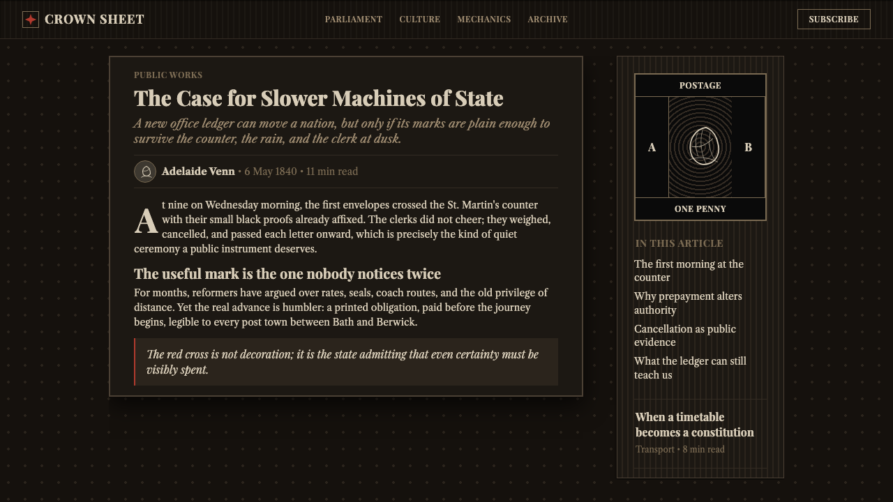
The palette is near-monochrome by design: dense carbon black for the primary image, softened by warm brown ink and gently toned period paper, with red reserved exclusively for a single documented purpose — the cancellation mark that proved the stamp had been used. Red never appears as decoration; it appears as proof.
Line Engraving
Depth and shadow come entirely from line density rather than tonal blending. Fine, slightly irregular engraved lines pack together to build darkness, the way a steel-plate engraver builds a shadow out of hundreds of individual cuts. Ink visibly pools at line intersections — a texture no flat digital fill can replicate without deliberate effort.
Typography
Lettering is engraved serif capitals in the early-Victorian manner — POSTAGE, ONE PENNY — set with the weight and slight irregularity of hand-cut steel type rather than the mechanical evenness of digital fonts. Letterforms sit inside the composition as engraved objects, not as text laid over an image.
Guilloché Ornament
The engine-turned guilloché field — fine, mathematically repeating curved lines borrowed directly from banknote security printing — is the system's signature background texture. It reads as protective and official rather than merely decorative, the visual signal of a document too precise to forge by hand.
Framing and Corner Marks
Composition is bordered and gridded like a printing plate rather than an open canvas: a hard rectangular frame, corner check-letter squares, and the sense that every element occupies a fixed, accountable position. Nothing floats free of the grid.
Restrained Accent
Because the historic system's single color deviation was a functional cancellation mark, this design language treats any accent color as an event, not an ambience — a single red stamp, seal, or marker that signals a specific, meaningful state rather than a mood.

Who shaped Penny Black Stamp?
Hill's 1837 pamphlet argued that Britain's expensive, recipient-paid, distance-based postage was both unjust and easily defrauded, and proposed a flat, sender-prepaid penny rate instead. His reform became law in 1839, and the adhesive stamp was the practical device that made national prepayment workable — turning postage from a negotiation at the doorstep into a small piece of printed paper anyone could buy in advance.
The printing firm won the government contract not because it specialized in stationery, but because it specialized in banknotes. Its anti-counterfeiting engraving techniques — transfer rollers, engine-turned security backgrounds — were repurposed wholesale for the Penny Black, embedding currency-grade security thinking into what looked like a humble scrap of gummed paper.
The Heath brothers engraved the queen's portrait onto the printing plate, working from an earlier commemorative medal of the young Victoria and rendering it in the disciplined line-engraving idiom shared with contemporary banknotes. Their engraving is the reason the stamp's central image reads as sculpted rather than drawn.
Perkins, the American-born founder of the printing firm, had earlier pioneered transfer engraving and steel-plate siderography as anti-counterfeiting tools for currency. His methods gave the Penny Black its guilloché security background and its overall conviction that a printed surface could be engineered to resist forgery, not just to look attractive.
How do you use Penny Black Stamp today?
Penny Black works as a design language wherever the goal is to communicate authority, verification, or provenance rather than approachability. Applying it well means treating black as structural material, not merely a background — every surface should feel engraved rather than filled, and any accent color should be earned by meaning, the way the historic red cancellation mark meant something specific.
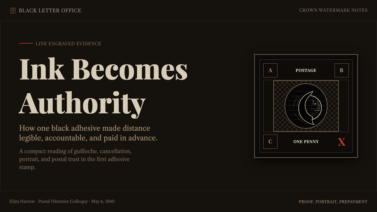
On a presentation cover slide, the system reads as a document of record: a dense, near-black field, a single engraved-style emblem or portrait silhouette, serif capital lettering set with slight, deliberate irregularity, and one small red mark used as a seal of authenticity rather than a highlight. Content slides should avoid soft shadows and gradients entirely — bullet hierarchy can be carried by rule lines and letter-spacing instead, echoing the stamp's engraved borders. Data slides benefit from a chart style that looks etched: fine gridlines, sparing color, numerals set in disciplined serif capitals.
For web interfaces, the system suits products built around trust, verification, or certification — digital notarization tools, credential platforms, premium subscription gates. A dashboard can use a near-black or deep charcoal ground with brown-toned neutrals standing in for the historic toned paper, reserving a single red accent for confirmed or verified states only. Pricing pages benefit from the guilloché motif rendered as a subtle repeating linework border around the featured tier, signaling that this is the option the system itself is vouching for.
In editorial and marketing contexts, the style supports long-form pieces about heritage, provenance, and craft. Body text should sit on a warm, faintly toned background rather than pure white, with pull-quotes rendered as engraved-style capital blocks. Marketing pages can lean on the seal-and-cancellation logic directly: a single red stamp-like mark beside a call-to-action reads as an implicit guarantee, provided it is used exactly once per composition rather than scattered as a repeating pattern.
The most common mistake is treating black as simply 'dark mode' and stopping there — flooding a layout with flat black fills and soft drop shadows produces something closer to contemporary minimalism than to this system's engraved density. Equally common is overusing the red accent: because the historic system used red exactly once, for exactly one purpose, spreading it across buttons, links, and icons dilutes the very meaning the accent depends on.
Penny Black Stamp — FAQ
Why does this system stay almost entirely monochrome?
Because the original object was. The Penny Black was printed in a single dense black ink with only warm brown and toned paper as relief — color was never part of the original design vocabulary. The system preserves that restraint deliberately, treating monochrome not as a limitation but as the source of its authority: a document that doesn't need color to prove it's serious.
How should the red accent be used correctly?
Sparingly, and only to mark a completed, verified, or authenticated state — the way the historic Maltese Cross cancellation proved a letter had actually been sent. Use it once per composition, ideally as a stamp-like or seal-like mark rather than a fill color, link color, or repeating icon tint.
Can this style work on a light background instead of dark?
Yes — the underlying paper of an actual Penny Black is pale and toned, with the near-black ink sitting on top of it. A light-ground application should keep that relationship: a warm, faintly aged neutral base with dense black linework and typography printed onto it, rather than inverting into a flat white with black type, which loses the engraved, printed-object quality entirely.
Does this system suit friendly, consumer-facing products?
Not usually. Its strength is authority and verification, not warmth — it suits certification platforms, legal or financial documents, premium credentialing, and heritage or provenance storytelling. Consumer products aiming for approachability or playfulness will generally find the engraved density and monochrome restraint work against the mood they're trying to create.
What's the difference between this and other Victorian-era styles?
Broader Victorian styles often lean into ornamental abundance — scrollwork, floral borders, dense color. This system is narrower and more specific: it is built on the anti-forgery engraving tradition borrowed from banknote printing, which favored precision and restraint over decorative excess. The guilloché backgrounds and disciplined serif capitals come from security printing, not from Victorian decorative fashion generally.
Related design styles
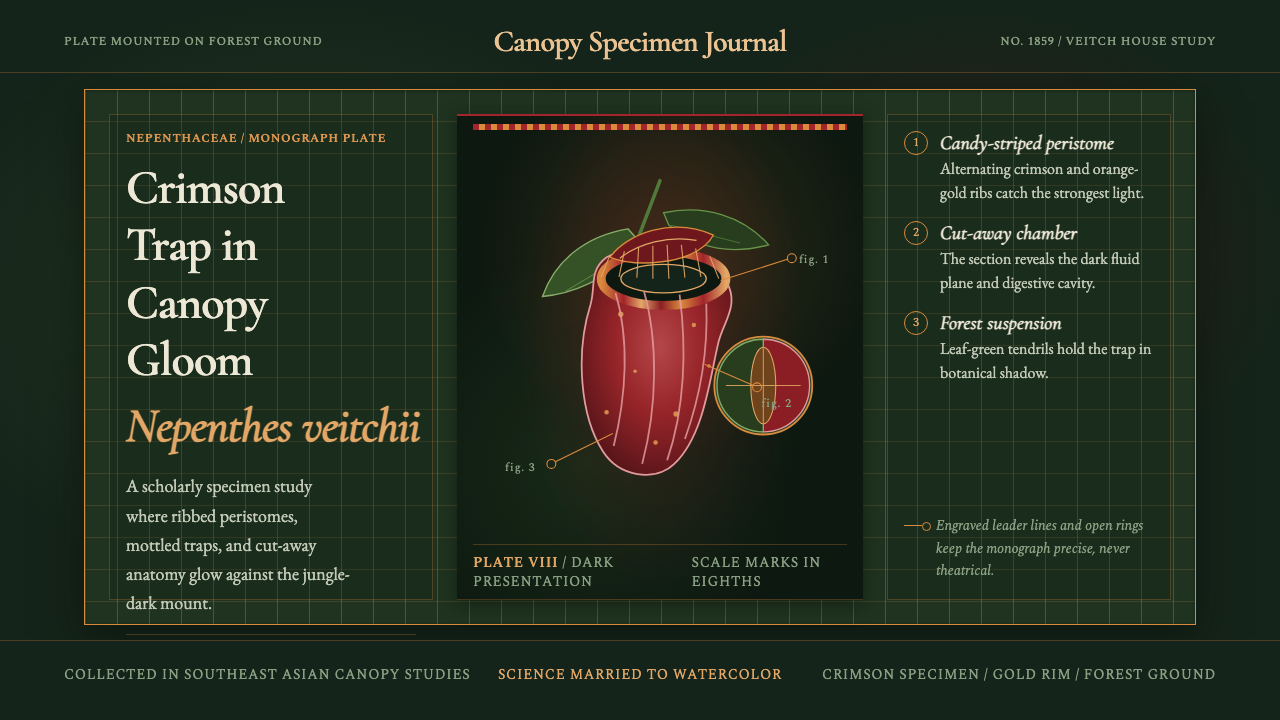 Carnivorous Pitcher PlantBotanical danger glows. Crimson traps and gold rims float on jungle-dark gree…
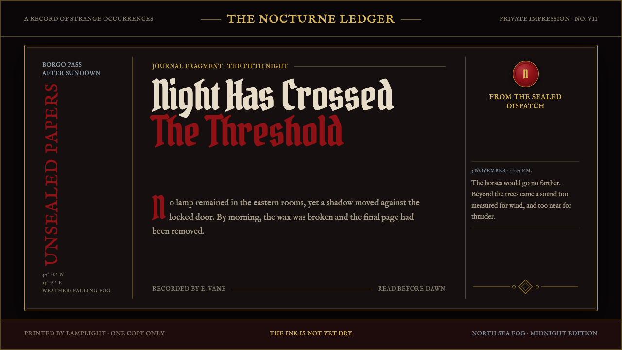 Dracula Gothic (1897)Victorian dread after dark. Blood-red initials and tarnished gilt haunt coffi…
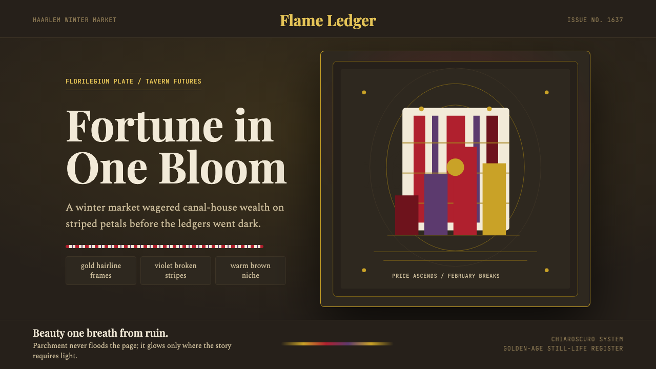 Dutch Tulip ManiaSpeculation burns in shadow. Flame red petals, violet stripes, gold frames on…
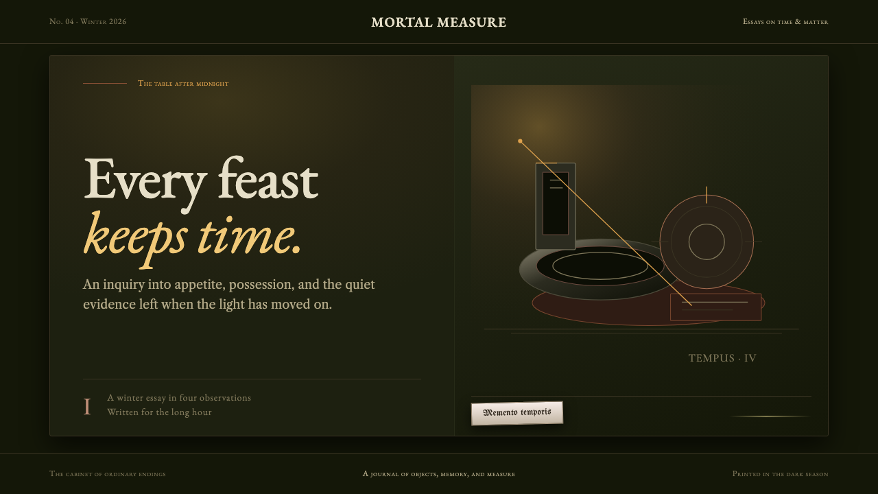 Dutch VanitasTime waits at the table. Olive-black depths, earth-brown type, and one candle…
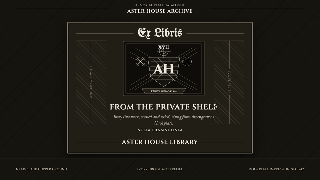 Ex Libris BookplateScholarly ownership, cut in ivory. Cinzel caps and crosshatch rules rise from…
 Frankenstein (1818)Knowledge glows before it kills. Acid green cuts through storm-slate and engr…