What is Mineral Specimen Plate?
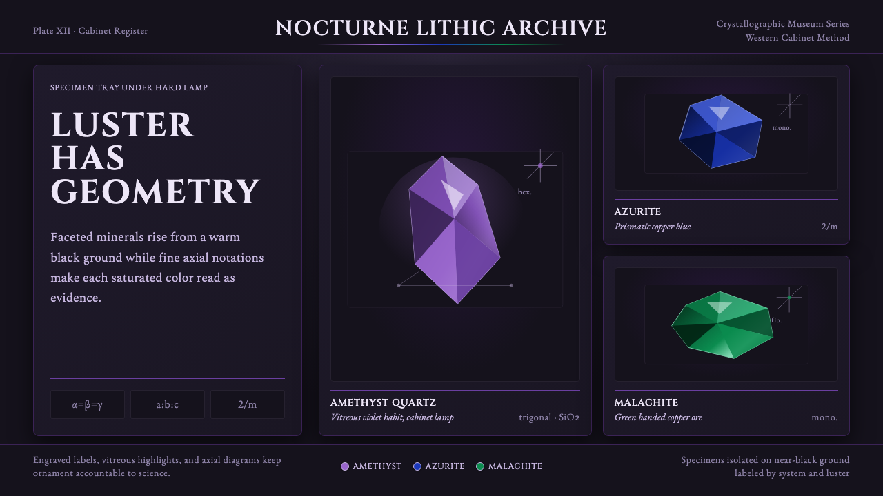
Mineral Specimen Plate turns science into ornament — faceted amethyst, azurite, and malachite lit hard against black, catalogued with the engraved precision of a museum cabinet label.
Mineral Specimen Plate in brief
This style reproduces the visual grammar of the mineral specimen plate — the illustrated catalogue page used in museum collections and mineralogical texts to document crystal specimens for scientific and educational display. It renders faceted, gem-like mineral forms lit hard against a black ground, so that the color and luster of each stone carries the entire composition, accompanied by precise labeling and thin technical diagrams tracing each mineral's underlying crystal structure.
The defining tension is between scientific rigor and visual splendor. Every element on the page has a documentary purpose — the name, the crystal-system diagram, the axial notation — yet the overall effect reads as luxurious and ornamental, because the specimens themselves are naturally so vivid: deep amethyst purple, saturated azurite blue, rich malachite green, each rendered with the glassy, faceted surface quality of cut stone rather than the flat color of illustration.
Applied as a design language, the style keeps this dual character. A black or near-black ground does the same work a museum display case does: it isolates each specimen so its color and light-catching surface become the entire point of attention. Titles are set in engraved-feeling Roman capitals, more permanent record than headline, while thin, precise line diagrams sit beside each named form like a caption that has been allowed to become part of the composition.
Where does Mineral Specimen Plate come from?
The tradition of illustrated mineral specimen plates has roots stretching back before 1900 but reached its mature, recognizable form through the development of crystallography as a rigorous scientific discipline across the nineteenth century, produced and refined within mineralogical academies and museum cabinets across Western Europe. Natural history museums of the era treated mineral collections as objects worthy of the same careful documentary illustration given to botanical specimens or zoological plates, and crystallography added a further layer: the internal geometric structure of a crystal, not just its outward appearance, needed to be recorded.
René Just Haüy, the French mineralogist often credited as a founder of modern crystallography, established the principle that a crystal's outward faceted form was the visible expression of an underlying, mathematically describable internal lattice structure. This idea — that a beautiful faceted stone was simultaneously a piece of geometric law made visible — is central to why specimen plates pair ornamental, gem-like illustration with schematic axial diagrams: the two were never in tension for the scientists producing these plates, because the beauty and the geometry were understood as the same fact viewed two ways.
Museum cabinet culture of the period reinforced this presentation logic. Mineral specimens were displayed in glass-fronted cases, often against dark velvet or black-lined trays, lit to bring out color and luster rather than to illuminate a whole room — a deliberate strategy that treated each specimen the way a jeweler treats a gem, isolating it in controlled light against a void. Illustrated plates made for texts and catalogues mimicked this same display logic on paper: black or near-black backgrounds, hard directional lighting rendered in ink or watercolor, and precise engraved-style lettering for names and classifications.
This combination of scientific specimen illustration and mineralogical cabinet display created a visual tradition where documentation and ornament were never separated — a plate intended purely for scientific reference still had to be beautiful enough to justify its place in an expensively bound volume, and a display case intended purely for public wonder still labeled every specimen with exacting technical precision.
What defines the Mineral Specimen Plate look?
Color
The palette centers on a near-black ground with deep, saturated mineral hues rising out of it: amethyst purple leading, flanked by azurite blue and malachite green, occasionally joined by other gem-toned colors as the specimen catalogue expands. These colors are rich and jewel-like rather than muted, but they are always isolated against darkness rather than set beside one another in large flat fields, which keeps the palette feeling precious rather than busy.
Faceted Surface Quality
Mineral forms are rendered with a glassy, angular, faceted surface treatment — hard-edged planes each catching light slightly differently — so they read as cut, structured stone rather than smooth cartoon gems or soft organic blobs. Each facet behaves like a small flat mirror at a distinct angle, which is what gives the specimens their sense of internal geometric order.
Typography
Plate titles use engraved-feeling Roman capital letterforms — upright, classical, and permanent in character, as befits a catalogue record rather than a promotional headline. Technical notation and mineral names accompanying the axial diagrams use a more restrained serif suited to scientific labeling, precise and legible at small size rather than decorative.
Axial Diagrams
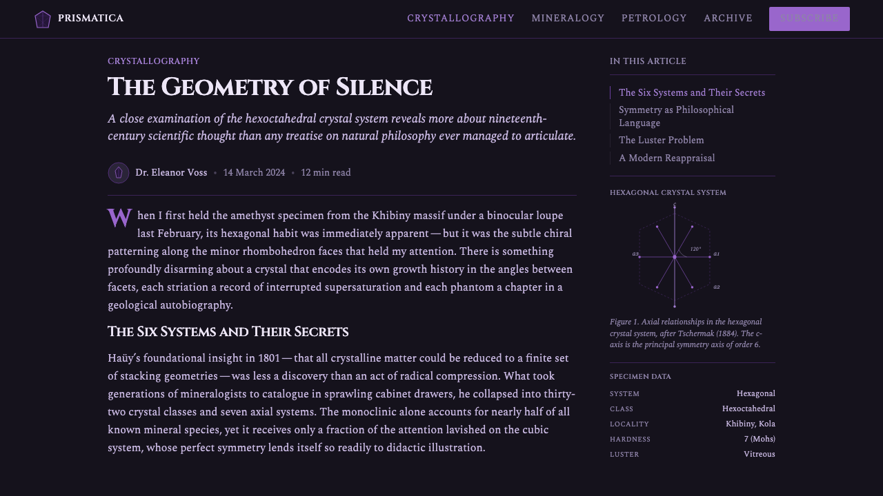
Thin, precise line diagrams trace the underlying crystal system beside each named specimen — schematic, technical drawings rather than decorative flourishes. These diagrams are drawn with restraint: fine lines, minimal shading, and geometric exactness, functioning as a scientific caption that happens to sit comfortably within an ornamental composition.
Isolation Against Darkness
Each specimen sits in its own field of near-total black, echoing the museum display case or velvet-lined tray it would historically have been shown in. This isolation is compositional discipline: it prevents specimens or colors from competing with one another and lets each mineral's particular hue and luster be read individually and clearly.
Hard Directional Light
Light in this style behaves as a single strong source from one direction, producing sharp highlights on the facets and equally sharp, dark shadow on the opposite side — never soft, ambient, or evenly diffused illumination. This hardness of light is what gives the faceted surfaces their glassy, gem-cut readability.
Scientific Restraint
Despite the visual richness of the mineral colors, the surrounding composition — labeling, diagram placement, spacing between specimens — remains orderly and restrained, following the logic of a catalogue page rather than a decorative poster. This restraint is what keeps the style reading as documentary and credible even as the imagery itself is lush.

Who shaped Mineral Specimen Plate?
A French mineralogist widely regarded as a founding figure of modern crystallography, Haüy established the theory that a crystal's external faceted form directly expressed an underlying, geometrically ordered internal structure. His work gave scientific weight to the practice of illustrating minerals with precise attention to facet geometry, linking beauty and mathematical law as a single subject of study.
The scientific academies that formalized crystallography as a discipline across the nineteenth century commissioned and standardized the specimen-plate format, establishing conventions of scale, labeling, and diagram placement that later plates continued to follow.
Natural history museum curators of the period developed the practice of displaying mineral specimens in glass-fronted cases against dark velvet or black-lined trays, lit to bring out color and luster — a physical display logic that illustrated plates translated directly onto the printed page.
How do you use Mineral Specimen Plate today?
This style carries a mood of scientific credibility paired with genuine visual luxury, which makes it most effective wherever a product wants to feel authoritative, precise, and quietly beautiful rather than either purely decorative or purely clinical. It rewards specificity — treating each color or element as though it represents something named and classifiable — over generic ornamental variety.
For presentation slides, the style is well suited to cover pages and section dividers built around a single focal specimen: a faceted gem-like form glowing against a black ground, with a small, precise engraved-style title beneath it, reads as considered and credible rather than merely dark-themed. Content and data slides can borrow the axial-diagram convention directly, using thin precise line drawings to annotate charts or structures in place of heavier iconography.
For web interfaces, the style suits premium catalogue, collection, or reference products — anything positioning itself as an authoritative, curated archive rather than a casual browsing experience. A dashboard or product catalogue can use a black or near-black ground with individual items isolated in their own lit field, each labeled in the engraved Roman-capital convention, giving even a commercial product page the credibility of a museum record.
For editorial and marketing work, the style pairs naturally with content about science, natural materials, connoisseurship, or luxury goods with a factual, specimen-like quality — jewelry, natural stone, botanical or geological subject matter. A masthead treating the hero image as an isolated, hard-lit specimen against black, captioned with precise technical-feeling labeling, borrows the plate's authority without needing literal mineral content.
The most common mistake is treating the mineral colors as a free decorative palette applied broadly across a layout, which loses the isolation and restraint that make each specimen feel precious in the source material. A second common mistake is softening the hard directional lighting into a diffuse, ambient glow — doing so collapses the glassy, faceted surface quality into something closer to a soft gem emoji than a scientifically observed crystal.
Mineral Specimen Plate — FAQ
Does this style require using actual mineral names or real crystal-system diagrams?
No. The underlying structure — a specimen isolated against black, engraved-style labeling, a thin precise diagram alongside it — transfers well to any content that benefits from feeling classified and authoritative, whether or not the labeled subject is literally mineralogical. Using invented or placeholder labels in the same visual convention still produces the style's characteristic credibility.
How many mineral colors should appear in a single composition?
The style works best with a small, curated set — typically two or three dominant hues such as amethyst purple, azurite blue, and malachite green — each given its own isolated space rather than blended together. Introducing many colors at once, all competing in the same field, undermines the precious, catalogued feel that comes from treating each hue as a distinct, individually presented specimen.
Can this style work on a light background instead of black?
The style depends heavily on the near-black ground to isolate each specimen and make its color and faceted surface the sole point of focus, in the same way a museum display case uses darkness. On a light background, the mineral colors lose much of their glow and the composition tends to read as generic gem illustration rather than the specific specimen-plate tradition this style draws from.
What distinguishes this from a generic 'gemstone' or 'crystal' decorative aesthetic?
Generic crystal or gemstone aesthetics tend toward soft, dreamy, or mystical treatment — pastel glows, rounded forms, often paired with astrology or wellness themes. This style is the opposite in spirit: it is documentary and scientific first, ornamental second, built from hard-edged facets, precise engraved labeling, and technical axial diagrams rather than soft glow and mystical framing.
Is this style suitable only for scientific or museum-related products?
No. While it originates from mineralogical illustration, its underlying logic — a precious subject isolated against darkness, labeled with authoritative precision — transfers well to any product wanting to feel like a curated, credible archive: luxury catalogues, premium collections, reference tools, or connoisseur-oriented content of any kind. The scientific origin lends the style its authority, not its subject-matter limits.
Related design styles
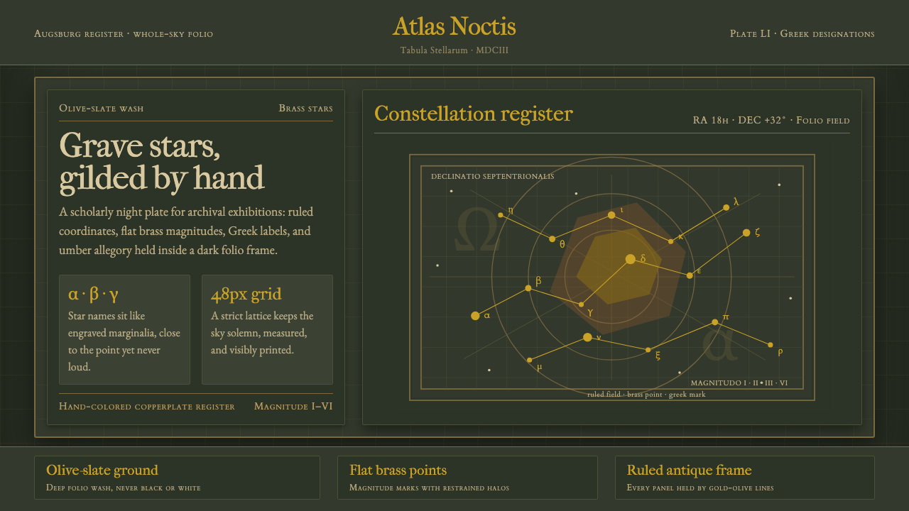 Bayer UranometriaGrave celestial folio. Olive-slate grid, brass stars, Greek labels, old-style…
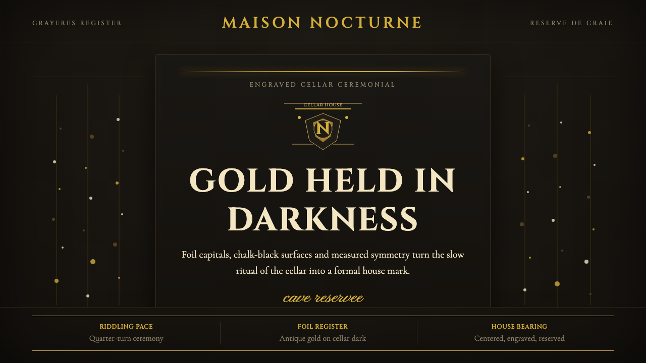 Champagne MaisonGrandeur without glitter. Cinzel capitals and gold foil rules glow in cellar…
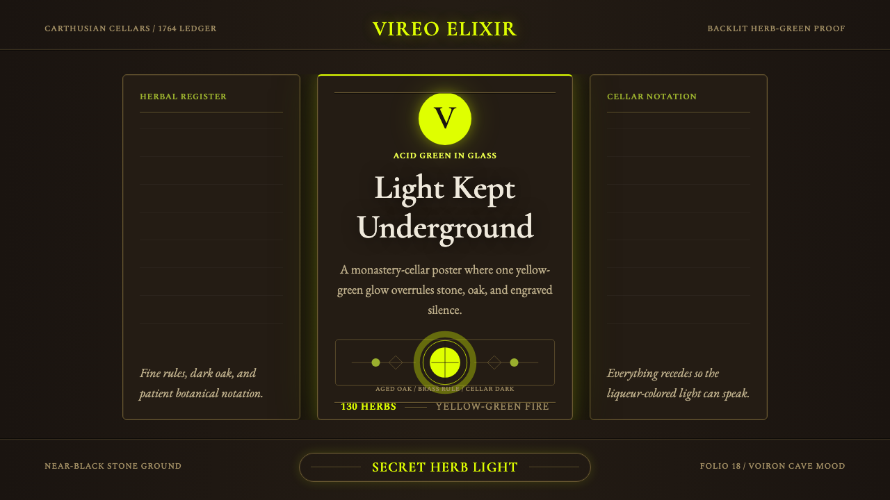 Chartreuse Liqueur GreenAcid glow rules the cellar. Cormorant Garamond and brass hairlines frame yell…
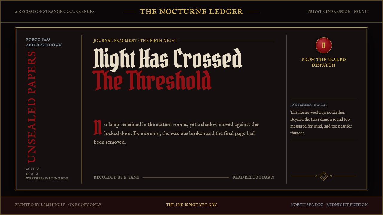 Dracula Gothic (1897)Victorian dread after dark. Blood-red initials and tarnished gilt haunt coffi…
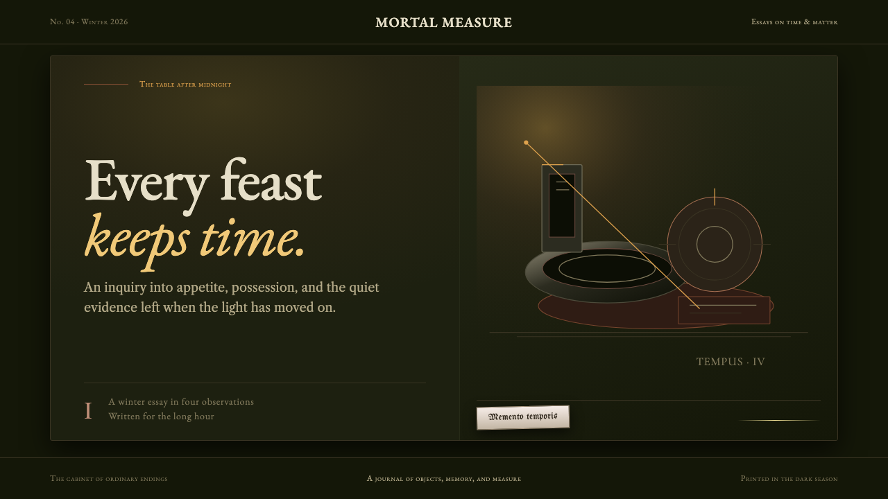 Dutch VanitasTime waits at the table. Olive-black depths, earth-brown type, and one candle…
 Ex Libris BookplateScholarly ownership, cut in ivory. Cinzel caps and crosshatch rules rise from…