What is Victorian Brass Microscope?
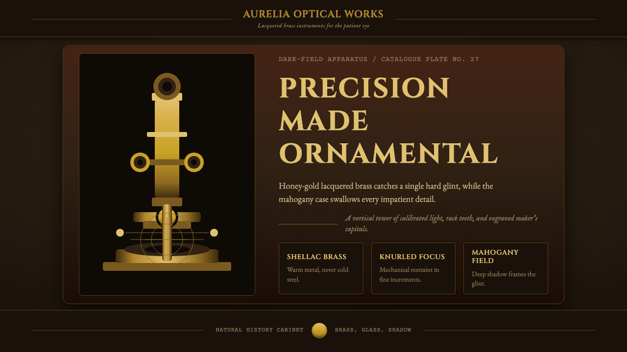
A Victorian brass microscope turns precision instrument into ornament — polished lacquered metal glowing gold against a black dark-field, as if science itself had been put under glass.
Victorian Brass Microscope in brief
This style takes its visual grammar from the compound microscopes built in Britain during the Victorian golden age of optical instrument-making, roughly 1840 to 1899. It is not a graphic movement or a school of designers; it is an object language, translated into an interface — the honey-gold warmth of lacquered brass, the specular glint of turned metal, and the near-total blackness of the case that holds it all.
The defining move is contrast between warm metal and dark ground. A Victorian microscope's tube, focus wheels, and stage were all brass, coated in shellac so the surface would not tarnish and would instead deepen into an amber-honey color. Set against the mahogany-lined interior of its fitted case, or displayed on a velvet-covered bench, the instrument reads as a small tower of controlled light — hard highlights racing along every turned edge, everything else swallowed by shadow.
Applied to digital work, the style keeps that same discipline: a dark, almost black ground carries the composition, warm brass-gold tones do the work of accenting and signaling importance, and surfaces behave like polished, engraved metal rather than flat color. It rewards restraint — the gold is a highlight, not a wash — and it rewards precision, since the whole point of the original object was mechanical exactness rendered beautiful.
Where does Victorian Brass Microscope come from?
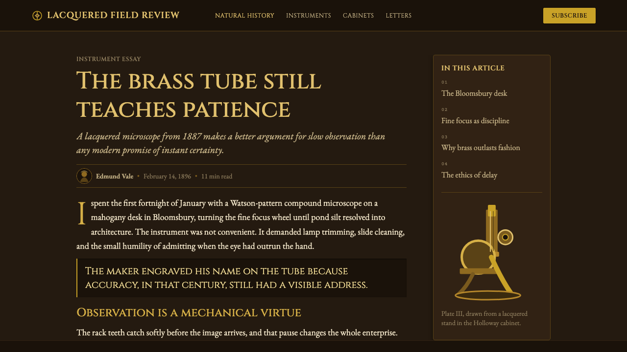
The Victorian compound microscope emerged from a specific convergence: an empire obsessed with cataloguing the natural world, a manufacturing base capable of producing precision brass optics at scale, and a middle class with enough disposable income and enough scientific curiosity to buy instruments as both tools and status objects. Between roughly 1840 and the close of the century, London became the center of a competitive, prestige-driven trade in optical instruments, and the physical object itself — not just what it showed under the lens — became a thing to be admired.
Firms such as Powell & Lealand, Ross, and Smith & Beck built reputations on the quality of their brasswork as much as on their optics. A microscope from one of these makers was a status object as well as a working tool: engraved with the maker's name along the tube, finished by hand, fitted into a bespoke mahogany case lined with velvet or silk. Owning one signaled participation in the era's great enthusiasm for natural history — pond life, insects, botanical cross-sections, mineral thin-sections — all newly visible and newly fashionable to examine.
The Royal Microscopical Society, founded in London in 1839, gave this culture an institutional center: a place where instrument makers, amateur naturalists, and professional scientists compared notes, judged workmanship, and pushed manufacturers toward ever finer mechanical tolerances. Microscopy became a parlor pursuit as much as a laboratory one — a Victorian household with means might display a fine brass microscope in the parlor the way it displayed silver or clocks, as evidence of taste and intellectual seriousness combined.
What survives visually from this period is the specific material logic of lacquered brass under glass-fronted, dark-lined display: warmth against void, engraved precision against shadow, and an object culture that treated scientific instruments as worthy of the same finish and reverence as fine furniture.
What defines the Victorian Brass Microscope look?
Color
The palette is built on a near-black ground — the dark-field of the microscope's fitted case — punctuated by warm honey-gold and amber brass tones. Gold is never spread evenly; it appears as highlight, edge, and accent, concentrated where the eye should land, while the surrounding field stays dark and quiet. Secondary tones lean toward deep mahogany brown, used sparingly to suggest wood grain or case lining rather than as a competing accent.
Material Finish
Surfaces read as polished, lacquered metal rather than flat digital color: hard specular highlights, not soft glows, mark every curved or turned edge. The finish is closer to shellac over brass than to paint — a slightly warm, slightly amber cast sits over the metal sheen, as if a thin coat of varnish had aged onto it. Nothing looks matte; everything looks like it could catch a point of light and hold it.
Typography
Lettering follows the logic of engraved instrument markings — the maker's name run along a tube, calibration numbers stamped into a focus wheel. It favors precise, slightly formal letterforms, evenly spaced, with the restraint of something meant to be read once and trusted rather than something meant to catch the eye repeatedly. Labels behave like engravings: small, exact, and permanent rather than decorative.
Composition and Depth
Compositions favor a single dominant vertical or structural form — echoing the microscope's own tube-and-stand silhouette — rising out of darkness, with supporting elements arranged around it like fittings around an instrument. Depth is built through layered darkness rather than distance haze: a foreground element glows, a middle layer sits in shadow, and the background recedes to near-total black, the way a case interior recedes behind its brass contents.
Ornament as Precision
Decoration in this style never looks arbitrary — every curve, knurled ring, or engraved line reads as functional: a grip surface, a calibration mark, a joint. This is ornament earned through mechanical purpose rather than applied afterward. It gives the style a disciplined, almost scientific feel even when used purely decoratively, because nothing in the source material was ever decoration for its own sake.
Shadow Depth
Shadow is treated as a dominant compositional force, not an afterthought. The dark-field ground is not merely a backdrop but an active participant — it is what makes the gold read as precious and the highlights read as sharp. Shadows are deep and largely undifferentiated in the far background, reserving detail and gradation only for the zones immediately around the brass forms.
Restraint of Accent
Because the gold reads as valuable precisely because it is rare, the style depends on ratio: a small proportion of gleaming metal against a much larger field of near-black. Overusing the gold — spreading it across large flat areas — collapses the effect into generic warm-luxury styling and loses the specific, instrument-like precision that defines this look.
Who shaped Victorian Brass Microscope?
A London firm regarded by many contemporaries as the finest maker of compound microscopes of the era, prized for the exactness of its mechanical stages and the quality of its brasswork. A Powell & Lealand instrument was as much a demonstration of the maker's skill in metal as it was an optical tool, and its finish set a benchmark other makers were judged against.
One of the leading Victorian optical firms, Ross produced microscopes for both professional scientists and wealthy amateurs, competing directly with Powell & Lealand on both optical performance and the visual refinement of the instrument's brass fittings and case presentation.
A prominent London instrument-making partnership whose microscopes were widely used and admired for combining solid mechanical engineering with the ornamental brass finish expected of a high-status scientific instrument in this period.
Founded in London in 1839, the Society became the institutional hub of Victorian microscopy — a body where instrument quality was debated, workmanship compared, and the culture of microscope collecting and connoisseurship was formalized and sustained.
How do you use Victorian Brass Microscope today?
This style carries a strong sense of preciousness and craft, which makes it most effective wherever a product wants to signal expertise, heritage, or considered quality rather than speed or casualness. It rewards restraint far more than density — the source material earns its warmth through scarcity of gold against a large dark field, and digital work that tries to reproduce it should keep that same ratio.
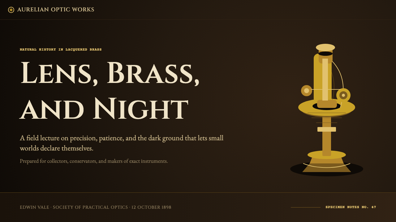
For presentation slides, this style suits cover pages and section dividers especially well: a dark ground with a single glowing gold element — a title, an icon-like mark, a thin rule — reads as considered and high-value rather than merely dark-mode. Content slides should limit gold to headers, key numbers, or a single highlighted data point, keeping body text in a quieter, more neutral tone so the gold accent retains its impact rather than becoming wallpaper.
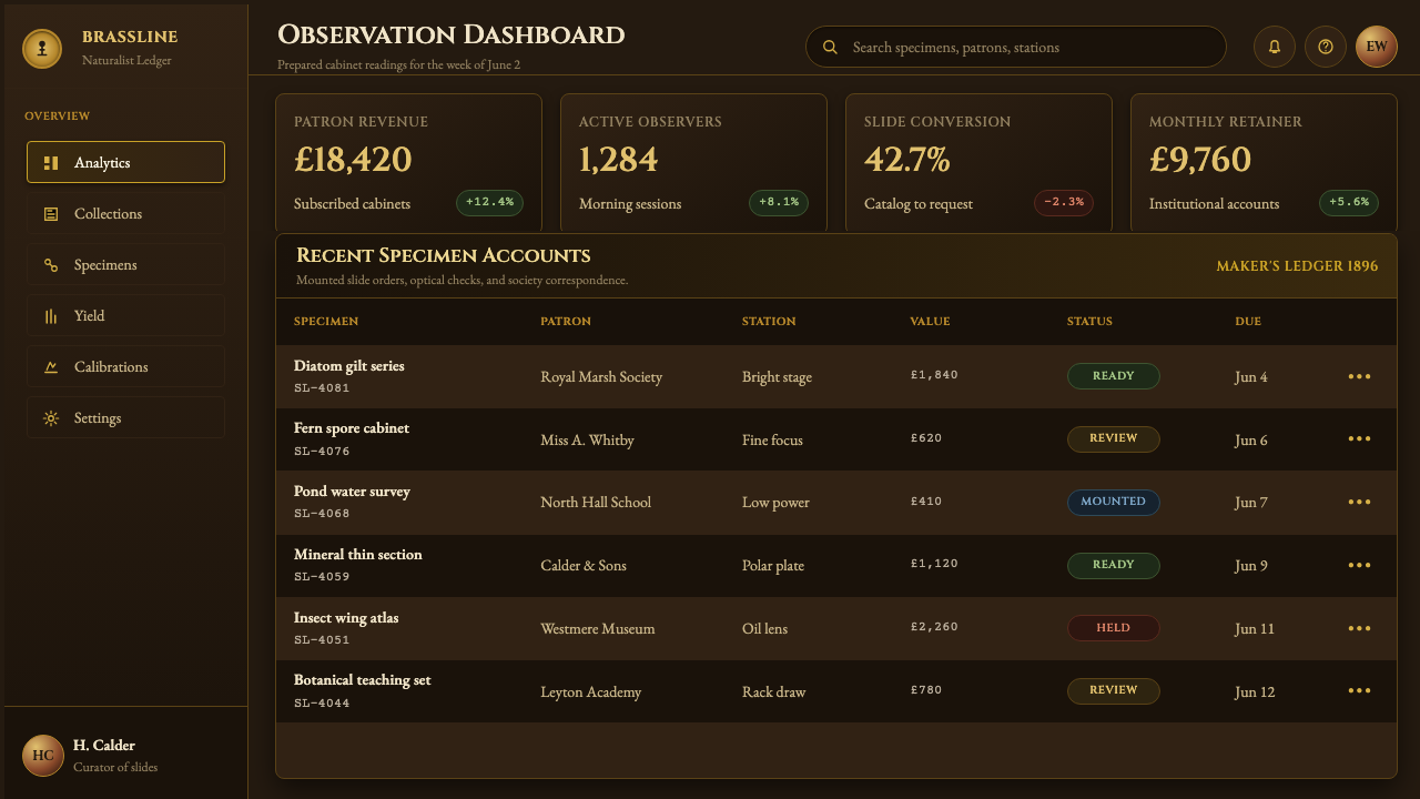
For web interfaces, the style is well suited to dashboards or account areas built around trust and precision — financial tools, professional software, premium subscription tiers — where a dark theme with a warm metallic accent communicates seriousness without feeling cold. Buttons, active states, and key metrics can carry the gold; backgrounds, cards, and secondary text should stay dark and quiet so the hierarchy stays legible.
For editorial and marketing use, the style pairs naturally with content about heritage, craftsmanship, precision engineering, or connoisseurship — the kind of subject matter the original object itself represented. A hero image or masthead with a dark field and a single warm accent line does the same work a Victorian instrument case did: it frames one valuable thing in darkness so it reads as worth looking at closely.
The most common mistake is treating the gold as a general accent color to be splashed across a layout the way a bright brand color might be. Because the original material logic depends on scarcity — one glowing thing in a field of near-black — spreading gold evenly across large surfaces, buttons, and backgrounds collapses the effect into a generic warm dark theme and loses the exact, instrument-like specificity that makes this style recognizable.
Victorian Brass Microscope — FAQ
Does this style require a fully black background?
Not literally pure black, but the ground should read as very dark and largely undifferentiated — close to the interior of a fitted instrument case. A near-black brown or a very deep neutral tone works, as long as it stays dark enough that the gold accents remain the brightest, most attention-grabbing element on the surface.
How much gold or brass tone should appear in a typical layout?
As a general guide, gold should behave like a highlight rather than a fill — a minority of the visual field, concentrated on the elements that matter most: a headline, an icon, a key metric, an active state. If gold starts covering large background areas or filling whole cards, the effect stops reading as precision instrument and starts reading as generic warm decoration.
What kind of typography fits this style best?
Precise, evenly spaced, slightly formal letterforms fit best — type that reads like an engraving rather than a poster headline. Avoid heavily decorative or hand-drawn scripts; the original object's lettering was functional and exact, meant to identify and calibrate rather than to charm.
Is this style only suitable for scientific or historical content?
No. While it originates from a scientific instrument, the visual logic — warm precious metal against dark ground, precision as ornament — transfers well to any context built around trust, expertise, or premium positioning: finance, professional tools, luxury goods, or heritage branding. The subject matter does not need to be scientific for the aesthetic to feel earned.
How does this differ from a generic 'dark mode with gold accents' theme?
The difference is in material logic and restraint. A generic dark-and-gold theme treats gold as a brand color applied broadly. This style treats gold the way lacquered brass behaves under light — concentrated highlights, engraved precision in the lettering, and a strict ratio that keeps most of the surface dark. It is closer to photographing a single well-lit object in a dark room than to painting a page gold and black.
Related design styles
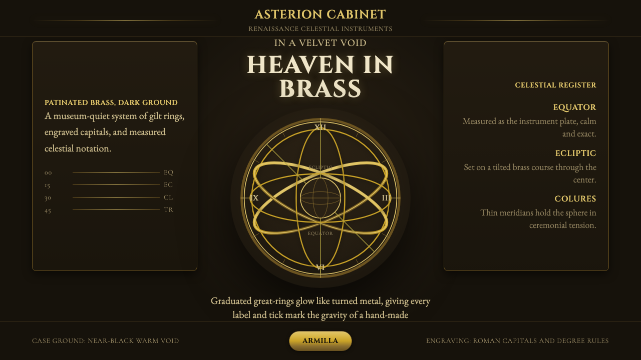 Armillary SphereMuseum darkness makes brass celestial. Cinzel capitals and concentric gold ri…
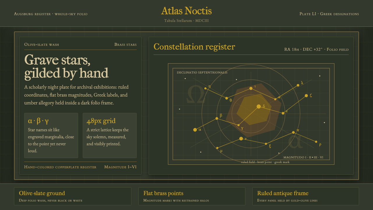 Bayer UranometriaGrave celestial folio. Olive-slate grid, brass stars, Greek labels, old-style…
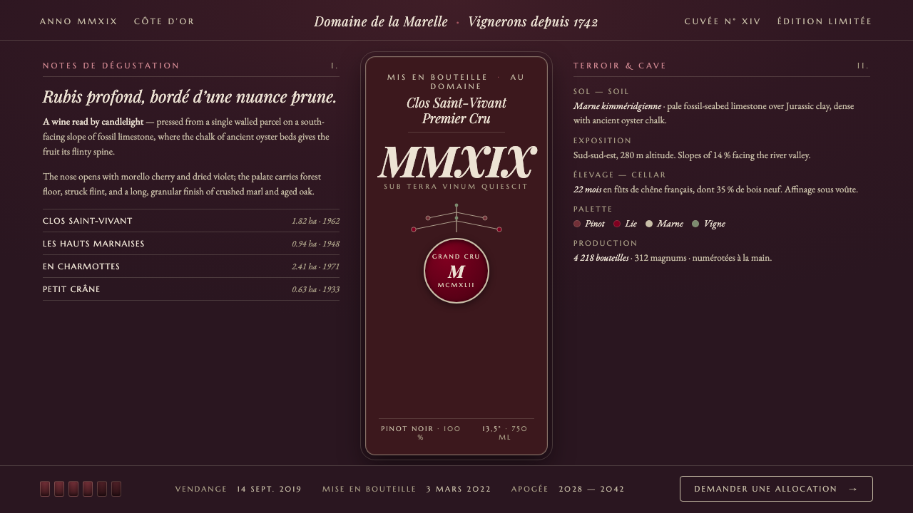 Burgundy VineyardRead by candlelight in a wine-lees cellar. Aged purple-red Pinot on near-blac…
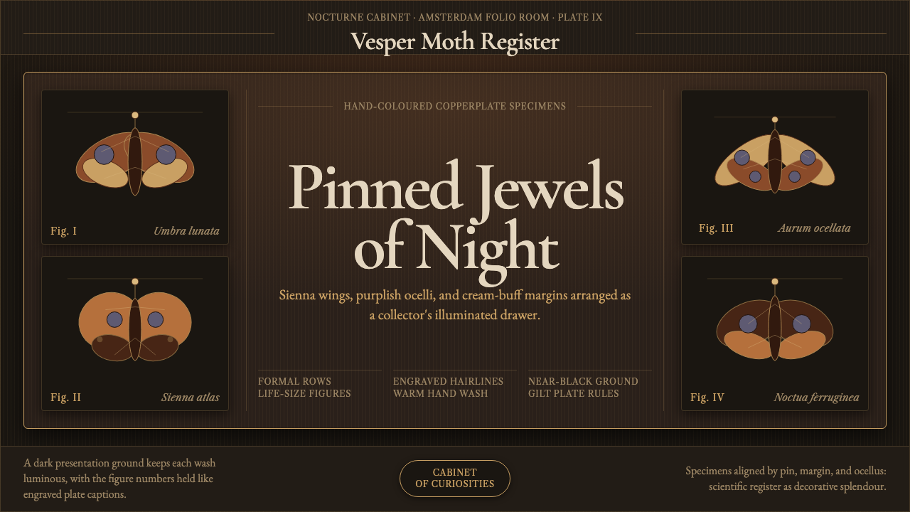 Cramer Exotic MothsJewel-like precision. Sienna specimens glow in formal rows on a near-black pl…
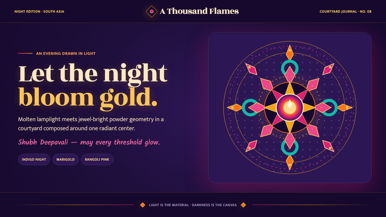 Diwali Festival of LightsNight blooms from within. Molten gold and jewel-bright rangoli radiate across…
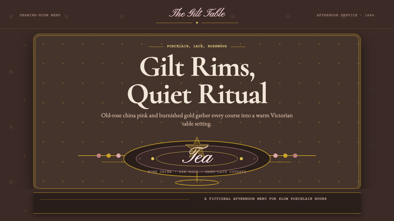 English Afternoon TeaOrnament is the ritual. Old-rose porcelain, gilt rims, and script rest on ros…