What is English Afternoon Tea?
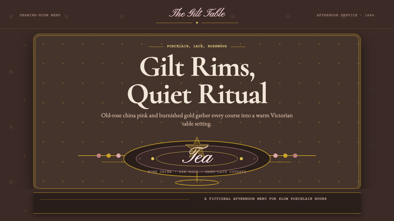
English Afternoon Tea is a design system rooted in the 1840s Victorian drawing room — a world of hand-painted bone china, tiered cake stands, lace cloths, and copperplate menus where ornament is not decoration but devotion. Every surface behaves like glazed porcelain: warm rose pinks and burnished gilt glow against the deep shadow of aged rosewood, and nothing is left unembellished.
English Afternoon Tea in brief
English Afternoon Tea is a Victorian-era design style tracing directly to the ritual that Anna Russell, seventh Duchess of Bedford, popularized in the 1840s. Feeling hungry between the midday meal and late-evening dinner, the Duchess began calling for tea and light refreshments in her private rooms, eventually inviting friends to join her. The practice spread rapidly through the aristocracy and upper-middle classes, crystallizing a highly specific set of material objects — bone china teacups with rose motifs, gilded cake stands, embroidered linen, and handwritten invitation cards — whose aesthetic qualities became a complete visual system.
Visually, the style is characterized by warmth and ornamental abundance rather than restraint. The color foundation is a triad of Old Rose (a softened, dusty china pink), burnished gilt (warm gold that reads as candlelit rather than bright), and deep rosewood (a near-black reddish-brown that anchors the composition). These three tones echo the actual materials of a Victorian tea table: the fired glaze of Spode or Royal Doulton china, the gilded rims applied by hand before a second firing, and the dark mahogany and rosewood furniture of the drawing room.
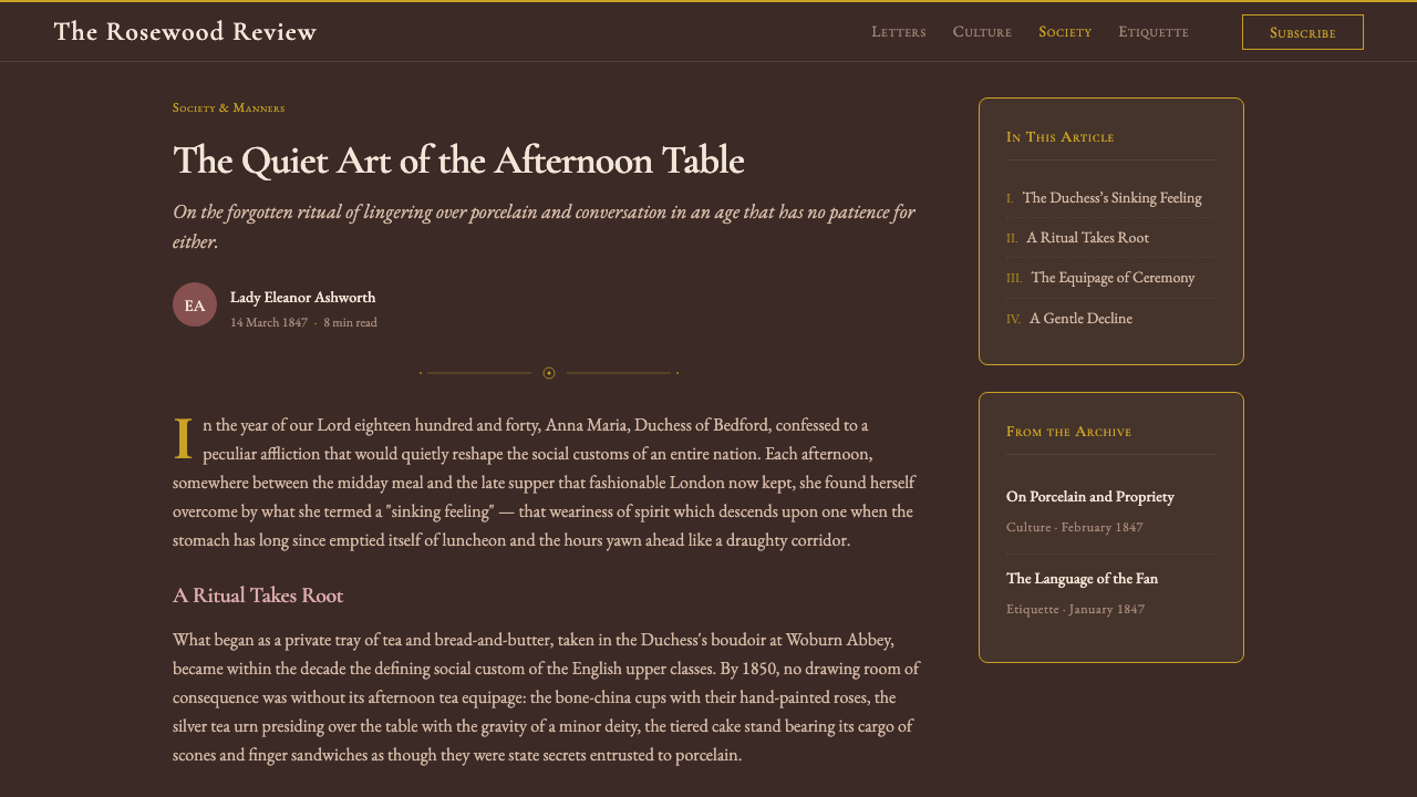
Typography in this system is explicitly calligraphic and historical. Copperplate script typefaces reference the engraved invitation cards and handwritten menus of the original ritual. High-contrast floral serifs — letterforms with swelling strokes and fine hairlines, often with small decorative flourishes at terminals — carry the headings and lend the system a sense of genteel ceremony. The principle at the heart of the style is that ornament is the point: scalloped lace borders, gilt rule lines, chintz floral sprays, and porcelain-glaze surface effects are not additions to an otherwise austere layout but the very substance of the design.
Where does English Afternoon Tea come from?
The ritual that gave this design system its vocabulary emerged in the early 1840s at Woburn Abbey, the Bedfordshire seat of the Dukes of Bedford. Anna Russell, who held the title from 1839 after marrying the seventh Duke, is credited with establishing the practice of an afternoon tea service at around five o'clock. The Regency and early Victorian eras had been pushing the evening meal progressively later — dinner by eight or nine in the evening was fashionable — leaving a long, hungry gap in the afternoon. The Duchess's solution was as much social as culinary: gathering friends for tea and small sandwiches, cakes, and pastries created a new semi-public occasion for conversation and display.
The material culture of the ritual drew directly on the flourishing English china industry. The eighteenth century had seen the development of true English bone china — a porcelain body incorporating calcined animal bone, giving it a characteristic translucency and warmth — by Josiah Spode around 1800. By the 1840s, manufacturers including Spode, Royal Doulton, Wedgwood, and Minton had developed rich decorative vocabularies: hand-painted Old Rose and blush patterns, cobalt blue underglaze transfer prints, and the practice of applying gilded rims and handles before a second kiln firing. These decoration techniques gave Victorian bone china its distinctively layered, light-catching quality, with matte painted surfaces punctuated by glossy gilt lines.
Victorian interior design provided the backdrop. The drawing rooms of the 1840s and 1850s were heavily furnished environments with deep-piled carpets, velvet curtains, rosewood and mahogany furniture, and surfaces crowded with ornaments. This was deliberate: in an era when moral and social standing were closely correlated with domestic virtue, the richness of one's drawing room was a public statement. Afternoon tea took place in this environment and absorbed its values — the association between abundance of detail, care for guests, and the performance of refinement. The tiered cake stand, the embroidered tray cloth, the engraved silver teaspoon were not mere conveniences but theatrical props in a daily domestic drama.
The tradition was institutionalized and globalized through the Victorian expansion of hotels and railway travel. Grand hotels — Claridge's, The Savoy, The Ritz in London — developed formal afternoon tea services from the 1860s onward, creating the architectural and material archetype that would be refined over the following century. The style absorbed influences from both the Arts and Crafts movement (which valued hand-craftsmanship and historicist ornament) and the aesthetic movement (which elevated decoration as an intrinsic value rather than a moral one), giving the resulting visual language a richness and self-consciousness that distinguishes it from purely functional Victorian design.
What defines the English Afternoon Tea look?
Color Palette
The palette is built around three foundational tones: Old Rose, a dusty, muted china pink that reads as warm and faded rather than bright; burnished gilt, a deep warm gold that recalls candlelight and kiln-fired ceramic luster rather than bright metallic shine; and aged rosewood, a near-black reddish-brown that grounds the composition and creates depth without cold darkness. These tones are supplemented by ivory and cream for backgrounds — never pure white, which would read as too clinical — and by accents of dusty lavender or sage green in secondary decorative elements. The palette's distinguishing quality is its warmth: all hues tend slightly toward amber and rose rather than blue or green.
Ornament as Structure
Unlike design systems that treat ornament as a layer applied on top of content, English Afternoon Tea makes ornament structurally inseparable from the composition. Gilt rule lines define regions and hierarchies in the same way a grid would in a more reductive system. Scalloped lace borders carry the eye around the edges of a layout. Floral chintz sprays occupy corners and negative spaces, turning what would otherwise be empty zones into active visual terrain. The absence of ornament in a zone reads as an error, not as restraint. This inversion of modernist values is the style's defining characteristic.
Typography
The typographic system draws from two historical traditions. Copperplate script — the fine, slanted, pressure-variable penmanship used by Victorian engravers for invitation cards, menus, and certificates — appears in display applications where personal warmth and ceremony are required. High-contrast serif typefaces with pronounced thick-thin stroke variation and small, precise serifs carry headings at larger sizes. Body text traditionally uses a more restrained old-style serif, set with generous line spacing and wide margins that recall the layout of Victorian correspondence. The key typographic value is legibility through elegance rather than through simplicity: the style does not simplify to aid reading but relies on the reader's willingness to slow down and attend.
Surface and Texture
In digital applications, the English Afternoon Tea style simulates the layered material surfaces of its physical sources. Backgrounds suggest the matte warmth of linen or paper rather than the flat neutrality of a screen. Raised or inset effects imply the embossing found on Victorian stationery. Gilt elements carry a subtle luster — a slight shine or reflected highlight — that distinguishes them from flat yellow shapes. Floral motifs are rendered with the delicacy of transfer-print porcelain decoration: thin, precise lines with soft color fills rather than bold flat shapes. The overall effect should suggest something that could be picked up, handled, and admired as a physical object.
Hierarchy through Ceremony
Information hierarchy in this system is established through ceremony rather than through contrast alone. Size differences exist, but they are accompanied by changes in typeface, treatment (a header might be in gilt script, a subhead in a smaller serif, body text in a restrained upright), and surrounding ornament (gilt rule above and below primary headings, simpler rule for secondary headings, no rule for tertiary elements). The layering of treatments is itself the signal of importance: a heavily ornamented element is by definition more significant than a plainly typeset one. This differs from modernist hierarchy, which typically signals importance through size and weight alone.
Floral Motif Language
Floral motifs in this system are not generic decorations but a specific, historically grounded vocabulary drawn from English chintz textile patterns and bone china decoration traditions. Roses — particularly Old Rose and blush varieties — are primary. Secondary motifs include forget-me-nots, sweet peas, and English garden perennials rendered in soft, slightly faded watercolor hues. These motifs follow conventional placement rules: corner sprays, border repeat patterns, central medallions, and scattered toss patterns. The discipline lies in density and scale calibration: motifs should feel lush but never chaotic, and their scale should relate logically to the scale of the text and layout they accompany.
Dark Ground and Glow
A defining compositional move in this system is the placement of warm, luminous elements against the deep rosewood ground. Rather than building upward from white (additive), the style builds inward from darkness: the aged rosewood sets a rich, shadowy baseline, and Old Rose, ivory, and gilt glow against it with a warmth that resembles candlelight or the soft gleam of polished silver. This dark-ground approach gives the style a nocturnal, intimate quality — appropriate for a ritual that was associated with drawing rooms, candlelight, and the private hours of the afternoon — and distinguishes it from pastoral or daytime-associated interpretations of Victorian design.
Who shaped English Afternoon Tea?
Anna Russell is credited with originating the English afternoon tea ritual in the early 1840s at Woburn Abbey. Her decision to address the long afternoon gap between meals by hosting an informal tea gathering codified a social practice that spread from the aristocracy through the upper-middle classes and eventually into the commercial hotel culture of the late nineteenth century. The material choices associated with her ritual — bone china, tiered stands, lace cloths — form the aesthetic vocabulary that the design system directly references. The Duchess was also known for her correspondence, and the copperplate-style invitation cards associated with afternoon tea gatherings reference the engraving traditions of her social milieu.
Josiah Spode the Second is credited with perfecting the formula for English bone china around 1800, building on decades of experimentation by his father and the broader Staffordshire pottery industry. The resulting material — creamy, translucent, with a warmth that Continental hard-paste porcelain lacked — became the preferred medium for English afternoon tea services throughout the nineteenth century. Spode's decorative vocabulary, including the iconic Blue Italian pattern and numerous floral designs developed for his wares, established a template for tea-service decoration that manufacturers including Royal Doulton, Wedgwood, and Minton would elaborate and extend for generations.
Royal Doulton, founded by John Doulton in Lambeth in 1815 and awarded its royal warrant in 1901, became one of the defining manufacturers of fine bone china for the English table. The company's decorative programs — including the Old Country Roses pattern introduced in 1962, which became the world's best-selling china pattern — crystallized the visual vocabulary of English afternoon tea into a globally recognized aesthetic. Their use of hand-applied gilding, layered floral transfers, and the characteristic warm cream of their bone china body established standards that other manufacturers measured themselves against. Royal Doulton's output represents the commercial institutionalization of an aesthetic that began in the aristocratic drawing room.
Wedgwood, founded by Josiah Wedgwood in 1759, occupies a somewhat distinct position in the English china tradition: its Jasperware and Queen's Ware lines developed a classically restrained aesthetic that stands apart from the more floridly ornamental mainstream of Victorian tea ware. However, the company's influence on the overall culture of ceramic collecting, presentation, and the association between fine china and social performance was enormous. Wedgwood helped establish the idea that the specific objects used in domestic ritual — the teacup, the serving plate, the sugar bowl — were themselves cultural statements, a principle that underpins the entire design system.
The Ritz Palm Court, opened in 1906, represents the translation of the aristocratic afternoon tea ritual into a luxury public institution. César Ritz and his design collaborators created an environment of gilded excess, mirrored surfaces, elaborate floral arrangements, and white-gloved service that amplified the domestic aesthetics of the Victorian drawing room into an architectural and theatrical statement. The Ritz's afternoon tea service became the international standard against which hotel afternoon tea experiences were measured, and the visual codes of the Palm Court — heavy gold ornament, deep upholstery, tiered stands, hothouse flowers — became the commercial shorthand for English afternoon tea as a global brand.
How do you use English Afternoon Tea today?
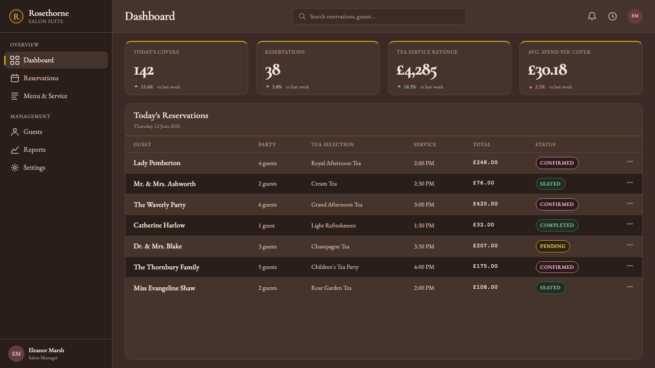
English Afternoon Tea is a style that rewards understanding its underlying logic before application. Its central principle — that abundance of ornament signals care and quality — runs directly counter to modernist design training, which equates restraint with sophistication. Designers accustomed to subtractive editing need to approach this system additively: the first version of a layout is rarely ornate enough, and the discipline lies in curating what to add rather than what to remove. The style is most powerful in contexts where its emotional associations — warmth, ceremony, gentility, unhurried attention — directly serve the product's values.
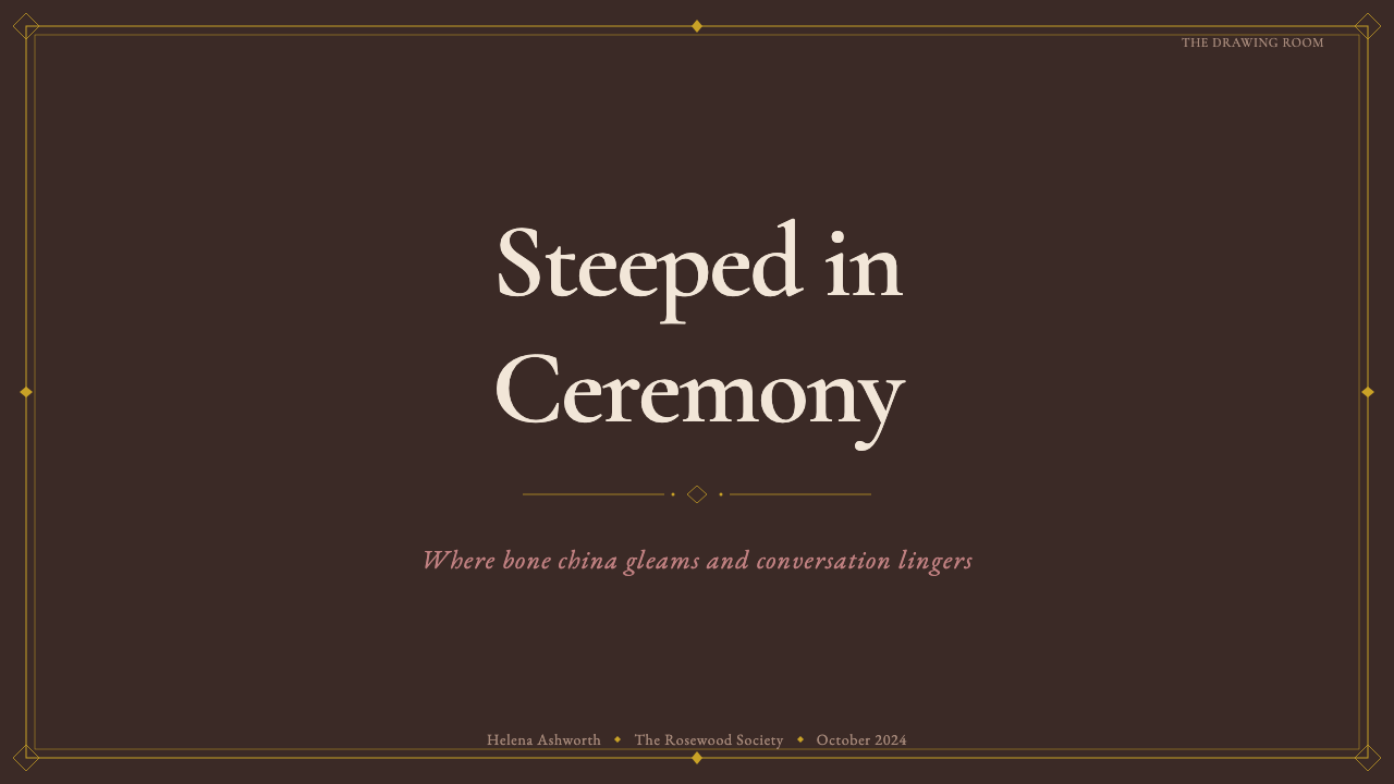
For presentation slides, English Afternoon Tea works best on cover pages and section dividers where visual impact is the primary goal. A cover built in this system uses the dark rosewood ground, places a floral chintz spray in one or two corners, centers the title in a high-contrast serif or copperplate script in Old Rose or gilt, and frames it with a paired gilt rule border. Content slides within the same deck should use a lighter approach — ivory or cream ground, one or two small ornamental details, consistent typeface treatment — to prevent the audience from experiencing visual fatigue. Data slides should abstract the palette: use the rose and gilt tones in chart elements, keep chart backgrounds cream, and resist adding floral ornament to data-heavy pages.
For web interfaces, the style is best suited to landing pages, about pages, and marketing contexts rather than application interfaces. The ornamental density that makes a printed tea menu feel luxurious becomes disruptive in interfaces where users need to navigate and act quickly. Where the style is applied to web, it works well in full-width feature sections with dark rosewood backgrounds, large serif headings in gilt or Old Rose, and restrained floral details used as section dividers or corner accents rather than as wallpaper. E-commerce contexts benefit from the style's association with quality and care — applied to product photography framing and packaging detail pages.
For editorial and marketing work, English Afternoon Tea supports luxurious, ceremony-forward communication: wedding invitations, hotel and hospitality branding, food and beverage editorial, luxury retail, and heritage brand communications. The style works well for print more readily than digital because the material references — paper texture, embossing, gilding — translate more directly in physical media. For brand identity systems, the most transferable elements are the typographic hierarchy (script display, serif heading, refined body) and the color palette (rosewood, Old Rose, gilt, ivory); the floral ornament can be scaled back considerably without losing the system's essential character.
The most common mistake when applying English Afternoon Tea is conflating Victorian ornament in general with this specific system. The Victorian era produced many distinct design vocabularies — Gothic Revival, Japonisme, Arts and Crafts, Aesthetic Movement, Rococo Revival — each with different material references, palettes, and ornamental grammars. Applying the wrong sub-vocabulary (Gothic pointed arches in a tea-room context, or Japonisme fans in a setting that should feel English country house) creates a sense of visual incoherence. The other common error is applying the palette without understanding the dark-ground principle: Old Rose and gilt placed on a pure white background read as costume rather than atmosphere. The warmth of the system depends on the rosewood shadow underneath.
English Afternoon Tea — FAQ
How does English Afternoon Tea differ from general Victorian design?
Victorian design encompasses a very wide range of aesthetics — from Gothic Revival's pointed arches and stone-grey palettes to Japonisme's asymmetric fans and cherry blossoms to the Arts and Crafts movement's emphasis on hand-craftsmanship and naturalistic motifs. English Afternoon Tea is a specific subset drawn from the domestic ritual of the tea table: its palette centers on Old Rose, gilt, and rosewood specifically; its ornamental vocabulary is bone-china floral and lace-border specifically; its typographic tradition is copperplate and high-contrast serif specifically. Applying Gothic or Japanese Victorian motifs in a context that calls for the tea-table aesthetic will feel tonally wrong, even if both are broadly 'Victorian'.
Can this style work on a light background instead of the dark rosewood ground?
Yes, and the light-ground variant is in some ways more versatile for digital applications. An ivory or cream background with Old Rose typography, gilt rule lines, and floral ornament reads as afternoon tea without requiring the full dark-ground drama. The trade-off is that the distinctive glow of the original — the way warm pinks and golds illuminate against the rosewood dark — is lost. On a light ground, the palette becomes gentler and more pastel-adjacent; it reads as 'English country garden' or 'bridal' rather than 'Victorian drawing room.' Whether this lighter register is appropriate depends entirely on the product's emotional target: approachable and airy versus intimate and theatrical.
Is this style appropriate for digital product interfaces, or only marketing material?
It is genuinely challenging in dense application interfaces — the ornamental density that creates atmosphere in a landing page or printed card becomes noise in a dashboard or settings panel. For transactional contexts where users need to navigate quickly, find information efficiently, and complete tasks without friction, the style's emphasis on ceremony and slowness works against usability. The strongest digital applications are contexts where the user is expected to stop and dwell: editorial long-reads, luxury e-commerce product pages, hotel booking pages, heritage brand storytelling pages. In these contexts, the style's insistence on unhurried attention aligns with the user's browsing mode rather than fighting it.
How should floral ornament be scaled relative to the overall layout?
A useful calibration principle: ornament should occupy space in proportion to the ceremony level of the content it accompanies. A primary heading or hero section might have full corner sprays and a gilt border treatment; a secondary section header might have a small floral rule above it; body text paragraphs should have no ornament at all. The system fails when ornament is applied uniformly at the same density throughout — when every element is equally decorated, the hierarchy collapses and the decorative language starts reading as wallpaper rather than as ceremony. Knowing when to withhold ornament is as important as knowing when to deploy it.
What makes this style feel authentic versus merely nostalgic or pastiche?
Authenticity in this system comes from understanding that it is a material tradition before it is an aesthetic one. The original afternoon tea ritual was organized around specific physical objects — bone china, silver, linen, rosewood — each with their own material properties that the aesthetic evolved to honor. A design that references these materials faithfully (the specific warmth of fired porcelain rather than generic pink, the depth of burnished gilt rather than flat yellow, the grain and shadow of rosewood rather than generic brown) will read as rooted. A design that merely applies pastel pinks and gold stripes without that material understanding will read as costume. The difference between depth and decoration is reference: the style should feel like it remembers where it came from.
Related design styles
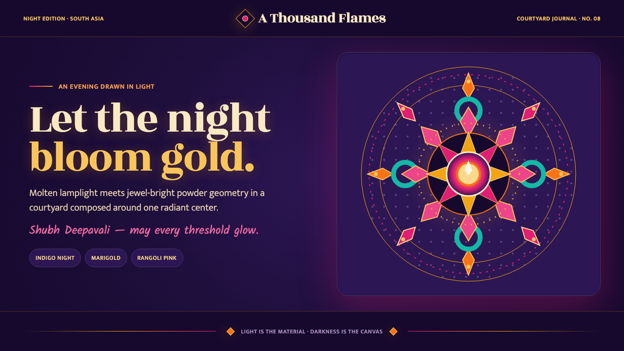 Diwali Festival of LightsNight blooms from within. Molten gold and jewel-bright rangoli radiate across…
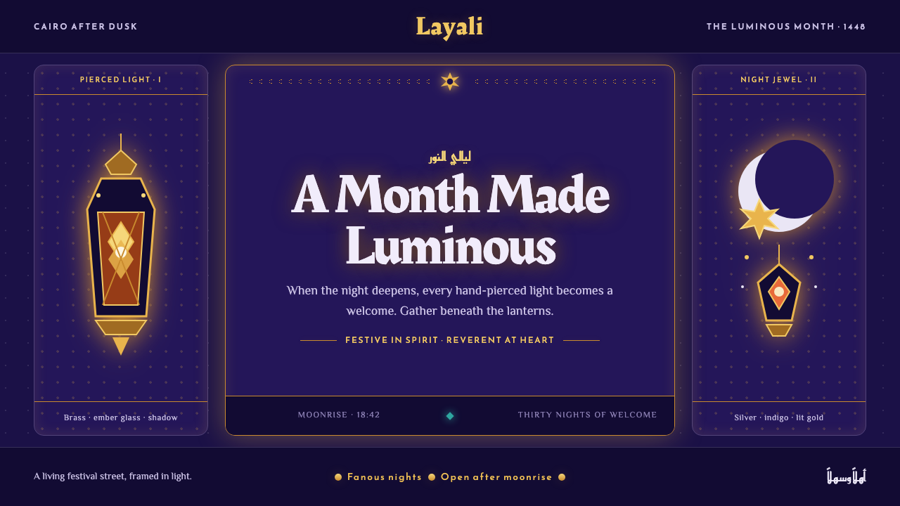 Ramadan Lanterns (Fanous Nights)Night becomes sacred light. Pierced brass and amber glow burn across bottomle…
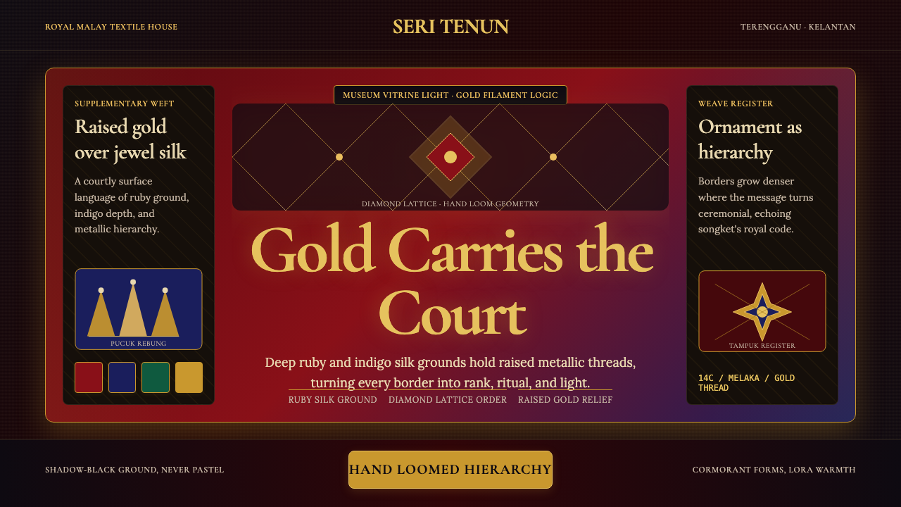 Malaysian Songket (Gold-Thread Weave)Royal textile opulence. Ruby and indigo silk grids lift gold-thread relief.
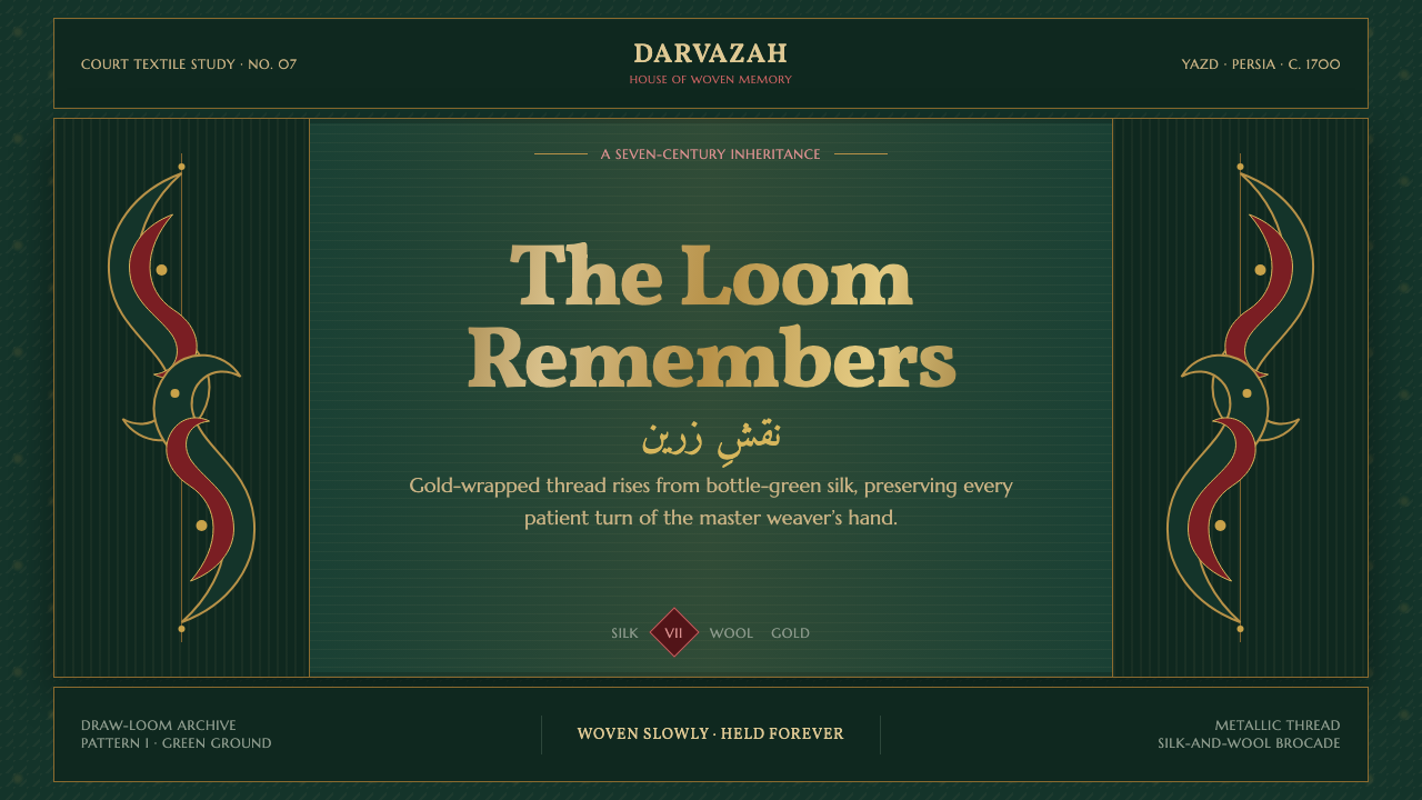 Persian Termeh BotehRoyal brocade, densely alive. Antique-gold boteh climbs across lustrous bottl…
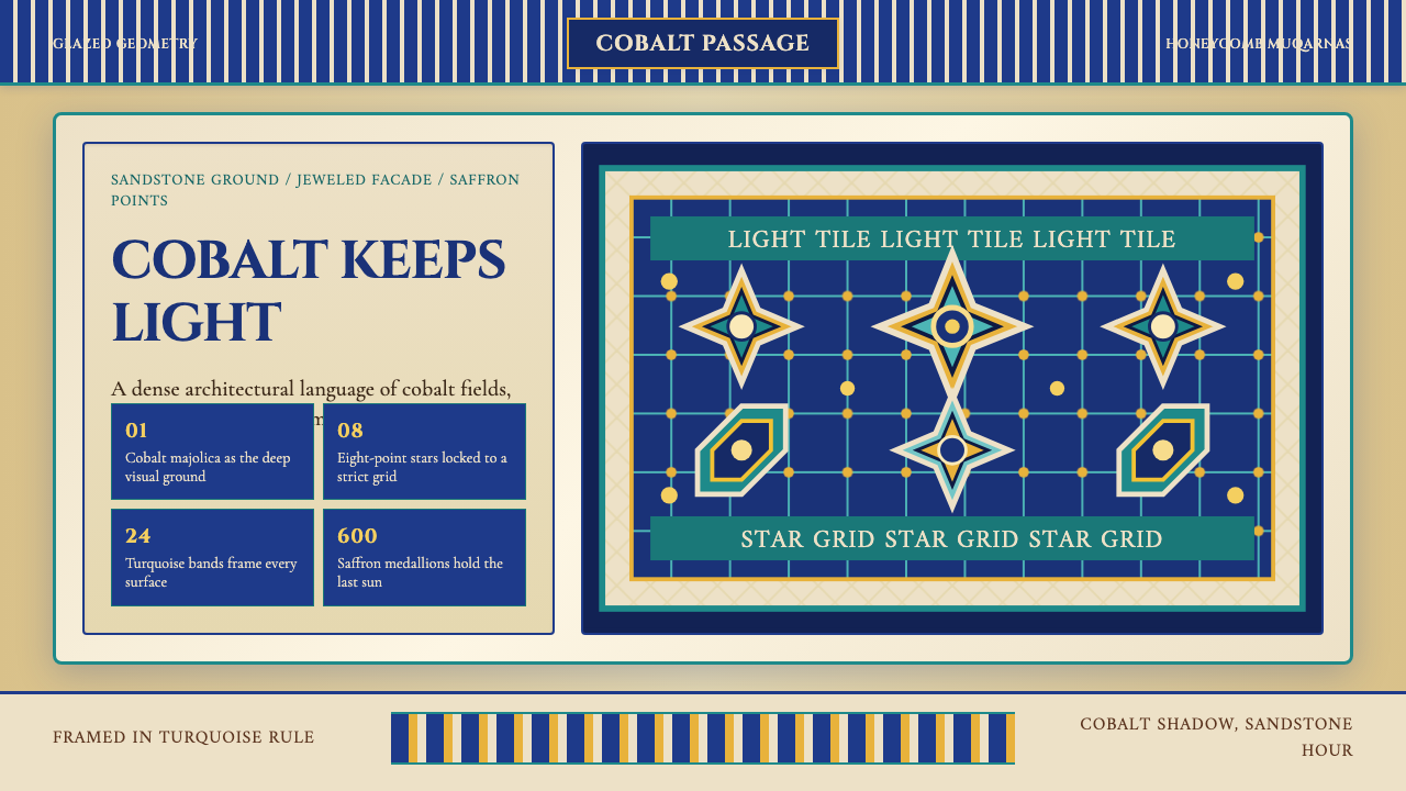 Uzbek Samarkand Shah-i-ZindaOpulent tile memory. Cobalt grids, turquoise bands, and saffron medallions cr…
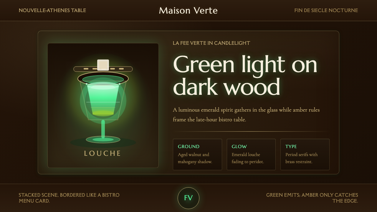 Absinthe Green Fairy GlowDarkness makes the fairy glow. Emerald louche on mahogany, framed by amber se…