What is Aneroid Barometer?
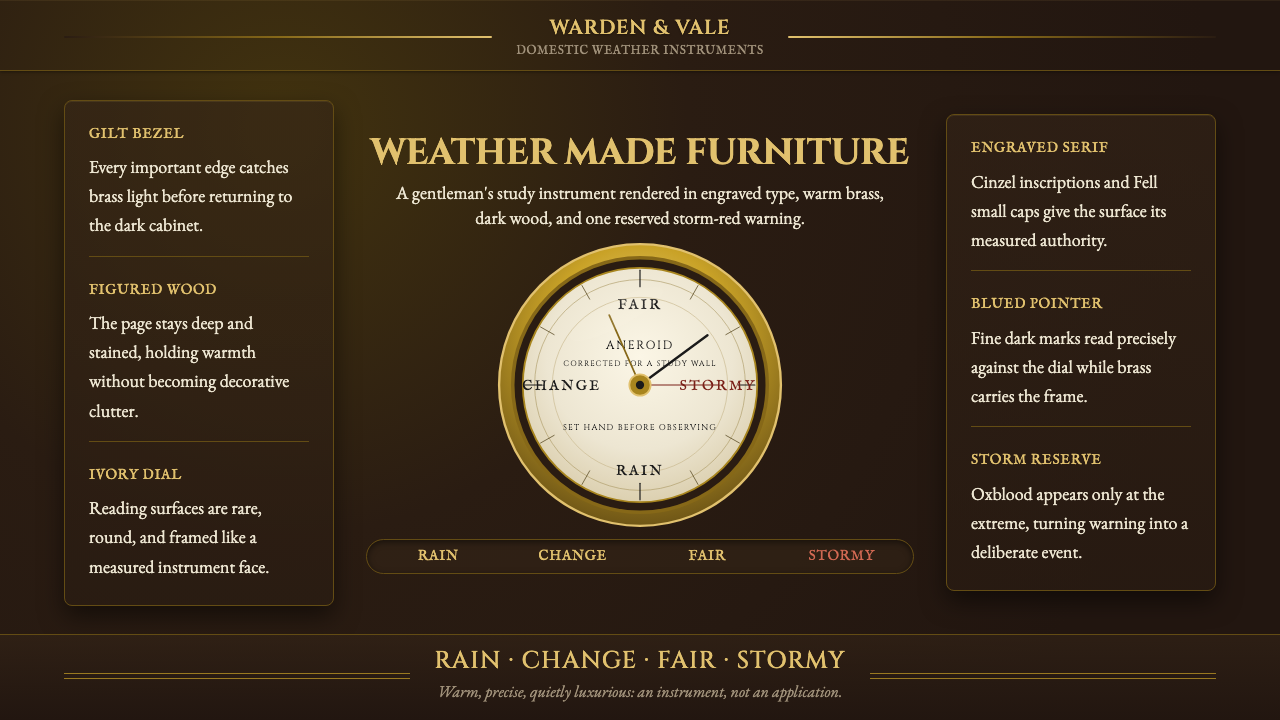
The aneroid barometer is a Victorian scientific instrument that became a piece of furniture — a gilt-brass bezel, a silvered dial reading RAIN · CHANGE · FAIR · STORMY, and a dark-stained wood case hung in the gentleman's study. The Aneroid Barometer design style takes that object apart and rebuilds it as a visual language: deep figured wood for grounds, burnished gold for every important edge, aged ivory for informational surfaces, engraved serif letterforms, and one restrained red reserved for the dramatic end of the scale. Warm, precise, and quietly luxurious — an instrument, not an application.
Aneroid Barometer in brief
The Aneroid Barometer style is rooted in the domestic scientific instruments of Victorian England and France — specifically the wall-hung barometers that occupied the hallways and studies of middle- and upper-class homes from the 1860s through the 1890s. Where most design systems abstract from architecture or fashion, this one abstracts from a single manufactured object: a brass-and-oak measuring device whose visual conventions — radial scales, indexed pointers, engraved typography, rich material contrasts — were extraordinarily refined by decades of craft production.
The palette is defined by material rather than aesthetic preference. Deep figured wood (oak, mahogany, walnut) provides the ground. Burnished gilt brass frames every important boundary — bezels, chapter rings, the outer edge of scale arcs. An aged, slightly warm ivory serves informational surfaces: dials, label fields, data backgrounds. Against these warm grounds, the typography is engraved — fine, incised, unhurried — in a classical serif with deliberate small-caps for scale labels. A single accent color, a restrained warm red, marks the danger end of the weather scale and nothing else.
Visually, the style carries genuine weight and seriousness. It is not rustic, not steampunk, and not merely ornate — it is the aesthetic of precision under constraint. Every element justifies its presence by function: the brass ring holds the glass, the ivory face makes the needle legible at a glance, the red warns of storms. This functional-decorative integration, where every visual choice is simultaneously utilitarian and beautiful, is what separates the style from period pastiche.
Where does Aneroid Barometer come from?
The aneroid barometer takes its name from the Greek for 'without fluid' — a distinction from the older mercury barometer, in which a column of liquid metal registered atmospheric pressure changes. The aneroid mechanism, patented by the French engineer Lucien Vidi in 1844, replaced mercury with a sealed, flexible metallic capsule (the aneroid cell) that expanded or contracted with changing pressure. A series of levers amplified this tiny movement and transmitted it to a rotating pointer. The result was safer, more portable, and far more amenable to decorative treatment than any mercury instrument could be.
The timing of Vidi's invention coincided with a surge in middle-class prosperity across Britain and France. By the 1860s, the parlor and the gentleman's study had become sites of conspicuous cultivation — filled with telescopes, microscopes, clocks, and barometers that declared the owner's engagement with scientific progress. The London instrument-making trade, concentrated in the workshops of firms like Negretti & Zambra, responded by producing barometer cases of increasing elegance: carved oak, inlaid mahogany, ebonized wood with brass fittings. The dial evolved in parallel — printed on fine paper or silvered metal, its typography moving from plain lettering to engraved, gilded, or embossed scripts that treated the instrument as a work of printed art.
The Victorian domestic barometer existed in cultural tension. It was a measuring device, and its credibility depended on legibility and precision. But it was also an object of display, and its desirability depended on beauty and material richness. The craft solution was to make the precision itself beautiful: the engraved scale arc, the chamfered brass bezel, the blued-steel pointer (oxidized to a deep, lustrous near-black to contrast against the pale dial) — each element performed both a functional and an ornamental role simultaneously. This dual performance is the defining logic of the style.
By the Edwardian period, the combination of cheaper manufacturing and changing taste began to dilute the barometer's design quality. Mass production introduced lithographed paper dials, plated rather than cast brass fittings, and cheaper case woods. The golden period of the Victorian aneroid barometer — roughly 1860 to 1900 — represents the high-water mark of the aesthetic. The Aneroid Barometer design style draws specifically from this peak era, before the economies of scale eroded the craft traditions that gave the objects their visual authority.
What defines the Aneroid Barometer look?
Ground and Material
The foundational layer is always a rich, dark wood tone — the color of well-seasoned oak or aged mahogany, with the visual suggestion of grain rather than a flat field. This is not a decorative texture applied for atmosphere; it is the structural ground from which all other elements read. Against it, every surface that carries information — dials, label fields, data panels — shifts to aged ivory or warm off-white, creating a controlled luminosity that draws the eye to content without using light as decoration.
Brass and Gold Edging
Burnished gilt brass marks every boundary where functional information meets structural frame. Bezels, chapter rings, dividers, and borders are rendered in a warm, slightly aged gold — not the bright chrome-yellow of new metal, but the settled, reflective warmth of metal that has been handled. This edging serves a precise perceptual function: it sharpens the boundary between information zones, adds tactile authority to the composition, and provides a consistent warm highlight thread running through the layout.
Typography
The typefaces are classical serifs used with the sensibility of engraving rather than typesetting. Labels are set in small capitals — a form historically associated with instrument scales and cartography, where consistent cap-height letterspacing improves legibility at small sizes and suggests professional precision. Decorative variation in weight is avoided: where emphasis is needed, it comes from size or case change, not from boldface or italic. The overall texture of a text block should evoke a dial face or a chart legend — dense with information yet visually calm.
The Single Red
In a palette otherwise entirely composed of warm neutrals — wood browns, brass golds, ivory, dark iron — a single restrained warm red appears at precisely one location: the danger or critical end of a scale, alert state, or maximum threshold indicator. This is not decorative color; it is signal color, used exactly as it was used on the original instrument. Its scarcity gives it absolute authority. If red appears in more than one semantic context within a layout, the system loses its logic entirely.
Radial and Arc Geometry
The dominant geometric motif is the arc and the radial scale — the circular logic of a dial face. Progress, quantity, and comparative data are most naturally expressed in arc segments rather than rectangular bars. Circular or semicircular framing devices organize secondary information around a central datum. This radial grammar is not nostalgia; it is a genuinely effective way to communicate continuous measurement and deviation from a norm, and it distinguishes the style immediately from rectilinear data-presentation conventions.
Depth through Material, Not Shadow
The style does not rely on drop shadows or diffuse glows to create visual hierarchy. Depth is communicated through material contrast — the recession of dark wood behind the projection of a brass ring, the forward-reading quality of pale ivory against a deep ground. When shadows appear at all, they are the hard, descriptive shadows of a physical object photographed from the side: a specific, geometric shade shape, not an atmospheric diffusion. This keeps the palette clean and prevents the design from looking digitally lit or screen-native.
Quiet Luxury in Restraint
The overall sensibility is what might now be called quiet luxury — richness expressed through quality of materials and refinement of detail rather than through spectacle or excess. Nothing shouts. The brass does not gleam aggressively; it glows. The ivory does not dazzle; it settles. The red does not alarm; it signals. This pervasive restraint means that every departure from the neutral ground — a brass rule, a scaled arc, a red warning indicator — carries the weight of a decision, and reads as considered rather than arbitrary.
Who shaped Aneroid Barometer?
The French engineer Lucien Vidi patented the aneroid cell mechanism in 1844, making the wall-hung domestic barometer possible. His invention replaced the fragile mercury column with a sealed metallic capsule sensitive enough to detect the small pressure changes that indicate weather shifts. Vidi spent much of his career defending his patent against infringers — the instrument's commercial success was rapid, and the design quickly spread from Paris to London, spawning the elaborate craft tradition that defines the style's visual vocabulary.
The London firm of Negretti & Zambra, founded in 1850 by the Italian immigrants Enrico Negretti and Joseph Warren Zambra, became the most prominent supplier of scientific instruments to the Victorian public. Their aneroid barometers — sold from their shops on Hatton Garden and at the Crystal Palace — set the design standard for the domestic instrument: carved oak cases, richly engraved dials, and gilt-brass bezels that made precision appear as ornament. They held a Royal Warrant and supplied instruments to maritime explorers, Alpine mountaineers, and the suburban gentleman alike.
Not a person but an institution: the furnished study of a prosperous Victorian household was the primary context in which aneroid barometers were designed, sold, and used. The room combined library, office, and cabinet of curiosities — bookshelves, a writing desk, a globe, framed maps, and instruments on the wall. The barometer's visual language was shaped by its neighbors in this room: it had to be worthy of the mahogany bookcase beside it and readable from the leather armchair opposite. This curatorial context explains why the instrument's makers invested so heavily in case quality and dial craftsmanship.
The blued-steel pointer is a small but emblematic element of the Victorian aneroid barometer. Steel is heated to a precise temperature to produce a controlled oxidation that turns the surface a deep, lustrous blue-black — a color that sits at the visual opposite of the pale ivory dial. This is functional aesthetics at its clearest: the pointer must be visible against the dial, so its color is engineered to maximize contrast, and the oxidation process that produces the color also hardens the surface and prevents corrosion. The visual result — a slim, dark lancet form crossing a pale luminous ground — is one of the most distinctive signatures of the style.
How do you use Aneroid Barometer today?
The Aneroid Barometer style is highly legible and warm, which makes it effective for contexts where a product needs to convey authority, precision, and trustworthiness without the coldness of clinical modernism. The style suits dashboards for financial tracking, scientific data visualization, weather or environmental monitoring applications, and any interface where the user is expected to read quantitative information and make a decision based on it. It also suits premium product landing pages, case study presentations, and editorial contexts where craft and heritage are genuine selling points.
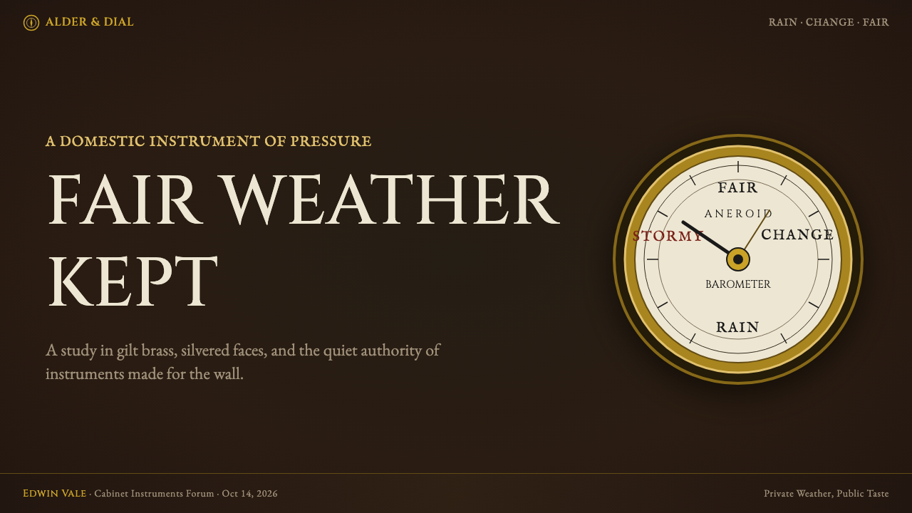
For presentation slides, the style works most powerfully when data visualization takes on the radial and arc geometry of an instrument dial. A cover slide benefits from a dark figured-wood ground with a central circular or oval information window — brass-framed — containing the title in engraved serif lettering. Content slides should treat the ivory panel as the primary information zone, with narrow brass-ruled borders and small-caps labels for categories and scale markers. Data slides displaying percentages, completion rates, or ranges are natural candidates for arc-chart treatment, which is more native to this style than any bar or column chart.
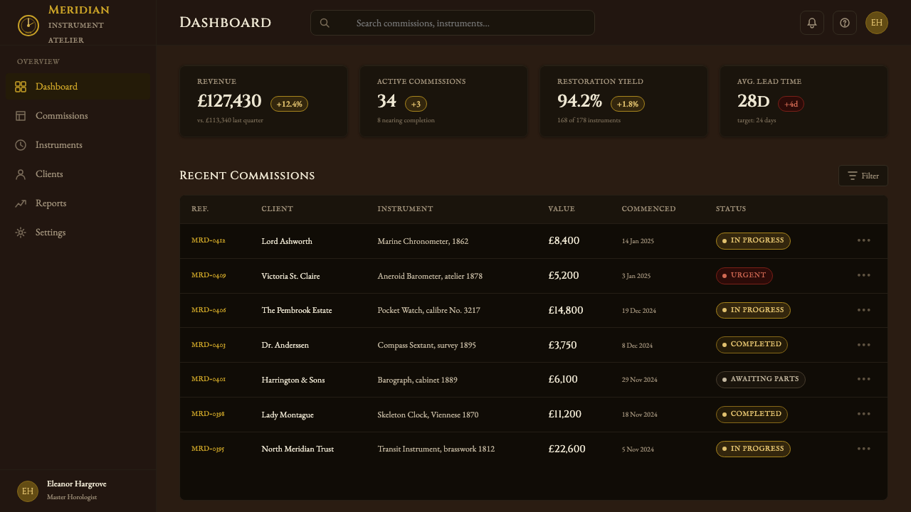
For web interfaces, the style produces rich, high-contrast layouts well suited to dashboards, premium SaaS pricing pages, and portfolio sites where the product has a physical or craft dimension. The approach: set a deep dark wood-tone background for the chrome (navigation, sidebars, footers), switch to an aged ivory or warm off-white for content panels, use gilt-brass-colored rules and bezels as section dividers, and reserve the warm red strictly for alert states, warnings, or threshold exceeded indicators. Typography should use a classical serif at moderate size with deliberate small-caps for all metadata and secondary labels.
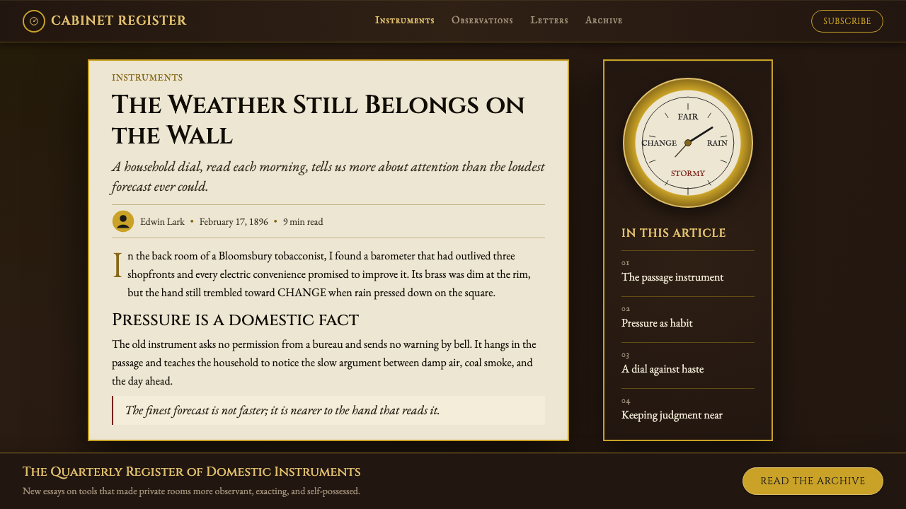
For editorial and marketing contexts, the style supports long-form content with great composure. An article or report page using this visual system should treat running text as a dial face — unhurried, even, precisely spaced — with pull quotes or section headings treated as scale labels: centered, in small capitals, framed by thin brass-colored rules above and below. Marketing pages can use the dark wood ground for hero sections and feature callouts, creating a sense of enclosure and focus that feels like entering a well-appointed room rather than landing on a website.
The most common mistake when applying this style is using too many accent elements — multiple gold borders, several arc-chart components, abundant serif variety, and generous use of the red — simultaneously. The style's authority comes from restraint and specificity: one arc, one red, one framing brass rule per composition zone. Piling on decorative elements turns a careful instrument aesthetic into a cluttered antique-store visual. The discipline is to ask, for each embellishment: could the original barometer maker have justified this element on a real instrument? If not, remove it.
Aneroid Barometer — FAQ
Is this style the same as steampunk?
No, and the distinction matters. Steampunk is a fantasy aesthetic that imagines an alternate technological history — it combines Victorian imagery with anachronistic machinery, excessive ornamentation, and an explicit sense of counterfactual play. The Aneroid Barometer style draws from a specific, historically real object category and aims for the visual qualities of that object at its most refined: precision, restraint, material honesty, and functional beauty. Where steampunk piles on gears, rivets, and exposed pipes, the barometer aesthetic edits them all out, retaining only what a real instrument-maker would have considered necessary and elegant. The tone is a gentleman's study, not an inventor's workshop.
Can this style work for digital-native products, or does it always feel historical?
It can work for contemporary digital products when the historical references are treated as structural logic rather than costume. The key is to apply the underlying principles — material contrast to create depth, radial geometry for measurement, small-caps labeling for data, a single-accent danger color — without reaching for overt period signifiers like flourished borders, antique map textures, or serif typefaces with extreme optical oldstyle features. A monitoring dashboard, a weather app, a financial instrument tracker, or a precision measurement tool built with this style's underlying grammar will feel authoritative and distinctive rather than dated, provided the interface interaction patterns follow contemporary expectations.
How should photography or imagery be handled in this style?
Photography, when used at all, should be treated as an instrument element rather than an atmospheric backdrop. The most natural approach is close-up, high-contrast photography of objects with physical texture — aged metal, polished wood, mechanical detail — cropped tightly and set against the dark wood ground or within a brass-framed oval or circle, echoing the format of a dial face. Full-bleed lifestyle photography is antithetical to the style's focused, instrumental quality. If illustration is used instead of photography, it should follow the sensibility of scientific illustration: precise, descriptive, limited to what is necessary to identify and explain the subject, with no interpretive flourish.
What is the difference between this style and other warm, dark design systems?
Many contemporary design systems use dark backgrounds with warm accent colors — burnt orange, amber, copper tones — for a premium, tactile feel. The Aneroid Barometer style is distinguished from these by three specific features: the ivory dial face (a warm-light information zone within a dark-ground composition, not a full-dark layout), the use of radial arc geometry as a primary organizational form, and the single-purpose red as the sole saturated accent. Without all three of these elements working together, you have a warm dark design — a handsome thing, but not this thing. The barometer's visual logic is precise and specific to its original function, and that specificity is the source of its authority.
Does the style work in a light-background version?
The authentic form of the style is dark-ground — the deep wood background is structural, not decorative, because the contrast between the dark frame and the pale information surface is what gives the style its legibility logic. A light-background version is possible but requires significant reinterpretation: the dark wood tone would move to borders and accent elements rather than the primary ground, the ivory would become the primary ground, and the gilt brass would need to be darkened toward a warm antique-bronze to remain visible. The result is closer to aged parchment or Edwardian cream than to the original instrument. It loses some of the style's dramatic material contrast but retains its typographic and geometric character.
Related design styles
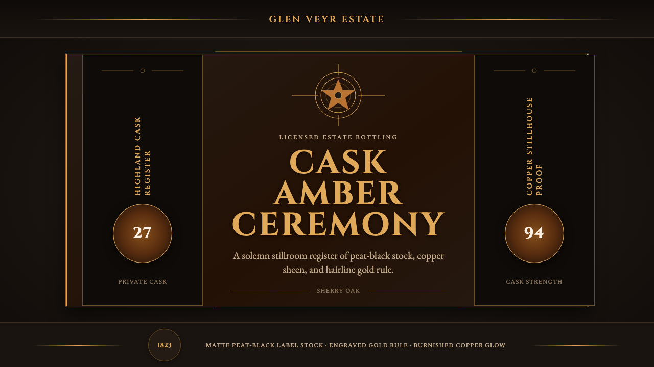 Single Malt ScotchSolemn amber gravity. Thin gold rules and Cinzel capitals glow on peat-black.
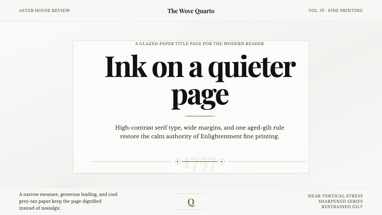 Baskerville Transitional SerifCalm authority in print. Glazed grey-tan paper, sharp serif contrast, one age…
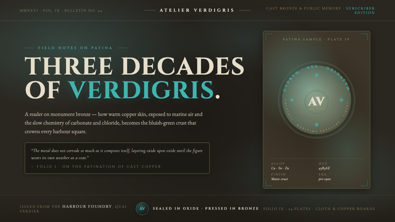 Bronze Patina StatueThree decades of weather, worn as a coat. Verdigris crust on dark bronze, eng…
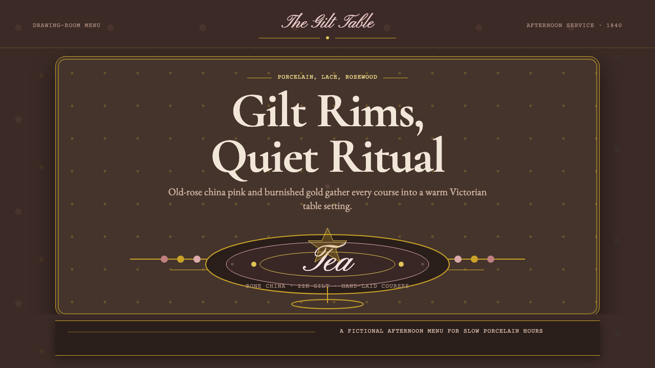 English Afternoon TeaOrnament is the ritual. Old-rose porcelain, gilt rims, and script rest on ros…
 English Saddlery TanQuiet hand-made luxury. Saddle tan leather, brass accents, and waxed-linen st…
 Fatimid LustrewareOpulence fired into earth. Copper-gold lustre glows through dense medallions…