What is Single Malt Scotch?
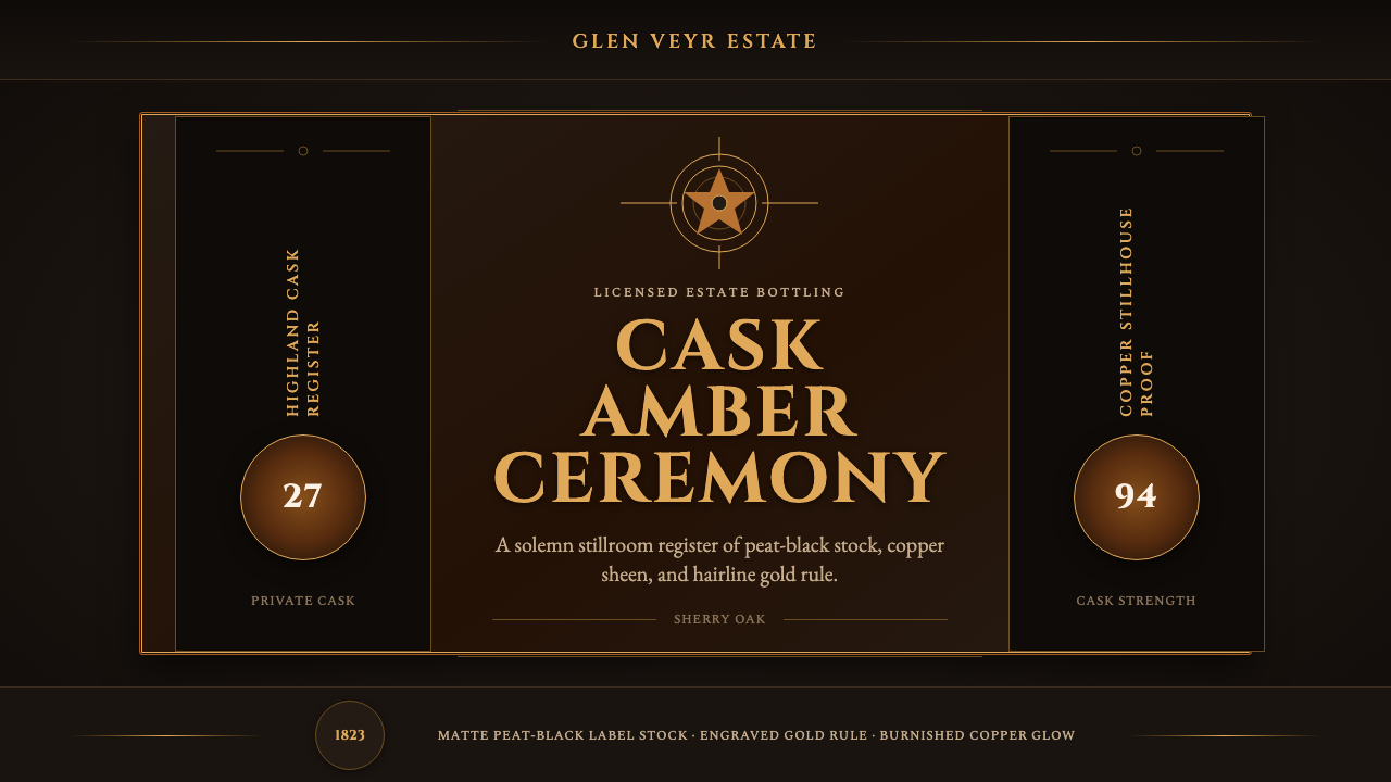
A Victorian distillery label speaks in a single register — solemn amber gravity, thin gold rules, and engraved capitals that never once raise their voice.
Single Malt Scotch in brief
Single Malt Scotch is a design language drawn from the house style of Victorian-era Scottish distilleries — the labels, crests, and packaging conventions that emerged as licensed pot-still whisky production professionalized across the Highlands and Speyside through the nineteenth century. The visual world is built around a dark, smoky stillroom: near-black peat as the dominant ground, warm copper and old-gold amber as the glowing figure, and an overall register of restraint rather than festivity. This is not a celebratory party aesthetic — it is the visual equivalent of a long, quiet toast.
Every surface in the system reads as matte black label stock bordered by thin gold hairline rules and finished with a hint of copper sheen, evoking the physical pot-still copper the spirit itself passes through during distillation. Crucially, the palette is drawn from the spirit rather than applied decoratively: cask-aged amber, sherried mahogany, and true pot-still copper are treated as the literal colors of the product, never as a generic decorative orange standing in for 'whisky' in the abstract.
Typography carries the ceremony. Small-capital, letter-spaced, engraved serif lettering — the kind produced by a copperplate engraver cutting a printing plate rather than a modern digital typesetter — gives every label a formal, symmetrical, crested composition. The overall tone is solemn rather than festive: this is packaging built for a product meant to be aged, discussed, and taken seriously, not one built for impulse or novelty.

Where does Single Malt Scotch come from?
Scotch whisky distilling has roots stretching back centuries, with written references to distillation in Scotland dating to the late fifteenth century, but the modern licensed distillery house style the visual system draws on emerged specifically in the Victorian era, roughly the 1820s through the 1890s. The Excise Act of 1823 dramatically reduced licensing costs and penalties for legal distillation, ending an era in which most Highland whisky production was illicit and untaxed, hidden from excise officers in remote glens. Legal, licensed distilleries proliferated in the decades that followed, and with legality came the need for formal branding: a label, a crest, a name that could be advertised, exported, and defended against imitation.
The Highland and Speyside regions became the geographic and stylistic center of this newly formal industry, their estate distilleries adopting the visual conventions of Victorian commercial engraving and heraldry — symmetrical crests, hairline rules, engraved serif lettering — conventions shared with other prestige goods of the era, from banknotes to formal stationery, but applied here to a product whose value proposition was age, provenance, and craft rather than novelty.
The pot-still process itself — copper vessels used to distill fermented malt wash in batches, as opposed to the continuous column stills used for lighter grain whisky — remained a point of pride and a marketing differentiator throughout this period, and it directly supplies the style's material palette: the warm copper of the still itself, the near-black peat used to dry malted barley in some Highland traditions, and the amber-to-mahogany color range the spirit takes on during years of cask aging in oak, often previously used for sherry, which imparts a deeper reddish-brown tone.
This visual language proved durable precisely because it encoded genuine production values — age, copper pot-still craft, oak-cask maturation — into an aesthetic vocabulary rather than treating branding as separate from process. Distillery houses that have operated continuously since the nineteenth century, and newer distilleries seeking to signal traditional credibility, both draw on this same Victorian-era visual grammar today.
What defines the Single Malt Scotch look?
Color
Near-black peat serves as the dominant ground, with warm copper, old-gold amber, and sherried mahogany carrying all the warmth in the system. Every warm tone must read as though it were drawn from the spirit itself — cask-aged amber rather than generic orange — and copper appears as a metallic sheen rather than a flat hue, evoking the polished still.
Hairline Gold Rules
Extremely thin gold border lines define every edge and frame, echoing the fine engraved lines of Victorian commercial printing. These rules should remain hairline-thin — thickening them into bold borders immediately shifts the mood from restrained ceremony toward something louder and less credible as heritage craft.
Engraved Serif Typography
Small-caps, letter-spaced serif type — reading as though cut into a copperplate engraving rather than digitally set — carries labels, headings, and crests. The tracking (letter spacing) should be generous enough to read as formal and deliberate, and capitals should dominate over lowercase to preserve the engraved, monumental quality.
Symmetrical Crested Composition
Layouts are formally symmetrical, centered around a crest, seal, or emblem the way a Victorian estate label was centered around its house mark. This symmetry signals heritage and institutional permanence — it is the opposite of the asymmetric dynamism found in more modern commercial branding.
Material Sheen over Flat Color
Copper and gold elements carry a metallic sheen — a highlight and gradient suggesting polished metal — rather than being rendered as flat fills. This distinguishes the style's amber and copper from a generic warm color scheme: the sheen is what signals 'metal and spirit,' not merely 'warm palette.'
Restrained Register
The overall tone is solemn, not celebratory — closer to a formal document or a family crest than to festive packaging. Bright, saturated colors, playful iconography, or casual typography all work against the style, which depends on communicating age, seriousness, and quiet confidence rather than excitement.

Who shaped Single Malt Scotch?
Rather than a single named designer, the style emerged from the collective practice of licensed Scottish distillery estates in the decades following the 1823 Excise Act, who commissioned formal engraved labels and crests as legal, brandable identities for a newly legitimized industry. Their shared visual conventions — symmetrical crests, engraved serif type, hairline gold rules — form the style's foundation.
Commercial engravers who cut printing plates for Victorian-era labels, banknotes, and formal stationery supplied the small-caps, letter-spaced serif lettering that defines the style's typography. Their trade — cutting fine lines into metal plates for printing — is the direct technical origin of the hairline gold rules and engraved type still associated with premium spirits packaging today.
The batch-process copper pot still, as opposed to continuous column distillation, remained a point of craft pride throughout the Victorian era and supplies the style's defining copper-sheen material palette. Distilleries that emphasized their pot-still process in marketing directly shaped the visual association between copper metal and whisky heritage.
How do you use Single Malt Scotch today?
Single Malt Scotch transfers well to any digital product wanting to signal heritage, craft, and quiet confidence rather than novelty or excitement — spirits and beverage brands, luxury goods, private members' clubs, or financial and legal services wanting to borrow the same institutional gravitas. Applying it correctly means keeping the palette narrow and material rather than treating amber and gold as a generic 'warm luxury' scheme.
For presentation slides, a cover works well built on a near-black peat-toned field with a centered crest or emblem rendered in hairline gold, and a small-caps engraved title beneath it — the same symmetrical composition a Victorian label used to announce a distillery's name. Content slides should stay restrained: a single organizing gold rule, engraved small-caps headings, and generous dark negative space rather than dense information. Data should be treated sparingly and formally — a single gold-highlighted figure within an otherwise dark, quiet slide communicates gravity better than a busy chart.
For web interfaces, the style suits landing pages for premium goods, membership or subscription tiers, and about pages built around provenance and craft narrative, more than data-dense dashboards where the dark ground and thin gold rules would reduce legibility at scale. A hero section might use a near-black ground, a centered crest-like logotype, and a single restrained call-to-action rendered in the small-caps engraved type, with copper sheen reserved for hover or active states.
For editorial and marketing work, the style rewards formal, unhurried copy: a distillery's history, a tasting note written with technical precision, or a heritage brand's founding story. Pull quotes and captions should stay in the small-caps engraved register rather than switching to a casual sans-serif, and photography should favor still, formally composed shots — a bottle, a cask, a crest — over lifestyle or candid imagery.
A common mistake is treating amber and gold as a generic warm palette and brightening or saturating them until they read as festive rather than solemn — a mistake that immediately undermines the style's Victorian restraint. A second common mistake is thickening the hairline gold rules into bold decorative borders, which shifts the composition from engraved formality toward something that reads as costume rather than genuine heritage.

Single Malt Scotch — FAQ
Why must the amber and gold in this style look 'material' rather than decorative?
Because the entire style's credibility depends on the palette reading as drawn from the actual product — the spirit's cask-aged color, the still's copper sheen — rather than applied as an abstract warm color scheme. A flat, decorative amber reads as a generic 'whisky-themed' graphic; a material, sheen-carrying amber reads as the genuine color of an aged spirit, which is the whole point of the style.
Is this style the same as generic 'whisky branding' or bar signage?
Not quite. Generic whisky branding often leans festive, rustic, or masculine-casual, with heavier borders and bolder type meant to stand out on a crowded bar shelf. Single Malt Scotch is specifically the Victorian estate-label register — formal, symmetrical, engraved, and restrained — closer to a family crest or a formal document than to shelf-facing retail packaging.
Can this style work on a light background instead of near-black?
It can, but the near-black peat ground is central to how the copper and gold elements achieve their glowing quality — the contrast against darkness is what makes them read as luminous rather than flat. On a light ground, the same colors tend to read as ordinary brown and yellow rather than as glowing spirit and metal, so a light variant should be approached carefully and is generally less faithful to the source.
What kind of type weight and spacing should headings use?
Small capitals with generous letter spacing (tracking), set in a serif typeface with the fine, deliberate stroke quality of an engraved plate rather than a heavy display face. The goal is a formal, monumental feel achieved through spacing and case rather than through weight — heavy bold type undermines the engraved, restrained quality the style depends on.
Does this style suit youthful or playful brands?
Generally not. The style's entire value proposition is age, formality, and quiet institutional confidence, which sits uneasily with a brand voice built around playfulness or youthfulness. It is best reserved for contexts where heritage, craft, and seriousness are genuinely part of the brand story — premium spirits, private clubs, legacy financial institutions — rather than applied purely for its visual richness.
Related design styles
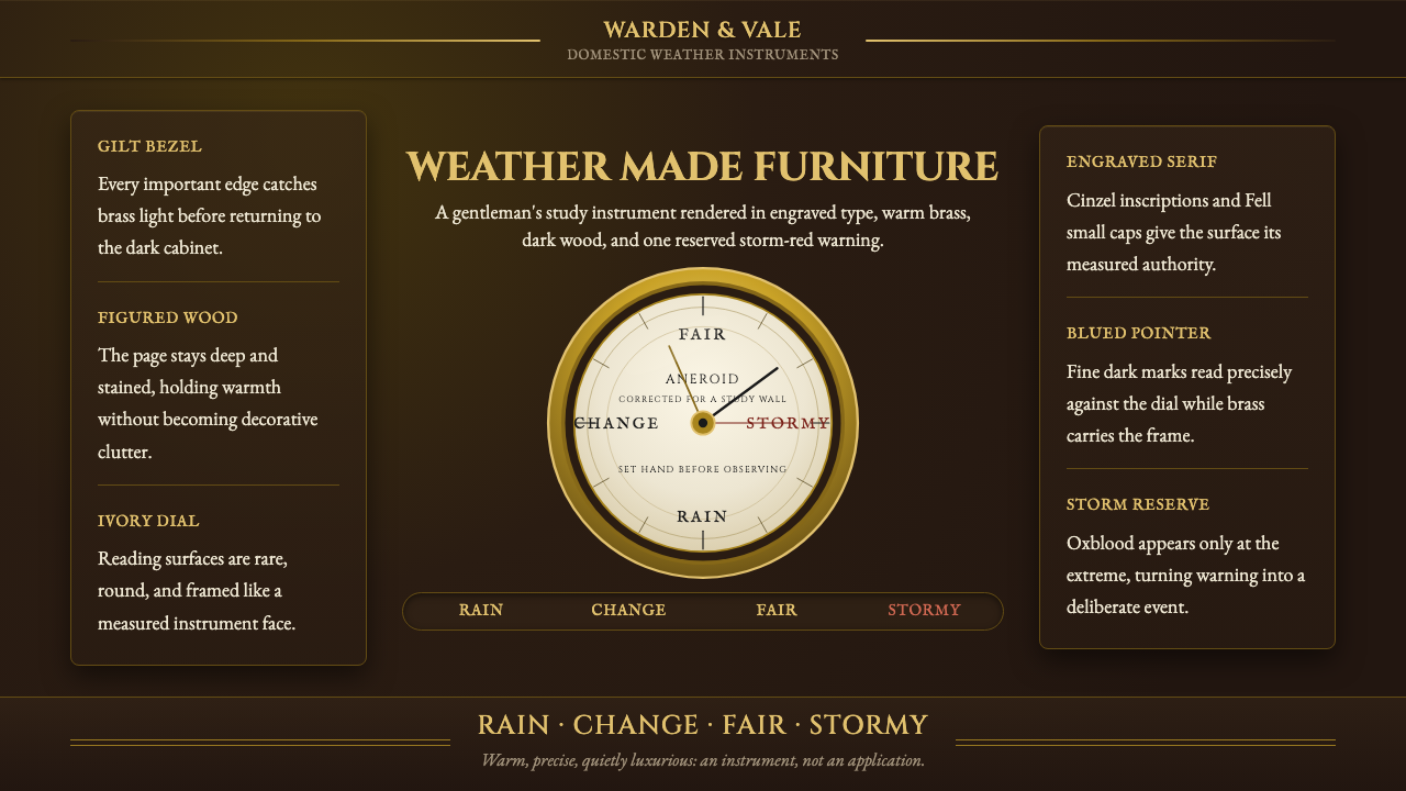 Aneroid BarometerMeasures weather as furniture. Gilt rings and Cinzel engraving glow on dark w…
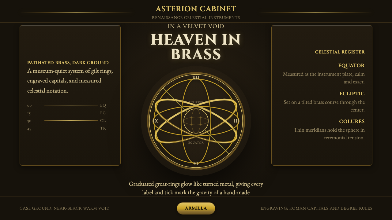 Armillary SphereMuseum darkness makes brass celestial. Cinzel capitals and concentric gold ri…
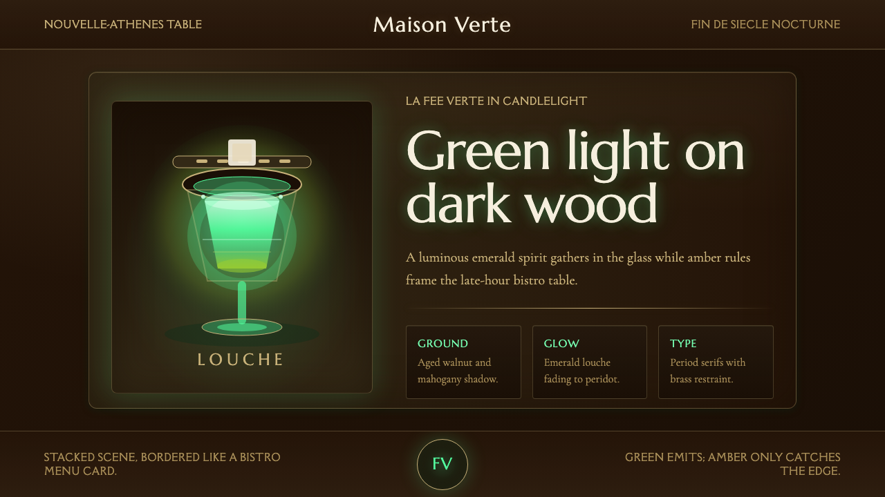 Absinthe Green Fairy GlowDarkness makes the fairy glow. Emerald louche on mahogany, framed by amber se…
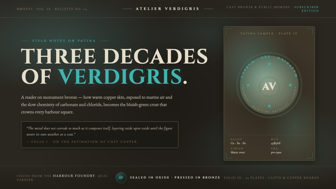 Bronze Patina StatueThree decades of weather, worn as a coat. Verdigris crust on dark bronze, eng…
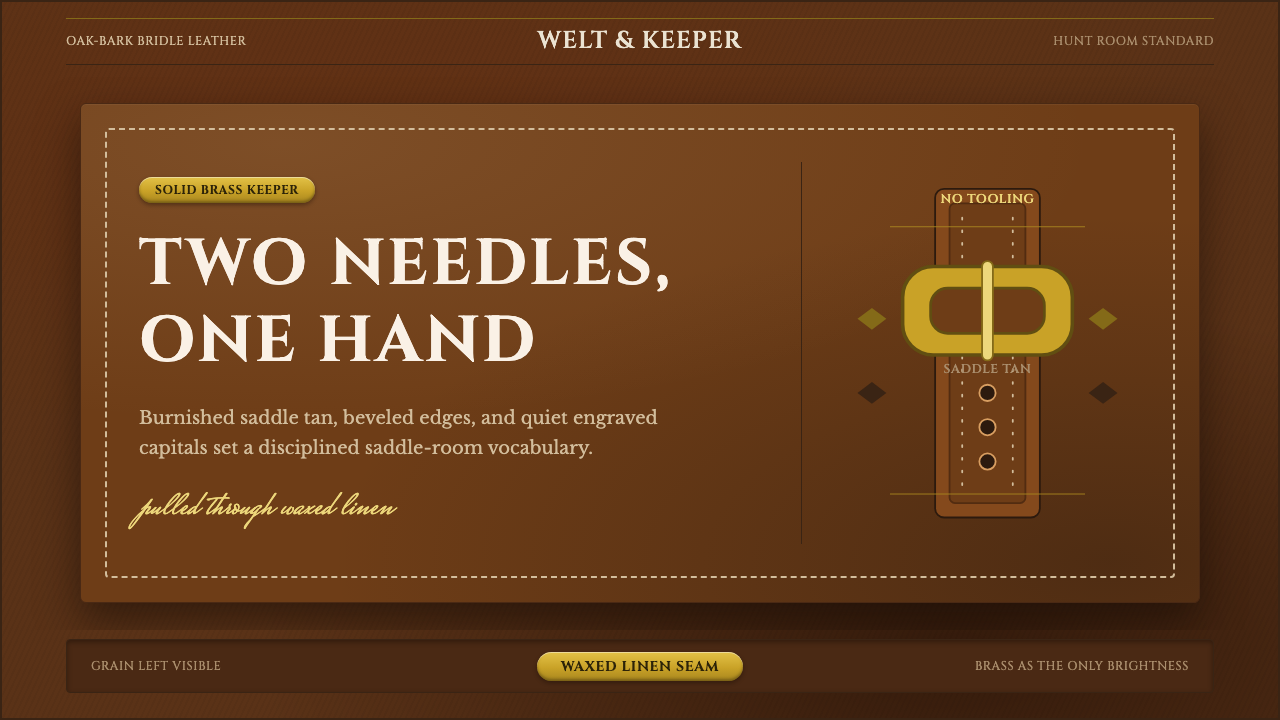 English Saddlery TanQuiet hand-made luxury. Saddle tan leather, brass accents, and waxed-linen st…
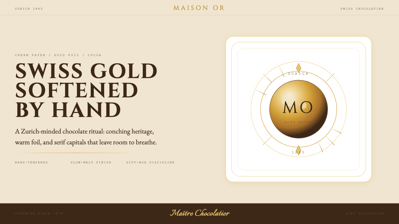 Lindt Swiss ChocolateOld-world luxury, softened. Gold foil, cocoa brown, and cream paper carry the…