What is Bronze Patina Statue?
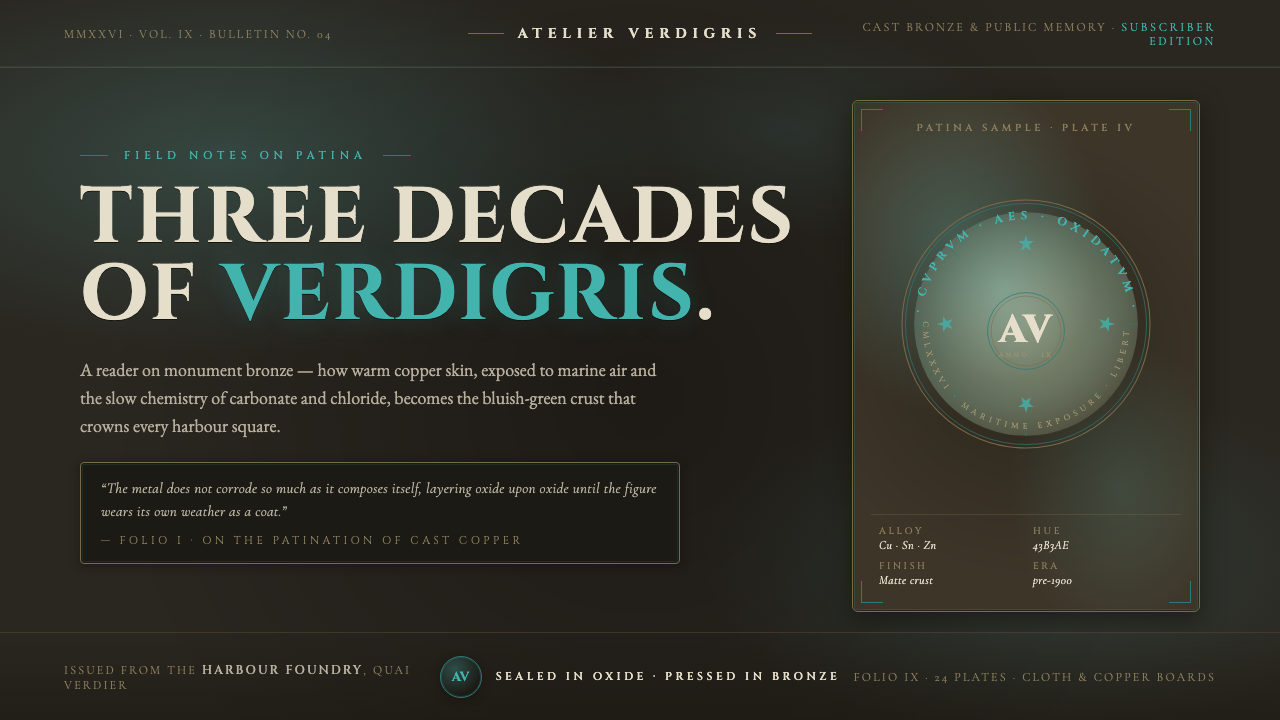
Bronze Patina Statue treats weather not as damage, but as the slow finishing process that turns public metal into memory.
Bronze Patina Statue in brief
Bronze Patina Statue is a material-led visual style drawn from weathered civic monuments: dark, patinated bronze interrupted by a brilliant bluish-green verdigris bloom. Its central image is metal exposed to decades of air, moisture, shelter, and runoff. The surface is never uniform. Open areas gather oxidized green crust, while recessed or protected passages remain warm, dark brown-bronze. The contrast gives the material its sense of age, mass, and lived history.
Verdigris is the visual event that makes the style legible. It is the blue-green crust associated here with copper carbonates and chlorides, spreading across a darker copper-alloy ground without erasing that ground entirely. It should read as accumulated matter rather than applied color: mottled, chalky, irregular, and materially attached to the bronze beneath it. The dark base preserves gravity; the oxidized green brings exposure, change, and a trace of the open air.
Engraved Roman serif inscriptions provide the style’s voice. They emerge from the dim metal as inscriptions on a monument do: formal, durable, and slightly withheld by shadow and texture. The visual language is monumental rather than theatrical. It avoids polish, synthetic shine, and decorative brightness in favor of a restrained warm darkness, one oxidized-green accent, and the tactile authority of engraved lettering.
Where does Bronze Patina Statue come from?
The style belongs to the long tradition of classical and public-monument bronze casting and patination, a tradition established before 1900 in Western Europe. Its subject is not a new object fresh from a workshop, but a civic object transformed by duration. Bronze becomes especially expressive in public settings because its altered surface is visible at architectural scale: viewers can read exposure, shelter, and time directly on the monument’s skin.
Its canonical example is the Statue of Liberty, completed in 1886 and given from Western Europe to North America. The source image behind this style is its transition from brown copper to full verdigris. That transformation establishes the visual logic: warm metal is the original ground, while blue-green oxidation becomes the record of weather. The aged surface does not abandon the monument’s dignity; it intensifies it by making history visible.
The chemical story is inseparable from the aesthetic one. Copper carbonates and chlorides create the verdigris crust that gives exposed copper alloys their blue-green character. In this visual system, chemistry becomes composition. The oxidized crust is concentrated enough to command attention, but it is meaningful only against the darker patinated bronze that remains visible around it and below it.
Roman epigraphic lettering supplies a second historical layer. Engraved capitals and serif forms turn text into part of the monument’s material body rather than a separate graphic overlay. Alongside civic and commemorative bronze sculpture, this lettering tradition explains why the style feels ceremonial and public. Frédéric Auguste Bartholdi, Gustave Eiffel, and Auguste Rodin are the key figures named within this broader monument-centered lineage.
What defines the Bronze Patina Statue look?
Patinated Ground
The dominant field is dark patinated bronze, warm rather than neutral and matte rather than polished. It should feel deep, dense, and slightly uneven, as though the metal has carried weather for a long time. This ground gives every later accent its weight.
Verdigris Bloom
Bluish-green verdigris appears as a localized crust or bloom, not a smooth wash. Its edges are irregular and its distribution is selective, recalling exposed metal rather than a uniformly recolored object. The green should feel mineral, oxidized, and quiet despite its brightness.
Sheltered Warmth
Protected passages retain dark brown-bronze warmth. This is essential because it prevents verdigris from becoming an abstract green effect. Recesses, engraved areas, and visually sheltered zones establish the sense that one material has aged differently according to exposure.
Engraved Roman Serif
Typography should resemble an inscription cut into dim metal: Roman serif capitals, measured spacing, and a firm ceremonial rhythm. The words do not float above the surface. They appear embedded in it, their visibility shaped by the contrast between engraving, shadow, and aged bronze.
Mottled Matte Surface
The surface quality is mottled and matte. Variation is welcome when it resembles oxidation, crust, and worn metal, but not when it reads as random digital noise. Gloss would weaken the weathered premise by making the monument seem newly coated or artificially lit.
Monumental Restraint
The palette is warm and nearly monochrome, with verdigris acting as the single oxidized-green interruption. The result should be grave, public, and durable. Bright competing accents, neon effects, or ornamental abundance break the illusion of a material shaped by weather.

Who shaped Bronze Patina Statue?
Bartholdi is named as a key figure in the civic and commemorative bronze-sculpture context behind this style. The canonical Statue of Liberty makes the movement from warm brown copper to verdigris central to the visual language of aged public metal.
Eiffel is one of the key figures attached to the monument-centered origin of the style. His presence situates Bronze Patina Statue within a Western European civic tradition in which structural ambition and public symbolism meet in enduring built form.
Rodin is listed among the key figures of the broader bronze-sculpture lineage. Within this theme, his name reinforces that bronze is not merely a color reference: it is a sculptural material whose patina, weight, and surface history carry cultural meaning.
How do you use Bronze Patina Statue today?
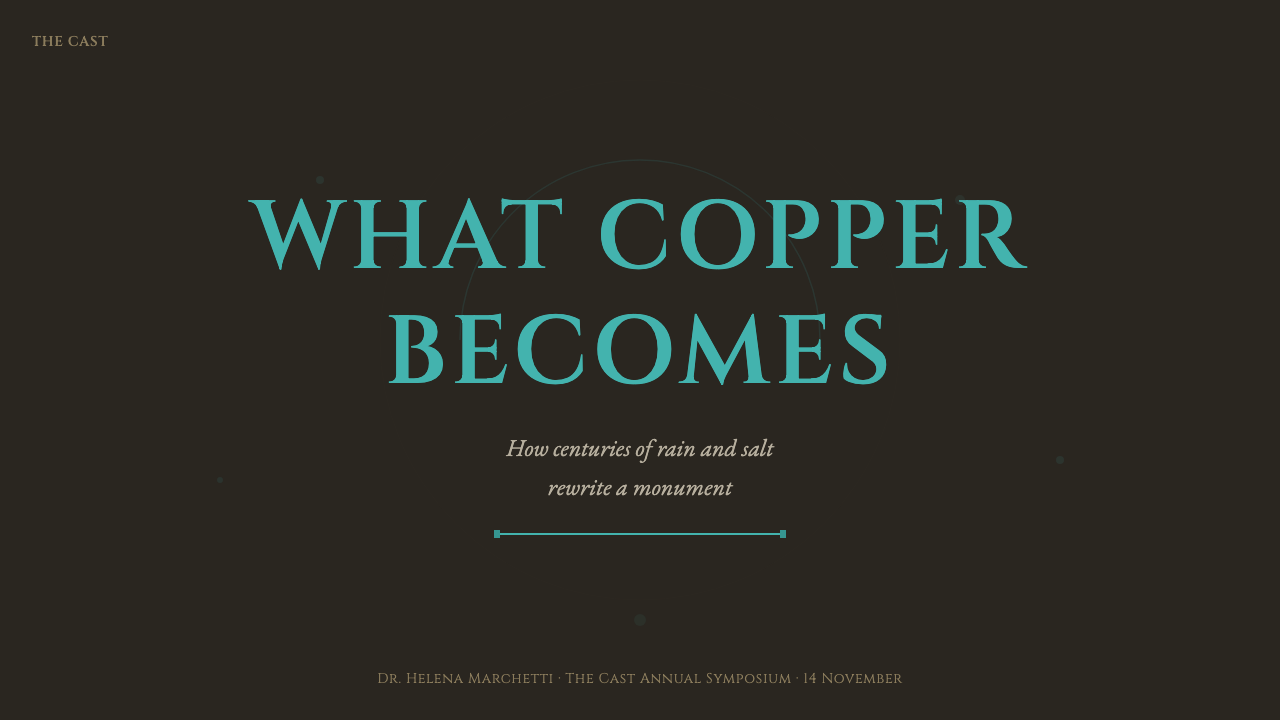
For presentation covers, Bronze Patina Statue works best when a dark bronze field carries a short engraved-style title and a single area of verdigris texture. Keep the composition broad and calm, with the text allowed to feel discovered in the material. On content slides, use the aged ground sparingly behind structured text areas so legibility remains ceremonial rather than gloomy. Data slides should favor engraved labels, quiet warm contrast, and verdigris only for the information that deserves immediate attention.
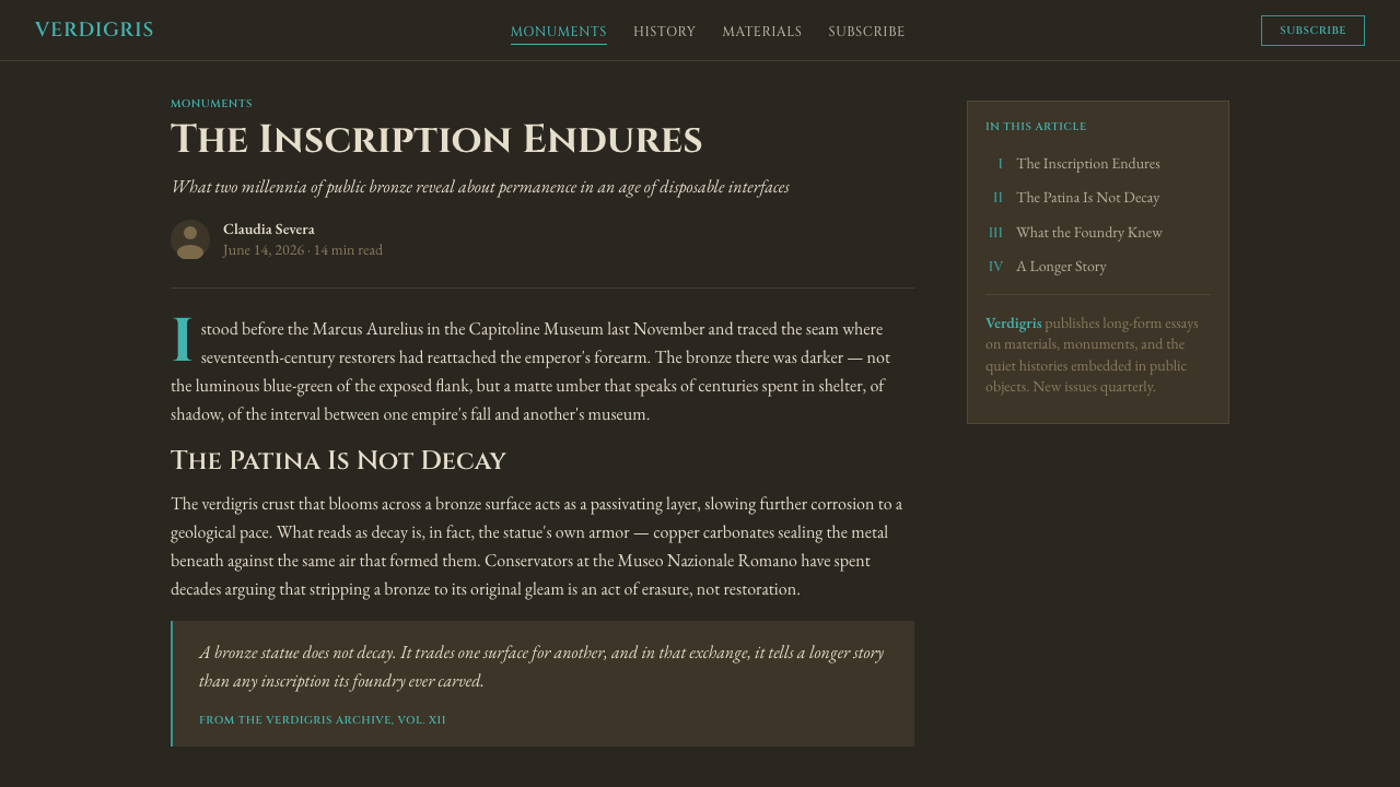
For web interfaces, the style suits dashboards, archives, cultural institutions, civic projects, and premium informational products that need gravity without generic luxury gloss. A dark patinated surface can frame navigation, summary panels, or status areas, while the oxidized green identifies active states, selected records, or consequential changes. Roman serif display text works best for headings and inscriptions; dense operational content still needs a highly readable supporting text treatment.
For pricing pages and structured product pages, use the monument metaphor carefully. Bronze surfaces can make tiers, commitments, or long-lived membership propositions feel stable and considered. The green accent should identify a preferred action or distinguished plan rather than decorate every component. Repeated crust textures, faux metal borders, and bright calls to action will turn a material narrative into a theatrical skin.
For editorial and marketing work, this style is particularly strong for histories, exhibitions, architecture, public memory, restoration, and objects made to endure. Let the page alternate between quiet inscription-like text blocks and close surface details that imply weathering. Marketing language should match the material: measured, durable, and specific. A claim should feel engraved into the composition, not shouted from it.
The common mistake is to treat verdigris as an interchangeable teal accent on a black background. That loses the style’s actual logic. Verdigris only works when dark warm bronze remains present, when the green feels oxidized rather than luminous, and when lettering appears materially engraved rather than merely set in a classical-looking font. The atmosphere comes from weathered relationships, not from a single color cue.
Bronze Patina Statue — FAQ
Is Bronze Patina Statue simply a dark theme with green accents?
No. Its logic is material and historical: warm dark bronze is the main body, verdigris is oxidation produced by weather, and engraving binds text to the object. A generic dark interface with a cool accent may resemble the palette, but it does not communicate age, monumentality, or weathered metal.
Why must the bronze remain warm and dark?
Because the warm brown-bronze ground gives verdigris its material context. Without it, the green stops reading as oxidation and becomes a detached decorative color. The dark ground also supplies the visual mass expected of a public monument and lets engraved inscriptions emerge with restraint.
Can the style use bright green or glossy metal?
Neither is a natural fit. Verdigris should feel like a matte, mineral crust, not an illuminated signal. Likewise, glossy metal suggests a newly finished or artificially polished surface, while the style depends on mottling, oxidation, and the subdued appearance of a monument exposed to weather.
What kind of typography belongs with the style?
Engraved Roman serif inscriptions are the defining typographic reference. They should feel formal, durable, and cut into a dim surface. The important quality is not decorative classicism, but the sense that letters belong to the bronze object and are shaped by the same shadow, depth, and wear.
Where does this style work poorly?
It struggles where the product needs lightness, rapid visual cheer, or a frictionless contemporary feel. The style carries the gravity of civic commemoration and weathered material, so it can make playful, highly energetic, or brightly commercial experiences feel unnecessarily solemn. Use it when endurance and public memory are meaningful values.
Related design styles
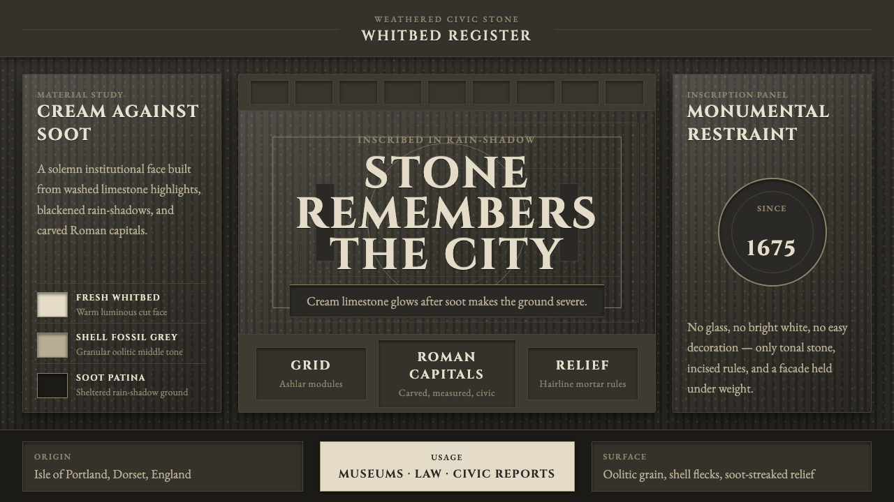 Portland Whitbed StoneCivic stone in shadow. Cream Cinzel capitals glow over soot-black ashlar grai…
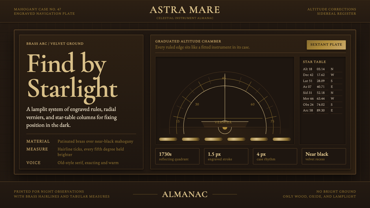 Sextant NavigationPrecision feels ceremonial. Brass ticks and mahogany grids chart the dark by…
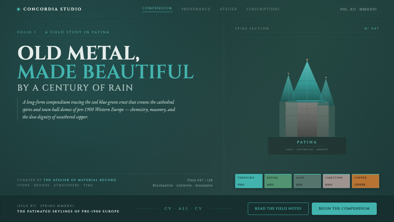 Verdigris Copper RoofOld metal made beautiful by decay. Cool cyan-green patina on dark teal, with…
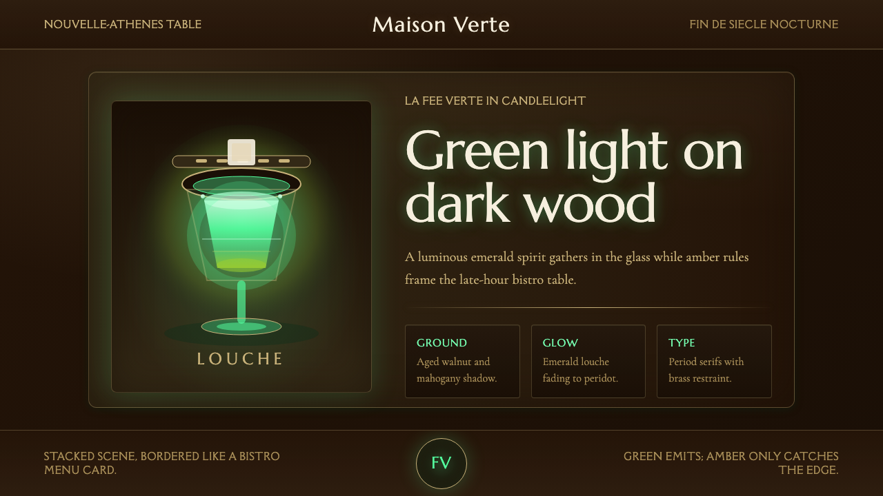 Absinthe Green Fairy GlowDarkness makes the fairy glow. Emerald louche on mahogany, framed by amber se…
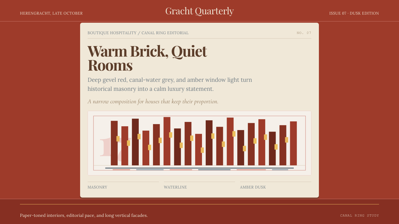 Amsterdam Canal HouseQuiet luxury in brick and cream. Playfair serif, narrow columns, amber window…
 Aneroid BarometerMeasures weather as furniture. Gilt rings and Cinzel engraving glow on dark w…