What is Verdigris Copper Roof?
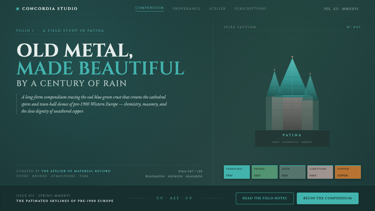
Verdigris Copper Roof finds grandeur in weathering: cold mineral green, deep eaveshadow, pale stone, and capitals that seem cut into a civic monument.
Verdigris Copper Roof in brief
Verdigris Copper Roof is a dark, architectural style drawn from the oxidized copper spires and domes of pre-1900 Western Europe. Its central image is not new metal with a polished shine, but copper after rain, sea air, and long exposure have given it a cool cyan-green crust. That patina is set against deep teal shadow, weathered limestone, and the feeling of a roofline seen from a town square or cathedral close.
The style treats decay as evidence of permanence. The green is mineral rather than playful, cool rather than tropical, and never merely decorative. It suggests a surface that has endured weather without losing dignity. Dark grounds create the recess beneath a roof edge; lighter stone-like surfaces give the patina something to emerge from. Together they create a mood of public architecture, accumulated time, and restrained civic authority.
Its typographic counterpart is inscriptional Roman capitals in the Trajan lineage, expressed through Cinzel-like letterforms. These capitals should feel carved, deliberate, and ceremonial rather than fashionable or casual. Verdigris Copper Roof is therefore not a generic dark-green theme. It is a system of aged material, monumental lettering, and controlled contrast, intended to make information feel durable enough to belong on stone, metal, or a historic facade.
Where does Verdigris Copper Roof come from?
The visual source lies in copper roofing across Western Europe before 1900, especially in Northern France, the Low Countries, Germany, Scandinavia, and Britain. Copper appeared on spires, domes, and other prominent roof forms associated with churches, cathedrals, town halls, and civic buildings. Its public visibility matters: a copper roof was not an intimate domestic surface but a silhouette above streets and squares, where changing weather made its material character legible from a distance.
Over decades, copper sheathing exposed to rain and sea air develops the blue-green patina that gives this style its name. The transformation is central rather than incidental. A new copper surface and a weathered green one do not communicate the same values: the latter carries visible duration. Verdigris Copper Roof borrows that reading of age and preservation, using patina as an image of material history rather than as a novelty color treatment.
Gothic and Romanesque ecclesiastical architecture provide the setting for much of the style's emotional vocabulary. Vertical roofs, towers, stone walls, and shadowed architectural recesses establish its contrast between exposed mineral green and deep darkness. Nineteenth-century civic monumental building extends the same language into town halls and public institutions, where copper and stone could make authority appear inherited, legible, and built to outlast a passing season.
Its lettering descends from Roman square-capital inscriptional traditions associated with Trajan. In this context, capitals are not simply an uppercase setting; they act as an architectural material. They frame names, dates, declarations, and section titles with the gravity of carved stone. The people behind the roofs were often anonymous guild coppersmiths and cathedral builders, while later conservation scientists, including those associated with the Statue of Liberty, helped make the public meaning of copper patina visible again: weathered metal is not automatically failure, but a surface with a history.
What defines the Verdigris Copper Roof look?
Patina as the Focal Material
Cool cyan-green is the visual event. It should read as a mineral deposit on old copper, with enough restraint to remain rare and consequential. Treat it as the exposed roof surface or inscriptional accent, not as a cheerful all-over wash. Its force comes from looking earned by weather.
Deep Eaveshadow
Dark teal establishes depth without resorting to theatrical blackness. It suggests the cool recess beneath a roofline, the protected side of a dome, or stone receding behind metal. Use darkness as an architectural field that holds the brighter patina in place.
Weathered Stone Contrast
Pale, weathered limestone-like surfaces give the palette its historic setting. They should feel dry, quiet, and slightly worn, never glossy or pristine. Against them, verdigris gains clarity while dark fields gain the gravitas of a shadowed facade.
Inscriptional Capitals
Cinzel-like Roman capitals supply ceremony and permanence. Use them for titles, names, navigation landmarks, and short declarations where each word can bear visual weight. They are strongest when given generous surrounding space, rather than compressed into dense paragraphs.
Monumental Restraint
The composition should feel built rather than decorated. Broad quiet areas, firm alignments, and a limited number of emphatic elements create the sense of a facade or roof plane. Avoid lively ornament, playful illustration, or excessive visual chatter; this style needs silence around its material cues.
Age Without Ruin
Verdigris Copper Roof celebrates weathering, not collapse. Surfaces may imply oxidation, stone, rain, and accumulated exposure, but the hierarchy remains clean and the message remains readable. The desired impression is maintained heritage: old enough to carry memory, cared for enough to remain public.
Who shaped Verdigris Copper Roof?
Anonymous guild coppersmiths belong at the foundation of this style because they made copper a durable architectural skin for roofs and prominent civic forms. Their authorship is largely collective rather than individual, which suits the theme's emphasis on craft, material endurance, and buildings that exceed a single designer's visible signature.
Cathedral builders supplied the architectural setting in which spires, domes, stone walls, and dark recesses become a coherent visual world. Their work connects copper roofing to Gothic and Romanesque ecclesiastical architecture, where height, shadow, and public ritual give weathered surfaces their monumental charge.
Conservation scientists associated with the Statue of Liberty provide the modern interpretive lens for verdigris. Their work helps distinguish a weathered copper surface from a simplistic image of neglect. In this style, that distinction matters: patina signals exposure and age, yet can also signify preservation, continuity, and material dignity.
How do you use Verdigris Copper Roof today?
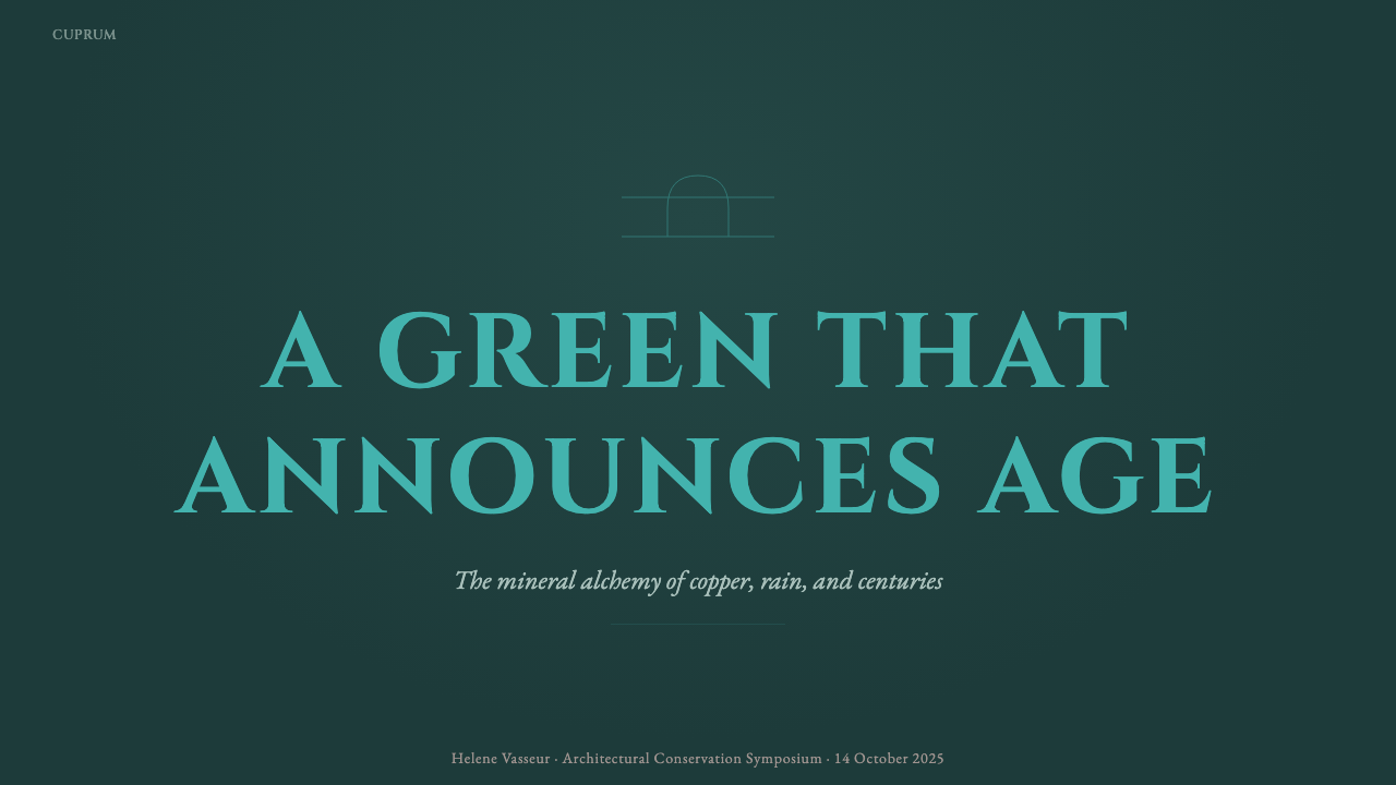
For presentation covers, use Verdigris Copper Roof as an architectural threshold. Let a dark teal field suggest depth, introduce one decisive verdigris form or detail, and place the title in spacious Roman capitals. The cover should feel like an inscription encountered on approach, not a poster competing for attention. Keep supporting information subordinate, as though it belongs on a discreet plaque beneath the main monument.
For content and data slides, let hierarchy do the work. Pale stone-like panels can hold explanatory text, while dark sections separate major ideas and verdigris marks the information that needs to be found again. Charts should be sober and legible rather than decorative: use the patina accent to identify the main series, and let surrounding lines and labels remain quiet. This approach suits material histories, civic topics, cultural institutions, architecture, preservation, and any presentation that benefits from calm authority.
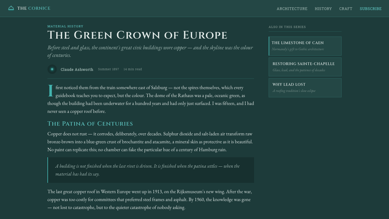
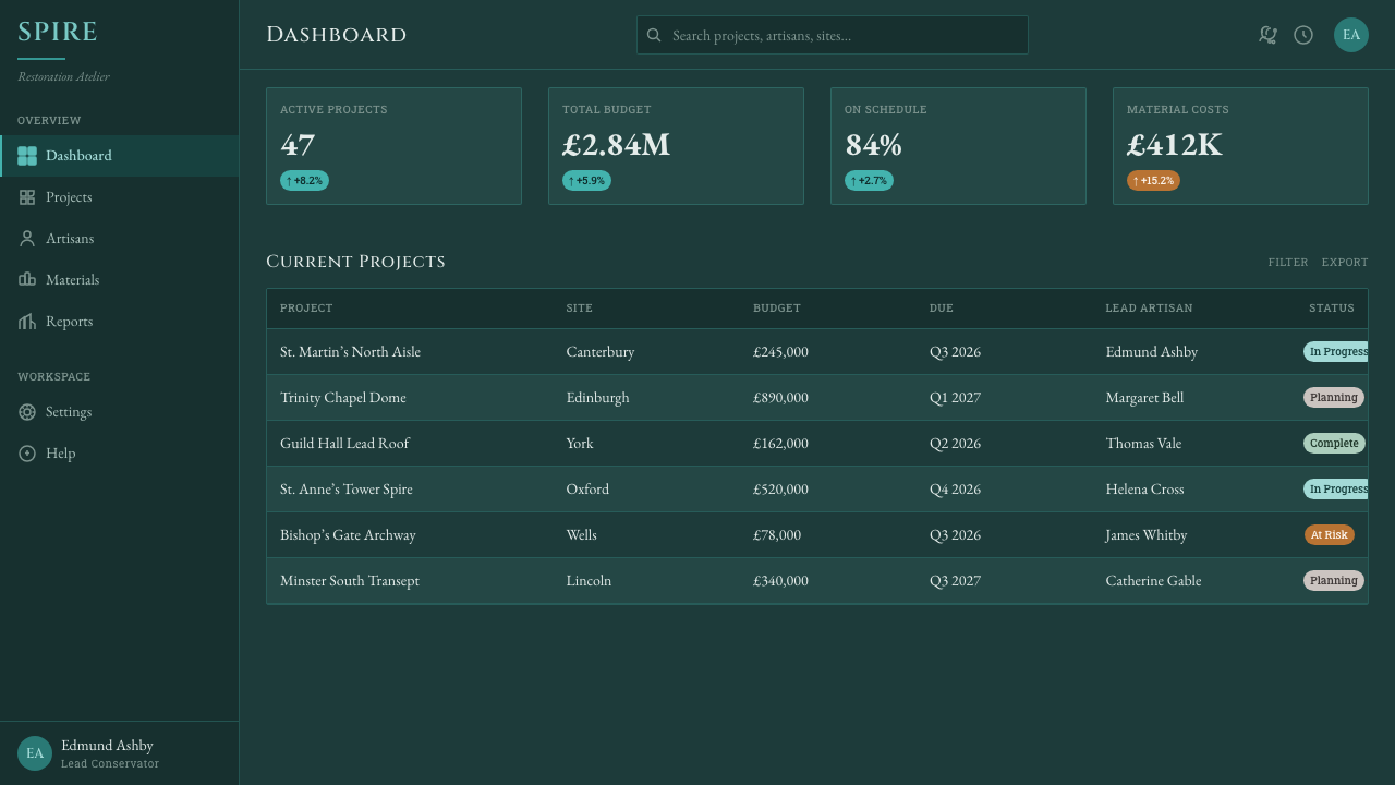
For web interfaces, the style is strongest in dashboards, archival tools, institutional portals, and pricing pages where trust and longevity matter. Use deep background areas as structural zones rather than a continuous decorative atmosphere. Inscriptional capitals work best for identity, major headings, and concise category labels; longer reading should remain clear and calm on lighter stone-like surfaces. Interactive emphasis should be selective, so verdigris retains the meaning of a discovered or exposed material.
For editorial and marketing work, make the page feel like a sequence of architectural surfaces. A feature story can begin in shadow, move through a pale reading field, then return to verdigris for a pull quote, chapter marker, or call to action. Marketing should emphasize provenance, preservation, craftsmanship, cultural memory, or durable public value. It is particularly effective for architecture, museums, heritage projects, premium public services, and products that need gravity without becoming ornate.
The common mistake is treating verdigris as an interchangeable green luxury accent. That removes the style's reason for existing. Do not pair it with glossy glamour, soft fantasy effects, tropical associations, or casual decorative lettering. Equally, do not make every surface green. The patina needs dark eaveshadow and weathered stone around it, while the capitals need room to feel carved. The style succeeds when age, contrast, and restraint all support one another.
Verdigris Copper Roof — FAQ
Is Verdigris Copper Roof simply a dark green luxury style?
No. Luxury styling often relies on polish, rarity, and visual shine, whereas Verdigris Copper Roof relies on weathering, architecture, and public permanence. Its green should recall oxidized copper, not a generic premium accent. The surrounding darkness is eaveshadow, and the pale contrast is weathered stone; removing those material relationships leaves only a color preference, not the style.
Can the style use photography or imagery?
Yes, provided imagery serves the architectural material story. Rooflines, copper surfaces, stone, towers, domes, rain-darkened recesses, and close material details belong naturally within it. Images should feel observational and enduring, not glossy or lifestyle-driven. Treat photography as evidence of place and weather, then let type and quiet framing give it the gravity of an inscription.
Why are Roman capitals so important here?
They connect the style to inscription rather than ordinary display typography. In the Trajan lineage, capitals carry the visual memory of letters cut into civic and monumental surfaces. Their role is to make a title, name, or short declaration feel placed with intention. They should not be used indiscriminately for dense text, where their ceremonial character becomes tiring and weakens readability.
Where does Verdigris Copper Roof work poorly?
It struggles where immediacy, playfulness, softness, or exuberant novelty are the product's primary values. Children's entertainment, casual social spaces, bright seasonal campaigns, and products built around frictionless informality can find its monumentality too severe. The style needs room for shadow, silence, and measured reading. If a product needs to feel spontaneous, sunny, or disposable, another visual language will be more truthful.
Related design styles
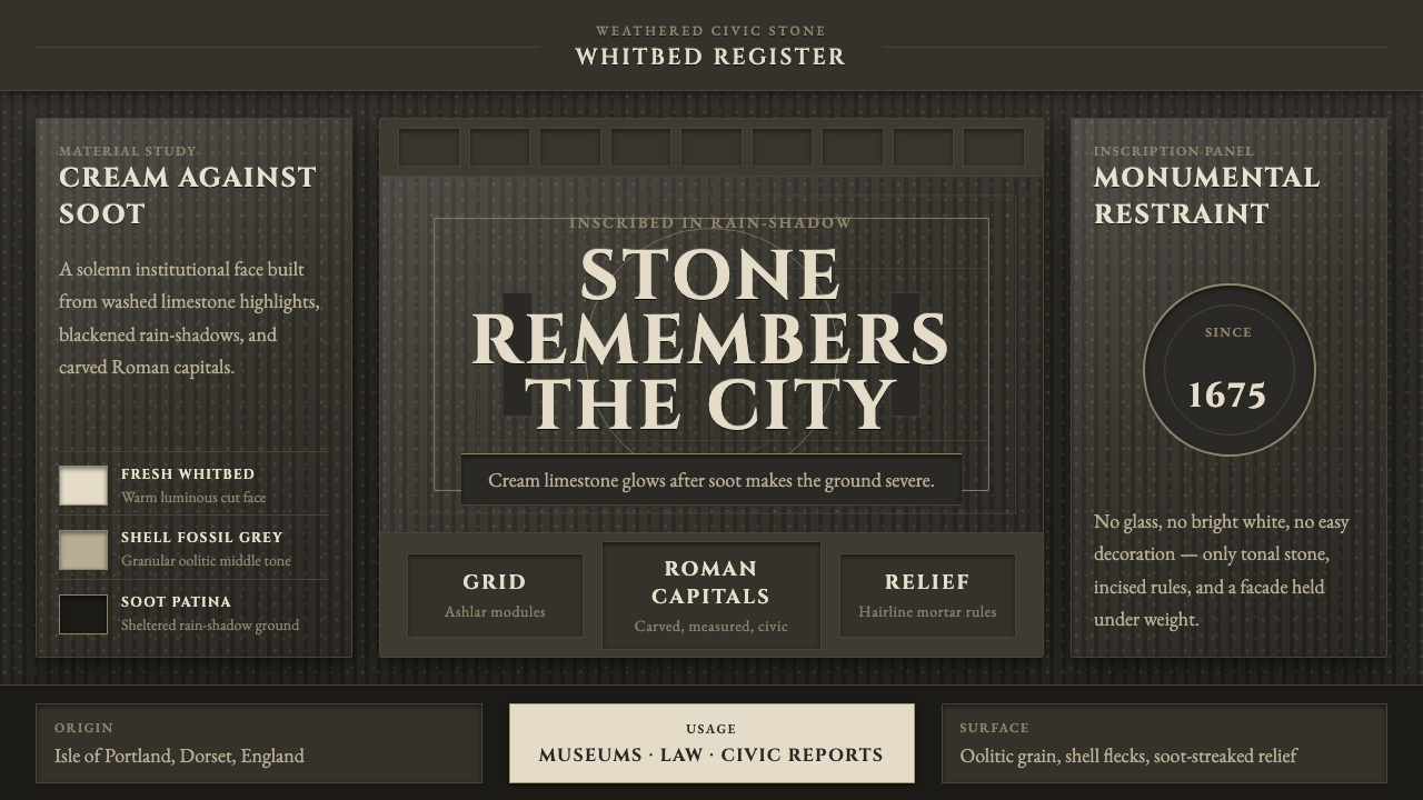 Portland Whitbed StoneCivic stone in shadow. Cream Cinzel capitals glow over soot-black ashlar grai…
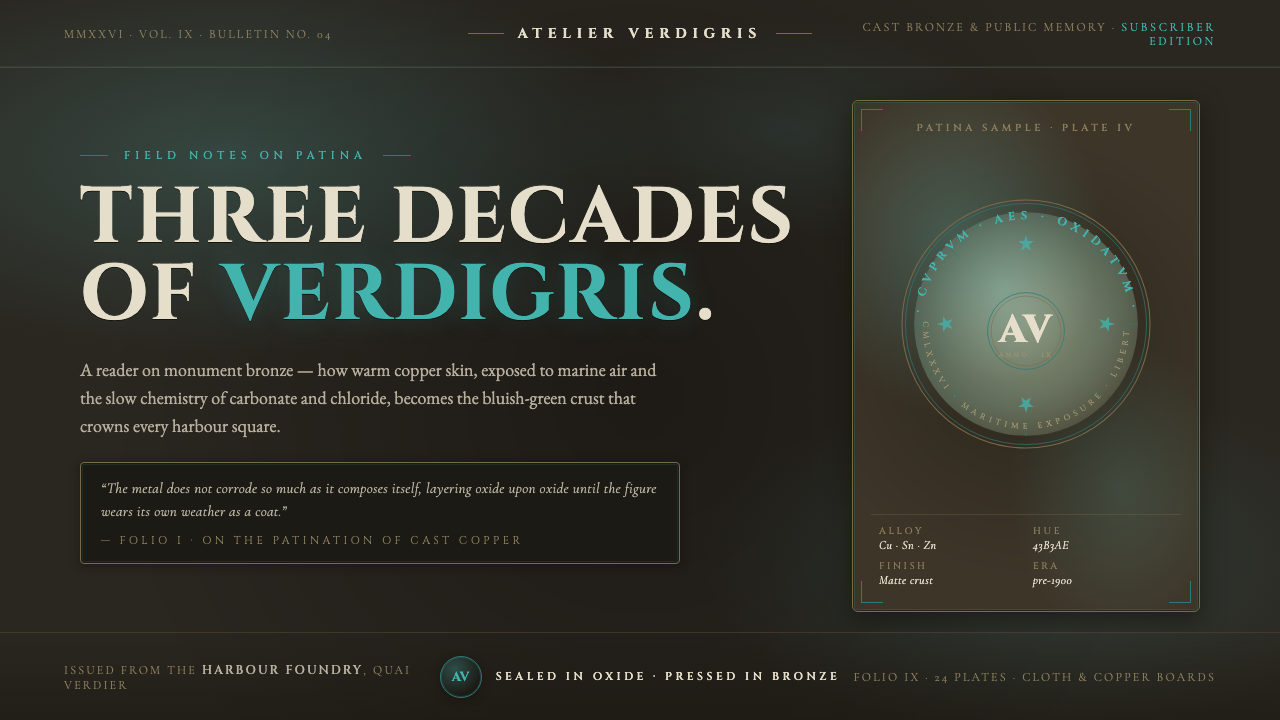 Bronze Patina StatueThree decades of weather, worn as a coat. Verdigris crust on dark bronze, eng…
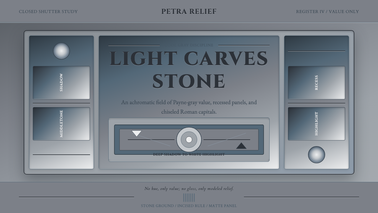 Grisaille PaintingStone without color. Payne-gray relief, Cinzel capitals, and recessed panels…
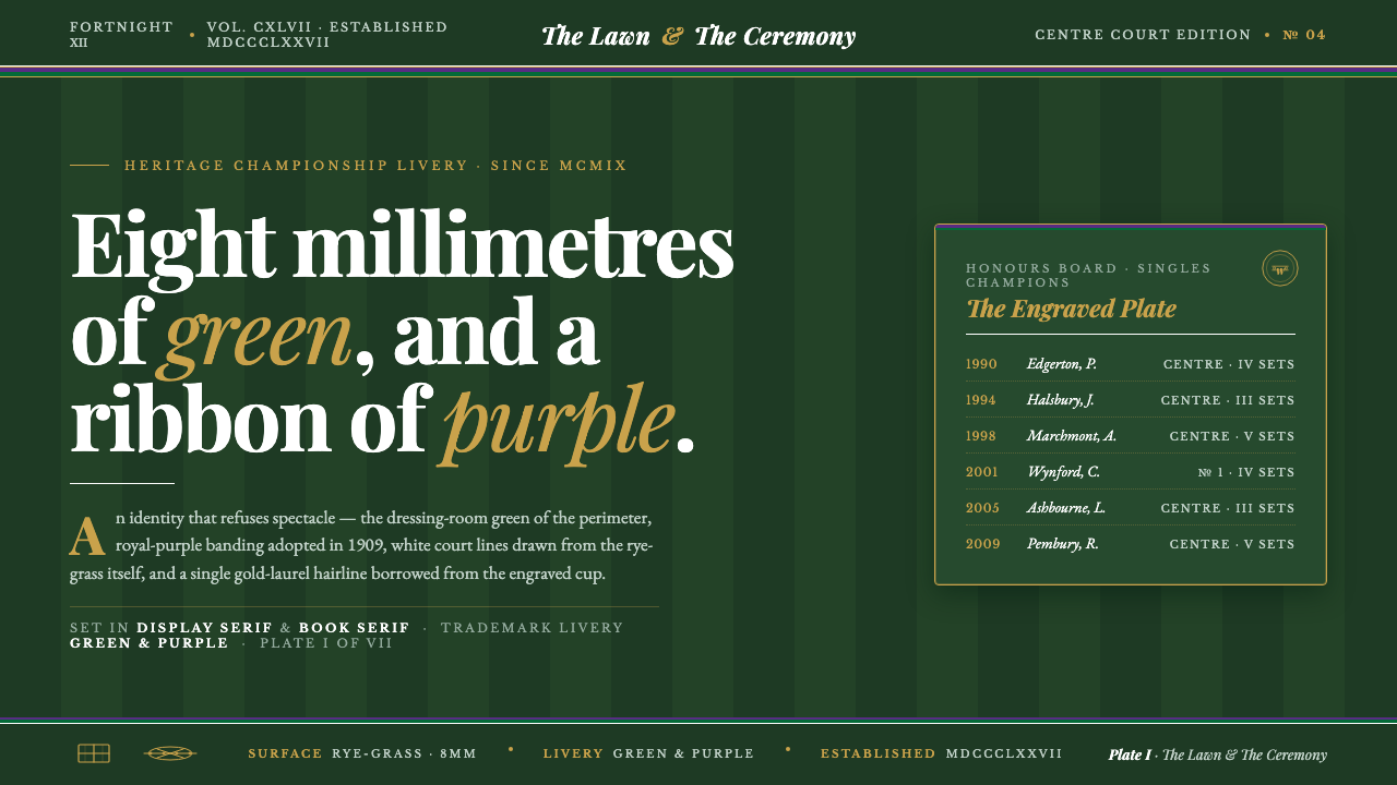 Wimbledon GrassHeritage, not stadium. Championship green ground, purple-and-green livery, go…
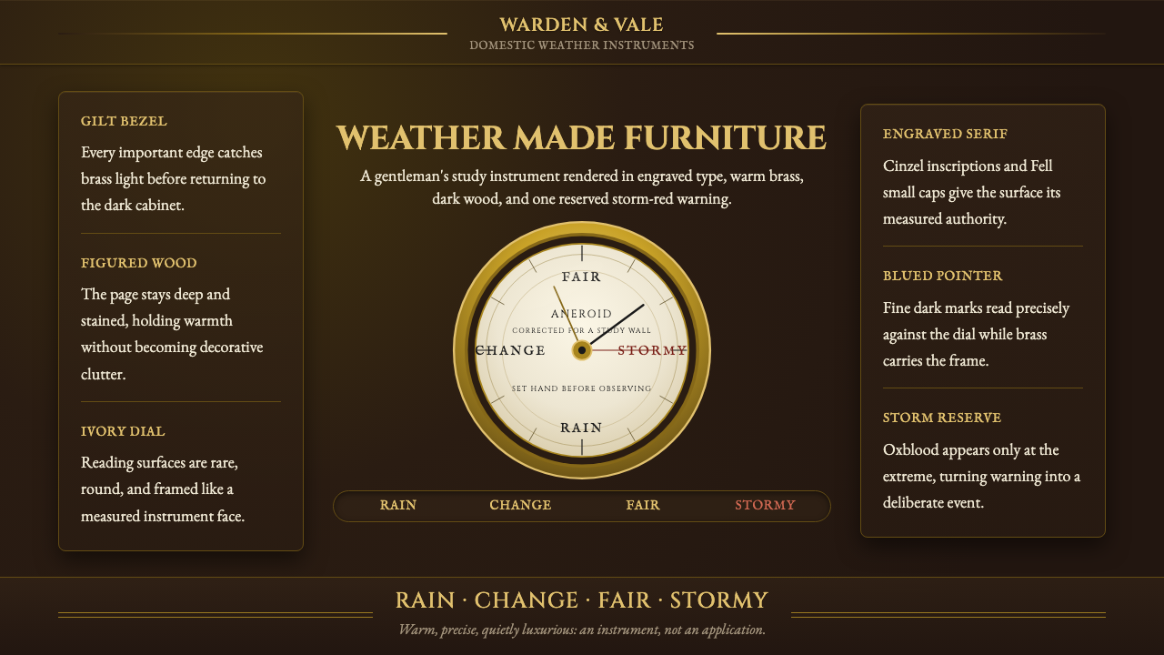 Aneroid BarometerMeasures weather as furniture. Gilt rings and Cinzel engraving glow on dark w…
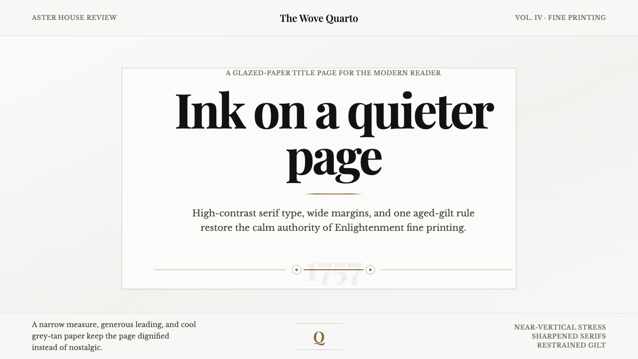 Baskerville Transitional SerifCalm authority in print. Glazed grey-tan paper, sharp serif contrast, one age…