What is Portland Whitbed Stone?
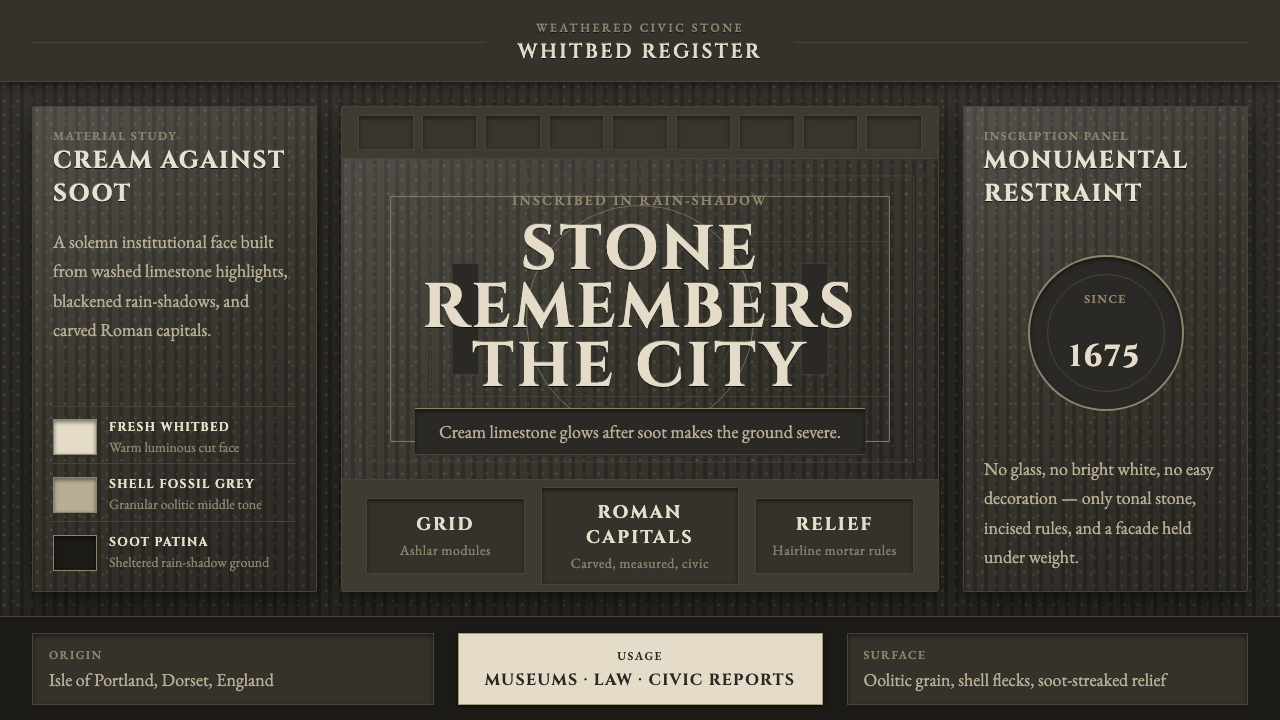
Portland Whitbed Stone turns civic London inside out: weathered black masonry becomes the field, while creamy inscriptional stone rises from shadow with the authority of a public monument.
Portland Whitbed Stone in brief
Portland Whitbed Stone is a dark visual system derived from Portland Whitbed, the creamy oolitic limestone quarried on the Isle of Portland in Dorset, England. The stone is associated with St Paul’s Cathedral, Buckingham Palace, and Whitehall: buildings whose material presence helped define civic London. Its design language begins with that specific contrast between pale stone and the darkened surfaces that accumulated around it.
The system does not treat darkness as a neutral backdrop. Its ground recalls weathered ashlar in London’s rain and historic soot, where masonry can appear almost black. Against that depth, cream-colored lettering and pale stone details act as the illuminated surface. The result is ceremonial without becoming theatrical: the page feels built, carved, and weathered rather than merely decorated.
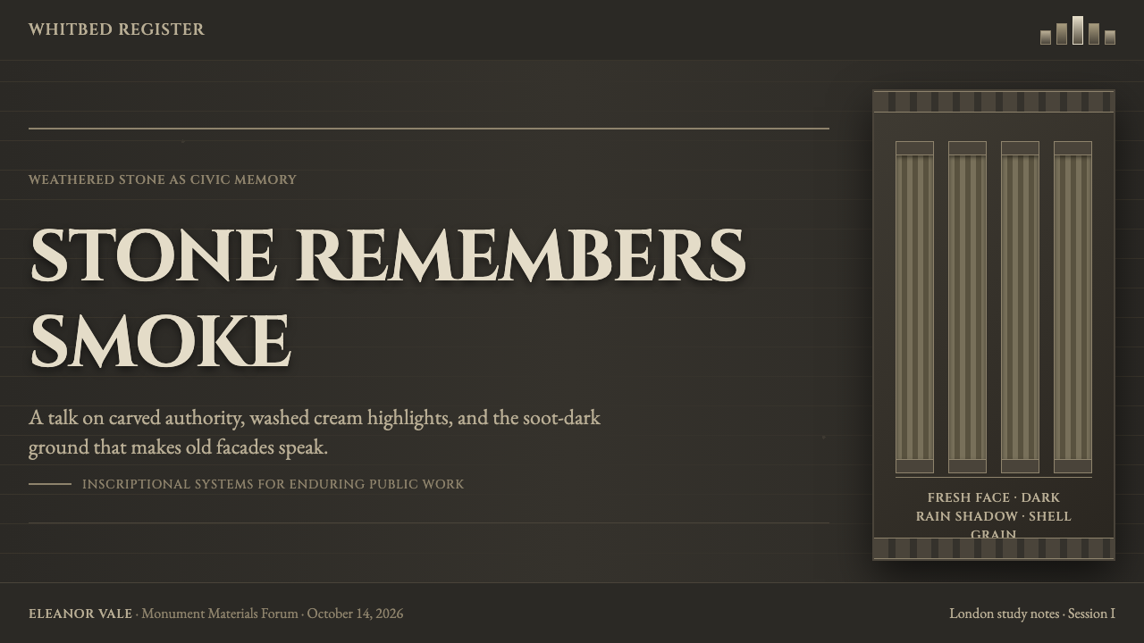
Roman inscriptional capitals provide the typographic voice. They suggest carved public lettering, formal facades, memorial tablets, and institutional names. Combined with a restrained stone palette and visible ashlar-like grain, the style gives contemporary content the gravity of a civic building while keeping the composition legible and spare.
Where does Portland Whitbed Stone come from?
The material origin is Portland Whitbed, a creamy oolitic limestone from the Isle of Portland, Dorset. It has been quarried since the Roman era, giving the stone a long relationship with building rather than a purely decorative association. Its pale body and shell-flecked character make it especially suited to surfaces intended to read as durable, public, and permanent.
From the seventeenth century onward, Portland stone became a landmark material in London’s civic architecture. St Paul’s Cathedral, Buckingham Palace, and Whitehall establish the visual frame for this system: pale stone used at an architectural scale, set within a city whose weather and industrial history could darken surrounding masonry. The contrast is not invented for a screen; it is drawn from a real urban condition.
Sir Christopher Wren is the key figure named in this lineage. The associated architectural context includes English Baroque and Neoclassical architecture, movements in which public form, ordered facades, and durable materials carry institutional meaning. Portland Whitbed Stone translates that civic material logic into a dark-page system: shadowed masonry becomes the setting, while cream stone and inscriptional capitals bear the message.
This translation matters because it preserves the source material’s tension. The style should not resemble a generic luxury dark mode, nor a theatrical ruin. Its authority comes from an observed relationship between clean pale stone, soot-black patina, rain-weathered surface, and formal public lettering. The historical reference remains architectural even when the final application is digital or editorial.
What defines the Portland Whitbed Stone look?
Weathered Dark Ground
The background should evoke soot-black ashlar and rain-shadowed masonry rather than an empty black void. A subtle granular or stone-like presence gives the dark field age, weight, and physical credibility. It remains quiet enough that lettering still reads as the primary carved surface.
Cream Stone Highlight
Cream is the luminous material in the system. It should read as freshly cleaned or newly exposed stone against aged masonry, not as a casual warm accent. Use it to carry names, headings, rules, and focal architectural details with deliberate restraint.
Inscriptional Capitals
Roman inscriptional capitals establish the voice. Their role is not nostalgic ornament but civic address: they make a title feel named, carved, and publicly accountable. They work best in short ceremonial phrases, institutional labels, and spacious headings rather than dense passages of body text.
Ashlar Grain
Ashlar grain introduces the sense of assembled stonework. It should suggest cut masonry and accumulated weathering without becoming a photographic wall surface. The texture belongs to the field, helping the page feel constructed from material planes instead of floating interface panels.
Civic Restraint
The composition should feel formal, balanced, and durable. Large areas of quiet darkness, measured alignment, and limited luminous elements create authority. Richness comes from contrast between patina and stone, not from accumulating decorative devices, effects, or competing visual signals.
Carved Surface Logic
Elements should appear placed on, cut into, or revealed from a masonry surface. Separators can resemble fine incisions; highlights can resemble exposed stone. This creates depth through material contrast and placement, avoiding the need for glossy illumination or simulated luxury finishes.

Who shaped Portland Whitbed Stone?
Wren is the key figure identified in the material’s architectural lineage. His presence anchors the style in civic London and in an era where stone, public buildings, and formal architectural expression were inseparable. Within this system, his significance is not a decorative historical reference but a reminder that the visual language begins with built form.
St Paul’s Cathedral is named as a major landmark associated with Portland Whitbed. It represents the stone at civic scale: pale limestone carrying architectural dignity in the center of a city marked by rain, soot, and weathering. Its role in the style is to establish monumentality without requiring ornament.
Buckingham Palace is another landmark named in the stone’s civic history. It broadens the reference from a single monument to a wider language of state-facing architecture, where pale Portland stone communicates endurance, formality, and public presence. The system borrows that composed material authority rather than reproducing a palace facade.
Whitehall places Portland stone within London’s administrative and civic landscape. As a reference, it reinforces the connection between formal lettering, durable masonry, and public institutions. The visual system draws from that relationship to make information feel addressed to a public realm rather than presented as disposable content.
How do you use Portland Whitbed Stone today?
For presentation covers, use the dark weathered field as the architectural setting and let a cream inscriptional title carry the primary message. A restrained stone-like focal area can frame a subtitle or institutional name. On content slides, preserve the same hierarchy: dark ground, pale text, clear alignments, and only a few carved-looking rules or markers to organize sections.
Data slides benefit from the style when information is treated as civic evidence rather than spectacle. Keep charts and labels pale against the dark masonry field, with restrained contrast between primary and secondary information. The objective is a measured, archival clarity: data should look placed on a formal surface, not surrounded by decorative glow.
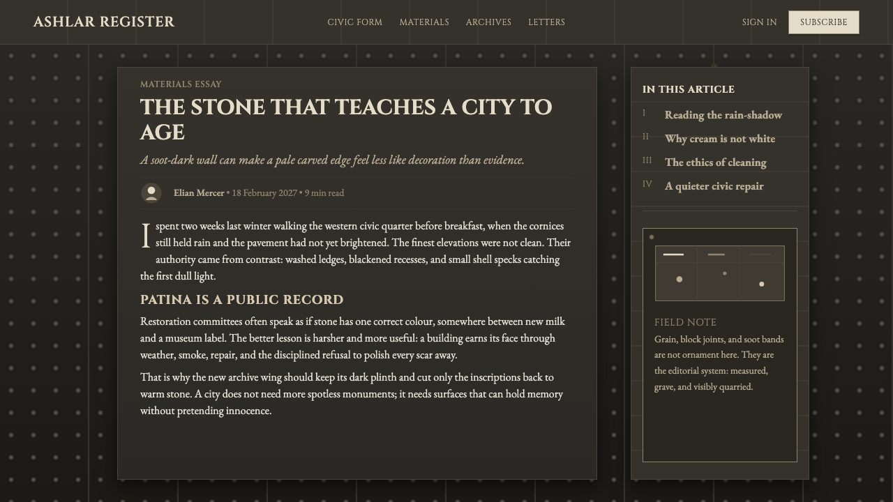
For web interfaces, Portland Whitbed Stone suits dashboards, public-facing portals, institutional profiles, and pricing pages that need gravity and confidence. Use the dark ground as a continuous material field, reserve cream for hierarchy and important actions, and let divisions resemble carefully set stone joints or incised lines. Components should feel aligned within an architectural plane.
In editorial and marketing work, the system is strongest when copy has a public voice. Long-form articles can use inscriptional capitals for titles and section openers while keeping body text calm and readable. Marketing pages can alternate large dark masonry fields with cream stone panels, making a feature, service, or statement feel like an element of a civic facade.
A common mistake is turning the style into generic black-and-gold luxury branding. Portland Whitbed Stone is not about preciousness, glamour, or ornate historical imitation. Its cream highlight comes from limestone, its darkness from weathered soot-black masonry, and its formality from public architecture. Over-polished surfaces, excessive metallic cues, and dense decorative typography erase the material story that gives the system its authority.
Portland Whitbed Stone — FAQ
Is Portland Whitbed Stone simply a dark version of classical architecture?
No. The system is built around a specific material and environmental contrast: creamy Portland Whitbed limestone against soot-black, weathered masonry. Roman inscriptional capitals and formal composition matter, but they are part of a civic stone logic rather than a general-purpose classical costume. The dark field is essential because it makes the pale stone read as exposed material.
Why are inscriptional capitals important to the style?
They connect text to carved public surfaces. In this system, capitals make a title feel declared rather than casually displayed, echoing the formal lettering associated with civic architecture. They should carry names, short statements, and navigation-level hierarchy; relying on them for dense body copy weakens readability and turns the architectural reference into a mannerism.
Can this style work for an interface that must remain highly practical?
Yes, particularly where information needs to feel stable, institutional, and carefully ordered. Dashboards and pricing pages can use the dark masonry field to unify the experience, while cream text and rules create clear hierarchy. Practicality depends on restraint: texture must stay subordinate to content, and the inscriptional treatment should be reserved for high-level labels rather than every control.
What most often makes a Portland Whitbed Stone design feel inauthentic?
The usual problem is losing the relationship between material, weathering, and civic form. A flat dark background with ornate cream lettering may look historical, but it does not necessarily evoke Portland Whitbed. The design becomes convincing when the dark field suggests soot-black masonry, the light areas feel like limestone, and typography behaves like formal inscription rather than ornamental display.
Related design styles
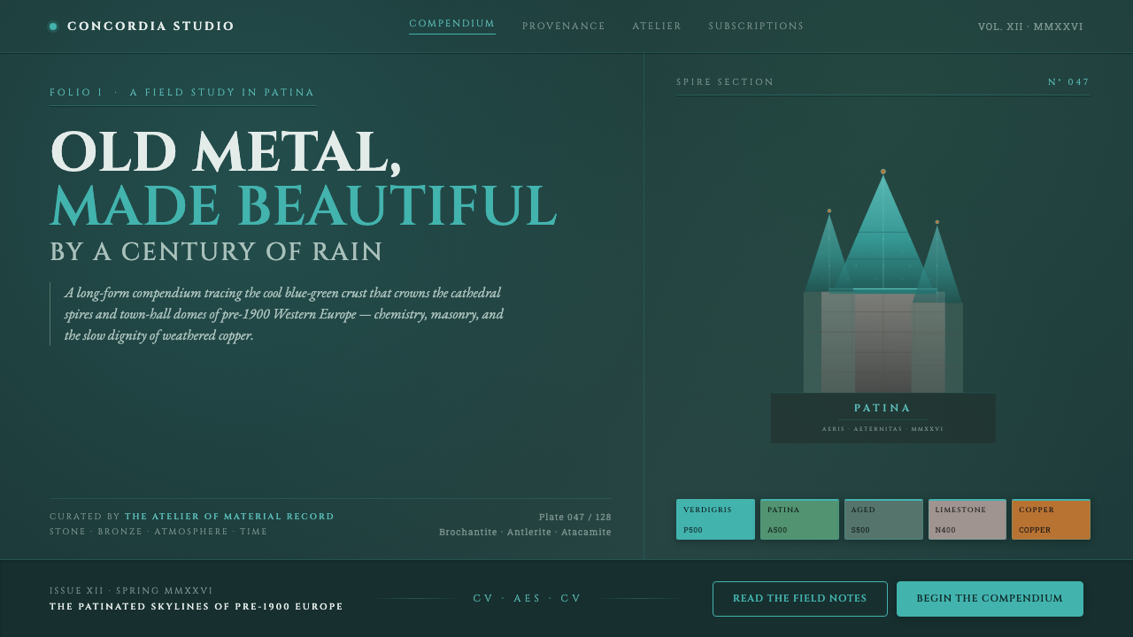 Verdigris Copper RoofOld metal made beautiful by decay. Cool cyan-green patina on dark teal, with…
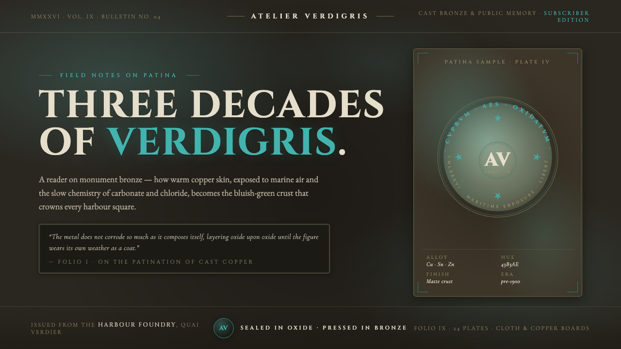 Bronze Patina StatueThree decades of weather, worn as a coat. Verdigris crust on dark bronze, eng…
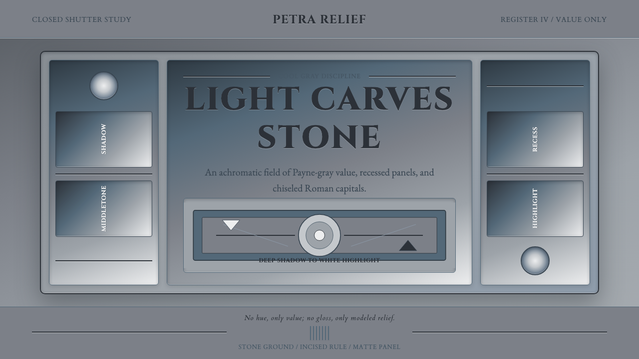 Grisaille PaintingStone without color. Payne-gray relief, Cinzel capitals, and recessed panels…
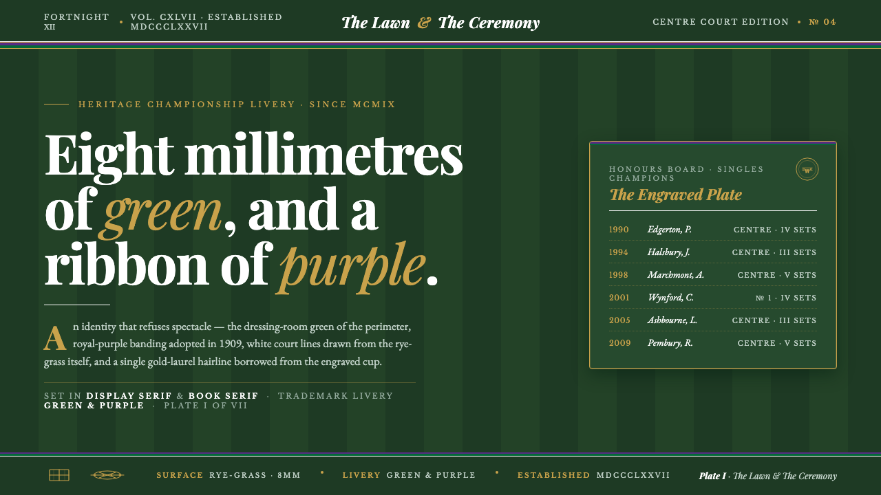 Wimbledon GrassHeritage, not stadium. Championship green ground, purple-and-green livery, go…
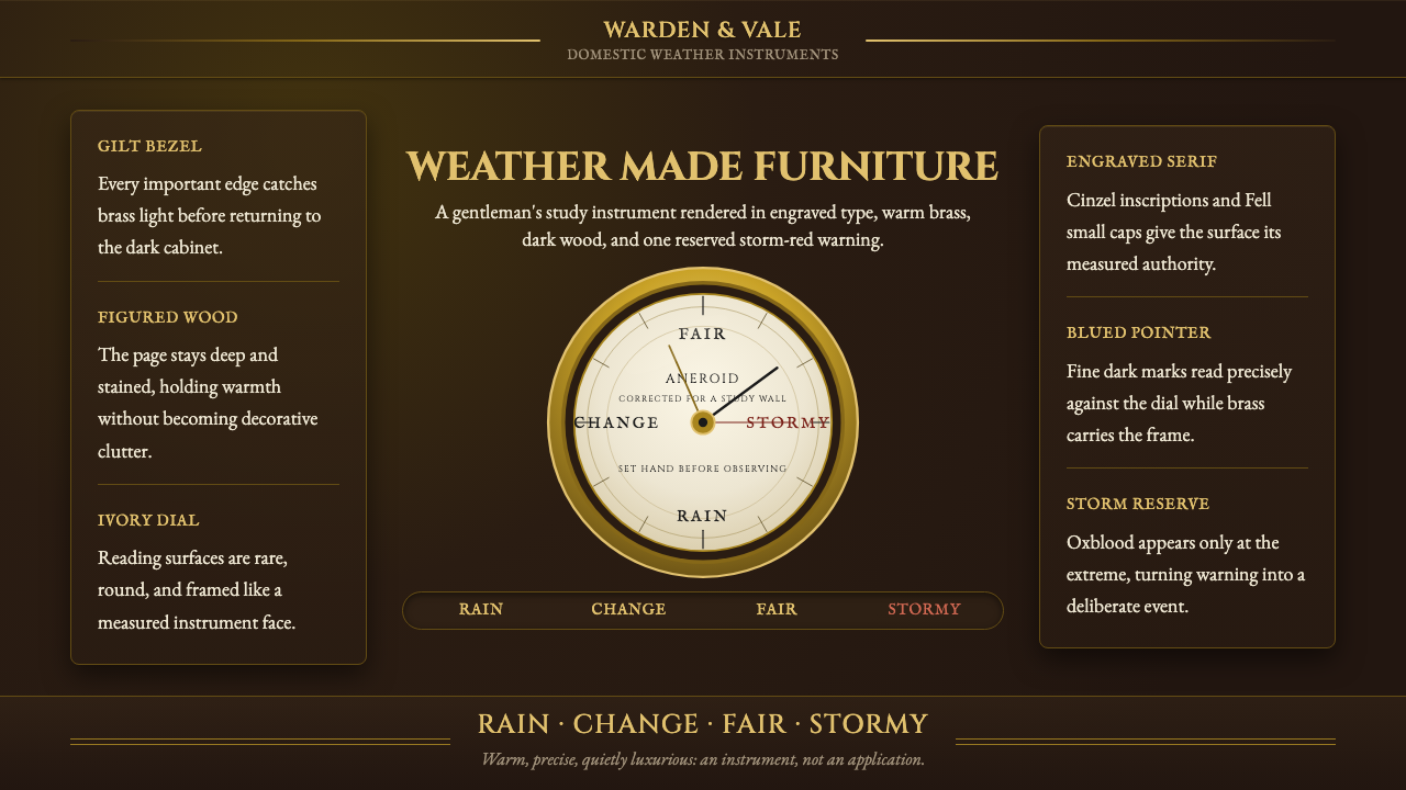 Aneroid BarometerMeasures weather as furniture. Gilt rings and Cinzel engraving glow on dark w…
 Baskerville Transitional SerifCalm authority in print. Glazed grey-tan paper, sharp serif contrast, one age…