What is Baskerville Transitional Serif?
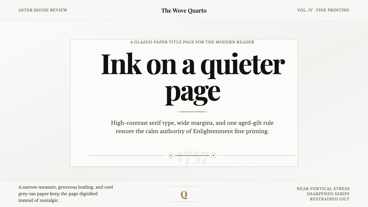
Baskerville brings the calm authority of Enlightenment fine printing into the present: a cool glazed paper field, brilliant serif contrast, and a page that earns attention through restraint.
Baskerville Transitional Serif in brief
Baskerville Transitional Serif is a print-led editorial style built around the visual breakthrough of John Baskerville’s 1757 quarto Virgil. It occupies the historical threshold between Old-Style and Modern type: its serifs are sharpened and tapered, its letterforms carry a near-vertical stress, and its strokes move from fine to heavy with a contrast that was startling in its own moment. The result is neither antique softness nor later Modern severity. It is poised, lucid, and unusually self-assured.
The style’s defining ground is as important as its type. Baskerville printed on James Whatman’s new wove paper, pressing sheets between heated copper plates to create a smooth, faintly grey glazed surface rather than the warm cream associated with laid stock. A faithful contemporary interpretation begins there: not bright white, not nostalgic parchment, but a quiet grey-tan paper field that makes dark ink feel deliberate and display type appear to catch the light.
Its visual language translates the logic of a finely printed book into an editorial system. Wide margins create silence around the text. Centred title pages establish ceremony without ornament. Large serif headlines sparkle because the surrounding page is restrained, not because the composition is crowded with effects. One aged-gilt rule can establish hierarchy and interval. The atmosphere is cultivated but not theatrical: authority comes from paper, proportion, and typographic precision.
Where does Baskerville Transitional Serif come from?
The style begins in Birmingham, England, with John Baskerville’s 1757 quarto Virgil. Baskerville was both printer and letter-founder, and the book made his ambitions visible as a single printed object: type, paper, inked impression, and page composition were treated as parts of one system. Its importance lies not in decorative novelty but in a new degree of control. The page appeared sharper, smoother, and more deliberate than the older printing traditions from which it emerged.
The type was cut to Baskerville’s design by punchcutter John Handy during the 1750s. Its letterforms marked a transition in the history of serif printing. The stress became nearly vertical, the serifs became more pointed and tapered, and the contrast between fine and heavy strokes increased. These are structural changes rather than surface styling. They make the text seem brighter on the page and give individual letters a composed, upright presence.
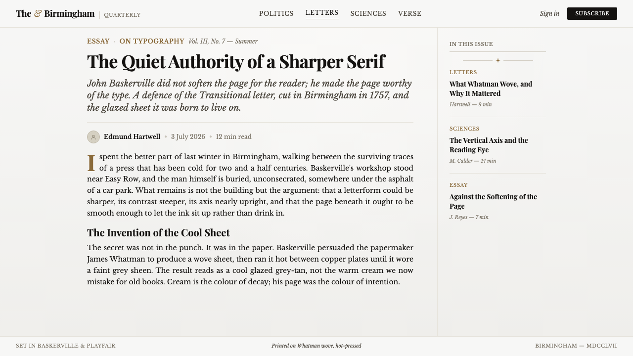
Baskerville’s material process was equally decisive. He used the new wove paper made by James Whatman and glazed each sheet by pressing it between hot copper plates. Instead of the warmer, more visibly textured character of laid paper, the result was smooth with a faint grey sheen. That surface allowed the typographic contrast to register with unusual clarity. In this visual system, paper is not a neutral background; it is an active partner in the legibility and authority of the type.
The historical setting is English Enlightenment fine printing, but the style survives because its lessons are transferable. It demonstrates that refinement can be achieved through a limited number of decisions made consistently: a particular paper character, rigorous letterform contrast, generous empty space, centred ceremonial composition, and a small amount of metallic emphasis. Contemporary work should preserve this relationship between material calm and typographic intensity rather than treating Baskerville merely as a decorative old book font.
What defines the Baskerville Transitional Serif look?
Glazed Grey-Tan Ground
The authentic ground is cool and faintly grey-tan, recalling glazed wove paper rather than ivory, bright white, or visibly fibrous stock. It should feel smooth, lightly reflective, and reserved. This ground gives the page an archival gravity without making it look distressed. Its purpose is to heighten the dark ink and provide a quiet atmosphere in which fine serif details can register.
Transitional Letterform Contrast
Baskerville’s personality resides in the tension between delicate and substantial strokes. Fine joins and hairline details are set against confident vertical stems, while the stress remains close to upright. The effect is lucid rather than ornamental: letters feel engraved, not embellished. Use the face where its contrast can breathe, especially in titles, quotations, and carefully set editorial text.
Centred Ceremony
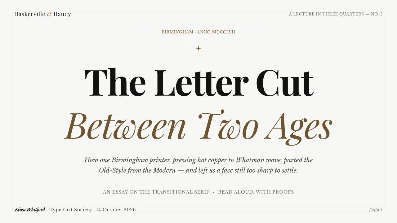
Centred title-page composition is central to the system. A title, subtitle, byline, or short introduction can occupy the calm middle of the page, surrounded by empty space rather than boxed in by decorative furniture. The alignment should feel ceremonial but readable, like the opening page of a serious volume. It is strongest when the text is concise and the page is allowed to remain visibly quiet.
Generous Margins
Margins are not unused space. They establish the physical feeling of a printed leaf, protect the text from visual noise, and slow the reader into a more attentive pace. The text block should appear intentionally held within the page rather than stretched toward every edge. This restraint makes even a dense subject feel considered and gives display typography room to shine without becoming loud.
Aged-Gilt Rule
A single aged-gilt rule is the style’s preferred accent. It can separate a title from its supporting information, mark a chapter interval, or anchor a small piece of metadata. Its value lies in rarity and precision. It should read as a trace of fine-book craft, not as a luxury effect repeated across the interface. When overused, it loses the restraint that makes it persuasive.
Editorial Restraint
This is not a texture-heavy vintage style. The system gains character from paper tone, typographic contrast, centred composition, and carefully rationed metallic detail. Decorative illustrations, ornamental borders, aggressive shadows, and busy interfaces dilute the effect because they compete with the very qualities that make Baskerville compelling. The page should feel edited down to its essential print decisions.
Who shaped Baskerville Transitional Serif?
Baskerville was the printer and letter-founder behind the 1757 quarto Virgil in Birmingham. His contribution was systemic: he did not treat type as separate from paper and printing. By bringing a newly designed face, smooth glazed paper, and disciplined page composition together, he established the visual conditions this style continues to draw from.
John Handy was the punchcutter who cut Baskerville’s type to his design during the 1750s. His work gave physical form to the sharp tapered serifs, near-vertical stress, and pronounced stroke contrast that distinguish the face. In a style founded on precision, the punchcutter’s role matters: the apparent calm of the finished page depends on exact decisions at the level of every letterform.
James Whatman supplied the new wove paper that made Baskerville’s printing surface distinctive. When the sheets were pressed between heated copper plates, they developed the smooth, faintly grey glazed character associated with the Virgil. Whatman’s paper is a reminder that this style is not only typographic; its authority depends on the relationship between letterforms and the surface that receives them.
How do you use Baskerville Transitional Serif today?
For presentation slides, use Baskerville Transitional Serif to make a cover feel like the opening leaf of a considered volume. Let a centred title occupy a cool glazed grey-tan field, with a restrained subtitle and one aged-gilt rule if hierarchy needs reinforcement. Do not fill the cover with badges, icons, or competing visual accents. The style works when the title feels placed, not merely enlarged.
Content and data slides need a more practical interpretation. Keep the reading surface calm, use Baskerville for the title or a key quotation, and let supporting information remain orderly and subordinate. Data should read as editorial evidence rather than as a decorative chart wall: clear labels, careful grouping, and a limited visual accent produce a more credible result than many competing colors or effects. The wide-margin principle can be adapted as breathing room around a chart, note, or explanatory caption.
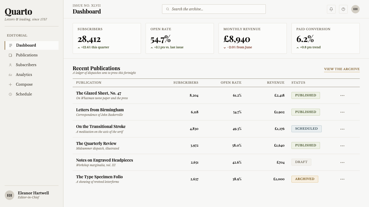
For web interfaces, the style is especially effective in dashboards, reports, premium editorial tools, and pricing pages that need composure rather than urgency. A cool paper-like ground and serif-led headings can make navigation, account information, or plan comparisons feel considered. Use the gilt accent sparingly for a selected state, a dividing rule, or a significant action. Functional controls should remain direct and legible; the fine-print atmosphere must not make everyday tasks feel ceremonial.
For editorial and marketing work, Baskerville excels where provenance, thoughtfulness, and long-form attention are part of the message. Essays, cultural programs, book-related projects, archives, membership communications, and high-consideration product stories all benefit from its page-like authority. Structure the composition as a sequence of title pages, generous text blocks, quiet captions, and occasional rules. Photography or illustration, if present, should preserve the same tonal calm rather than turning the layout into a period costume.
The common mistake is to confuse Baskerville with generic luxury or vintage styling. Warm parchment, excessive gilding, florid ornament, rough paper textures, and crowded decorative frames all pull the system away from its source. Another mistake is using its high-contrast display character everywhere, especially in dense functional text. The real effect comes from disciplined contrast: a cool smooth ground against dark type, elaborate letterform detail against spacious composition, and one accent against a mostly quiet page.
Baskerville Transitional Serif — FAQ
Is Baskerville Transitional Serif simply a vintage book style?
No. Its source is historical fine printing, but its governing ideas are precise rather than nostalgic: controlled contrast, smooth cool paper character, generous margins, and composed hierarchy. It can feel contemporary when these principles are used to clarify information. It becomes costume-like only when warm faux parchment, excessive ornament, or indiscriminate antique effects replace the original discipline.
Why is the paper ground grey-tan rather than ivory?
The source material is Baskerville’s glazed wove paper, made with James Whatman’s stock and pressed between heated copper plates. Its surface was smooth and faintly grey rather than warmly creamy. That coolness matters visually: it distinguishes the system from generic old-paper aesthetics and creates a clearer stage for the sharp contrast of Baskerville’s letterforms.
Can this style support data-heavy dashboards?
Yes, provided the typographic atmosphere does not override utility. Use Baskerville to establish section hierarchy, report titles, significant metrics, and editorial framing; keep labels, controls, and dense operational information exceptionally clear. The style’s wide-margin logic is useful around charts and summaries, but the interface should still allow rapid comparison and direct action.
How much aged-gilt accent should be used?
Treat it as a singular editorial signal, not a general palette. One fine rule can divide a title page, mark a transition, or indicate a chosen state with more authority than repeated metallic treatments. Its scarcity is what makes it feel connected to fine printing. If every card, button, and section carries the accent, the page loses both calm and hierarchy.
What most often makes a Baskerville layout feel inauthentic?
The most damaging error is adding visual richness where the original system uses restraint. Rough textures contradict the glazed surface; warm parchment contradicts the cool grey-tan ground; crowded ornaments undermine the wide margins; and many competing accents weaken the authority of a single gilt rule. Start with the relationship between smooth paper, dark type, and empty space. Everything else should justify itself against that foundation.
Related design styles
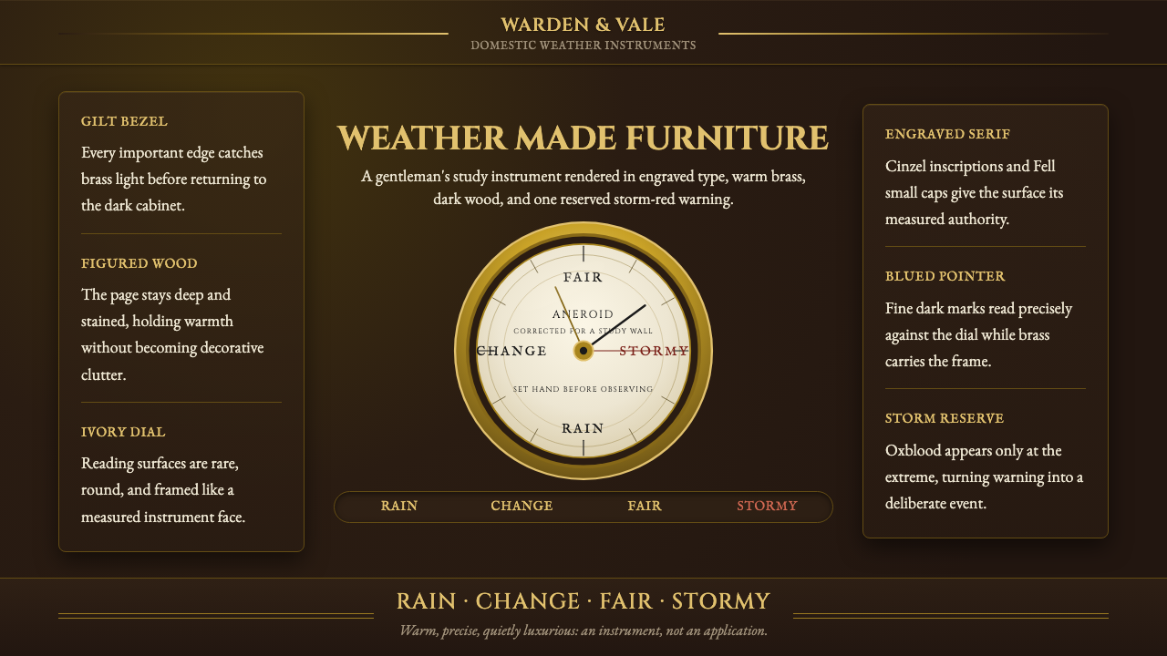 Aneroid BarometerMeasures weather as furniture. Gilt rings and Cinzel engraving glow on dark w…
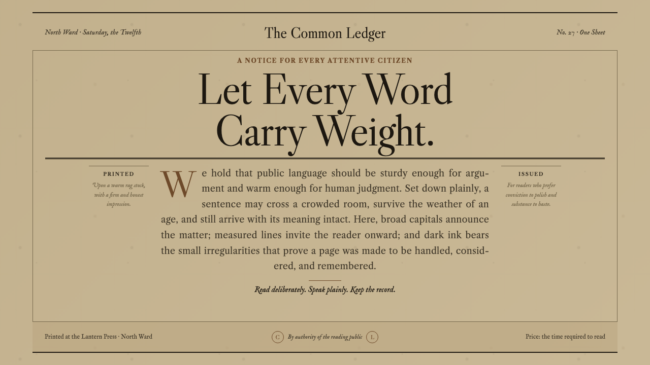 Caslon English Text SerifWarm authority, pressed into paper. Caslon capitals and engraved rules comman…
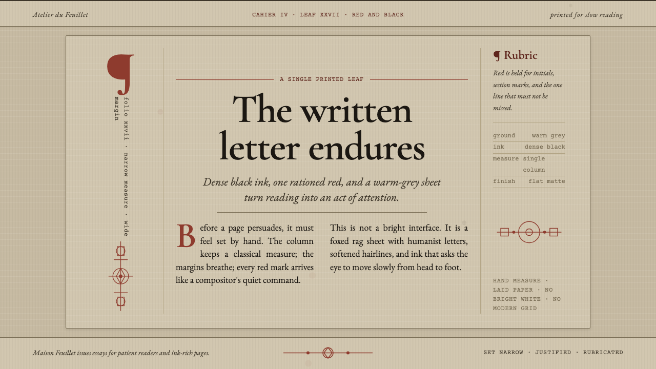 Garamond Old-Style French SerifInk ages with grace. Warm-grey rag paper, Garamond columns, and red rubric ma…
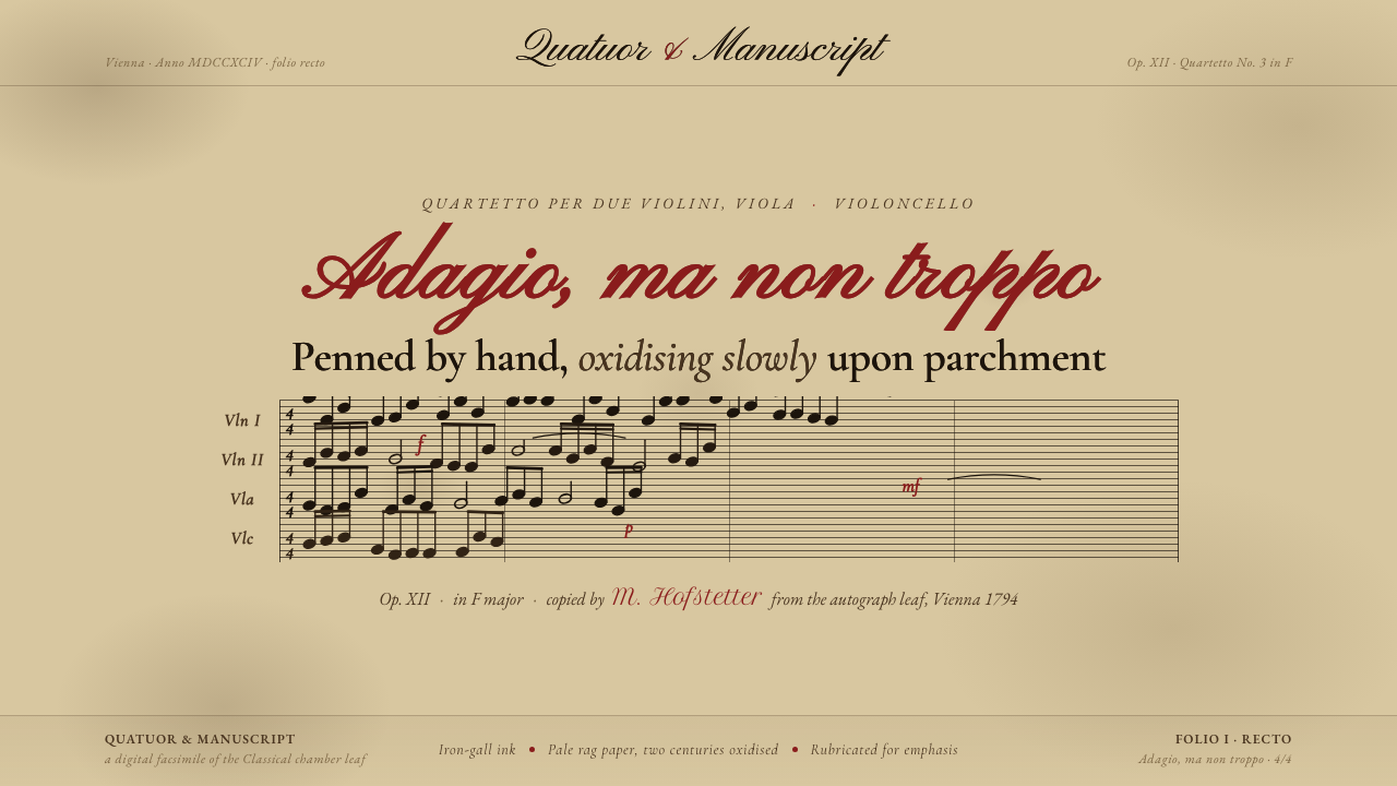 String Quartet ScorePenned by hand, oxidising slowly. Iron-gall ink browned on deep aged parchmen…
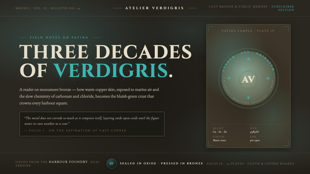 Bronze Patina StatueThree decades of weather, worn as a coat. Verdigris crust on dark bronze, eng…
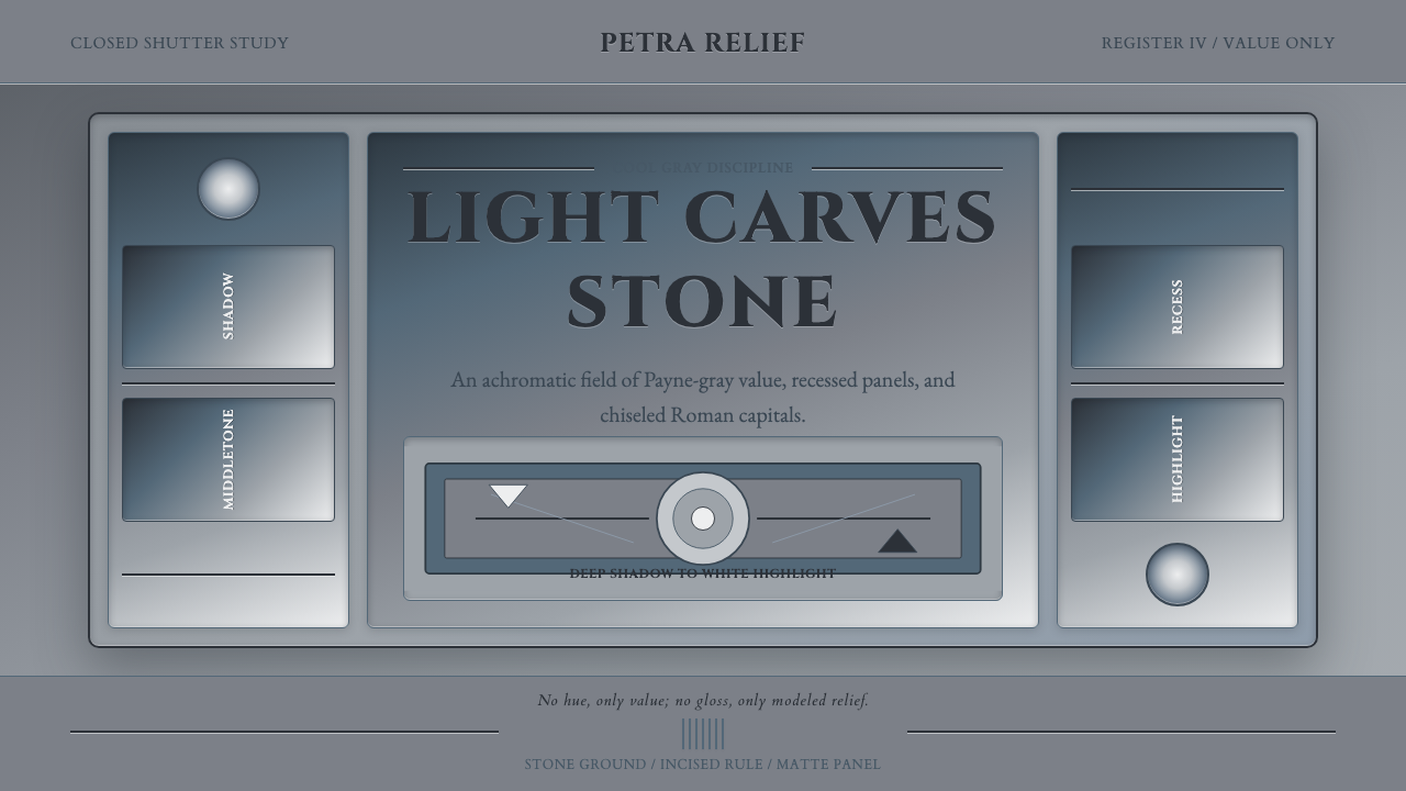 Grisaille PaintingStone without color. Payne-gray relief, Cinzel capitals, and recessed panels…