What is String Quartet Score?
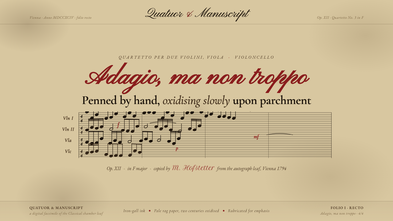
String Quartet Score treats the interface as a manuscript leaf: iron-gall ink, deep aged parchment, and the patient irregularity of music copied by hand.
String Quartet Score in brief
String Quartet Score draws from hand-copied Classical-era manuscript leaves made in Western Europe, especially the Vienna tradition. Its visual world is built from four staves resting across rag or parchment paper, with black-brown ink slowly oxidising into the page. This is not the clean authority of print; it is the quiet evidence of a hand moving carefully across a surface.
The palette begins with deep aged parchment rather than fresh cream paper. Iron-gall ink appears brown-black, softened by time but still firm enough to carry staff lines and note-heads. Occasional rubricated red introduces a restrained human interruption: a mark of emphasis, correction, or attention rather than a general decorative accent.
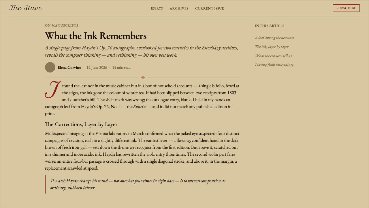
Digitally, the style translates that historical darkening into a calm editorial surface. Hand-penned irregularity, foxing stains, softened edges, and the recurring presence of four staves create atmosphere without turning the interface into theatrical nostalgia. Every element should feel placed, written, or preserved rather than manufactured for effect.
Where does String Quartet Score come from?
The source tradition belongs to the eighteenth and early nineteenth centuries, within the Classical period and a broader pre-modern manuscript culture. Before a score was encountered as a reproducible printed object, it could exist as a hand-copied leaf: a working surface in which the quality of the line, the pressure of the pen, and the colour of the ink were part of the document’s identity.
Its material language begins with rag paper or parchment. Onto that surface, scribes drew four staves in iron-gall ink and added the note-heads and other marks needed to carry the quartet’s musical structure. The result was neither perfectly uniform nor visually neutral. It recorded the act of copying as clearly as it recorded the music.
The ink’s later transformation is central to the style. Iron-gall writing oxidises slowly, turning from a darker black toward brown, while the page itself deepens and gathers the marks of age. Foxing stains and irregularities are therefore not random vintage effects; they express the long physical life of a manuscript leaf and the distance between its making and its present reading.
The cultural setting is Western Europe, with Vienna as a particularly resonant reference point within the Classical tradition. The design system honours the movement between composer, copyist, and manuscript scribe without inventing a single authorial personality. Its emotional register is deliberate and concentrated: music preserved through penmanship, read through accumulated time.
What defines the String Quartet Score look?
Aged Parchment
The ground is deep, brown, and visibly aged rather than pale, fresh, or polished. It should feel like a surface that has absorbed time: quiet enough for reading, but never blank. Subtle variation in the field gives the page a material presence while preserving the authority of the written marks.
Iron-Gall Brown
Staff lines and note-heads appear in a black-brown that has softened through oxidation. The colour is darker and more serious than ordinary brown, but less absolute than fresh black. This middle register lets the design feel archival without sacrificing contrast or legibility.
Four-Stave Structure
The four staves are the clearest compositional signature. They can sit behind a title, frame a reading area, or run quietly through a section as a recurring horizontal order. Their role is structural, not illustrative: they establish rhythm, alignment, and the sense that the page belongs to a score.
Hand-Penned Irregularity
Lines should not behave like mechanically reproduced rules. Slight shifts in pressure, alignment, and density suggest a living hand without making the interface chaotic. The irregularity is most convincing when it remains subordinate to the reading system and appears as evidence of process rather than an effect applied everywhere.
Rubricated Red
Red appears rarely and with purpose. It may identify a callout, a correction, a key transition, or a moment that deserves the reader’s attention. Its power depends on scarcity: when every element is marked, the rubric loses the particular authority associated with a manuscript annotation.
Foxing and Patina
Stains and darkened patches should be atmospheric, uneven, and quiet. They create the impression of paper that has survived handling and storage, but they must never compete with the score or obscure the reading path. Patina gives the surface history; it should not become the subject.
Who shaped String Quartet Score?
The copyist is the style’s central invisible presence. This role turns notation into a physical act: drawing the staves, placing the note-heads, and maintaining enough order for music to remain readable. The design honours that labour through controlled irregularity, visible line variation, and the feeling that every mark required attention.
The composer represents the musical structure that the manuscript preserves. In this system, composition is not portrayed through a portrait or signature but through the disciplined presence of four staves held in relation. The score becomes a meeting point between abstract musical thought and the material page.
The manuscript scribe stands for the broader hand-copying tradition surrounding Classical-era chamber music. This figure connects the page to a culture of patient transmission, where a work moves through materials, hands, and time. The style’s aged field and oxidised ink make that continuity visible without attaching it to a fabricated individual story.
How do you use String Quartet Score today?
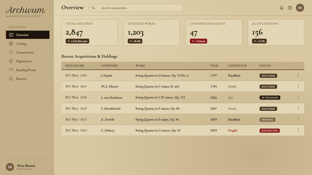
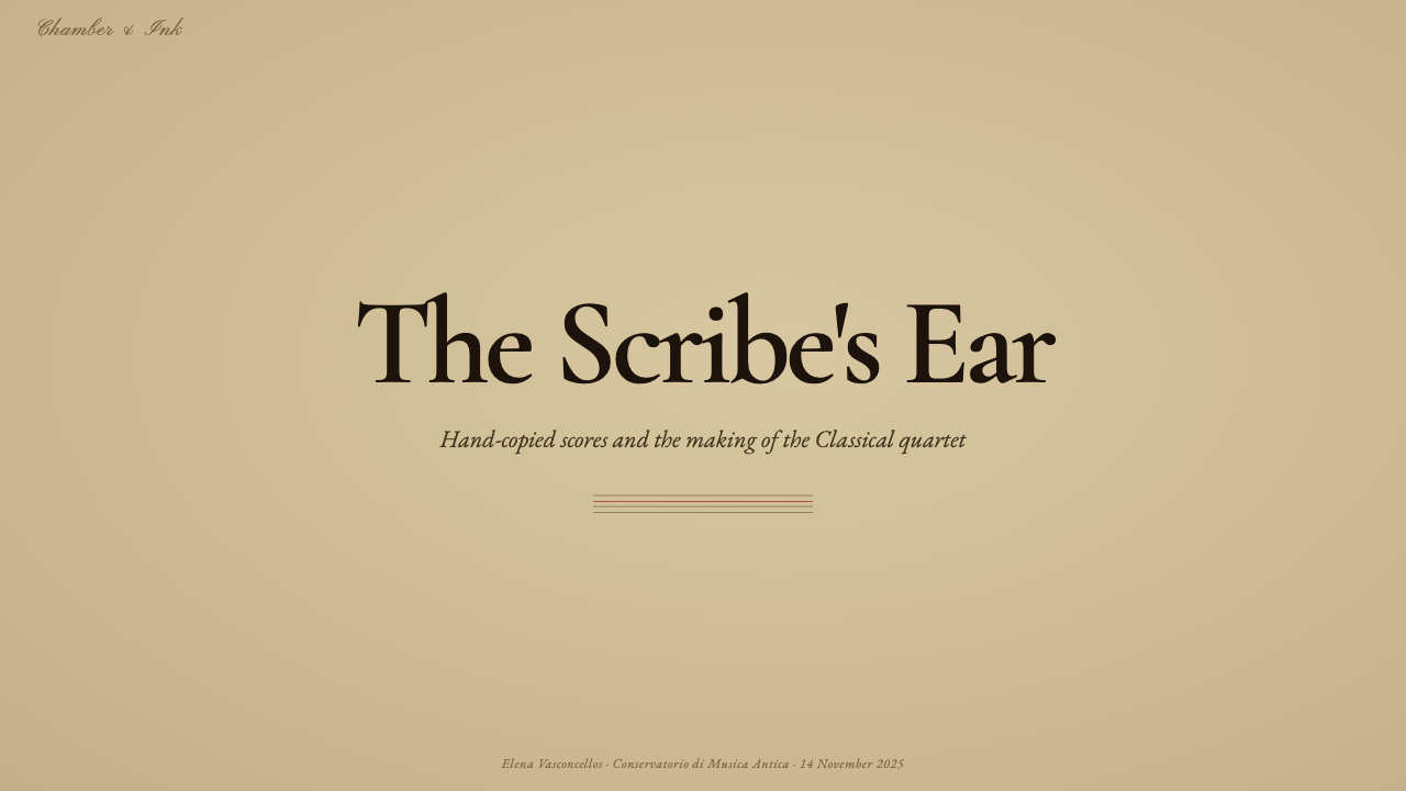
For presentation slides, use the manuscript leaf as the organizing metaphor. A cover can place the title in a quiet field of deep parchment, with four staves passing through or resting near the composition. Content slides should keep the reading surface calm and use the staves as alignment devices. Data slides can treat charts as annotations on a score: structured, legible, and punctuated by a rare rubricated-red emphasis rather than a loud multicolour system.
For web interfaces, String Quartet Score suits cultural archives, music education, publishing tools, research dashboards, and products that want to communicate patience and depth. Dashboards should use the parchment field as a continuous reading surface, with ink-brown text and red reserved for alerts, selected states, or editorial notes. Pricing pages benefit from manuscript-like comparison: clear columns, restrained dividers, and a single marked recommendation that feels annotated rather than advertised.
For editorial and marketing work, the style is strongest when it treats content as something preserved and consulted. Articles can pair a narrow reading measure with generous surrounding space, quiet staff lines, and occasional foxing that fades into the background. Campaigns can frame a product or idea as part of a longer tradition, using a hand-penned title, a parchment-toned field, and one carefully placed red mark instead of generic nostalgia.
The style also works well for interfaces that need to make slowness feel valuable. Reading lists, archival indexes, composition notes, and educational sequences can use repeated horizontal staff structures to create continuity from one section to the next. The important quality is concentration: the page should feel prepared for sustained attention, not optimized for rapid spectacle.
The most common mistake is treating the look as a package of random vintage decorations. Sepia surfaces, stains, red accents, and script-like lettering do not create String Quartet Score by themselves. The system depends on relationships: deep aged parchment against oxidised ink, four staves establishing order, irregularity kept under control, and red used sparingly. Remove any one of those relationships and the result can become a generic antique theme rather than a manuscript-derived design language.
String Quartet Score — FAQ
Is String Quartet Score meant to look like fresh sheet music?
No. Its defining surface is a manuscript leaf that has darkened across more than two centuries. Fresh cream paper and crisp black notation miss the point. The intended impression is deeper aged parchment, brown-black iron-gall ink, visible hand-penned irregularity, and a page whose material history remains present without obstructing reading.
Why are the four staves so important?
They are the clearest structural link to the source material. The staves provide horizontal rhythm, alignment, and an immediate sense of musical order. They should not be pasted on as decoration; they need to organize the page, frame content, or create continuity between sections.
How much red should the design use?
Very little. Rubricated red is powerful because it interrupts the brown-black field with intention. Use it for a selected state, a correction, a callout, or a meaningful transition. If red becomes a general background, border, or repeated decoration, it loses the authority of a manuscript mark.
Can the style use a dark digital background?
The approved reference is a light-ground system built around deep aged parchment, so a darker interface would move away from its defining material logic. If the surface becomes uniformly dark, the contrast between parchment and oxidised ink disappears, as does the sense of a manuscript leaf. Preserve the aged-paper field whenever the style’s identity matters.
How can it avoid becoming generic vintage design?
Keep the source relationships visible. Use the four staves as structure, let iron-gall brown carry the notation, make irregularity feel handwritten rather than distressed, and keep foxing quiet. Red should behave like a rubricated annotation. When every choice points back to penmanship, aged parchment, and Classical-era manuscript culture, the result remains specific.
Related design styles
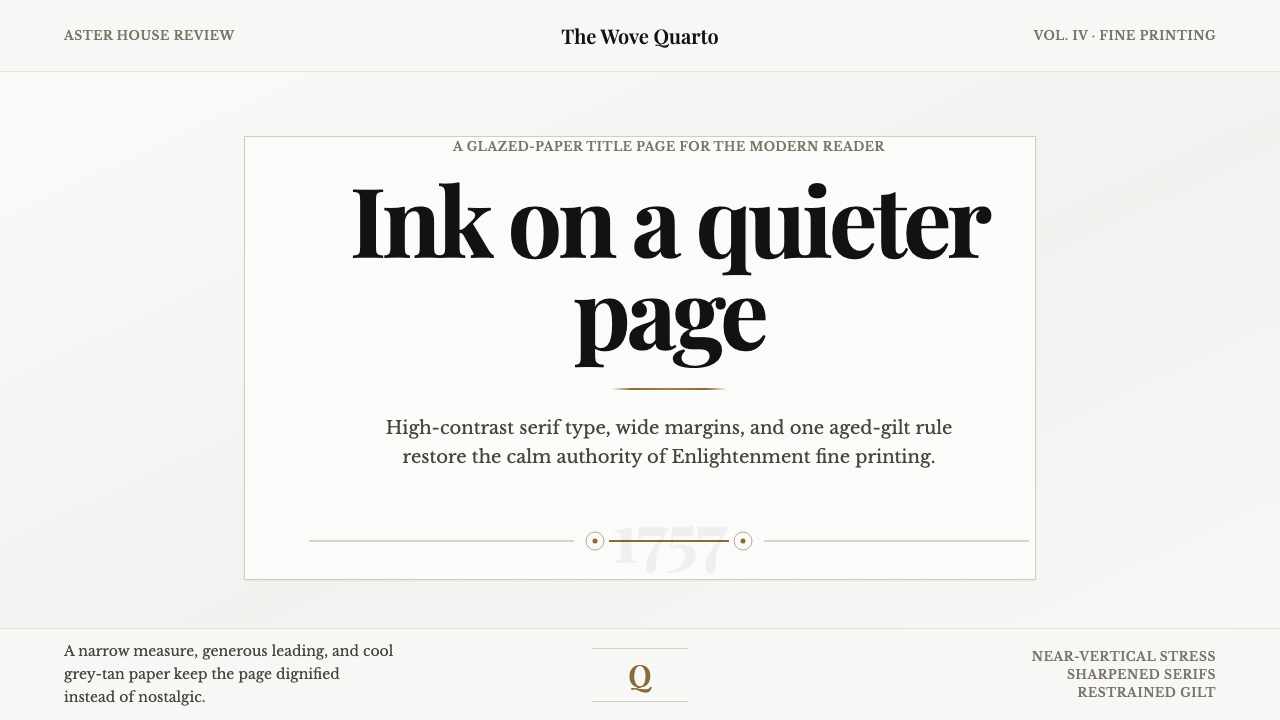 Baskerville Transitional SerifCalm authority in print. Glazed grey-tan paper, sharp serif contrast, one age…
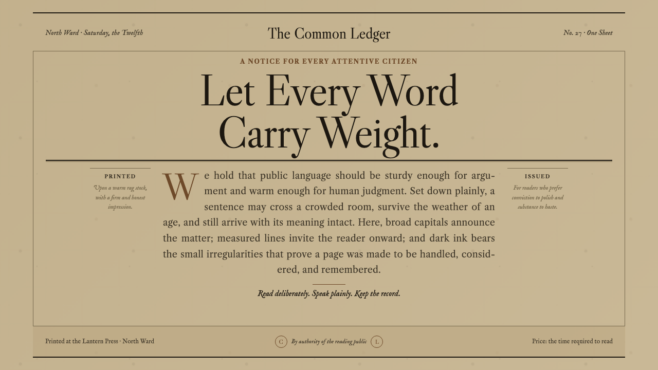 Caslon English Text SerifWarm authority, pressed into paper. Caslon capitals and engraved rules comman…
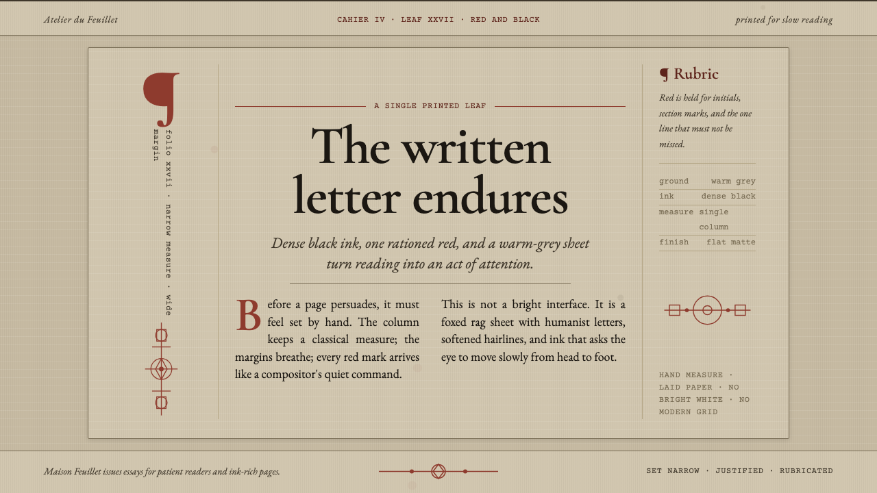 Garamond Old-Style French SerifInk ages with grace. Warm-grey rag paper, Garamond columns, and red rubric ma…
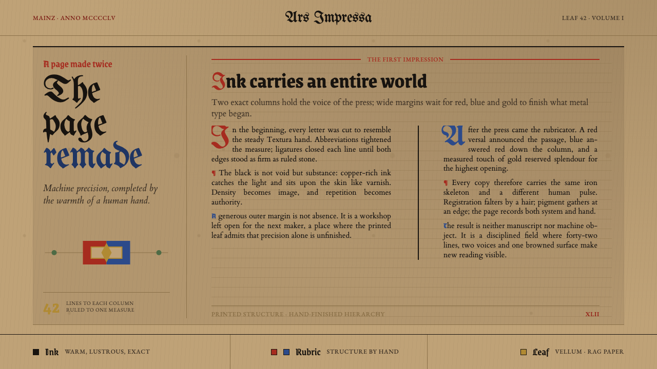 Gutenberg 42-Line BiblePrecision awaits the hand. Dense black columns open into red, blue and gold o…
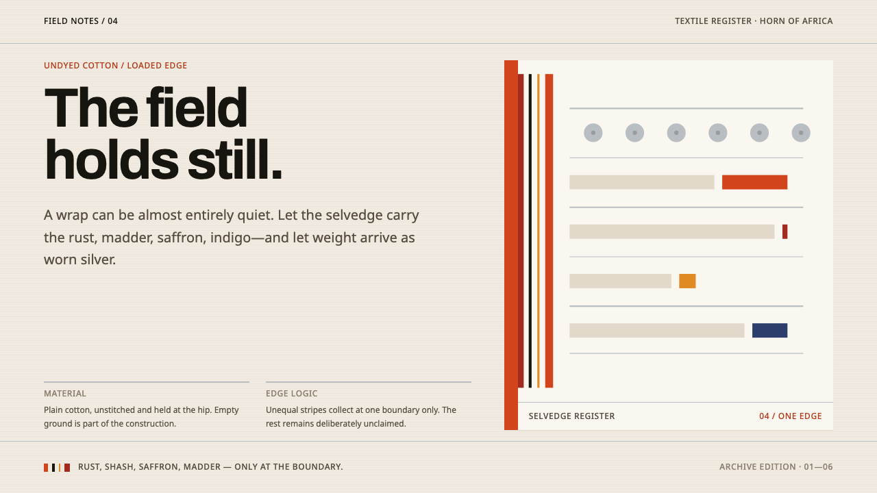 Afar Nomad TextileWeight lives at the edge. Rust and madder selvedges cut across a quiet cotton…
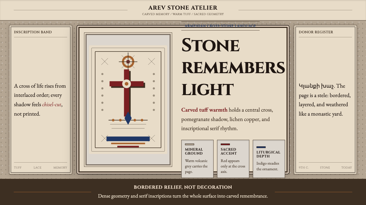 Armenian Khachkar Cross-StoneStone becomes memory. Tuff grey, pomegranate red, and carved borders hold the…