What is Garamond Old-Style French Serif?
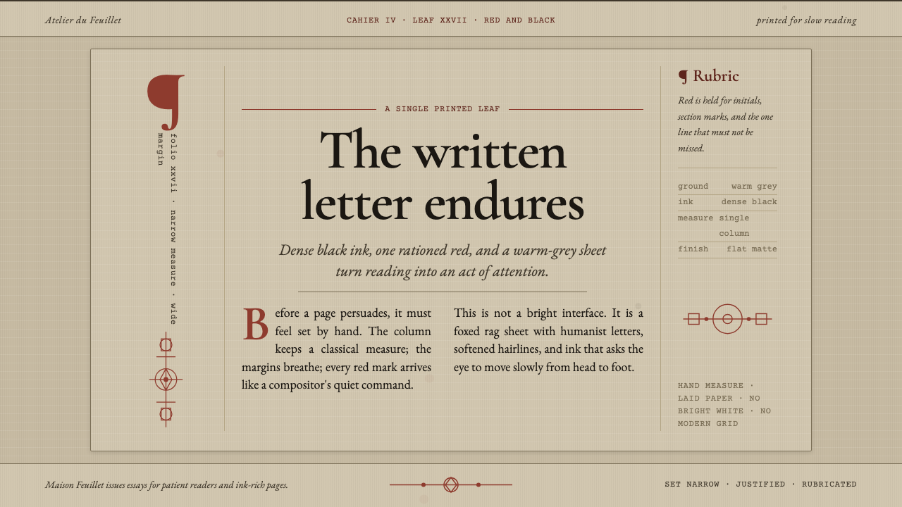
Ink ages with grace: warm-grey rag paper, calligraphic Garamond columns, and restrained red rubric marks make reading feel deliberate again.
Garamond Old-Style French Serif in brief
Garamond Old-Style French Serif is the archetypal French humanist serif, cut by Claude Garamont in Paris during the 1530s and codified by the Egenolff-Berner specimen of 1592. Its character is neither sleek nor mechanical. The letters feel drawn by a pen before they are cut in metal: stress leans through the forms, apertures remain small, and every curve carries the memory of handwriting.
The type lives on an authentic Renaissance ground rather than a neutral digital canvas. Aged laid rag book paper gives the page a muted warm-grey presence, darker and more weathered than fresh cream. Dense black ink supplies the main voice, while rubricated red is reserved for initials and section marks. The result is a page that feels printed, handled, and allowed to gather time.
Its composition is deliberately bookish: a single justified column, wide margins, drop initials, and running heads. Nothing is arranged to imitate a modern dashboard or a glossy webpage. The design asks the eye to enter a measured column, follow the rhythm of dark type across the page, and notice red only when the structure calls for emphasis.

Where does Garamond Old-Style French Serif come from?
The system begins in Paris during the French Renaissance, when Claude Garamont cut the roman forms that became its foundation. The source material places these cuts in the mid-1530s through the 1540s, with the earliest character of the style already visible in its pen-drawn construction. The letters are not conceived as abstract geometric units. Their proportions and stress follow the movement of writing, giving the page an intimate, human cadence.
Garamont’s forms belong to the French humanist Old-Style tradition. Their visual authority comes from the relationship between the written gesture and the printed impression. An inclined stress keeps the letters from appearing static; a small aperture preserves the compactness of the word; and the softened, calligraphic structure prevents dense composition from becoming sterile. The result is formal enough for sustained reading but alive enough to feel made by a hand.
The Egenolff-Berner foundry’s specimen, composed in 1592, gave the design its definitive printed reference. That specimen matters not merely as a historical record but as a model of how the letterforms should be understood: within a page, among margins, headings, initials, and ink rather than isolated as a digital sample. The style is therefore a complete typographic atmosphere, not simply a choice of serif shapes.
Its second foundation is Renaissance red-and-black printing. Black establishes the continuous body of the text, while red interrupts that continuity with deliberate signals: an initial, a section mark, or another point of orientation. The contrast is economical and structural. Together with aged rag paper, a justified column, wide margins, drop initials, and running heads, it forms a page language that feels archival without becoming theatrical.
What defines the Garamond Old-Style French Serif look?
Calligraphic Letterforms
The letters appear written before they appear constructed. Inclined stress, compact apertures, and gently shaped strokes give the face a pen-drawn rhythm. The forms are not decorative flourishes added around neutral letters; the writing gesture is built into the structure itself. This makes Garamond feel warm and literate even when set in dense, uninterrupted passages.
Old-Style Serif Structure
The serif belongs to a humanist Old-Style system rather than a rigidly engineered modern construction. Its authority comes from proportion, contrast, and the movement of the stroke. The face should be allowed to speak through long passages, where repeated forms create a quiet texture. It is strongest when treated as the primary voice of the page rather than as a nostalgic accent.
Aged Rag Paper
The ground is a laid rag book paper with a foxed warm-grey cast. It is darker and more settled than fresh cream, giving black ink a softened but still substantial field. The paper should feel fibrous, handled, and slightly uneven in spirit. Its role is not to add theatrical texture but to make the printed page feel like a material object with a past.
Single Justified Column
The page is organized around one continuous justified column. This creates a disciplined reading channel without the visual fragmentation of many panels or competing blocks. The column carries the body text, while wide margins provide the silence that allows it to breathe. The composition feels editorial because hierarchy comes from the page’s proportions and flow rather than from interface chrome.
Rubricated Red
Red is an interruption with a job to do. It marks initials, section changes, and other moments where the reader needs orientation. Because the main text remains black, the red carries immediate structural weight without taking over the page. Its restraint is essential: rubrication should feel like a hand placed on the margin, not like decoration spread across every surface.
Bookish Hierarchy
Drop initials and running heads create hierarchy through editorial convention rather than visual spectacle. A large initial opens the text as a threshold, while a running head keeps the reader aware of the page’s position within the whole. These elements are quiet but consequential. They make the composition feel continuous, navigable, and tied to the logic of a book.

Who shaped Garamond Old-Style French Serif?
Claude Garamont cut the foundational roman forms in Paris during the 1530s. His importance in this system lies in the way the letters preserve the movement of writing: inclined stress, compact apertures, and a structure that feels drawn rather than engineered. The visual language named for him is therefore inseparable from the humanist idea that printed type can retain the intelligence and warmth of the hand.
The Egenolff-Berner foundry supplied the specimen composed in 1592 that codified the Garamond model. Its role is not merely archival. The specimen anchors the face in a complete printed environment, where type, paper, margins, initials, and red-and-black hierarchy operate together. It confirms that the style is a page system rather than a loose collection of attractive letterforms.
This movement supplies the intellectual and formal category in which Garamond belongs. Its defining qualities are the visible influence of handwriting, an oblique internal stress, compact openings, and a reading texture that remains graceful under sustained use. In the article system, it functions as the governing principle: every typographic decision should preserve the feeling of letters shaped by a practiced hand.
Renaissance red-and-black printing provides the color logic of the page. Black carries the continuous body of knowledge; red identifies moments of structure and orientation. The relationship is restrained rather than ornamental, allowing rubrication to remain meaningful. Used with aged paper and a single column, it gives the page the authority of a printed leaf without turning history into costume.
How do you use Garamond Old-Style French Serif today?
For presentation slides, the cover should establish the page as a printed leaf: a warm-grey ground, a Garamond title with generous surrounding space, and a single red initial or rubric mark to give the composition its point of entry. Content slides should keep the body in a disciplined column with running heads or quiet section labels. Data slides should rely on black as the continuous field and use red only to identify the decisive category, change, or annotation, preserving the style’s editorial calm.
For web dashboards and pricing pages, Garamond works best when the interface accepts reading as its primary activity. Use the warm-grey paper tone as the surrounding field, dense black for the main text, and rubricated red for selected states, section markers, or the most important distinction. Keep the hierarchy typographic and let wide margins separate areas of information. The page should feel like a navigable book leaf, not a collection of glossy panels.
For editorial websites and marketing pages, the style supports long-form authority. Articles can open with a drop initial, continue through a single justified measure, and use running heads to maintain orientation. Marketing covers can borrow the contrast between quiet paper and dense ink, introducing red only where the message needs a clear signal. The strongest result is not theatrical antiquarianism but a sense that the material has been carefully composed, printed, and preserved.
The same system suits educational and archival communication because it makes information feel worth attending to. A section should begin with a clear typographic threshold, then settle into continuous prose. Margins can hold small structural cues without becoming a second interface. The visual rhythm should alternate between the concentrated black of reading and the occasional red interruption that tells the reader where the argument turns.
The common mistake is to treat Garamond as a vintage font placed on an otherwise modern page. Clean white space without material warmth, scattered cards, excessive red, and decorative historical textures all weaken the system. Another mistake is to multiply columns in the name of density. The style depends on a single reading channel, wide margins, restrained rubrication, and the feeling that every mark belongs to the logic of a real printed book.

Garamond Old-Style French Serif — FAQ
Is Garamond Old-Style French Serif simply a Garamond font choice?
No. The typeface is the foundation, but the system also requires the ground and the page logic associated with it: aged laid rag paper, dense black ink, restrained rubricated red, a single justified column, wide margins, drop initials, and running heads. Without those relationships, Garamond can become a nostalgic accent detached from its French humanist and Renaissance printing character.
What makes the letterforms feel humanist?
Their construction follows the behavior of writing rather than the neutrality of geometric engineering. The inclined stress, small aperture, and pen-drawn curves make the letters feel as though they were written before they were cut. That quality gives long passages a living rhythm while keeping the page formal and highly readable.
Why is the paper darker than fresh cream?
The warmer, foxed grey of aged rag paper supplies the authentic ground described by the system. It softens the contrast of dense black ink without making the page feel blank or contemporary. The paper also gives the composition material memory, so the reader encounters an object that feels printed and handled rather than a clean screen carrying historical decoration.
How should the red rubric marks be used?
Red should identify structure: an initial, a section mark, or another moment where orientation matters. It should not compete with the continuous black body of the text or spread across the page as a decorative pattern. Its power comes from interruption and scarcity. When red appears, the reader should understand that the page is pointing to something.
Can this Renaissance page system work in a digital interface?
Yes, provided the digital surface preserves the underlying relationships. Keep the page warm and material in spirit, let Garamond carry the main reading voice, organize content through a single clear column, and use red as a restrained navigational signal. The goal is not to imitate every physical detail but to preserve the experience of a deliberate printed page rather than turning the style into a decorative skin.
Related design styles
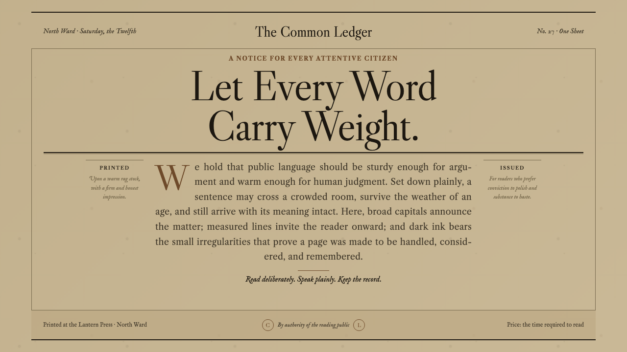 Caslon English Text SerifWarm authority, pressed into paper. Caslon capitals and engraved rules comman…
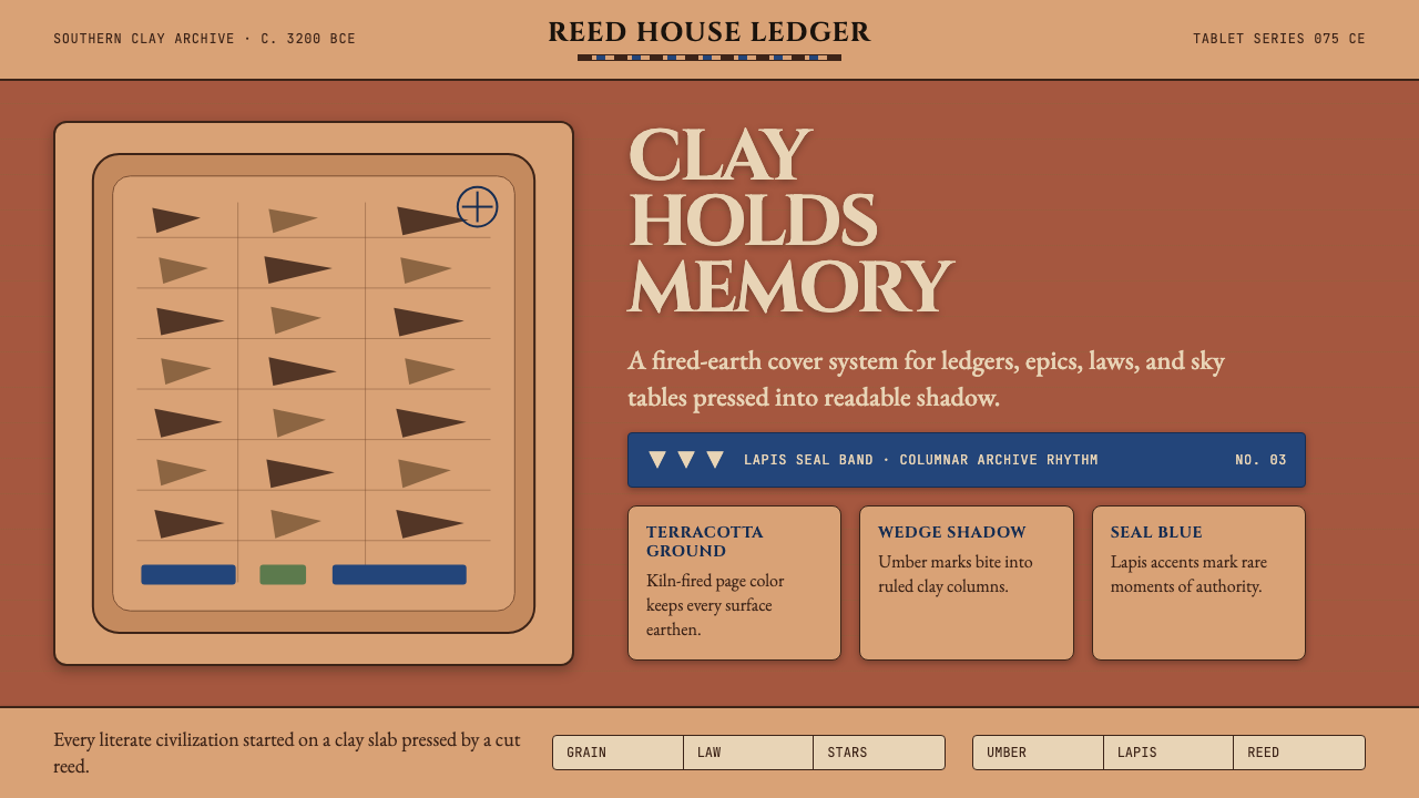 Mesopotamian Cuneiform TabletsWritten memory feels fired. Terracotta, umber wedges, and lapis bands build t…
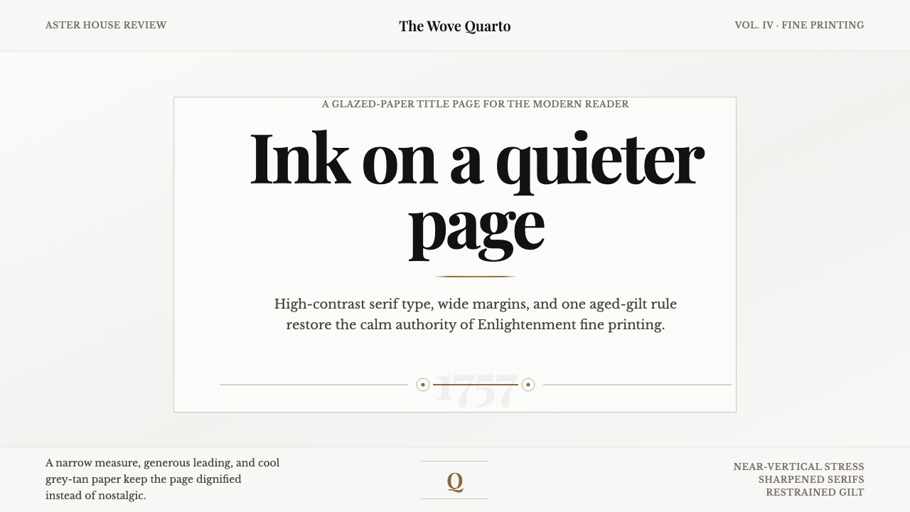 Baskerville Transitional SerifCalm authority in print. Glazed grey-tan paper, sharp serif contrast, one age…
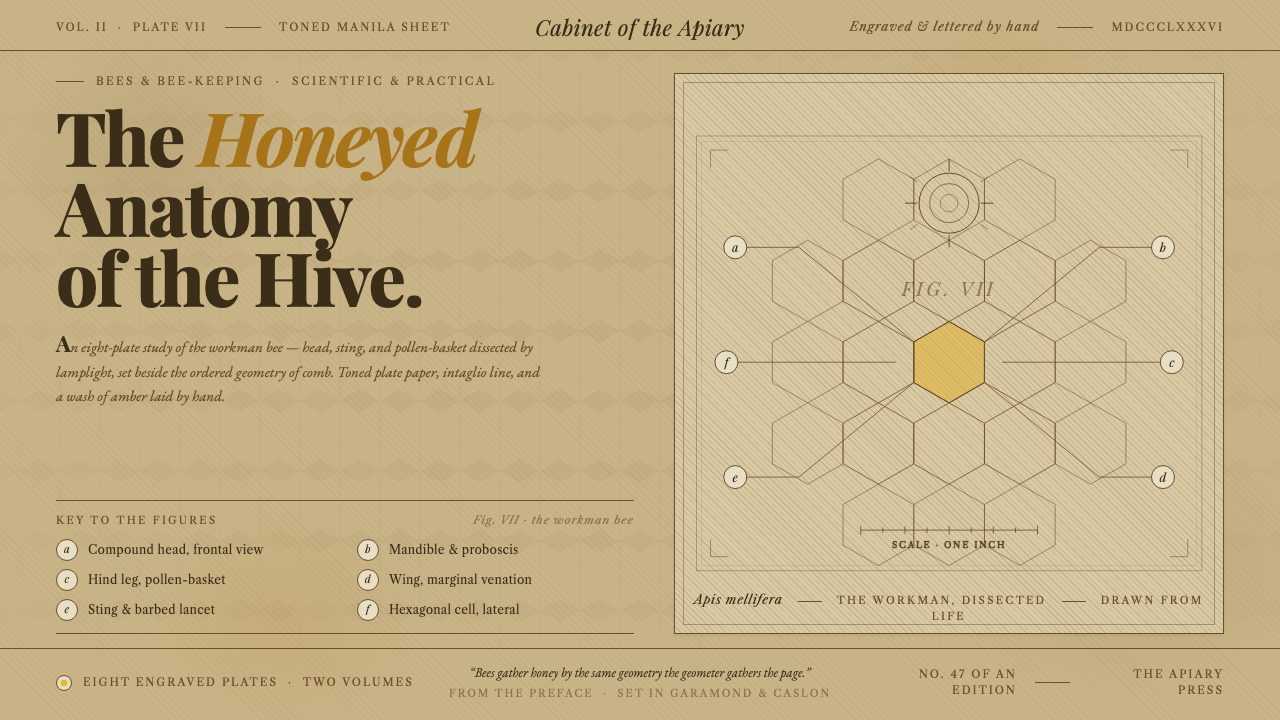 Honeybee Anatomy PlateAn 1886 beekeeping manual, reopened. Amber wash over engraved anatomy, letter…
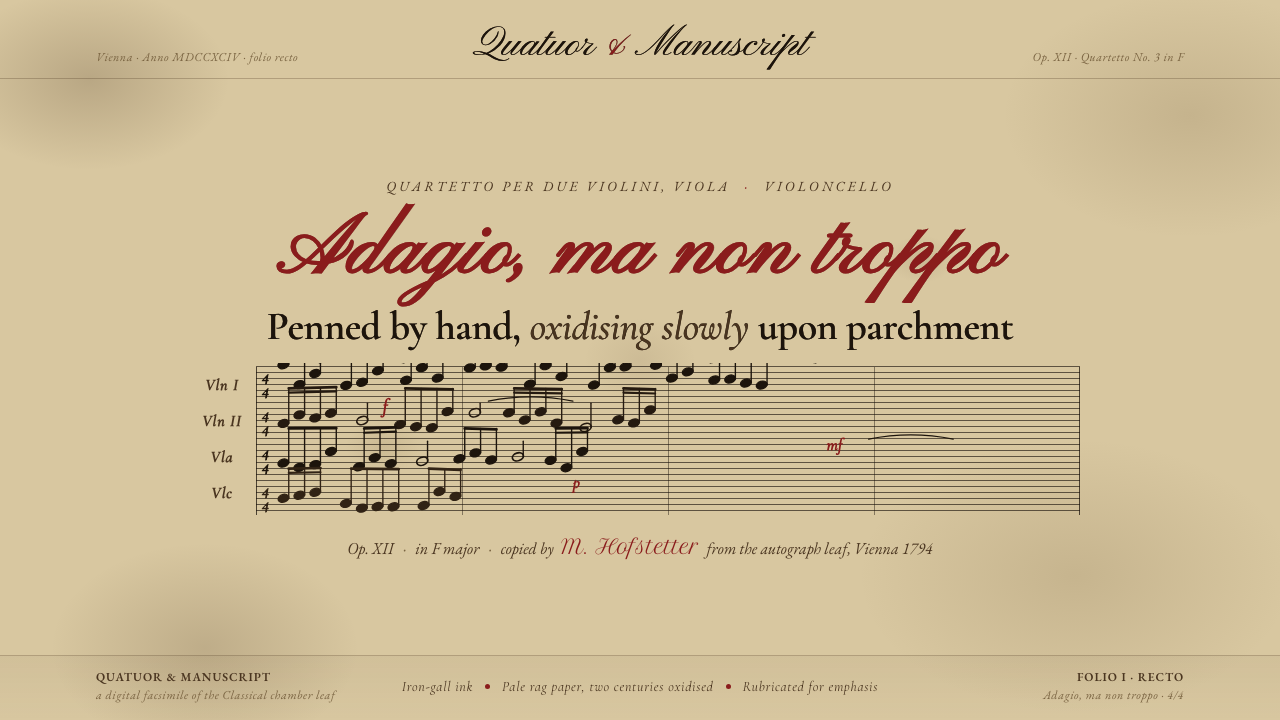 String Quartet ScorePenned by hand, oxidising slowly. Iron-gall ink browned on deep aged parchmen…
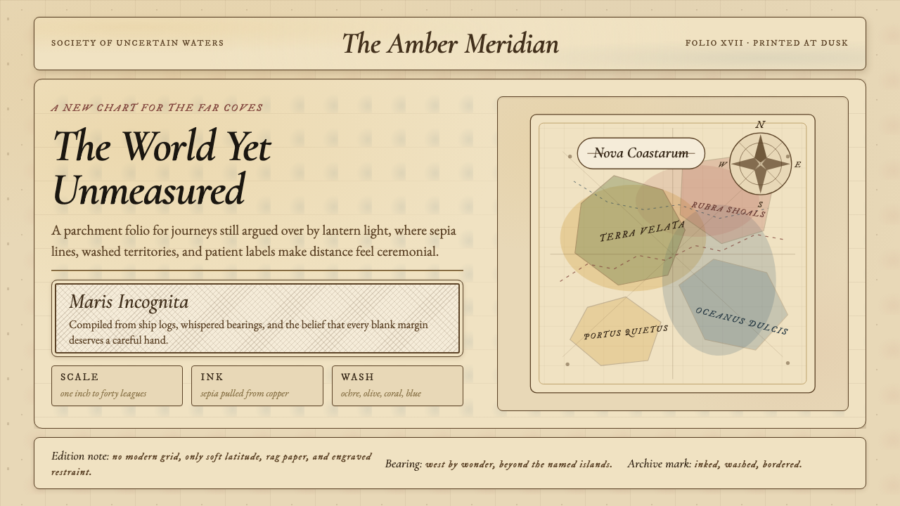 Vintage CartographyDiscovery feels ceremonial. Sepia copperplate on aged parchment, framed by co…