Design style guide设计风格指南
What is Mesopotamian Cuneiform Tablets?什么是 Mesopotamian Cuneiform Tablets?
Cuneiform — the world's oldest legible writing — pressed three millennia of civilization into clay, and its fired-earth palette and wedge-shadow geometry translate into one of the most distinctive design languages available to contemporary AI.楔形文字是地球上最古老的可辨认书写系统,三千年文明以楔痕印入泥土——它的烧陶色调与楔形阴影几何,构成了当代 AI 可取用的最具辨识度的设计语言之一。
Mesopotamian Cuneiform Tablets in briefMesopotamian Cuneiform Tablets 速览
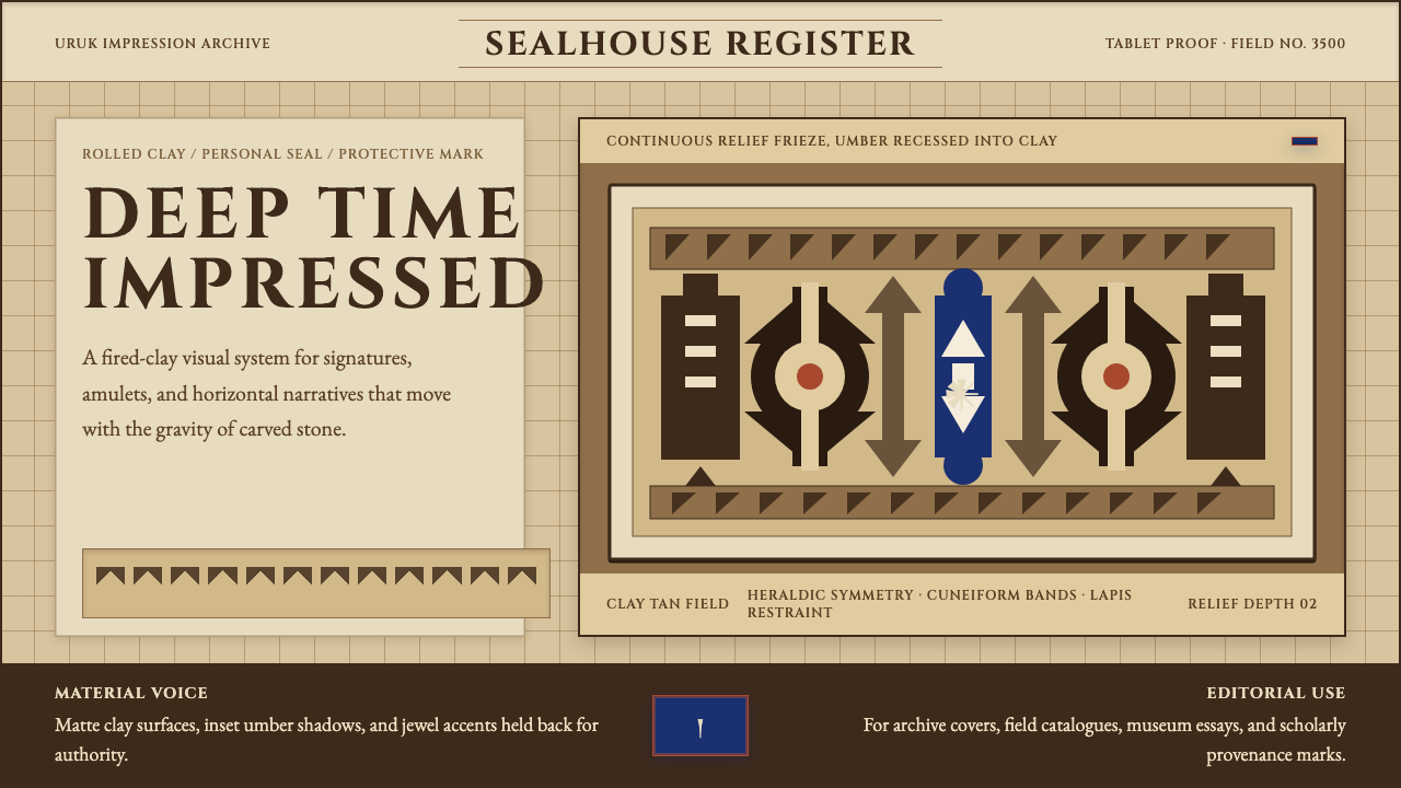
Mesopotamian Cuneiform Tablets is a design style rooted in the material reality of the world's earliest bureaucratic archive. Cuneiform — from the Latin for 'wedge-shaped' — was invented in southern Mesopotamia around 3200 BCE, when temple administrators needed a way to record grain allocations, livestock counts, and labor assignments at a scale that human memory could no longer manage. Scribes pressed the blunt triangular tip of a cut reed stylus into wet clay tablets, producing the characteristic wedge and chevron impressions that give the script its name. Over three millennia, the system expanded from accounting tokens to epic poetry, legal codes, astronomical tables, and diplomatic correspondence — recorded across a dozen languages from Sumerian to Old Persian.美索不达米亚楔形文字泥板是一种根植于世界最早官僚档案馆物质现实的设计风格。楔形文字——源自拉丁语楔形——约于公元前 3200 年在美索不达米亚南部发明,彼时神庙管理者需要一种能够记录粮食分配、牲畜数量与劳动摊派的方法,规模已超出人类记忆所能承载。书吏用削尖的芦苇杆将三角形尖端压入湿泥板,留下特有的楔形与箭形痕迹,系统因此得名。三千年间,它从记账符号扩展至史诗、法典、天文表与外交函件,横跨苏美尔语至古波斯语的十余种语言。
The design language translates this archival physicality into a contemporary visual system. The defining palette draws from the kiln and the excavation site: fired-clay terracotta as the dominant ground tone, sun-baked clay as a warmer surface register, deep umber shadow filling the recessed wedge impressions, and the rare, precious lapis lazuli blue — quarried in what is now Afghanistan and traded across Mesopotamia for cylinder seals and temple inlay — as the single accent of saturated color. Every surface in this system feels like earth that has passed through fire, never like paper, parchment, or screen.这套设计语言将档案馆的物质性转化为当代视觉系统。其定义色板来自窑炉与发掘现场:烧制陶土的赤褐色作为主导底调,晒干泥板的暖色调作为表面层次,深棕褐色填充楔痕凹陷的阴影,以及罕见而珍贵的青金石蓝——这种矿石产自今阿富汗,沿贸易路线输入美索不达米亚,用于圆柱形印章与神庙镶嵌——作为唯一的高饱和强调色。这套系统中的每一个表面都如同经过窑火淬炼的泥土,绝非纸张、羊皮卷或屏幕的质感。
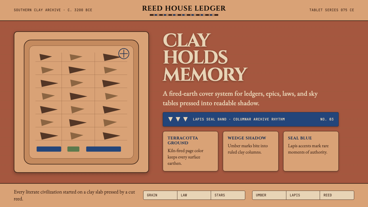
Structurally, the style organizes information the way a cuneiform tablet organizes text: in ruled registers, reading left-to-right and top-to-bottom, with column markers and dividing lines giving spatial structure to dense content. Wedge shapes recur as decorative and functional motifs — as bullet markers, section dividers, directional indicators. The overall effect is one of weight, permanence, and archival authority, a sense that whatever is recorded here has been fired into lasting form.在结构上,这种风格组织信息的方式如同楔形文字泥板组织文字:水平分栏、从左至右、从上至下,以栏标与分割线为密集内容赋予空间秩序。楔形母题作为装饰性与功能性元素反复出现——充当列表标记、段落分隔符与方向指示符。整体效果营造出一种重量感、永久感与档案权威感,令人感到无论记录于此的内容,皆已被烧制为持久的形态。
See the Mesopotamian Cuneiform Tablets design system →查看 Mesopotamian Cuneiform Tablets 完整设计系统 →
Where does Mesopotamian Cuneiform Tablets come from?Mesopotamian Cuneiform Tablets 从何而来?
The earliest cuneiform tablets, dating to around 3200–3000 BCE and unearthed primarily at Uruk (in what is now southern Iraq), were not literature — they were receipts. Temple administrators of the Eanna precinct used the system to track the redistribution of agricultural surplus: so many jars of barley to this worker, so many sheep allocated to that estate. The script began as a set of pictographic tokens impressed into clay envelopes, then gradually abstracted into the wedge-and-line system recognizable today. The transition from pictograph to phonetic sign — from a drawing of a foot meaning 'foot' to a combination of wedges meaning the syllable 'du' — took several centuries and represents one of the most consequential intellectual developments in human history.最早的楔形文字泥板约可追溯至公元前 3200 至 3000 年,主要出土于乌鲁克(今伊拉克南部)。这些泥板最初并非文学作品,而是收据。乌鲁克埃安娜神庙区的管理者用这套系统追踪农业剩余物资的再分配:多少罐大麦分配给这位工人,多少头羊划拨给那处庄园。文字起源于压印进泥土封套的象形符号,此后逐渐抽象为今日所见的楔线系统。从象形符号到音节符号的转变——从脚的图画意味脚,到楔形组合读作音节du——历时数百年,是人类历史上影响最深远的智识演进之一。
The Old Babylonian period (roughly 2000–1600 BCE) was the script's classical age. Under rulers such as Hammurabi of Babylon, cuneiform became the instrument of codified law. The famous stele of Hammurabi — nearly two and a half meters tall, carved in diorite, and now housed in the Louvre — records 282 legal provisions in neat cuneiform columns, topped by a bas-relief showing Hammurabi receiving the laws from the sun god Shamash. At the same time, scribal schools called edubba ('tablet house') trained professional scribes in the full repertoire of Sumerian and Akkadian literature, including the Epic of Gilgamesh, the world's oldest surviving work of literary narrative. Scribal education was rigorous: students copied canonical texts repeatedly until they could reproduce them without error, developing a muscular, confident wedge pressure that is visible in surviving tablets.古巴比伦时期(约公元前 2000 至 1600 年)是这套文字的古典时代。在汉谟拉比等统治者治下,楔形文字成为成文法律的工具。著名的汉谟拉比法典石柱——近两米半高,以闪长岩刻制,现藏卢浮宫——以整齐的楔形文字竖列记载 282 条法律条文,顶部浮雕呈现汉谟拉比从太阳神沙马什手中接受法律。与此同时,被称为埃杜巴(泥板之屋)的书吏学校培训专业书吏,掌握苏美尔语与阿卡德语文学的全部曲目,其中包括《吉尔伽美什史诗》——世界上现存最古老的文学叙事作品。书吏教育极为严格:学生反复抄写经典文本直至能够无误复现,由此养成一种有力而自信的楔痕压力,在留存至今的泥板上清晰可见。
The Assyrian period (roughly 900–600 BCE) gave the world its first systematically organized library. King Ashurbanipal of Nineveh, who ruled from 668 to approximately 627 BCE, dispatched agents across the Mesopotamian world to collect, copy, and catalog every tablet they could find. The resulting library at Nineveh contained tens of thousands of tablets organized by subject — divination, medicine, astronomy, mythology, history — each stored in clay jars or wooden boxes on shelved rooms. When the Assyrian empire fell to Babylonian and Median forces in 612 BCE and Nineveh was sacked, the library's roof collapsed, burying the tablets under rubble and baking them further in the fires — accidentally creating the best-preserved archive of ancient knowledge yet discovered. The tablet-room aesthetic of this archive directly inspires the design system's sense of ordered, fireproof permanence.亚述时期(约公元前 900 至 600 年)为世界留下了第一座系统组织的图书馆。尼尼微国王亚述巴尼拔(约公元前 668 至 627 年在位)遣派使者遍走美索不达米亚,收集、抄录与编目所能找到的每一块泥板。尼尼微图书馆由此藏有数万块泥板,按主题分类——占卜、医学、天文、神话、历史——各储于泥罐或木箱中,置于有架房间内。公元前 612 年亚述帝国为巴比伦与米底联军所灭、尼尼微被洗劫时,图书馆屋顶塌陷,将泥板埋于瓦砾之下,大火反而进一步烧制了它们——意外创造出迄今所发现的最完好的古代知识档案。这座档案馆的泥板室美学,正是本设计系统所唤起的那种有序、防火、历久弥坚之感的直接源泉。
Cuneiform was finally deciphered in the nineteenth century through the work of several European scholars, most notably Henry Rawlinson, a British officer stationed in Persia who copied and then decoded the trilingual Behistun Inscription — carved high on a cliff face in what is now western Iran by order of the Achaemenid king Darius I around 520 BCE. The inscription recorded the same text in Old Persian, Elamite, and Babylonian cuneiform. By 1857, Rawlinson and three other scholars independently translated the same Assyrian text, proving that cuneiform had been correctly read. The decipherment transformed what had been visually arresting but semantically opaque tablet surfaces into legible historical documents, and it established the scholarly discipline of Assyriology. The physical tablets themselves — especially the large, formally ruled administrative and literary tablets — became aesthetic objects as well as historical evidence, influencing later designers drawn to the combination of geometric rigor and material warmth.楔形文字最终在十九世纪经由数位欧洲学者的努力而被破解,其中最重要的是英国军官亨利·罗林森。他驻扎波斯期间抄录并解读了贝希斯敦铭文——该铭文由阿契美尼德王朝国王大流士一世约于公元前 520 年下令刻于今伊朗西部悬崖峭壁之上,以古波斯语、埃兰语和巴比伦楔形文字三语记载同一内容。1857 年,罗林森与另外三位学者各自独立译出同一段亚述文本,证明楔形文字已被正确读解。破译工作将那些视觉上引人入胜却语义不明的泥板表面,转化为可读的历史文献,并确立了亚述学这一学术学科。泥板本身——尤其是那些大幅、有规则行列的行政与文学泥板——也成为兼具历史证据与审美价值的对象,影响了后来那些被几何严谨与材料温度之结合所吸引的设计师。
What defines the Mesopotamian Cuneiform Tablets look?Mesopotamian Cuneiform Tablets 的视觉特征是什么?
Palette色板
The color system centers on the tonal range of fired and sun-dried clay: a warm terracotta anchors backgrounds, a lighter buff-clay tone lifts surface elements, and a deep umber fills recessed impressions and shadow areas. Against this earth register, lapis lazuli blue — deep, saturated, and used with extreme restraint — functions as the sole accent, evoking the rare stone used in cylinder seals and royal jewelry. There is no cool white, no neutral grey; every tone carries the warmth of kiln-fired earth.色彩系统以烧制与晒干泥板的色调范围为核心:温暖的赤陶色锚定背景,较浅的浅棕黏土色提亮表面元素,深棕褐色填充凹陷的楔痕与阴影区域。在这片大地色调之上,青金石蓝——深沉、高饱和、用法极为克制——作为唯一强调色,唤起用于圆柱形印章与皇室珠宝的珍贵矿石。这里没有冷白,没有中性灰;每一种色调都承载着窑火陶土的暖意。
Surface Texture表面质感
The defining tactile quality is that of pressed clay: slightly rough, warm, and yielding. In digital applications, this translates to surfaces that carry a subtle grain or matte quality rather than the reflective smoothness of glass or polished metal. Cards and containers feel heavy and grounded, as though they have physical mass. The goal is to evoke the material memory of fired ceramic without resorting to literal photographic texture — the grain is suggested, not simulated.最具特征的触觉品质来自被压印的泥土:略显粗糙、温暖而有弹性。在数字应用中,这转化为带有细微颗粒感或哑光品质的表面,而非玻璃或抛光金属的反光平滑。卡片与容器感觉沉重而有根基,仿佛拥有实体质量。目标是唤起烧制陶瓷的材料记忆,而不必依赖字面意义上的摄影纹理——颗粒感是被暗示的,而非被模拟的。
Wedge Motif楔形母题
The wedge — the fundamental mark of cuneiform writing — recurs throughout the system as both a decorative and functional element. Horizontally oriented, it functions as a directional indicator or list bullet. Vertically stacked, it creates section dividers or ruled register lines. Used in clusters, it evokes the dense field of impressed marks on a well-inscribed tablet. The wedge is never merely decorative; in authentic applications of this style, every wedge mark carries positional logic derived from the original scribal practice.楔形——楔形文字书写的基本笔痕——作为装饰性与功能性元素贯穿整个系统。水平朝向时,它充当方向指示符或列表标记;垂直堆叠时,构成段落分隔符或栏格线。成簇使用时,它唤起一块刻写精良的泥板上密集的楔印原野。楔形从不仅仅是装饰;在这种风格的真实应用中,每一个楔形标记都承载着源自原始书吏实践的位置逻辑。
Register and Grid分栏与网格
Cuneiform tablets were written in ruled horizontal registers, often divided into columns by vertical lines — a spatial organization system developed to maximize the information density of a finite clay surface. The design style inherits this columnar, register-based structure. Layouts are divided into clear horizontal bands, with strong vertical column logic organizing content within each band. This is not a minimalist grid in the contemporary sense; it is a dense, structured archive grid where every zone carries content.楔形文字泥板书写于有横线的分栏之中,常以竖线分隔为多列——这套空间组织系统是为了最大化有限泥土表面的信息密度而发展出来的。设计风格继承了这种基于栏格的结构。版面被划分为清晰的水平分段,强烈的垂直列逻辑在每个分段内组织内容。这并非当代意义上的极简网格;它是一种密集的、结构化的档案网格,其中每个区域都承载着内容。
Shadow and Impression阴影与压痕
Depth in this system is expressed through the logic of impressed clay rather than cast light. Shadows are directional and hard-edged — they represent the physical cavity left by a stylus pressing into a surface, not the soft diffusion of ambient illumination. Elements appear to be either raised above the ground plane (like the clay surface around an impressed mark) or recessed into it (like the impression itself). This gives the visual system a sense of low relief sculpture rather than flat graphic design.这套系统中的深度通过压印泥土的逻辑而非投射光线来表达。阴影是有方向性的硬边——它们代表书写工具压入表面所留下的物理凹陷,而非漫射环境光的柔和扩散。元素看起来要么凸出于底面之上(如楔痕周围的泥土表面),要么凹入其中(如印痕本身)。这赋予视觉系统一种浅浮雕雕塑感,而非平面图形设计感。
Typography Register字体层级
Because cuneiform itself is a writing system, typography in this design style carries particular conceptual weight. Typeface choices lean toward the monumental and lapidary — letterforms that feel carved or pressed rather than drawn or printed. Display text benefits from wide letter-spacing to evoke the deliberate spacing of cuneiform signs in a register. Body text should feel dense but legible, recalling the close but orderly packing of signs on a well-executed administrative tablet.由于楔形文字本身即是一套书写系统,这种设计风格中的字体排印承载着特别的概念重量。字体选择偏向纪念碑式与石刻式——字形给人以雕刻或压印之感,而非书写或印刷之感。展示性文字适合使用宽字距,以唤起楔形文字符号在栏格中刻意留白的间隔。正文字体应当密集而清晰,令人联想起一块执行精良的行政泥板上符号的紧凑而有序的排列。
Material Permanence材质永久性
The system carries an aesthetic of permanence and weight that distinguishes it from more ephemeral digital styles. Where much contemporary design suggests lightness and transience — thin hairline type, transparent overlays, evanescent micro-animations — this style suggests the opposite: content that has been pressed into material form and fired to last. Elements do not float or fade; they sit, they are grounded, and they convey the sense that the information they carry has been archived for the long term.这套系统承载着一种永久感与重量感,使其区别于更多短暂性的数字风格。许多当代设计暗示轻盈与流逝——细如发丝的字体、半透明叠层、转瞬即逝的微动效——而这种风格则传达相反的信息:内容已被压入物质形态并烧制以求持久。元素不漂浮,不消隐;它们静置,它们有根基,传达出所承载的信息已被长期存档的意涵。
See the Mesopotamian Cuneiform Tablets design system →查看 Mesopotamian Cuneiform Tablets 完整设计系统 →
Who shaped Mesopotamian Cuneiform Tablets?谁塑造了 Mesopotamian Cuneiform Tablets?
Enheduanna, daughter of Sargon of Akkad, lived around 2300 BCE and is the earliest named author in human history whose works survive. As high priestess of the moon god Nanna at Ur, she composed hymns to the goddess Inanna that remain among the most powerful lyric poems of the ancient world. Her authorship — explicitly credited in the tablets — established the cuneiform tablet as the medium of individual literary voice, not merely administrative record. She is cited in the design system's lineage as the figure who transformed pressed clay from ledger to literature.恩赫杜安娜是阿卡德国王萨尔贡之女,生活于约公元前 2300 年,是人类历史上有作品存世的最早留名作者。身为乌尔月神南纳的高祭司,她为女神伊南娜创作的赞美诗至今仍是古代世界最有力量的抒情诗篇之一。她的著作权——在泥板上有明确署名——确立了楔形文字泥板作为个人文学声音之媒介的地位,而不仅仅是行政记录工具。她在这套设计风格的谱系中,是将压印泥土从账本转化为文学的那位人物。
Hammurabi, who ruled Babylon from approximately 1792 to 1750 BCE, is inseparable from the visual history of cuneiform. His law code — inscribed on a basalt stele in formal cuneiform columns, displayed publicly in Babylon's central market — represents the most famous single use of the script as an instrument of civic communication. The stele's combination of monumental physical scale, columnar text organization, and royal imagery at the apex established a visual template for authoritative public inscription that echoes through the design tradition.汉谟拉比(约公元前 1792 至 1750 年在位)与楔形文字的视觉历史密不可分。他的法典——以正式楔形文字竖列刻于玄武岩石柱之上,公开展示于巴比伦中央市场——是这套文字作为公民传播工具最著名的单次使用案例。石柱将纪念碑式的物理规模、竖列文字组织与顶部王权图像相结合,确立了一种权威性公共铭文的视觉范式,其回响贯穿整个设计传统。
Ashurbanipal, Assyrian king from 668 to approximately 627 BCE, created the first systematically organized library in human history at his capital Nineveh. His obsessive project of collecting, cataloging, and copying tablets from across the known world produced an archive whose room-by-room organization, subject classification, and clay-jar storage system anticipated modern library science. The aesthetic of the Nineveh archive — ordered rooms, labeled containers, dense rows of inscribed tablets — is the direct visual inspiration for the design system's sense of structured, permanent information storage.亚述巴尼拔(公元前 668 至约 627 年在位)在其都城尼尼微创建了人类历史上第一座系统组织的图书馆。他痴迷于从已知世界各地收集、编目与抄录泥板,由此产生的档案库以逐室组织、主题分类与泥罐储存系统,预示了现代图书馆学。尼尼微档案馆的美学——有序的房间、标记的容器、密排的刻字泥板——是本设计系统所唤起的那种结构化、永久性信息储存感的直接视觉灵感来源。
Henry Rawlinson (1810–1895), a British army officer and diplomat, accomplished the foundational act that transformed cuneiform from a visually compelling but illegible surface into a readable historical record. While stationed in Persia, he undertook the dangerous task of copying the Behistun Inscription — carved high on a cliff face in trilingual cuneiform — and then spent years decoding it. By 1857, his work and that of three other scholars had produced independently verified translations that proved the script had been correctly read. Without Rawlinson, the tablet aesthetic would remain beautiful abstraction; with him, it became documented history.亨利·罗林森(1810—1895),英国陆军军官与外交官,完成了将楔形文字从视觉引人入胜但无法辨读的表面转化为可读历史档案的奠基性工作。驻扎波斯期间,他冒险抄录了贝希斯敦铭文——以三语楔形文字刻于高耸峭壁之上——此后数年致力于解读。到 1857 年,他与另外三位学者各自独立完成了相互验证的译文,证明这套文字已被正确读解。没有罗林森,泥板美学将停留于美丽的抽象;有了他,它成为有文可查的历史。
The anonymous scribes trained in the Mesopotamian edubba — the scribal school or 'tablet house' — are collectively responsible for the visual quality of cuneiform as a design system. Scribal education required years of copying canonical texts, developing the muscular control needed to produce consistent wedge depth, angle, and spacing. The formal beauty of a well-executed Old Babylonian tablet — its even register lines, confident wedge pressure, and spatial balance — is the direct product of this training tradition. The edubba scribes are the equivalent of type designers in the cuneiform tradition: anonymous craftspeople whose accumulated skill decisions shaped the entire visual language.在美索不达米亚埃杜巴——书吏学校即泥板之屋——接受训练的无名书吏们,共同缔造了楔形文字作为设计系统的视觉品质。书吏教育需要数年时间抄录经典文本,养成产生一致楔痕深度、角度与间距所需的肌肉控制。一块执行精良的古巴比伦泥板的形式之美——均匀的栏格线、自信的楔痕压力与空间平衡——正是这一训练传统的直接产物。埃杜巴书吏相当于楔形文字传统中的字体设计师:正是这些无名工匠的累积技艺决策,塑造了整套视觉语言。
How do you use Mesopotamian Cuneiform Tablets today?今天怎么用 Mesopotamian Cuneiform Tablets?
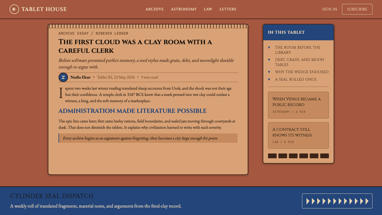
The Mesopotamian Cuneiform Tablets style is well-suited to applications that need to convey authority, permanence, and archival weight. It works against the grain of the lightweight, airy aesthetic that dominates much contemporary digital design, which makes it a powerful differentiator for products positioning themselves as serious, lasting, or institutional. The style rewards restraint in application: its effectiveness depends on using the terracotta-and-umber palette consistently rather than broadly, and on maintaining the columnar, register-based structure that gives the system its sense of organized depth.美索不达米亚楔形文字泥板风格非常适合需要传达权威感、永久感与档案分量的应用场景。它与当代数字设计中占主导地位的轻盈通透美学逆道而行,这使它成为定位严肃、持久或机构化产品的有力差异化手段。这种风格对克制的应用态度有所回报:其效果取决于以一致而非广泛的方式使用赤陶与深褐色板,并维持赋予系统以有序深度感的分栏、栏格结构。
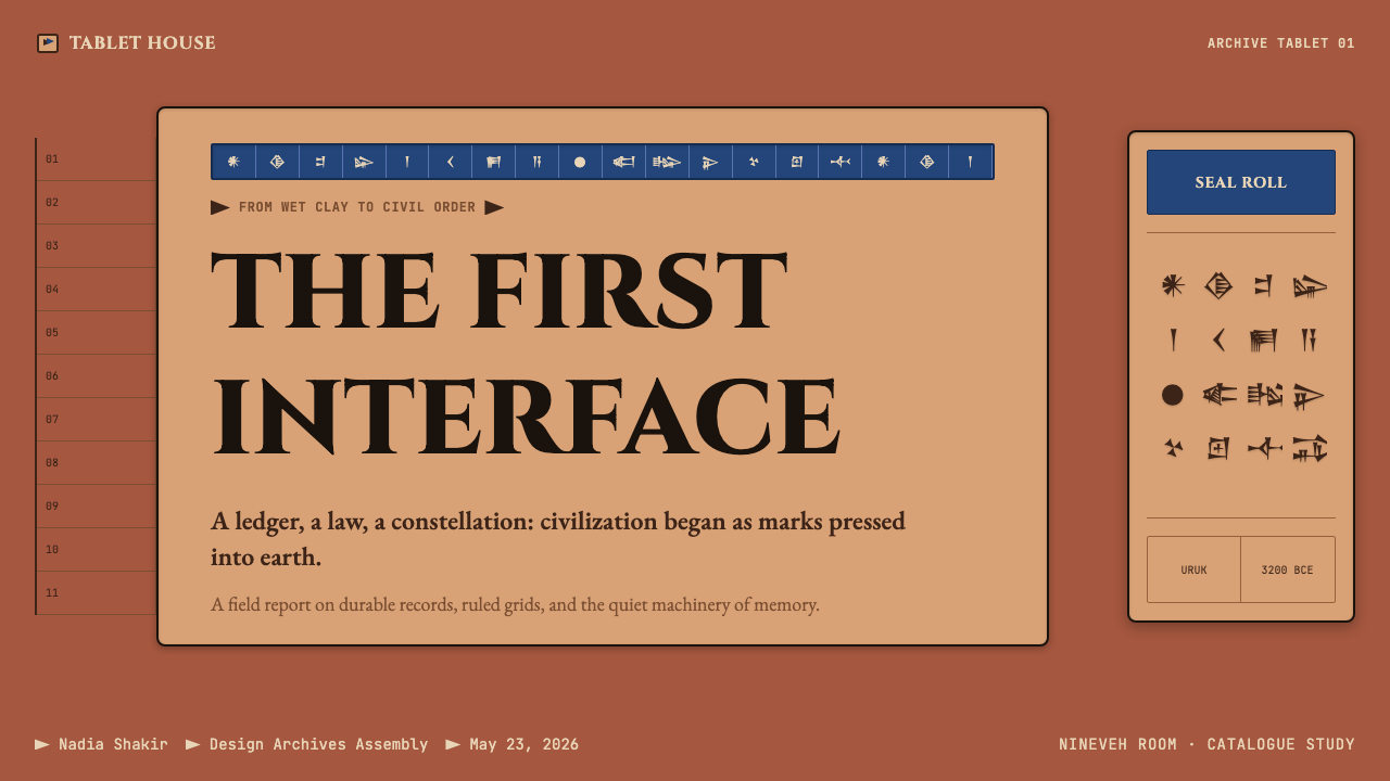
For presentation slides, the style delivers maximum impact on cover and chapter-divider pages. A cover that places a large wedge-form graphic — rendered in lapis against a deep terracotta ground — alongside monumental display type achieves an immediate sense of authority. Content slides should embrace the register logic: divide each slide into two or three horizontal bands, use the upper band for the main statement (in large, widely-spaced type), and reserve the lower band for supporting data or body text. Data visualizations should be treated as inscribed records — bar charts using the umber-to-terracotta range, with lapis reserved for the single most important data point.对于演示文稿,这种风格在封面页与章节分隔页上发挥最大效果。一个将大型楔形图形元素——以青金石蓝渲染于深赤陶底面之上——与纪念碑式展示字体并置的封面,能立即营造出权威感。内容页应拥抱栏格逻辑:将每张幻灯片划分为两到三个水平分段,上方分段放置主要陈述(以大号宽字距字体呈现),下方分段保留给支撑数据或正文。数据可视化应当被当作铭刻记录来处理——条形图使用深褐至赤陶色值范围,青金石蓝仅保留给最重要的单个数据点。
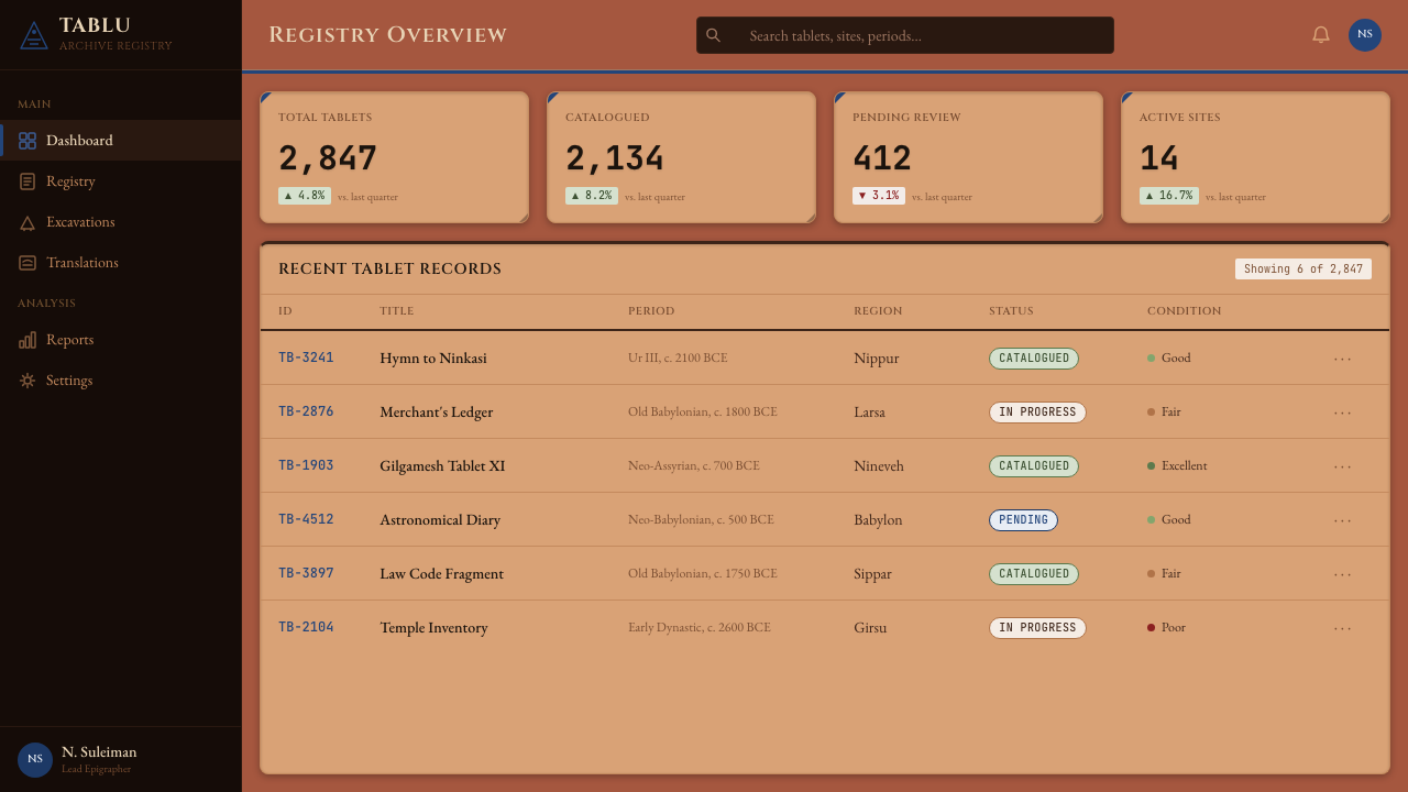
For web interfaces, the style is particularly effective for dashboards, archive browsers, database interfaces, and any product that deals with records, history, or accumulated data. The palette's warmth prevents the clinical coldness that can afflict data-heavy interfaces built on cool greys and white. Navigation elements benefit from the columnar logic: a left-side navigation panel structured in clear horizontal registers, with wedge indicators marking the active item, reads as both visually distinctive and intuitively hierarchical. Pricing pages can use the register structure to organize feature tiers, with each tier presented as a distinct horizontal band rather than isolated cards.对于网页界面,这种风格对仪表板、档案浏览器、数据库界面以及任何涉及记录、历史或累积数据的产品尤为有效。色板的温度感能防止建立在冷灰与白色之上的数据密集界面所常见的临床冷漠感。导航元素受益于栏格逻辑:以清晰水平分段结构化的左侧导航面板,配以标记当前项目的楔形指示符,既在视觉上独树一帜,又直觉上呈现出层级关系。定价页面可以用栏格结构组织功能等级,将每个等级呈现为独立的水平分段,而非孤立的卡片。
For editorial and marketing contexts, the style suits brands or publications that want to signal depth, scholarship, or institutional confidence. A publication masthead or brand identity built on this palette — deep terracotta primary, lapis accent, monumental letterforms — reads as authoritative without being corporate. Marketing landing pages work best when they commit to a single, dominant layout element: one large register of monumental type, one archival-style graphic, one carefully deployed lapis accent. Restraint is essential; the style loses its authority when it becomes busy.对于编辑与营销场景,这种风格适合希望传递深度感、学术感或机构自信感的品牌或出版物。建立在这一色板上的出版物刊头或品牌标识——深赤陶为主色、青金石蓝为强调、纪念碑式字形——给人以权威感而非企业感。营销落地页在坚定于单一主导版面元素时效果最佳:一大段纪念碑式字体栏格、一幅档案风格图形、一处精心运用的青金石蓝强调。克制至关重要;当风格变得繁复时,它便失去了权威感。
A common mistake is treating the terracotta palette as an invitation to warm maximalism — layering textured backgrounds, piling on decorative wedge motifs, and using the lapis blue too liberally across multiple elements simultaneously. Authentic cuneiform tablets are visually dense in their content (rows of inscribed signs) but visually sparse in their decoration (no borders, no pigment beyond the occasional ochre or red wash on royal tablets). Apply the same discipline digitally: let the structure and the content carry the weight, use the lapis accent sparingly and with intention, and resist adding ornamental wedge patterns beyond what is functionally necessary.一个常见错误是将赤陶色板视为温暖极大主义的邀请——叠加纹理背景、堆砌装饰性楔形母题、将青金石蓝过于自由地同时应用于多个元素。真实的楔形文字泥板在内容上视觉密集(铭刻符号的行列),在装饰上却视觉稀疏(无边框,颜料仅限于皇家泥板上偶见的赭石或红色涂层)。在数字端应用同等自律:让结构与内容承担重量,以克制而有意图的方式使用青金石蓝强调,抵制添加超过功能需要的装饰性楔形图案。
See the Mesopotamian Cuneiform Tablets design system →查看 Mesopotamian Cuneiform Tablets 完整设计系统 →
Mesopotamian Cuneiform Tablets — FAQMesopotamian Cuneiform Tablets · 常见问题
Is this style suitable for modern tech products, or does it read as purely historical pastiche?这种风格适合现代科技产品吗,还是只会被解读为纯粹的历史仿古?
Used with discipline, it reads as distinctive rather than merely historical. The key is applying the structural logic — columnar organization, register-based layouts, the umber-terracotta-lapis palette — without literal cuneiform calligraphy or explicit ancient imagery. A dashboard or analytics product built on this color palette, with its warm grounds and hard-edged shadow system, will feel authoritative and original rather than costumed. The pastiche risk rises when decorative elements (wedge ornaments, tablet-border frames) dominate over structural ones. Let the system do the work; keep the props minimal.以自律的方式运用,它给人以独特感而非单纯的历史感。关键在于应用其结构逻辑——栏格化组织、基于分段的版面、深褐赤陶青金石色板——而不引入字面意义上的楔形书法或明显的古代图像。一个建立在这一色板之上的仪表板或分析产品,凭借其温暖底调与硬边阴影系统,给人的感觉将是权威而原创,而非服装感。当装饰性元素(楔形纹饰、泥板边框)压过结构性元素时,仿古风险便会上升。让系统本身发挥作用;将道具保持在最低限度。
How do I use the lapis blue without it overwhelming the earthy palette?如何使用青金石蓝而不令其压过大地色系色板?
Treat lapis the way ancient Mesopotamians treated lapis lazuli — as a rare, precious material used for specific high-value purposes, not as a general colorant. Reserve it for one category of element per interface: interactive calls to action, the single most important metric in a data view, or an accent that marks a premium tier or featured content. A useful rule is that lapis should appear in fewer than ten percent of the visual field at any one time. When it is that rare, its appearance carries the weight of a cylinder seal on a clay document — a mark of distinction rather than decoration.对待青金石蓝的方式,应当像古代美索不达米亚人对待青金石矿石一样——将其视为用于特定高价值用途的稀有珍贵材料,而非通用着色剂。将它保留给每个界面中的某一类元素:可交互的行动号召、数据视图中最重要的单个指标,或标记高级等级或精选内容的强调。一个有用的规则是:任何时候青金石蓝在视觉域中出现的比例不应超过百分之十。当它如此稀少时,它的出现便承载着泥土文件上圆柱形印章的分量——是区分的标志,而非装饰。
Does the style work in dark-mode interfaces?这种风格能用于深色模式界面吗?
A dark variant is possible but requires a different reference point than simply inverting the palette. Rather than going black, anchor the dark mode in the deep shadow tones of the cuneiform tradition: a very dark, warm umber or charred-clay ground, with the lighter terracotta tones used for text and elevated surfaces. The lapis blue remains usable as an accent in this variant, as it was historically used on fired-clay objects against dark surfaces. Avoid cool dark greys or true black backgrounds, which undermine the material warmth that defines the system.深色变体是可行的,但需要一个与简单反转色板不同的参照点。不要走向纯黑,而应将深色模式锚定于楔形文字传统的深沉阴影色调之中:极深的、温暖的深褐或炭化泥土底色,以较浅的赤陶色调用于文字与抬升表面。青金石蓝在这一变体中仍可作为强调色使用,正如它在历史上用于深色表面上的烧制陶土器物。避免使用冷调深灰或纯黑背景,这些会破坏定义该系统的材质温度感。
What kinds of content or industries are a poor fit for this style?哪些类型的内容或行业不适合这种风格?
The style struggles anywhere lightness, freshness, or approachability are core brand values. Consumer food products, children's platforms, wellness and mental health applications, fashion editorial, and social-first consumer apps all depend on qualities — softness, warmth in the personal rather than archival sense, contemporaneity, playful energy — that the cuneiform system actively contradicts. Similarly, products targeting young demographics with a need to feel current and informal will find the style's monumental seriousness alienating. The system is an asset when permanence, depth, and institutional weight are genuine selling points; it is a liability when lightness is what the user actually needs.在轻盈感、新鲜感或亲切感是核心品牌价值的场景中,这种风格会遭遇困境。消费类食品产品、儿童平台、健康与心理健康应用、时尚编辑、以及社交优先的消费者应用,都依赖于楔形文字系统所主动抵触的品质——柔软感、个人意义而非档案意义上的温暖、当代性、玩味能量。同样,需要感觉当下且随意的年轻受众导向产品,会发现这种风格的纪念碑式严肃令人疏远。当永久感、深度感与机构权重是真正的卖点时,这套系统是一种资产;当轻盈感才是用户真正需要的时,它便是一种负担。
How does this style relate to other ancient or archaeological design traditions?这种风格与其他古代或考古设计传统有何关系?
Cuneiform Tablets shares the material-warmth approach with Egyptian Hieroglyphic styles, both drawing from fired-earth palettes and monumental inscription traditions. The differences are significant, however. Egyptian visual culture is dominated by figural representation, strict canon of proportion, and a color system that includes vivid mineral pigments well beyond the cuneiform range. Mesopotamian cuneiform is almost purely typographic and abstract — the script itself is the visual field, with minimal figurative decoration except on royal monuments. This makes the cuneiform tradition particularly compatible with information-dense, text-forward design applications, while Egyptian-derived styles lean more naturally toward image-dominant layouts with strong symbolic iconography.楔形文字泥板与埃及象形文字风格在材质温度方面有所共通,两者均取材于烧制陶土色板与纪念碑铭文传统。然而差异同样显著。埃及视觉文化以具象表达、严格比例法则以及超越楔形文字范围的鲜艳矿物颜料色彩系统为主导。美索不达米亚楔形文字几乎是纯粹的字体性与抽象性的——文字本身就是视觉场域,除皇家纪念碑外具象装饰极为有限。这使楔形文字传统尤其适合信息密集、以文字为主的设计应用,而埃及衍生风格则更自然地倾向于以强烈象征图像学主导的图像优先版面。
Related design styles相关设计风格
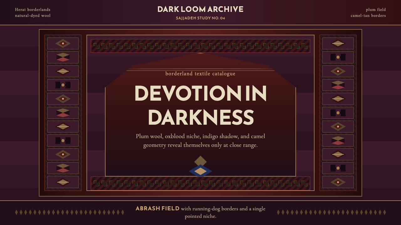 Afghan Baluchi Prayer RugDevotional darkness glows. Plum field, oxblood mihrab, and camel borders surf…虔敬暗色会发光:梅紫毯面、牛血红壁龛与骆驼棕边饰缓缓显影。
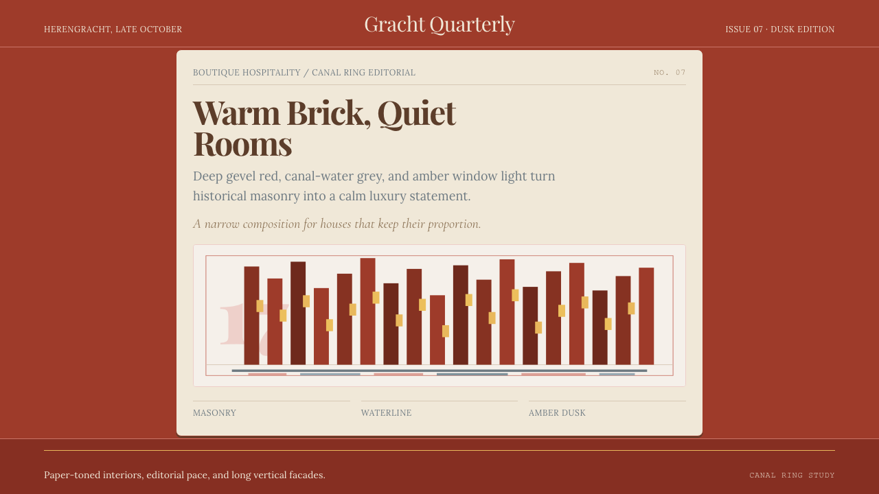 Amsterdam Canal HouseQuiet luxury in brick and cream. Playfair serif, narrow columns, amber window…克制的奢华。砖红配奶油纸面,窄列与琥珀窗光。
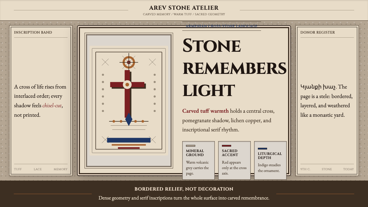 Armenian Khachkar Cross-StoneStone becomes memory. Tuff grey, pomegranate red, and carved borders hold the…石头成为记忆:凝灰岩灰、石榴红与刻痕边框托住十字中轴。
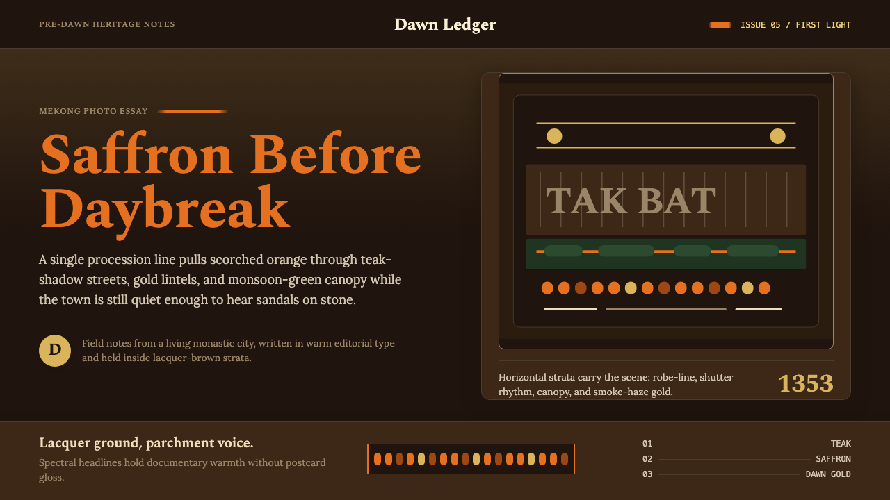 Luang Prabang Saffron AlmsDawn has weight. Saffron bands cut through teak brown and smoke-gold editoria…黎明有重量:藏红带穿过柚木棕与烟金色编辑字体。
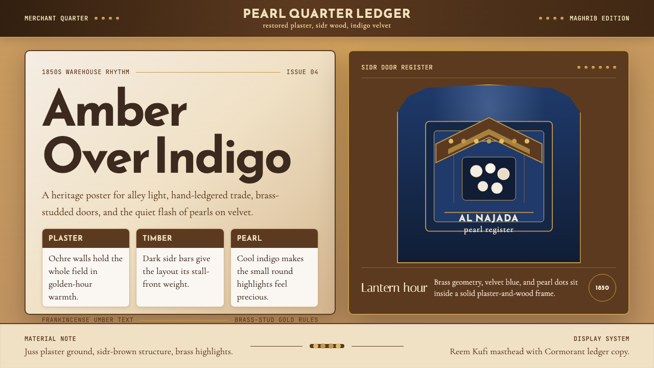 Qatari Souq Waqif Pearl QuarterWarmth has weight. Ochre plaster, sidr-brown bars, indigo velvet, brass geome…温暖有重量。赭石灰泥、棕木横栏、靛蓝丝绒与黄铜几何。
 Sumerian Cylinder SealAncient weight, pressed in clay. Cinzel caps and cuneiform wedges cut umber i…古老而沉重。Cinzel 大写与楔形纹把深褐压入陶土。