Design style guide设计风格指南
What is Armenian Khachkar Cross-Stone?什么是 Armenian Khachkar Cross-Stone?
The khachkar distills a millennium of Armenian devotion into a single carved stone — cross, knotwork, and vine wound so tightly they read as one living form.哈奇卡尔将千年亚美尼亚信仰凝入一块雕石——十字、结纹与藤蔓交织之密,仿佛同一有机体在生长。
Armenian Khachkar Cross-Stone in briefArmenian Khachkar Cross-Stone 速览
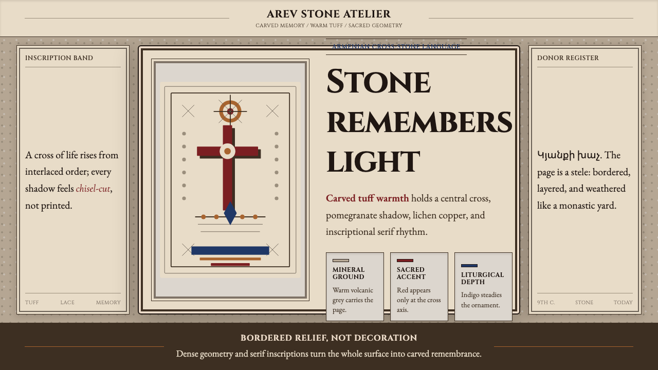
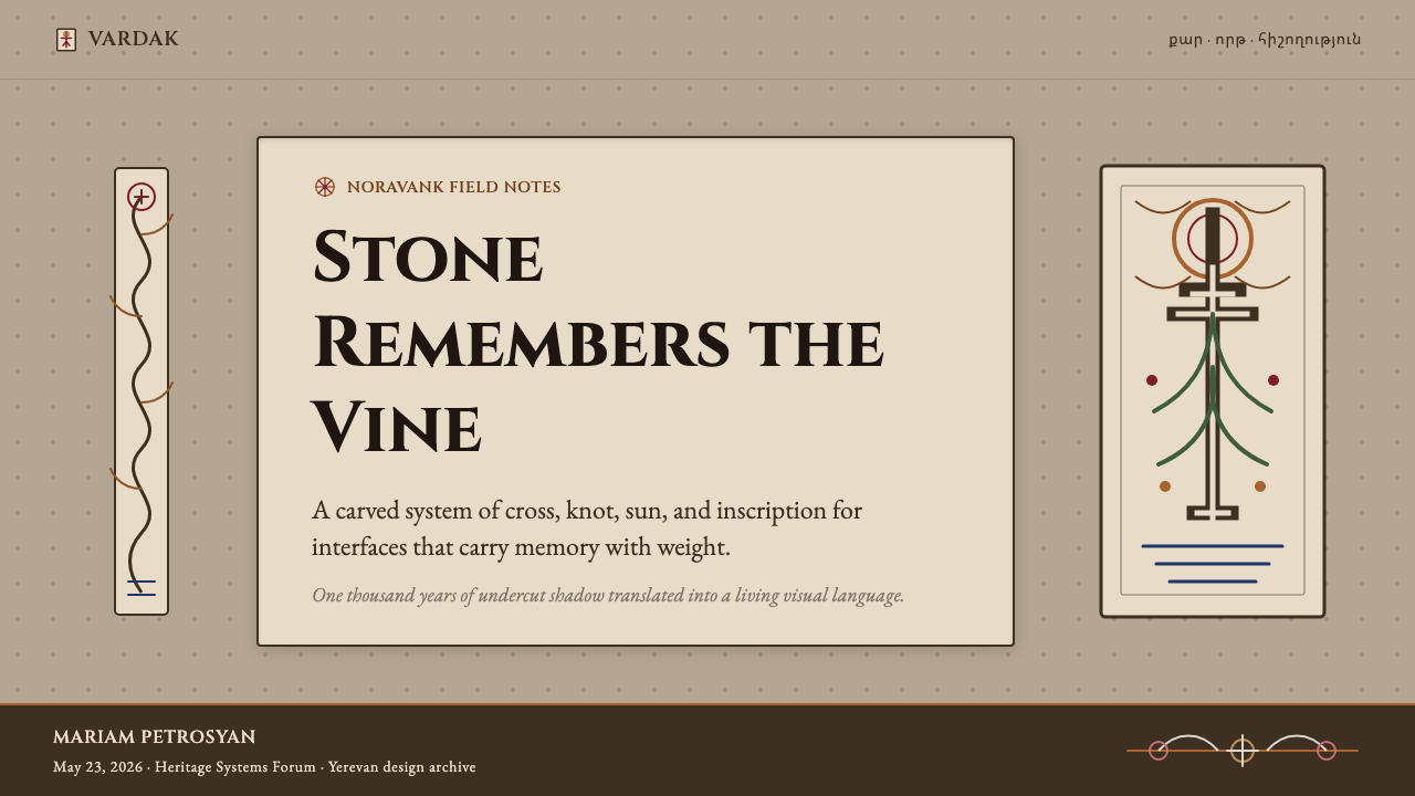
Khachkar — the Armenian word literally means 'cross-stone' — is a genre of carved stone stele unique to Armenian Christian culture. Each khachkar centers on a cross that sprouts upward from an interlaced base of knotwork, sending tendrils of vine and leaf outward into the surrounding field. The composition is never static: the cross is always embedded in a living, branching geometry that suggests perpetual growth rather than fixed symbol.哈奇卡尔——亚美尼亚语字面意思即“十字石碑”——是亚美尼亚基督教文化独有的石碑艺术门类。每一块哈奇卡尔以一个从交织结纹底座向上生长的十字为核心,向外蔓延出藤叶纹饰,铺满周围的石面。构图从不静止:十字始终嵌入一套活泼分叉的几何体中,暗示的是生生不息的生长,而非僵固的符号。
What makes the khachkar visually extraordinary is the density of its carving. Master stonecutters worked the surface of volcanic tuff — a pale, warm-grey stone quarried across the Armenian highlands — so deeply and completely that the finished slab reads as lace rather than relief. Negative space is as articulate as positive form: the shadow cast by an undercut border is part of the design. Every inch of the stone is inhabited.哈奇卡尔在视觉上的非凡之处在于雕刻的密度。工匠在凝灰岩——一种遍布亚美尼亚高地的浅暖灰色火山石——上深雕细刻,使完成后的石板读来如蕾丝而非浅浮雕。负空间与正形同样精确:下切边框所投下的阴影本身就是设计的一部分,石面每一寸都被占满。
As a design vocabulary, khachkar offers a rare combination of strict axial structure and exuberant surface ornament. The central cross provides the vertical and horizontal anchors from which everything radiates — a compositional logic that translates naturally into grids, panels, and hierarchical layouts. The knotwork and vine fill that radiate from the cross carry warmth and organic vitality, softening what might otherwise be a severe geometric schema.作为设计语汇,哈奇卡尔提供了一种罕见的组合:严格的轴线结构与华美的表面装饰并存。中心十字提供一切元素向外辐射的纵横锚点——这种构图逻辑天然地映射到网格、面板与层级版面上。从十字向外蔓延的结纹与藤蔓带来温度与有机活力,柔化了原本可能显得严峻的几何框架。
See the Armenian Khachkar Cross-Stone design system →查看 Armenian Khachkar Cross-Stone 完整设计系统 →
Where does Armenian Khachkar Cross-Stone come from?Armenian Khachkar Cross-Stone 从何而来?
The khachkar tradition emerged in the 9th century, roughly four hundred years after Armenia adopted Christianity as the state religion in 301 CE — the first nation in history to do so. Early khachkars were functional monuments: marking graves, commemorating military victories, dedicating springs and roads, or standing as votive offerings at pilgrimage sites. Their form evolved quickly from simple incised crosses to the elaborate interlaced compositions that define the tradition's classic phase.哈奇卡尔传统兴起于九世纪,距亚美尼亚于公元301年成为世界上第一个将基督教立为国教的国家,已过去约四百年。早期哈奇卡尔具有实用纪念功能:标记墓地、纪念军事胜利、奉献泉水与道路,或作为朝圣地点的还愿献品。其形制迅速从简单的刻线十字演变为定义这一传统古典时期的繁复交织构图。
The style reached its peak between the 10th and 14th centuries, a period coinciding with the Bagratid kingdom and its successor states. Monasteries such as Noravank, Haghpat, Saghmosavank, and Goshavank became workshops where named masters competed in the refinement of the form. Master Momik, active in the late 13th and early 14th centuries, is considered the greatest of these carvers: his khachkars at Noravank monastery in the Vayots Dzor gorge achieve a level of articulation — cross medallions suspended within radiating tracery, vine scrolls inhabited by pomegranates and birds — that subsequent carvers could only approach, not surpass.风格在十至十四世纪间达到巅峰,这一时期恰与巴格拉提德王国及其继承国家重叠。诺拉旺克、哈赫帕特、萨赫莫萨旺克、戈沙旺克等修道院成为工坊,留名于史的大师们在此竞相精进这一艺术形式。活跃于十三世纪末至十四世纪初的大师莫米克被认为是其中最卓越的雕刻者:他在瓦约茨·佐尔峡谷诺拉旺克修道院的哈奇卡尔在表达上达到了一种后人只能接近而无法超越的境界——十字形圆饰悬置于放射状透雕网格之中,葡萄藤卷中栖居着石榴与飞鸟。
The Julfa cemetery in the Nakhchivan region represented another peak of the tradition: thousands of khachkars accumulated over centuries in a single extraordinary necropolis, documented by scholars and travellers before its near-total destruction between 1998 and 2006. The Julfa stones were notable for their horizontal banding and elongated proportions — a regional variant that demonstrated how far the core compositional grammar could be stretched while remaining legible as khachkar.纳希切万地区的朱勒法墓园代表了这一传统的另一个高峰:数千块哈奇卡尔在数百年间聚集于这座非凡的墓城,在1998年至2006年间几乎被彻底摧毁之前,曾由学者与旅行者留下记录。朱勒法石碑以其水平分带与修长比例为特色——这是一种地区变体,展示了核心构图语法在保持哈奇卡尔可读性的前提下所能延伸的幅度。
Armenian diaspora communities carried the tradition beyond the homeland. Khachkars were installed in Jerusalem's Armenian Quarter, in Venice at the Armenian monastery of San Lazzaro, and eventually in Los Angeles, Paris, and Sydney. UNESCO recognized khachkar craftsmanship as Intangible Cultural Heritage in 2010, by which point the tradition was maintained by a small number of living carvers — among them Argam Ayvazyan and Vardan Adat — who trained in both the classical grammar and the specific geology of Armenian tuff.亚美尼亚散居社群将这一传统带出故土。哈奇卡尔被安置于耶路撒冷亚美尼亚区、威尼斯圣拉扎罗修道院,最终出现在洛杉矶、巴黎与悉尼。2010年,联合国教科文组织将哈奇卡尔工艺列入非物质文化遗产,此时仍在延续这一传统的,是为数不多的在世工匠——其中包括阿尔加姆·阿伊瓦扎扬和瓦尔丹·阿达特——他们在古典语法与亚美尼亚凝灰岩特定材质特性两个层面上均接受过系统训练。
What defines the Armenian Khachkar Cross-Stone look?Armenian Khachkar Cross-Stone 的视觉特征是什么?
Color and Tone色彩与调性
The palette is anchored in the stone itself: volcanic tuff reads as a warm mineral grey, neither cool nor purely neutral, weathered over centuries to a surface that holds lichen-tinged copper and amber alongside its base grey. Against this ground, carved shadows register as deep cool brown or near-black, giving the surface its three-dimensional drama without any additional color. Accent tones — pomegranate red, copper-green — are borrowed from the botanical imagery carved into the stone rather than imposed from outside. The effect is monolithic unity: the design feels grown from the material, not applied to it.色调锚定于石材本身:凝灰岩呈暖矿物灰,既不偏冷也不纯粹中性,历经数百年风化,在底色灰调之上留下地衣铜锈色与琥珀色的印记。在这一底面上,雕刻阴影呈现为深沉的冷棕或近黑,赋予表面三维戏剧感而无需任何额外色彩。强调色——石榴红、铜绿——来自石刻植物纹饰本身,而非外部施加。整体效果呈现出整体性的统一:设计仿佛从材质中生长而出,而非附加其上。
Surface Density and Negative Space表面密度与负空间
Classic khachkar carving fills the stone to a degree that can seem almost impossible in reproduction: no background is left plain, every interval between vine tendrils holds another carved detail. Yet the composition never collapses into visual chaos because the carver maintains a rigorous distinction between positive form (the raised interlace) and shaped negative space (the undercut voids). Both are designed; neither is leftover. This principle — that the spaces between forms deserve as much attention as the forms themselves — is one of the most transferable lessons the style offers.经典哈奇卡尔的雕刻密度之高,在复制品中几乎令人难以置信:没有任何底面留白,每一段藤蔓之间的间隔都藏有另一个雕刻细节。然而构图从不陷入视觉混乱,因为雕刻者在正形(浮起的交织纹)与被塑造的负空间(下切的虚空)之间保持了严格区分。两者都经过设计,没有任何一处是剩余。这一原则——形体之间的空间与形体本身同等值得关注——是这种风格所能传授的最具普遍价值的教益之一。
Axial Hierarchy轴线层级
Every khachkar is governed by the vertical axis of the cross, which establishes the primary hierarchy, and a secondary horizontal axis where the cross beam falls. Everything else — knotwork base, vine fill, inscription border — reads as subordinate to this cruciform skeleton. The composition is intensely centered: the eye is always drawn back to the intersection of the two axes. This gives khachkar-derived designs an inherent sense of gravity and order, making them naturally suited to compositions where a single focal point must command a field of rich detail.每块哈奇卡尔都由十字的纵轴支配——它确立了主要的层级关系——横梁所在处则形成次级横轴。其余一切——结纹底座、藤蔓填充、铭文边框——都读作从属于这一十字形骨架的元素。构图极度居中:视线始终被拉回到两条轴线的交汇处。这赋予源自哈奇卡尔的设计天然的重量感与秩序感,使其尤其适合需要单一焦点统领丰富细节场景的构图。
Interlace and Knotwork交织纹与结纹
The knotwork that typically fills the lower register of a khachkar — and often frames the entire cross field — is geometrically rigorous: each strand passes over and under adjacent strands in a consistent rhythm, and the pattern could theoretically be extended infinitely in any direction. The strands are rendered in full relief with crisp edges, so the interweaving reads clearly even at a distance. This is not the loose decorative filler it might appear; it is a structured, repeating module that has more in common with tiling logic than with organic ornament.通常填满哈奇卡尔下部、并常常框住整个十字区域的结纹,在几何上是严格的:每一条纹带以一致的节奏在相邻纹带上下穿插,图案在理论上可以向任意方向无限延伸。纹带以清晰边缘的高浮雕呈现,使交织关系在远处也清晰可读。这并非看起来那样松散的装饰性填充,而是一种结构化的重复模块,与其说接近有机装饰,不如说更接近平铺逻辑。
Inscriptional Typography铭文式排版
Khachkars frequently carry donor inscriptions or religious formulae carved in Armenian Erkat'agir script — the angular, lapidary letterform developed for monumental carving. These letters are chiseled with the same precision as the ornament, treating letterforms as carved objects rather than written marks. The result is a typographic character that is simultaneously bold and fine: dense stroke weight, crisp terminal cuts, strong vertical emphasis. When applied to contemporary type choices, this heritage favors letterforms with clear structural weight and precise termination over those that suggest handwriting or softness.哈奇卡尔常常刻有以亚美尼亚埃尔卡塔吉尔字体书写的捐赠铭文或宗教祷词——这种有棱有角、适合碑刻的字体正是为纪念性石刻发展而来的。这些字母以与装饰纹样同等的精度凿入石面,将字形视为雕刻对象而非书写痕迹。结果呈现出一种同时具备粗犷与精细特质的排版气质:笔画密实、切口清脆、纵向强调突出。这一传统映射到当代字体选择时,偏向于具有清晰结构重量与精确收笔的字形,而非暗示手写质感或柔软性的字体。
Stone Texture as Ground石材质感作为底面
The uncarved portions of a khachkar are not smooth: tuff stone retains a granular, slightly pitted surface that gives the background of the composition a tactile presence. This means the ground is never empty — it contributes a visual weight and warmth of its own. Design systems inspired by khachkar honor this by avoiding pristine white or pure flat backgrounds in favor of surfaces that carry subtle texture: lightly grained paper, low-contrast noise fields, or warm off-white grounds that suggest physical materiality rather than digital blankness.哈奇卡尔未经雕刻的部分并非平滑:凝灰岩保留着颗粒感、略有坑洞的表面,赋予构图底面区域自身的触感存在感。这意味着底面从不是空洞的——它贡献了自己的视觉重量与温度。受哈奇卡尔启发的设计系统尊重这一特质,回避一尘不染的纯白或完全平整的底面,转而偏爱携带微妙质感的表面:轻微纹理的纸张、低对比度噪点底面、或暗示物理材质而非数字空白的暖调米白底色。
Vine and Botanical Fill藤蔓与植物填充
Spreading outward from the cross into the surrounding field, vine scrolls carry pomegranates, grapes, almond blossoms, and occasionally birds or human figures. This botanical vocabulary is not merely decorative: in Armenian theological tradition, the vine of life is a direct symbol of Christ and resurrection, making every tendril a legible theological statement. The botanical elements are rendered with simplified realism — recognizable but not naturalistic — and their visual rhythm is that of controlled growth, never chaos. The pomegranate in particular, with its crown form and seed-dense interior, recurs as a concentrated symbol of abundance within the overall composition.从十字向外蔓延至周围石面的葡萄藤卷,托承着石榴、葡萄、杏花,有时还有鸟类或人物。这套植物词汇并非纯粹装饰:在亚美尼亚神学传统中,生命之藤是基督与复活的直接象征,使每一条藤蔓都成为可读的神学陈述。植物元素以简化的写实手法呈现——可识别却非自然主义——其视觉节奏是受控生长的节奏,而非混乱的蔓延。石榴尤为突出,以其冠形外廓与籽粒密布的内部,在整体构图中反复出现,作为丰盛的浓缩象征。
See the Armenian Khachkar Cross-Stone design system →查看 Armenian Khachkar Cross-Stone 完整设计系统 →
Who shaped Armenian Khachkar Cross-Stone?谁塑造了 Armenian Khachkar Cross-Stone?
Active in the late 13th and early 14th centuries, Momik is the most celebrated name in the khachkar tradition. He worked primarily at Noravank monastery in the Vayots Dzor gorge, where his surviving khachkars and architectural carvings represent the form at its most technically ambitious. His cross compositions feature layered medallions and tracery of extraordinary delicacy, with vine scrolls inhabited by pomegranates, birds, and human figures so deeply undercut they seem almost detached from the stone. Momik also designed the church of Surb Astvatsatsin at Noravank, demonstrating that the visual grammar of the khachkar extended into architectural ornament without loss of coherence.活跃于十三世纪末至十四世纪初的莫米克是哈奇卡尔传统中最负盛名的名字。他主要在瓦约茨·佐尔峡谷的诺拉旺克修道院工作,那里留存的哈奇卡尔与建筑雕刻代表了这一形式在技术层面的最高抱负。他的十字构图以层叠圆饰与极致精细的透雕网格为特色,葡萄藤卷中栖居着石榴、鸟类与人物形象,下切之深几乎使这些形体与石面脱离。莫米克还设计了诺拉旺克的圣母升天教堂,证明哈奇卡尔的视觉语法可以延伸至建筑装饰而不失连贯性。
Pavel is one of the few khachkar carvers from the medieval period whose name survives in an inscription on his own work. He was active in the 13th century and is associated with the Haghpat and Sanahin monastery complexes in northern Armenia's Lori region, UNESCO World Heritage sites renowned for their density of medieval stone carving. Pavel's compositions favor a particularly controlled interlace pattern in the lower register and a distinctive treatment of the vine scroll that privileges clarity of individual elements over maximum density — a different aesthetic choice than Momik's maximalism, and one that reveals the range of individual expression possible within a shared formal grammar.帕维尔是中世纪为数不多的名字得以通过自己作品铭文留存至今的哈奇卡尔雕刻者之一。他活跃于十三世纪,与北亚美尼亚洛里地区的哈赫帕特和萨纳欣修道院建筑群相关联——这两处均为联合国教科文组织世界遗产,以中世纪石刻的密集程度著称。帕维尔的构图倾向于在下部区域使用特别规整的交织图案,以及一种独特的藤蔓卷处理方式,优先考虑单个元素的清晰度而非最大密度——与莫米克的极繁主义相比是一种不同的美学选择,揭示了共同形式语法框架内个体表达的幅度。
Ayvazyan is one of the most significant living practitioners of the khachkar tradition and a key figure in its documentation and transmission. Beyond his own carving practice — which works in both the classical grammar and in contemporary adaptations — he has devoted substantial effort to cataloguing the khachkars of historic Armenia, including those destroyed at Julfa. His scholarly and artistic work together represent the dual obligation that contemporary inheritors of a threatened tradition carry: to practice the form with integrity and to preserve its record against further loss.阿伊瓦扎扬是哈奇卡尔传统最重要的在世传承者之一,也是这一传统记录与传承工作的核心人物。除自身雕刻实践——他在古典语法与当代改编两个层面均有创作——之外,他还投入大量精力对历史亚美尼亚的哈奇卡尔进行系统编目,包括朱勒法遭毁的那些。他的学术与艺术工作共同代表了一个受威胁传统的当代传承者所承担的双重义务:以诚信实践这一形式,并在进一步损失发生之前保存其记录。
Adat is a contemporary carver who has worked to revive and transmit khachkar craft through direct teaching and through commissions that place new khachkars in diaspora communities worldwide. His practice addresses the fundamental challenge of a stone-carving tradition in an age when the geological source materials, specialist tools, and accumulated workshop knowledge are all under pressure from modernization and diaspora dispersion. Adat's work demonstrates that the tradition is not merely an archival category but a living craft practice capable of producing new work of genuine quality.阿达特是当代雕刻师,致力于通过直接教学和在全球散居社群安置新哈奇卡尔的委托项目,来复兴与传授哈奇卡尔工艺。他的实践直面一个石刻传统在现代面临的根本挑战:地质来源材料、专业工具与积累的工坊知识,都在现代化与侨民离散的双重压力下走向式微。阿达特的工作证明,这一传统不仅是一个档案类别,而是一种能够产出真正品质新作的活态工艺实践。
Grigor of Narek (951–1003) was an Armenian theologian, monk, and poet whose major work, the Book of Lamentations (Matean Voghbergutyan), is one of the foundational texts of Armenian Christian culture. Though not a khachkar carver himself, Narekatsi's theological vision — in which the cross is a living symbol of suffering, redemption, and cosmic order simultaneously — provides the intellectual framework within which khachkar iconography developed its full meaning. His writing makes explicit what the stone carvers expressed visually: that the cross sprouting vine is not two separate symbols but a single compound statement about the nature of sacred life.纳雷克的格里高尔(公元951—1003年)是亚美尼亚神学家、修道士与诗人,其代表作《悲叹之书》(Matean Voghbergutyan)是亚美尼亚基督教文化最重要的奠基文本之一。尽管他本人并非哈奇卡尔雕刻者,纳雷卡茨的神学视野——十字是苦难、救赎与宇宙秩序同时并存的活态象征——为哈奇卡尔图像志发展其完整含义提供了思想框架。他的文字使石刻工匠以视觉方式表达的东西变得明确:萌发藤蔓的十字并非两个独立的象征,而是关于神圣生命本质的一个复合陈述。
How do you use Armenian Khachkar Cross-Stone today?今天怎么用 Armenian Khachkar Cross-Stone?
The khachkar design vocabulary is suited to contexts where heritage, spiritual gravity, and handcrafted precision are genuine values — not surface styling, but alignment between what a product stands for and what the visual system communicates. It works best for cultural institutions, memorial or commemorative projects, premium artisan brands, and any context where the depth and density of a visual system signal that something has been made with serious attention. Applied to contemporary interfaces without that alignment, the style risks looking archaeological rather than authoritative.哈奇卡尔设计语汇适合那些文化传承、精神庄重与手工精准是真实价值主张的场景——不是表面风格的借用,而是产品所代表的价值与视觉系统所传达的信息之间真正的对齐。它最适合文化机构、纪念或追悼项目、高端匠作品牌,以及任何希望通过视觉系统的深度与密度来表明这件事是以严肃态度做成的语境。若在缺乏这种对齐的当代界面中生硬套用,这种风格有沦为考古展示而非权威表达的风险。
For presentation slides, the khachkar offers a distinctive compositional logic: a strongly centered cover slide organized around a cruciform axis, with the title occupying the intersection and supporting information distributed symmetrically in the four quadrants. The vine and knotwork motifs work as border ornaments on section dividers or as textural backgrounds for full-bleed slides, at a scale where their density reads as richness rather than noise. Content slides benefit from the style's strict axial hierarchy — a clear vertical organizing line with information subordinated in tiers, echoing the way a khachkar marshals detail around its central cross. Data visualization in this idiom favors contained circular forms and symmetrical arrangements over free-form scatter or bar-heavy layouts.对于演示文稿,哈奇卡尔提供了一种独特的构图逻辑:以十字轴线为核心组织的强居中封面,标题占据轴线交汇处,辅助信息在四个象限中对称分布。藤蔓与结纹母题在分节页的边框装饰或全出血幻灯片的肌理底面上效果出色——在此尺度下,其密度读作丰盛感而非噪音。内容页受益于这种风格严格的轴线层级——一条清晰的纵向组织主轴,信息在梯级中从属分布,回应哈奇卡尔在中心十字周围统领细节的方式。这种语法中的数据可视化倾向于封闭的圆形与对称排列,而非自由散点或以水平条形为主的布局。
For web interfaces, the style is best deployed at the level of identity and page structure rather than component-level detail. A khachkar-informed navigation header might use a centered logotype flanked by knotwork ornament, with a warm stone-toned background that reads as material rather than digital. Hero sections work well with the strong vertical axis: a centered headline sitting above a large ornamental device, with supporting body text in an inscriptional, upright roman face. Pricing and tier comparison pages benefit from the tradition's strong sense of bounded panels: each tier presented as a distinct carved field with clear border ornament rather than the usual floating card with soft shadow. The style does not naturally lend itself to the horizontal scroll patterns or card-stack interactions common in contemporary interfaces — it assumes the viewer will approach a composition that is complete in itself, not a feed.对于网页界面,这种风格最适合应用于身份标识与页面结构层面,而非组件级细节。一个受哈奇卡尔启发的导航头部,可以使用两侧配有结纹装饰的居中商标字,以暖石调背景传达材质感而非数字感。英雄区适合采用强纵轴:居中标题位于大型装饰母题之上,辅助正文使用铭文式直立罗马字体。定价与层级对比页面受益于这一传统清晰界定的面板感:每个层级以独立的雕刻区域呈现,配有清晰边框装饰,而非通常的浮动卡片配柔和阴影。这种风格天然不适合当代界面常见的横向滚动模式或卡片堆叠交互——它预设观者将面对一个自身完整的构图,而非信息流。
For editorial and marketing work, the khachkar's most powerful asset is its ability to convey timelessness without anachronism. Magazine covers, cultural event posters, and heritage brand campaigns can use the style's central axis and ornamental density to project an authority that comes from depth rather than trend. The vine and pomegranate motifs translate effectively into drop-cap ornaments, section markers, and pull-quote decorations, where their botanical specificity — neither generic Celtic knotwork nor Islamic arabesque — anchors the content in a distinct cultural identity. Packaging and label design for Armenian food, wine, and craft products find the most natural home for the style, where the design directly reflects the product's origin.对于编辑与营销工作,哈奇卡尔最强大的资产是它传达永恒感而不显得过时的能力。杂志封面、文化活动海报与传统品牌推广可以借助这种风格的中轴线与装饰密度,投射出一种来自深度而非潮流的权威感。藤蔓与石榴母题有效地转化为首字母装饰、章节标记与引文装饰——它们的植物特定性——既非泛用的凯尔特结纹,也非伊斯兰阿拉伯式花样——将内容锚定在鲜明的文化身份中。亚美尼亚食品、葡萄酒与工艺产品的包装与标签设计是这种风格最自然的归宿,设计与产品溯源直接呼应。
A common mistake when working with this style is treating the ornamental density as the defining feature and chasing maximum surface fill at the expense of the axial structure that gives the density its meaning. Khachkar carving is not chaotic: every detail is subordinated to the central cross hierarchy. The equivalent error in a digital context is decorating a layout with vine patterns and stone textures while abandoning clear information hierarchy — the result reads as costume rather than conviction. Equally problematic is scaling the ornamental elements to a size where individual motifs become legible as isolated shapes rather than part of a continuous pattern: a half-visible pomegranate in a corner looks accidental, not intentional.运用这种风格时最常见的错误,是将装饰密度视为决定性特征,为追求最大表面填充而牺牲赋予密度以意义的轴线结构。哈奇卡尔雕刻不是混乱的:每一个细节都从属于中心十字的层级。与之等价的数字语境错误,是在版面上叠加藤蔓图案与石材质感,同时放弃清晰的信息层级——结果读来像是服装道具而非内在信念。同样有问题的是将装饰元素放大到单个母题作为孤立形状变得清晰可辨的程度:角落里一个半露的石榴看起来像是意外,而非刻意为之。
See the Armenian Khachkar Cross-Stone design system →查看 Armenian Khachkar Cross-Stone 完整设计系统 →
Armenian Khachkar Cross-Stone — FAQArmenian Khachkar Cross-Stone · 常见问题
How does khachkar differ from other Christian cross traditions?哈奇卡尔与其他基督教十字传统有何不同?
The defining difference is the integration of cross and vine as a single inseparable form. In most Western Christian traditions, the cross is a geometric symbol that stands alone or is placed against a neutral background. In the khachkar tradition, the cross is always embedded in a living botanical field — vine scrolls, leaf forms, and pomegranates grow directly from its base and fill its surrounding field. The result is a cross that is simultaneously architectural anchor and living organism. Additionally, the Armenian carving tradition allows no distinction between ornament and structure: the border knotwork, the vine fill, and the cross medallion are all equally essential to the composition. This total integration distinguishes khachkar from Celtic high crosses (which have ornament but keep the cross form dominant and relatively isolated), Byzantine cross compositions (which tend toward flat mosaic rather than deep relief), and Gothic stone carving (which separates figural subjects from foliate borders).决定性的差异在于十字与藤蔓作为不可分割的单一形式的整合。在大多数西方基督教传统中,十字是一个独立存在或置于中性背景前的几何符号。在哈奇卡尔传统中,十字始终嵌入一个活态的植物场域——藤蔓卷、叶形与石榴直接从其底座生长并填满周围区域。结果是一个同时是建筑锚点与活态生命体的十字。此外,亚美尼亚石刻传统不允许装饰与结构之间存在区分:边框结纹、藤蔓填充与十字圆饰对构图而言同等重要。这种全面整合将哈奇卡尔与凯尔特高十字(有装饰但保持十字形式主导且相对独立)、拜占庭十字构图(倾向于平面马赛克而非深浮雕)以及哥特式石刻(将具象主题与叶形边框分离)区别开来。
Can the khachkar style work in dark-background digital contexts?哈奇卡尔风格能用于深色背景的数字场景吗?
The tradition is historically light-ground: tuff stone ranges from pale cream to warm grey, and the design reads primarily through shadow and carved depth. A dark inversion is possible, but it inverts the essential logic: in the original, the stone surface is warm and light, and the carved shadows are dark. In a dark version, the background becomes the deep shadow and the ornamental forms become the highlight. This works when the ornamental elements are rendered as fine light lines or gold-toned outlines on a dark ground — a treatment that references the tradition of metalwork and illuminated manuscripts that often parallels khachkar in Armenian visual culture. It becomes problematic when ornamental forms are filled with heavy light tones against dark, because the visual weight flips and the fine interlace loses its legibility.这一传统历史上以浅色底面为基础:凝灰岩从浅奶油色到暖灰色不等,设计主要通过阴影与雕刻深度来呈现。深色反转版本是可能的,但它颠覆了基本逻辑:在原作中,石面是温暖的浅色,雕刻阴影是深色。在深色版本中,背景变成了深沉的阴影,装饰形体变成了高光。当装饰元素以细线光色或金调轮廓线的形式呈现于深色底面时,这种处理是有效的——它呼应的是在亚美尼亚视觉文化中常与哈奇卡尔并行的金属工艺与彩绘手稿传统。当装饰形体以厚重的浅色填充对抗深色背景时,问题就出现了:视觉重量发生反转,精细的交织纹失去其可读性。
What is the appropriate scale for ornamental motifs in contemporary applications?装饰母题在当代应用中的恰当尺度是什么?
This is one of the trickiest questions the style poses. On an actual khachkar, individual motifs — a pomegranate, a single interlace unit, a vine leaf — are relatively small in relation to the whole composition, which might be a metre or more tall. Their legibility comes from the cumulative effect of many similar units, not from isolated reading of any single one. In screen contexts, this translates to a principle of contextual scale: ornamental motifs should be large enough to read as pattern, not so large that individual elements become isolated icons. A knotwork border on a panel should feel like texture from a distance and reveal detail on close inspection — not present as a sequence of distinct shapes that each demand separate visual processing. As a rough guide, if a single interlace unit fills more than about a fifth of the width of the element it borders, it has been scaled too large for the khachkar idiom.这是这种风格提出的最棘手的问题之一。在真实的哈奇卡尔上,单个母题——一颗石榴、一个交织单元、一片藤叶——相对于整体构图(可能高达一米以上)是相对小巧的。它们的可读性来自许多相似单元的累积效果,而非对任何单一母题的独立阅读。在屏幕语境中,这转化为一个与语境相关的尺度原则:装饰母题应足够大到作为图案被识别,但不应大到单个元素变成孤立图标。面板上的结纹边框应该从远处感觉像质感,近观才显露细节——而不是呈现为一系列各自要求独立视觉处理的独立形状。粗略地说,如果单个交织单元填满了它所框住的元素宽度的五分之一以上,那么在哈奇卡尔语法中它的尺度就已经过大了。
How does the khachkar relate to Armenian manuscript illumination?哈奇卡尔与亚美尼亚彩绘手稿有何关联?
The two traditions developed in parallel and share a visual grammar so thoroughly that scholars sometimes speak of an Armenian ornamental system that encompasses both. Illuminated Armenian Gospels — particularly those produced at Gladzor, Cilicia, and later at the Matenadaran scriptorium — use the same interlace borders, vine scrolls, and cross medallions that appear on khachkars, translated into pigment on vellum. The canon table arches in Armenian manuscripts directly echo the framed composition of a khachkar face. Where the khachkar expresses depth through shadow and undercut relief, the manuscript expresses it through layered color and gold leaf. The shared vocabulary means that a designer working in the khachkar idiom can legitimately borrow from illuminated manuscript conventions and vice versa — they are dialects of the same visual language.两种传统平行发展,共享的视觉语法之彻底,使学者有时谈及一个涵盖两者的亚美尼亚装饰体系。彩绘亚美尼亚福音书——尤其是在格拉佐、西里西亚以及后来的马泰纳达兰誊抄工坊产出的那些——使用与哈奇卡尔完全相同的交织边框、藤蔓卷与十字圆饰,只是将它们转译为犊皮纸上的颜料。亚美尼亚手稿中的正典对照表拱券直接呼应哈奇卡尔正面的框式构图。哈奇卡尔通过阴影与下切浮雕表达深度,手稿通过叠色与金叶表达深度。共享的词汇意味着,在哈奇卡尔语法中工作的设计师可以合理地借鉴彩绘手稿的惯例,反之亦然——它们是同一视觉语言的方言。
Is it appropriate to use khachkar motifs outside of Armenian cultural contexts?在亚美尼亚文化语境之外使用哈奇卡尔母题是否恰当?
The question is more nuanced than a simple yes or no. Khachkar is a living tradition, not a historical artifact — carvers are still working today, the form still carries deep religious and memorial significance for Armenian communities, and the destruction of the Julfa cemetery has made it a symbol of cultural loss that many Armenians feel acutely. Using khachkar motifs superficially — as exotic ornament or generic ancient pattern — without acknowledgment of their context and meaning is likely to read as careless at best. However, serious engagement with the visual grammar — studying its structural logic, using it to address themes of memory, heritage, and devotion, or working in collaboration with Armenian artists and communities — is a different matter. The distinction the tradition itself would recognize is the one between a foreign stone-carver who studies under a master and one who traces rubbings of a monument for decorative use.这个问题比简单的是或否更为复杂。哈奇卡尔是一种活态传统,而非历史文物——雕刻者至今仍在工作,这一形式对亚美尼亚社群而言仍承载着深厚的宗教与纪念意义,而朱勒法墓园的毁坏使它成为许多亚美尼亚人感同身受的文化丧失的象征。肤浅地使用哈奇卡尔母题——作为异域装饰或泛泛的古代图案——而不承认其语境与含义,充其量只会显得轻率。然而,对视觉语法的认真介入——研究其结构逻辑,将其用于探讨记忆、传承与信仰的主题,或与亚美尼亚艺术家和社群合作——则是另一回事。这一传统本身会认可的区分,与外国石匠拜师学艺和外国旅行者拓印碑文用于装饰之间的区分,是同一个区分。
Related design styles相关设计风格
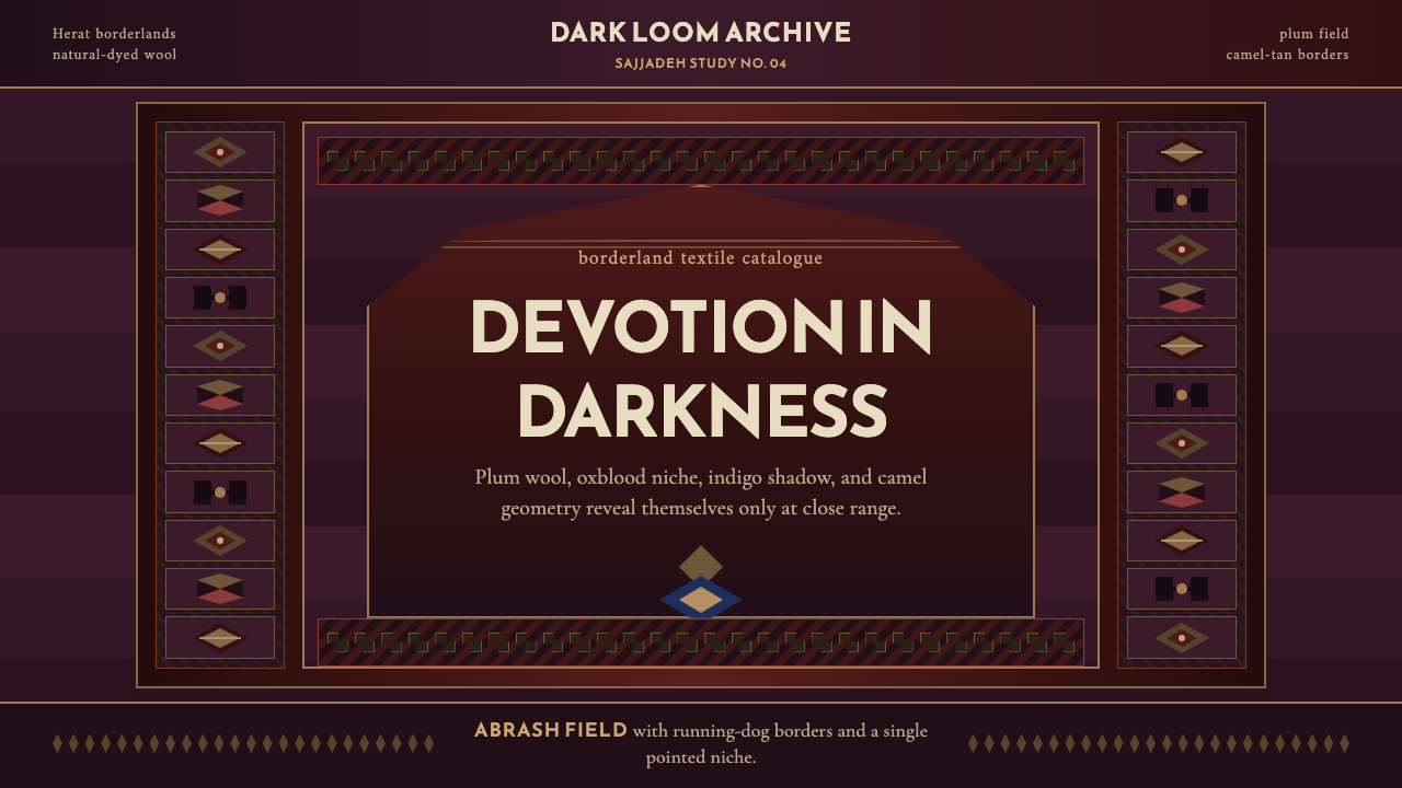 Afghan Baluchi Prayer RugDevotional darkness glows. Plum field, oxblood mihrab, and camel borders surf…虔敬暗色会发光:梅紫毯面、牛血红壁龛与骆驼棕边饰缓缓显影。
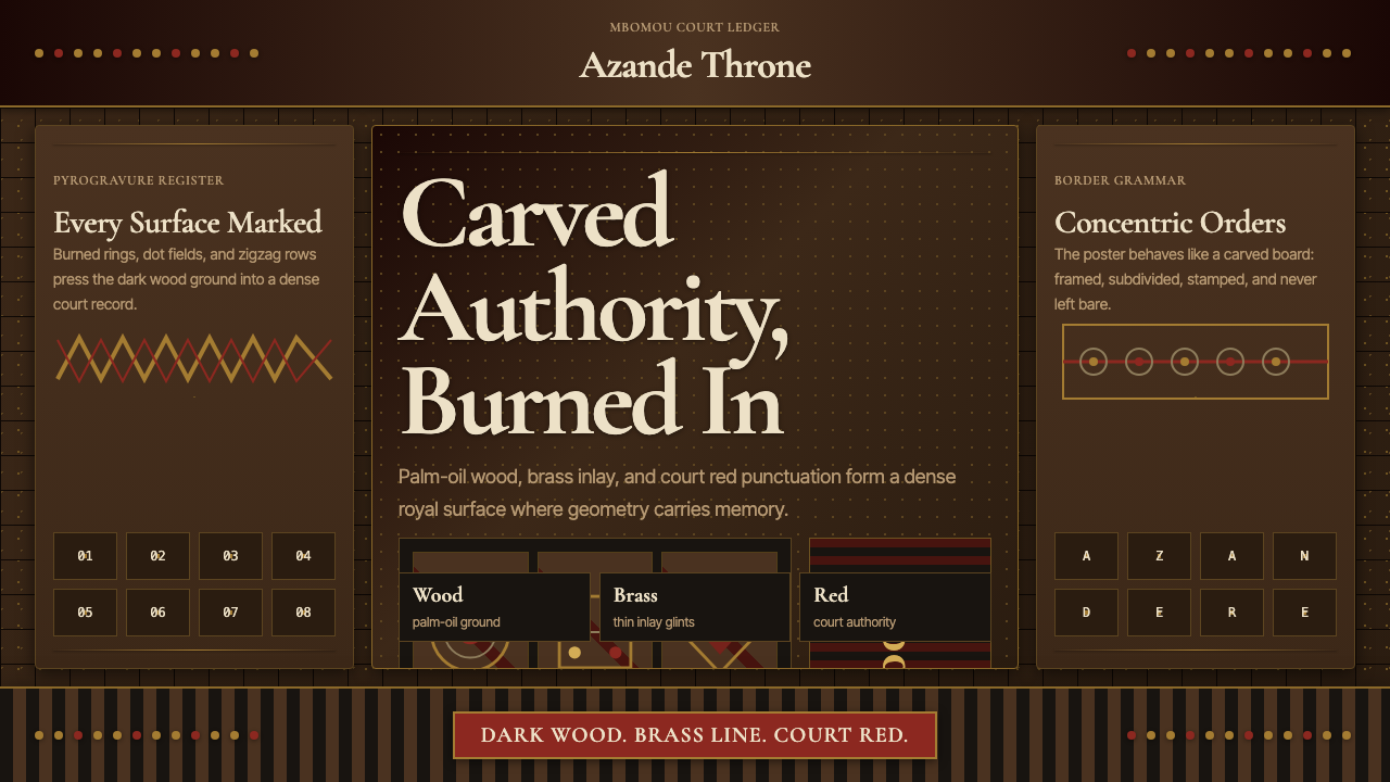 Central African Azande ThroneDense court gravity. Dark wood grids, brass dots, and court red cover every s…宫廷感厚重:深木网格、黄铜点阵与宫廷红铺满表面。
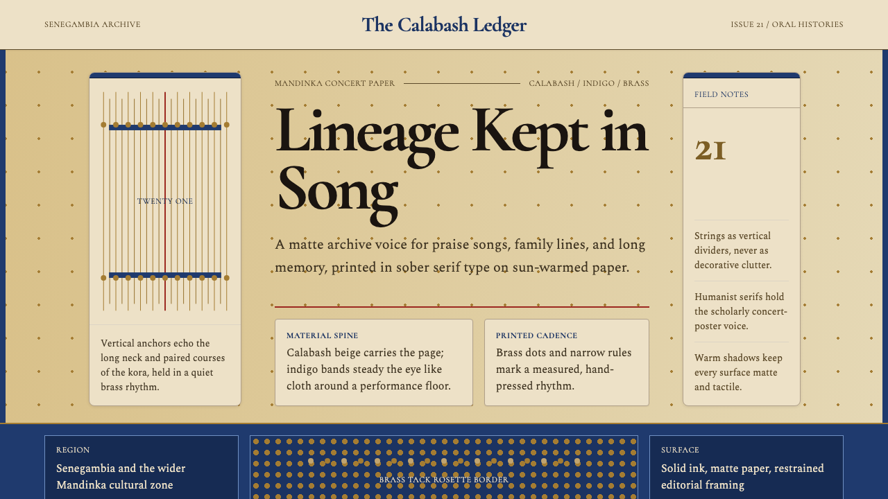 Gambian Griot Kora (21-string)Oral history feels tactile. Calabash beige, indigo bands, and 21 brass string…口述史有触感。葫芦米色、靛蓝带与21道黄铜弦线。
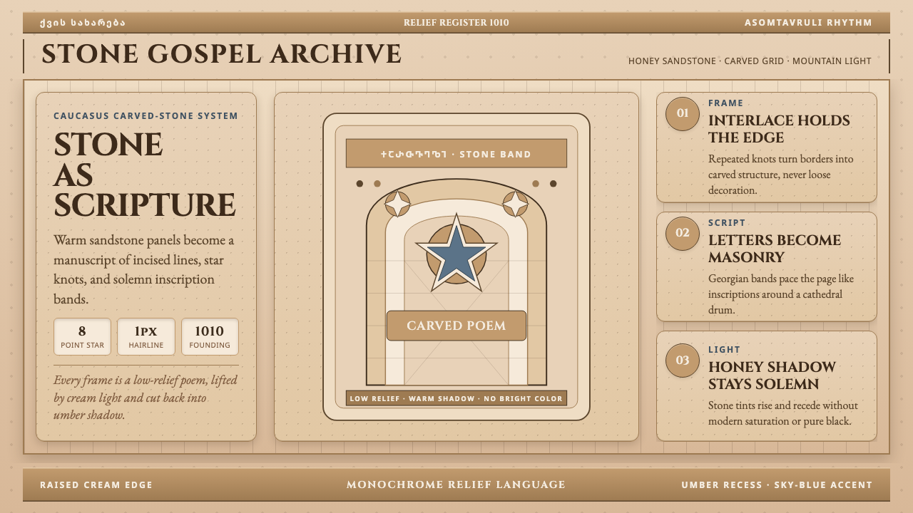 Georgian Nikortsminda Stone-CarvingStone becomes scripture. Cinzel caps and Georgian bands carve honey-sandstone…石如经卷。Cinzel大写与格鲁吉亚铭文刻出蜜砂岩网格。
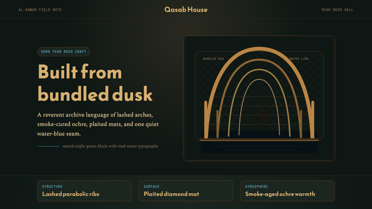 Iraqi Marsh Arab Mudhif ReedReverent reed darkness. Kufi arches, ochre lattice, and one water-blue line h…庄重的芦苇夜色。库菲拱线、赭黄格纹与一笔水蓝托住黄昏。
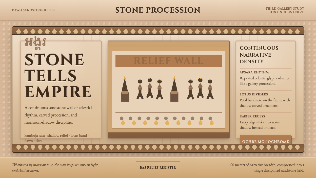 Khmer Angkor Wat ReliefStone remembers everything. Ochre friezes, Cinzel capitals, and lotus bands h…石头记住一切:赭石浮雕、Cinzel碑铭与莲瓣带压满墙面。