What is Khmer Angkor Wat Relief?什么是 Khmer Angkor Wat Relief?
Six hundred meters of twelfth-century sandstone carved with armies, gods, and a thousand celestial dancers — Angkor Wat's bas-relief is the longest continuous narrative wall in the world, and its warm rust-ochre monotone is one of history's most disciplined visual systems.六百米十二世纪砂岩石壁,凿满军队、神祇与千名天女——吴哥窟浮雕是世界上最长的连续叙事墙,其温暖赭石单色调是人类历史上最严苛的视觉系统之一。
Khmer Angkor Wat Relief in briefKhmer Angkor Wat Relief 速览
Khmer Angkor Wat Relief is a design language rooted in the visual world of the great Angkor temple complex in present-day Cambodia. Its defining quality is warm monochrome density: every surface is inhabited — processions of soldiers, celestial Apsara dancers, lotus-petal border bands, protective kāla faces at every threshold — all rendered in a single warm sandstone register where shallow carving and raking light do the entire expressive work.高棉吴哥窟浮雕是一套植根于柬埔寨吴哥建筑群视觉世界的设计语言。它的核心特质是温暖的单色密度:每一寸表面都有居住者——士兵行列、天女阿普萨拉、莲瓣纹饰带、每道门楣上的卡拉守护神面——全部在一个温暖砂岩调性中呈现,浅浮雕与斜射光线承担所有表达功能。
The aesthetic draws its authority from the actual 12th-century bas-reliefs that line the third gallery of Angkor Wat, the world's largest religious monument. Those 600 meters of carved wall narrate the Hindu epics Ramayana and Mahabharata, the Churning of the Sea of Milk, and the celestial court of King Suryavarman II, all in overlapping horizontal registers of figures pressed into shallow relief. The translation of this sensibility into contemporary design produces surfaces that feel archaeological: layered, warm, deliberate, and laden with meaning.这套美学的权威性来自吴哥窟第三回廊的实际十二世纪浮雕——世界上最大宗教建筑的六百米石刻墙面。那些浮雕讲述《罗摩衍那》与《摩诃婆罗多》、乳海翻腾、以及苏耶跋摩二世的天国朝廷,所有叙事压缩进层层叠叠的水平人物带,以浅浮雕的形式嵌入石面。这种感性转化为当代设计时,产生的表面带有考古学气质:层次丰富、温暖沉着、经过深思熟虑,并且承载意义。
As a design system, Angkor Wat Relief depends on three interlocking commitments. First, a strict warm-sandstone palette — running from pale unweathered stone through deep rust ochre to shadow-brown — with no cool tones and no white voids. Second, an ornamental grammar based on the lotus petal, the sinuous vine scroll, and the repeating figure in procession. Third, monumental lapidary capitals that echo the carved inscriptions of Khmer stelae, giving text the same geological weight as the imagery beside it.作为设计系统,吴哥窟浮雕依赖三项相互咬合的承诺:其一,严格的温暖砂岩色调——从未风化的浅米色,经深赭石,到阴影棕褐——无冷色调,无白色空白。其二,以莲瓣、蜿蜒藤蔓卷草纹与行列中的重复人像构成的装饰语法。其三,呼应高棉石碑铭文的纪念性雕刻大写字体,赋予文字与旁边图像同等的地质量感。
See the Khmer Angkor Wat Relief design system查看 Khmer Angkor Wat Relief 完整设计系统
Where does Khmer Angkor Wat Relief come from?Khmer Angkor Wat Relief 从何而来?
The Khmer Empire dominated mainland Southeast Asia from approximately 802 to 1431 CE, at its height controlling territories that encompass modern Cambodia, Thailand, Laos, and southern Vietnam. The empire's religious and artistic program was a synthesis of Hindu cosmology, Buddhist practice, and indigenous Khmer traditions — a syncretism that produced one of the most distinctive visual cultures in human history. Angkor, the imperial capital near present-day Siem Reap, was home at its peak to perhaps one million people, making it one of the largest pre-industrial cities on earth.高棉帝国大约从公元802年统治东南亚大陆直至1431年,鼎盛时期的版图涵盖今日的柬埔寨、泰国、老挝及越南南部。帝国的宗教与艺术纲领是印度教宇宙观、佛教实践与高棉本土传统的综合——这种融合孕育了人类历史上最独特的视觉文化之一。帝国首都吴哥位于今暹粒附近,鼎盛时期人口或达百万,是地球上最大的前工业城市之一。
Construction of Angkor Wat began around 1113 CE under King Suryavarman II and was largely complete by 1150 CE. The temple was conceived as a terrestrial representation of Mount Meru, the cosmic mountain at the center of Hindu and Buddhist cosmology, surrounded by the world ocean. Its bas-relief galleries — the longest continuous narrative bas-relief ever created — were executed by an estimated 200,000 workers over several decades. The carvings depicted the Churning of the Sea of Milk (in which gods and demons cooperate to produce the nectar of immortality), the Battle of Kurukshetra from the Mahabharata, the armies of Suryavarman II in full ceremonial procession, and 1,800 individual Apsara celestial dancer figures, each with a distinct facial expression and headdress arrangement.吴哥窟的建造约始于公元1113年苏耶跋摩二世在位期间,至1150年大体完工。神庙被构想为须弥山的地上再现——须弥山是印度教与佛教宇宙观中的宇宙中心之山,被世界之洋环绕。其浮雕回廊——有史以来规模最大的连续叙事浮雕——由估计二十万工匠历数十年完成。石刻描绘乳海翻腾(神灵与恶魔合力提取不死甘露)、《摩诃婆罗多》中的俱卢之战、苏耶跋摩二世军队的盛大仪仗行列,以及一千八百尊各具独特面部表情与头冠样式的天女阿普萨拉。
After the fall of the Khmer Empire to the Ayutthaya Kingdom in 1431, Angkor was progressively abandoned to the jungle, though it remained a functioning Buddhist pilgrimage site. It was brought to sustained Western attention in 1860 by the French naturalist Henri Mouhot, whose widely read journals described the temples as surpassing the monuments of Greece and Rome. The subsequent French colonial administration began systematic documentation and partial restoration. The scholar George Cœdès, working in the early twentieth century, deciphered the Khmer inscriptions and established the historical framework for understanding Angkor's political and religious significance.1431年高棉帝国被阿瑜陀耶王国攻破后,吴哥逐渐被丛林侵占,但仍作为佛教朝圣地保持运转。1860年,法国博物学家亨利·穆奥在其广为流传的日记中将这些神庙描述为超越希腊罗马建筑,由此将吴哥持续引入西方视野。随后法国殖民政府开始系统性记录与局部修复工作。二十世纪初,学者乔治·塞代斯破译了高棉碑铭,建立起理解吴哥政治与宗教意义的历史框架。
Angkor Wat was listed as a UNESCO World Heritage Site in 1992, at a moment when Cambodia was emerging from decades of civil war and the devastation of the Khmer Rouge period. The site has since become both a symbol of Cambodian national identity — it appears on the national flag — and an object of international conservation attention. The bas-relief aesthetic has influenced regional textile traditions, theatrical costume, classical dance, and sacred architecture across Southeast Asia for centuries, and in the digital era has become recognizable globally as a visual language of antiquity, spirituality, and monumental narrative craft.1992年,吴哥窟被列入联合国教科文组织世界遗产名录,彼时柬埔寨正从数十年内战与红色高棉浩劫中走出。此后,吴哥窟既成为柬埔寨国家认同的象征——它出现在国旗上——也成为国际保护的焦点。浮雕美学数百年来持续影响东南亚地区的纺织传统、戏剧服装、古典舞蹈与神圣建筑;在数字时代,它已在全球范围内成为一种关于远古、精神性与宏大叙事手工艺的可辨识视觉语言。
What defines the Khmer Angkor Wat Relief look?Khmer Angkor Wat Relief 的视觉特征是什么?
Warm Sandstone Palette温暖砂岩色调
The entire visual system operates within a single warm register: the pale buff of freshly cut stone at the light end, deepening through rich rust-ochre at the midtone, and settling into shadow-brown where carvings recede. There are no cool tones, no blues, no greens in the base palette — coolness enters only as a distant accent when moss or patina is evoked. This monochrome discipline forces all visual differentiation through texture, depth of carving, and the angle of light, rather than through hue contrast.整个视觉系统在一个温暖的单一音域内运作:光端是新切砂岩的浅米色,中间调是丰厚的赭石锈色,阴影处则沉入深棕。基础色调中没有冷色,没有蓝,没有绿——冷感仅在唤起苔藓或风化包浆时作为遥远点缀出现。这种单色纪律迫使所有视觉区分通过纹理、浮雕深度与光线角度来完成,而非通过色相对比。
Shallow Relief and Shadow Emboss浅浮雕与阴影浮压
The defining carving technique of Angkor Wat is shallow bas-relief: figures and ornament project only a small distance from the wall surface, creating the illusion of three-dimensional scene through controlled shadow rather than actual depth. In design terms this translates to a shadow-emboss treatment where elements appear subtly raised or incised — a technique that preserves the flat warm field while suggesting material substance. Deep drop shadows or sharp dimensional cuts break the spell; the effect depends on restraint.吴哥窟的标志性雕刻技法是浅浮雕:人像与纹饰仅从墙面突出极小距离,通过可控的阴影而非实际深度制造三维场景的幻觉。转化为设计语言时,这演变为一种阴影浮压处理——元素看起来微微隆起或凹刻——这种技法在保持温暖平面底场的同时暗示材质实体感。深重的投影或锐利的立体切割会打破这种魔法;效果依赖克制。
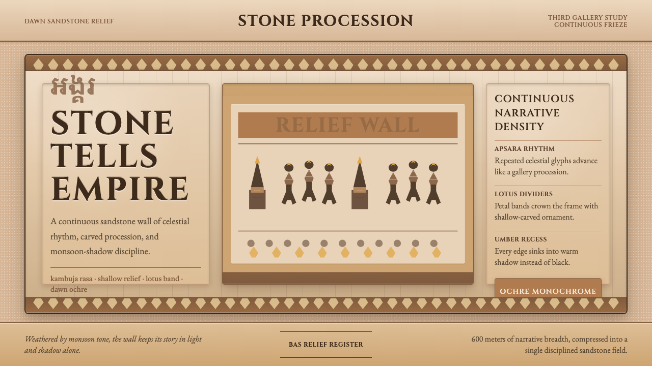
Continuous Narrative Register连续叙事带
Angkor Wat's compositional logic is the horizontal frieze: figures and scenes arranged in continuous overlapping bands that read from left to right without pause or frame break. Hierarchy is expressed through vertical position within the register (dominant figures are taller), through repetition (an army is rendered as dozens of near-identical soldiers), and through scale contrast between divine and mortal figures. In contemporary layouts this principle encourages long horizontal compositions, banded content sections, and the use of repeated motifs to build rhythmic density.吴哥窟的构图逻辑是水平横带:人物与场景排列于连续叠压的带状区域,从左向右阅读,无停顿也无框架中断。层级通过在带内的垂直位置表达(主导人物更高大),通过重复表达(一支军队由数十名近乎相同的士兵呈现),以及通过神灵与凡人之间的比例对比表达。在当代版面中,这一原则鼓励采用长水平构图、带状内容区块,以及通过重复母题构建节奏密度。
Lotus and Vine Ornamental Grammar莲瓣与藤蔓纹饰语法
The decorative vocabulary of Khmer relief is built from two primary motifs: the lotus petal, used in layered bands to frame registers and crown architectural elements, and the sinuous vine scroll, which fills transitional zones between narrative scenes. Both are rendered with the same shallow emboss technique as figurative carving, so ornament and narrative exist at the same visual level — neither background nor foreground, but woven together. This integration of pattern and image, with no hierarchy between them, is what gives the style its characteristic surface density.高棉浮雕的装饰词汇由两种基本母题构成:莲瓣,以层叠带状形式框架各叙事带并装饰建筑构件顶部;蜿蜒藤蔓卷草纹,填充叙事场景之间的过渡区域。两者均以与具象雕刻相同的浅浮雕手法呈现,因此纹饰与叙事处于相同的视觉层面——既非背景也非前景,而是交织在一起。图案与图像的这种整合,两者之间没有主次,正是赋予这种风格其特有表面密度的原因。
Lapidary Monumental Typography石碑纪念性字体
Khmer stelae — upright stone slabs bearing royal inscriptions in both Sanskrit and Old Khmer — established a tradition of carved letterforms with strong vertical strokes, precise serifs, and the unmistakable solidity of stone-cut inscription. Contemporary applications of this aesthetic reach for serif typefaces in the lapidary tradition: letterforms that feel chiseled rather than drawn, with a weight and formality that anchors text within the warm stone field. The typeface carries the same geological seriousness as the imagery.高棉石碑——刻有梵文与古高棉文王室铭文的直立石板——建立了一种雕刻字形传统:竖笔强劲,衬线精准,带有石刻铭文无可置疑的厚重感。这种美学的当代应用选用属于石碑传统的衬线字体:字形感觉像是凿刻而非书写,其重量与庄重感将文字锚定于温暖石面底场之中。字体承载与图像同等的地质严肃性。
Kāla and Guardian Motifs卡拉与守护者母题
At every lintel and threshold of Angkor Wat appears the kāla — a protective demonic face rendered without a lower jaw, from whose mouth foliage and smaller figures sometimes emerge. These guardian faces serve both apotropaic and compositional purposes: they mark boundaries, anchor centers, and provide points of visual rest within otherwise unbroken ornamental fields. In design terms, the kāla principle suggests the use of bold, symmetrical focal devices at structural boundaries — chapter breaks, section headers, key callouts — to organize an otherwise dense surface.在吴哥窟的每道门楣与门槛处,都出现卡拉——一张没有下颌的守护恶魔面孔,口中有时生出枝叶与更小的人物。这些守护者面孔同时服务于辟邪与构图目的:它们标记边界,锚定中心,在连绵不断的装饰区域中提供视觉休息点。从设计语言的角度,卡拉原则建议在结构性边界——章节分隔、段落标题、关键引用——使用大胆、对称的焦点装置,以组织一个密度极高的表面。
Figure Repetition and Rhythmic Density人物重复与节奏密度
Angkor Wat achieves its epic scale not through individual virtuoso figures but through the disciplined repetition of near-identical elements: row upon row of soldiers in identical armor, column after column of Apsara dancers in matched poses. This repetition creates visual rhythm while simultaneously conveying mass, ceremony, and cosmic order. In design, the principle translates to pattern systems and modular component grids — repeating cards, icon sets, data rows — where consistency of the individual unit makes the collective field powerful rather than monotonous.吴哥窟通过近乎相同元素的纪律性重复而非个别精湛人物来实现其史诗规模:一排又一排身着相同甲胄的士兵,一列又一列摆出相同姿态的天女阿普萨拉。这种重复在制造视觉节奏的同时,传递着规模、仪式与宇宙秩序。在设计中,这一原则转化为图案系统与模块化组件网格——重复的卡片、图标集、数据行——其中单个单元的一致性使整体区域显得有力而非单调。
See the Khmer Angkor Wat Relief design system查看 Khmer Angkor Wat Relief 完整设计系统
Who shaped Khmer Angkor Wat Relief?谁塑造了 Khmer Angkor Wat Relief?
The Khmer king who commissioned Angkor Wat, reigning from approximately 1113 to 1150 CE. Suryavarman II dedicated the temple to Vishnu — a departure from the Shaivite orientation of previous kings — and appears in the bas-reliefs himself, depicted in a ceremonial audience scene larger than any surrounding figure. His military campaigns against the Cham, Vietnamese, and Mon peoples are also recorded in the reliefs, making the gallery simultaneously a cosmic narrative and a royal propaganda document. The visual conventions established under his reign — the processional register, the Apsara type, the kāla threshold guardian — became the defining vocabulary of Khmer relief art.委托建造吴哥窟的高棉国王,约公元1113至1150年在位。苏耶跋摩二世将神庙奉献给毗湿奴——这是与前代国王奉祀湿婆的传统的一次背离——他本人也出现在浮雕中,在一幕礼仪觐见场景里以大于周围所有人物的尺寸被描绘。他对占婆、越南与孟族人的军事远征同样被记录在浮雕中,使这组回廊同时成为宇宙叙事与王室宣传文本。在他统治期间确立的视觉惯例——行列纪念带、天女造型、卡拉门槛守护者——成为高棉浮雕艺术的决定性词汇。
The Khmer king who ruled from approximately 1181 to 1218 CE and transformed Angkor into its most extensive form, constructing the Bayon temple, Ta Prohm, Preah Khan, and the Angkor Thom city complex. Jayavarman VII converted the empire to Mahayana Buddhism, and his building program shows a shift in relief imagery: where Suryavarman II's reliefs are primarily Hindu epic and military, Jayavarman VII's introduce Buddhist iconography, the enigmatic tower faces of the Bayon, and a greater emphasis on everyday Khmer life. His prolific construction — unprecedented in scale even within the Angkor period — pushed Khmer visual culture to its widest geographic and iconographic reach.约公元1181至1218年在位的高棉国王,将吴哥扩建至其最宏大的规模,修建了巴戎寺、塔普伦寺、圣剑寺与吴哥通城市建筑群。阇耶跋摩七世将帝国改宗大乘佛教,他的建造计划在浮雕图像上显示出转变:苏耶跋摩二世的浮雕主要是印度教史诗与军事场景,阇耶跋摩七世的浮雕则引入佛教图像志、巴戎寺那些充满谜意的塔面、以及对高棉日常生活更多的关注。他前所未有的大规模建造活动——即便在吴哥时期内也无与伦比——将高棉视觉文化推向最广的地理与图像覆盖范围。
The French naturalist and explorer whose journals, published posthumously in 1863, introduced Angkor Wat to sustained Western attention. Mouhot visited the temples in 1860 and described them in terms that placed them beyond the monuments of antiquity — a dramatic claim that captured the European imagination and spurred decades of French colonial archaeological interest. Though he did not 'discover' Angkor (it was never lost to local populations or regional travelers), his writings fixed the temples in the Western cultural imagination as a monument of mysterious grandeur, directly contributing to the romantic and archaeological framing through which Angkor's visual vocabulary was first absorbed into European and eventually global design consciousness.法国博物学家与探险家,其日记于1863年身后出版,将吴哥窟持续引入西方视野。穆奥于1860年造访神庙,以超越古代一切纪念碑的言辞加以描述——这一震撼性论断俘获了欧洲人的想象,激发了法国殖民考古数十年的热情。尽管他并未「发现」吴哥(对当地居民与地区旅行者而言,吴哥从未失落),他的文字却将这些神庙固定在西方文化想象中,作为神秘宏伟的纪念碑——直接促成了吴哥视觉词汇最初被欧洲、继而被全球设计意识吸收时的浪漫主义与考古学框架。
The French-Hungarian epigraphist and historian whose decades of work deciphering Khmer, Mon, and Old Malay inscriptions established the modern scholarly understanding of Angkor's political, religious, and artistic history. Working primarily in the first half of the twentieth century, Cœdès identified Suryavarman II as the founder of Angkor Wat, established the chronology of Khmer kings from inscriptional evidence, and published the foundational texts through which Angkor's iconographic programs can be read. His scholarship transformed Angkor from a romantic ruin into a historically legible monument, making it possible to interpret the narrative content of the relief galleries with specificity.法裔匈牙利铭文学家与历史学家,他数十年破译高棉文、孟文与古马来文碑铭的工作,奠定了现代学界对吴哥政治、宗教与艺术史的理解。主要活跃于二十世纪前半叶的塞代斯,确认苏耶跋摩二世为吴哥窟创建者,从碑铭证据中建立了高棉国王的年代序列,并出版了可用于解读浮雕回廊图像纲领的基础性著作。他的学术工作将吴哥从一处充满浪漫色彩的废墟转化为历史上可读的纪念碑,使得以具体性解读浮雕回廊的叙事内容成为可能。
Not a single figure but a collective presence: the 1,800-plus Apsara reliefs at Angkor Wat are the most studied individual carving type in Khmer art. Each figure is a celestial dancer in Hindu-Buddhist cosmology — supernatural beings who inhabit the heavens and entertain the gods — shown in a frontal or three-quarter pose, adorned with elaborate tiered headdresses, jeweled belts, and flared hip sampot garments. Researchers have catalogued distinct regional and stylistic groupings among the Apsara figures, suggesting they were carved by different workshops. As a visual motif, the Apsara silhouette — sinuous, adorned, symmetrical — is the single most recognizable emblem of Angkor Wat's aesthetic vocabulary worldwide.不是单一人物,而是一种集体存在:吴哥窟超过一千八百尊天女阿普萨拉浮雕是高棉艺术中研究最深入的单一雕刻类型。每一尊都是印度教-佛教宇宙观中的天界舞者——居住于天国、娱乐神明的超自然存在——以正面或四分之三侧面姿态呈现,头戴精美多层头冠,腰束珠宝腰带,下着张开的臀部三角裤裙。研究者已在天女人物中归类出不同的地域与风格分组,表明她们由不同工坊雕刻完成。作为视觉母题,天女的轮廓——蜿蜒、华美、对称——是吴哥窟美学词汇在全球范围内最具辨识度的单一标志。
How do you use Khmer Angkor Wat Relief today?今天怎么用 Khmer Angkor Wat Relief?
Khmer Angkor Wat Relief is a style of deliberate density and ceremonial warmth, suited to contexts where cultural depth, narrative authority, and a sense of antiquity add genuine value. Applying it correctly means committing to the warm monochrome discipline and the ornamental logic of the relief tradition — not simply overlaying ochre tones and serif type on an otherwise conventional layout. The system rewards restraint in color and extravagance in pattern.高棉吴哥窟浮雕是一种刻意密集、仪式性温暖的风格,适用于文化深度、叙事权威与远古感能够带来真实价值的场景。正确应用它意味着承诺于温暖单色的纪律和浮雕传统的装饰逻辑——而不仅仅是在常规版面上叠加赭石调与衬线字体。这套系统回报色彩上的克制与图案上的丰盛。
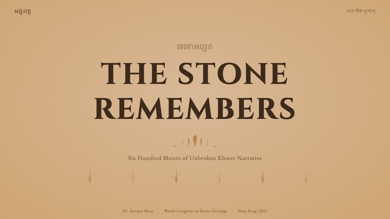
For presentation slides, the relief style works with exceptional force on cover pages and divider slides. A cover benefits from a full-bleed warm-tone field — deep ochre or sandstone rust — with the title set in monumental lapidary capitals and a lotus-band or vine-scroll decorative border framing the composition. Content slides should maintain the warm ground but simplify the ornamental vocabulary: one horizontal rule in an ochre tone, body text in a refined serif, and section markers drawn from the kāla or lotus motif. Data slides translate naturally into bas-relief diagrammatics — bar charts and timelines rendered in the warm-to-shadow tonal range, with depth suggested by the emboss treatment rather than by color variance.在演示文稿中,浮雕风格在封面与分隔页上发挥出格外强大的力量。封面适合采用满版温暖色调底场——深赭或砂岩锈色——标题以纪念性石碑大写字体设置,莲瓣带或藤蔓卷草纹装饰边框框定构图。内容页应保持温暖底场但简化装饰语汇:一条赭石色水平线,正文选用精炼的衬线字体,段落标记借鉴卡拉或莲瓣母题。数据页自然转化为浮雕示意图式——柱状图与时间线在温暖至阴影的色调范围内呈现,深度通过浮压处理而非色相变化来暗示。
For web interfaces and dashboards, the style is appropriate for cultural institutions, heritage brands, luxury travel, spiritual wellness platforms, and any product seeking to communicate depth and historical rootedness. The practical approach: set a warm parchment or sandstone ground, use a single deep-rust accent for interactive elements and calls to action, build card components with a subtle emboss or inset border rather than a drop shadow, and choose typography from the lapidary serif tradition for all display text. Navigation and labeling benefit from wide letter-spacing in a monumental weight, evoking the deliberate spacing of carved inscription. Pricing pages in this style should avoid the visual noise of feature-comparison tables; instead, tier distinctions work better as architectural elements — different surface treatments for each tier, like different chambers of a temple.对于网页界面与仪表板,这种风格适合文化机构、传统品牌、高端旅游、精神健康平台,以及任何寻求传达深度与历史根植感的产品。实践方法:设置温暖的羊皮纸或砂岩底场,以单一深锈红作为交互元素与行动号召的强调色,以细腻浮压或内嵌边框而非投影构建卡片组件,为所有展示文字选用石碑衬线传统的字体。导航与标签以宽字距的纪念性字重设置,唤起雕刻铭文刻意间距的感觉。这种风格下的定价页面应避免功能对比表的视觉噪声;相反,等级区分作为建筑元素更为奏效——每个等级使用不同的表面处理,如神庙的不同院落。
For editorial and marketing work, Angkor Wat Relief lends itself to storytelling contexts: feature articles, cultural brand campaigns, heritage tourism materials, museum publications, and long-form digital essays. The compositional principle of the continuous register encourages full-width banded layouts in which content sections flow into one another without hard-edge breaks. Pull quotes and chapter titles set in lapidary caps against a warm field read as stelae — inscribed markers of significance. Marketing materials for luxury or heritage products use the style's density as a signal of craft and depth: detailed ornamental headers, rich warm photography treated with a warm-tone overlay, and copy that matches the measured cadence of the carved inscription.对于编辑与营销内容,吴哥窟浮雕适合叙事场景:深度报道、文化品牌活动、文化遗产旅游材料、博物馆出版物与长篇数字散文。连续带状的构图原则鼓励采用全宽带状版面,内容区块彼此流入而无硬边截断。以石碑大写字体设置于温暖底场上的引用语与章节标题,读来如同石碑——具有意义的刻写标记。奢侈或传统产品的营销材料利用这种风格的密度作为工艺与深度的信号:精致的装饰性标题、以温暖色调叠加处理的丰富暖色摄影,以及与雕刻铭文的从容节奏相匹配的文案。
A common mistake when applying this style is confusing density with clutter. Angkor Wat's reliefs are dense but never chaotic — every element belongs to a grammar that governs its placement, repetition, and relationship to adjacent elements. Designers who reach for this aesthetic but omit the underlying organizational logic produce surfaces that feel muddy rather than monumental. The corrective is to establish the horizontal register structure first, then populate it with repeating elements at consistent intervals. A second common error is using warm color without tonal range — a flat single ochre produces none of the depth that makes the style compelling. The palette must travel from light unweathered stone through mid ochre to shadow-brown, with the three values doing the structural work that hue contrast does in other systems.应用这种风格时,最常见的错误是将密度与混乱混为一谈。吴哥窟的浮雕是密集的,但绝非混乱——每个元素都属于一套支配其位置、重复与和邻近元素关系的语法。设计师向往这种美学却省略底层组织逻辑,产生的表面感觉模糊而非宏伟。纠正方法是首先建立水平带状结构,再以一致间隔填充重复元素。第二个常见错误是使用温暖色彩却缺乏色调范围——单一的扁平赭色产生不了使这种风格引人注目的任何深度。色调必须从浅色未风化的石材,经由中间赭色,行至阴影棕褐,三个明度值承担着其他系统中色相对比所做的结构工作。
See the Khmer Angkor Wat Relief design system查看 Khmer Angkor Wat Relief 完整设计系统
Khmer Angkor Wat Relief — FAQKhmer Angkor Wat Relief · 常见问题
How is Angkor Wat Relief different from other ancient Asian relief traditions?吴哥窟浮雕与其他亚洲古代浮雕传统有何不同?
The defining distinction is the continuous horizontal narrative register without frame interruption. Greek and Roman friezes, while also continuous, are organized into discrete scenes with vertical dividers. Indian temple sculpture from Khajuraho or Ellora tends toward individual devotional figures in deep niches rather than mass-narrative panoramas. Chinese and Japanese relief traditions are typically more architecturally embedded and less panoramically narrative. Angkor Wat's system is unique in combining the panoramic scale of an epic narrative with the shallow-relief technique that keeps the whole wall surface visually unified — neither sculpture-in-the-round nor flat painting, but something precisely in between.决定性区别在于没有框架中断的连续水平叙事带。希腊和罗马饰带虽然也是连续的,但以垂直分隔线组织成独立场景。卡久拉霍或埃洛拉的印度神庙雕塑倾向于在深龛中呈现个别祈祷性人物,而非大规模叙事全景。中国和日本的浮雕传统通常更多嵌入建筑,叙事全景性较弱。吴哥窟的系统独特之处在于,将史诗叙事的全景规模与浅浮雕技法相结合,使整个墙面视觉上保持统一——既非圆雕也非平面绘画,而是精确处于两者之间的某种存在。
Can this style work in dark-mode or low-light digital environments?这种风格能用于深色模式或低光数字环境吗?
It can, but the inversion requires care. The original palette is inherently light-ground — the warm stone reads against jungle shadow, not against a light field. A dark-mode adaptation that preserves the style's logic would use a deep shadow-brown as the ground, allow the mid-ochre to serve as the midtone, and reserve the palest buff only for highlight text and critical ornamental details. The risk is losing the legibility of the emboss treatment: shallow relief depends on the contrast between raised surface and recessed shadow, and in a dark environment the two values can collapse. To prevent this, the light source implied by the emboss should shift to a warmer, more raking angle — a technique that increases apparent relief depth without changing carving depth.可以,但反转需要谨慎处理。原始色调本质上是浅色底场——温暖石材对比的是丛林阴影,而非亮色底场。保留风格逻辑的深色模式改编,应以深阴影棕褐作为底场,以中赭色充当中间调,将最浅的米色保留仅用于高亮文字与关键装饰细节。风险在于失去浮压处理的可读性:浅浮雕依赖隆起表面与凹陷阴影之间的对比,在深色环境中这两个明度值可能合并崩塌。为防止这种情况,浮压所暗示的光源应转向更温暖、更倾斜的角度——这是一种在不改变雕刻深度的情况下增加表观浮雕深度的技法。
Is this style appropriate for non-cultural or non-heritage brands?这种风格适合非文化或非遗产类品牌吗?
It is appropriate wherever the brand's values include depth, ceremony, craft, and a sense of accumulated wisdom — regardless of whether the brand has an explicit connection to Khmer culture. High-end hospitality, premium spirits, artisan food and beverage, fine jewelry, literary publishing, and luxury wellness are all contexts where the style's signaling — that something has been made with patience, knowledge, and reverence — aligns with what the brand needs to communicate. It is less appropriate for technology brands, fast-moving consumer goods, or any product where the primary value proposition is novelty, speed, or accessibility. Using the style in inappropriate contexts produces an ironic disconnect: the visual language promises depth that the product cannot deliver.凡是品牌价值包含深度、仪式感、工艺与积累的智慧的场合,这种风格均为适用——无论品牌是否与高棉文化有明确关联。高端酒店业、顶级烈酒、手工食饮料、精品珠宝、文学出版、奢华健康——这些都是风格信号——某物以耐心、知识与敬意制造——与品牌需要传达的内容对齐的场景。这种风格对科技品牌、快速消费品,或任何主要价值主张是新颖性、速度或可及性的产品来说较不适合。在不适宜的场景中使用这种风格会产生一种讽刺性的断裂:视觉语言承诺了产品无法兑现的深度。
How should photography be treated within this design system?在这个设计系统中,摄影图像应该如何处理?
Photography should be treated as if it were a relief surface: warm-toned, flattened toward the midtone, and stripped of the cool highlights and shadows that naturalistic photography typically contains. A practical approach is a warm overlay that shifts the entire image toward the ochre-to-rust range and reduces contrast at the highlights, producing the appearance of stone lit by afternoon sun. Photographs of architecture, texture, carved surface, and ritual ceremony work best; photographs of people should favor frontal or profile poses that echo the conventions of the relief figures rather than the dynamic, informal compositions of contemporary editorial photography. Avoid cool-toned stock photography entirely — it breaks the palette's integrity.摄影图像应被处理得如同一个浮雕表面:暖色调,向中间调压缩,剥去自然主义摄影通常包含的冷高光与冷阴影。一个实用的方法是施加温暖叠层,将整张图像向赭石至锈色范围推移,同时降低高光处的对比度,产生被午后阳光照射的石材外观。建筑、纹理、雕刻表面与宗教仪式的摄影效果最佳;人物摄影应倾向于正面或侧面姿态,呼应浮雕人物的惯例,而非当代编辑摄影中充满活力、随意的构图。完全避免冷调的图库摄影——它会破坏色调的完整性。
What is the biggest risk when designers attempt this style?设计师尝试这种风格时最大的风险是什么?
The biggest risk is surface imitation without structural logic — borrowing the visual vocabulary of Angkor Wat (ochre tones, lotus ornament, serif type) without understanding the compositional grammar that makes those elements work. In the original reliefs, density is controlled by the register system: every figure belongs to a defined horizontal band, every ornamental element belongs to a defined border or transition zone, and the kāla faces mark every structural threshold. Designers who apply dense ornament without this underlying architecture produce surfaces that feel overwrought and illegible. The corrective is always structural: establish the register grid first, assign each element type to its proper zone, and let the ornamental vocabulary fill those zones — not overflow them.最大的风险是缺乏结构逻辑的表面模仿——借用吴哥窟的视觉词汇(赭石调、莲瓣装饰、衬线字体)而不理解使这些元素奏效的构图语法。在原始浮雕中,密度由带状系统控制:每个人物属于一个确定的水平带,每个装饰元素属于一个确定的边框或过渡区域,卡拉面孔标记每个结构性门槛。设计师在没有这种底层架构的情况下施加密集装饰,产生感觉过于繁复且难以阅读的表面。纠正方法始终是结构性的:首先建立带状网格,将每种元素类型分配到其适当的区域,让装饰词汇填充这些区域——而不是溢出它们。
Related design styles相关设计风格
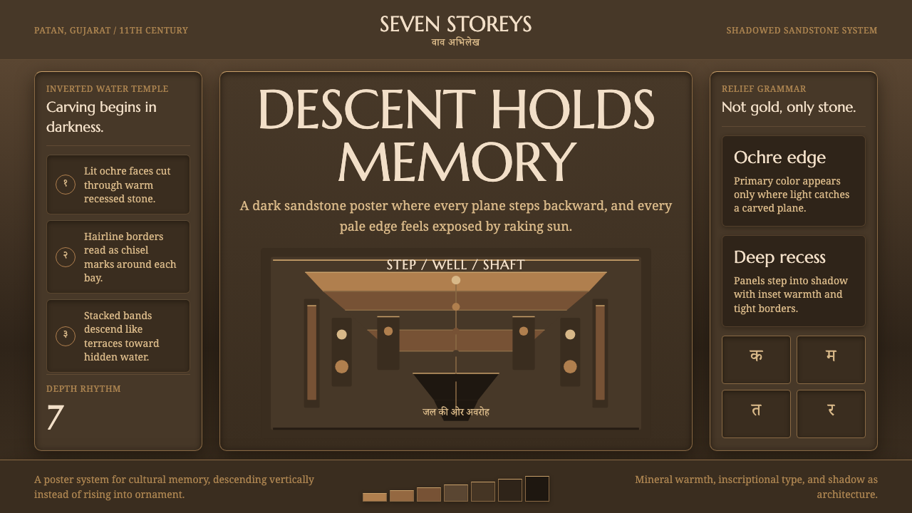 Indian StepwellStone descends into shadow. Ochre serif type and stacked terraces carve the f…砂岩向暗处下沉。赭色衬线与层叠阶台凿出画面。
 Khmer Apsara Relief (Bayon)Contemplative stone weight. Cinzel capitals sit on sandstone registers with l…沉思的石质重量。Cinzel大写压在砂岩叙事带与苔绿边框上。
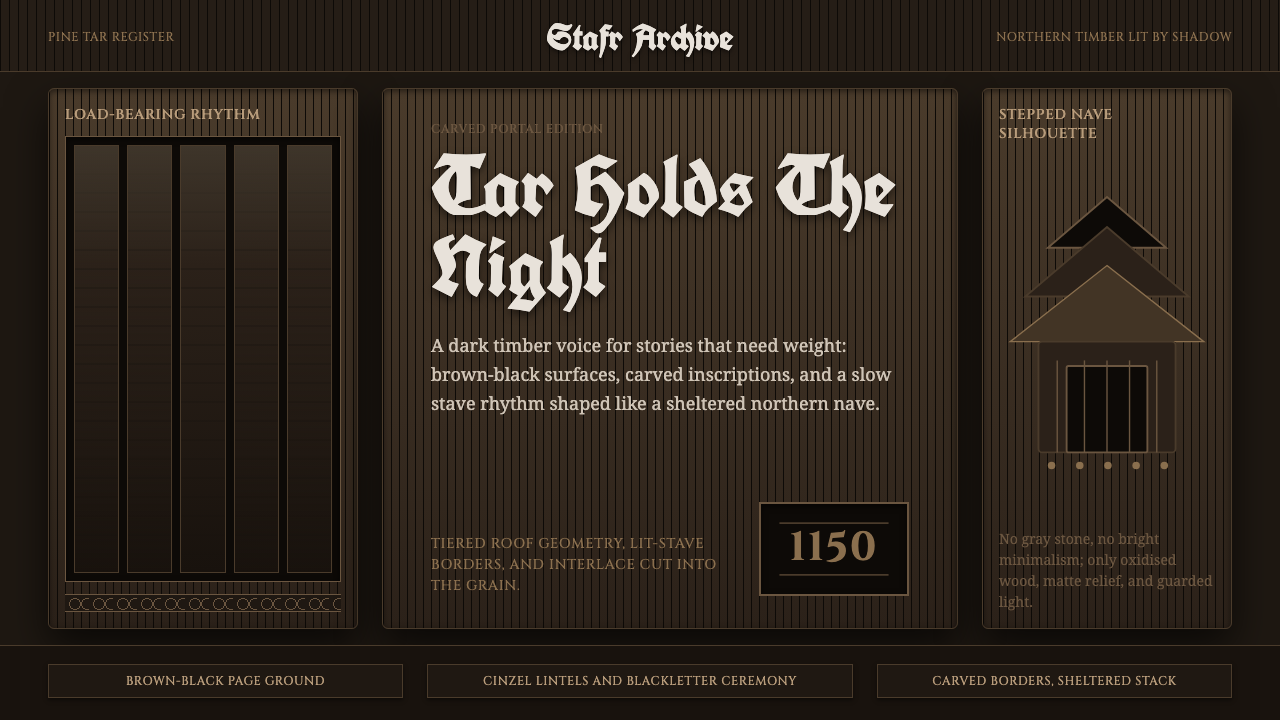 Norwegian Stave ChurchTar makes the sacred heavy. Brown-black fields, Cinzel inscriptions, tiered t…焦油让神圣变重。棕黑底、Cinzel铭文与层叠木构几何。
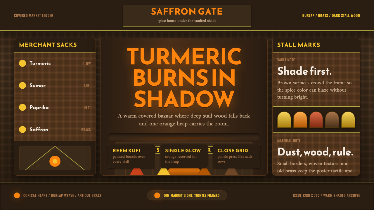 Spice Souk BazaarShade carries the heat. Turmeric orange glows through brown grids and Kufi si…阴影托起热度。姜黄橙穿过深棕网格与库菲招牌发光。
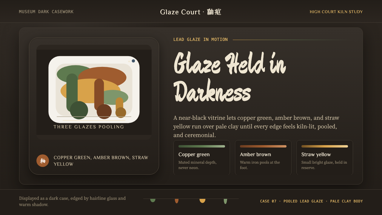 Tang Sancai 唐三彩Museum-dark and molten. Copper green, amber, and straw pools glow in bordered…暗如展柜,釉色流动。铜绿、琥珀与草黄在边框展窗中聚光。
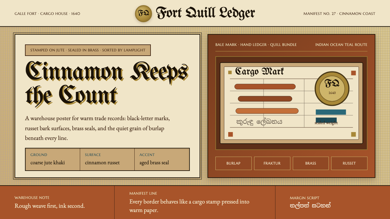 Sri Lankan Cinnamon Galle (1640)Warehouse warmth. Jute khaki, Fraktur stamps, brass seals, cinnamon-russet bl…仓储有温度。黄麻卡其、黑字母戳记、黄铜印章、肉桂赭块。