Design style guide设计风格指南
What is Khmer Apsara Relief (Bayon)?什么是 Khmer Apsara Relief (Bayon)?

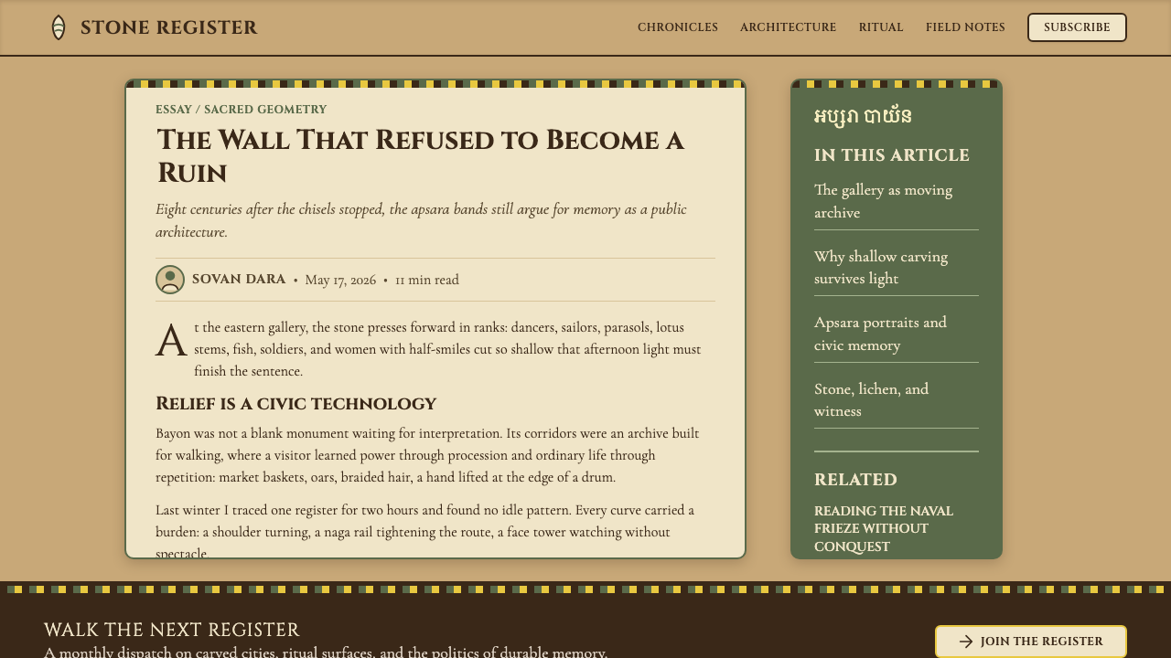
Eight centuries of tropical rain and lichen have given Bayon's stone faces their gravity — a design language built from sandstone registers, apsara processions, and the serene weight of Khmer imperial Buddhism.八百年热带雨水与苔藓赋予了巴戎石面独特的庄重——这套设计语言由砂岩叙事带、阿普莎拉行列与高棉帝国佛教的宁静重量共同构成。
Khmer Apsara Relief (Bayon) in briefKhmer Apsara Relief (Bayon) 速览
Khmer Apsara Relief (Bayon) is a design system drawn from the stone carvings of the Bayon temple at Angkor — the ceremonial heart of the Khmer Empire built under Jayavarman VII in the late twelfth and early thirteenth centuries. Its visual language is defined by warm laterite tan as the dominant ground tone, lichen-green pooling in carved recesses, and the structured density of figures arranged in horizontal narrative registers across every available wall surface.高棉阿普莎拉浮雕(巴戎)是一套源自吴哥巴戎寺石刻的设计系统——这座寺庙是高棉帝国的礼仪中心,由阇耶跋摩七世在十二世纪末至十三世纪初建造。其视觉语言以温暖的赤土色为主色调,苔绿沉积于雕刻凹槽,形象按水平叙事带密集排列于每一面可用的墙面之上。
The aesthetic character is contemplative rather than decorative. Where other imperial styles project grandeur through gilding, lacquer, or polychrome paint, the Bayon system works through relief and shadow alone — raised surfaces catching light while carved grooves hold darkness. The result is a palette that is almost monochromatic: earth, stone, aged lime-wash cream, deep umber shadow lines, and the rare punctuation of vermilion on ceremonial detail.这套美学的气质是沉思性的,而非装饰性的。其他帝国风格通过镀金、漆器或多色彩绘来彰显宏大,巴戎系统则仅靠浮雕与阴影本身运作——凸起的表面承接光线,雕刻的凹槽蓄留暗影。由此形成的色调近乎单色:大地、石材、老旧石灰膏的乳白、深赭阴影线条,以及礼仪细节上偶现的朱砂点缀。
Typography in this system is monumental and carved in character — letterforms with the weight and deliberateness of inscriptions cut into stone, not drawn on parchment. Layouts favor horizontal stacking: content arranged in layered registers, one above the next, like the processional friezes that ring the galleries of Angkor Thom. Density is disciplined, not chaotic — each register contains its own narrative rhythm, separated from the next by a clean horizontal band.这个系统的字体如碑刻般庄重——字形具有铭刻于石面的分量与郑重,而非描绘于纸上的轻盈。版面偏爱水平层叠:内容按叠加的叙事带排列,一层接一层,犹如环绕吴哥通城廊道的行进浮雕。密度是有节制的,而非混乱的——每条叙事带包含自身的叙事节奏,以干净的水平条带与上下相邻的带区分隔。
See the Khmer Apsara Relief (Bayon) design system →查看 Khmer Apsara Relief (Bayon) 完整设计系统 →
Where does Khmer Apsara Relief (Bayon) come from?Khmer Apsara Relief (Bayon) 从何而来?
The Bayon temple was constructed at the geographic and spiritual center of Angkor Thom, the walled capital that Jayavarman VII built after recapturing Angkor from the Cham invaders in 1181. Unlike the earlier Angkor Wat — a Hindu monument oriented toward the east and the rising sun — the Bayon is a Mahayana Buddhist temple, and its iconography reflects that shift: the serene, slightly smiling faces that crown each of its towers are believed to represent either the bodhisattva Avalokiteśvara, or Jayavarman VII himself, or a fusion of the two — the god-king merged with compassion.巴戎寺建于吴哥通的地理与精神中心——吴哥通是阇耶跋摩七世于1181年击退占婆入侵者、重夺吴哥后修建的城垣首都。与早期面朝东方、朝向旭日的印度教纪念建筑吴哥窟不同,巴戎是一座大乘佛教寺庙,其图像体系反映了这一转变:加冕每座塔顶的宁静微笑石面,据信代表菩萨观世音、或阇耶跋摩七世本人、或两者的融合——神王与慈悲合而为一。
The visual vocabulary of apsara figures predates the Bayon by several centuries. Apsaras — divine female dancers and celestial nymphs from Hindu and Buddhist cosmology — appeared in Khmer temple carving as early as the ninth century at Roluos and Preah Ko. By the time of Angkor Wat in the twelfth century, devata and apsara figures had become one of the most refined elements of Khmer sculptural tradition: each figure carved with individually distinctive headdresses, jewelry, and postures, none duplicated exactly. The Bayon extended this tradition to extraordinary scale, with approximately 1,500 unique apsara portraits across its galleries.阿普莎拉图像的视觉词汇早于巴戎数百年便已存在。阿普莎拉——印度教与佛教宇宙论中的天界女舞者与仙女——早在九世纪便已出现于罗洛士和白庙等高棉寺庙的石刻之中。到十二世纪吴哥窟时代,天女与阿普莎拉形象已成为高棉雕塑传统中最为精湛的元素之一:每尊形象的头冠、珠宝与姿态各具个性,无一重复。巴戎将这一传统推至非凡的规模,在其廊道间留下约一千五百尊独一无二的阿普莎拉肖像。
The scholar George Cœdès, working in the early twentieth century, was the first to systematically decode the inscriptions and iconography of Khmer temples, establishing the historical framework within which the Bayon is still understood. Philippe Stern's stylistic analysis in the 1920s and 1930s established the Bayon as a distinct phase — the Bayon style — in the sequence of Khmer architectural development, characterized by a move toward greater decorative density and a softening of the face's expression compared to earlier, more austere Khmer work. Later scholars including Vittorio Roveda mapped the narrative reliefs of the galleries in detail, showing that the outer galleries document historical events — naval battles against the Cham, markets and daily life — while the inner galleries depict cosmological and mythological subjects.学者乔治·赛代斯在二十世纪初率先系统解读高棉寺庙的铭文与图像体系,奠定了至今仍用于理解巴戎的历史框架。菲利普·斯特恩在二十至三十年代的风格分析将巴戎确立为高棉建筑发展序列中一个独特的阶段——巴戎风格——其特征是装饰密度的提升,以及面部表情相较早期更为严峻的高棉作品的柔化。维托里奥·罗韦达等后继学者对廊道叙事浮雕进行了详细测绘:外廊记录历史事件(对战占婆的水战、集市与日常生活),内廊则描绘宇宙论与神话主题。
Eight centuries of tropical climate shaped the patina that is now inseparable from the Bayon's identity. Grey-green lichen colonized the sheltered recesses; lime-wash applied by later restorers survived in patches on raised surfaces as a warm cream; deep umber shadow collected in the grooves between carved figures. This accretion of time is not damage — it is the system's color palette, and any contemporary application of this style works with those aged tones rather than imagining an improbable original freshness.八百年热带气候塑造了如今已与巴戎身份不可分割的包浆。灰绿色苔藓在遮蔽的凹槽中蔓延;后世修复者涂抹的石灰膏在凸起表面的斑块上以温暖乳白色留存;深赭阴影沉积于雕刻人物之间的凹槽中。这种时间的积淀并非损伤——它就是这套系统的色彩调色板,任何对这种风格的当代应用,都应与这些经年色调共处,而非想象一种不可能存在的原初鲜亮。
What defines the Khmer Apsara Relief (Bayon) look?Khmer Apsara Relief (Bayon) 的视觉特征是什么?
Color Palette色彩调色板
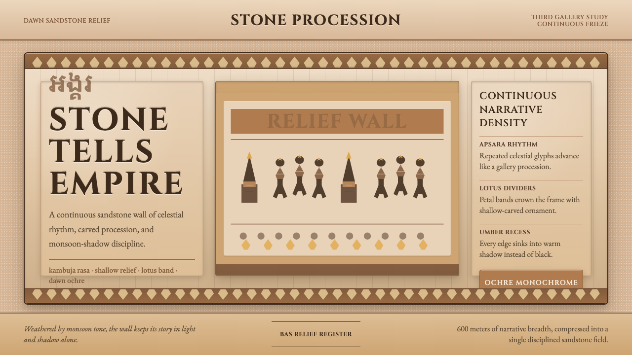
The dominant ground is a warm laterite tan — the color of aged sandstone under afternoon light. Into this ground, carved recesses collect a grey-green lichen tone that reads as a cool shadow accent. Surviving lime-wash on raised surfaces adds a warm cream highlight, and deep umber shadow lines define contour and edge. Vermilion appears as a rare ceremonial accent, never a dominant hue. The overall impression is near-monochromatic: a family of earth tones with a single cool note and occasional warm accent.主底色是温暖的赤土色——午后阳光下老旧砂岩的颜色。在这一底色之中,雕刻凹槽积聚了一种灰绿苔藓色调,作为冷色调的阴影强调。凸起表面残存的石灰膏增添了温暖的乳白色高光,深赭阴影线条勾勒轮廓与边缘。朱砂仅作为罕见的礼仪性点缀出现,从不成为主导色调。整体印象近乎单色:一组大地色调构成的色系,带有一个冷调音符与偶发的暖色强调。
Narrative Register Layout叙事带版面
Content is organized in horizontal stacked bands — registers — each carrying its own visual story. Thin ruled lines or carved ledges mark the boundary between registers, creating a clear hierarchy without interrupting the lateral flow. Reading direction is left to right within each register, and registers stack from bottom to top in order of cosmological significance. This horizontal layering is the defining compositional principle: it accommodates density without visual chaos, and it gives layouts a quality of sequential narration.内容按水平叠加的条带——叙事带——组织,每条带承载自身的视觉叙事。细规则线或雕刻凸台标示叙事带之间的边界,在不中断横向流动的前提下建立清晰的层级关系。每条叙事带内的阅读方向从左至右,各带按宇宙论重要性由下至上叠加。这种水平分层是定义性的构图原则:它在不造成视觉混乱的前提下容纳密度,并赋予版面一种连续叙事的品质。
Figural Density形象密度
Figures are numerous and closely spaced, but each maintains individual identity. In apsara registers, each dancer is distinct in headdress, jewelry, and hand position — repetition of form with variation in detail. This principle translates directly to design applications: a dense grid or list layout where each cell or row shares a common structure but carries unique identifying detail. Density is not clutter; it is organized abundance, legible through the consistent underlying register system.形象数量众多、间距紧凑,但每尊形象保持个体身份。在阿普莎拉叙事带中,每位舞者的头冠、珠宝与手势各异——形式的重复伴随细节的变化。这一原则直接适用于设计应用:在密集的网格或列表版面中,每个单元格或行共享共同结构,却承载独特的识别细节。密度不是杂乱,而是有组织的丰盛,通过一致的底层叙事带系统保持可读性。
Relief Weight and Shadow浮雕重量与阴影
The defining visual quality of Bayon carving is the relationship between raised surface and recessed shadow. The higher the relief, the more dramatic the shadow line — forms are readable at any distance because light and dark do the work of color. In design applications, this translates to a preference for depth created through shadow rather than color contrast: elements with a sense of physical weight, where the shadow implies substance rather than simply lifting an element off a background.巴戎雕刻最具定义性的视觉品质,是凸起表面与凹陷阴影之间的关系。浮雕越高,阴影线越戏剧性——形体在任何距离都清晰可读,因为光与暗承担了色彩的职能。在设计应用中,这转化为一种偏好:用阴影而非色彩对比来创造深度,元素带有物理重量感,阴影暗示实体的存在,而非仅仅将元素从背景中浮起。
Monumental Serif Typography碑刻式衬线字体排印
Letterforms in this system carry the weight and deliberateness of stone inscription. Serifs are robust and structural — the bracketed kind that suggest a chisel rather than a pen nib. Spacing is generous, with letterforms given room to breathe in the way that carved inscriptions are spaced to remain legible as moss and age encroach. Headlines command authority through mass and deliberate pace; body text is set at a measured register, never hurried.这套系统中的字形承载石刻铭文般的分量与郑重。衬线粗壮而具结构感——带括号的类型,暗示凿刀而非笔尖。字间距宽松,字形获得充分的呼吸空间,就像雕刻铭文被间隔以确保在苔藓与岁月侵蚀中依然清晰可读。标题通过质量与从容的节奏彰显权威;正文以稳定的节律排布,从不仓促。
Aged Patina as Surface时间包浆作为表面
The Bayon's visual character cannot be separated from the visible marks of time: lichen blush over carved faces, umber shadow in grooves, cream lime-wash surviving in sheltered pockets. In contemporary application, this means favoring surface treatments that suggest material history — slight texture, uneven tone, the visual equivalent of stone that has been outdoors for centuries. Pristine digital smoothness is the enemy of this aesthetic; controlled imperfection is its instrument.巴戎的视觉特质无法与时间的可见印记分离:苔藓笼罩雕刻面容,赭色阴影沉积于凹槽,石灰膏在遮蔽之处以乳白色留存。在当代应用中,这意味着偏爱那些暗示材料历史的表面处理——轻微的肌理、不均匀的色调、几百年来置身户外的石材的视觉等价物。数字的极致光滑是这种美学的对立面;有节制的不完美是它的工具。
Symmetry with Animated Variation对称与活态变奏
Bayon reliefs operate within a framework of structural symmetry — temple towers are arrayed symmetrically, registers are horizontally balanced — but within that framework, individual figures and narrative scenes introduce constant, lively variation. This is not the rigid mirror symmetry of classical European design; it is bilateral structure animated from within. Design applications should aim for the same quality: a clear symmetric or grid-based structure that is enlivened by variation in the details of each repeating unit.巴戎浮雕在结构对称的框架内运作——寺庙塔楼对称排列,叙事带水平均衡——但在这一框架内,单独的形象与叙事场景引入了持续而生动的变化。这不是欧洲古典设计中僵硬的镜像对称,而是从内部被激活的双侧结构。设计应用应追求同样的品质:清晰的对称或网格结构,通过每个重复单元细节的变化而充满生气。
See the Khmer Apsara Relief (Bayon) design system →查看 Khmer Apsara Relief (Bayon) 完整设计系统 →
Who shaped Khmer Apsara Relief (Bayon)?谁塑造了 Khmer Apsara Relief (Bayon)?
The Khmer king who commissioned the Bayon and rebuilt Angkor Thom after the Cham sack of 1177. His reign (1181–1218) represents the apex of Khmer imperial building ambition — he constructed more monuments than all previous Khmer rulers combined. A devoted Mahayana Buddhist, he embedded his own image (or that of Avalokiteśvara, deliberately merged) into the faces of the Bayon's towers, making the temple simultaneously a religious monument, a portrait gallery, and a declaration of divine sovereignty. His legacy is the most recognizable visual symbol of mainland Southeast Asian civilization.委托建造巴戎并在1177年占婆劫掠后重建吴哥通的高棉国王。他的统治(1181—1218年)代表了高棉帝国建筑抱负的顶峰——他修建的纪念建筑多于此前所有高棉统治者的总和。作为虔诚的大乘佛教徒,他将自己的形象(或有意融合的观世音形象)植入巴戎塔楼的石面之中,使这座寺庙同时成为宗教纪念碑、肖像画廊与神圣主权的宣言。他的遗产是东南亚大陆文明最具辨识度的视觉符号。
The French epigraphist and historian who, working primarily in the first half of the twentieth century, deciphered the Sanskrit and Old Khmer inscriptions of Angkor and established the scholarly framework for understanding the Khmer Empire. His systematic publication of the corpus of Khmer inscriptions made it possible to date monuments, identify patrons, and understand the ideological programs embedded in temple iconography — including the Bayon's identification as a Mahayana Buddhist monument built under Jayavarman VII.二十世纪上半叶主要活跃的法国铭文学家与历史学家,他破译了吴哥的梵文与古高棉文铭文,建立了理解高棉帝国的学术框架。他对高棉铭文语料的系统性出版,使学界得以为纪念建筑断代、识别赞助人,并理解嵌入寺庙图像体系中的意识形态方案——包括将巴戎确认为阇耶跋摩七世建造的大乘佛教纪念建筑。
The French art historian whose stylistic analysis in the 1920s and 1930s first established the Bayon as a distinct and datable style within the sequence of Khmer art. Stern demonstrated that the Bayon's characteristic soft-faced, smiling towers represented a deliberate departure from earlier Khmer aesthetics — a move toward greater interiority and compassionate expression — and that this change tracked with the shift from Hindu to Mahayana Buddhist royal patronage. His work remains foundational to the connoisseurship of Khmer sculpture.二十至三十年代的法国艺术史学家,他的风格分析率先将巴戎确立为高棉艺术序列中一个独特且可断代的风格。斯特恩证明,巴戎标志性的柔面微笑塔楼代表着对早期高棉美学的刻意偏离——朝向更深邃的内省性与慈悲表情的移动——这一转变与皇家赞助从印度教转向大乘佛教同步发生。他的工作至今仍是高棉雕塑鉴赏的基础。
The Italian art historian who produced the most comprehensive modern mapping of the Bayon's narrative relief galleries, published in his detailed studies of Khmer mythological and historical imagery. Roveda's work demonstrated the systematic organization of the relief program — distinguishing the historical reliefs of the outer galleries (battles, processions, markets) from the mythological scenes of the inner galleries — and identified specific episodes from Mahayana Buddhist cosmology, the Mahabharata, and the Ramayana rendered in stone across the walls of the Bayon and its surrounding temples.意大利艺术史学家,他对巴戎叙事浮雕廊道进行了迄今最为全面的现代测绘,成果收录于其关于高棉神话与历史图像的详细研究中。罗韦达的工作揭示了浮雕方案的系统性组织——将外廊的历史浮雕(战役、行进、集市)与内廊的神话场景加以区分——并识别出大乘佛教宇宙论、《摩诃婆罗多》和《罗摩衍那》中的特定情节如何以石刻形式展现于巴戎及周边寺庙的墙面之上。
How do you use Khmer Apsara Relief (Bayon) today?今天怎么用 Khmer Apsara Relief (Bayon)?
Khmer Apsara Relief (Bayon) is a rare style in contemporary design: it offers gravitas without severity, density without chaos, and an aged material warmth that is entirely distinct from the cool minimalism that dominates contemporary digital design. Applying it well requires working with its structural logic — the register system, the relief-and-shadow palette, the monumental typographic weight — rather than simply extracting its color tones and applying them to an otherwise standard layout.高棉阿普莎拉浮雕(巴戎)是当代设计中罕见的风格:它提供庄重而不严峻、密度而不杂乱,以及一种与当代数字设计主导的冷淡极简主义截然不同的经年材料温度。正确应用它需要与其结构逻辑共处——叙事带系统、浮雕与阴影调色板、碑刻般的字体重量——而不仅仅是提取其色调叠加于否则标准的版面之上。
For presentation slides, the Bayon style suits documentary, heritage, or cultural subject matter where depth of history is a design asset. A cover slide works best as a single compositional statement: a large sandstone-toned ground, a dramatic central image treated with low contrast and lichen-green shadow tones, and a title in monumental serif letterforms centered or symmetrically placed. Content slides should lean into the register principle — organizing information in clearly bounded horizontal bands rather than in free-floating text blocks. Data slides take on a relief-like quality when chart elements are given surface weight: deep umber outlines, warm tan fills, and minimal axis decoration, so that the chart reads as carved rather than printed.对于演示文稿,巴戎风格适合以历史深度为设计资产的纪录性、遗产性或文化性主题。封面幻灯片最适合作单一构图陈述:宽阔的砂岩色底面、以低对比度处理并带苔绿阴影调的戏剧性中心图像,以及以碑刻衬线字形居中或对称排布的标题。内容幻灯片应深入叙事带原则——在清晰划定的水平条带中组织信息,而非使用自由浮动的文字块。当图表元素被赋予表面分量时,数据幻灯片呈现出浮雕般的品质:深赭轮廓、温暖赤土色填充、极简的坐标轴装饰,使图表读起来像是雕刻而非印刷。
For web interfaces, this style is most at home in contexts where gravitas and cultural depth are assets: heritage institutions, travel platforms with a Southeast Asian focus, editorial publications on history or archaeology, or any brand that wants to position itself as rooted rather than trend-chasing. Dashboard and pricing pages can use the register principle to organize tier information in horizontal bands, with the dominant sandstone tone as background and licher-green or umber used strictly for emphasis. Navigation should be spare and typographically weighted — not icon-driven, not playful, but deliberate in the manner of an inscription.对于网页界面,这种风格最适合庄重感与文化深度是资产的场景:遗产机构、聚焦东南亚的旅行平台、历史或考古类编辑出版物,或任何希望将自身定位为根植传统而非追逐潮流的品牌。仪表板与定价页面可以使用叙事带原则将等级信息组织为水平条带,以主色砂岩调为背景,苔绿或赭色仅用于强调。导航应当简练且具字体分量——非图标驱动,非玩耍性的,而是带有铭文般郑重感的克制设计。
For editorial and marketing work, the Bayon system supports a particular kind of storytelling: layered, patient, accretive. Long-form editorial layouts benefit from the horizontal register principle applied to chapter breaks and pull-quotes. Marketing pages work well when they alternate between a full warm-ground section and a near-neutral section, letting the sandstone tone land with the weight of stone rather than the lightness of a digital surface. Vermilion, used sparingly as a single call-to-action accent, carries the weight of ceremonial marking without overwhelming the contemplative ground.对于编辑与营销内容,巴戎系统支持一种特定类型的叙事:分层的、从容的、积累性的。长篇编辑版面在章节分隔与引文提示中受益于水平叙事带原则的应用。营销页面在全幅温暖底色区块与接近中性的区块之间交替时效果最佳,让砂岩调以石材的重量而非数字表面的轻盈感落地。朱砂作为单一行动号召的强调色,以克制的方式使用,承载礼仪性标记的分量而不压倒沉思性的底色。
The most common mistake when applying this style is treating the earth-tone palette as simply rustic or neutral, then undermining it with contemporary interface conventions — flat shadows, neon interactive states, geometric sans-serif type, grid-based layouts that have no register logic. A second common mistake is over-texturing: reaching for stone or grunge overlays to simulate aged material, when the real work of this style is done through tone and contrast, not through applied texture filters. The Bayon's depth comes from relief, not from noise — keep surfaces clean within their tonal range and let shadow do the heavy work.应用这种风格时最常见的错误,是将大地色调色板简单视为乡土或中性风格,然后用当代界面惯例来破坏它——平面阴影、霓虹交互状态、几何无衬线字体、缺乏叙事带逻辑的网格版面。第二个常见错误是过度肌理化:为了模拟经年材料而叠加石材或做旧滤镜,而这种风格的真正工作实际上是通过色调与对比完成的,而非通过叠加的肌理滤镜。巴戎的深度来自浮雕,而非噪点——在色调范围内保持表面干净,让阴影承担繁重的工作。
See the Khmer Apsara Relief (Bayon) design system →查看 Khmer Apsara Relief (Bayon) 完整设计系统 →
Khmer Apsara Relief (Bayon) — FAQKhmer Apsara Relief (Bayon) · 常见问题
Is this style only appropriate for Southeast Asian or heritage subjects?这种风格只适合东南亚或遗产类主题吗?
Not necessarily. The Bayon style's core visual principles — earth-tone near-monochromy, horizontal register organization, relief-weight depth, and monumental typography — are structurally transferable to any subject matter that calls for gravitas and contemplative depth. It works well for documentary subjects, long-form journalism, archival or scholarly platforms, and premium brands that want to signal depth of craft rather than trend-awareness. Where it struggles is in contexts that need lightness, speed, or contemporary freshness — fintech, social apps, consumer products aimed at youthful audiences. The palette signals age and weight, which is an asset or a liability depending entirely on what the product needs to communicate.不一定。巴戎风格的核心视觉原则——大地调近单色性、水平叙事带组织、浮雕重量感深度与碑刻式字体排印——在结构上可移植至任何需要庄重感与沉思深度的主题。它适用于纪录性主题、长篇新闻报道、档案或学术平台,以及希望传递工艺深度而非潮流意识的高端品牌。它在需要轻盈感、速度或当代新鲜感的场景中则力不从心——金融科技、社交应用、面向年轻受众的消费品。这套调色板传递岁月与重量的信号,这既可以是资产,也可以是负担,完全取决于产品需要传达什么。
How do you achieve the aged-stone look without relying on texture overlays?如何在不依赖肌理叠加层的情况下实现经年石材的质感?
The aged quality of Bayon stone comes from tone relationships, not texture. The key is working with a palette that has internal variation — not a single flat sandstone color, but a range within the same warm tan family where shadows cool toward grey-green and highlights warm toward cream. Using slightly unsaturated tones rather than clean neutral greys produces the characteristic muted earthiness. Deep, low-opacity shadows that pool in corners and beneath elements simulate the way shadows collect in carved recesses. Texture overlays tend to read as surface noise — they make things look dirty rather than aged. The Bayon's depth is structural, produced by differential lighting on raised versus recessed surfaces, and that is best approximated through deliberate tonal contrast rather than applied filters.巴戎石材的经年品质来自色调关系,而非肌理。关键在于使用内部有变化的调色板——不是单一的平砂岩色,而是同一暖赤土色系内的色域,阴影向灰绿冷却,高光向乳白暖化。使用略微去饱和的色调而非干净的中性灰,能产生标志性的低调土质感。在角落与元素下方沉积的深色、低不透明度阴影,模拟阴影在雕刻凹槽中积聚的方式。肌理叠加往往被读作表面噪点——它让东西看起来脏而非经年。巴戎的深度是结构性的,由凸起与凹陷表面的差异光照产生,这最好通过刻意的色调对比而非叠加滤镜来近似。
How should the register (horizontal band) principle be applied in a modern digital layout?叙事带(水平条带)原则应如何应用于现代数字版面?
The register principle is essentially a structured approach to vertical rhythm. In practical terms, it means dividing a page into distinct horizontal zones — each with a clear beginning and end, its own internal organization, and a visible boundary (a thin ruled line, a tonal shift, or a spatial gap) separating it from adjacent registers. Each register should have a consistent internal logic: if a register contains text, all text in that register follows the same hierarchy; if it contains figures or cards, they follow the same grid within the band. The critical difference between register layout and ordinary section layout is intentionality about boundaries: section breaks should feel like ledges or carved thresholds, not gradual fades or flowing transitions.叙事带原则本质上是一种对纵向节奏的结构化处理方式。在实践中,它意味着将页面划分为清晰的水平区域——每个区域有明确的开始与结束、自身的内部组织,以及一条可见边界(细规则线、色调转换或空间间隙)将其与相邻叙事带分隔。每条叙事带应有一致的内部逻辑:若一条带包含文字,该带内所有文字遵循相同的层级;若包含形象或卡片,它们在条带内遵循相同的网格。叙事带版面与普通分区版面的关键区别在于对边界的意向性:区域分隔应感觉像台阶或雕刻的门槛,而非渐进的消散或流动的过渡。
Can this style work in dark mode?这种风格能用于深色模式吗?
A dark inversion of the Bayon palette is historically plausible — the carved surfaces themselves become near-black at night, and the recessed areas that catch lichen and shadow dominate. On a deep umber or near-black ground, the warm cream and laterite tan shift to role of highlight rather than ground, and lichen green takes on an almost luminescent quality against the dark. This dark variant reads as nocturnal and more intimate than the daylight version. The risks: the near-monochromatic character that gives the style its dignity in daylight can become heavy and oppressive on dark ground if shadow depth is not carefully managed. Reserve vermilion as a single accent only, and ensure that the typographic weight remains sufficient to be legible without competing against the ground for attention.巴戎调色板的深色反转在历史上是合理的——雕刻表面本身在夜间趋近黑色,而积聚苔藓与阴影的凹陷区域占据主导。在深赭或近黑底面上,温暖的乳白与赤土调转变为高光而非底色的角色,苔绿在暗色衬托下呈现出近乎发光的品质。这种深色变体读起来像夜晚的、比日间版本更为亲密的氛围。风险在于:在白昼赋予这种风格庄重感的近单色特质,若阴影深度控制不当,在深色底面上可能变得沉重而压抑。将朱砂保留为单一强调色,并确保字体重量足以在不与底面争夺注意力的前提下保持清晰可读。
What distinguishes authentic use of this style from generic 'ancient temple' visual clichés?对这种风格的真实运用与泛化的「古代神庙」视觉陈词有何区别?
Generic ancient-temple aesthetics typically rely on a handful of visual shortcuts: gold tones, crumbling texture overlays, serif fonts with swash flourishes, and decorative borders modeled on carved frames. None of these are characteristic of the Bayon. The Bayon's palette is warm earth and cool lichen, not gold. Its surfaces are muted and aged, not dramatized through grungy overlays. Its typography is weighty and architectural, not decoratively calligraphic. Its structural principle is the horizontal register — sequential, narrative, measured — not the ornamental frame or symmetrical cartouche. Authentic application requires engaging with the system's structural logic, not its surface associations. If the result looks like a travel poster for a generic ancient site, the structural principles have been ignored in favor of the clichés.泛化的古代神庙美学通常依赖几个视觉捷径:金色调、破碎的肌理叠加层、带花饰的衬线字体,以及以雕刻框架为模型的装饰边框。这些都不是巴戎的特征。巴戎的调色板是温暖大地与冷调苔藓,而非黄金。其表面是低调而经年的,而非通过做旧叠加层戏剧化呈现。其字体是厚重而建筑感的,而非装饰性书法感的。其结构原则是水平叙事带——连续的、叙事性的、节制的——而非装饰性框架或对称的徽章式构图。真实的应用要求与这套系统的结构逻辑相处,而非其表面联想。如果结果看起来像一张泛化古迹的旅游海报,那么结构原则就已经被放弃,取而代之的是陈词滥调。
Related design styles相关设计风格
 Khmer Angkor Wat ReliefStone remembers everything. Ochre friezes, Cinzel capitals, and lotus bands h…石头记住一切:赭石浮雕、Cinzel碑铭与莲瓣带压满墙面。
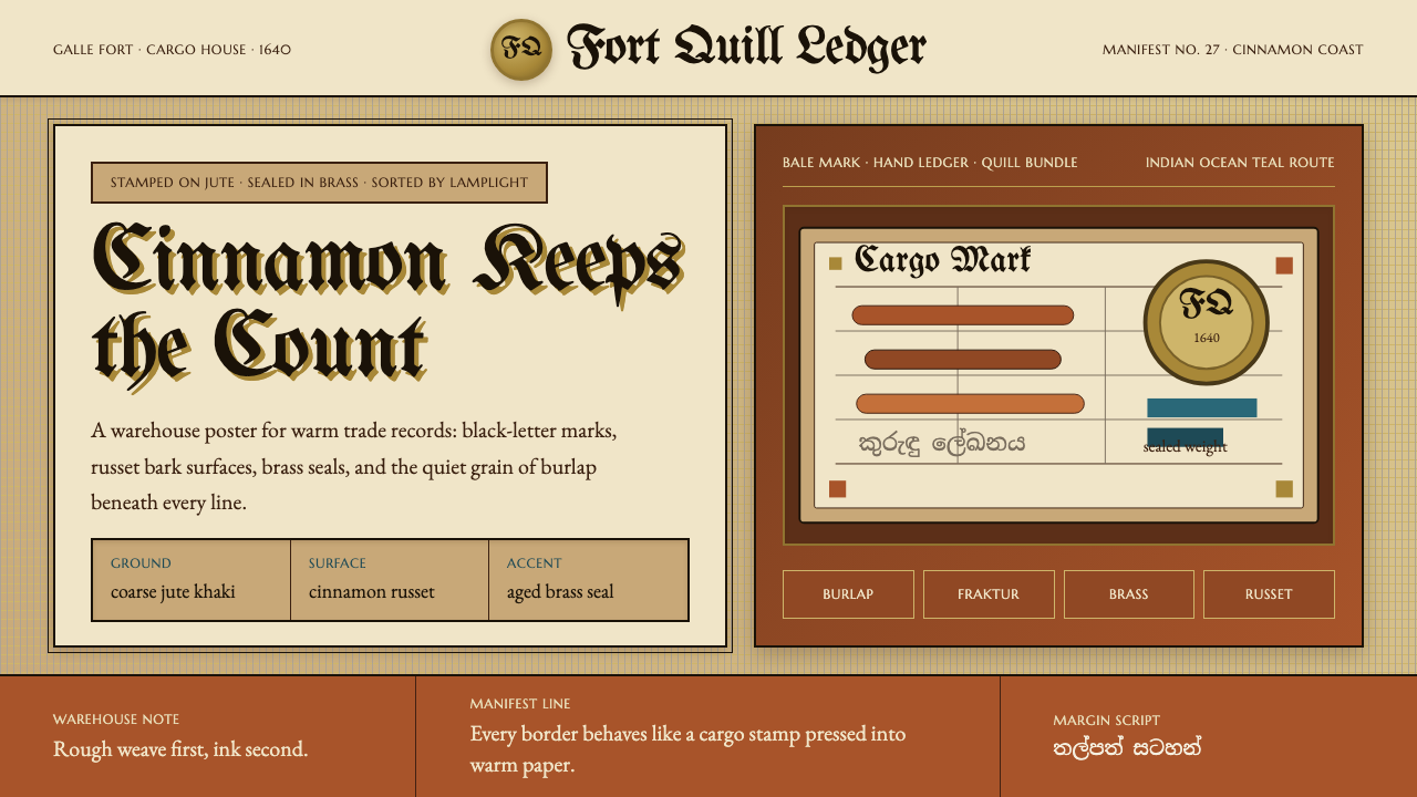 Sri Lankan Cinnamon Galle (1640)Warehouse warmth. Jute khaki, Fraktur stamps, brass seals, cinnamon-russet bl…仓储有温度。黄麻卡其、黑字母戳记、黄铜印章、肉桂赭块。
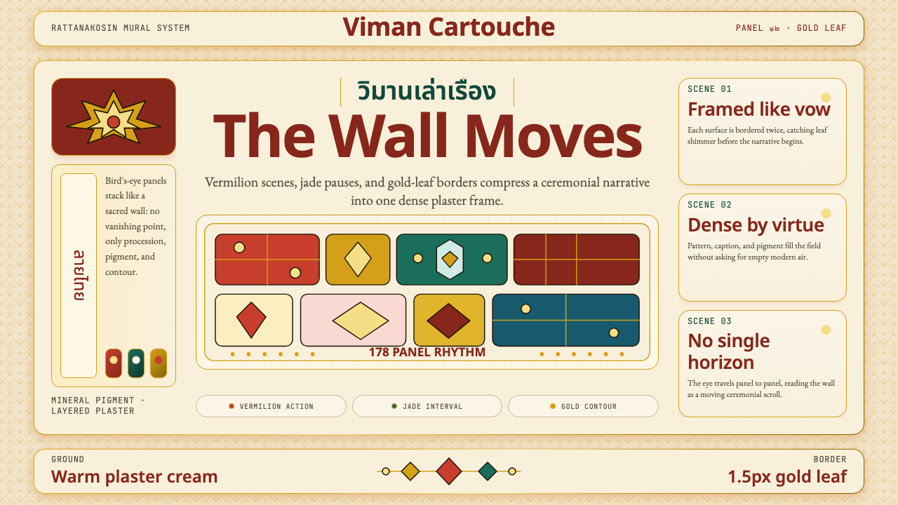 Thai Temple MuralDevotional density. Vermilion panels, plaster cream, and 1.5px gold borders m…虔诚的密度:朱砂面板、灰泥米底与1.5px金线,让墙面成为移动长卷。
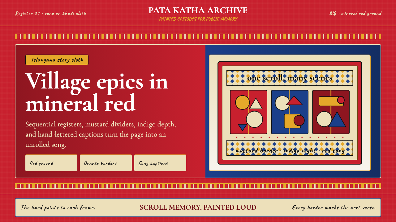 Andhra Cheriyal Scroll PaintingSaturated oral memory. Mineral red registers, mustard diamonds, and serif son…饱和的口述记忆:矿物红分格、芥末黄菱纹与衬线唱词。
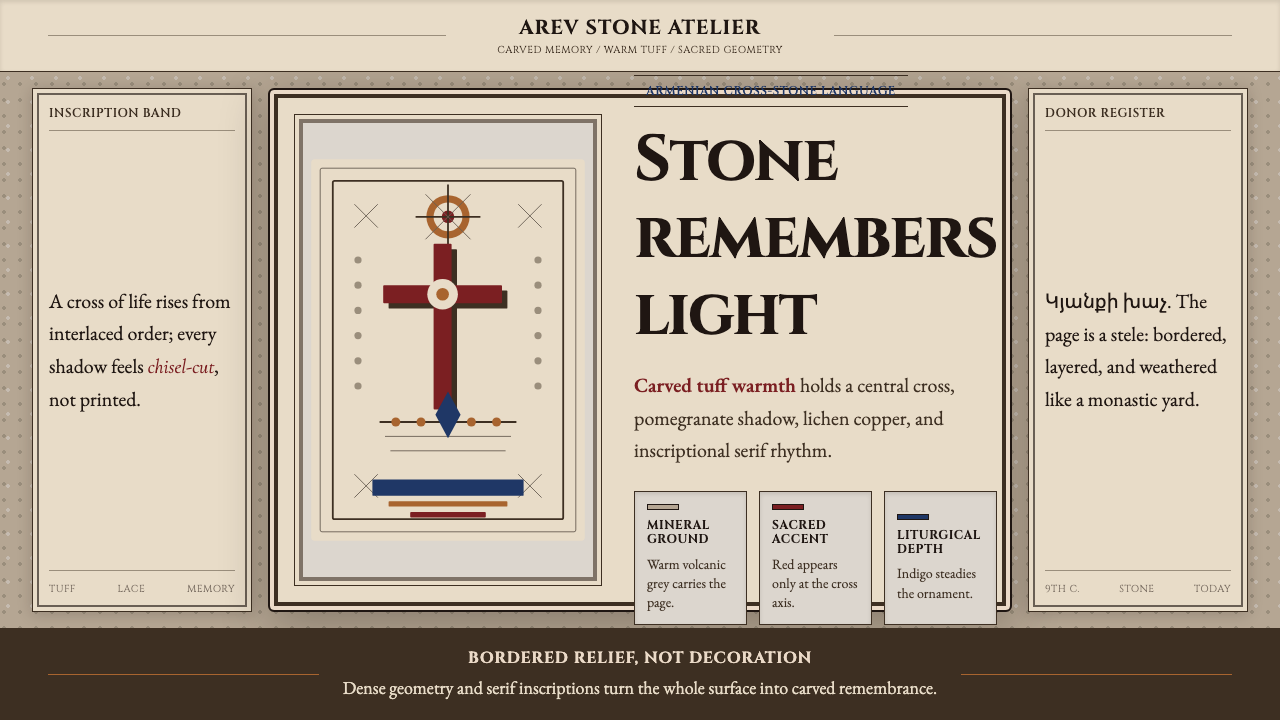 Armenian Khachkar Cross-StoneStone becomes memory. Tuff grey, pomegranate red, and carved borders hold the…石头成为记忆:凝灰岩灰、石榴红与刻痕边框托住十字中轴。
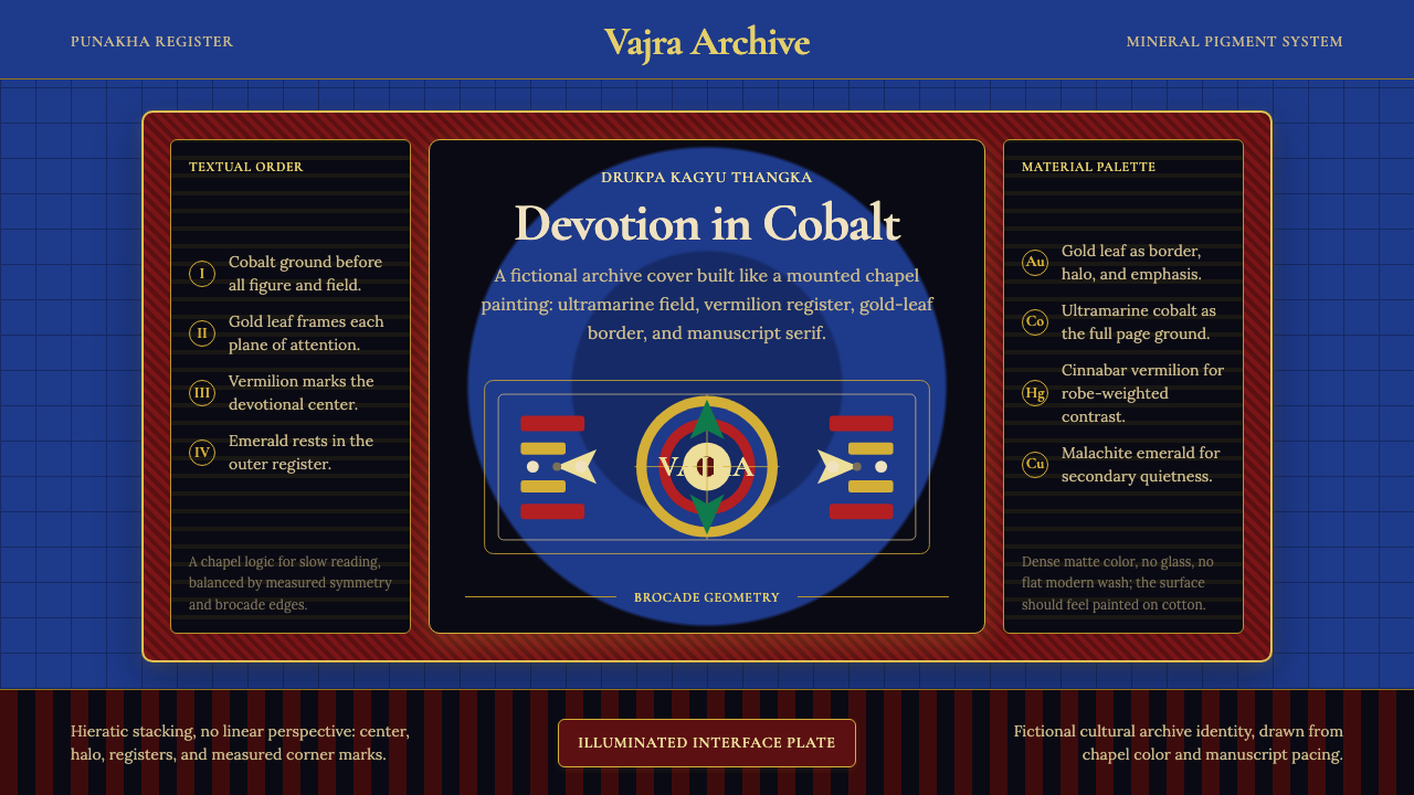 Bhutanese Drukpa Kagyu ThangkaDevotion made cobalt. Gold frames, Cormorant serif, and vermilion marks hold…钴蓝承载虔敬:金框、Cormorant 衬线与朱砂标记构成佛殿秩序。