What is Thai Temple Mural?什么是 Thai Temple Mural?
Thai temple murals pack centuries of celestial narrative into vermilion panels and gold-leaf borders — a devotional density that translates directly into contemporary visual design.泰国寺庙壁画将数百年的天界叙事压缩进朱砂面板与金箔边框之中,这份虔诚的密度可以直接转译为当代视觉设计语言。
Thai Temple Mural in briefThai Temple Mural 速览
Thai temple mural painting is Southeast Asia's most elaborate narrative visual tradition — a system of image-making that developed over centuries to cover the interior walls of Buddhist temple complexes with interlocking scenes of cosmic warfare, royal procession, Jataka birth tales, and divine hierarchy. Unlike decorative traditions that repeat a pattern or celebrate a single motif, Thai murals are programmatic: every surface participates in a unified theological argument, with scenes assigned to walls by cardinal direction and iconographic rank.泰国寺庙壁画是东南亚最精密的叙事视觉传统——一套历经数百年演化、专门覆盖佛教寺院内壁的图像体系,将宇宙战争、王室仪驾、佛本生故事与神祇谱系交织并列。它不同于以重复纹样或单一母题为核心的装饰传统,而是有程序性的:每一面墙都参与一个统一的神学论述,图像依方位与图像等级分配于不同壁面。
The visual language is immediately distinctive. Scenes unfold in elevated bird's-eye perspective with no Western vanishing point — figures, palaces, and forests are stacked vertically on the picture plane in registers that read simultaneously rather than sequentially. Dominant hues include warm vermilion, deep ochre, and plaster cream, enriched by gold-leaf accents applied to architectural details, celestial crowns, and the borders that separate narrative episodes. The effect is one of controlled richness: densely packed yet hierarchically legible.其视觉语言具有极强的辨识度。场景以鸟瞰视角展开,没有西方透视的消失点——人物、宫殿与林木以垂直叠置的方式铺陈在画面上,多个叙事段落同时呈现而非线性推进。主导色调包括温暖朱砂、深赭与灰泥米色,并以金箔点缀建筑细部、天神冠冕以及分隔叙事章节的边框。整体效果是一种被驾驭的丰盛:密度极高,却层级清晰。
As a design system, Thai temple mural aesthetics offer a rare combination of qualities — warmth without casualness, ornamentation without arbitrariness, cultural specificity without parochialism. Every decorative element has iconographic precedent; nothing is added for mere visual effect. This principled density makes the tradition a powerful reference for contemporary work that needs to feel both authoritative and alive.作为一套设计系统,泰国寺庙壁画美学提供了一种罕见的品质组合——温暖却不随意,装饰却不武断,文化特殊性却不狭隘。每一个装饰元素都有图像学的根据,没有任何东西仅仅为了视觉效果而存在。这种有原则的密度,使这一传统成为当代作品的有力参照——当作品既需要权威感,又需要充满生命力时。
See the Thai Temple Mural design system查看 Thai Temple Mural 完整设计系统
Where does Thai Temple Mural come from?Thai Temple Mural 从何而来?
The roots of Thai mural painting reach back to the Ayutthaya kingdom (1351–1767), where royal temple complexes served simultaneously as religious centers and statements of dynastic legitimacy. Court artists, organized into royal workshops, developed a shared iconographic canon derived from Buddhist scripture, the Hindu epic Ramayana (adapted in Thai as the Ramakien), and astrological-cosmological texts describing the layered heavens of Mount Meru. By the time Ayutthaya fell to Burmese forces in 1767, this canon was mature: perspective conventions, color hierarchies, and figural types were established well enough that a new capital could revive them almost immediately.泰国壁画艺术的根源可上溯至大城王国(1351—1767年)。在那里,王室寺院建筑群同时承担宗教中心与王朝正统性宣示的双重功能。宫廷画师以御用工坊的形式组织起来,从佛教经典、印度史诗《罗摩衍那》(泰文改编版为《罗摩坚》)以及描述须弥山诸天层级的天文宇宙学文本中,发展出一套共享的图像规范。大城王国于1767年被缅甸军队攻陷时,这套图像体系已相当成熟——透视惯例、色彩层级与人物类型均已确立,以至于新都城几乎能立刻将其复兴。
The Rattanakosin period, beginning when King Rama I founded Bangkok in 1782, produced the tradition's most celebrated surviving works. The 178-panel Ramakien cycle at Wat Phra Kaew (the Temple of the Emerald Buddha) represents the genre's peak ambition: a continuous narrative wrapping the entire cloister, with panels depicting armies of garuda warriors, naga serpent kings, monkey generals, and celestial palaces rendered in the full palette of vermilion, gold leaf, cobalt, and plaster cream. Across town, the Jataka cycle at Wat Pho depicts scenes from the Buddha's five hundred and forty-seven previous lives in an equally systematic register. These two complexes together function as the tradition's canonical reference.曼谷王朝时期(始于1782年拉玛一世建都曼谷)留下了这一传统中最广为人知的存世作品。玉佛寺(Wat Phra Kaew)的178幅《罗摩坚》回廊壁画代表了这一体系最宏大的叙事野心:一组连续展开、环绕整个廊道的图像,描绘迦楼罗战士军团、那伽蛇王、猴将、天界宫殿,以朱砂、金箔、靛蓝与灰泥米色构成完整色谱。卧佛寺(Wat Pho)的佛本生故事壁画则以同样系统的方式,描绘佛陀五百四十七次前世的片段。这两处建筑群共同构成这一传统的经典参照。
Northern Thailand maintained a parallel tradition under the Lanna kingdoms centered in Chiang Mai. Lanna murals, visible at temples such as Wat Phumin in Nan province, share the broad iconographic program but differ in palette — favoring cooler ochres and siennas — and in figure style, where Chinese and Burmese influences introduced flatter, more graphic silhouettes alongside the sinuous Rattanakosin figural mode. The two regional variants cross-pollinated through the nineteenth and early twentieth centuries, producing a tradition simultaneously unified and locally inflected.泰国北部在以清迈为中心的兰纳王国治下,维持着一套平行的壁画传统。兰纳壁画(可见于南府的帕明寺等处)在图像程序上与曼谷传统一脉相承,但在色调上有所不同——倾向于更冷的赭石与生赭色——在人物风格上,中国与缅甸的影响带入了更平面、更图形化的轮廓处理,与曼谷王朝流畅的人物造型并存。两个地区传统在十九世纪至二十世纪初相互交融,形成一个既统一又带有地方特色的整体传统。
The Department of Fine Arts (Krom Silpakorn), established in the early twentieth century, took on the role of codifying, teaching, and restoring the tradition. Monk-painter Khrua In Khong (active mid-nineteenth century) represents a fascinating transitional moment: working at Wat Bowonniwet in Bangkok, he became the first Thai mural artist to incorporate Western single-point perspective into temple painting, creating compositions that look outward through illusionistic arches — a choice that remains historically controversial precisely because it broke from the canonical elevated viewpoint. Contemporary artist Chalermchai Kositpipat, responsible for the interior of Wat Rong Khun (the White Temple) in Chiang Rai, has extended the tradition into the twenty-first century by incorporating contemporary iconography — including figures from popular culture — into the classical compositional framework.二十世纪初成立的泰国艺术厅(Krom Silpakorn)承担起整理、传授与修复这一传统的职责。十九世纪中叶活跃的僧侣画家克鲁阿·因孔(Khrua In Khong)代表了一个迷人的过渡时刻:他在曼谷的博文尼韦寺(Wat Bowonniwet)工作,成为泰国第一位将西方单点透视引入寺庙壁画的画师,创作了向外穿越幻觉性拱门的构图——这一选择在历史上颇具争议,恰因为它打破了经典的鸟瞰视角传统。当代艺术家查伦猜·戈西彼帕(Chalermchai Kositpipat)负责清莱府白庙(Wat Rong Khun)内部壁画的绘制,他将当代图像——包括流行文化人物——纳入经典构图框架,将这一传统延伸进了二十一世纪。
What defines the Thai Temple Mural look?Thai Temple Mural 的视觉特征是什么?
Color Hierarchy色彩层级
The palette is stratified by sacred rank. Gold leaf — applied to divine beings, celestial architecture, and border lines — occupies the highest tier, signaling proximity to the sacred. Vermilion grounds identify principal narrative panels and primary figures. Plaster cream or warm off-white serves as the base tone for secondary surfaces and mortal characters. Deep cobalt and forest green appear in foliage, water, and demon armies. This hierarchy is not decorative accident — it encodes theological importance into visual weight, so a viewer can read the status of any figure by the colors surrounding it.色彩谱系依神圣等级分层。金箔——施于神祇、天界建筑与边框线条——位于最高层级,标示与神圣领域的接近程度。朱砂红底色界定主要叙事面板与核心人物。灰泥米色或温暖的非纯白色作为次要空间与凡人角色的基调。深靛蓝与森林绿出现在植被、水域与魔军之中。这一层级并非装饰性偶然——它将神学重要性编码进视觉重量之中,观者仅凭包围某一人物的色彩,便能解读其地位。
Gold-Leaf Border System金箔边框体系
One of the tradition's most transferable design elements is its border logic. Narrative panels are separated by thin gold-leaf lines of consistent weight — not decorative flourishes but structural divisions that define the reading unit. These borders serve the same function as a grid in contemporary layout: they prevent visual collision between scenes, establish breathing room, and communicate that each framed area is a complete compositional unit. The borders also create a secondary all-over pattern when viewed from a distance, giving large mural surfaces a textile-like coherence.这一传统中可移植性最强的设计元素之一,是其边框逻辑。叙事面板之间以线重统一的细金线分隔——不是装饰性花饰,而是界定阅读单元的结构性分割线。这些边框与当代排版中网格的功能相同:防止场景之间的视觉碰撞,建立呼吸空间,并传达每个被框起的区域是一个完整的构图单元。从远处观看时,这些边框还形成一种遍布全面的二级图案,使大型壁画面产生织物般的整体性。
Elevated Viewpoint and Spatial Convention鸟瞰视角与空间惯例
Thai murals employ a distinctive elevated, panoramic viewpoint that has no Western equivalent. Rather than establishing a single horizon line, scenes are organized in vertical registers where scale indicates importance rather than depth. Foreground figures may be the same size as distant ones; a palace tower might be depicted simultaneously in elevation and plan. This spatial convention allows enormous compositional density — a single panel can contain hundreds of legible figures without visual chaos — and creates an immediately recognizable flatness that distinguishes the tradition from European pictorial space.泰国壁画采用一种独特的鸟瞰全景视角,没有西方对应物。它不以单一地平线组织画面,而是以垂直叠置的方式排列场景,尺寸表示重要性而非深度。前景人物可能与远景人物等大;一座宫殿塔楼可能同时以立面和平面图的方式呈现。这种空间惯例允许极高的构图密度——一个面板可以容纳数百个可辨识的人物而不产生视觉混乱——并创造出一种直接可辨的平面性,使这一传统有别于欧洲图像空间。
Figural Iconography人物图像规范
Character types in Thai mural painting are highly codified. Celestial beings (devas) are distinguished by elaborate tiered crowns and sinuous posture; garuda figures are half-man, half-eagle with wings in a characteristic spread; naga serpents rear upward in multi-headed hoods; demon kings are identified by dark skin, bulging eyes, and fanged grimace. These types function like a visual vocabulary — their combination and arrangement communicates narrative meaning even to a viewer unfamiliar with the source texts. The consistency of figural type across centuries of mural production is itself a design principle: recognizability builds trust and reduces interpretive friction.泰国壁画中的人物类型高度规范化。天神(Deva)以精致的层叠宝冠与婉转体态区别;迦楼罗形象为半人半鹰,双翼展开成标志性姿态;那伽蛇神以多头蛇冠仰首而立;魔王以深色皮肤、凸眼与獠牙怒容辨识。这些类型如同视觉词汇——它们的组合与排列传递叙事意义,即便对于不熟悉原始文本的观者亦然。数百年壁画创作中人物类型的一致性,本身就是一种设计原则:可辨识性建立信任,减少解读摩擦。
Narrative Density and Register Logic叙事密度与叙述层级逻辑
Thai murals do not treat negative space as a compositional virtue. Every available surface is charged with narrative incident — mountains, trees, water, and architectural detail fill the interstices between figures, preventing any visual rest. This density is purposeful: the mural tradition emerged from a context where visual instruction served populations with limited access to written texts, so completeness of information was itself a virtue. Translated to contemporary design, this principle argues for information-rich layouts where visual complexity is carefully organized rather than avoided — the opposite of the current cultural preference for white space.泰国壁画不将留白视为构图美德。每一处可用的表面都充满叙事事件——山脉、树木、水流与建筑细部填满人物之间的间隙,不留任何视觉休止。这种密度是有意为之:壁画传统诞生于一个以视觉教化为主要传播手段的语境,因此信息的完整性本身就是一种美德。转译为当代设计,这一原则支持信息丰富的版面——视觉复杂性被精心组织而非回避——这与当下对留白的文化偏好恰恰相反。
Architectural Integration建筑整合性
Thai temple murals are never conceived as standalone pictures — they are designed as integral skins for specific architectural surfaces. Scenes wrap continuously around cloister walls, with iconographic programs calibrated to the orientation of each wall face (east-facing walls typically show cosmological maps; west-facing walls address death and the afterlife). Window openings become compositional moments, and decorative borders transform architectural features into picture frames. This total integration of image and architecture is a defining characteristic: the work cannot be fully understood as a flat image but only as an immersive spatial experience.泰国寺庙壁画从不被构想为独立图像——它们被设计为特定建筑面的整体表皮。叙事场景连续环绕廊道墙面,图像程序依每面墙的朝向校准(东向墙面通常呈现宇宙地图,西向墙面涉及死亡与来世)。窗洞成为构图时刻,装饰边框将建筑构件转化为画框。图像与建筑的这种全面整合是一个决定性特征:这批作品不能作为平面图像被完全理解,只能作为沉浸式空间体验来感知。
Ornamental Syntax: Cho Fa and Flame Motifs装饰语法:却发与火焰纹
Thai temple visual vocabulary includes a set of recurring ornamental forms that carry specific meaning rather than pure decoration. The cho fa — a curved finial resembling a stylized bird beak or flame — appears at the apex of every gable, signaling celestial territory. Flame or kinnara feather motifs border panels and frame figures, indicating sacred space. Knobbly naga balustrades define pathways and thresholds. These motifs function as a syntactic layer: they do not narrate but they cue the viewer into the register of meaning in which the narrative operates. Contemporary applications that borrow these forms selectively gain immediate cultural legibility.泰国寺庙视觉词汇包含一组具有特定含义而非纯粹装饰性的反复出现的母题。「却发」(Cho Fa)——一种弯曲的脊饰,形似程式化的鸟喙或火焰——出现在每个山墙顶端,标示天界领域。火焰或迦鲁达羽毛纹样框缘面板、环绕人物,指示神圣空间。布满鳞节的那伽栏杆界定通道与门槛。这些母题构成一个句法层:它们不叙事,但引导观者进入叙事所在的意义维度。有选择地借用这些形式的当代作品,可以立即获得文化可读性。
See the Thai Temple Mural design system查看 Thai Temple Mural 完整设计系统
Who shaped Thai Temple Mural?谁塑造了 Thai Temple Mural?
Khrua In Khong was a Buddhist monk-painter active in Bangkok during the mid-nineteenth century, primarily at Wat Bowonniwet Vihara, where he worked under royal patronage during the reign of Rama IV (King Mongkut). He is the pivotal and controversial figure in the tradition's history: the first Thai mural artist to systematically incorporate Western single-point perspective into temple painting, producing compositions where interior spaces recede through arched windows into illusionistic landscapes. His innovation was not universally welcomed — many regarded it as a departure from canonical elevated viewpoint that undermined the cosmic spatial logic of traditional mural programs — and the debate his work provoked remains relevant to any contemporary designer navigating the tension between inherited visual conventions and foreign aesthetic imports.克鲁阿·因孔是十九世纪中叶活跃于曼谷的佛教僧侣画师,主要工作于博文尼韦寺,在拉玛四世(蒙固王)在位期间接受王室赞助。他是这一传统历史中最关键也最具争议的人物:泰国第一位系统性地将西方单点透视引入寺庙壁画的画师,创作了室内空间透过拱形窗洞向幻觉性风景退缩的构图。他的创新并未获得普遍认可——许多人认为,这是对经典鸟瞰视角的背离,破坏了传统壁画程序的宇宙空间逻辑——他的作品所引发的争论,至今对任何在继承的视觉惯例与外来美学输入之间导航的当代设计师都有参考意义。
Chalermchai Kositpipat is the most prominent contemporary Thai artist working in the temple mural tradition. Born in Chiang Rai in 1955, he studied at the Poh Chang Academy of Arts in Bangkok and later at Silpakorn University. His defining achievement is the interior of Wat Rong Khun (commonly known internationally as the White Temple) in Chiang Rai, which he began designing and painting in 1997 and continues to expand. Kositpipat's approach integrates traditional iconographic types — celestial beings, naga serpents, mythological battles — with imagery drawn from contemporary popular culture, science fiction, and current events, treating the mural tradition as a living framework capable of absorbing new content without losing structural coherence. His work has provoked both acclaim and criticism for its departure from strict classical precedent.查伦猜·戈西彼帕是当代最重要的延续寺庙壁画传统的泰国艺术家。1955年生于清莱,先后就读于曼谷博昌艺术学院与西拉巴昆大学。他最具决定性意义的成就是清莱府白庙(Wat Rong Khun)内部的设计与绘制——他于1997年开始这一工程,至今仍在持续扩建。戈西彼帕的方式将传统图像类型——天神、那伽、神话战斗——与来自当代流行文化、科幻小说及时事的图像整合在一起,将壁画传统视为一个能够吸收新内容而不失结构连贯性的活体框架。他的作品因偏离严格的经典先例而招致赞誉与批评并存。
The Department of Fine Arts — in Thai, Krom Silpakorn — was established in 1911 under Prince Damrong Rajanubhab and reorganized in its modern form in 1926 under the Italian sculptor Corrado Feroci (who took the Thai name Silpa Bhirasri). The department functions as the institutional custodian of Thai classical visual arts, overseeing the restoration of historic murals, training artists in traditional techniques, certifying authentic restoration work, and maintaining the archives of iconographic precedents against which new works are measured. Its role is analogous to that of a national standards body: it does not produce the most innovative contemporary work in the tradition, but it preserves the canonical reference against which innovation is measured and assessed.泰国艺术厅(Krom Silpakorn)于1911年在达姆隆·拉贾努帕王子主持下建立,1926年在意大利雕塑家科拉多·费罗奇(泰文名西拉帕·碧拉西)主导下以现代形态重组。艺术厅作为泰国古典视觉艺术的机构守护者,负责监督历史壁画的修复、培训传统技法艺术家、认证真实的修复工作,并维护图像先例档案库——新作品将以此为参照进行衡量。其角色类似于一个国家标准机构:它未必产出传统中最具创新性的当代作品,但它保存着经典参照,使创新能够被测量与评估。
The Lanna mural tradition centered in Chiang Mai and the surrounding northern provinces developed in partial independence from the Rattanakosin style of Bangkok. Lanna master painters — many of them anonymous monks or lay artists attached to local temple workshops — produced a regional variant characterized by a cooler, earthier palette (siennas, cool ochres, muted greens), flatter figural silhouettes reflecting Burmese and Yunnan Chinese influence, and a more intimate compositional scale. The most celebrated surviving examples are at Wat Phumin in Nan province (c. 1874–1875), which depict court scenes and local life alongside canonical Jataka narratives with a directness and psychological warmth unusual in the more formally hierarchical Bangkok tradition.以清迈及周边北部省份为中心的兰纳壁画传统,在一定程度上独立于曼谷的曼谷王朝风格而发展。兰纳画师——其中许多是匿名僧侣或附属于地方寺庙工坊的俗家艺人——创作了一种地区变体,以更冷、更质朴的色调(生赭、冷赭、低饱和绿色)、受缅甸与云南汉族影响的更平面的人物轮廓,以及更亲切的构图尺度为特征。最广为人知的存世实例是南府的帕明寺壁画(约1874—1875年),其中将宫廷场景与本地生活同经典佛本生故事并列描绘,呈现出一种在更正式层级化的曼谷传统中罕见的直接性与心理温度。
As the founder of the Rattanakosin dynasty and the city of Bangkok in 1782, Rama I was not an artist but the supreme patron whose architectural ambitions made the tradition's greatest surviving works possible. His decision to commission the Ramakien mural cycle for the cloister of Wat Phra Kaew established the scope and ambition that defined the tradition for the following two centuries. The Ramakien — his own revised translation of the Ramayana, which he personally edited — became both the literary source and the iconographic template for the 178-panel sequence. Patronage at this scale, directing teams of royal artists under exacting iconographic supervision, is itself a form of design practice: Rama I effectively art-directed the canonical statement of the tradition.拉玛一世(帕佛陀约华朱拉洛)作为曼谷王朝的创立者,于1782年建都曼谷,他并非画师,而是至高赞助人,正是他的建筑抱负使这一传统最伟大的存世作品成为可能。他委托玉佛寺廊道绘制《罗摩坚》壁画的决定,确立了此后两个世纪定义这一传统的规模与野心。《罗摩坚》——他亲自修订的泰文版《罗摩衍那》——既是这组178幅系列壁画的文学来源,也是其图像模板。在如此规模的赞助之下,指挥王室画师团队在严格图像监督下工作,本身就是一种设计实践:拉玛一世实际上对这一传统的经典陈述进行了艺术指导。
How do you use Thai Temple Mural today?今天怎么用 Thai Temple Mural?
Thai temple mural aesthetics offer contemporary designers a system of controlled richness — dense, ornamental, and warm — that is rarely available in Western design traditions without tipping into kitsch. Applying it correctly requires understanding the underlying principle: every element earns its presence through iconographic function, not pure aesthetics. The goal is not to replicate the imagery but to absorb the structural logic: hierarchical color, framed panels, border systems, and elevated compositional perspective.泰国寺庙壁画美学为当代设计师提供了一套被驾驭的丰盛系统——密度高、装饰性强、色调温暖——在西方设计传统中,这种组合极难不滑向俗艳。正确应用它,需要理解其底层原则:每一个元素都通过图像功能而非纯粹的审美来证明自己的存在合法性。目标不是复制图像,而是吸收其结构逻辑:层级化的色彩、框架面板、边框系统,以及鸟瞰式的构图透视。
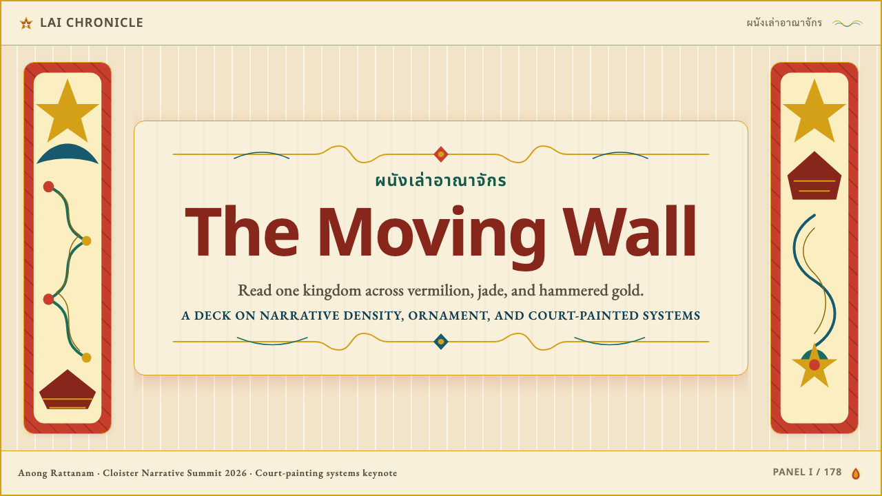
For presentation slides, the tradition provides one of the strongest models for cover design. A cover slide benefits from a deep vermilion or warm plaster-cream ground, with the title and key information set in high contrast against it. Gold-weight borders — thin lines that frame the content area as a panel — establish immediate visual authority. The bird's-eye compositional logic translates into asymmetric arrangements where elements stack vertically rather than centering on a Western axis. Content slides should use the border-panel system consistently: each data table, chart, or text block is framed as a discrete panel with a thin gold or deep-toned rule, so the overall slide reads like a mural fragment. Avoid centering compositions — lateral asymmetry is more consistent with the tradition's visual energy.在演示文稿中,这一传统为封面设计提供了最有力的范本之一。封面幻灯片可以使用深朱砂或温暖灰泥米色作为底色,标题与关键信息以高对比度置于其上。金线重量的边框——框定内容区域作为「面板」的细线——立即建立起视觉权威感。鸟瞰式构图逻辑转化为非对称排列,元素垂直叠置而非居中于西方轴线。内容幻灯片应一致地使用边框—面板系统:每个数据表、图表或文本块都以细金线或深色调规则框起,使整体幻灯片读起来如同一片壁画残片。避免居中构图——横向非对称更符合这一传统的视觉能量。
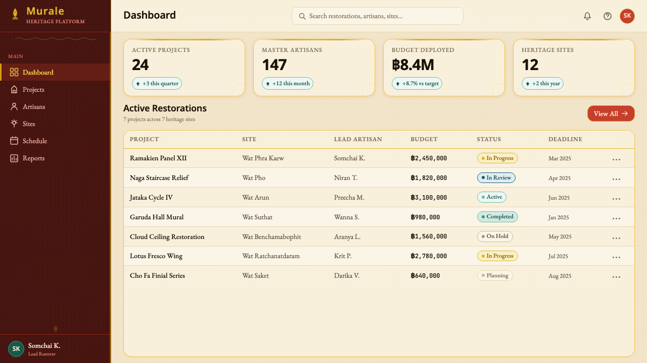
For web interfaces and dashboards, the style excels where information density is an asset rather than a liability. A dashboard using this aesthetic should adopt a warm off-white or plaster-cream background — never cool gray — with data panels clearly framed by hairline borders in a deeper tone or gold weight. Navigation elements work well in deep vermilion or ochre; interactive states can shift to gold or bright accent tones without breaking the palette logic. The tradition supports multi-panel layouts naturally — its compositional precedent is literally a wall of adjacent framed scenes — making it ideal for complex data environments where multiple information streams coexist. Pricing pages benefit from the color hierarchy: use the warmest, highest-status tone (vermilion or deep gold-adjacent) for the featured tier, cooler and more neutral tones for standard options.对于网页界面与仪表板,这种风格在信息密度是资产而非负担的场景中表现出色。采用这套美学的仪表板应使用温暖的非纯白或灰泥米色作为背景——绝不使用冷灰——数据面板以深色调或金线重量的发丝线边框清晰划定。导航元素在深朱砂或赭色中表现良好;交互状态可以转移到金色或明亮强调色,而不打破色板逻辑。这一传统自然支持多面板布局——其构图先例字面上就是一面相邻框景并列的墙——使其非常适合多信息流共存的复杂数据环境。定价页面可以借用色彩层级:使用最温暖、最高地位的色调(朱砂或接近深金的色调)标示特色方案,用更冷、更中性的色调表示标准选项。
For editorial and marketing work, the tradition provides a framework for warm, authoritative visual storytelling. Magazine layouts and long-form editorial pieces can borrow the register logic directly: sections separated by horizontal gold-weight rules, pull quotes or call-outs placed in visually bordered panels, and photography treated as a narrative element rather than decoration. Marketing hero sections work well with full-width panels in deep warm grounds, type set large and centered in the manner of a mural inscription. Brand identities that need to evoke craft, cultural depth, and premium warmth — hospitality, food and beverage, cultural institutions, luxury goods with Southeast Asian or Buddhist cultural connections — find the tradition's visual language a credible and distinctive alternative to Western minimalism.对于编辑与营销内容,这一传统提供了一个温暖而权威的视觉叙事框架。杂志版面与长篇编辑内容可以直接借用叙述层级逻辑:以横向金线重量的规则分隔各节,将引语或重点内容置于有视觉边框的面板中,将摄影处理为叙事元素而非装饰。营销主视觉区域适合使用深暖色底面的全宽面板,标题以大字号居中设置,如壁画题记般处理。需要唤起工艺感、文化深度与高端温度的品牌识别——餐旅、食品饮料、文化机构、具有东南亚或佛教文化关联的奢侈品——会发现这一传统的视觉语言是西方极简主义之外一个可信而独特的选择。
A common mistake when applying Thai temple mural aesthetics is treating the gold as the primary element and building everything else around it. In authentic mural work, gold is an accent applied to the highest-status elements — borders, crowns, architectural details — against grounds that carry the weight. If gold becomes the ground or dominates more than a quarter of the visual field, it loses its hierarchical function and the palette reads as merely opulent rather than structured. Similarly, confusing the tradition's density with license for visual disorder misses its core logic: the density of Thai mural painting is always organized by panel borders, figure type conventions, and register hierarchy. Contemporary work that adopts the density without the organizing system produces visual noise rather than richness.应用泰国寺庙壁画美学时最常见的错误,是将金色当作主要元素,将其他一切围绕其构建。在真实的壁画作品中,金色是施于最高地位元素的点缀——边框、宝冠、建筑细部——底色才是承载重量的部分。如果金色成为底色,或占据超过四分之一的视觉空间,它便失去了层级功能,整个色板读起来仅仅是奢华,而非有结构的。同样,将这一传统的密度误解为视觉无序的许可,会错过其核心逻辑:泰国壁画的密度始终由面板边框、人物类型惯例与叙事层级组织起来。采用了密度却没有组织系统的当代作品,产生的是视觉噪音而非丰盛感。
The tradition's warm palette does have a natural dark mode: deep lacquer black — historically used as the base coat in certain mural painting techniques — paired with vermilion and gold leaf creates an intensely dramatic alternative. This dark variant works well for premium evening events, luxury product presentations, and contexts where the primary emotional register is grandeur rather than warmth. On a deep ground, use gold-weight borders more sparingly and increase the luminosity of the vermilion accent to maintain figure-ground legibility. Avoid adding cool tones or desaturated neutrals — they will immediately break the warm-opulent palette logic that distinguishes this tradition from generic dark-luxury aesthetics.
See the Thai Temple Mural design system查看 Thai Temple Mural 完整设计系统
Thai Temple Mural — FAQThai Temple Mural · 常见问题
How does Thai temple mural style differ from other Southeast Asian mural traditions?泰国寺庙壁画风格与其他东南亚壁画传统有何不同?
Thai temple mural painting is distinguishable from its closest neighbors by several specific features. Compared to Cambodian Khmer relief sculpture (the visual tradition most often confused with it), Thai mural painting is two-dimensional and color-saturated rather than monochrome stone carving. Compared to Burmese lacquerware painting, Thai murals are larger in scale and more narratively programmatic, with scenes assigned by iconographic hierarchy rather than decorative rhythm. Compared to Balinese mural and textile traditions, Thai mural painting is more formalized in its figure types and more closely tied to a specific literary canon (the Ramakien and the Jataka). The Lanna northern tradition shares characteristics with Burmese Shan and Yunnan Chinese Buddhist painting, but the Rattanakosin Bangkok style is unmistakably Thai in its palette intensity, gold-leaf density, and elevated-viewpoint spatial convention.泰国寺庙壁画可通过几个具体特征与最近的邻近传统区分。与最常与之混淆的高棉浮雕石刻相比,泰国壁画是二维的、色彩饱和的,而非单色石雕。与缅甸漆器绘画相比,泰国壁画规模更大,叙事程序性更强,场景依图像层级而非装饰节奏分配。与巴厘岛壁画和纺织传统相比,泰国壁画在人物类型上更为规范化,与特定文学经典(《罗摩坚》与佛本生故事)的关系更为紧密。兰纳北部传统与缅甸掸族及云南汉族佛教绘画有所共通,但曼谷王朝风格在色板强度、金箔密度与鸟瞰空间惯例上具有无可误认的泰国特质。
Can this aesthetic work for non-religious or secular products?这种美学适用于非宗教或世俗类产品吗?
Yes, and it does so most effectively when the design borrows the structural vocabulary — color hierarchy, panel-border logic, warm grounds, elevated compositional viewpoint — without directly reproducing sacred iconography. The tradition's visual power comes from its organizational system, not from the specific figures of Buddha, garuda, or naga. A dashboard using warm plaster-cream panels, hairline gold borders, and vermilion primary actions draws on the same structural logic without invoking religious meaning. What matters is avoiding two failure modes: cultural appropriation (directly reproducing sacred iconographic programs in trivial commercial contexts) and superficiality (using only the gold and ignoring the underlying organizational system). Brands in hospitality, cultural tourism, craft food and beverage, and editorial contexts have successfully adopted the tradition's vocabulary without religious implication.可以,且在设计借用结构性词汇——色彩层级、面板边框逻辑、暖色底面、鸟瞰式构图视角——而不直接复制神圣图像时最为有效。这一传统的视觉力量来自其组织系统,而非佛陀、迦楼罗或那伽的具体形象。一个使用温暖灰泥米色面板、发丝金线边框与朱砂主操作色的仪表板,借用了同样的结构逻辑,而不唤起宗教含义。重要的是避免两种失败模式:文化挪用(在微不足道的商业语境中直接复制神圣图像程序)与表面主义(只用了金色而忽视底层组织系统)。餐旅、文化旅游、工坊食品饮料与编辑语境中的品牌,已成功地在没有宗教暗示的情况下采用了这一传统的视觉词汇。
How should photography be handled within this aesthetic?在这套美学中应如何处理摄影图像?
Thai mural painting has no native photographic tradition — the medium is entirely hand-painted. When incorporating photography into designs using this aesthetic, the key is to prevent photographs from importing a naturalistic, three-dimensional pictorial space that conflicts with the tradition's elevated-viewpoint flatness. Practical approaches include: treating photographs as bounded panels rather than bleeds (border them with a hairline rule, not let them float); applying a warm overlay or duotone in vermilion and cream to bring photography into the color palette; or cropping photographs to silhouette figures against a solid warm ground. Avoid photography that depicts deep spatial recession or dramatic Western-style chiaroscuro — it creates a visual register conflict with the flat, hierarchically colored mural aesthetic.泰国壁画绘画没有本土摄影传统——这一媒介完全是手工绘制的。在使用这套美学的设计中加入摄影时,关键是防止照片带入与这一传统鸟瞰平面性相冲突的自然主义三维图像空间。实际做法包括:将照片视为有边界的面板而非出血(用发丝线边框框起,不让其漂浮);施加朱砂与米色的暖色叠层或双色调,将摄影纳入整体色板;或将照片裁切为在实色暖色底面上的轮廓剪影。避免呈现深度空间退缩或戏剧性西方风格明暗对比的摄影——它会与平面、层级化着色的壁画美学产生视觉层级冲突。
What kinds of products or brands are a poor fit for this style?哪些类型的产品或品牌不适合这种风格?
Thai temple mural aesthetics carry strong associations — warmth, cultural specificity, narrative density, ornamental richness, devotional seriousness — and these qualities are actively wrong for certain product categories. Technology products positioning themselves as clean, fast, and globally neutral (cloud infrastructure, developer tools, consumer hardware) will find the style's warmth and density work against the expected visual register of their category. Brands in medical or health contexts may find the ornamental richness conflicts with the clinical neutrality that builds trust in those sectors. Children's education products benefit from visual systems with more primary clarity and less hierarchical complexity. The style's cultural specificity is both an asset and a risk: it creates immediate distinctiveness in contexts where that specificity is welcome, but can feel incongruous when applied to brands with no genuine connection to Southeast Asian culture.泰国寺庙壁画美学携带着强烈的联想——温暖、文化特殊性、叙事密度、装饰丰盛、虔诚的庄重感——而这些品质对于某些产品类别来说是主动错误的。将自身定位为简洁、快速、全球中性的技术产品(云基础设施、开发者工具、消费硬件)会发现这种风格的温暖与密度与其所在类别的预期视觉层级相悖。医疗或健康场景中的品牌可能发现装饰丰盛感与在这些领域建立信任所需的临床中性相冲突。儿童教育产品受益于具有更多原色清晰度和更少层级复杂性的视觉系统。这种风格的文化特殊性既是资产也是风险:在特殊性受到欢迎的语境中它创造直接的辨识度,但当被应用于与东南亚文化没有真实关联的品牌时,可能显得格格不入。
Is the elevated bird's-eye viewpoint essential, or can the style work with conventional perspective?鸟瞰视角是这种风格的必要条件吗?还是用常规透视也能驾驭?
The elevated viewpoint is the tradition's most distinctive spatial characteristic, but it is also the element most difficult to directly translate into contemporary two-dimensional design. In practice, most effective contemporary applications absorb it as a compositional tendency rather than a strict rule: elements are stacked vertically on the picture plane rather than receding in depth; layouts favor overlapping flat shapes over three-dimensional rendering; informational hierarchies are communicated through scale and color rather than spatial position. The one place where a literal elevated-viewpoint perspective works well in contemporary design is in maps, data visualizations, or illustrated diagrams where a bird's-eye orientation is functionally appropriate. Forcing the convention into contexts where it is spatially incongruous — product photography, portrait compositions, UI icon design — will produce awkwardness rather than cultural resonance.鸟瞰视角是这一传统最具辨识度的空间特征,但它也是最难直接转译为当代二维设计的元素。在实践中,大多数有效的当代应用将其作为一种构图倾向而非严格规则来吸收:元素在画面上垂直叠置,而非向深处退缩;版面偏好相互叠压的平面形,而非三维渲染;信息层级通过比例和色彩而非空间位置来传达。字面意义上的鸟瞰透视在当代设计中效果良好的唯一场合,是地图、数据可视化或插图示意图——在那里鸟瞰方向在功能上是合适的。将这一惯例强行用于空间上不合适的场景——产品摄影、肖像构图、UI图标设计——会产生尴尬感,而非文化共鸣。
Related design styles相关设计风格
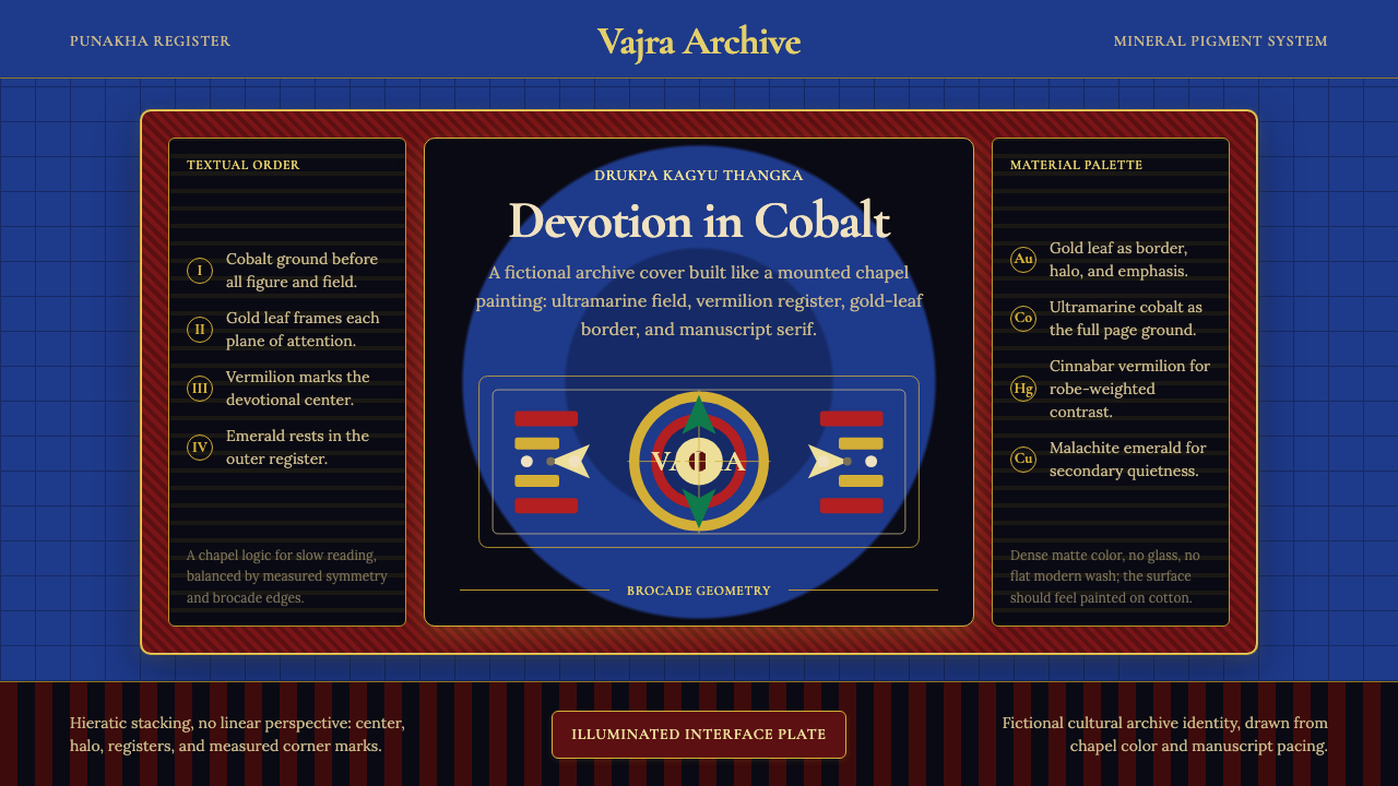 Bhutanese Drukpa Kagyu ThangkaDevotion made cobalt. Gold frames, Cormorant serif, and vermilion marks hold…钴蓝承载虔敬:金框、Cormorant 衬线与朱砂标记构成佛殿秩序。
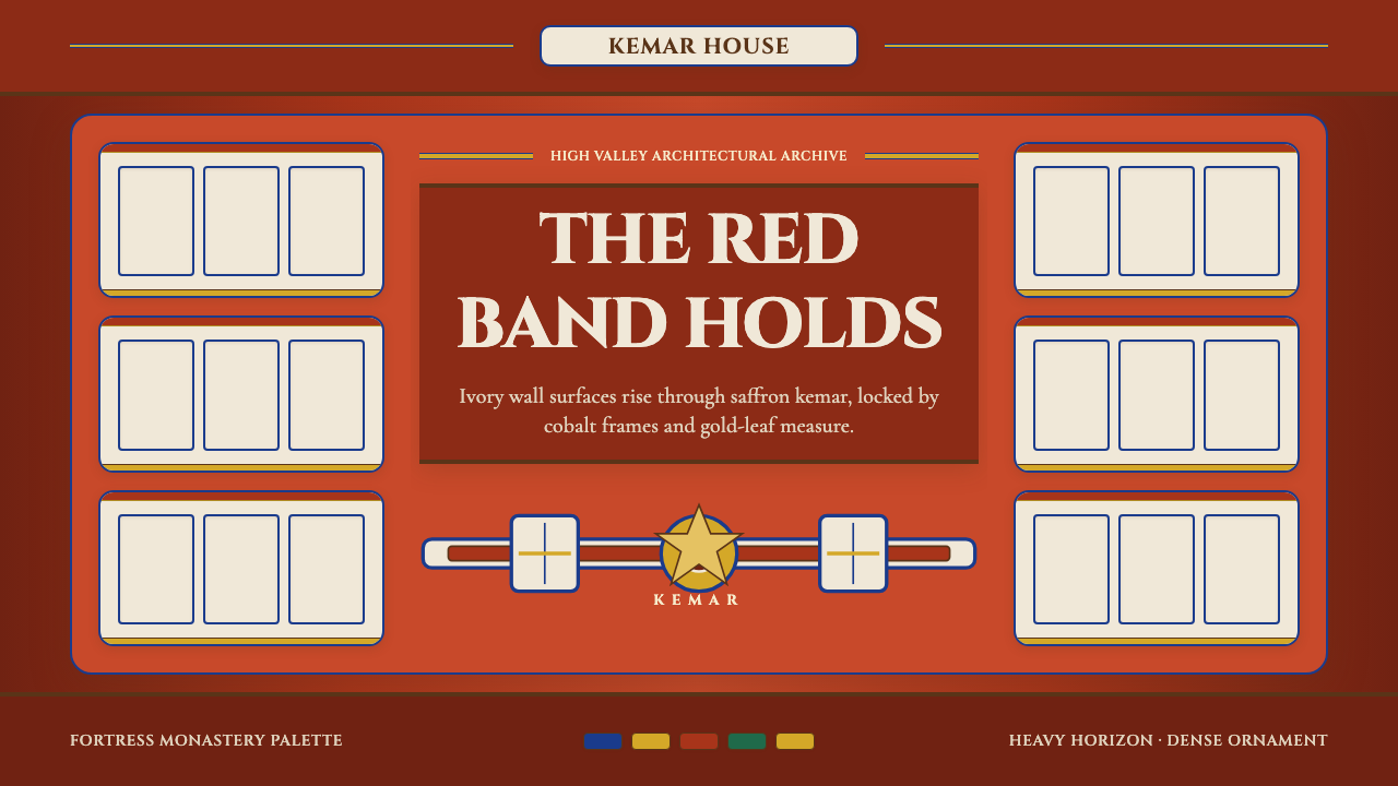 Bhutanese Dzong (Fortress Red)Monumental red holds the page. Cobalt frames and gold bands lock the fortress…厚重藏红掌控页面。钴蓝窗框与金色横带锁定宗堡节奏。
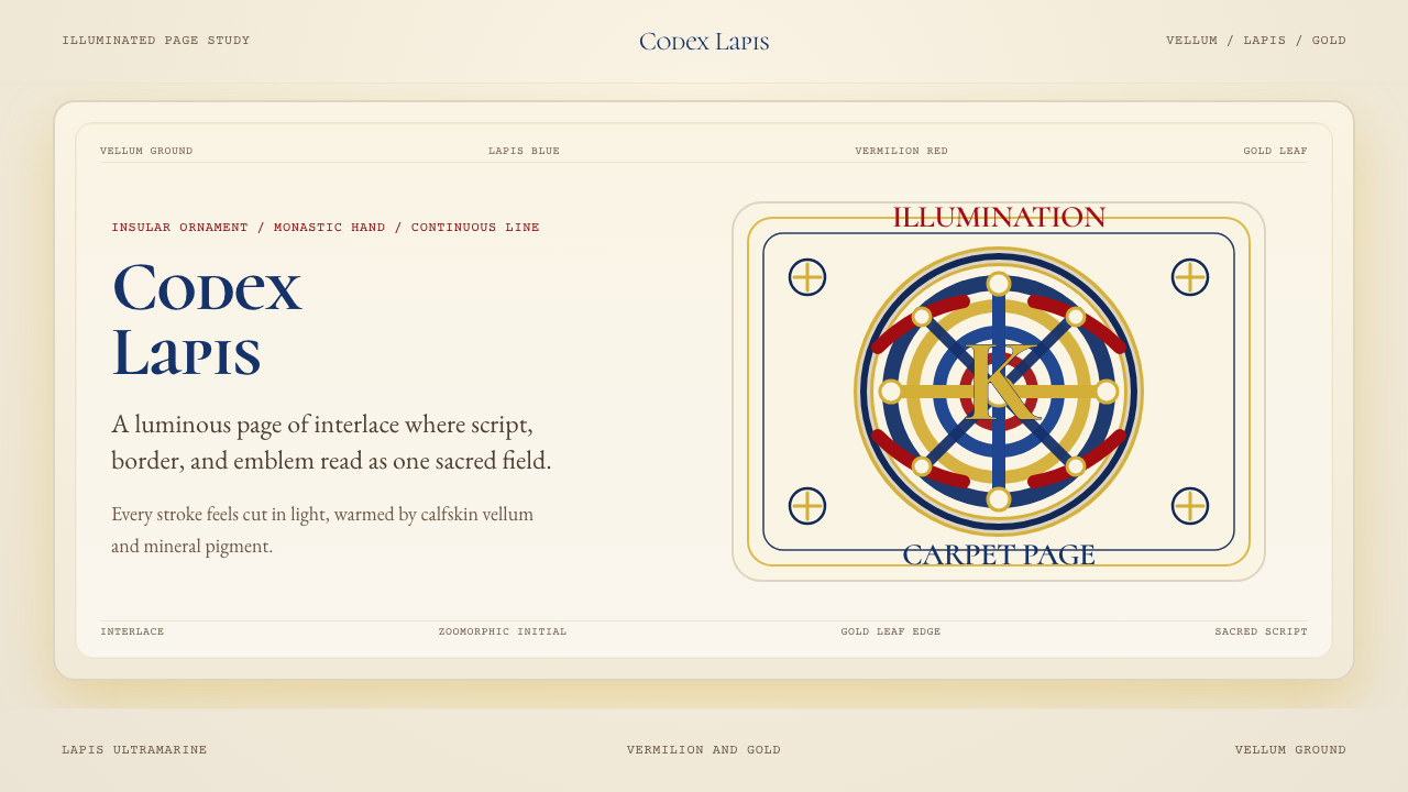 Book of Kells Celtic (800)Sacred and precise. Vellum cream, lapis, vermilion, and gold knotwork.神圣而精密。奶油羊皮底上铺陈青金石、朱砂与金色缠结纹。
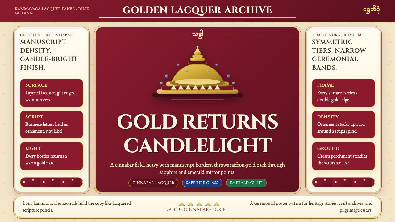 Burmese Shwedagon Gold-LacquerOpulence catches fire. Gold-leaf gradients on cinnabar panels frame a stupa s…虔诚的金色密度:朱漆面板上的金箔渐变,围出佛塔中轴。
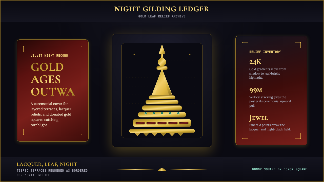 Burmese Shwedagon Stupa ReliefGold refuses restraint. Velvet black, teak-red lacquer, and tiered gradients…金色拒绝克制:黑夜、柚木红漆与层叠渐变堆出神圣密度。
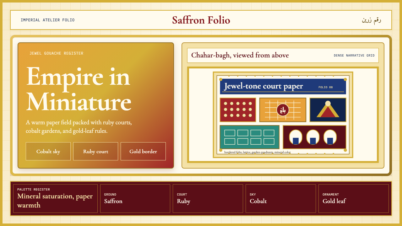 Mughal Miniature (Akbar era)Opulence refuses emptiness. Saffron paper, ruby panels, cobalt lattice, gold…华贵拒绝留白:番红花纸底、宝石红分栏、钴蓝格纹与金箔边饰。