Design style guide设计风格指南
What is Sri Lankan Cinnamon Galle (1640)?什么是 Sri Lankan Cinnamon Galle (1640)?
In 1640, when the Dutch VOC seized Galle Fort from the Portuguese, the world's most prized spice trade found a new visual language — one built from burlap, brass, cinnamon bark, and black-letter ink.1640年,荷兰东印度公司夺取加勒堡,世界上最珍贵的香料贸易找到了新的视觉语言——由粗麻布、黄铜、肉桂树皮与黑字母墨迹共同构成。
Sri Lankan Cinnamon Galle (1640) in briefSri Lankan Cinnamon Galle (1640) 速览
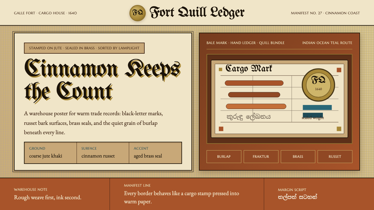
Sri Lankan Cinnamon Galle (1640) is a design aesthetic rooted in the material culture of the Dutch VOC spice trade at its seventeenth-century apex. Its visual logic draws directly from the warehouse and the counting house: rough jute sacking as the ground texture, the warm russet hue of rolled cinnamon bark as the dominant surface color, bold black-letter cargo stamps pressed into that warmth, and brass monogram seals that catch the glow of oil lamps. Nothing here is decorative for its own sake — every visual element traces back to an object that actually existed in the storerooms of Galle Fort.斯里兰卡肉桂加勒(1640年)是一套根植于十七世纪荷兰东印度公司香料贸易物质文化的设计美学。其视觉逻辑直接来自仓库与账房:粗织黄麻袋布作为底纹肌理,卷成筒状的肉桂树皮温润赭褐色作为主导表面色调,粗黑字母体货运戳记印压于这片暖色之上,黄铜徽章在油灯的光晕中闪烁。这里没有任何纯粹为装饰而存在的视觉元素——每一个视觉符号都能追溯至加勒堡仓库中真实存在过的物品。
At its heart, the system is about the romance of mercantile precision. The Dutch were obsessive record-keepers and brand markers: every sack, every crate, every bale of Ceylon cinnamon was stamped, sealed, and documented. That documentary impulse — the idea that commerce requires a visual grammar as rigorous as any legal code — gives this aesthetic its distinctive tension between warmth and authority. The jute and cinnamon surfaces feel tactile and almost edible; the Fraktur stamps and brass monograms impose an order that is unmistakably official.这套系统的核心,是商业精确性中蕴含的浪漫气质。荷兰人是狂热的记录者与品牌标记者:每一只麻袋、每一个板条箱、每一包锡兰肉桂,都要被加盖戳记、封印、登记在册。这种记录的冲动——商业需要一套与法典同样严格的视觉语法的观念——赋予这套美学以独特的张力:温暖与权威之间的张力。黄麻与肉桂的表面触感真实、几乎令人垂涎;哥特式黑字母戳记与黄铜徽章则强加了一种无可置疑的官方秩序。
Quieter but equally important are the traces of Sinhalese manuscript culture that haunt the margins of this visual world. Ola-leaf manuscripts — texts scratched onto dried palm leaves in graceful, flowing Sinhalese script — were the indigenous parallel to Dutch ledger culture. In this design system, their ghost appears as faint watermark-like patterns, a reminder that the spice trade overlaid a much older civilization without erasing it entirely.同样重要但更为低调的,是游荡于这个视觉世界边缘的僧伽罗文手稿痕迹。贝叶经——用尖笔划刻于干燥棕榈叶上的文字,字迹流动优美——是荷兰账本文化的本土平行存在。在这套设计系统中,它们的幽灵以水印般的淡淡纹样显现,提醒人们:香料贸易叠加在一个更古老的文明之上,却未能将其彻底抹去。
See the Sri Lankan Cinnamon Galle (1640) design system →查看 Sri Lankan Cinnamon Galle (1640) 完整设计系统 →
Where does Sri Lankan Cinnamon Galle (1640) come from?Sri Lankan Cinnamon Galle (1640) 从何而来?
Ceylon — the island now known as Sri Lanka — produced cinnamon unlike anything grown elsewhere on earth. The spice derived from the inner bark of the Cinnamomum verum tree, native to the island's southwestern lowlands, possessed a delicacy and sweetness that traders across Asia, the Middle East, and Europe had coveted for centuries. By the early seventeenth century, the Portuguese had established the first European monopoly on Ceylon cinnamon, controlling distribution through Colombo and extracting it via a system of forced labor from the indigenous Salagama caste of bark peelers. Galle, on the island's southwestern tip, was the natural deep-water harbor through which much of this traffic flowed.锡兰——即今日之斯里兰卡——所产肉桂举世无双。这种香料取自岛屿西南低地原生的锡兰肉桂树(Cinnamomum verum)的内层树皮,其细腻甘甜为整个亚洲、中东与欧洲的商人所垂涎数百年。十七世纪初,葡萄牙人建立了欧洲对锡兰肉桂的第一个垄断,通过科伦坡控制分配,并依赖对本土萨拉加马种姓剥皮工人的强制劳役提取香料。加勒位于岛屿西南端,是这一贸易流量汇聚的天然深水良港。
In 1640, a Dutch VOC fleet under Willem Jacobszoon Coster besieged and captured Galle Fort, ending a century of Portuguese dominance. The Dutch immediately recognized Galle's strategic value and expanded the fort significantly — the fortification walls, bastions, and warehouses they built between 1649 and the early eighteenth century survive almost intact today, now a UNESCO World Heritage Site. The VOC reorganized the cinnamon harvest on an industrial scale, negotiating treaties with the Kandyan Kingdom that granted them exclusive peeling rights across vast territories of the island's interior. Historian S. Arasaratnam's research documented how thoroughly the Dutch rationalized the trade: fixed quotas for cinnamon peelers, standardized bundle weights, rigorous inspection systems, and a paper trail of ledgers, cargo manifests, and seal-stamped bales that would eventually fill the VOC archives in Amsterdam.1640年,荷兰东印度公司舰队在威廉·雅各布松·科斯特的率领下围攻并夺取加勒堡,终结了葡萄牙一个世纪的统治。荷兰人立即认识到加勒的战略价值,大幅扩建要塞——他们在1649年至十八世纪初建造的城墙、棱堡与仓库今日几乎完好无损,现为联合国教科文组织世界遗产。东印度公司以工业规模重组肉桂采收,与康提王国谈判签订条约,获得岛屿内陆大片土地的独家剥皮权。历史学家S.阿拉萨拉特纳姆的研究记录了荷兰人将这一贸易理性化的彻底程度:剥皮工的固定配额、标准化的捆扎重量、严格的检验制度,以及最终填满阿姆斯特丹东印度公司档案馆的账本、货运清单与加盖印章的货包。
The cinnamon trade reached its commercial peak between roughly 1750 and 1830 — the period when Ceylon cinnamon commanded extraordinary premiums in European markets, when Galle Fort was the most important VOC entrepot in the Indian Ocean, and when the warehouse culture that this aesthetic captures was at its most elaborate. Lodewijk Wagenaar's later historical work examined how the Dutch physical infrastructure at Galle — warehouses, weigh-houses, inspection halls — created a built environment specifically engineered for the verification and documentation of spice quality. Every surface in that environment had a function; every mark on a sack carried legal weight.肉桂贸易的商业顶峰大约在1750至1830年间——这一时期,锡兰肉桂在欧洲市场享有极高溢价,加勒堡是印度洋上最重要的东印度公司转口港,而这套美学所捕捉的仓库文化也在此时达到最精细的形态。历史学家洛德韦克·瓦亨纳尔后来的研究考察了荷兰人在加勒建立的实体基础设施——仓库、称重场、检验厅——如何创造出一个专为核验和记录香料品质而精心工程化的建筑环境。那个环境中的每一个表面都有其功能;麻袋上的每一个标记都具有法律效力。
The aesthetic of this period is inseparable from the collision of material cultures it represents. Dutch merchant print culture brought Fraktur typography, brass die stamps, wax seals, and ledger paper to a landscape of jute, cinnamon, coconut, and ola-leaf manuscripts. The Sinhalese manuscript tradition — elegant, curving scripts carved into preserved palm leaves — existed alongside and in tension with the Dutch documentary apparatus. This coexistence, never comfortable and never equal, is encoded in the visual system: the dominant warmth of tropical materials, the overlay of European commercial marks, the ghost of indigenous script surviving in the margins.这一时期的美学与它所代表的物质文化碰撞密不可分。荷兰商人的印刷文化将哥特式黑字母排版、黄铜模压戳记、蜡封与账本纸带进了一片充斥着黄麻、肉桂、椰子与贝叶经的土地。僧伽罗文手稿传统——刻写在防腐处理的棕榈叶上的优雅弯曲字迹——与荷兰的记录体系并存而相互张力。这种共存,从未舒适,从未平等,被编码进视觉系统之中:热带材料的温润主色调,欧洲商业标记的叠加,本土文字幽灵般地在页边存活。
What defines the Sri Lankan Cinnamon Galle (1640) look?Sri Lankan Cinnamon Galle (1640) 的视觉特征是什么?
Color Palette色彩体系
The dominant ground is a warm jute-burlap khaki — neither beige nor tan but the specific undyed tone of coarse woven sacking. Against this, cinnamon-bark russet provides the principal accent: the warm reddish-brown of a freshly peeled quill, deeper and more saturated than terracotta. Brass gold appears as a metallic highlight — the color of a VOC seal catching lamplight, used sparingly for embossed or stamped elements. Black, in the weight of Fraktur letterpress ink, handles all text and structural marks. A faint ghost of parchment or ola-leaf ivory may appear in background washes.主导底色是温润的黄麻卡其色——既非米色也非棕褐,而是粗织麻布特有的本色调性。肉桂树皮赭褐色作为主要强调色:新鲜剥取的肉桂皮卷的暖红棕,比赤陶更深、更饱和。黄铜金作为金属高光出现——东印度公司印章在油灯下的光泽,少量用于浮雕或戳印元素。黑色,以哥特式铅印油墨的厚重感,承担所有文字与结构性标记。羊皮纸或贝叶经象牙色的幽淡晕染可在背景层隐约浮现。
Typography字体排印
Headlines and display text call for a period-appropriate Fraktur or black-letter style — the dense, angular, highly stroked letterforms that Dutch commercial printers used throughout the seventeenth century. This is not decorative novelty; it is the typeface of VOC cargo manifests and Amsterdam trade ledgers. Body text pairs with an old-style Roman — a warm, humanist serif in the tradition of seventeenth-century Dutch type founders, with moderate contrast between thick and thin strokes and bracketed serifs that feel handmade rather than mechanically precise. The combination of black-letter display and humanist body creates the same typographic tension found in period Dutch printed books.标题与展示文字采用时代准确的哥特式黑字母风格——荷兰商业印刷商在整个十七世纪使用的那种笔画密集、棱角分明、转折丰富的字形。这不是装饰性猎奇,而是东印度公司货运清单与阿姆斯特丹贸易账本的字体。正文与古典风格罗马体搭配——一种温润的人文主义衬线体,延续十七世纪荷兰铸字传统,粗细笔画对比适中,括弧式衬脚感觉是手工制作而非机械精密。黑字母展示字与人文主义正文体的组合,再现了同期荷兰印刷书籍中的排印张力。
Texture and Surface肌理与表面
Surface texture is central to the system in a way that purely color-based palettes are not. The weave pattern of jute sacking — a coarse diagonal grid of natural fibers — functions as an ever-present ground texture, appearing as a subtle overlay on backgrounds and behind typographic elements. Cinnamon bark offers a contrasting texture: fine parallel striations running along the length of a rolled quill, warmer and more organic than the burlap weave. These two textures, layered and differentiated, give the system a tactile warmth that distinguishes it from flat commercial aesthetics.表面肌理在这套系统中占据核心地位,这是纯色彩体系所无法企及的。黄麻麻布的编织纹样——天然纤维构成的粗旷斜向网格——作为无处不在的底纹肌理,以微妙的叠加形式出现于背景层和字体元素之后。肉桂树皮提供了对比性肌理:沿卷筒长轴延伸的细腻平行纹路,比麻布编织更温润、更有机。两种肌理叠合、区分,赋予这套系统一种触觉般的温度,使之有别于平面化的商业美学。
Stamps, Seals, and Marks戳记、印章与标记
The most distinctive graphic vocabulary of this system is the cargo mark and the seal stamp. The VOC monogram — the interlocking letters of the Vereenigde Oostindische Compagnie — appears as a brass die impression or a wax seal, embossed or debossed, with the characteristic weight of metal pressed into soft material. Cargo stamps in black-letter type denote origin, weight, and inspection: these have the quality of a rubber or woodblock stamp, with slightly irregular edges and ink bleed that suggest mechanical reproduction rather than digital precision. The aesthetic of imperfect but authoritative marking is fundamental.这套系统最具辨识度的图形词汇是货运标记与印章戳记。荷兰东印度公司徽章——公司名称字母的交织组合——以黄铜模压或蜡封的形式出现,凸压或凹压,带有金属压入软质材料时特有的厚重感。用黑字母体印制的货运戳记标注产地、重量与检验信息:它们具有橡皮戳或木版印章的质感,边缘略不规整,油墨扩散痕迹暗示机械复制而非数字精度。不完美但权威的标记美学,是这套体系的根本。
Margin and Document Logic页边与文档逻辑
The system carries the compositional logic of a trade document or manuscript page. Wide margins are not white space for breathing room but are functional zones: they hold annotations, classifications, notarial marks, and the ghostly traces of Sinhalese ola-leaf script. The column structure of body text echoes ledger columns rather than magazine grids — organized for data, measurement, and reference rather than for visual surprise. Horizontal rules are used as dividers between record entries, giving layouts the quality of a scanned historical document.这套系统承载了贸易文件或手稿页面的构图逻辑。宽阔的页边不是供呼吸的留白,而是功能性区域:它们容纳批注、分类标记、公证印记,以及僧伽罗贝叶经文字的幽淡痕迹。正文文字栏的结构呼应账本栏目而非杂志网格——为数据、测量与查阅而组织,而非为视觉惊喜。水平分割线用作记录条目之间的间隔,赋予版面扫描历史文件般的质感。
Warmth and Authority温润与权威
The fundamental tension of this aesthetic — and its primary expressive quality — is the coexistence of sensory warmth and institutional authority. The cinnamon and jute palette is genuinely warm, organic, and almost inviting; the Fraktur type and brass seals are legalistic and commanding. This is not contradiction but historical accuracy: the spice trade was simultaneously a sensory and a bureaucratic enterprise, one that owed its profits equally to the extraordinary flavor of its product and to the ruthless efficiency of its commercial apparatus.这套美学的根本张力——也是其首要表达性品质——在于感官温润与制度权威的共存。肉桂与黄麻的色调是真实温暖的、有机的、几乎令人亲近的;哥特式黑字母与黄铜印章则是法典性的、命令式的。这不是矛盾,而是历史真实:香料贸易同时是感官的与官僚的事业,其利润既来自产品非凡的风味,也来自其商业装置冷酷的效率,二者不可偏废。
Sinhalese Script as Subtext僧伽罗文字作为潜文本
The visual system acknowledges, without foregrounding, the indigenous culture that the spice trade overlaid. Sinhalese script — rounded, richly curved, derived from a Brahmic tradition quite unlike the angular Latin letterforms of the Dutch — appears in the aesthetic as a watermark presence: visible when you look for it, but never competing with the dominant commercial vocabulary. This sub-layer adds historical honesty and prevents the aesthetic from becoming a pure celebration of colonial mercantilism.这套视觉系统在不将其推至前景的前提下,承认了香料贸易所叠覆的本土文化。僧伽罗文字——圆润、弧线丰富,源自婆罗米文字传统,与荷兰人棱角分明的拉丁字形迥异——以水印般的存在出现于这套美学之中:刻意寻找时清晰可见,却从不与主导的商业词汇竞争。这个子层增添了历史诚实性,防止这套美学沦为对殖民地商业主义的纯粹颂歌。
See the Sri Lankan Cinnamon Galle (1640) design system →查看 Sri Lankan Cinnamon Galle (1640) 完整设计系统 →
Who shaped Sri Lankan Cinnamon Galle (1640)?谁塑造了 Sri Lankan Cinnamon Galle (1640)?
As the VOC commander who led the 1640 siege and capture of Galle Fort, Coster effectively ended Portuguese hegemony over the Ceylon cinnamon trade and established the Dutch commercial infrastructure in the southwestern harbor that would define the spice's visual and logistical world for the next century and a half. His military action was the founding event for the design culture this aesthetic commemorates.作为主导1640年加勒堡围攻与夺取的东印度公司指挥官,科斯特实际上终结了葡萄牙对锡兰肉桂贸易的霸权,并在西南良港建立了荷兰商业基础设施——这一基础设施定义了此后一个半世纪香料贸易的视觉与物流世界。他的军事行动,是这套美学所纪念的设计文化的奠基事件。
One of the foremost historians of Dutch commercial imperialism in South and Southeast Asia, Arasaratnam's scholarship documented the administrative, documentary, and material systems the VOC used to organize the cinnamon trade — the ledger systems, the peeler quotas, the inspection apparatus, and the paper trail of cargo marks that have become this aesthetic's primary visual vocabulary. His work provides the historical foundation for understanding what was genuinely at stake in those warehouse environments.阿拉萨拉特纳姆是研究南亚与东南亚荷兰商业帝国主义最重要的历史学家之一。他的学术研究记录了东印度公司组织肉桂贸易所使用的行政、文献与物质体系——账本制度、剥皮工配额、检验装置,以及成为这套美学首要视觉词汇的货运标记纸面记录。他的工作为理解那些仓库环境中的真实历史利害提供了史学基础。
Wagenaar's historical research focused specifically on the built environment and material infrastructure of Galle Fort under Dutch rule — the physical spaces where cinnamon was weighed, graded, bundled, sealed, and loaded. His work on the architecture of VOC commercial buildings illuminates how the warehouse aesthetic this design system draws from was not accidental but purposefully engineered: spaces designed to make verification and documentation impossible to falsify.瓦亨纳尔的历史研究专门聚焦于荷兰统治下加勒堡的建筑环境与物质基础设施——肉桂被称重、分级、捆扎、封印与装船的实体空间。他对东印度公司商业建筑的研究阐明了这套设计系统所汲取的仓库美学并非偶然产生,而是经过刻意工程化的:这些空间被专门设计为使核验与文件记录无法造假的场所。
The visual and economic system this aesthetic celebrates rested on the skilled labor of the Salagama, the hereditary caste of cinnamon peelers whose knowledge of when to harvest, how to peel, and how to roll the bark into quills was irreplaceable. The Dutch, like the Portuguese before them, relied entirely on this expertise while systematically coercing its practitioners. Their labor is the invisible origin of every cinnamon-bark surface and warm russet tone in this visual system.这套美学所颂扬的视觉与经济体系,建立在萨拉加马世袭种姓剥皮工人的熟练劳动之上。他们关于何时采收、如何剥皮、如何将树皮卷成筒状的知识无可替代。荷兰人与此前的葡萄牙人一样,在系统性强制这些从业者的同时,完全依赖他们的专业技艺。他们的劳动,是这套视觉系统中每一处肉桂树皮表面与温润赭褐色调的隐形起源。
The ola-leaf manuscript tradition — in which trained scribes incised Sinhalese text onto dried palm leaves using iron styluses, then rubbed soot into the grooves to make the writing legible — produced one of the most distinctive written cultures in the Indian Ocean world. Their scripts appear in this aesthetic as ghostly margin presence, a counterpoint to the Dutch commercial documentary apparatus that dominated the same physical space in Galle Fort.贝叶经书写传统——由训练有素的文士用铁笔将僧伽罗文字刻入干燥的棕榈叶,再将煤灰揉入刻痕使字迹清晰——孕育了印度洋世界最具特色的书写文化之一。他们的文字在这套美学中以幽灵般的页边存在显现,与在加勒堡同一物理空间内占主导地位的荷兰商业记录体系形成对位关系。
How do you use Sri Lankan Cinnamon Galle (1640) today?今天怎么用 Sri Lankan Cinnamon Galle (1640)?
The Sri Lankan Cinnamon Galle aesthetic is most naturally suited to contexts that need to communicate heritage, craft, and discerning quality without sacrificing legibility or structure. Applied correctly, it evokes a world where every mark carries meaning and every material was chosen for a reason — a sensibility that translates well to premium product branding, archival or historical publishing, specialty food and beverage identity, and any context where provenance and materiality are central values.斯里兰卡肉桂加勒美学最自然地适用于需要传达遗产感、工艺感与品味鉴赏力而不牺牲可读性或结构性的场景。正确应用时,它唤起一个每一个标记都承载意义、每一种材料都出于理由而被选择的世界——这种感性能很好地转化为高端产品品牌、档案或历史出版、特色食品与饮料形象塑造,以及任何以溯源性与物质性为核心价值的场景。
For presentation slides, this system excels at cover pages that establish immediate gravitas through material warmth rather than corporate gloss. A cover built from cinnamon russet surfaces, a heavy Fraktur display headline, and a centered or offset brass-seal motif reads as authoritative and handcrafted simultaneously. Content slides should lean into the ledger aesthetic: clear column structure, body text in an old-style serif, and section breaks marked by horizontal rules rather than decorative icons. Data visualizations gain character when chart elements inherit the palette — bar charts in russet and khaki, annotations in black-letter weight type, axes ruled in the style of account-book lines.在演示文稿中,这套系统最擅长制作通过材料温度而非企业光泽建立即时庄重感的封面页。以肉桂赭褐色表面为底、粗重黑字母体展示标题、居中或偏置黄铜印章母题构成的封面,同时传递权威感与手工感。内容页应当深入账本美学:清晰的栏目结构,正文采用古典风格衬线体,章节分隔用水平分割线而非装饰图标标记。数据可视化在图表元素继承色板后获得独特气质——赭褐色与卡其色的柱状图,黑字母字重的批注,以账本线条风格绘制的坐标轴。
For web interfaces, this aesthetic works best for premium editorial, specialty retail, and archival or catalogue contexts. A homepage or landing page using the jute khaki ground, cinnamon accent panels, and brass monogram elements establishes a sense of rarity and craftsmanship immediately. Navigation should be typographically driven — text-weight nav items in an old-style serif, with brass-weight markers for active states. Card components benefit from a slight texture overlay on their backgrounds and from hard-edged offsets rather than soft drop shadows. Pricing pages can use the cargo-document logic effectively: tier names in Fraktur display, feature lists structured as ledger entries, call-to-action buttons in deep cinnamon russet.对于网页界面,这套美学最适合高端编辑类、特色零售类以及档案或目录类场景。以黄麻卡其色为底、肉桂色强调面板、黄铜徽章元素构成的主页或落地页,能立即建立稀缺感与工艺感。导航应当以字体驱动——古典风格衬线体的文字型导航项,以黄铜色重量的标记指示当前状态。卡片组件在背景上添加轻微肌理叠加和硬边偏置(而非柔和投影)后效果更佳。定价页可以有效运用货运文件的逻辑:哥特式黑字母体的等级名称,以账本条目形式组织的功能列表,深肉桂赭色的行动号召按钮。
For editorial and marketing material, the system supports a strong contrast between the warmth of ground surfaces and the authority of text. A feature article layout works well with a wide left margin used as an annotation zone — in the tradition of a VOC cargo manifest where notes run alongside the main record — and body text in a humanist serif at comfortable measure. Marketing campaigns for heritage or craft brands can use the stamp-and-seal vocabulary effectively: a branded stamp element in the corner of an image, a wax-seal badge for certifications or guarantees, a Fraktur headline announcing provenance.对于编辑与营销材料,这套系统支持底面温润与文字权威之间的强烈对比。特写文章版面采用宽阔的左侧页边作为批注区域效果极好——延续东印度公司货运清单中批注沿主记录并排书写的传统——正文以人文主义衬线体在舒适的行宽中排布。传承类或工艺类品牌的营销活动可以有效运用戳记与印章词汇:图像角落的品牌戳印元素、用于认证或保证的蜡封徽章、以哥特式黑字母宣告产地来源的标题。
A common mistake when applying this aesthetic is treating the warmth as softness and losing the documentary authority that makes it distinctive. The jute-and-cinnamon palette is warm, but it is not rustic or casual — it is the warmth of a serious working environment where materials and marks carry legal and economic weight. Mixing the system with contemporary geometric minimalism, pastel accents, or soft rounded interface elements destroys the historical tension that gives it character. Equally damaging is over-applying the Fraktur typography: used everywhere, it becomes illegible and theatrical; used selectively for display, stamps, and seals only, it functions as the system intends.应用这套美学时最常见的错误,是将温润误读为柔软,从而失去使其与众不同的文献权威感。黄麻与肉桂色板是温暖的,但它不是乡村的或随意的——它是一个严肃工作环境的温度,在那里,材料与标记承载着法律与经济的重量。将这套系统与当代几何极简风、粉彩强调色或柔和圆润的界面元素混合,会摧毁赋予它性格的历史张力。同样有害的是过度使用哥特式黑字母排版:遍布各处时,它变得难以辨读且戏剧性过强;仅选择性地用于展示文字、戳记与印章时,它才能按系统本意发挥功效。
See the Sri Lankan Cinnamon Galle (1640) design system →查看 Sri Lankan Cinnamon Galle (1640) 完整设计系统 →
Sri Lankan Cinnamon Galle (1640) — FAQSri Lankan Cinnamon Galle (1640) · 常见问题
How is this different from a generic vintage or colonial aesthetic?这与通常的复古或殖民地美学有何不同?
Generic vintage aesthetics tend to use warm palettes and aged textures without specificity — they evoke an undifferentiated 'old-timey' feeling. The Cinnamon Galle system is built from documented historical specifics: the particular khaki of undyed jute, the particular russet of Cinnamomum verum bark, the particular typographic conventions of seventeenth-century Dutch commercial printing, and the particular documentary logic of VOC cargo records. The Sinhalese manuscript subtext also distinguishes it fundamentally — it acknowledges the indigenous culture that the trade overlaid, which a generic colonial aesthetic never does. Used thoughtfully, this system communicates a precise historical moment rather than a vague nostalgic mood.通用复古美学倾向于使用温暖色调与做旧纹理,却缺乏特殊性——它们唤起一种无差别的「老时光」感觉。肉桂加勒系统建立于有据可查的历史特殊性之上:未染色黄麻特有的卡其色,锡兰肉桂树皮特有的赭褐色,十七世纪荷兰商业印刷特有的排印惯例,以及东印度公司货运记录特有的文献逻辑。僧伽罗文手稿的潜文本也从根本上区分了它——它承认了贸易所叠覆的本土文化,而通用殖民地美学从不这样做。经过深思熟虑地使用,这套系统传达的是一个精确的历史时刻,而非模糊的怀旧情绪。
Can this aesthetic work in digital interfaces, or is it inherently print-oriented?这套美学能用于数字界面吗,还是它本质上更适合印刷?
The aesthetic is grounded in print and material culture, but it translates effectively to digital contexts when applied with discipline. The key is to treat digital surfaces as analogues of physical materials rather than trying to reproduce every historical texture literally. A web background can evoke jute sacking through a warm khaki field without requiring a photographic weave overlay on every element. The stamp and seal vocabulary works especially well in digital contexts — used for badges, certifications, or state indicators, it adds the feeling of authoritative marking without slowing down the interface. The main adjustment for digital use is restraint: the system's richness comes from layering, and on screen it is easy to over-layer until the interface feels heavy.这套美学根植于印刷与物质文化,但在有节制地应用时能有效转化至数字场景。关键在于将数字表面视为实体材料的类比,而不是试图字面复现每一处历史肌理。网页背景可以通过温润的卡其色底面唤起黄麻麻布的质感,而无需在每个元素上添加织物肌理的摄影叠加。戳记与印章词汇在数字场景中尤其有效——用于徽章、认证或状态指示时,它增添了权威标记的感觉,而不会拖慢界面。数字使用时的主要调整是克制:这套系统的丰富感来自于层叠,而在屏幕上过度叠加很容易让界面显得沉重。
Is it appropriate to use this aesthetic for brands or contexts unrelated to spice, trade, or Sri Lanka?将这套美学用于与香料、贸易或斯里兰卡无关的品牌或场景,是否合适?
Yes, with the same caveat that applies to any historically grounded aesthetic: the system's values need to align with the product's values. The Cinnamon Galle aesthetic communicates craftsmanship, documented provenance, sensory richness, and the authority of long-standing commercial tradition. These values transfer well to specialty food and beverage, artisan products, heritage publishing, archival research tools, and premium services in any domain where depth of knowledge and quality of material are selling points. They transfer poorly to products whose core promise is speed, novelty, or lightness — a fast-casual food brand or a consumer tech startup would find the aesthetic working against them.可以,但与任何根植于历史的美学相同,需要满足同一前提:这套系统的价值观需要与产品的价值观对齐。肉桂加勒美学传达工艺感、有据可查的溯源性、感官丰富性,以及历史悠久商业传统的权威。这些价值观能很好地迁移至特色食品与饮料、匠人产品、传承类出版、档案研究工具,以及任何以知识深度与材料品质为卖点的高端服务领域。它们则难以迁移至核心承诺是速度、新奇或轻盈的产品——快餐休闲食品品牌或消费科技初创公司会发现这套美学在与他们作对。
How should the Sinhalese manuscript element be used without being appropriative or decorative?如何在不带有文化挪用或纯粹装饰意味的情况下使用僧伽罗文手稿元素?
The distinction is one of register and function. The Sinhalese script element in this system is designed to function as a subtext or watermark presence — something visible at the periphery that acknowledges the indigenous culture without centering it as exotic decoration. Used this way, it performs historical honesty rather than cultural appropriation. The problematic use would be foregrounding Sinhalese script as a decorative exotic motif while suppressing the historical context that explains its presence — treating it as a design flourish rather than as evidence of a civilization that predated and survived the spice trade. Context and intent determine whether the element functions with integrity.区别在于语域与功能。这套系统中的僧伽罗文字元素,设计为以潜文本或水印形式存在——作为在边缘可见的东西,承认本土文化的存在而不将其作为异域装饰置于中心。如此使用,它执行的是历史诚实,而非文化挪用。有问题的用法是:将僧伽罗文字作为装饰性异域母题推至前景,同时压制解释其存在的历史背景——将其视为设计花饰而非早于并存活于香料贸易之上的一个文明的证据。语境与意图决定了这个元素是否以诚实的方式发挥功能。
What contemporary design contexts does this aesthetic suit least well?这套美学最不适合哪些当代设计场景?
The aesthetic struggles in contexts that require lightness, approachability, or emotional softness. The dominant palette is warm but never light — the cinnamon and jute tones carry weight, and the Fraktur typography adds authority that can feel imposing in consumer emotional contexts. Children's products, wellness brands, social apps, and any interface where the primary emotional register is playful, casual, or intimate will find this system working against the experience. It also requires a reader or user with enough visual literacy to appreciate the historical resonance — in contexts where that literacy cannot be assumed, the Fraktur elements in particular risk reading as merely foreign or difficult rather than as historically meaningful.这套美学在需要轻盈感、亲近感或情感柔软度的场景中举步维艰。主导色板是温暖的,但从不轻盈——肉桂与黄麻色调承载重量,哥特式黑字母排版增添权威感,在面向消费者的情感场景中可能显得压迫。儿童产品、健康品牌、社交应用,以及任何主要情感基调是嬉戏、随意或亲密的界面,都会发现这套系统与体验背道而驰。它还需要读者或用户具备足够的视觉素养来欣赏历史共鸣——在无法假设这种素养存在的场景中,哥特式黑字母元素尤其有被解读为仅仅陌生或难以辨认的风险,而非被视为具有历史意义的存在。
Related design styles相关设计风格
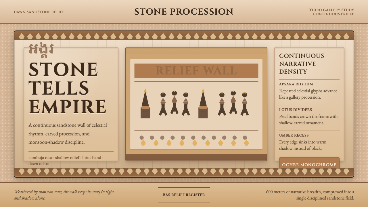 Khmer Angkor Wat ReliefStone remembers everything. Ochre friezes, Cinzel capitals, and lotus bands h…石头记住一切:赭石浮雕、Cinzel碑铭与莲瓣带压满墙面。
 Khmer Apsara Relief (Bayon)Contemplative stone weight. Cinzel capitals sit on sandstone registers with l…沉思的石质重量。Cinzel大写压在砂岩叙事带与苔绿边框上。
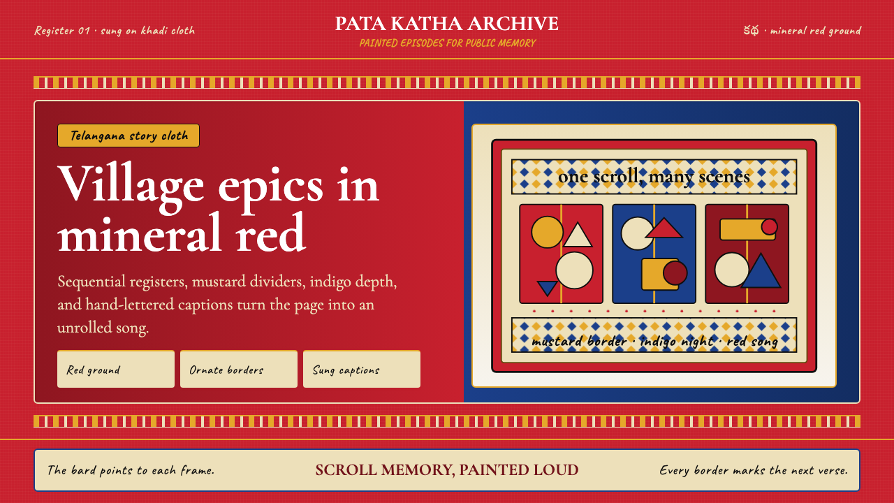 Andhra Cheriyal Scroll PaintingSaturated oral memory. Mineral red registers, mustard diamonds, and serif son…饱和的口述记忆:矿物红分格、芥末黄菱纹与衬线唱词。
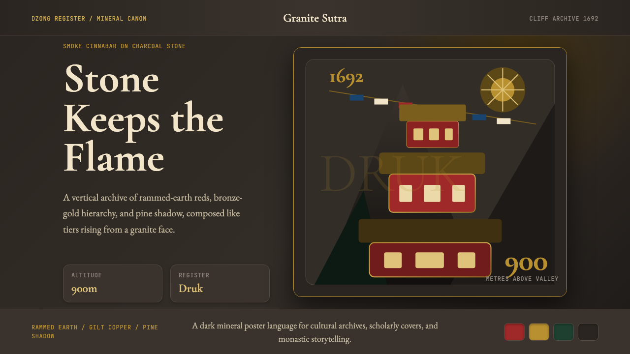 Bhutanese Tiger's Nest Cliff MonasterySacred altitude, mineral-dark. Cinnabar tiers and bronze rules climb charcoal…神圣垂直感。朱砂层台与青铜线条攀上炭灰花岗岩。
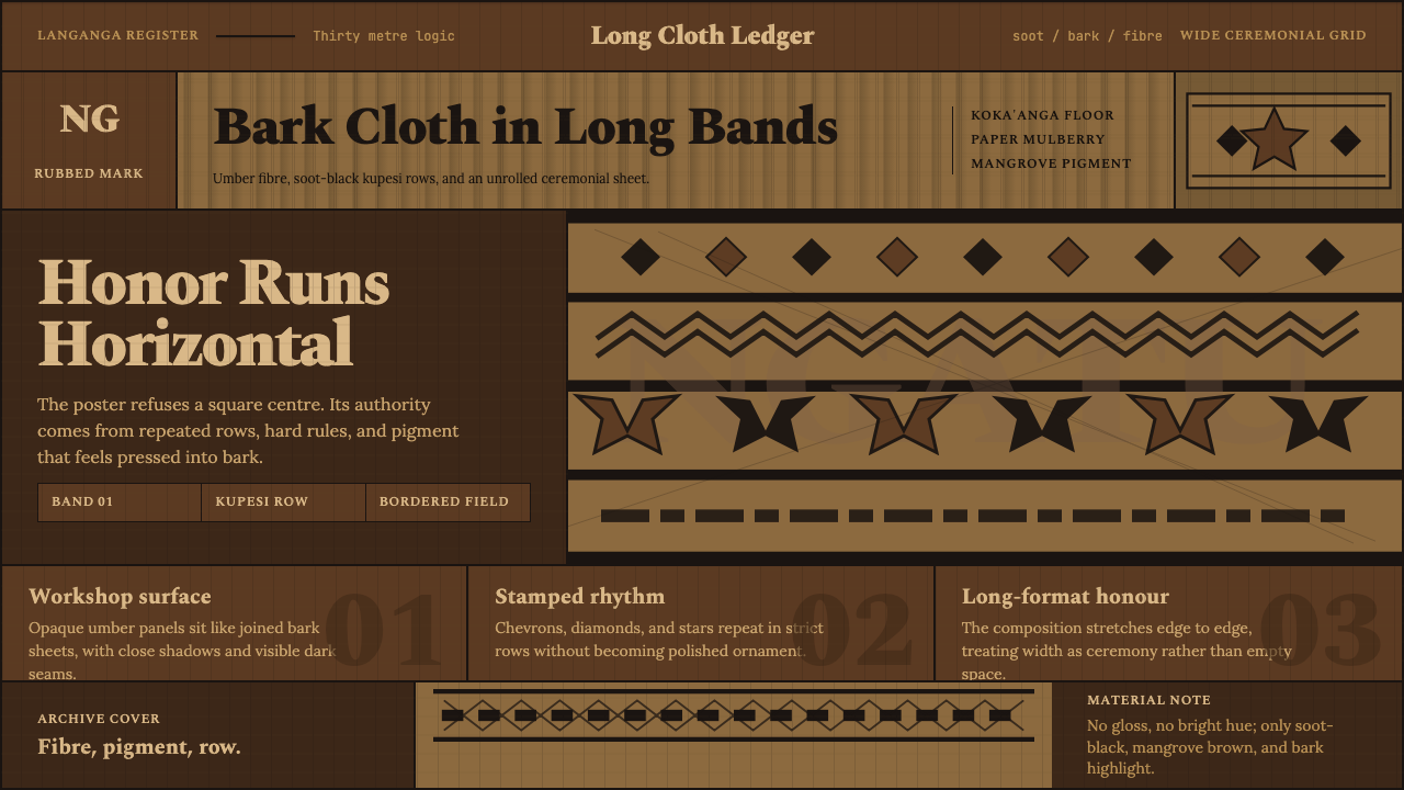 Tongan Ngatu (Tapa)Ceremony runs wide. Soot-black rows stamp umber bark with strict kupesi geome…仪式感横向铺展:烟黑条带在赭色树皮上拓出库佩西几何。
 Torajan Tongkonan (Boat-Roof House)Ancestral dusk, carved in color. Soot black frames ochre, lime white, and tur…祖屋暮色有重量:烟黑底托起红赭、石灰白与姜黄雕带。