Design style guide设计风格指南
What is Bhutanese Tiger's Nest Cliff Monastery?什么是 Bhutanese Tiger's Nest Cliff Monastery?
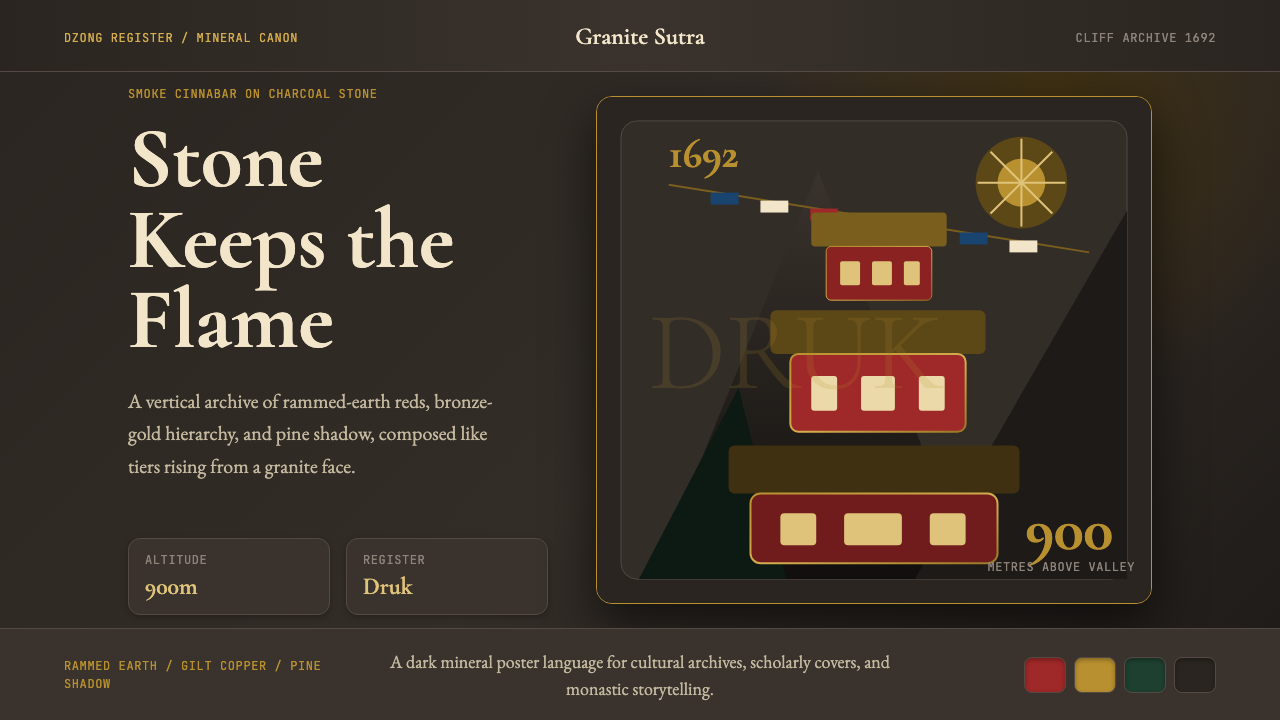
Paro Taktsang defies gravity and ornament alike — a monastery hammered into living granite nine hundred metres above the valley floor, where cinnabar earth, bronze gilt, and deep conifer green compose a visual language that is simultaneously sacred, severe, and magnificently alive.帕罗虎穴寺同时挑战着重力与装饰——一座凿入活花岗岩、悬于谷底九百米之上的寺院,以朱砂夯土、铜鎏金与深松绿构成一套视觉语言,既神圣又峻肃,又充满惊人的生命力。
Bhutanese Tiger's Nest Cliff Monastery in briefBhutanese Tiger's Nest Cliff Monastery 速览
The Bhutanese Tiger's Nest Cliff Monastery design system takes its name and its entire visual logic from Paro Taktsang, the most celebrated sacred site in the Kingdom of Bhutan. Built in 1692 into the sheer granite face of the Paro Valley, the monastery translates the raw materiality of its cliff setting — mineral reds, metallic golds, slate charcoals, and the dark evergreen of the forests below — into an architectural vocabulary that has remained remarkably consistent across three centuries of Bhutanese building practice.不丹虎穴寺悬崖寺院设计体系从帕罗虎穴寺汲取名称与全部视觉逻辑,那是不丹王国最受尊崇的圣地。这座寺院建于1692年,嵌入帕罗河谷的垂直花岗岩崖面,将崖壁的原始物质性——矿物红、金属金、板岩炭灰,以及山下常绿林海的深色——转化为一套三百余年来在不丹建筑实践中保持惊人一致性的视觉语汇。
What distinguishes this system from the broader category of Himalayan or Tibetan Buddhist aesthetics is its specifically Bhutanese character. Bhutan is not Tibet, and its visual tradition is not a diluted version of Lhasa. The Drukpa Kagyu school of Buddhism, which has been the state religion since the Zhabdrung Ngawang Namgyal unified the kingdom in the seventeenth century, produced an architectural and decorative canon with its own proportional rules, its own palette emphases, and its own hierarchy of sacred markings. The cinnabar red of Bhutanese walls is deeper and earthier than its Tibetan counterpart. The dzong fortress tradition — massive whitewashed citadels that serve simultaneously as administrative and religious centers — introduced an architectural severity that kept ornament disciplined and structural.将这个体系与更宽泛的喜马拉雅或藏传佛教美学区分开来的,是其特有的不丹性格。不丹不是西藏,其视觉传统并非拉萨风格的稀释版本。竺巴噶举派自十七世纪扎布东·阿旺·南嘉统一王国以来一直是国家宗教,它形成了有着自身比例规则、色彩侧重与神圣标记层级的建筑与装饰典范。不丹墙面的朱砂红比藏地同类色更深沉、更具土质感。宗堡传统——兼作行政与宗教中心的巨大白墙城堡——引入了一种建筑上的严峻感,使装饰保持克制并服从于结构。
As a design system, Bhutanese Tiger's Nest Cliff Monastery operates through three dominant tonal registers: the smoke-red of rammed cinnabar earth, which commands attention and signals primary hierarchy; the bronze-gold of gilt finials and roof ornaments, which marks sacred or premium distinction; and the deep charcoal of the granite cliff itself, which grounds the entire composition and absorbs the surrounding brightness into itself. A secondary register of deep pine green, drawn from the conifer forests that cling to the cliffs below the monastery, provides the only organic softening in an otherwise mineral palette.作为设计体系,不丹虎穴寺悬崖寺院以三种主色调运作:夯土朱砂的烟红色,统摄视觉注意力,标志首要层级;镀金屋顶装饰与宝幢的青铜金,标记神圣或高阶区分;以及花岗岩崖壁本身的深炭灰,将整个构图锚定于地,将周围的光亮悉数吸纳其中。深松绿作为次级色调,取自悬挂于寺院下方崖壁的针叶林,在这片矿物质感的色板中提供唯一的有机柔化。
Where does Bhutanese Tiger's Nest Cliff Monastery come from?Bhutanese Tiger's Nest Cliff Monastery 从何而来?
The historical root of Taktsang stretches back to the eighth century, when Guru Rinpoche — Padmasambhava, the Indian tantric master who brought Vajrayana Buddhism to the Himalayas — is said to have flown to the site on the back of a tigress and meditated in a cave for three months, subduing local demons and consecrating the ground. The cave he occupied became the innermost sanctum around which all subsequent construction was arranged. Whether understood literally or as sacred legend, this founding narrative established the site as one of Bhutan's most powerful pilgrimage destinations centuries before the current monastery was built.虎穴寺的历史根源延伸至八世纪。相传莲花生大师——帕德玛桑巴瓦,将金刚乘佛教带入喜马拉雅地区的印度密宗大师——骑乘一只母虎飞至此地,在洞穴中打坐三月,降伏当地鬼神,将这片土地奉为圣所。他所居住的山洞成为内殿核心,此后一切建筑皆围绕这一核心展开。无论作为史实还是神圣传说来理解,这一开创性叙事在现有寺院建成之前数百年,便已将此地确立为不丹最具精神力量的朝圣地。
The present complex was commissioned in 1692 by the fourth desi (secular ruler) of Bhutan, Tenzin Rabgye, who recognized the site's spiritual authority and chose to formalize it through permanent architecture. Tenzin Rabgye worked within the dzong aesthetic that Zhabdrung Ngawang Namgyal had established as the visual language of Bhutanese state power during his unification campaigns of the 1620s and 1630s. The Zhabdrung — himself a religious and political figure of enormous consequence, who fled persecution in Tibet and remade Bhutan as an independent Buddhist kingdom — had developed a building tradition that combined the fortified practicality of hill citadels with the ceremonial richness of monastic space. Taktsang applied this tradition to an extreme topographic condition: a cliff face so steep that construction required workers to be lowered on ropes.现存建筑群由不丹第四任代理(世俗统治者)丹增·拉杰于1692年主持兴建,他认可此地的精神权威,决意以永久性建筑将其正式化。丹增·拉杰遵循扎布东·阿旺·南嘉在1620至30年代统一战争中确立为不丹国家权力视觉语言的宗堡美学。扎布东本人是具有重大历史意义的宗教与政治人物——他逃离西藏的迫害,将不丹重塑为一个独立的佛教王国——他发展出一套将山地城堡的防御实用性与寺院空间的礼仪丰富性相结合的建筑传统。虎穴寺将这一传统运用于极端的地形条件:崖面陡峭至施工者须以绳索垂挂作业。
The visual identity of the monastery was shaped by the specific requirements of Drukpa Kagyu devotion. Unlike some Tibetan schools that favor a lighter, more gilt-saturated palette, Drukpa Kagyu spaces in Bhutan tend toward deeper, earthier tones — the dark cinnabar, the heavy charcoal, the restrained use of gold as accent rather than field. Prayer flags — long streamers of silk in white, blue, red, green, and yellow — are strung from the monastery across the chasms to adjacent rock faces, introducing the only elements that move in the composition. Their fading and renewal over time became part of the visual experience: color that ages into the rock rather than fighting it.寺院的视觉特性由竺巴噶举宗派的特定礼仪需求塑造而成。与某些偏好更明亮、鎏金更为饱满的藏地流派不同,不丹的竺巴噶举空间倾向于更深沉、更具土质感的色调——深朱砂、厚重的炭灰、将金色作为点睛之笔而非铺底色彩加以克制使用。经幡——白、蓝、红、绿、黄五色的长丝带——从寺院横越深渊连至对岸岩壁,构成构图中唯一随风而动的元素。它们随时间褪色与更新的过程,本身便成为视觉体验的一部分:色彩在岁月中融入岩石,而非与之抗争。
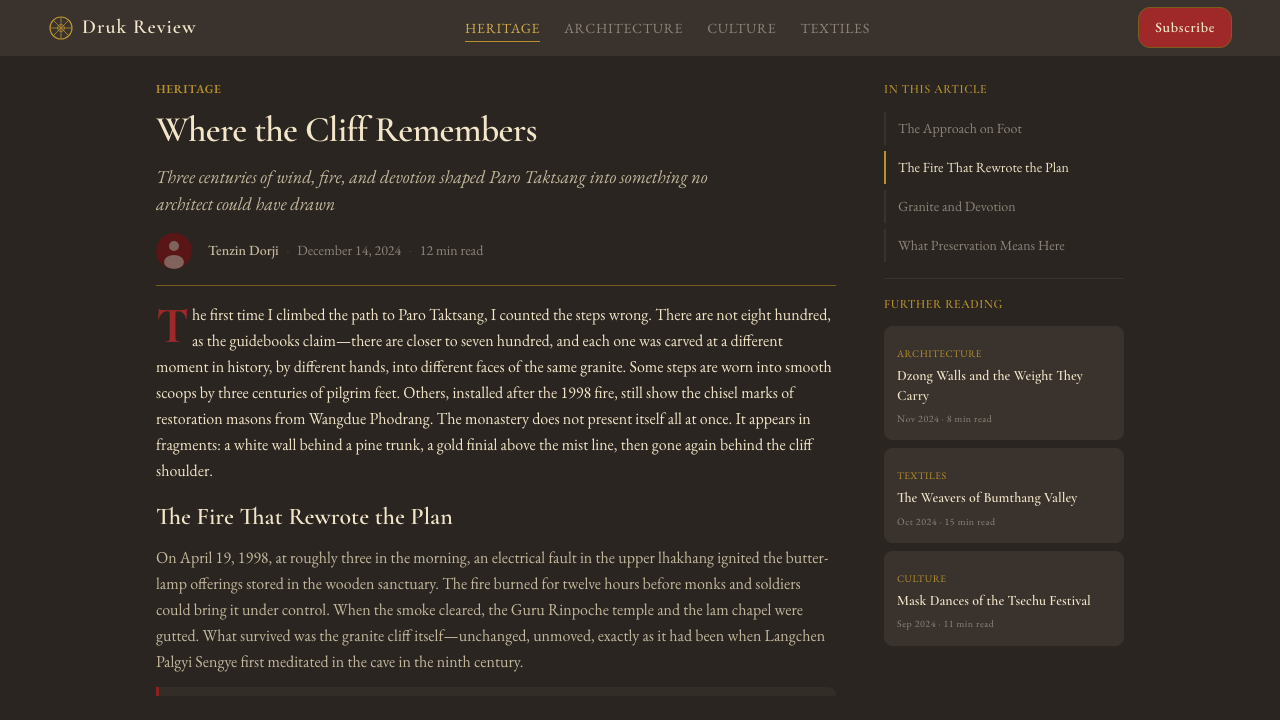
Taktsang was severely damaged by fire in 1998, and the reconstruction undertaken by the royal government of Bhutan between 1998 and 2004 became a deliberate act of cultural preservation. The rebuilding adhered strictly to the pre-fire visual canon — the same cinnabar wash on the walls, the same proportional system for windows and cornices, the same bronze-gold on the ritual objects and roof ornaments. King Jigme Khesar Namgyel Wangchuck, who has made Bhutanese cultural continuity a pillar of royal policy, has continued to support the kind of architectural stewardship that keeps the monastery's visual language fixed even as contemporary materials are used in its maintenance. The result is a site that looks, from a distance, almost exactly as it appeared in seventeenth-century paintings — a remarkable achievement in a part of the world where heritage is perpetually under pressure.虎穴寺于1998年遭受严重火灾,1998至2004年间不丹王室政府主持的重建工程成为一次自觉的文化保护行动。重建工程严格遵循火灾前的视觉典范——墙面同样的朱砂涂层,窗户与飞檐同样的比例体系,礼器与屋顶装饰同样的青铜金色。将文化延续性列为王室政策核心支柱的吉格梅·凯萨尔·南嘉尔·旺楚克国王,持续支持这类建筑管护工作,使寺院的视觉语言在采用当代材料维护的同时保持固定。其结果是:从远处望去,这座寺院的外观与十七世纪画作中的呈现几乎完全一致——在遗产永受压力的地区,这是一项了不起的成就。
What defines the Bhutanese Tiger's Nest Cliff Monastery look?Bhutanese Tiger's Nest Cliff Monastery 的视觉特征是什么?
Cinnabar Earth Red朱砂土红
The dominant hue of the system is a smoke-red drawn from rammed cinnabar earth — a tone that reads as simultaneously warm and austere, neither the bright vermilion of Chinese imperial architecture nor the lighter ochre-red of many Tibetan monasteries, but something denser and more mineral. This red functions as the primary attention register in the system: it covers the largest surface areas, anchors the composition, and signals primary hierarchy. Its smokiness — the sense that it absorbs light rather than reflecting it — prevents it from reading as decorative. It is a constructive color, the color of the wall itself.整个体系的主色调是从夯土朱砂中提取的烟红色——这一色调既温暖又峻肃,既非中国皇家建筑的亮朱红,也非许多藏地寺院的浅赭红,而是某种更厚重、更具矿物感的色彩。此红色在体系中充当首要注意力寄托:它覆盖最大的表面积,锚定构图,标志最高层级。它的烟熏感——那种吸收光而非反射光的质地——使其不会被误读为装饰性色彩。它是一种建构性的色彩,是墙体本身的颜色。
Bronze-Gold Hierarchy青铜金层级
Gold in this system is not a background or a field; it is an accent of sacred distinction. Historically derived from the gilt finials, roof ornaments, and ritual objects of Bhutanese monastery interiors, the bronze-gold tone in the design system marks the highest tier of hierarchy — the element or label that is spiritually or structurally paramount within a given composition. It appears sparingly, which is what gives it authority. Used broadly, it becomes decoration; used at precise focal points, it reads as consecration. The bronze character of the gold — heavier and older than a bright yellow-gold — keeps it legible against the dark grounds that dominate the system.金色在这个体系中不是背景或底色,而是神圣区分的点睛之笔。历史上源自不丹寺院内部的镀金宝幢、屋顶装饰与礼器,青铜金色调在设计体系中标记层级最高者——在特定构图中精神上或结构上至为重要的元素或标签。它被节制地使用,正是这种节制赋予它权威感。广泛使用时,它沦为装饰;精确地用于焦点之处,它被解读为圣化。其青铜特质——比明黄金更厚重、更古旧——使其在主导体系的深色底面上保持清晰可读。
Charcoal Granite Ground炭灰花岗岩底色
The dark ground of the system is the cliff itself — a charcoal that carries the texture and density of granite, not the flat neutral of a digital dark mode. Against this ground, both the cinnabar red and the bronze-gold take on a new quality: the red deepens and intensifies, the gold glows rather than glares. The charcoal serves a compositional function that lighter grounds cannot: it absorbs competing brightness and enforces the primacy of the palette's two main active colors. The system is dark at its core not for atmosphere or drama, but because the cliff is dark, and the monastery was built into the cliff rather than placed on top of it.体系的深色底面是崖壁本身——一种带有花岗岩质感与密度的炭灰,而非数字深色模式的平板中性色。在这一底色衬托下,朱砂红与青铜金都呈现出新的品质:红色加深而愈加浓烈,金色发光而不刺眼。炭灰承担着浅色底面无法承担的构图功能:它吸收竞争性的亮度,强化色板两种主动色的主导地位。体系的核心是深色的,不是为了氛围或戏剧感,而是因为崖壁是深色的,寺院是凿入崖壁而非置于崖顶的。
Pine Green Anchor松绿锚定色
Drawn from the conifer forests that cling to the valley walls below the monastery, deep pine green provides the one organic element in an otherwise entirely mineral palette. It does not soften the system; rather, it anchors it — providing the fourth reference point that prevents the composition from feeling suspended in abstraction. In the monastery's context, the green is the ground of the physical world, the living base from which the sacred cliffs rise. In the design system, it functions similarly: secondary backgrounds, supporting content areas, or navigational regions that need to feel grounded rather than elevated.深松绿取自依附于寺院下方谷壁的针叶林,在这片纯粹矿物质感的色板中提供唯一的有机元素。它不使体系柔化,而是将其锚定——提供第四个参照点,防止构图感觉悬浮于抽象之中。在寺院的语境中,绿色是物质世界的根基,是神圣崖壁拔起其间的鲜活地面。在设计体系中,它的功能与之相似:次级背景、辅助内容区域,或需要感觉扎根而非升华的导航区域。
Vertical Emphasis and Tiered Massing垂直张力与层台构成
Paro Taktsang does not spread horizontally — it stacks. Multiple distinct temple buildings at different elevations on the same cliff create a composition of tiered platforms, each with its own roof line and cornice, each slightly different in proportion, all bound together by a shared palette and the unifying white plaster of the connecting walls. In the design system, this translates to a strong vertical preference in layout: content stacks rather than spreads, hierarchy reads top-to-bottom rather than left-to-right, and distinct tiers within a single screen or document are separated by clear horizontal dividers that echo the cliff's natural ledges.帕罗虎穴寺不向水平展开——它向上叠加。同一崖壁上不同高度的多座独立殿宇构成一个层台平台的构图,每座都有自己的屋顶线和飞檐,比例各异,却因共同的色板和连接墙体统一的白灰泥而融为一体。在设计体系中,这转化为版面上强烈的垂直倾向:内容纵向叠加而非横向展开,层级从上至下而非从左至右阅读,同一屏幕或文档中不同层级之间以清晰的水平分隔呼应崖壁天然的岩阶。
Prayer-Flag Silk Accents经幡丝绸点缀
The only elements in the monastery's visual composition that are not mineral or architectural are the prayer flags: long horizontal streamers of silk in a sequence of five traditional colors — white, blue, red, green, and yellow — that span the chasms between cliff faces. In the design system, this translates to a specific use of accent color: brief, horizontal, and sequential, functioning like a data band, a progress indicator, or a color-coded legend. The accent is never used as a fill or a background; it is always a narrow horizontal register — a whisper of color across a dark or neutral ground, referencing the flutter of silk against granite.寺院视觉构图中唯一非矿物、非建筑的元素是经幡:五色传统丝带——白、蓝、红、绿、黄——的长水平飘带,横跨崖壁之间的深渊。在设计体系中,这转化为点缀色的特定用法:简短、水平、序列性,功能如同数据条带、进度指示器或色彩编码图例。点缀色从不用作填充或底色;它始终是一个细窄的水平色带——在深色或中性底面上的一抹色彩低语,呼应花岗岩上丝绸的轻颤。
Ornament as Sacred Law装饰即圣律
Unlike minimalist systems that eliminate ornament on principle, the Bhutanese Tiger's Nest system includes specific decorative elements — but each one carries a defined sacred function. The gilt finials mark points of transition between the earthly and the divine. The cornice overhangs signal the boundary between interior and exterior, protected and exposed. The carved wooden window frames establish viewing apertures as acts of deliberate framing rather than merely structural openings. In the design system, this means that decorative elements are not forbidden, but they must earn their place: each visible mark should be traceable to a hierarchical or functional purpose, not applied for visual richness alone.与以原则为由消除装饰的极简体系不同,不丹虎穴寺体系包含特定的装饰元素——但每一元素都承载着明确的神圣功能。镀金宝幢标记尘世与神圣之间的过渡点。飞檐挑出标志着内与外、受护与暴露之间的界限。雕刻木窗框将观看开口确立为有意识的取景行为,而非单纯的结构开洞。在设计体系中,这意味着装饰性元素并非被禁止,但必须自证其存在价值:每一个可见标记都应可追溯至某一层级或功能目的,而非仅仅为视觉丰富性而添加。

Who shaped Bhutanese Tiger's Nest Cliff Monastery?谁塑造了 Bhutanese Tiger's Nest Cliff Monastery?
The eighth-century Indian tantric master Padmasambhava, known in Bhutan as Guru Rinpoche, is the spiritual originator of the Taktsang site. According to Bhutanese Buddhist tradition, he flew to the cliff on a tigress — who was a transformation of his consort Yeshe Tsogyal — and spent three months in the cave that became the monastery's innermost sanctum. His legendary presence established the site as one of the most sacred in the Vajrayana world, and his iconography — particularly the distinctive red hat and the vajra held in the right hand — became the visual touchstone from which much of the monastery's decorative program derives.八世纪印度密宗大师莲花生大师(帕德玛桑巴瓦),在不丹被尊称为古汝仁波切,是虎穴寺圣地的精神开创者。据不丹佛教传统,他骑乘一只母虎——其明妃依喜措嘉的化身——飞抵崖壁,在后来成为寺院内殿的山洞中打坐三月。他的传奇存在使此地成为金刚乘世界最神圣的圣地之一,他的图像——尤其是标志性的红帽与右手持金刚杵——成为寺院大部分装饰程序由此衍生的视觉基石。
The Zhabdrung — 'at whose feet one prostrates' — was a Tibetan Buddhist master who arrived in Bhutan in 1616 after fleeing a succession dispute in Tibet. Over the following decades he unified the country's warring fiefdoms, established the Drukpa Kagyu school as the national religion, and created the dual secular-religious governance structure that defined Bhutanese statecraft for centuries. His most consequential architectural act was the development of the dzong typology: massive whitewashed fortress-monasteries whose visual grammar — rammed earth walls, inward-tapering towers, internal courtyards governed by strict proportional rules — became the foundational language of Bhutanese architectural identity, within which Taktsang's entire visual vocabulary sits.扎布东——「向其脚下礼拜者」——是一位1616年因西藏继承权纷争而出走不丹的藏传佛教大师。在此后数十年间,他统一了各自为政的封建领地,确立竺巴噶举派为国教,并建立了定义不丹国家政体数百年的世俗-宗教双轨治理结构。他在建筑上最具深远意义的成就是宗堡类型的发展:大型白墙堡垒寺院,其视觉语法——夯土墙面、内倾收分的塔楼、遵循严格比例规则的内庭——成为不丹建筑身份的基础语言,虎穴寺的全部视觉词汇均植根其中。
The fourth desi of Bhutan, Tenzin Rabgye served as the secular regent of the country from 1680 to 1694 and is credited as the patron who commissioned the construction of the current Paro Taktsang monastery in 1692. His decision to build was not merely pious; it was also a political act that reinforced the Drukpa Kagyu establishment's authority over the sacred landscape of western Bhutan. The monastery he commissioned applied the mature dzong aesthetic — by then standardized across the kingdom — to the peculiar conditions of a cliff site, producing a building that became the most recognizable image of Bhutan itself.不丹第四任代理(世俗摄政)丹增·拉杰于1680至1694年间执政,被誉为1692年主持建造现存帕罗虎穴寺的施主。他的决定不仅出于虔诚,也是一项政治行动,强化了竺巴噶举教派对不丹西部神圣地景的权威。他所委托兴建的寺院将当时已在王国全境标准化的成熟宗堡美学运用于崖面地点的特殊条件,产生了一座后来成为不丹本身最具标志性图像的建筑。
The fifth and current king of Bhutan, known affectionately as the Dragon King, has made the continuity of Bhutanese cultural identity — including its architectural and visual heritage — a defining theme of his reign. His government's oversight of the post-1998 fire reconstruction of Taktsang, which adhered strictly to the pre-fire visual canon rather than taking the opportunity to modernize, reflects a deliberate policy of aesthetic conservation. Under his patronage, Bhutan's building standards require new government and religious structures to maintain the dzong aesthetic, ensuring that the visual language first codified under the Zhabdrung remains the dominant architectural idiom of the kingdom.不丹第五任在位国王,民间亲切地称为龙王,将不丹文化身份的延续——包括其建筑与视觉遗产——作为其执政的核心主题。他的政府对1998年火灾后虎穴寺重建工程的监督,严格遵循火灾前的视觉典范而非借机现代化,体现了一项自觉的美学保护政策。在他的庇护下,不丹的建筑标准要求新建政府与宗教建筑保持宗堡美学,确保最初在扎布东时代编典的视觉语言至今仍是王国的主导建筑惯例。
No single architect or designer is credited with the specific forms of Bhutanese monastic architecture; the tradition was carried by generations of anonymous master builders — lopon, or chief craftsmen — who transmitted the proportional rules, the correct cinnabar-to-white ratios for wall painting, the method for calculating roof overhang, and the ritual requirements for window orientation by apprenticeship and practice. This anonymous transmission is itself part of the tradition's visual authority: the forms are not attributed to individual genius but to accumulated sacred knowledge, which gives the aesthetic its quality of inevitability — as though it could not have been otherwise.没有任何个人被列为不丹寺院建筑特定形制的设计者;这一传统由一代代无名匠师——洛本,即首席工匠——所传承,他们以学徒制与实践传授比例规则、墙绘中朱砂与白色的正确比值、屋顶挑出的计算方法,以及窗户朝向的礼仪要求。这种匿名传承本身就是传统视觉权威的组成部分:这些形制不被归于个人天才,而被归于积累的神圣知识,赋予这套美学一种必然性的品质——仿佛它只能是这个样子,别无他途。
How do you use Bhutanese Tiger's Nest Cliff Monastery today?今天怎么用 Bhutanese Tiger's Nest Cliff Monastery?
The Bhutanese Tiger's Nest Cliff Monastery system is among the most architecturally coherent of Himalayan-derived design languages, and its power depends on respecting the hierarchy it encodes. Before applying any element, understand the three-tier color logic: the smoke-red is structural and primary, the bronze-gold is sacred and premium, the charcoal is the ground. Reversing or conflating these tiers — using gold as a background, for example, or treating charcoal as merely a dark mode alternative — collapses the system's internal logic and produces something that looks like a borrowing rather than a commitment.不丹虎穴寺悬崖寺院体系是喜马拉雅派生设计语言中建筑逻辑最为完整的之一,其力量依赖于对其所编码的层级的尊重。应用任何元素之前,须先理解三层色彩逻辑:烟红色是结构性的、首要的;青铜金是神圣的、高阶的;炭灰是底色。颠倒或混淆这些层级——例如将金色用作底色,或将炭灰视为普通的深色模式替代品——会瓦解体系的内在逻辑,产生一种看起来像借鉴而非承诺的东西。
For presentation slides, the system produces strong results on both cover and content pages. A cover slide should lean into the system's verticality and mineral weight: a tall composition with the title in a light, warm-toned type against a deep charcoal field, a narrow bronze-gold horizontal rule below the headline, and a smoke-red element — a block, a band, a vertical rule — anchoring one edge. Content slides benefit from the tiered structure: section headers in a slightly lighter charcoal or in the smoke-red, body text in a warm off-white, and call-out data points or labels in bronze-gold to signal hierarchical importance. Data visualizations should use the palette's full sequence — smoke-red for primary series, bronze-gold for secondary, pine green for tertiary — rather than introducing outside colors.对于演示文稿,该体系在封面页和内容页上都能产生强烈效果。封面幻灯片应充分利用体系的垂直性与矿物重量感:高耸的构图,标题以浅暖色调文字置于深炭灰底面,标题下方配以细窄青铜金水平线,以烟红色元素——色块、色带或垂直线——锚定一侧边缘。内容幻灯片受益于层台结构:章节标题使用略浅的炭灰或烟红色,正文使用暖调近白色,引用数据点或标签使用青铜金以标示层级重要性。数据可视化应使用色板的完整序列——烟红色用于主要系列,青铜金用于次要系列,松绿色用于第三层——而非引入外部色彩。
For web and dashboard interfaces, the system is particularly well-suited to contexts where depth, authority, and a sense of deliberate craft are valued: financial products, cultural institutions, premium subscription platforms, or any application that wants to signal care and precision rather than friendliness and speed. The charcoal dark ground works as a primary background; a slightly lighter derivative of the charcoal handles card and panel surfaces. Interactive elements — buttons, active states, selected items — use the smoke-red, reserving bronze-gold for tier labels, badges, or the single most important call-to-action on any given screen. Navigation should be restrained and typographic, with minimal iconography.对于网页和仪表板界面,该体系特别适合重视深度、权威感与刻意工艺质感的场景:金融产品、文化机构、高级订阅平台,或任何希望传达用心与精准而非友好与速度的应用。炭灰深色底面用作主背景;炭灰的略浅派生色处理卡片和面板表面。交互元素——按钮、活跃状态、选中项——使用烟红色,将青铜金保留给层级标签、徽章,或特定屏幕上最重要的单一行动号召。导航应克制且以文字为主,图标使用最小化。
For editorial and marketing applications, the style's poster-like quality — derived from the monastery's tendency to present itself as a single bold mass against a sky — translates into strong full-width hero blocks and section dividers. A marketing page should alternate between charcoal-ground and a slightly off-white ground for different sections, using the smoke-red consistently for primary calls-to-action and the pine green for supporting or secondary sections. Bronze-gold appears only at the highest tier of the page hierarchy: the primary headline, the pricing badge, the key feature callout. Resist the temptation to use it broadly — in this system, gold that appears everywhere is no longer gold.对于编辑与营销应用,这种风格的海报式品质——源自寺院倾向于以单一大胆体量呈现于天空前的方式——转化为强劲的全宽主视觉区块和版块分隔。一个营销页面应在炭灰底面和略偏白的底面之间交替用于不同版块,对主要行动号召始终如一地使用烟红色,对辅助或次要版块使用松绿色。青铜金仅出现在页面层级的最高层:主标题、定价徽章、关键功能引用。克制广泛使用的冲动——在这个体系中,随处可见的金色已不再是金色。
The most common mistake when working with this system is treating it as generically dark and moody rather than specifically mineral and sacred. The charcoal ground should feel like granite — dense and particular — not like a generic dark backdrop. The smoke-red should feel earthy and absorbed, not bright or aggressive. If the palette starts to feel cinematic or luxury-lifestyle, it has drifted from the system's register. The corrective is always to return to the source: a cliff face, a rammed-earth wall, a gilt ornament catching thin Himalayan light. The system's authority comes from geological and spiritual specificity, not from general dark elegance.使用这个体系时最常见的错误,是将其视为泛泛的深色与阴郁,而非具体的矿物质感与神圣感。炭灰底面应该有花岗岩的感觉——致密而特定——而非通用的深色背景。烟红色应该感觉质朴而内敛,而非明亮或咄咄逼人。如果色板开始给人电影感或奢侈生活方式的感觉,它就已经偏离了体系的语境。纠正的方法始终是回到源头:一面崖壁,一堵夯土墙,一件在稀薄喜马拉雅光线中捕光的镀金装饰。这个体系的权威来自地质与精神的特殊性,而非泛泛的深色高雅。
Bhutanese Tiger's Nest Cliff Monastery — FAQBhutanese Tiger's Nest Cliff Monastery · 常见问题
How is this system different from Tibetan Buddhist design?这个体系与藏传佛教设计有何不同?
The most important distinction is national: Bhutan developed its own architectural and visual tradition under the Drukpa Kagyu school and the Zhabdrung's dzong-building program, distinct from Gelug-dominated Lhasa. The Bhutanese palette runs deeper and earthier — the cinnabar is darker, the use of white is more architectural than decorative, the gold is used as an accent of hierarchy rather than a field of celebration. Structurally, the dzong aesthetic emphasizes severity and mass over the layered richness of Tibetan monastery interiors. There is also a specific relationship to the landscape: Bhutanese buildings are designed to be read from a distance against mountain and sky, which requires boldness and legibility at scale rather than the intricate close-up ornament that characterizes much Tibetan interior work.最重要的区别是国家性的:不丹在竺巴噶举派和扎布东宗堡建造计划的框架下发展出自己的建筑与视觉传统,有别于格鲁派主导的拉萨风格。不丹色板更深沉、更具土质感——朱砂更暗,白色的运用更偏建筑性而非装饰性,金色作为层级点缀而非庆典铺底色使用。在结构上,宗堡美学强调峻肃与体量,而非藏地寺院内部层叠的丰富感。此外,还存在与地景的特定关系:不丹建筑设计为在山脉与天空背景下远观,这需要尺度上的大胆与可读性,而非定性多数藏地内饰作品的精细近景装饰。
Can this dark-ground system work for consumer-facing products, or is it too austere?这个深色底面体系适合面向消费者的产品吗,还是太过严峻?
It depends entirely on what the product is communicating. The system's register is sacred, mineral, and ancient — it communicates depth, authority, and rarity rather than warmth, playfulness, or accessibility. This makes it well-suited for products in the premium, cultural, or contemplative space: high-end travel, meditation or wellness applications aimed at a disciplined rather than casual audience, archival or heritage institutions, financial platforms communicating stability and long duration. It struggles in contexts that require emotional warmth, broad accessibility, or the sense of ease and speed. The monastery does not invite the casual visitor; it rewards the determined pilgrim. Any product using this system should be comfortable with the same implicit ask of its user.完全取决于产品在传达什么。这个体系的语境是神圣的、矿物的、古老的——它传达深度、权威与稀有感,而非温暖、趣味或亲和力。这使其非常适合高端、文化或静思性的产品领域:高端旅行、面向自律而非随意受众的冥想或健康应用、档案或文化遗产机构、传达稳健与持久性的金融平台。在需要情感温暖、广泛亲和力或轻松快速感觉的场景中,它则力不从心。寺院不欢迎随意的游客;它犒赏坚毅的朝圣者。任何使用这个体系的产品都应该对其用户有同样的隐性期待。
What is the role of prayer flags in the design system, and how literal should that reference be?经幡在设计体系中扮演什么角色,这种参考应该有多直接?
The prayer flags in the original monastery serve a specific spatial function: they bridge the void between cliff faces, marking a transition across empty space. In the design system, the reference should be structural rather than literal. The flag sequence — its five colors in a horizontal band — informs the use of accent color as a narrow sequential register rather than as fill or background. A progress bar, a data band, a color-coded tag row, a thin top-of-card accent line: these are legitimate translations of the flag's spatial logic. An actual prayer-flag graphic or a decorative textile motif would be too literal, reducing a structural principle to cultural decoration. The flags are interesting because they move across a void; in interface design, the equivalent is a marking that spans or measures rather than fills.原始寺院中的经幡承担着特定的空间功能:它们横越崖壁之间的虚空,标记穿越空白的过渡。在设计体系中,这种参考应是结构性的而非字面的。经幡序列——水平色带上的五种颜色——为点缀色作为细窄序列色带而非填充色或底色的用法提供参照。进度条、数据色带、色彩编码标签行、卡片顶部细窄强调线:这些都是经幡空间逻辑的合理转译。实际的经幡图形或装饰性纺织母题则过于字面化,将结构原则降格为文化装饰。经幡之所以有趣,是因为它们在虚空中运动;在界面设计中,与之相当的是跨越或测量而非填充的标记。
How should the system handle light mode, given that the canonical palette is dark-ground?鉴于标准色板以深色为底,这个体系应如何处理浅色模式?
A light inversion is possible but requires understanding what the dark ground is actually doing. The charcoal is not simply the absence of light — it is the cliff, the geological mass that gives the monastery its context. In a light inversion, the cliff becomes a deeply warm off-white or pale stone — not pure white, which would strip the mineral quality entirely. The smoke-red remains the primary active color; the bronze-gold may lighten slightly but should stay in the warm metallic register rather than shifting to a bright yellow-gold. Pine green holds its deep tone even on a light ground. The light variant works best when it is understood as viewing the monastery in full Himalayan midday sun rather than at dusk: the forms are the same, the light has changed.浅色反转是可行的,但需要理解深色底面实际上在做什么。炭灰不仅仅是光的缺席——它是崖壁,是赋予寺院其语境的地质体量。在浅色反转中,崖壁变成深暖近白或淡石色——而非纯白,那会将矿物质感完全剥除。烟红色保持首要活跃色的地位;青铜金可以略微变浅,但应保持温暖的金属语境而非转向明亮的黄金色。即使在浅色底面上,松绿色也保持其深色调。当浅色变体被理解为在喜马拉雅正午阳光而非黄昏时分观看寺院时,效果最佳:形制相同,光线改变了。
Is this system appropriate for brands that have no direct connection to Bhutan or Buddhism?这个体系适合与不丹或佛教没有直接关联的品牌吗?
The system is appropriate for any brand that genuinely aligns with the values it encodes: depth over surface, endurance over novelty, the reward that comes from sustained engagement rather than immediate gratification. These are not uniquely Bhutanese or Buddhist values — they appear in many cultural contexts and many product categories. What the brand should avoid is treating the system as exotic wallpaper: using the cinnabar because it is unusual, or the bronze-gold because it reads as luxurious, without committing to the structural logic that makes the palette coherent. Used with understanding, the system offers something that most contemporary design language cannot: a palette that feels genuinely ancient without being archaic, and genuinely sacred without being inaccessible.这个体系适合任何真正与其所编码的价值观相符的品牌:深度胜于表面,持久胜于新奇,持续投入带来的回报胜于即时满足。这些不是独特的不丹价值观或佛教价值观——它们出现在许多文化语境和许多产品类别中。品牌应避免的是将这个体系视为异域装饰:因朱砂不寻常而使用它,或因青铜金读起来奢华而使用它,却不承诺使色板连贯的结构逻辑。以理解为前提使用时,这个体系提供了大多数当代设计语言无法给予的东西:一套感觉真正古老而不陈腐、真正神圣而不难以接近的色板。
Related design styles相关设计风格
 Jaipur Pink City RajasthanRoyal warmth, ordered by decree. Pink sandstone, cream jali, emerald borders.王室暖意由法令定色:粉砂岩底、奶油贾利格、翡翠边框。
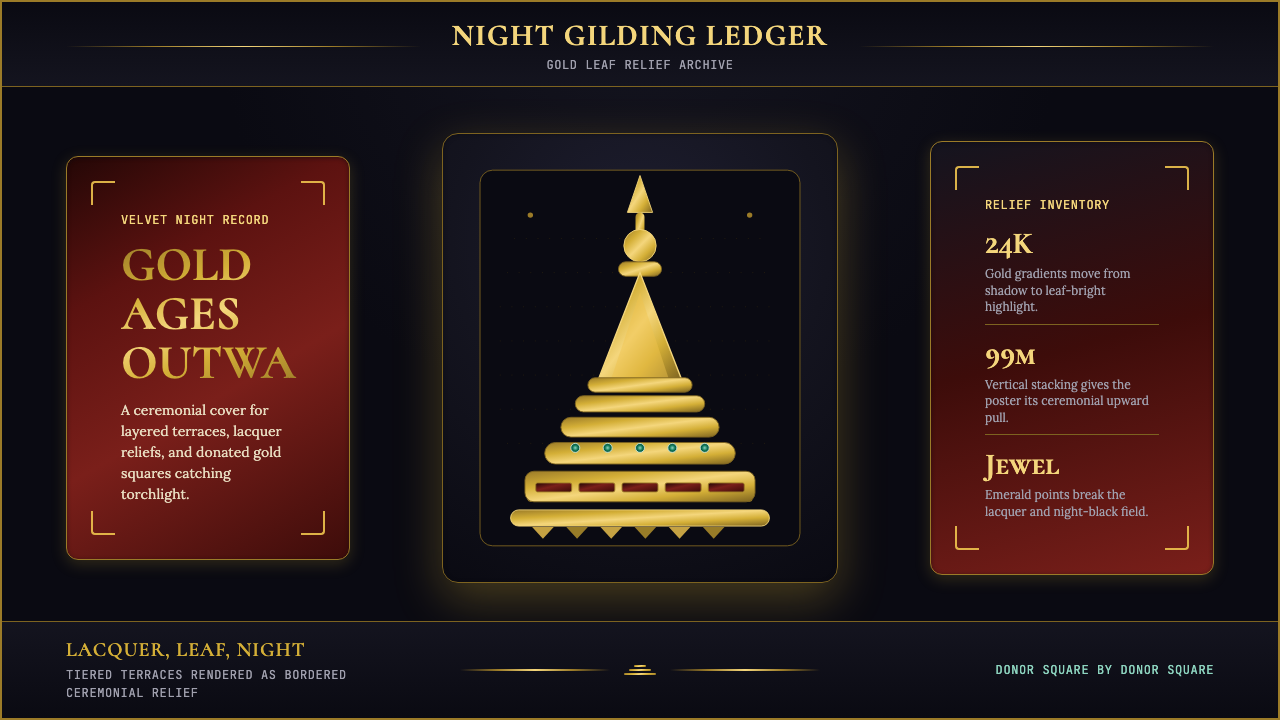 Burmese Shwedagon Stupa ReliefGold refuses restraint. Velvet black, teak-red lacquer, and tiered gradients…金色拒绝克制:黑夜、柚木红漆与层叠渐变堆出神圣密度。
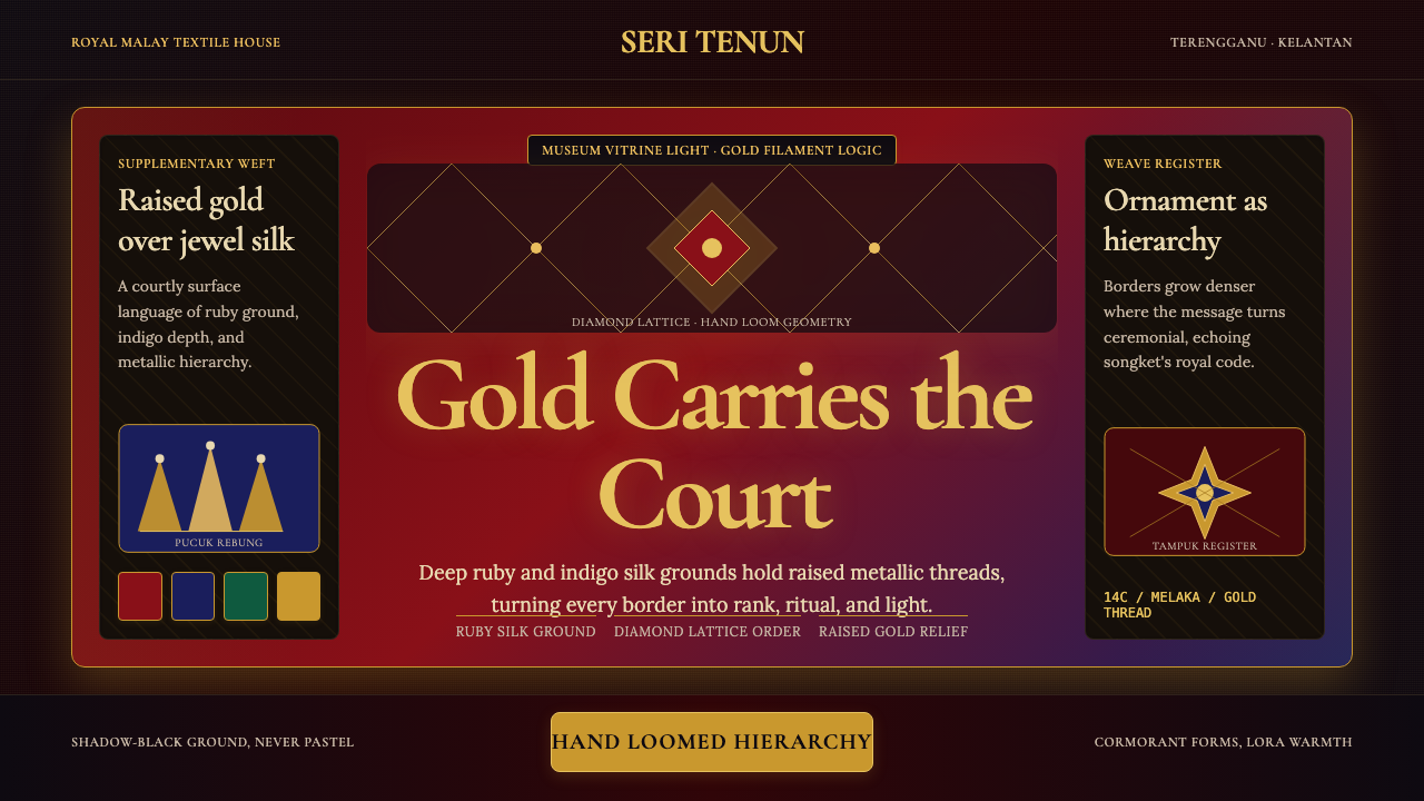 Malaysian Songket (Gold-Thread Weave)Royal textile opulence. Ruby and indigo silk grids lift gold-thread relief.皇家织物的华贵:红宝石与靛蓝格栅托起金线浮雕。
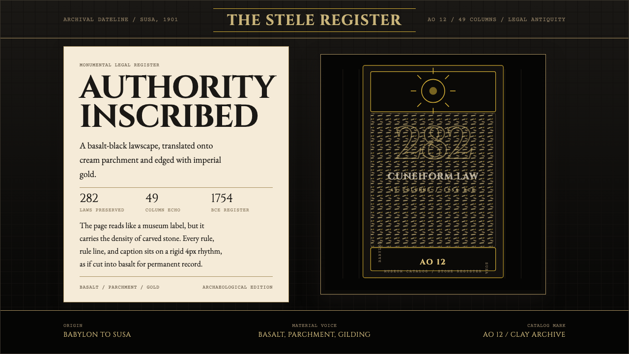 Babylonian Hammurabi SteleAuthority carved in stone. Basalt-black grids, parchment panels, and imperial…权威刻于石上。玄武岩黑底、羊皮纸面板、帝王金点缀。
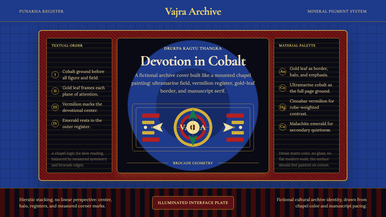 Bhutanese Drukpa Kagyu ThangkaDevotion made cobalt. Gold frames, Cormorant serif, and vermilion marks hold…钴蓝承载虔敬:金框、Cormorant 衬线与朱砂标记构成佛殿秩序。
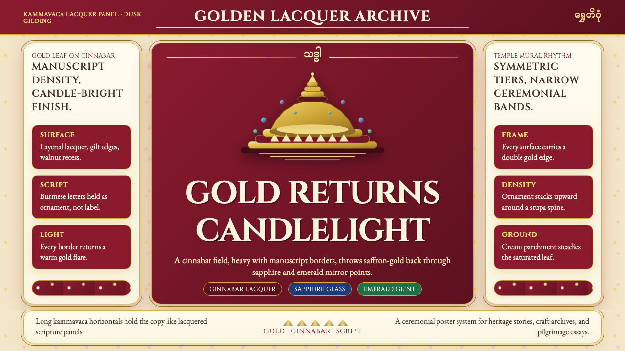 Burmese Shwedagon Gold-LacquerOpulence catches fire. Gold-leaf gradients on cinnabar panels frame a stupa s…虔诚的金色密度:朱漆面板上的金箔渐变,围出佛塔中轴。