What is Jaipur Pink City Rajasthan?什么是 Jaipur Pink City Rajasthan?
A royal decree in 1876 painted an entire walled city pink overnight — and gave the world its first deliberate urban brand.1876年的一道王室法令,令整座古城在一夜之间换上粉装,由此诞生了世界上第一个刻意打造的城市品牌。
Jaipur Pink City Rajasthan in briefJaipur Pink City Rajasthan 速览
The Jaipur Pink City aesthetic is one of the rare design systems rooted not in a school or movement but in a single royal command. When Maharaja Sawai Ram Singh II ordered the walled city of Jaipur painted in terracotta pink ahead of the 1876 visit of the Prince of Wales, he established a chromatic identity so powerful that more than a century later it still governs every façade within the old city walls — by municipal law. This is a style born from ceremony, maintained by statute, and amplified by modern heritage tourism.斋浦尔粉红之城的视觉体系,是极少数根植于一道王室命令而非某所学校或某场运动的设计系统。1876年,摩诃罗阇萨瓦伊·拉姆·辛格二世为迎接威尔士亲王到访,下令将整座旧城涂成赤陶粉色,由此确立了一种强大到跨越一个多世纪的色彩认同——如今,旧城墙内的每一处立面仍依市政法规维护着这份粉色。这是一种诞生于仪典、由法令延续、经现代遗产旅游放大的风格。
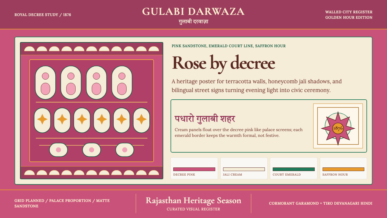
Visually, the system rests on a handful of recurring elements that feel simultaneously ancient and surprisingly contemporary: a warm, dusty pink drawn from local sandstone, lattice screens (jali) in pale cream that filter harsh desert light into geometric shadow patterns, emerald and teal accents borrowed from Rajput court interiors, and saffron moments that echo both festival and devotion. The result is layered in the truest sense — not applied decoration but a visual language that developed organically from climate, craft, and court culture over nearly three centuries.在视觉上,这套体系依赖于一组反复出现、兼具古意与当代感的元素:从本地砂岩中提炼的温暖、带尘感的粉色;将刺眼的沙漠阳光过滤成几何阴影图案的浅奶油色贾利格窗;借自拉杰普特宫廷内装的翡翠绿与蓝绿色点缀;以及兼具节日气息与虔诚意味的藏红花色亮点。整体效果是真正意义上的层叠——不是外加的装饰,而是近三个世纪以来从气候、工艺与宫廷文化中有机生长出的视觉语言。
Applied to modern design contexts, the Jaipur palette carries an unmistakable warmth and cultural authority that purely synthetic palettes cannot replicate. It works because its proportions are already calibrated: the dominant pink is always dusty rather than saturated, the cream lattice is always the mid-tone bridge, and the jewel-toned accents appear sparingly, echoing the way precious stones were used in Rajput miniature painting — as focal points, not fields.运用于现代设计语境时,斋浦尔色板携带着纯粹人工合成的色板无法复制的温度与文化权威感。这套系统之所以奏效,在于它的比例关系已经自我校准:主体粉色始终是带灰调的低饱和粉而非鲜亮粉,奶油色贾利格始终是过渡性的中间调,珠宝色系的点缀则克制出现——正如宝石在拉杰普特细密画中的用法:作为视觉焦点,而非底色铺陈。
See the Jaipur Pink City Rajasthan design system查看 Jaipur Pink City Rajasthan 完整设计系统
Where does Jaipur Pink City Rajasthan come from?Jaipur Pink City Rajasthan 从何而来?
Jaipur was founded in 1727 by Maharaja Sawai Jai Singh II, a ruler as accomplished in astronomy as in statecraft. Breaking from the hilltop defensive tradition of older Rajput citadels, Jai Singh commissioned the architect Vidyadhar Bhattacharya to design a city on the plains according to the principles of Vastu Shastra, the ancient Hindu system of spatial arrangement. The result was one of the first planned cities in the Indian subcontinent: a grid of nine rectangular sectors (chowkris) organized around a central palace complex, with broad avenues, uniform building heights, and systematic proportions that would have impressed a European Baroque planner. The city's buildings were constructed primarily from the pink-hued sandstone quarried at nearby Khatoo and Jodhpur — the stone itself gave the city its characteristic warmth long before any decree made it official.斋浦尔由摩诃罗阇萨瓦伊·贾伊·辛格二世创建于1727年,这位君主在天文学与治国之道上同样造诣深厚。他打破了旧时拉杰普特山头要塞的防御传统,委托建筑师维迪亚达尔·巴塔查里亚依照印度教古典空间体系瓦斯图沙斯特拉的原则,在平原上规划一座新城。建成的斋浦尔是印度次大陆最早的规划城市之一:九个矩形街区(乔克里)围绕中央宫殿群展开网格布局,宽阔的林荫大道、统一的建筑檐高与系统化的比例关系,令任何一位欧洲巴洛克城市规划者都会印象深刻。城市建筑主要采用从附近卡图和焦特布尔采掘的带粉调砂岩——早在任何法令使之成为规定之前,这种石材本身便已赋予斋浦尔那标志性的温暖底色。
The city's original palette was therefore not a design decision in the modern sense but a geological fact. The sandstone used in monuments like the Hawa Mahal (Palace of Winds), completed around 1799 under Sawai Pratap Singh, and the Jantar Mantar observatory complex already gave Jaipur a coherent warm ochre-pink tone. Mughal influence brought with it the refinement of jali screens — intricate lattice panels in white or pale stone, originally developed in Agra and Delhi, which in Jaipur were adapted to the local sandstone vocabulary and deployed on façades to provide shade, ventilation, and visual texture simultaneously. The Hawa Mahal's façade, with its 953 small casement windows behind honeycombed jali screens, remains the most iconic synthesis of these two elements.斋浦尔最初的色调,因此不是现代意义上的设计决定,而是一个地质事实。风之宫殿(约1799年萨瓦伊·普拉塔普·辛格在位期间建成)与简塔·曼塔天文台建筑群所使用的砂岩,已然赋予斋浦尔连贯的暖赭粉调。莫卧儿的影响则带来了贾利格窗的精细化——这种由白色或浅色石材雕刻而成的镂空格窗,最初发展于阿格拉和德里,在斋浦尔被融入本地砂岩词汇,大面积部署于建筑立面,同时提供遮阳、通风与视觉质感三重功能。风之宫殿那由953扇小窗藏于蜂巢状贾利格窗之后的立面,至今仍是这两种元素最具标志性的融合体。
The famous pink decree of 1876 is often presented as a simple story — paint the city pink to honor a royal guest — but its implications were more significant. Maharaja Sawai Ram Singh II was a reforming ruler who introduced photography to Rajasthan, established schools for girls, and managed the transition to British suzerainty with considerable political skill. His decision to paint the entire walled city a uniform terracotta pink was simultaneously an act of hospitality (pink being the color of welcome in Rajput tradition), a display of political sophistication (presenting a unified, ordered city to the British Crown's heir), and, in retrospect, an act of early urban branding of remarkable effectiveness. The decree was not temporary; subsequent rulers maintained it, and it became codified in municipal regulation.1876年著名的粉色法令,常被讲述为一个简单的故事——为迎接皇室贵客将全城涂成粉色——但其意涵远不止于此。萨瓦伊·拉姆·辛格二世是一位改革型君主,他将摄影术引入拉贾斯坦,创办女子学校,并以相当的政治手腕处理了归顺英国宗主权的过渡。他令整座旧城涂上统一赤陶粉色的决定,同时具有三重意义:待客之道(粉色在拉杰普特传统中是欢迎之色)、政治表演(向英国王储呈现一座整齐划一、秩序井然的城市),以及——回望历史——一次效果卓著的早期城市品牌化行动。这道法令并非权宜之计;历代君主相继维护,最终被编入市政法规。
The modern identity of Jaipur as the Pink City was further shaped by Maharani Gayatri Devi, wife of Maharaja Sawai Man Singh II, who became one of the most celebrated women in post-independence India and an international fashion icon. Her effortless synthesis of Rajput tradition with mid-century cosmopolitan elegance — receiving guests at City Palace in traditional Rajasthani dress while hosting dignitaries from the Kennedy circle — helped project Jaipur as a place where ancient visual culture and modern sophistication coexisted. The Indian heritage-tourism revival of the 1970s and 1980s, and subsequently the global appetite for artisan craft and 'authentic' travel, transformed Jaipur's chromatic identity from a local regulation into an internationally recognized brand, embedding the Pink City aesthetic into the consciousness of designers, photographers, and travelers worldwide.斋浦尔作为「粉红之城」的现代身份,进一步由摩诃罗阇尼·盖雅特丽·黛维塑造。作为萨瓦伊·曼·辛格二世的王后,她成为独立后印度最具知名度的女性之一和国际时尚偶像。她在拉杰普特传统与二十世纪中叶世界主义优雅之间的从容融合——身着传统拉贾斯坦服饰在城市宫殿接待宾客,同时与肯尼迪圈子的政要交往——帮助斋浦尔以「古老视觉文化与现代精致并存」的形象投射于国际视野。1970至80年代印度遗产旅游的复兴,以及随后全球对手工艺品与「真实」旅行体验的渴望,将斋浦尔的色彩认同从一项地方法规转化为一个国际认知的品牌,将粉红之城美学嵌入设计师、摄影师与旅行者的集体意识之中。
What defines the Jaipur Pink City Rajasthan look?Jaipur Pink City Rajasthan 的视觉特征是什么?
The Terracotta Pink Ground赤陶粉底色
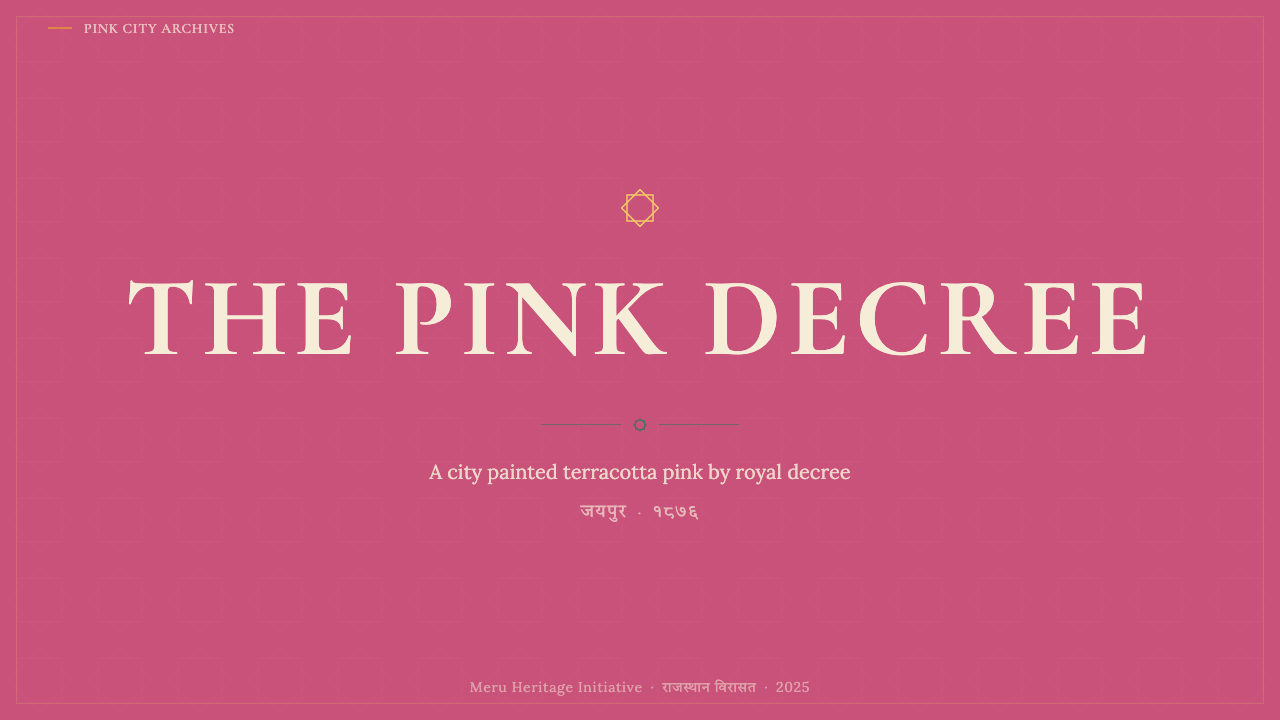
The defining chromatic note is a warm, dusty pink that sits closer to terracotta than to pastel. It carries the earthy weight of sandstone — slightly muted, never candy-bright, always warm in undertone. This is not a delicate color; it holds its presence under harsh midday sun and glows differently at dawn and dusk. In design applications, it functions as a full-page or large-area ground rather than an accent, because its natural dustiness prevents it from overwhelming the eye. Paired with cream or off-white, it reads as noble and warm; paired with jewel tones, it recedes gracefully to support them.这套体系最具定义性的色彩音符,是一种温暖、带尘感的粉色——比柔和的粉彩更偏向赤陶,携带着砂岩特有的泥土厚重感:微微沉敛,从不糖果亮粉,底调始终温暖。这不是一种纤弱的颜色;它在正午烈日下保有自身存在感,在黎明与黄昏以不同方式发光。在设计应用中,它作为全页或大面积底色使用,而非点缀色,因为其天然的低饱和感使它不会压迫视觉。与奶油色或米白色搭配,显得高贵温润;与珠宝色系搭配,则优雅退让,托举后者。
Jali Lattice Ornament贾利格镂空装饰
The jali — an intricate pierced screen of stone or plaster — is the system's most distinctive formal element. Jali patterns are geometric in their underlying logic (grids of stars, octagons, or interlocking diamonds) but organic in their density and visual rhythm, which shifts as light conditions change. In two-dimensional design, the jali motif translates into patterned overlays, card borders, or background textures that suggest depth and craftsmanship without requiring literal reproduction of the architectural form. The defining quality is the interplay between solid and void: neither the filled shapes nor the open spaces dominate; they are in continuous dialogue.贾利格——一种由石材或灰泥雕制的精细镂空屏风——是这套体系最具辨识度的形式元素。贾利格图案在底层逻辑上是几何性的(星形、八边形或互锁菱形构成的网格),但在密度与视觉节奏上却是有机的,随光线条件的变化而移动。在二维设计中,贾利格母题可转化为图案叠加、卡片边框或背景纹理,无需字面复现建筑形态,即能传递深度感与工艺质感。其核心品质在于实形与虚空的对话:填充形与开放空间均不独占视野,二者始终处于持续的呼应之中。
Jewel-Tone Court Accents珠宝色宫廷点缀
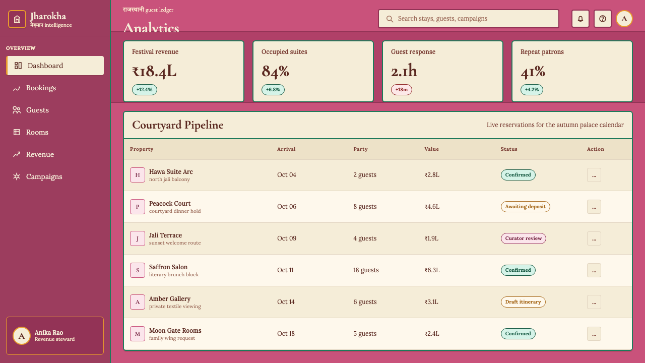
Rajput palace interiors — from the Sheesh Mahal (Palace of Mirrors) to the painted haveli chambers of Shekhawati — are saturated with emerald green, deep teal, peacock blue, and rich cobalt, applied in tiles, frescoes, and inlay work. These colors function as focal-point accents against the dominant pink and cream ground: never backgrounds themselves, always small concentrated areas of intensity. In design, this translates to using jewel tones for interactive elements, data highlights, or typographic emphasis — the visual equivalent of a single emerald tile in a pink sandstone wall.拉杰普特宫殿内部——从镜宫到谢卡瓦提彩绘哈维利的厅室——遍布翡翠绿、深蓝绿、孔雀蓝与浓郁钴蓝,体现于瓷砖、湿壁画与镶嵌工艺中。这些颜色在主体粉色与奶油色底面前充当焦点性点缀:从不作为背景底色,始终是小面积的高强度色彩集中区。在设计中,这转化为将珠宝色系用于交互元素、数据高亮或字体强调——犹如粉色砂岩墙壁上单块翡翠绿瓷砖的视觉等价物。
Saffron and Gold Ceremony藏红花与金色仪典感
Saffron — the warm orange-yellow of marigold garlands, Rajasthani turbans, and Hindu ceremony — appears throughout Jaipur's visual life as a signal of festivity and importance. In the Pink City palette, saffron and its warm golden relatives serve as the highest-emphasis accent: the color used for the most critical call-to-action, the hero moment, or the primary data point that must not be missed. Unlike the steady warmth of the terracotta pink ground, saffron carries energy and urgency. Its restraint is important: overused, it loses its ceremonial authority.藏红花色——万寿菊花环、拉贾斯坦头巾与印度教仪典的暖橙黄——贯穿于斋浦尔视觉生活的各个角落,作为喜庆与重要性的信号出现。在粉红之城色板中,藏红花色及其暖金色近亲充当最高强调色:用于最关键的行动号召、英雄时刻,或不可错过的主要数据点。与赤陶粉底色稳定的温暖不同,藏红花色携带能量与紧迫感。克制使用至关重要:滥用则丧失其仪典权威性。
Devanagari and Bilingual Layering天城文与双语层叠
Jaipur's visual environment is inherently bilingual: Devanagari script for Hindi appears alongside Latin script in signage, shop fronts, and official notices throughout the old city. The two scripts have notably different rhythmic qualities — Devanagari's horizontal headline stroke (shirorekha) and vertical letterforms create a dense, woven texture, while Latin letterforms are more open and vertically variable. In design, treating both scripts as equally considered typographic choices — not a translation appended as an afterthought — is central to the Jaipur aesthetic. The interplay of scripts itself becomes a visual texture, echoing the layering of jali patterns.斋浦尔的视觉环境天然是双语的:天城文(用于印地语)与拉丁字母在旧城的招牌、店面与官方告示中并列出现。两种文字具有显著不同的节奏品质——天城文的水平顶线(顶线律)与竖向字形创造出密集、编织般的质感,而拉丁字母则更为开放、纵向变化更丰富。在设计中,将两种文字视为同等重要的排印选择——而非将翻译文字作为事后补充附加——是斋浦尔美学的核心。文字体系本身的交织成为一种视觉纹理,呼应贾利格图案的层叠感。
Warm Shadow and Texture暖调阴影与质感
Unlike design systems that use cool neutral shadows, the Jaipur palette produces shadows with a warm, amber-tinged character — consistent with how late-afternoon Rajasthani light actually behaves, tinting sandstone shadows toward ochre and rust rather than gray. In design applications, depth and elevation are suggested through warm-toned overlays and subtle textural variation rather than cool drop shadows. Card surfaces might carry a faint suggestion of the pitted, hand-applied texture of lime plaster; dividers might have the rough-edged quality of carved sandstone rather than the pixel-precise line of a digital ruler.与使用冷中性阴影的设计系统不同,斋浦尔色板产生带有温暖琥珀调的阴影——这与拉贾斯坦傍晚光线的实际表现一致,将砂岩阴影染向赭色与锈色而非灰色。在设计应用中,深度与层次感通过暖调叠加与微妙的质感变化来暗示,而非依赖冷调投影。卡片表面可带有石灰泥手工涂抹那种细腻坑纹的淡淡暗示;分割线可具有雕刻砂岩的粗糙边缘质感,而非数字标尺的像素级精准线条。
Structured Grandeur — Ordered, Not Chaotic有序的宏大——秩序而非混乱
For all its ornamental richness, the Jaipur aesthetic is deeply ordered. Jai Singh II's original city plan imposed a rigorous grid; the uniform pink façades create visual coherence across wildly varied architectural programs; jali patterns, however intricate, are always based on repeating geometric units. This is the crucial distinction between the Pink City aesthetic and merely decorative Rajasthani pastiche: richness of detail is contained within a clear hierarchical structure. Applied to design, this means ornamentation should always serve a layout logic — borders frame content areas, patterns occupy clearly bounded fields, and the eye always has a clear primary object to rest on.尽管装饰繁复,斋浦尔美学在骨子里是高度有序的。贾伊·辛格二世的原始城市规划强加了严格的网格;统一的粉色立面在功能各异的建筑单体之间创造了视觉连贯性;贾利格图案无论多么精细,始终以重复的几何单元为基础。这正是粉红之城美学与纯粹装饰性拉贾斯坦仿作之间的关键区别:细节的丰富性被包容在清晰的层级结构之中。应用于设计时,这意味着装饰始终应服务于版面逻辑——边框框定内容区域,图案占据清晰界定的字段,视线始终有明确的主要对象得以停驻。
See the Jaipur Pink City Rajasthan design system查看 Jaipur Pink City Rajasthan 完整设计系统
Who shaped Jaipur Pink City Rajasthan?谁塑造了 Jaipur Pink City Rajasthan?
The founder of Jaipur (1727) and the intellectual force behind its grid-planned layout, Jai Singh II was as much scientist as ruler. His Jantar Mantar observatory complexes — built in five Indian cities, with the Jaipur installation being the largest — demonstrate the same passion for systematic spatial organization that shaped the city's urban plan. The sandstone buildings commissioned under his rule established the material palette and architectural vocabulary that all subsequent Jaipur building would inherit and elaborate.斋浦尔的创建者(1727年)与其网格规划布局背后的智识力量,贾伊·辛格二世与其说是统治者,不如说同样是科学家。他在五座印度城市建造的简塔·曼塔天文台群——以斋浦尔的装置规模最大——展示了与塑造城市规划相同的系统性空间组织热情。他在位期间委托建造的砂岩建筑,确立了此后所有斋浦尔建筑将继承并发展的材料色板与建筑词汇。
The maharaja whose 1876 decree transformed the city's identity irreversibly, Ram Singh II was a modernizing ruler who embraced photography, education reform, and public infrastructure alongside his famous aesthetic command. The decree's genius was not the pink itself but its uniformity — by insisting that every building within the walls adopt the same terracotta tone, he achieved a visual coherence that no subsequent individual building decision could undo. His reign represents the moment Jaipur's geological palette became a conscious civic design system.以1876年法令不可逆地改变了城市认同的摩诃罗阇,拉姆·辛格二世是一位推动现代化的统治者,在他著名的美学命令之外,同样拥抱摄影术、教育改革与公共基础设施建设。这道法令的天才之处不在于粉色本身,而在于其统一性——通过坚持城墙内每一栋建筑采用相同的赤陶色调,他实现了此后任何个别建筑决策都无法撼动的视觉连贯性。他的统治代表着斋浦尔地质色板成为自觉市政设计体系的历史时刻。
The Bengali architect and urban planner who translated Sawai Jai Singh II's ambitions into the actual city grid, Bhattacharya applied the principles of Vastu Shastra — the ancient Sanskrit treatise on spatial arrangement — to produce a city plan of exceptional rational clarity. His nine-sector layout, with its differentiated zones for different trades and communities, established the ordering logic that would make Jaipur's visual richness legible rather than chaotic. He represents the tradition of learned, systematic design thinking that underlies what can seem to casual observers like organic urban exuberance.将萨瓦伊·贾伊·辛格二世的抱负转化为实际城市网格的孟加拉建筑师与城市规划师,巴塔查里亚将瓦斯图沙斯特拉——印度古代梵文空间布局论著——的原则应用于实践,产生了一个具有卓越理性清晰度的城市规划方案。他的九街区布局,以不同区域对应不同行业与社区,确立了令斋浦尔视觉丰富性呈现为可读秩序而非混乱的组织逻辑。他代表了有学养、系统性的设计思维传统——这一传统隐藏在表面上看似有机的城市活力之下。
Maharani of Jaipur and one of the most photographed women of the mid-twentieth century, Gayatri Devi exercised a different kind of design influence: she embodied the Pink City aesthetic for an international audience. Her personal style — Rajasthani textiles in jewel tones, impeccable draping, and an ease with both palace ceremony and cosmopolitan fashion — demonstrated that the Jaipur visual vocabulary could coexist with modernity without condescension in either direction. Her memoirs and the attention she brought to Jaipur were foundational to the city's emergence as a destination for design-conscious global travelers.斋浦尔摩诃罗阇尼,二十世纪中叶被拍摄最多的女性之一,盖雅特丽·黛维以另一种方式施加设计影响:她为国际受众体现了粉红之城美学。她的个人风格——珠宝色系拉贾斯坦纺织品、无懈可击的垂褶、从容周旋于宫廷仪典与世界主义时尚之间——展示了斋浦尔视觉词汇可以与现代性并存,两者之间无需任何方向的迁就俯就。她的回忆录以及她为斋浦尔带来的国际关注,是这座城市成为设计意识全球旅行者目的地的奠基性力量。
Sawai Pratap Singh commissioned the Hawa Mahal in 1799, producing what is now the most reproduced image of Jaipur worldwide. The five-storey façade of 953 small casement windows set within honeycombed jali screens — designed to allow royal women to observe street life while remaining unseen — is also one of the most elegant solutions to a spatial problem in Indian architectural history. The building synthesizes the entire Jaipur aesthetic in a single elevation: terracotta pink sandstone, intricate jali ornament, ordered geometric repetition, and a silhouette dramatic enough to read from a distance against a bright sky.萨瓦伊·普拉塔普·辛格于1799年下令建造风之宫殿,由此创造了当今全球最广为复制的斋浦尔形象。这座五层立面由953扇小窗嵌于蜂巢状贾利格屏风之后构成——设计初衷是让宫廷女性在不被外界看见的情况下观察街道生活——同时也是印度建筑史上对空间问题最优雅的解法之一。这座建筑在单一立面上综合了斋浦尔美学的全部要素:赤陶粉砂岩、精细贾利格装饰、有序的几何重复,以及在明亮天空背景下远距离可读的戏剧性轮廓。
How do you use Jaipur Pink City Rajasthan today?今天怎么用 Jaipur Pink City Rajasthan?
The Jaipur Pink City palette is one of the most evocative historical design systems available to contemporary designers, and also one of the most frequently misapplied. Its richness is structural — it emerges from the specific proportional relationships between terracotta pink, cream, jewel-tone accents, and saffron ceremony moments — and superficial borrowing, such as using a bright pink with gold accents and calling it Rajasthani, will read as costume rather than design. Applying the system correctly requires understanding that the pink is always dusty and large-area, the cream is always the bridging mid-tone, and the accents are always small and concentrated.斋浦尔粉红之城色板是当代设计师可资运用的最具感召力的历史设计系统之一,同时也是被误用最频繁的系统之一。它的丰富性是结构性的——来自赤陶粉、奶油色、珠宝色点缀与藏红花仪典时刻之间特定的比例关系——而肤浅的借用,例如使用亮粉色搭配金色点缀后冠以拉贾斯坦之名,结果只会读起来像戏服而非设计。正确应用这套系统需要理解:粉色始终是低饱和、大面积的;奶油色始终是过渡性的中间调;而点缀色始终是小面积、高浓度的。
For presentation slides, the system provides an unusually strong cover-page vocabulary. A full-bleed terracotta pink ground with title type in cream or off-white, a jali-pattern border or corner ornament, and a single saffron accent on a key word or subhead produces a slide that feels ceremonial and authoritative without resorting to stock-photo illustration. Content slides work best on near-white or very pale cream grounds, with the pink and jewel tones reserved for section headers, data callouts, and chart accent colors. Data slides benefit from the palette's natural hierarchy: terracotta for the primary series, emerald or teal for the secondary series, saffron for the highlighted exception — a chromatic encoding that carries emotional weight as well as visual distinction.对于演示文稿,这套系统提供了异常有力的封面词汇。满版赤陶粉底色配奶油或米白色标题字,辅以贾利格图案边框或角隅装饰,再以一个藏红花色点缀关键词或副标题,便能产生一张兼具仪典感与权威性、无需借助图库插图的封面。内容页在接近白色或极浅奶油色底面上效果最佳,粉色与珠宝色留给章节标题、数据标注与图表强调色。数据页面受益于色板天然的层级感:赤陶粉用于主要系列,翡翠绿或蓝绿色用于次要系列,藏红花色用于高亮异常值——这种色彩编码在传递视觉区分的同时携带情感重量。
For web UI and dashboards, the Jaipur system rewards restraint. The temptation to apply jali patterns as backgrounds or card textures throughout an interface should be resisted; pattern ornament works best as a contained decorative border on hero sections, empty states, or modal headers — areas with enough scale to do justice to the geometric complexity. Dashboard data visualization benefits from the jewel-tone accent family: the range of emerald, teal, cobalt, and peacock blue provides enough chromatic separation to distinguish multiple data series while remaining visually harmonious against cream and off-white grounds. Pricing pages and feature matrices can use the terracotta pink as the highlighted or recommended tier background, creating a warm, inviting emphasis quite unlike the cold blue typically used for this purpose.对于网页界面与仪表板,斋浦尔系统奖励克制。应抵制将贾利格图案作为全界面背景或卡片纹理全面铺开的诱惑;图案装饰最适合作为英雄区、空态或模态框标题的限定性装饰边框——这些区域拥有足够的尺度来承托几何复杂性。数据可视化受益于珠宝色调家族:翡翠绿、蓝绿色、钴蓝与孔雀蓝的范围足以区分多个数据系列,同时在奶油与米白底面上保持视觉和谐。定价页面与功能矩阵可将赤陶粉作为高亮或推荐套餐的背景色,营造出温暖、有邀请感的强调效果——与通常用于此目的的冷蓝色大相径庭。
For editorial and marketing design, the style excels in contexts that combine heritage authority with contemporary appeal — travel, luxury, craft, food, cultural institutions, and any brand that wishes to signal depth of tradition without appearing antiquated. A marketing hero section in full terracotta pink with cream type and a saffron call-to-action button has the poster-like boldness of a Rajasthani festival announcement. Editorial page layouts work well with the jali motif as a decorative column separator or pull-quote border, with jewel-tone drop caps or section numerals providing focal points within a predominantly warm cream body. The bilingual layering principle — treating multiple scripts as equal visual partners — is particularly valuable for brands operating across South Asian and international markets.对于编辑与营销设计,这种风格在结合遗产权威感与当代吸引力的场景中表现卓越——旅行、奢侈品、手工艺、餐饮、文化机构,以及任何希望传递传统深度而不显陈旧气息的品牌。全赤陶粉英雄区配奶油色字体与藏红花色行动号召按钮,具有拉贾斯坦节庆告示海报般的大胆感。编辑版面可将贾利格母题用作装饰性栏间分隔或引语边框,以珠宝色首字下沉或章节数字在以温暖奶油色为主的正文中提供视觉焦点。双语层叠原则——将多种文字视为平等的视觉伙伴——对在南亚与国际市场同时运营的品牌尤具价值。
The most common mistake when applying the Jaipur palette is chromatic overload: deploying terracotta pink, saffron, emerald, and teal simultaneously at high saturation produces visual noise rather than Rajasthani richness. Authentic Jaipur design is dominated by the pink and cream ground, with jewel accents appearing sparingly — as single tiles in a sandstone wall, not as a field of competing colors. A second common mistake is using the jali pattern at small scale, where its geometric logic becomes unreadable and it degrades into undifferentiated visual texture. The pattern requires sufficient scale to communicate the interplay of solid and void that is its defining quality. When in doubt, use less pattern and more plain terracotta pink: the ground is always the hero.应用斋浦尔色板最常见的错误是色彩过载:同时将赤陶粉、藏红花色、翡翠绿与蓝绿色以高饱和度并置,产生的是视觉噪音而非拉贾斯坦式的丰盛感。真实的斋浦尔设计以粉色与奶油色底面为主导,珠宝色点缀克制出现——如砂岩墙壁中的单块彩色瓷砖,而非相互竞争的色彩阵列。第二个常见错误是在过小尺寸下使用贾利格图案,此时其几何逻辑无从辨读,退化为无差别的视觉纹理。这种图案需要足够的尺度来传递实形与虚空对话这一定义性品质。若有疑虑,少用图案、多用纯赤陶粉底:底色永远是主角。
See the Jaipur Pink City Rajasthan design system查看 Jaipur Pink City Rajasthan 完整设计系统
Jaipur Pink City Rajasthan — FAQJaipur Pink City Rajasthan · 常见问题
Is the Jaipur Pink City palette appropriate for digital products, or is it inherently too 'heritage' in feel?斋浦尔粉红之城色板适用于数字产品吗,还是它在感觉上本质上过于「遗产风」?
The palette is entirely appropriate for digital products, but it works best when the product itself benefits from associations of warmth, cultural depth, and crafted quality. Travel platforms, hospitality products, artisan marketplaces, food and beverage brands, and cultural institutions are natural fits. The risk of feeling 'too heritage' typically arises from applying the jali ornament too literally or the terracotta pink at too high a saturation — both choices pull the design toward tourism-brochure pastiche. Used with restraint — dusty pink as a ground, cream as a primary text surface, jewel tones as data or interaction accents — the palette reads as warm and distinctive rather than dated.这套色板完全适用于数字产品,但在产品本身能从温暖感、文化深度与工艺品质的联想中获益时效果最佳。旅行平台、酒店产品、手工艺市集、餐饮品牌与文化机构都是天然适配场景。显得「过于遗产风」的风险,通常来自过于字面地应用贾利格装饰,或将赤陶粉饱和度推得过高——这两种选择都会将设计拉向旅游手册仿作。若能克制使用——低饱和粉色作底色,奶油色作主要文字面,珠宝色系作数据或交互点缀——色板呈现出温暖而独特的气质,而非过时感。
How does the Jaipur palette differ from other South Asian or Indian regional design traditions?斋浦尔色板与其他南亚或印度地区设计传统有何不同?
Indian visual culture is extraordinarily diverse, and Jaipur's Pink City aesthetic is specifically Rajput-Mughal hybrid in its formal vocabulary — not representative of Indian design broadly. Key distinctions: the terracotta-pink sandstone ground is characteristic of Rajasthan's geology and is not shared by, say, the whitewashed architecture of coastal Kerala or the wooden haveli carving traditions of Gujarat. The jali lattice is also specifically Mughal-influenced (it was refined under the Mughal emperors and adapted across North India), distinguishing it from Southern Indian temple ornament or Bengal's terracotta temple panels. The Pink City is a specific, historically documented aesthetic tied to a specific city, a specific political moment, and specific material conditions.印度视觉文化极为多元,斋浦尔粉红之城美学在形式词汇上是拉杰普特-莫卧儿混合体系的具体产物——并不代表印度设计的整体面貌。关键区别在于:赤陶粉砂岩底色是拉贾斯坦地质条件的特征,不与喀拉拉海岸白灰泥建筑或古吉拉特木雕哈维利传统共享。贾利格格窗同样具有明确的莫卧儿渊源(在莫卧儿皇帝治下得到精化并推广至北印度全境),有别于南印度神庙装饰或孟加拉的赤陶神庙浮雕。粉红之城是一种有历史文献记录的具体美学,与一座特定城市、一个特定政治时刻和特定物质条件紧密相连。
Can the Jaipur system work in dark-mode interfaces?斋浦尔系统能用于深色模式界面吗?
It can, but dark mode inverts the palette's natural logic in ways that require careful management. The historic Jaipur environment is fundamentally light: sandstone surfaces are pale, the sky is bright and harsh, and the jewel tones appear as concentrated points of color within a warm-light field. A dark inversion replaces this with a deep warm brown or charcoal ground — closer to the interior of a Rajput palace at night than to the exterior city. In this context, the jewel tones (emerald, teal, cobalt) can serve as primary surface accents, the cream becomes a type and highlight color, and the terracotta pink works as a mid-tone or accent rather than the dominant ground. Saffron remains effective as the highest-emphasis signal. The result reads as richer and more intimate than the light version — palace interior rather than sunny bazaar.可以,但深色模式以需要谨慎处理的方式反转了色板的自然逻辑。历史上的斋浦尔环境从根本上是明亮的:砂岩表面浅淡,天空明亮刺眼,珠宝色系以集中的色彩点出现在温暖光亮的底面之中。深色反转以深暖棕或木炭色替代这一底面——更接近拉杰普特宫殿夜晚的内部,而非外部城市。在此语境下,珠宝色系(翡翠绿、蓝绿色、钴蓝)可作为主要表面点缀,奶油色成为文字与高亮色,赤陶粉作为中间调或点缀而非主导底色。藏红花色作为最高强度信号依然有效。结果比浅色版本显得更为丰富而亲密——宫殿内室而非阳光集市的意境。
How literally should jali patterns be reproduced, and when does ornament become excessive?贾利格图案应该多字面地复现,以及什么时候装饰会变得过度?
Jali ornament functions as a controlled zone of complexity within a largely calm layout — the same role it plays architecturally, where it frames a window opening rather than covering an entire wall. In design, literal reproduction of a specific historical jali pattern (photographed or digitized from an actual screen) is more authentic and interesting than a generic 'lattice' pattern, but even a literal reproduction must be confined to a clearly bounded area. The ornament becomes excessive when it competes with content for attention — when a user's eye has to work to locate the type or data within the visual noise of a dense pattern. A reliable rule: if the jali pattern is visible but the content remains clearly primary, the balance is correct. If the pattern is the first thing the eye goes to, it has been applied too broadly or at too prominent a scale.贾利格装饰在大体平静的版面中作为受控的复杂性区域发挥作用——与它在建筑上扮演的角色相同:框定一个窗口开口,而非覆盖整面墙壁。在设计中,对特定历史贾利格图案的字面复现(从实物格窗拍摄或数字化)比通用「格栅」图案更真实有趣,但即便是字面复现也必须限定在清晰界定的区域内。当装饰开始与内容争夺注意力时——当用户的眼睛必须费力在密集图案的视觉噪音中定位文字或数据时——装饰就变得过度了。一个可靠的判断准则:若贾利格图案清晰可见但内容依然明确居于主导,比例恰当;若图案是眼睛最先抵达之处,则使用范围过广或尺度过于突出。
Is the Pink City style suited to brands that have no connection to India or Rajasthan?粉红之城风格适合与印度或拉贾斯坦没有任何关联的品牌吗?
The Pink City aesthetic, like all historically specific styles, carries cultural associations that a designer should engage with honestly. Used thoughtfully — where the warmth, the sense of ceremony, and the layered ornamental richness serve a genuine product purpose — the style can be appropriate for brands outside India, just as Bauhaus or Art Deco are legitimately applied in contexts far from their origins. The test is whether the style is chosen for structural reasons (its proportions, its warmth, its authority) or merely for exotic novelty. Superficial application — a logo with a generic 'Indian' lotus and a random saffron-pink gradient — is not engagement with the Pink City aesthetic at all; it is borrowed imagery without understanding. Designers should ask whether the system's values (warmth, ceremony, ordered richness) align with the product's values, not whether the product has a geographic link to Rajasthan.粉红之城美学与所有具有历史特殊性的风格一样,携带着设计师应当诚实对待的文化联想。经过深思熟虑地使用——当温暖感、仪典感与层叠装饰的丰富性服务于真实的产品目的时——这种风格可以适用于印度以外的品牌,正如包豪斯或装饰艺术风格合理地应用于远离其起源地的场景一样。评判标准在于:选择这种风格是出于结构性原因(其比例关系、温暖感、权威性),还是仅仅为了异域新奇感。肤浅的应用——一个配有通用「印度」莲花与随机藏红花粉渐变的标志——根本不是对粉红之城美学的运用,而是缺乏理解的形象借用。设计师应当追问:这套系统的价值观(温暖、仪典、有序的丰盛)是否与产品的价值观对齐,而非产品是否与拉贾斯坦有地理关联。
Related design styles相关设计风格
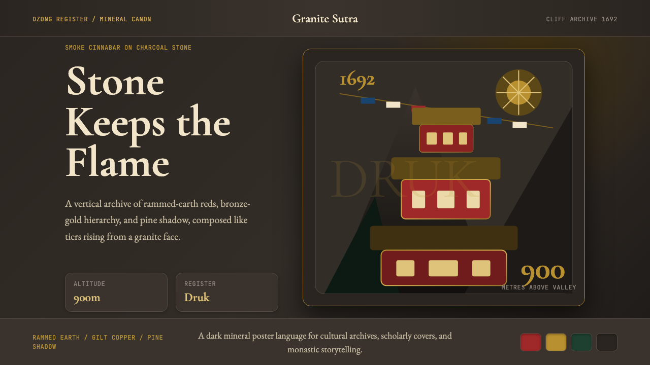 Bhutanese Tiger's Nest Cliff MonasterySacred altitude, mineral-dark. Cinnabar tiers and bronze rules climb charcoal…神圣垂直感。朱砂层台与青铜线条攀上炭灰花岗岩。
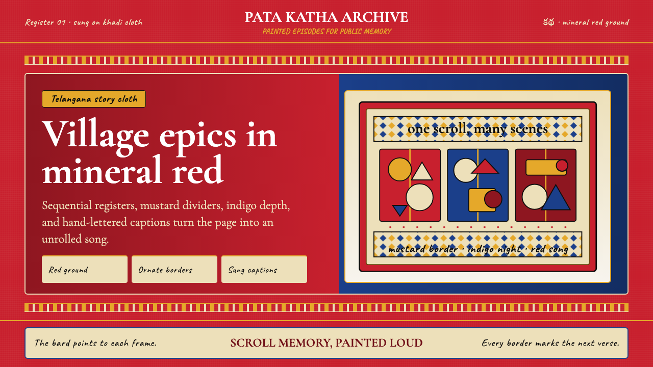 Andhra Cheriyal Scroll PaintingSaturated oral memory. Mineral red registers, mustard diamonds, and serif son…饱和的口述记忆:矿物红分格、芥末黄菱纹与衬线唱词。
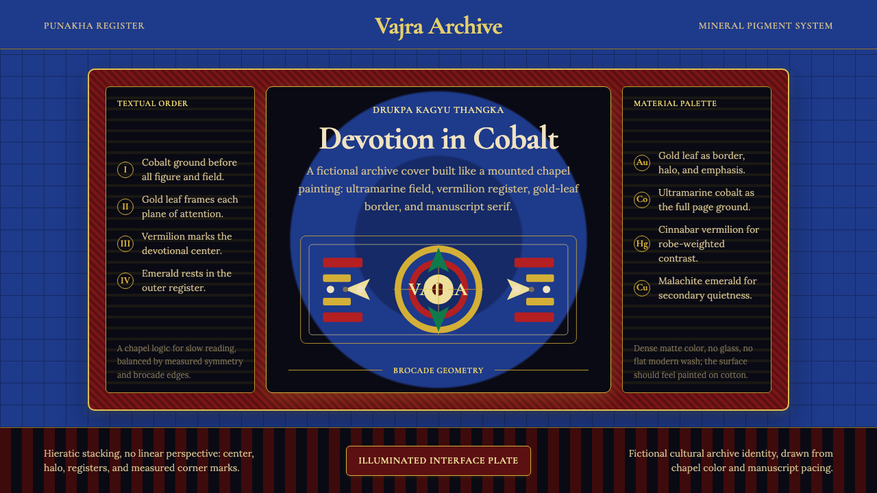 Bhutanese Drukpa Kagyu ThangkaDevotion made cobalt. Gold frames, Cormorant serif, and vermilion marks hold…钴蓝承载虔敬:金框、Cormorant 衬线与朱砂标记构成佛殿秩序。
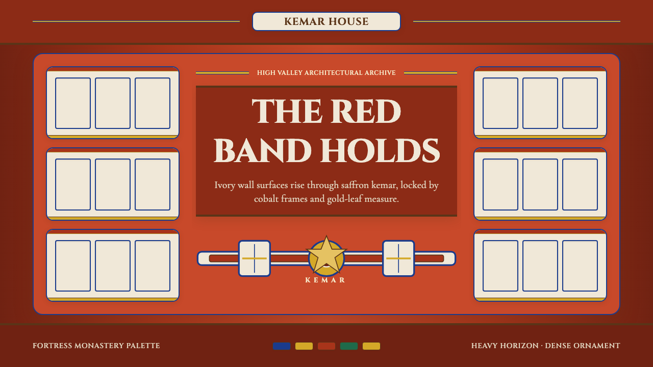 Bhutanese Dzong (Fortress Red)Monumental red holds the page. Cobalt frames and gold bands lock the fortress…厚重藏红掌控页面。钴蓝窗框与金色横带锁定宗堡节奏。
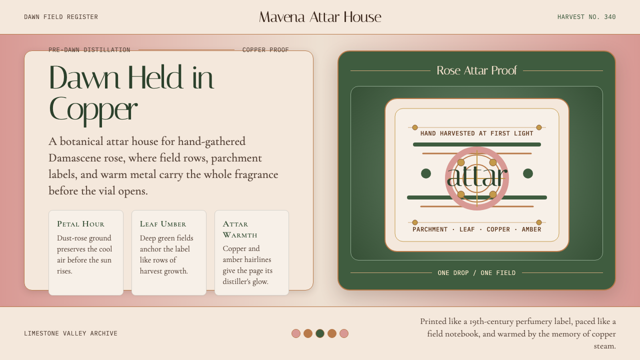 Bulgarian Kazanlak Rose ValleyDawn feels distilled. Dust-rose ground, leaf green, and copper label geometry…黎明被蒸馏:暮粉底、叶绿面与铜色标签几何留住香气。
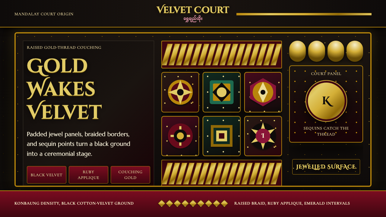 Burmese Kalaga TapestryVelvet becomes theater. Black ground, gold-thread borders, ruby and emerald p…黑绒如舞台。金线边框与红绿宝石色块密集闪耀。