What is Torajan Tongkonan (Boat-Roof House)?
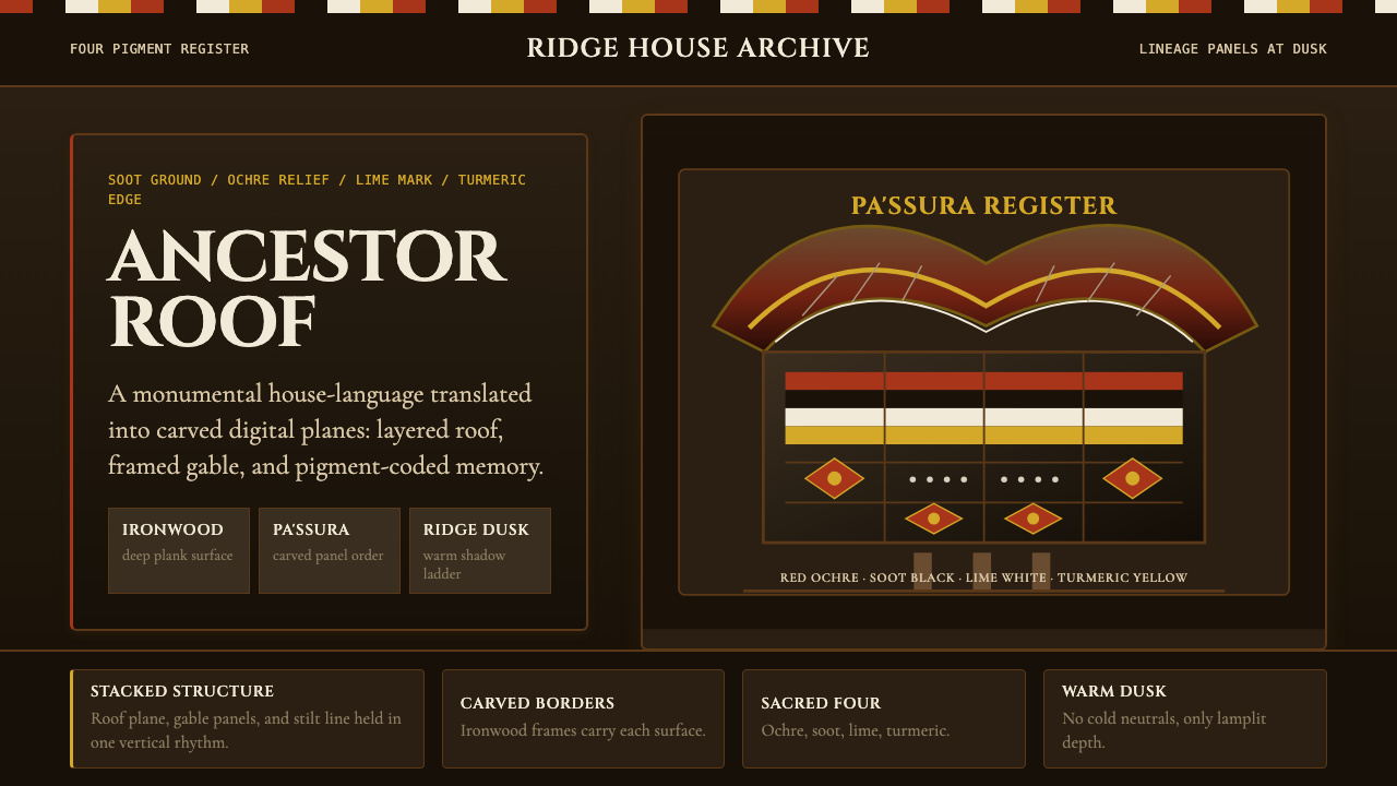
The tongkonan ancestor-house of South Sulawesi fuses boat-shaped rooflines, dense carved symbolism, and a four-color sacred palette into one of Southeast Asia's most architecturally distinctive vernacular traditions.
Torajan Tongkonan (Boat-Roof House) in brief
The tongkonan is the ceremonial ancestor-house of the Toraja people of Tana Toraja, a highland district of South Sulawesi, Indonesia. Its silhouette is immediately arresting: a massive saddleback roof curves sharply upward at both gable ends, mimicking the prow and stern of an Austronesian seafaring vessel. The structure sits high on ironwood stilts, and the gable facade — the most visible and socially significant surface — is covered top to bottom in carved wooden panels painted in the four sacred colors of the pa'ssura tradition.
Those four colors — red ochre, soot black, lime-paste white, and turmeric yellow — are not decorative choices. Each carries layered cosmological and social meaning encoded in the Torajan aluk to dolo ancestor religion. The carved motifs themselves, collectively called pa'ssura (meaning 'writing' or 'script'), number in the dozens and represent buffaloes, sun discs, spirals, cockerels, and geometric interlace, each motif indicating the clan rank, rite of passage, or cosmic orientation of the household. A tongkonan's facade is, in effect, a readable document in pigment and relief.
The design system that the tongkonan produces — dark warm grounds relieved by ochre and gold-toned relief, dense rhythmic pattern organized by strict symmetry, and a palette weighted toward earth and fire — has proved remarkably durable. Its visual vocabulary translates into digital contexts as a rich dark-mode aesthetic: deep soot backgrounds carrying fine carved-line borders, bands of red ochre and turmeric punctuating an otherwise tonal composition, and a strong sense that every surface bears meaning rather than mere decoration.
Where does Torajan Tongkonan (Boat-Roof House) come from?
The Toraja people — whose name is thought to derive from a Bugis term meaning 'people of the mountains' — have inhabited the highlands of South Sulawesi for at least a thousand years, though oral tradition traces their ancestry to a celestial origin, with the first tongkonan descending from the heavens. The built form of the ancestor-house is inseparable from the aluk to dolo ('the way of the ancestors'), the indigenous cosmological system that governed birth, marriage, death, harvest, and house construction until the arrival of Dutch missionaries in the early twentieth century began its gradual transformation.
The earliest written documentation of Torajan architecture and its material culture came from Dutch colonial administrators and missionaries in the late nineteenth and early twentieth centuries. C. C. F. M. Le Roux conducted systematic ethnographic fieldwork in the region in the 1920s, producing descriptions of the tongkonan's structural hierarchy — which classes of family are entitled to build which forms of roof and which categories of carved motif. The roof height and the complexity of the carved facade were regulated by adat (customary law), so the tongkonan was not simply a house but a legally encoded statement of hereditary status.
Academic interest deepened in the 1970s and 1980s, when anthropologist Roxana Waterson conducted the fieldwork that would lead to her landmark comparative study of Southeast Asian house forms, and ethnographer Hetty Nooy-Palm produced exhaustive documentation of the pa'ssura motif system and the aluk to dolo's visual symbolism. Their research coincided with the Indonesian government's designation of Tana Toraja as a cultural tourism destination in the late 1970s, which brought the tongkonan's imagery to international attention through photography and travel writing. Toby Volkman's anthropological work on Torajan ritual and identity documented the complex negotiations between ancestral practice and modernity that the tourism economy accelerated.
The designation of the Torajan funeral rite and the tongkonan itself as objects of heritage has had paradoxical effects. On one hand, it has preserved carving traditions and encouraged younger artisans to learn the pa'ssura vocabulary. On the other, the tourist economy has created a market for simplified or aestheticized versions of the carved panels and color system, detached from their cosmological function. The design system as it reaches contemporary visual culture is thus already a mediated form — filtered through photography, ethnographic illustration, and the heritage-tourism gaze — rather than a direct transcription of living practice.
What defines the Torajan Tongkonan (Boat-Roof House) look?
Sacred Four-Color Palette
The pa'ssura system restricts the carved facade to four colors: red ochre (symbolizing life, blood, and human vitality), soot black (death, darkness, and the earth), lime-paste white (purity and the bones of ancestors), and turmeric yellow (prosperity, divine blessing, and the power of royalty). These colors appear not as gradients or blended transitions but as flat, bounded zones of saturated pigment, each confined to a specific carved motif or structural band. The result is a palette that reads simultaneously as warm and weighty — the dark ground absorbing light while the ochre and yellow bands pulse with restrained brightness.
Boat-Roof Silhouette
The defining structural gesture of the tongkonan is the steeply curved roof that sweeps upward at both gable ends into exaggerated overhanging points, evoking the prow and stern of an Austronesian outrigger vessel. This form is not arbitrary — the Toraja trace mythological descent from a sea voyage, and the boat-roof literally encodes that origin story into the geometry of the house. In digital interpretation, this silhouette translates into compositions that emphasize upward-curving arcs, strong pointed terminal forms, and an overall sense of structural mass lifting off the ground rather than settling into it.
Dense Carved Relief Patterning
The gable facade of a high-status tongkonan has no undecorated surface. Carved panels tile the entire wall in a grid of interlocking motifs — buffalo heads, spiral hooks, sun discs, chicken effigies, geometric diamond grids — each panel a discrete unit of meaning within the pa'ssura vocabulary. The density is the point: visual weight and complexity signal clan prestige. In contemporary design, this translates to a pattern logic where background fields are treated as active surfaces rather than voids, with fine-line repeating motifs establishing texture without any single element demanding primary attention.
Ironwood and Buffalo Horn Material Register
The tongkonan's palette extends beyond the four sacred pigments to the raw tonal range of its construction materials: the deep reddish-brown of ironwood (ulin) structural members, the warm amber of bamboo bark cladding, the near-black of aged timber, and the ivory-to-charcoal gradient of water buffalo horn used in ceremonial fixtures. This material warmth gives the overall composition a tonal richness that is neither monochrome nor brightly colorful — it occupies a narrow band of warm near-neutrals punctuated by the four accent colors. Translated digitally, this suggests a palette of rich dark browns, deep tawny ambers, and muted golds, with pure black and pure white used sparingly for structural definition.
Bilateral Symmetry with Axial Emphasis
Unlike many vernacular traditions that permit asymmetric composition, the tongkonan facade operates on strict bilateral symmetry. The central vertical axis of the gable is architecturally and symbolically primary — it aligns with the ridge pole, with the central door, and with the cosmological orientation of the house toward the north (the direction of the ancestral origin in Torajan cosmology). Individual carved motifs are themselves often radially symmetric. This produces a visual logic of calm authority: compositions feel resolved rather than dynamic, centered rather than directional, monumental rather than intimate.
Dark Ground with Luminous Accent
The dominant ground of the tongkonan visual system is dark — soot black or deep ironwood brown — with the carved relief standing above it in ochre, yellow, and white. This inversion of the typical light-on-dark expectation gives the composition an unusual quality: warmth without cheerfulness, richness without excess. The red ochre and turmeric yellow tones appear to generate their own light against the dark background, an effect that corresponds directly to the Torajan ceremonial context of nighttime ritual fires illuminating carved surfaces in flickering orange and amber. Digital applications inherit this quality when warm accent tones are used on dark, slightly warm-tinted backgrounds rather than pure neutral black.
Ranked Hierarchy Encoded in Visual Complexity
In Torajan adat, the number of carved tiers, the height of the roof, and the density of the pa'ssura motifs are all regulated by hereditary rank. A family of lower standing may build a tongkonan but must omit certain motifs and reduce the number of carved bands. This means that visual complexity itself is a legible signal of hierarchy — more detail equals more status. For digital design systems, this principle translates into a tiered elaboration logic: base components are simple and typographic; premium or elevated components introduce patterned borders, warm accent tones, and increased visual density. The hierarchy is communicated through ornamentation, not just scale.
Who shaped Torajan Tongkonan (Boat-Roof House)?
A Dutch anthropologist who produced the most comprehensive scholarly documentation of the pa'ssura carved motif system and its relationship to aluk to dolo cosmology. Her systematic cataloguing of individual motifs, their permitted users, and their symbolic meanings established the foundational reference for all subsequent study of Torajan visual culture. Her work demonstrated that the tongkonan facade operates not as decorative embellishment but as a codified symbolic text whose grammar is as precise as written script.
A British social anthropologist whose comparative study of Southeast Asian house forms placed the tongkonan within a broader Austronesian cultural framework, demonstrating that the boat-roof silhouette, the orientation toward ancestral north, and the symbolic identification of the house with the body of a founding ancestor are widespread traits across island Southeast Asia rather than uniquely Torajan inventions. Her work gave the tongkonan's design vocabulary its wider theoretical grounding and helped explain why the visual system resonates beyond its originating culture.
An American anthropologist whose fieldwork in Tana Toraja in the 1970s and 1980s documented the collision between ancestral ritual practice and the emergent Indonesian cultural tourism economy. Her analysis of how the tongkonan and the elaborate funeral ceremony became externally legible 'cultural spectacles' while simultaneously being internally renegotiated by Torajan communities themselves is essential for understanding why the visual system that reaches contemporary designers is already a filtered and partially aestheticized version of its living source.
A Dutch colonial officer and early ethnographer who conducted systematic fieldwork among the Toraja in the 1920s, producing some of the earliest detailed written accounts of the tongkonan's structural hierarchy, the carving traditions, and the adat regulations governing which families were entitled to build which forms of house. His documentation, though shaped by the colonial gaze of its era, provided the empirical foundation on which later anthropological work was built.
How do you use Torajan Tongkonan (Boat-Roof House) today?
The Torajan tongkonan visual system is one of the richest vernacular design traditions applicable to contemporary digital interfaces, but it requires careful handling precisely because its visual density and symbolic coding are so far from the stripped-back conventions of most screen design. The key principle is restraint within richness: the system's power comes from what is carefully selected and bounded, not from everything being present at once. A successful application starts by committing to the dark ground and limiting the palette to the four sacred accent tones used hierarchically, with only one or two appearing on any given surface.
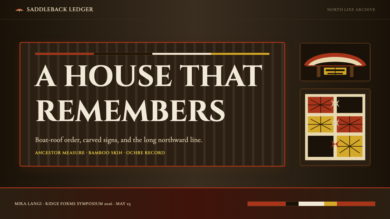
For presentation slides, the tongkonan system works best on dark-ground layouts where the cover page functions as a monumental facade. A black or deep ironwood-brown background carries the title in warm cream or off-white type, with a horizontal carved-pattern band — rendered as a repeating fine-line geometric border in ochre — separating the title area from a subtitle or byline below. Content slides should be treated with more restraint: the dark ground continues, but pattern elements withdraw to thin rule lines or subtle corner ornaments. Data visualization benefits from the color hierarchy directly — the primary metric or the most significant data series takes the red ochre or turmeric tone, while secondary series use warm near-neutrals, letting the accent colors do the work of priority signaling without the need for added labels.
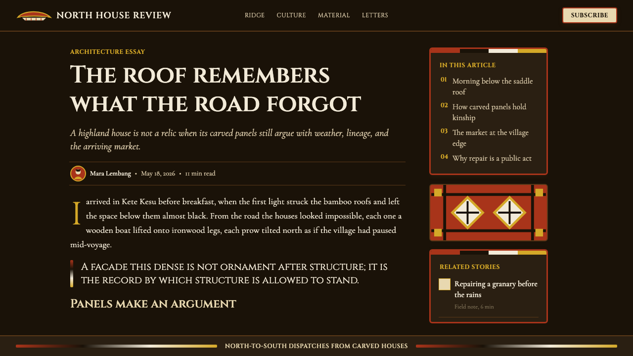
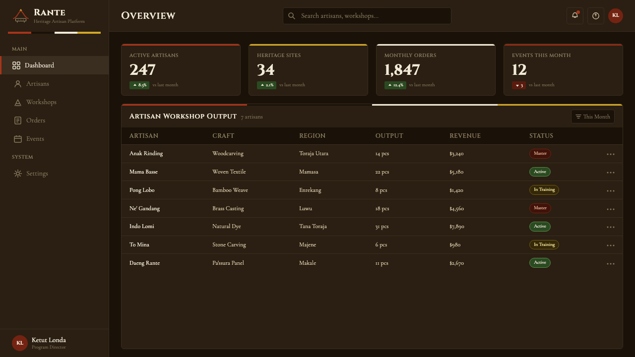
For web interfaces, the tongkonan aesthetic is particularly well-suited to dashboards, premium product pages, and editorial contexts where a sense of authority and craft is desired. The approach: establish a dark background in the warm-tinted near-black range rather than pure cool black, use a fine geometric repeating border or divider motif to separate content zones, and reserve the red ochre and turmeric tones for interactive highlights, call-to-action elements, and status indicators. Card components work well with a slightly elevated warm-brown surface and a fine engraved-line border in ochre, giving a sense of carved relief without literal texture. Navigation should remain typographic and clean, with the pattern system appearing only at structural junctions.
For editorial and marketing applications, the tongkonan system can generate covers and feature spreads of unusual visual authority. A full-bleed dark background with a centrally composed title in large cream or ochre type, flanked by bilateral carved-pattern panels, reads as genuinely ceremonial rather than merely dark-themed. Marketing pages work well with a tiered elaboration logic: entry-level offerings are presented on clean near-black grounds with minimal ornament, while premium tiers introduce full carved-panel borders, richer ochre and turmeric accents, and increased visual density — using the tongkonan's own hierarchy logic to signal product tier.
A common mistake when applying this system is reaching for high-saturation modern colors — electric orange, bright gold, vivid crimson — that share the warmth of the four sacred tones but lack their characteristic earthiness and opacity. The authentic palette is muted by pigment quality: red ochre is a dense, slightly brownish red, not a fire-engine or coral tone; turmeric yellow is warm and slightly greenish, not a pure lemon or gold; soot black carries a faint warm undertone, not the blue-cool of modern screen black. Working in this muddied, pigment-rich register rather than in saturated digital primaries is the single most important tonal calibration for a credible tongkonan-derived aesthetic.
Torajan Tongkonan (Boat-Roof House) — FAQ
What does the term pa'ssura actually mean, and how does it relate to the visual system?
Pa'ssura is a Torajan word that translates roughly as 'writing' or 'marks with meaning.' It refers collectively to the entire system of carved motifs used to decorate the tongkonan facade, as well as to woven textiles, bamboo objects, and other ceremonial surfaces. The term signals that these patterns are not decorative in the Western sense — they are a form of inscription, legible to those who know the code, encoding lineage, rank, cosmological orientation, and permitted ritual activities. A design system derived from pa'ssura thus inherits a logic in which every visual element is presumed to carry specific, bounded meaning rather than serving as ambient atmosphere.
How does the tongkonan visual system differ from other Southeast Asian dark-palette traditions like Balinese or Javanese design?
The most significant difference is in the density and symbolic encoding of surface decoration. Balinese decorative traditions — while also elaborate — tend toward curvilinear organic forms, gold leaf against warm stone or terracotta, and a sense of flowing movement. Javanese batik traditions operate through intricate geometric and floral repeat patterns on warm ground colors, typically in deep indigo, cream, and brown. The tongkonan system is distinguished by its flat, hard-edged carved relief, its restriction to four specific symbolic colors rather than a broader palette, and its strict bilateral symmetry and axial organization — qualities that feel more architectural and monumental than the fluid expressiveness of Balinese forms or the textile intimacy of Javanese batik.
Is this visual system appropriate for light-background interfaces, or is it inherently a dark-mode aesthetic?
The tongkonan system is fundamentally a dark-ground tradition — the deep black or ironwood-brown background is not an option but a structural commitment, because it is the darkness of the ground that makes the ochre and turmeric accents appear to glow. A light-background interpretation is possible but requires significant reinterpretation: the four sacred colors become accent tones against cream or warm white rather than luminous highlights against near-black, and the carved-pattern borders must be rendered at lower contrast to avoid overwhelming the composition. The result will read as 'inspired by' rather than 'of' the tradition. If a light-background interface is required, consider using only the bilateral symmetry, the carving-pattern border motifs, and the warm ochre-and-cream color relationship — leaving the dark ground, which is the system's identity, for accent panels and hero sections.
How should the carved pattern motifs be adapted for digital use without cultural misappropriation?
The most respectful and practically effective approach is to work with the geometric and structural logic of the pa'ssura system rather than directly reproducing specific sacred motifs. The diamond grid, the spiral hook, the concentric border band, and the chevron sequence are structural vocabularies that can be abstracted into repeating border patterns and divider ornaments without claiming to reproduce the specific symbolic content of individual motifs like the buffalo head or the sun disc, which carry precise ritual meaning. Additionally, acknowledging the source tradition — in product descriptions, documentation, or about pages — transforms reference into credit rather than extraction. The distinction between geometric inspiration and literal reproduction of sacred iconography is both ethically sound and practically useful, since the abstracted geometric system is more versatile in digital contexts than literal carved-panel facsimiles.
Does the system work for brands that need to convey warmth and approachability, or does it skew too formal?
The tongkonan system is ceremonial rather than casual, and that is its core value proposition — it communicates authority, depth, and cultural weight rather than friendliness or accessibility. Brands that benefit most are those where seriousness and craft are desired values: heritage luxury, premium cultural content, specialist editorial, high-end hospitality, and platforms that want to distinguish themselves through visual gravitas rather than approachability. For brands where warmth and ease are primary — consumer apps, family products, social platforms — the system's density and formality will likely work against the desired emotional register. It is possible to soften a tongkonan-derived palette by reducing pattern density and leaning into the warm amber and honey tones of the material register rather than the full four-color ceremonial system, which produces something more intimate while retaining the essential dark-ground warmth.
Related design styles
 Kutch Rogan Castor-Oil PaintingGlossy symmetry holds the dark. Magenta castor-oil lines mirror across black…
 Andhra Cheriyal Scroll PaintingSaturated oral memory. Mineral red registers, mustard diamonds, and serif son…
 Čičmany Painted House OrnamentWhite is the ornament, not the page. Lime-white folk geometry on dark weather…
 Karakalpak Yurt InteriorNo surface is left bare. Ochre, crimson and indigo bands wrap a smoke-darkene…
 Lepakshi Vijayanagara CeilingEarth remembers in registers. Ochre gold, red underdrawing and black rules ma…
 Marquesan Enata Tapa MotifNo empty ground. Ochre enata geometry packs a dark umber barkcloth field.