Design style guide设计风格指南
What is Welsh Tapestry Blanket Carthen?什么是 Welsh Tapestry Blanket Carthen?
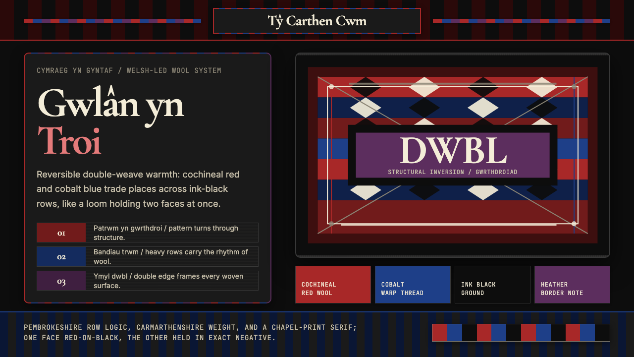
The Welsh carthen reverses the world — what is red on one face becomes black on the other, and this structural inversion, born on an eighteenth-century double-weave loom, is the whole idea.威尔士卡森毯颠倒了世界——正面是红的,反面便成黑的。这种结构性翻转诞生于十八世纪的双层织机,也是整套设计语言的核心。
Welsh Tapestry Blanket Carthen in briefWelsh Tapestry Blanket Carthen 速览
Welsh tapestry blanket design — known in Welsh as the carthen — is a textile tradition rooted in the rural farmhouses and later the mill towns of southwest and northwest Wales. Its most striking formal feature is reversibility: each blanket is woven on a double-weave loom so that the pattern on the face appears in exact negative on the reverse. Where one side shows a bold geometric band in wool-dyed crimson against deep black, the other shows that same band in black against crimson. This is not a decorative trick applied after the fact; it is the mechanical consequence of how the fabric is constructed.威尔士毯毯设计(威尔士语称 carthen)是扎根于威尔士西南与西北部农舍、后来延伸至纺织厂小镇的织物传统。其最显著的形式特征是可逆性:每条毯子用双层织机织成,正面的图案在反面以精确的负片形式呈现。一面以羊毛染就的浓红在深黑底面上绽放,另一面便是黑色在浓红底面上的镜像。这并非事后添加的装饰技巧,而是织物结构方式的力学结果。
The visual language that emerges from this weaving logic is bold, banded, and structured around tonal inversion. Compositions are built from horizontal and diagonal registers — repeating stripe sequences interrupted by panels of geometric interlocking, often borrowing motifs from medieval Welsh floor tiles, Celtic knotwork, and the broader tradition of European folk weaving. The color palette is wool-saturated and earthen: the dominant pairing is deep crimson or cochineal red against ink black, with accents in undyed cream, cobalt, and warm ochre appearing in different regional and mill traditions.从这种织造逻辑中诞生的视觉语言,大胆、成带状,围绕色调反转而构建。构图由水平与斜向的色带组成——重复的条纹序列被几何交错的图案面板打断,常借鉴中世纪威尔士地砖、凯尔特结纹以及欧洲民间织物的更广泛传统。色板是羊毛特有的饱和感与土地气息:主导配色是浓郁的胭脂红或洋红对墨黑,不同地区与纺织厂的传统中还以未漂白的奶油色、钴蓝与暖黄褐作点缀。
Translated into interface and screen contexts, this design system carries the same structural logic. Compositions are organized around bands and inversions rather than floating elements. Color operates in pairs — a dominant saturated tone and its structural negative — and the grain of woven textile gives even digital surfaces a perceptible tactile character. It is a style for contexts that want warmth without sweetness, and boldness without aggression.移植到界面与屏幕语境中,这套设计系统携带着同样的结构逻辑。构图围绕色带与反转而组织,而非漂浮的独立元素。色彩成对运作——一种主导饱和色及其结构性负片——织物经纬的纹理赋予数字表面可感知的触感。这是一种适合「有温度但不甜腻、大胆但不激进」氛围的风格。
See the Welsh Tapestry Blanket Carthen design system →查看 Welsh Tapestry Blanket Carthen 完整设计系统 →
Where does Welsh Tapestry Blanket Carthen come from?Welsh Tapestry Blanket Carthen 从何而来?
The carthen tradition dates to at least the eighteenth century, when farmhouses across Pembrokeshire and Carmarthenshire kept small treadle looms for domestic production. These early blankets were made from locally raised wool — the long-staple fleece of Welsh mountain sheep — spun and dyed in the farmyard, then woven in the winter months when agricultural labor slowed. The characteristic double-weave structure allowed weavers to produce a heavy, reversible fabric with no exposed back-of-work, practical for sleeping, traveling, and wrapping goods. The geometric banding patterns were not decorative whimsy but efficient use of the loom's threading sequence: changing the shed created the band, and the double structure created the inversion automatically.卡森毯传统至少可追溯至十八世纪,当时彭布罗克郡与卡马森郡各地的农舍都备有小型踏板织机供家用生产。早期毯子以当地饲养的羊毛制成——威尔士山地绵羊长纤维羊毛——在农场中纺纱染色,冬季农活放缓时在织机上完成。双层织造结构让织工能制作厚实可逆的织物,背面无外露线迹,适合睡眠、旅行与包裹货物。几何条带图案并非装饰性奇想,而是对织机穿经顺序的有效利用:换棕产生色带,双层结构则自动形成翻转效果。
The industrial revolution transformed the tradition without erasing it. Beginning in the 1820s and reaching a peak in the 1850s, water-powered woollen mills spread through the river valleys of Cardiganshire, Merionethshire, and Montgomeryshire. These mills adopted the carthen format but scaled it to steam-powered Jacquard-loom production, introducing a wider range of geometric motifs and expanding the color palette to include synthetic dyes — aniline crimson, prussian blue, and chrome yellow — that were more vivid and colorfast than the older plant-based dyes. The Mill period produced the visual richness most strongly associated with Welsh tapestry today: the deep-saturated banding, the elaborate interlocked panel work, and the reversible double-layer construction at commercial scale.工业革命改变了这一传统,却未将其抹除。从1820年代起,水力驱动的羊毛纺织厂开始在卡迪根郡、梅里奥内思郡与蒙哥马利郡的河谷中扩散,并在1850年代达到鼎盛。这些工厂采用卡森毯的形制,但将其升级为蒸汽动力提花机生产,引入更宽泛的几何母题,并将色板扩展至合成染料——苯胺洋红、普鲁士蓝与铬黄——比旧有植物染料更鲜艳、更耐褪色。工厂时期造就了今日威尔士毯最为人熟知的视觉丰富感:深度饱和的条带、精密交错的图案面板,以及商业规模的双层可逆结构。
The early twentieth century saw a sharp decline as machine-made alternatives undercut handweaving on price. Many mills closed between the 1920s and the 1950s. The 1970s brought a revival driven partly by the broader craft renaissance of that decade, partly by growing interest in Welsh cultural identity following the establishment of the Welsh Language Society in 1962 and the broader devolution movement. Weavers and scholars like J. Geraint Jenkins, whose research at the Welsh Folk Museum documented the mill tradition in detail, gave the carthen a documented historical foundation that supported its revival as a culturally rooted rather than merely nostalgic practice.二十世纪初,机器量产替代品以价格优势打压手工织造,行业急剧衰退,许多纺织厂在1920至1950年代相继关闭。1970年代,一场复兴随着那个十年更宏观的工艺复兴潮流而来,部分动力也来自1962年威尔士语协会成立后日益高涨的威尔士文化认同感与权力下放运动。民俗学者如杰恩·詹金斯(J. Geraint Jenkins)在威尔士民俗博物馆对纺织厂传统的深入记录,为卡森毯的复兴提供了历史依据,使其超越了单纯的怀旧,成为有文化根基的实践。
The contemporary period — from roughly 2000 onwards — has seen the carthen move into a dual position: as a living craft produced by a small number of active Welsh mills and studio weavers, and as a recognized cultural symbol used across Welsh heritage, tourism, and design contexts. Weavers including Eifion Griffiths, Amanda Griffiths, and Bonni Davies have been central to this continuity, working within the traditional double-weave structure while developing contemporary colorways and applications. Wool Week Wales, an annual celebration of Welsh wool and weaving held across the country, has been important in connecting the tradition with new audiences and contexts.当代时期——大约从2000年至今——卡森毯走向双重位置:一方面,少数活跃的威尔士纺织厂与工作室织工继续维系着这门活态工艺;另一方面,它已成为威尔士遗产、旅游与设计语境中被广泛认可的文化符号。织工艾菲昂·格里菲斯(Eifion Griffiths)、阿曼达·格里菲斯(Amanda Griffiths)与邦妮·戴维斯(Bonni Davies)在保持双层织造传统结构的同时,开发了当代配色与应用形式,是这一传承的核心人物。威尔士羊毛周(Wool Week Wales)——每年在全国各地举办的羊毛与织造庆典——在将这一传统与新受众和新场景相连接方面发挥了重要作用。
What defines the Welsh Tapestry Blanket Carthen look?Welsh Tapestry Blanket Carthen 的视觉特征是什么?
Structural Inversion结构性翻转
The defining characteristic of Welsh tapestry is that the pattern exists in two simultaneous negatives: the face and the reverse carry the exact same motif in inverted tones. In interface terms this becomes a compositional principle — every dominant color block implies and anticipates its inversion, and the system is designed to function in both modes. Dark-dominant and light-dominant variants are not afterthoughts; they are co-primary.威尔士毯最决定性的特征是图案同时以两个相反的形式存在:正反两面携带完全相同的母题,但色调互换。在界面语言中,这演化为一种构图原则——每一块主导色彩都暗示并预设其反转形态,整个系统被设计为能在两种模式下同等运作。深色主导与浅色主导不是事后添加的变体,而是共同的主体形态。
Banded Composition带状构图
Welsh tapestry compositions are organized into horizontal bands of varying widths — narrow accent stripes flanking broader field zones, interrupted by denser geometric panel blocks. This rhythm creates a strong vertical stacking logic that translates naturally into layout structures: header bands, content zones, and footer bands read as a designed system rather than arbitrary division. The bands have weight and sequence; they are not decorative trim but structural scaffolding.威尔士毯的构图以宽窄不一的水平色带为骨架组织——窄幅强调条纹夹持更宽的主体色域,中间穿插密集的几何图案面板。这种节奏形成了强劲的纵向叠层逻辑,天然对应版面结构:页眉色带、内容区域与页脚色带作为一套被设计的系统来读取,而非随意的分割。色带有重量与序列,是结构性脚手架,而非装饰性镶边。
Wool-Saturated Color羊毛饱和色彩
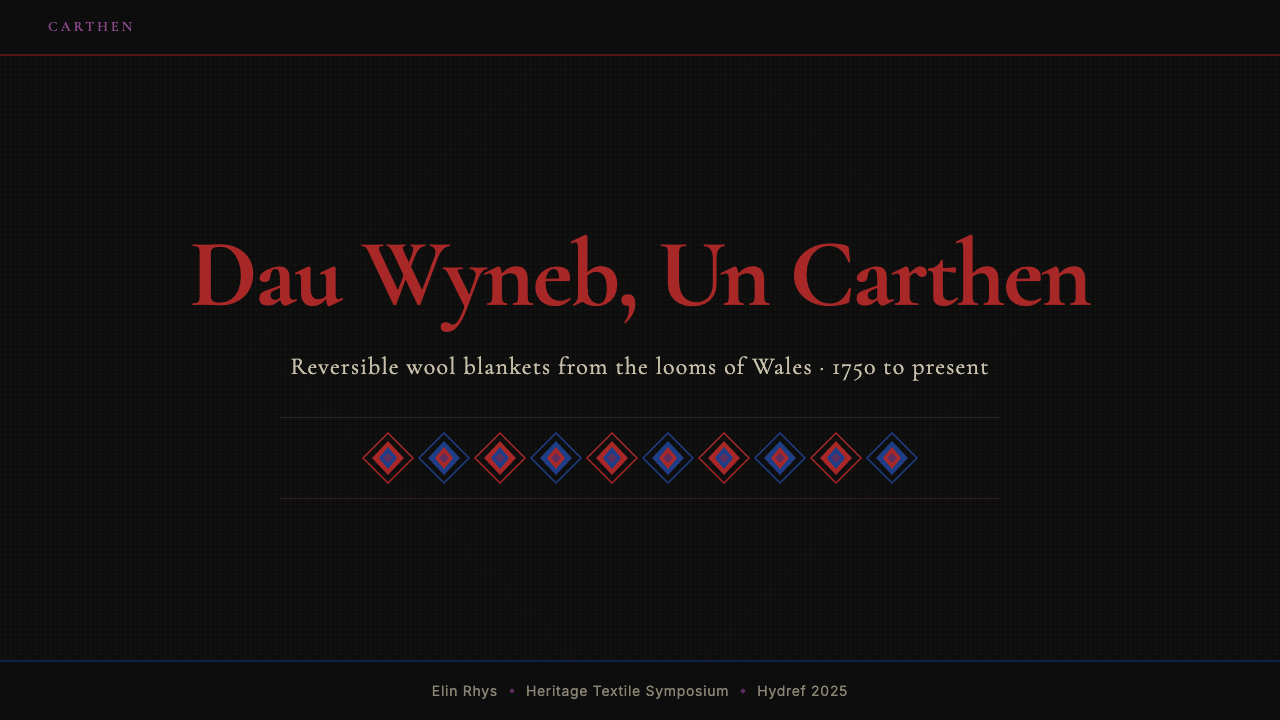
The palette draws from the specific quality of wool-dyed color: deeply saturated but never harsh, with a warmth and slight textural variation that distinguishes it from flat synthetic color. The characteristic pairings are ink black against crimson red, or cream against cobalt, with the dominant tone occupying most of the composition and the secondary tone appearing in geometric accents. Colors do not compete; they occupy their structural territory cleanly.色板来自羊毛染色的特有质感:深度饱和却不刺眼,带有温度感与轻微的纹理变化,与平面合成色彩截然不同。标志性配色是墨黑对浓红,或奶油对钴蓝——主导色占据构图的大部分面积,辅助色在几何点缀中出现。色彩之间不相争夺,而是各自干净地守住结构上的领地。
Geometric Motif Language几何母题语言
The panel work within Welsh tapestry draws from a specific vocabulary of interlocking geometric forms — chevrons, stepped diamonds, bilateral interlace, and grid-crossing diagonal fills — derived from medieval Welsh floor tiles and Celtic decorative traditions filtered through the loom's threading constraints. These are not free-hand shapes; they are forms that the loom generates naturally from its threading sequence. In design application, they appear as patterned fills, dividers, and textural backgrounds rather than illustrative elements.威尔士毯图案面板来自一套特定的几何形母题词汇——人字纹、台阶菱形、双边交织纹与斜向网格填充——源自中世纪威尔士地砖与凯尔特装饰传统,经织机穿经约束过滤而成。这些不是自由手绘的形态,而是织机从穿经顺序中自然生成的图形。在设计应用中,它们以图案填充、分割元素与纹理背景的形式出现,而非作为插图性元素使用。
Tactile Grain触感纹理
Even in its digital translation, Welsh tapestry design retains an implicit reference to the physical grain of woven cloth — the slight irregularity of hand-spun fiber, the visible weft and warp structure that gives the surface depth without gloss. This tactile quality separates it from purely graphic stripe patterns: there is always a suggestion of material weight and craft process. On screen, this grain is suggested through subtle surface texture, slight tonal variation within color fields, and the avoidance of perfectly smooth gradients.即使在数字化转译中,威尔士毯设计仍保留着对织物物理纹理的隐性参照——手纺纤维的轻微不均匀感、可见的经纬结构赋予表面无光泽的深度。这种触感特质将其与纯粹的平面条纹图案区别开来:始终有一种对材料重量与手工过程的暗示。在屏幕上,这种纹理感通过微妙的表面质感、色域内的轻微色调变化、以及刻意规避完美光滑渐变来传达。
Reversibility as System Logic可逆性作为系统逻辑
Unlike traditions that produce a 'right side' and a 'wrong side,' the carthen has no hierarchy between faces. This equality is a design principle: the system does not privilege one mode over the other, and both light-on-dark and dark-on-light compositions receive equal structural attention. In practice, this means designing both states fully from the start rather than treating one as a derived variant, and ensuring that neither state reads as a concession.与有「正面」和「反面」之分的织物传统不同,卡森毯在两面之间没有等级之别。这种平等性是一项设计原则:系统不偏袒任何一种模式,深底浅图与浅底深图两种构图都获得同等的结构关注。在实践中,这意味着从一开始便完整设计两种状态,而非将其中之一视为派生变体,并确保任何一种状态读起来都不像是妥协。
Regional and Mill Variation地区与纺织厂变体
Because the tradition was produced across multiple counties and dozens of distinct mills, Welsh tapestry does not have a single canonical form. Pembrokeshire production tends toward narrower banding and simpler panel work; the Teifi Valley mills favored broader field areas and more complex interlace. Cardigan Bay coastal workshops used cooler blues and greys alongside the dominant red-black. This range means the style can be interpreted with considerable latitude — the structural principles are consistent, but the specific proportions, motif complexity, and accent palette have legitimate historical precedent across a wide spectrum.由于这一传统跨越多个郡县、数十座不同的纺织厂生产,威尔士毯并没有唯一的标准形态。彭布罗克郡的产品倾向于更窄的色带与更简洁的图案面板;泰菲谷的纺织厂偏好更宽的主体色域和更复杂的交织纹样。卡迪根湾沿海工坊则在主导的红黑配色之外使用了更冷调的蓝色与灰色。这种多样性意味着这种风格可以在相当宽泛的范围内被诠释——结构原则保持一致,但具体比例、母题复杂度与点缀色板在历史上都有宽广的合法先例。
See the Welsh Tapestry Blanket Carthen design system →查看 Welsh Tapestry Blanket Carthen 完整设计系统 →
Who shaped Welsh Tapestry Blanket Carthen?谁塑造了 Welsh Tapestry Blanket Carthen?
Jenkins was the curator of material culture at the Welsh Folk Museum at St Fagans for much of the latter twentieth century, and his research systematically documented the surviving Welsh woollen mill tradition at a time when many mills were closing. His scholarly work gave the carthen and related Welsh textile traditions a rigorous historical foundation, transforming them from folk curiosities into documented cultural heritage. Without his documentation effort, much of the technical and regional knowledge of the mill weaving tradition would have been lost.詹金斯在二十世纪后半叶长期担任圣法根威尔士民俗博物馆物质文化馆长,他的研究在许多纺织厂相继关闭之际,系统记录了仍存续的威尔士羊毛纺织厂传统。他的学术工作为卡森毯及相关威尔士织物传统提供了严谨的历史基础,使其从民俗珍奇转化为有据可查的文化遗产。若无他的记录工作,纺织厂织造传统的大量技术与地区知识将从此失传。
Griffiths represents the contemporary practitioner generation that has sustained the double-weave carthen tradition into the present. Working within the structural constraints of the historical double-weave loom format, he has developed colorways and pattern compositions that connect the tradition's formal logic to contemporary aesthetic sensibilities. His work demonstrates that the carthen is not a museum object but an active design language capable of addressing present contexts.格里菲斯代表了将双层织造卡森毯传统延续至当代的实践者世代。他在历史双层织机结构约束之内工作,开发出将这一传统形式逻辑与当代审美感知相连接的配色与图案构图。他的作品证明卡森毯不是博物馆藏品,而是能够回应当下语境的活态设计语言。
Working alongside Eifion Griffiths, Amanda Griffiths has been involved in both the production and the promotion of contemporary Welsh tapestry work, contributing to efforts to build audiences and commercial viability for the tradition in the present century. Her work reflects the reality that sustaining a living craft tradition requires not only technical mastery but also engagement with the cultural and commercial contexts that allow it to continue.阿曼达·格里菲斯与艾菲昂·格里菲斯共同工作,参与了当代威尔士毯的生产与推广,为本世纪这一传统的受众建设与商业可行性做出贡献。她的工作体现了一个现实:维系一门活态工艺传统,不仅需要精湛的技艺,还需要与使其得以延续的文化和商业语境积极互动。
Davies is among the contemporary weavers who have engaged with the carthen tradition while connecting it to wider conversations about Welsh cultural identity, craft sustainability, and the role of textile heritage in regional economies. Her practice reflects the contemporary understanding of traditional crafts as living cultural resources rather than fixed historical forms, and her work has contributed to the growing visibility of Welsh textile arts in national and international contexts.戴维斯是在从事卡森毯传统的同时,将其与威尔士文化认同、工艺可持续性以及织物遗产在地区经济中角色等更宏观议题相连接的当代织工之一。她的实践体现了当代对传统工艺的理解——将其视为活态文化资源而非固定的历史形态——她的工作提升了威尔士纺织艺术在国家与国际语境中的能见度。
How do you use Welsh Tapestry Blanket Carthen today?今天怎么用 Welsh Tapestry Blanket Carthen?
Welsh tapestry blanket design carries a very specific set of values into any context it enters: warmth, material weight, structural boldness, and cultural rootedness. Understanding which of those qualities a given project needs — and which would be unwelcome — is the first task before any application begins. The style works against lightness and airy minimalism; it carries presence and gravity by design.威尔士毯设计在进入任何语境时都携带着一套极为具体的价值观:温暖、材料重量感、结构上的大胆,以及文化根植性。在任何应用开始之前,首要任务是理解特定项目需要其中哪些特质、哪些又是不受欢迎的。这种风格与轻盈通透的极简主义相悖,它天然携带存在感与厚重感。
For presentation slides, the carthen tradition offers a particularly strong cover page approach. A single bold band in deep crimson or ink black crossing the slide horizontally, with title type in the inverted tone, immediately establishes the style's structural logic. Interior content slides benefit from banded dividers between sections — not decorative rules, but color-weighted bands that carry the same compositional logic as the textile registers. Data visualization takes well to the palette: charts and tables organized around the dominant red-black pairing carry visual authority without the clinical feel of purely neutral palettes. Avoid crowding multiple color accents simultaneously; the carthen palette is designed for strong pairings, not polychrome complexity.在演示文稿中,卡森毯传统提供了一种特别有力的封面页方案。一条浓红或墨黑的粗色带水平横越幻灯片,标题文字以反转色调置其中,立即建立起这种风格的结构逻辑。内页内容幻灯片则受益于分节之间的带状分隔——不是装饰性线条,而是携带与织物色带同等构图逻辑的有重量色带。数据可视化与这套色板配合良好:围绕主导的红黑配色组织的图表和表格,具有视觉权威性,而不带纯中性色板的临床感。避免同时堆叠多种色彩强调;卡森毯色板为强对比配色而设计,不适合多彩复杂的表现。
For web interfaces, the style suits contexts that want to project craft quality, cultural identity, or warm authority — heritage brands, artisanal producers, cultural institutions, and regional identity projects. Structurally, it supports strong top-of-page banded headers, horizontal dividers with geometric fill, and card components with textured backgrounds. Navigation and body text work best in high-contrast pairings that respect the style's inversion logic: if the hero is dark-dominant, the content area can shift to light-dominant, with the structural band marking the transition. Dashboards and data-heavy interfaces are less natural territory, though the geometric register language can work well as a structural element in sidebars and category headers.在网页界面中,这种风格适合希望传达工艺品质、文化认同或温暖权威的语境——遗产品牌、手工艺生产者、文化机构以及地区身份识别项目。结构上,它支持强劲的页面顶部带状页眉、有几何填充的水平分隔线,以及带有纹理背景的卡片组件。导航与正文文字在遵循风格反转逻辑的高对比配色中效果最佳:若主视觉区为深色主导,内容区可转向浅色主导,带状元素标记两者的过渡。仪表板与数据密集型界面并非这种风格最自然的领地,但几何图案语言可在侧边栏与分类标题中作为结构性元素有效运用。
For editorial and marketing work, the carthen approach lends itself to full-width feature treatments where a band occupies the entire header and the content below reads against a complementary tone. Magazine layouts benefit from the banded approach: the style naturally generates a strong top-of-article visual identity without requiring photography. The geometric motif vocabulary can appear as section ornaments, pull-quote frames, or divider elements — used sparingly, they reinforce the textile reference without becoming pattern wallpaper. Marketing materials for products with craft, heritage, or regional identity positioning are the most natural home for this style.在编辑与营销内容中,卡森毯方法适合全宽特性处理——色带占据整个页眉,其下内容在互补色调上展开。杂志版面受益于带状方法:这种风格天然为文章顶部创造强劲的视觉识别感,无需依赖摄影。几何母题词汇可作为段落装饰、引用框或分隔元素出现——克制使用时,它们强化织物参照而不沦为满版重复图案。具有工艺、遗产或地区身份定位的产品营销材料,是这种风格最自然的归宿。
A common mistake when applying Welsh tapestry visually is over-saturating the palette — using the red and black at full maximum intensity without considering the warmth and slight texture that characterize the actual textile. The carthen palette is rich, not screaming; the reds have depth and warmth, the blacks are ink-deep rather than digital-zero. A second mistake is importing only the color without the structural banding logic: isolated crimson elements on a white ground do not read as Welsh tapestry — they read as a generic red accent. The band and the inversion are the content of the style; color alone is not enough.应用威尔士毯视觉风格时最常见的错误,是过度饱和色板——以最高强度使用红色与黑色,却忽略真实织物所特有的温度感与轻微纹理。卡森毯色板是丰富的,而非嘶吼的;红色有深度与温度,黑色是墨水般的深沉而非数字化的零点黑。第二个错误是只引入色彩而不带入结构性的带状逻辑:白底上孤立的深红元素读起来不像威尔士毯,而像是通用的红色强调。色带与翻转才是这种风格的内容;仅靠色彩本身远远不够。
See the Welsh Tapestry Blanket Carthen design system →查看 Welsh Tapestry Blanket Carthen 完整设计系统 →
Welsh Tapestry Blanket Carthen — FAQWelsh Tapestry Blanket Carthen · 常见问题
How is Welsh tapestry different from other British textile traditions?威尔士毯与其他英国织物传统有何不同?
Welsh tapestry occupies a distinct position even within the rich landscape of British textile traditions. Unlike Scottish tartan — which encodes clan and family identity through color-and-stripe grids — the carthen does not carry personal or genealogical symbolism; its patterns are structural and geometric rather than coded. Unlike English needlework or embroidery traditions, the carthen creates its imagery through the weave structure itself rather than thread applied on top of a ground fabric. And unlike the flat woven kilim traditions of other cultures, the double-weave structure makes it uniquely reversible. It is also specifically industrial in one phase of its history, giving it a range from farmhouse to factory that few other British textile traditions span.威尔士毯在丰富的英国织物传统版图中占据独特位置。与苏格兰格纹——通过色彩与条纹网格编码氏族和家族身份认同——不同,卡森毯不携带个人或谱系上的象征意义,其图案是结构性与几何性的,而非密码化的。与英国刺绣传统不同,卡森毯通过织物结构本身创造图案,而非将线迹施于底布之上。与其他文化的平织地毯传统不同,双层织造结构赋予它独一无二的可逆性。它的历史中还有一个明确的工业化阶段,使其横跨从农舍到工厂的跨度——这是其他少数英国织物传统能企及的。
Can Welsh tapestry work in a light-background, high-airiness design?威尔士毯风格能用在浅色背景、高通透感的设计中吗?
The carthen tradition is inherently a style of weight and presence; applying it to very light, airy, or minimalist design contexts will work against its structural logic. That said, a light-dominant variant — cream or undyed wool white as the dominant tone with crimson or cobalt accents — is historically authentic; many carthen pieces used cream as one of their two dominant tones. The key is that the banding logic must be preserved: even a light-dominant carthen-derived design should have clear bands with structural weight, not a scattering of color accents on a white field. Light can be the ground, but the pattern must still carry presence.卡森毯传统本质上是一种具有重量感与存在感的风格,将其应用于非常轻盈、通透或极简的设计语境,会与其结构逻辑相悖。话虽如此,浅色主导的变体——以奶油色或未漂白的羊毛白为主导色,以胭脂红或钴蓝作点缀——在历史上是真实存在的,许多卡森毯作品就以奶油色作为两种主导色之一。关键在于带状逻辑必须保留:即便是浅色主导的卡森毯衍生设计,也应有带有结构重量的清晰色带,而非白色底面上散落的色彩点缀。浅色可以是底面,但图案仍必须携带存在感。
What makes the double-weave technique visually distinctive from printed textile patterns?双层织造技术在视觉上与印花织物图案有何不同?
A printed textile pattern is applied onto a fabric surface: the pattern and the fabric are two separate things. A double-weave structure means the pattern and the fabric are the same thing — the pattern exists because of how the threads are interlaced, not because of what was applied afterwards. This produces a surface quality that has depth without gloss, where color has a slight variation and texture rather than the flat uniformity of print. It also means that the pattern has a structural logic: the motifs that can be achieved are constrained by what the loom can produce from its threading sequence. This constraint is visible in the work — carthen patterns have a rhythmic coherence that purely decorative prints rarely achieve.印花织物图案是施加在织物表面的:图案与织物是两种分离的东西。双层织造结构意味着图案与织物是同一件事——图案的存在,是因为纱线的交织方式,而非之后施加在上面的内容。这产生了一种有深度而无光泽的表面质感,色彩带有轻微的变化与纹理,而非印刷的平面均匀感。这也意味着图案具有结构逻辑:能够实现的母题受限于织机从穿经顺序中能够生成的形态。这种约束在作品中是可见的——卡森毯图案具有纯粹装饰性印花鲜少能达到的节奏性连贯感。
Is this style appropriate for digital products targeting global audiences, or does the cultural specificity work against it?这种风格适合面向全球受众的数字产品吗?还是其文化特殊性反而成了阻碍?
Cultural specificity cuts both ways. For products or brands that have no relationship to Welsh, British, or Celtic culture, the carthen references will be read as generic bold geometric stripe design — which is still a strong and valid visual approach, just not one carrying cultural resonance. For products that are genuinely rooted in Welsh or Celtic heritage, or that want to signal craft quality, regional pride, or handmade warmth, the cultural reference is an asset rather than a liability. The question to ask is whether the cultural dimension is a bonus or a distraction for the specific audience. One reliable universal application: the color logic and inversion principle are structurally strong enough to work as a design system even with the cultural references stripped out.文化特殊性是双面刃。对于与威尔士、英国或凯尔特文化毫无关联的产品或品牌,卡森毯的参照会被解读为通用的大胆几何条纹设计——这仍是一种强劲且有效的视觉方案,只是不携带文化共鸣。对于真正植根于威尔士或凯尔特遗产、或希望传递工艺品质、地区自豪感或手工温度的产品,文化参照是资产而非包袱。关键问题是:文化维度对特定受众而言是加分项还是干扰项。有一个可靠的普适应用:即便剥离文化参照,色彩逻辑与反转原则在结构上足够强大,可作为设计系统独立运作。
How does the style handle photography and illustration?这种风格如何处理摄影与插图?
The carthen tradition is entirely textile-based; there is no photographic or illustrative dimension in the historical source material. In design applications, photography can be integrated by treating it as one of the banded zones — cropped to a strong horizontal register, placed at full bleed within a band, and often treated with a color wash in the dominant palette tone to maintain color cohesion. Naturalistic full-color photography in small proportions sits awkwardly against the saturated boldness of the carthen palette; better to commit either to tinted or duotone treatment, or to full cropped bleed. Illustration works best when it follows the geometric constraint: flat, structured, and pattern-consistent rather than organic or hand-drawn.卡森毯传统完全基于织物,历史来源素材中不存在摄影或插图维度。在设计应用中,摄影可通过将其视为带状区域之一来整合——裁切为强劲的水平色带、在某个色带内满幅出血,并常施以主导色调的色彩叠洗以维持色彩一致性。以小比例出现的自然主义全彩摄影,面对卡森毯色板的饱和大胆感时显得格格不入;更好的做法是彻底选择着色或双色调处理,或全裁切满幅出血。插图在遵循几何约束时效果最佳:平面的、结构性的、与图案保持一致,而非有机的或手绘感的。
Related design styles相关设计风格
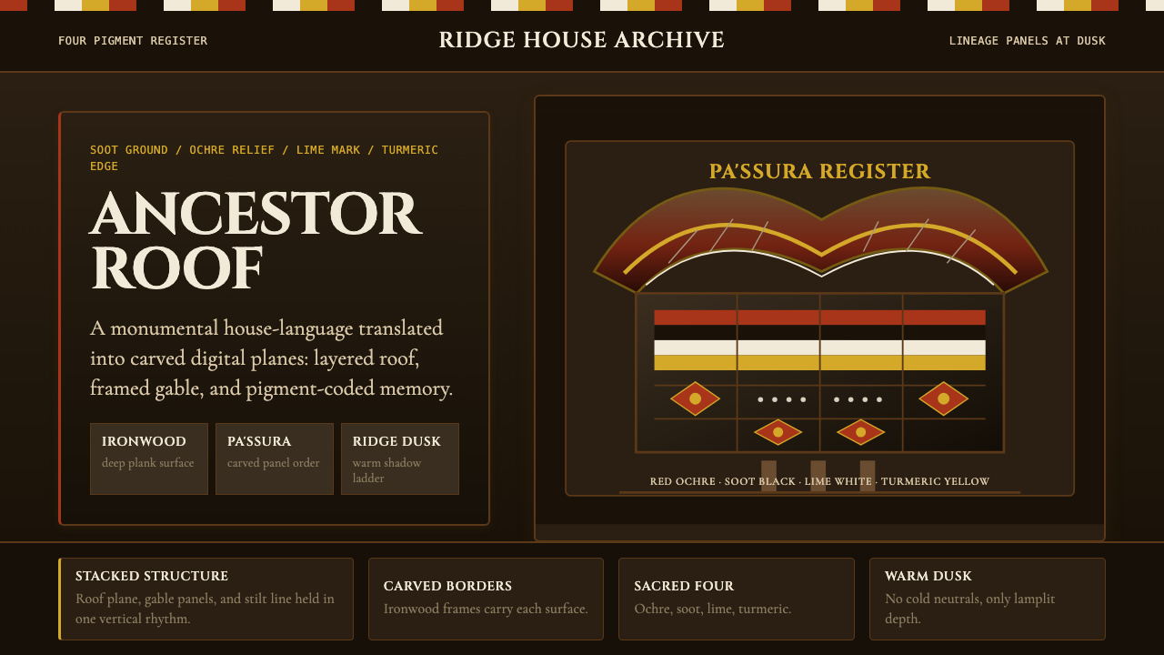 Torajan Tongkonan (Boat-Roof House)Ancestral dusk, carved in color. Soot black frames ochre, lime white, and tur…祖屋暮色有重量:烟黑底托起红赭、石灰白与姜黄雕带。
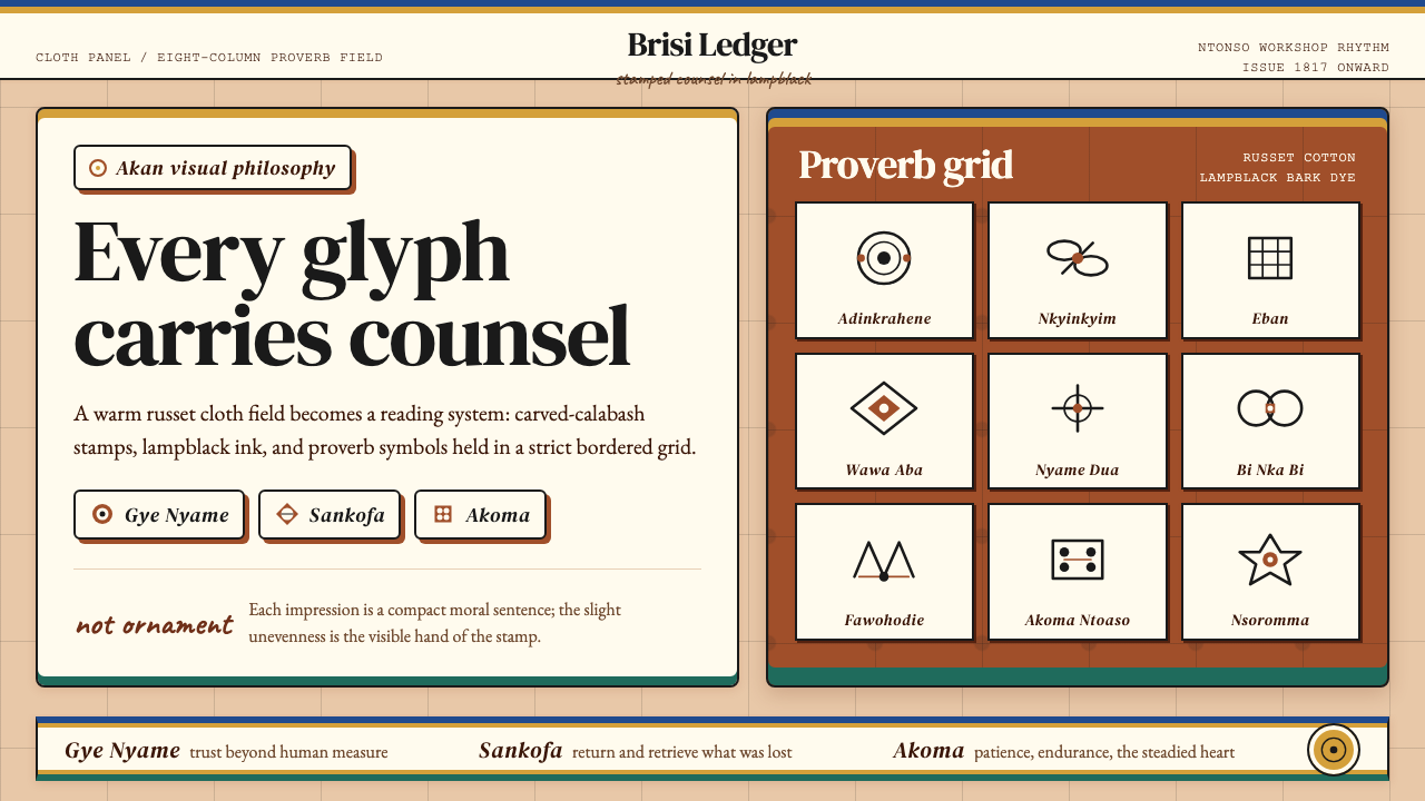 Akan Adinkra (Ghana)Proverbs become cloth. Russet grids, lampblack serif marks, and gold-edge ban…箴言化为布面:赭红网格、灯烟黑印纹与金边带盖出意义。
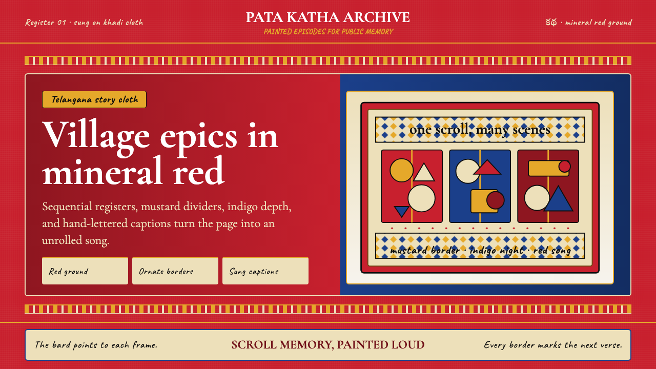 Andhra Cheriyal Scroll PaintingSaturated oral memory. Mineral red registers, mustard diamonds, and serif son…饱和的口述记忆:矿物红分格、芥末黄菱纹与衬线唱词。
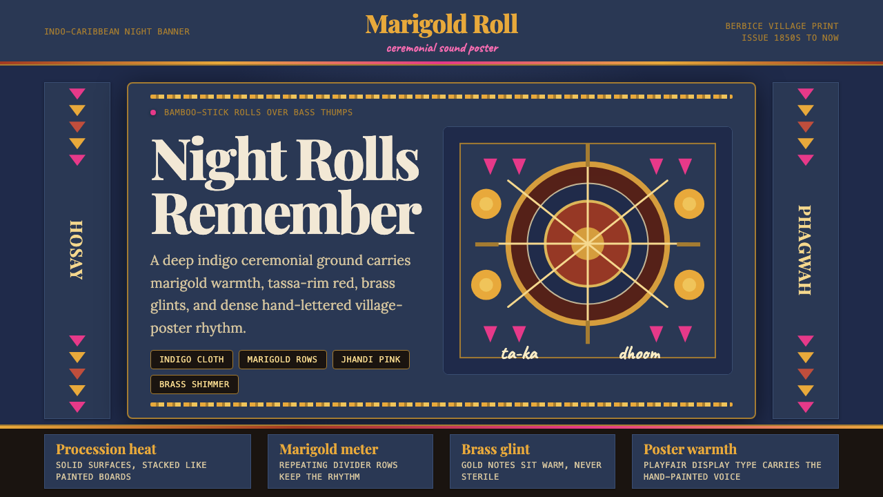 Guyanese Tassa DrumCeremony carries the beat. Indigo banners, Playfair type, and marigold rows g…仪式感击出鼓点:靛蓝旗面、Playfair 标题与万寿菊分隔线发光。
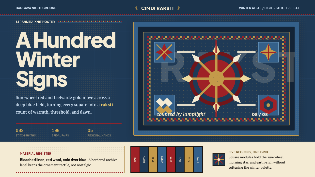 Latvian Knitted MittensWinter craft glows. Sun-wheel red and Lielvarde gold lock into an 8-stitch bl…冬夜手作发光。太阳红与利耶尔瓦尔德金锁进八针蓝格。
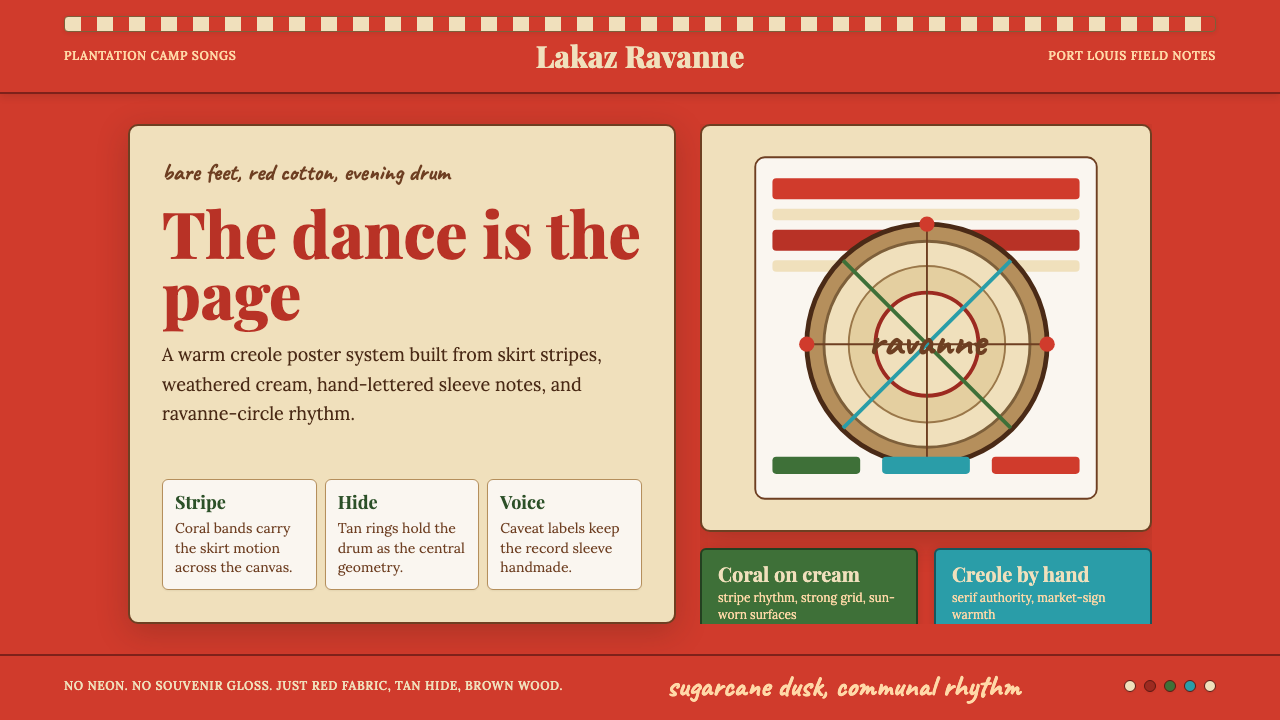 Mauritian Sega Creole (1810)Rhythm made visible. Coral stripes, cream sleeve type, and ravanne circles ca…节奏被看见:珊瑚红条纹、奶油唱片字与拉瓦纳鼓圆形。