What is Spice Souk Bazaar?
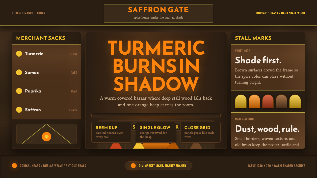
In the covered markets of Aleppo, shade carries the heat — turmeric orange glowing out of deep brown shadow, framed by hand-painted Arabic signboards.
Spice Souk Bazaar in brief
Spice Souk Bazaar is a design system drawn from the covered markets of Aleppo and the wider Levant — historic trading centers such as al-Madina Souk in Aleppo and the spice halls of Damascus and Istanbul, where merchants have for centuries sold turmeric, saffron, paprika, and sumac beside burlap sacks, hanging brass scales, and hand-painted Arabic signboards.
This is not a bright, sunlit marketplace palette. It is deliberately dim and warm-shaded, evoking the covered, roofed architecture of a real souk, where sunlight enters only in narrow shafts through gaps in a vaulted ceiling. Sackcloth and dark stall-wood fill most of the visual field in deep browns, and turmeric-orange functions as the single color that glows, almost like an ember, out of that surrounding shadow.
Typography carries much of the system's cultural identity: Reem Kufi, a modern geometric revival of the historic angular Kufic script, crowns each panel as a bold signboard letterform, while Amiri and Naskh — more flowing, traditional Arabic type styles — carry finer detail beneath. Together, the shaded palette and the calligraphic hierarchy recreate the sensory experience of walking beneath a vaulted market roof, where the eye is drawn first to the glowing spice heaps and only then to the signage around them.

Where does Spice Souk Bazaar come from?
Al-Madina Souk in Aleppo, one of the primary historical references for this system, is among the largest covered markets in the world — a labyrinthine network of vaulted stone passageways stretching for kilometers through the old city, developed over centuries along a Silk Road trading route that connected the eastern Mediterranean to Persia, Central Asia, and beyond. Its architecture — thick stone walls and vaulted or domed ceilings pierced by small openings for light and ventilation — was a practical response to the region's intense heat, keeping the interior naturally cool and shaded even at midday.
This covered-market form was common across the medieval Islamic world, from Damascus to Istanbul, and the spice trade was central to its commercial life. Spices arriving via Silk Road and maritime trade routes — turmeric and saffron from further east, sumac and paprika from more local cultivation — were sold from stalls that piled the dried goods in conical heaps, a merchandising convention that both displayed quantity and let color do the work of attracting customers in dim, lantern-lit interiors.
The Levantine spice-merchant guilds that operated these markets developed their own conventions of signage and craft, including hand-painted wooden signboards lettered in Arabic script advertising specific goods or family businesses, often passed down through generations. These signboards used calligraphic hierarchy deliberately: bold, geometric Kufic-derived lettering for maximum visibility at a distance, paired with more detailed, flowing script for finer information beneath — a hierarchy this design system directly translates into its typographic structure.
Al-Madina Souk itself was inscribed as part of the UNESCO World Heritage designation for the Ancient City of Aleppo in 1986, recognizing it as one of the most significant surviving examples of this medieval covered-market tradition. Portions of the souk suffered severe damage during the Syrian civil war in the 2010s, which has given the historical reference an added weight — this design system draws on a built heritage that is, in places, no longer physically intact in its original form.
What defines the Spice Souk Bazaar look?
Color
Deep, warm browns dominate the field, representing sackcloth, dark timber, and shadow. Turmeric-orange is the single glowing accent color reserved for the spices themselves and key focal points — never spread evenly across the composition, but concentrated where light would naturally fall on a heap of spice inside a dim market hall.
Typography
Reem Kufi, a bold geometric revival of historic Kufic script, is used for signboard-style headlines, crowning each panel the way a hand-painted wooden sign would crown a market stall. Amiri and Naskh, more traditional flowing Arabic type styles, carry finer detail text beneath, establishing a clear calligraphic hierarchy between bold declaration and detailed information.
Light and Shadow
Light enters only in narrow, directional shafts, as it would through small openings in a vaulted stone ceiling, rather than as even, diffuse illumination. This creates strong local contrast — a small area glowing brightly against a much larger field of shadow — rather than a uniformly lit composition.
Material
Surfaces read as sackcloth, aged dark wood, and hammered brass rather than smooth modern materials. Burlap texture and weathered timber grain give the deep brown ground a tactile, worn quality that contrasts with the vivid, almost luminous quality of the spice-colored accents.
Conical Display Convention
Spices and goods are represented in heaped, conical mounds rather than neat rows or packaged containers, echoing the actual merchandising convention of souk spice stalls. This shape — a soft triangular pile — can inform how data or content is visually grouped, favoring organic mounded clusters over rigid grids.
Hand-Painted Signage
Signboards carry a hand-crafted, slightly irregular quality rather than the mechanical precision of modern print — letterforms with subtle variation in stroke weight, as if painted by a single artisan rather than typeset by a machine. This handmade quality signals authenticity and craft heritage rather than industrial mass production.
Vaulted Framing
Compositional framing echoes the arched, vaulted architecture of a covered souk — curved upper boundaries, narrow passageways, and a sense of enclosure rather than open sky. This architectural echo reinforces the covered-market setting even in a flat digital layout without literal architectural elements.

Who shaped Spice Souk Bazaar?
The generations of trading families and guild organizations that operated the spice stalls and shaped the visual and commercial conventions of souks across the Levant, including the conical display method and the tradition of hand-painted signage passed down within family businesses over centuries.
Not an individual but the historic institution itself — one of the largest covered markets in the world, whose kilometers of vaulted stone passageways and centuries of continuous commercial use established the specific spatial and atmospheric qualities — filtered light, deep shadow, dense stall arrangement — this design system draws from most directly.
How do you use Spice Souk Bazaar today?
Spice Souk Bazaar is a warm, atmospheric style built on contrast between deep shadow and glowing accent color, and applying it well means preserving that darkness rather than brightening the palette for generic marketplace cheerfulness. The system depends on the tension between shade and glow — flatten that tension and the result reads as a generic warm-toned brand palette rather than this specific covered-market atmosphere.
For presentation slides, a cover page benefits from a deep brown ground with a single turmeric-orange focal element — a title treatment or graphic mark — glowing against it, framed by a Reem Kufi-style headline treatment. Content slides should keep most of the surface in shadow tones, using the orange accent sparingly for key figures, highlights, or calls to attention, echoing how a real souk uses light only where it needs to draw the eye.
For web interfaces, the style suits food and spice brands, marketplace platforms, hospitality products evoking Middle Eastern or Silk Road heritage, and any brand wanting a warm, artisanal, trade-heritage feel rather than a clinical modern one. Product cards can use the conical-heap visual convention for imagery framing, and navigation elements benefit from the calligraphic hierarchy — bold geometric headlines paired with more detailed flowing type beneath.
For editorial and marketing work, the style suits storytelling about trade history, culinary heritage, or Middle Eastern craft traditions. Photography and illustration should favor dim, warmly lit interior scenes with strong local contrast — a lit spice heap against dark surroundings — over bright, evenly lit exterior market shots, which shift the mood away from this specific covered-souk atmosphere.
A common mistake is brightening the entire palette into an evenly-lit, colorful bazaar scene, which loses the specific shade-and-glow tension the style depends on. Another mistake is using generic decorative "Arabic-style" lettering rather than authentic Kufic, Amiri, or Naskh type conventions, which can read as a shallow cultural gesture rather than a considered typographic hierarchy rooted in real signage traditions.

Spice Souk Bazaar — FAQ
Why is the palette dim rather than bright, given spice markets are often photographed in vivid color?
Many popular photographs of spice markets are taken with flash or heavy post-processing that brightens the entire scene evenly, which does not reflect the actual lighting conditions inside a genuine covered souk. Al-Madina Souk and similar Levantine markets were built with thick stone walls and small light openings specifically to stay cool and shaded, and the real sensory experience is one of walking through deep shadow punctuated by small glowing pools of light and color — which is what this system aims to capture.
What is the difference between Reem Kufi, Amiri, and Naskh, and why use all three?
Kufic is one of the oldest angular Arabic scripts, and Reem Kufi is a modern geometric revival of it, well-suited to bold, high-visibility headline use much like a signboard letter. Amiri and Naskh are more traditional, flowing calligraphic styles suited to body text and finer detail. Using a bold geometric script for headlines and a flowing traditional script for detail recreates the actual hierarchy found on historic hand-painted souk signage, where a shop name needed to be read from a distance while finer information sat beneath it.
Is this style specific to Aleppo, or does it represent souks generally?
Al-Madina Souk in Aleppo is the primary and most historically significant reference, but the covered-market form and its associated commercial and design conventions were shared across the wider Levant and the medieval Islamic world, including markets in Damascus and Istanbul. The style represents this broader tradition of covered spice trading, with Aleppo as its most architecturally and historically prominent example.
Can this style be applied respectfully given the souk's damage during the Syrian civil war?
Applying the design system respectfully means treating it as a genuine reference to a centuries-old living trade tradition and its distinctive architecture and craft, rather than as a decorative shorthand for "exotic" or "Middle Eastern" generically. Using authentic calligraphic conventions, accurate material references, and an understanding of the real historical and commercial function of the souk — rather than superficial ornament — is the difference between honoring the tradition and reducing it to a stereotype.
Related design styles
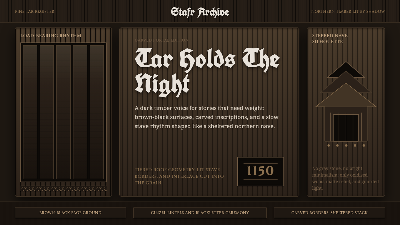 Norwegian Stave ChurchTar makes the sacred heavy. Brown-black fields, Cinzel inscriptions, tiered t…
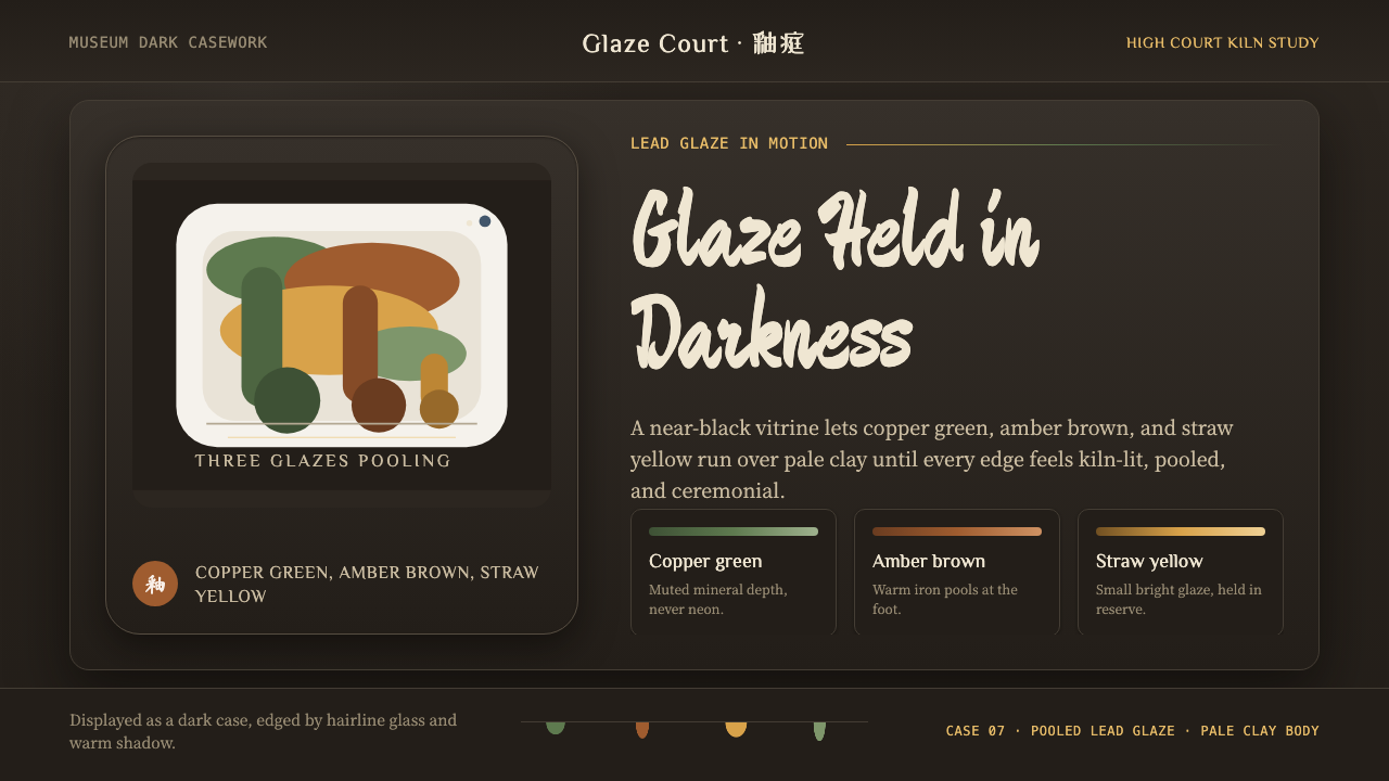 Tang Sancai 唐三彩Museum-dark and molten. Copper green, amber, and straw pools glow in bordered…
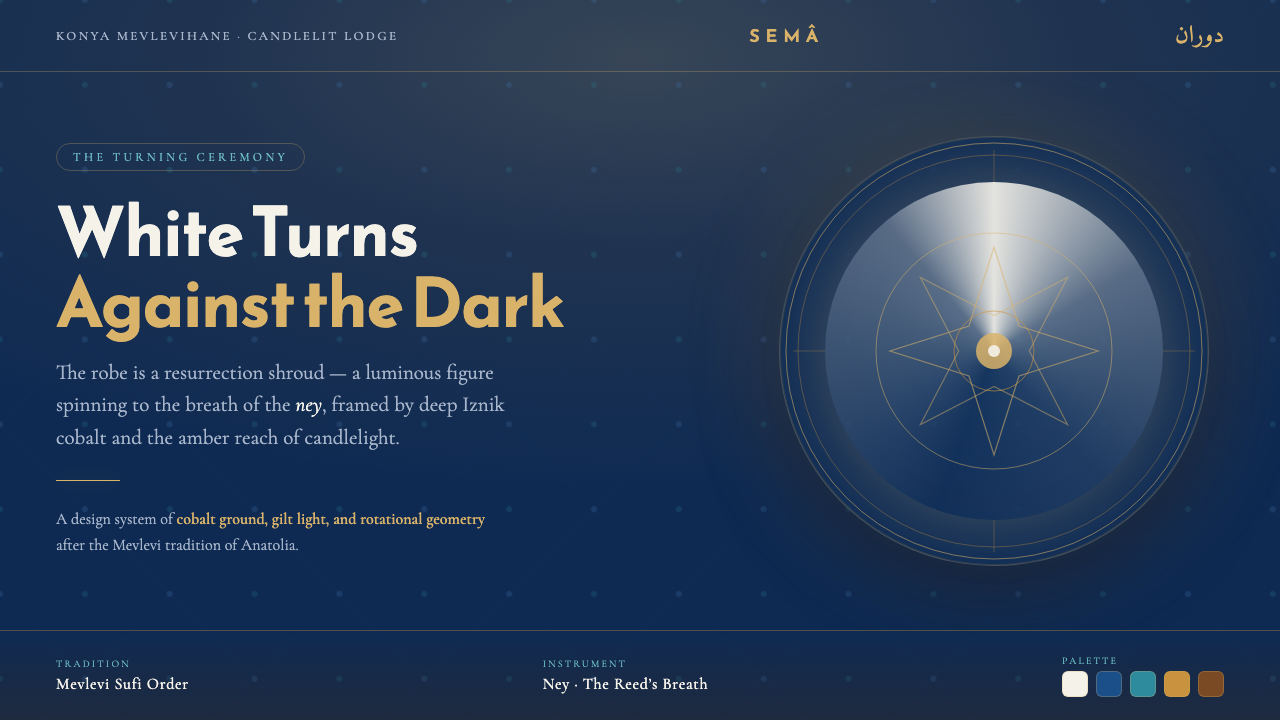 Whirling Dervish SemaWhite is always the figure. A spinning robe sweeps against deep Iznik cobalt,…
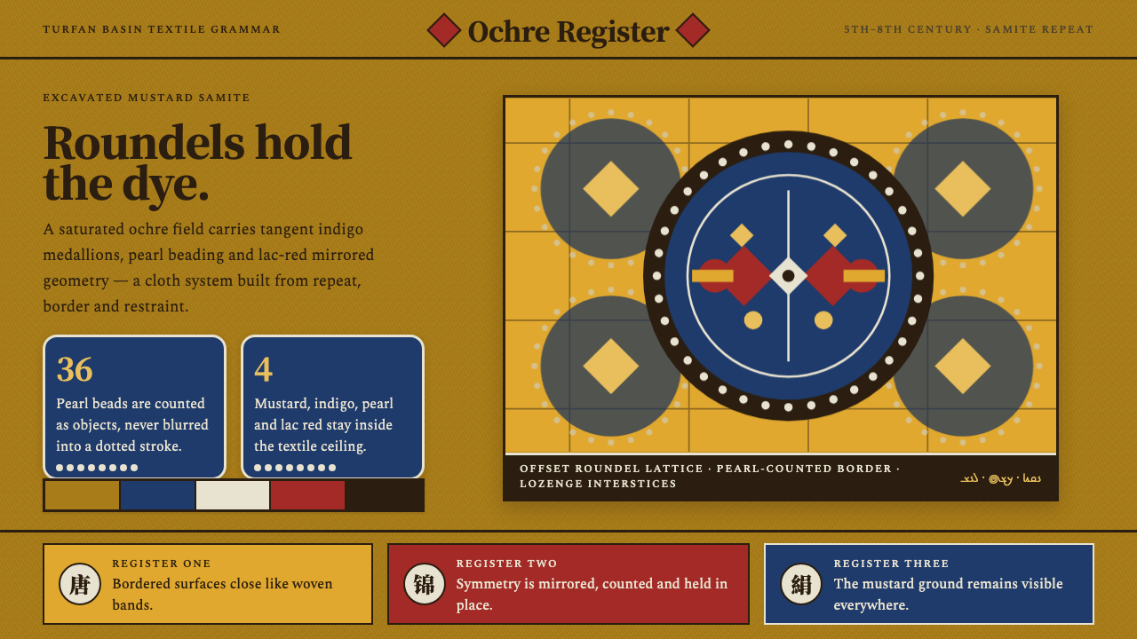 Astana Tomb SilksDye survives as structure. Mustard ground, indigo roundels and pearl beads lo…
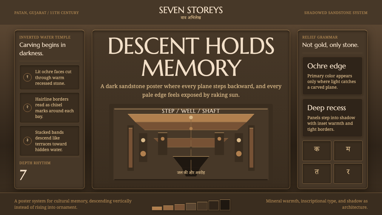 Indian StepwellStone descends into shadow. Ochre serif type and stacked terraces carve the f…
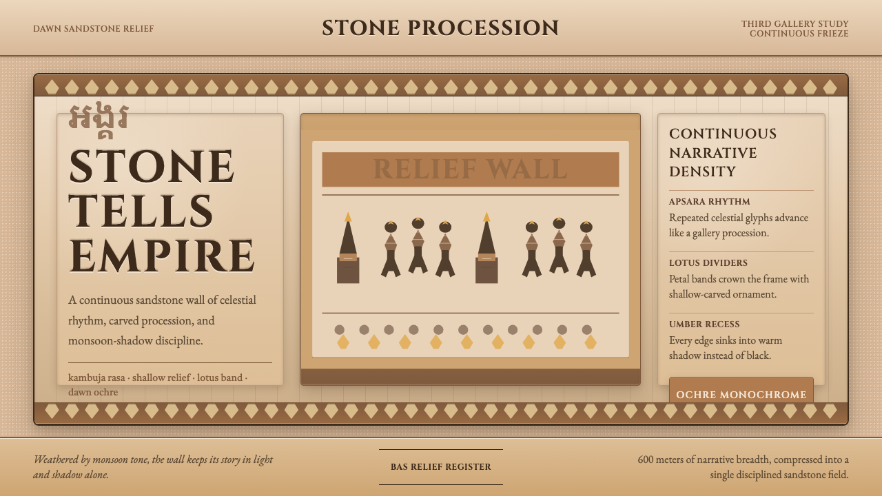 Khmer Angkor Wat ReliefStone remembers everything. Ochre friezes, Cinzel capitals, and lotus bands h…