What is Whirling Dervish Sema?
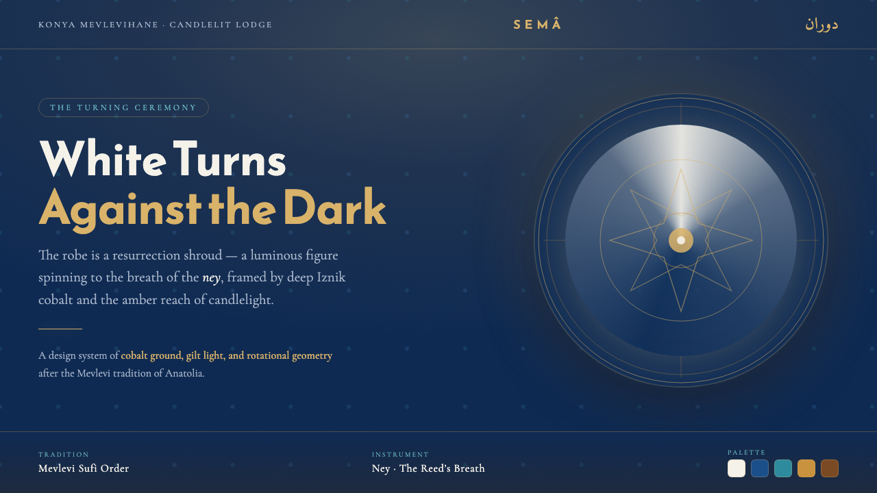
White is always the figure: a whirling robe crossing tiled cobalt darkness, held for a moment in amber candlelight.
Whirling Dervish Sema in brief
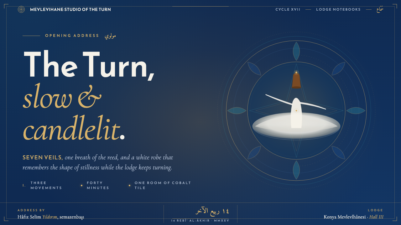
Whirling Dervish Sema draws its visual language from the Mevlevi sema, the turning ceremony of the Sufi order shaped by Rumi’s tradition. Its central image is not an abstract spiral but a semazen: a whirling dervish in a white, flared tennure skirt and camel-brown sikke hat, turning slowly to the breath of the ney reed. The white robe is understood here as a resurrection shroud, making the figure a presence that emerges through darkness rather than a decorative silhouette placed on a neutral field.
The authentic atmosphere is the candlelit mevlevihane lodge. Deep Iznik cobalt-and-turquoise tile covers the walls; amber lamplight warms selected surfaces; the white garment catches the eye because it moves against a field already dense with color, pattern, and shadow. This is therefore a dark visual system, but not an empty black one. Darkness has material character: it is tiled, blue, cool, architectural, and made legible by isolated warmth.
As a digital style, Whirling Dervish Sema translates that relationship into hierarchy. White remains reserved for the primary figure, the principal statement, or the most consequential piece of information. Cobalt establishes the surrounding world; turquoise gives the tiled field variation and continuity; amber acts like a flame, illuminating a focal detail rather than flooding the composition. The result should feel ceremonial, deliberate, and spatially contained, never like a generic dark interface with ornamental Middle Eastern references applied afterward.
Where does Whirling Dervish Sema come from?
The sema belongs to Mevlevi Sufism, the Sufi tradition associated with Rumi, also known as Mevlana. Its roots lie in the legacy of the thirteenth century and its form was codified through the Ottoman centuries. That long history matters to the style because it prevents the turning figure from becoming merely a motion motif. In the source tradition, the ceremony, the lodge, the clothing, and the music form one setting; the visual system should preserve that unity.
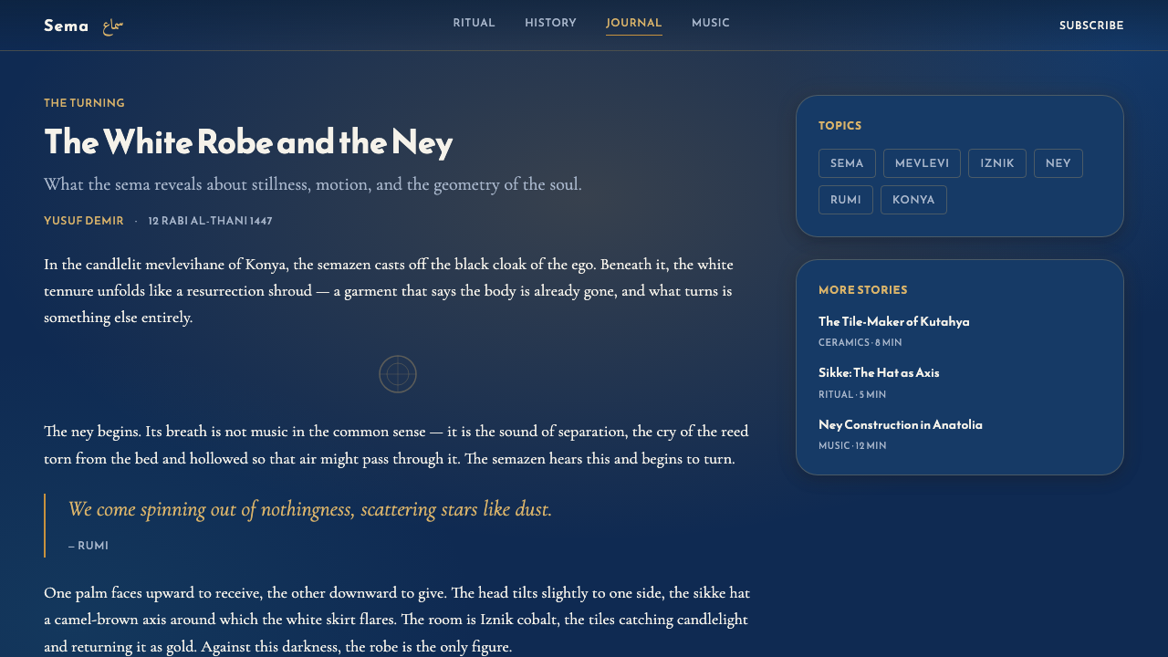
Konya and the lodges of the Ottoman world provide the geographic and architectural frame. A mevlevihane is not presented as a blank ceremonial room: its candlelit interior carries deep cobalt-and-turquoise Iznik tile. The tile makes the dark setting active. Repeated ceramic surfaces create a field through which the white robe can pass, while candlelight lends a local amber glow. This contrast between a moving pale figure and an enduring tiled enclosure is the style’s foundational composition.
The clothing establishes the most important visual distinction. The tennure is white and flared, so its silhouette expands into a sweeping circular form as the semazen turns. The sikke is camel-brown, introducing a quieter earthen note above the luminous white mass. Together they create a vertical relationship between hat, body, and skirt: a restrained upper marker above a garment that seems to gather motion and light. The digital translation should protect this hierarchy rather than treating every color as equally expressive.
Sound also belongs to the image. The semazen turns to the breath of the ney reed, and that phrasing suggests a rhythm that is continuous, spacious, and attentive rather than abrupt or theatrical. The visual language need not imitate movement literally. It can instead use recurrence, circular framing, paced repetition, and carefully isolated highlights to suggest sustained turning. The goal is not to recreate a lodge on screen, but to preserve its geometry of darkness, white form, tile, breath, and flame.
What defines the Whirling Dervish Sema look?
Figure and Ground
White belongs first to the figure. It should identify the central form, key message, or decisive interaction, while the surrounding field remains deep, tiled, and recessive. A pale surface used indiscriminately as a default background breaks the system’s premise: white must appear as something turning through darkness, not as the darkness’s replacement.
Iznik Cobalt Field
Cobalt-and-turquoise tile is the environmental language. It should read as an architectural field with repetition, depth, and quiet variation, not as a loose ornamental pattern sprinkled around content. The tiled ground gives dark space an interior character and provides enough visual structure for white elements to remain vivid without excessive framing.
Amber Illumination
Amber functions as candlelight: local, directional, and precious. It is most effective around an active focal point, a small status signal, a highlighted word, or a selected path through information. Broad amber coverage erases the ceremony’s low-light atmosphere. The warmth should feel discovered within the blue darkness rather than applied as an all-purpose accent.
Circular Sweep
The flared tennure suggests a broad circular sweep rather than a sharp mechanical spiral. Circular forms, curved crops, and repeated arcs can imply turning when they remain spacious and balanced. The motion should feel slow and sustained, with room around the imagined figure, instead of becoming a vortex that compresses every element toward the center.
Ceremonial Restraint
This style gains force from concentration. It should contain few dominant moments: a white figure, a candlelit detail, a controlled tiled enclosure, and a measured textual hierarchy. Dense collections of badges, competing illustrations, or decorative flourishes make the result feel theatrical in the wrong way. The intended mood is contemplative presence, not visual spectacle.
Breath and Space
The ney reed’s breath offers a useful compositional principle: information should arrive with pauses. Let dark intervals separate bright statements, let text sit within calm margins, and let tile pattern recede when reading needs priority. Space is not unused area here; it is the condition that allows white, amber, and movement to be perceived distinctly.

Who shaped Whirling Dervish Sema?
Rumi, also known as Mevlana, is the figure whose tradition frames the Mevlevi order. In this visual language, his significance is foundational rather than illustrative: the sema is approached as a ceremony within a Sufi inheritance, not as an interchangeable dance image. That distinction gives the white robe, the turning body, and the lodge setting their gravity.
The Mevlevi sheikhs belong to the order’s continuing ceremonial and lodge tradition. Their presence reminds designers that the sema is held within a disciplined communal setting. A visual adaptation should therefore favor structure, containment, and attentiveness over exotic display or freely mixed symbolic motifs.
The semazen, or whirling dervish, is the visual center of the system. White tennure, camel-brown sikke, slow rotation, and the robe’s expanding silhouette establish its hierarchy of light and form. When no human figure is shown, the same logic can survive through a white focal object moving conceptually through cobalt tile darkness.
The ney player supplies the breath to which the semazen turns. For design, this figure introduces rhythm without demanding literal musical illustration. It supports restrained repetition, gently paced disclosure, and the sense that visual elements are entering a shared atmosphere rather than competing for immediate attention.
How do you use Whirling Dervish Sema today?
For presentation covers, build the composition around one luminous white gesture against a deep cobalt tiled field. A cropped robe-like sweep, a circular white form, or a restrained white title can occupy the role of the figure, while a small amber glow establishes the candlelit focal point. Keep the cover spacious and let the dark architecture remain visible; the subject should feel encountered within a lodge-like enclosure, not placed on a flat promotional backdrop.
For presentation content and data pages, preserve the same figure-ground logic while making reading effortless. Use white for the principal conclusion and core labels, allow muted tiled blue surfaces to contain supporting information, and use amber only to identify a meaningful emphasis or selected path. Charts should feel calm and legible rather than ornamental: a single highlighted measure can carry the visual role of candlelight, while surrounding information recedes into the cobalt field.
For web interfaces, the style is especially suitable for cultural archives, contemplative learning spaces, curated collections, and dashboards where a sense of focus matters. A deep tiled environment can frame navigation and secondary panels, while a white primary card, active view, or central result becomes the turning figure. Pricing or membership pages can use the contrast particularly well: reserve white for the decision-making tier or central offer, and let amber mark attention without converting the whole page into a warm sales surface.
For editorial and marketing work, use the style to make an article or campaign feel like an evening interior rather than an undifferentiated dark poster. Long text benefits from calm white reading areas held within blue surroundings, with tile imagery or pattern operating at the edge of attention. Campaign modules can alternate between quiet cobalt expanses and concentrated white statements, but each should retain enough unoccupied darkness for the amber moments to feel like illumination rather than decoration.
The common mistake is reducing the style to a spinning icon, a blue background, and arbitrary gold ornament. That approach loses the source material’s actual order: white is the figure, cobalt-and-turquoise tile is the setting, amber is candlelight, and turning is slow ceremony shaped by the breath of the ney. Avoid making every panel equally bright, every surface equally patterned, or every element circular. The style works when contrast is scarce, intentional, and rooted in the relationship between robe, darkness, architecture, and flame.
Whirling Dervish Sema — FAQ
Is Whirling Dervish Sema simply a dark Middle Eastern decorative style?
No. Its starting point is a specific relationship from the Mevlevi sema setting: a white tennure turns in a candlelit mevlevihane against deep Iznik cobalt-and-turquoise tile. The dark field, the white figure, and the amber illumination have distinct roles. Treating tile or circular motifs as detached decoration removes the very contrast that gives the style meaning.
Why must white remain so restrained?
Because white carries the figure. In the source image, it is the flared robe that turns against darkness and catches candlelight. If every panel, card, and text area is white, the focal hierarchy disappears and cobalt darkness becomes merely a border. Reserve white for what should feel present, primary, or illuminated.
Can the style work without showing a dervish?
Yes. The dervish can be translated structurally rather than literally. A single white focal form, a broad circular crop, or a central statement surrounded by tiled darkness can carry the figure’s role. What matters is that the composition preserves the distinction between the pale turning presence and the cobalt architectural environment.
How should tile pattern be handled in readable interfaces?
Use it as environment, not competing content. Tile can establish the boundary, background depth, or a quiet secondary surface, then recede behind white reading areas and essential labels. When text becomes difficult to scan, the tile has taken on too much visual authority. Its task is to make darkness feel inhabited, not to demand equal attention.
What is the most important feeling to preserve in a contemporary adaptation?
Ceremonial concentration. The source material joins slow turning, the breath of the ney, candlelight, white robe, and tiled darkness into one attentive atmosphere. A successful adaptation does not need to reproduce the ceremony, but it should avoid haste, visual clutter, and interchangeable ornament. It should feel as though light and motion have been deliberately given a place to occur.
Related design styles
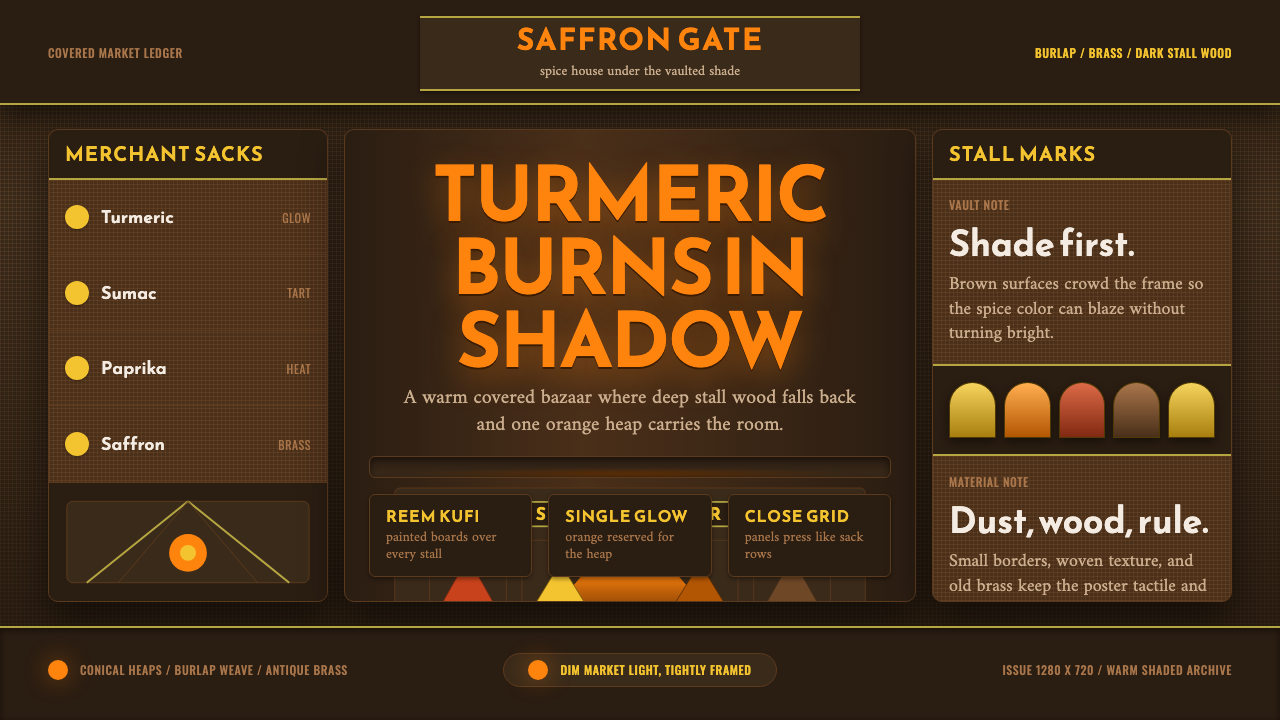 Spice Souk BazaarShade carries the heat. Turmeric orange glows through brown grids and Kufi si…
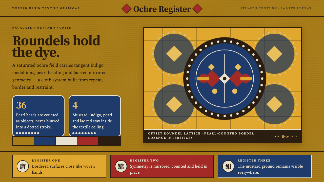 Astana Tomb SilksDye survives as structure. Mustard ground, indigo roundels and pearl beads lo…
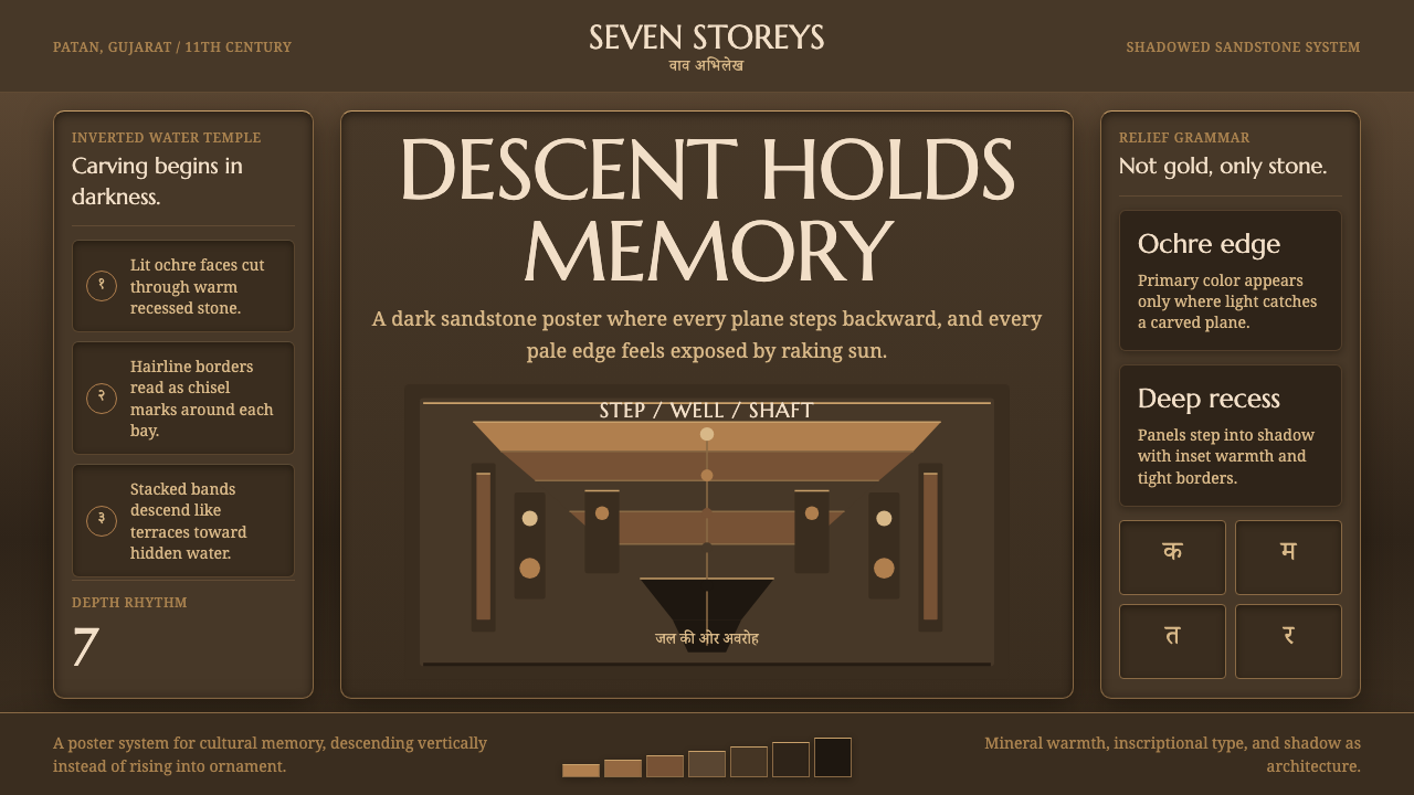 Indian StepwellStone descends into shadow. Ochre serif type and stacked terraces carve the f…
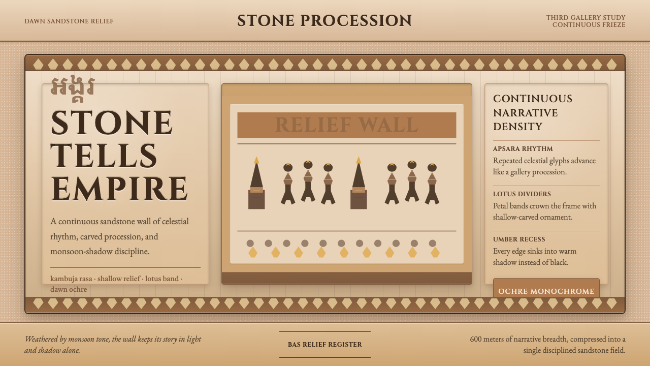 Khmer Angkor Wat ReliefStone remembers everything. Ochre friezes, Cinzel capitals, and lotus bands h…
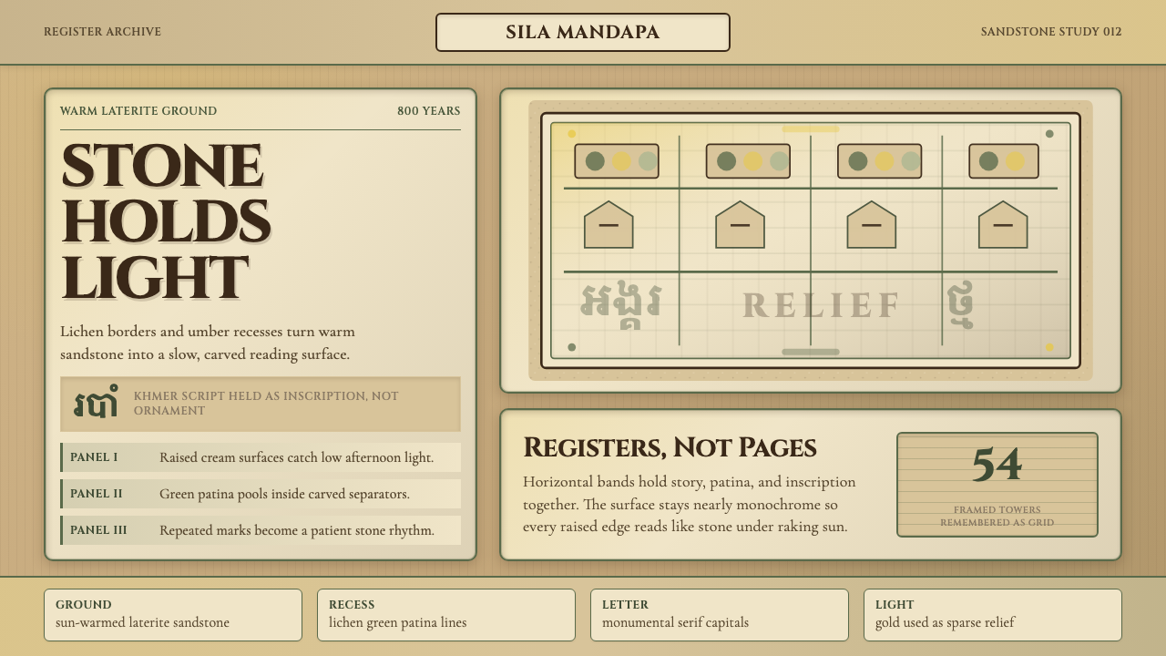 Khmer Apsara Relief (Bayon)Contemplative stone weight. Cinzel capitals sit on sandstone registers with l…
 Norwegian Stave ChurchTar makes the sacred heavy. Brown-black fields, Cinzel inscriptions, tiered t…