What is Indian Stepwell?
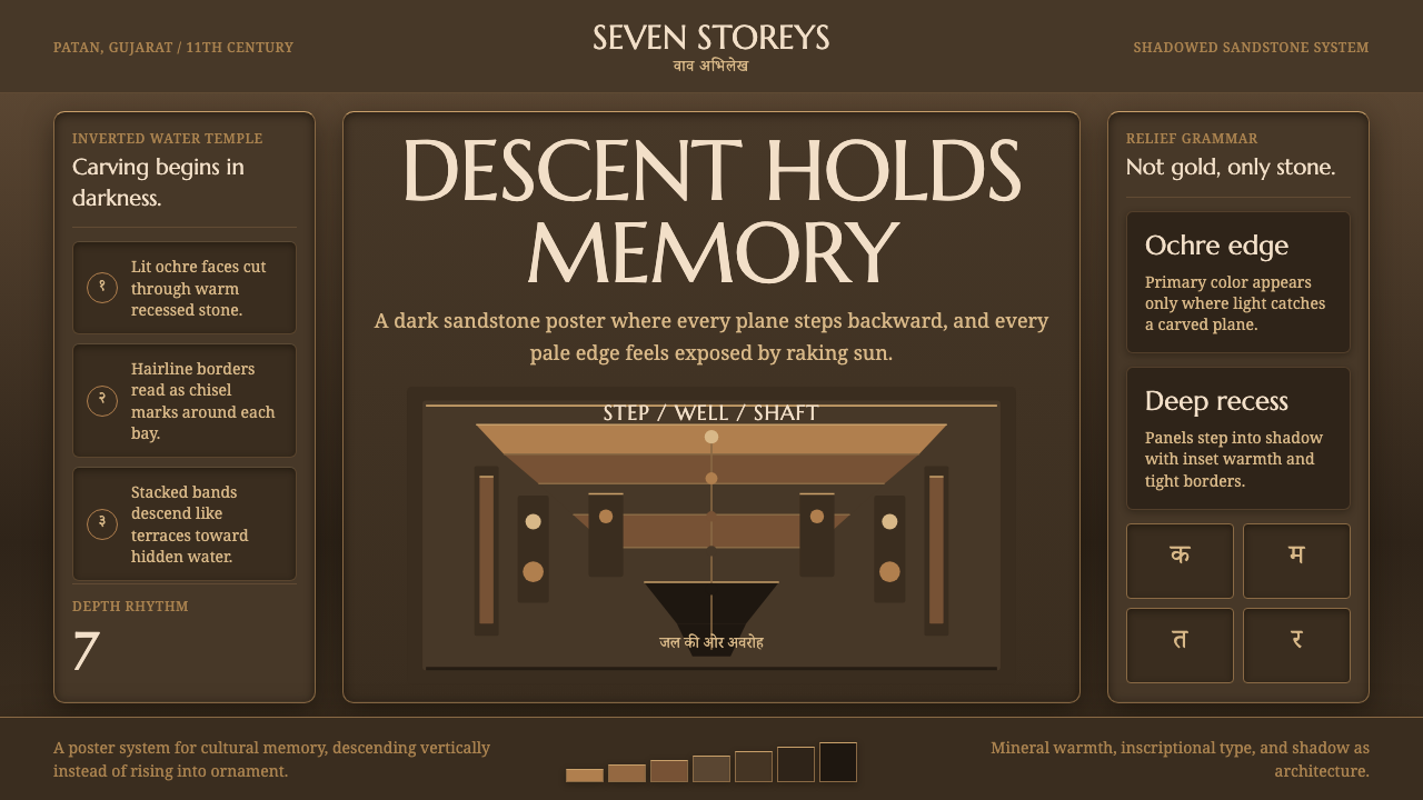
Rani-ki-Vav turns architecture upside down — a temple built downward into the earth, its carved stone walls disappearing into shadow the deeper you descend.
Indian Stepwell in brief
Rani-ki-Vav — literally 'the queen's stepwell' — is an eleventh-century subterranean water temple in Patan, in the Indian state of Gujarat. Where most sacred architecture reaches upward toward the sky, this one plunges downward, seven storeys of carved sandstone terraces stacked one below the other until they reach a narrow well shaft at the bottom. It was built not as a ruin-in-waiting but as working civic infrastructure: a place to draw water that was also, simultaneously, a shrine.
As a design system, the stepwell translates that descent into a visual logic rather than a literal one. The ground is not bright stone lit by sun — it is the stone already in shadow, the face of the terrace you'd see looking down into the well rather than up at a facade. Structure reads as horizontal bands, echoing the stacked terraces themselves, and ochre carving-toned accents surface out of that recessed dark the way relief figures emerge from a sandstone wall struck by a shaft of low light.
The overall register is austere and weathered rather than ornate. This is not gilded temple gold or painted devotional color — it is quarried stone, worn by a thousand years of monsoons and footsteps, carved rather than applied. Every visual decision should feel like it was cut into a surface, not printed on top of one.
Where does Indian Stepwell come from?
Rani-ki-Vav was commissioned in the eleventh century by Queen Udayamati, of the Solanki (also called Chaulukya) dynasty, in memory of her husband, King Bhima I. The Solankis ruled over Gujarat and parts of Rajasthan from their capital at Patan (then called Anhilwara), and under their patronage the region became a major center of what art historians call Maru-Gurjara temple architecture — a style distinguished by dense figural carving, intricate geometric ornament, and a willingness to treat stone as though it were something more pliant, closer to wax or wood, than a rigid mineral.
The building itself belongs to a specifically South Asian architectural tradition: the vav, or stepwell, a type found across Gujarat and Rajasthan where groundwater sits well below the surface and monsoon rainfall is seasonal and unreliable. A stepwell is simultaneously a reservoir, a cooling retreat from the heat above ground, a site of daily gathering, and — in the more ambitious examples, of which Rani-ki-Vav is the grandest survivor — a fully realized sacred monument. Descending its stairs was itself conceived as a devotional act, a journey inward and downward mirrored by the journey toward the water and toward the divine.
The scale of the carving program is what sets Rani-ki-Vav apart even among stepwells. Its walls hold more than five hundred principal sculptures and well over a thousand minor ones, organized around depictions of the Dashavatara — the ten avatars of the god Vishnu — interspersed with apsaras (celestial dancers) and nagakanyas (serpent-maidens), alongside sages, ascetics, and everyday figures. The iconographic program is theologically coherent: Vishnu's descents into the world, layered downward through the descending terraces of the well, so that the architecture itself performs a kind of doctrine.
The stepwell was eventually buried by flooding from the nearby Saraswati river and lay silted over for centuries, which — paradoxically — preserved its carving in far better condition than monuments left exposed to the open air. It was excavated by the Archaeological Survey of India in the twentieth century and was inscribed as a UNESCO World Heritage Site in 2014, recognized as the finest and most elaborate example of the stepwell form to survive from the Solanki period.
What defines the Indian Stepwell look?
Color
The palette reads as quarried stone rather than paint: deep recessed darks that stand in for the shadowed lower terraces, warmed by ochre and sandstone tones that surface where carving catches the light. There is no bright saturated color anywhere in this system — every hue behaves like mineral pigment embedded in rock, muted by age and by the dimness of a space that sunlight only reaches at a low, raking angle for part of the day.
Surface and Relief
Texture is carved, not printed. Where ornament appears, it should read as if cut into a surface with a chisel — figures and patterns raised or recessed from a shared ground plane, catching shadow along their edges the way relief sculpture does. Flat, decal-like decoration undermines the whole system; the ornament has to feel like it displaced material to exist, the way every carved figure on the actual stepwell walls does.
Typography
Serif letterforms carry the weight in this system, chosen for a quality closer to inscription than to print — the kind of serif that looks like it could have been cut with a blade rather than drawn with a pen. Ochre-toned type set against the dark ground behaves like carved lettering picking up light; it should never feel decorative or calligraphic, but architectural, load-bearing, permanent.
Vertical Rhythm and Terracing
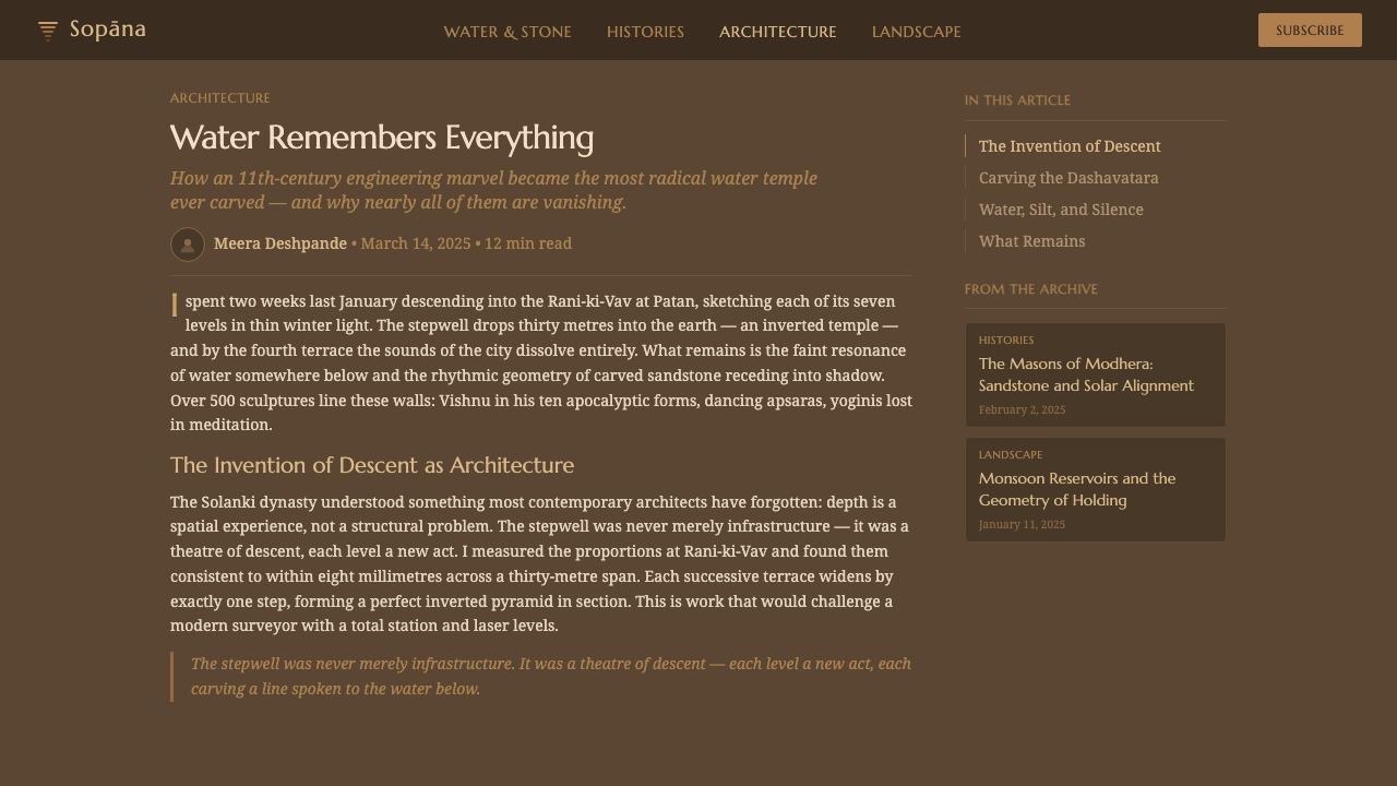
Composition organizes itself in horizontal bands stacked one atop another, echoing the stepwell's seven descending storeys. Rather than a single continuous surface, the page should feel like it is composed of distinct terrace-levels, each with its own register of content, separated by the kind of hard edge you'd find where one stone course meets the next.
Shadow as Depth
Depth in this system comes from real recession into darkness, not from soft ambient shadow beneath floating cards. The deepest elements of a layout should read as though they sit at the bottom of the well shaft — darkest, most compressed, hardest to make out — while elements closer to the 'surface' catch more ochre light. Shadow is structural, describing where in the descent something sits, not decorative.
Figural Ornament
Where illustrative or iconographic elements appear, they draw on a register of carved figures rather than flat icons — dancers, guardian figures, and mythic beings rendered with the same relief quality as the rest of the system, never as bright flat-color pictograms. The density of the original carving program (hundreds of principal figures, over a thousand minor ones) suggests that ornament here is meant to reward close, sustained looking rather than a single glance.
Restraint and Weathering
Nothing in this system should look new. Edges are softened as if worn by centuries of monsoon water and footsteps rather than crisply vector-perfect; surfaces carry the implication of age. This is a system built on subtraction and endurance rather than addition and polish — closer to erosion than to embellishment.
Who shaped Indian Stepwell?
Udayamati commissioned Rani-ki-Vav in memory of her husband, King Bhima I, making the stepwell simultaneously a work of civic infrastructure and a personal act of memorial devotion. Royal patronage of large stepwells was itself notable — most such structures were funded by wealthy merchants or local communities — and the scale and ambition of this one reflects the resources and religious authority of the Solanki court at its height.
Bhima I ruled the Solanki dynasty from Patan during the eleventh century, a reign whose memory the stepwell was built to honor. His court presided over a period in which Gujarat's temple architecture and stone-carving traditions reached a level of ambition that later Maru-Gurjara building across the region would continue to draw on.
The anonymous workshops responsible for the stepwell's carving produced over five hundred principal sculptures and more than a thousand minor ones, organized around a coherent iconographic program centered on Vishnu's ten avatars. Their collective achievement represents the high-water mark of Maru-Gurjara figural carving — dense, confident, and precise enough to survive burial under river silt for centuries and re-emerge legible.
The ASI's twentieth-century excavation uncovered Rani-ki-Vav from the silt that had buried and, paradoxically, preserved it, revealing carving far better preserved than monuments left exposed to open air for the same span of time. The survey's work made the stepwell's full scale and iconographic program visible again, leading eventually to its 2014 UNESCO World Heritage inscription.
How do you use Indian Stepwell today?
This style rewards restraint and depth more than any single decorative flourish — the temptation to over-illustrate with literal temple imagery should be resisted in favor of the structural logic of descent, terracing, and carved surface.
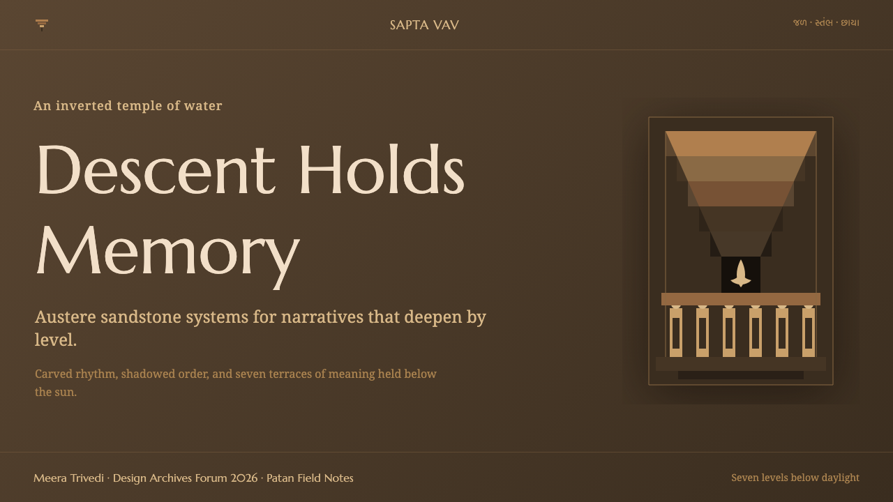
For presentation slides, the cover benefits from the deepest possible recession: a dark, shadowed ground with a single ochre-toned title treatment that appears to catch light the way carved lettering would, positioned as if at the bottom of a terrace rather than centered on a flat plane. Content slides should adopt the terracing principle directly — organize information into stacked horizontal bands, each reading as a distinct level, with hierarchy expressed through how far an element sits from the 'surface' rather than through color variety. Data visualizations work best rendered as if carved in relief: bars and figures should look raised from the dark ground rather than floating in bright flat color.
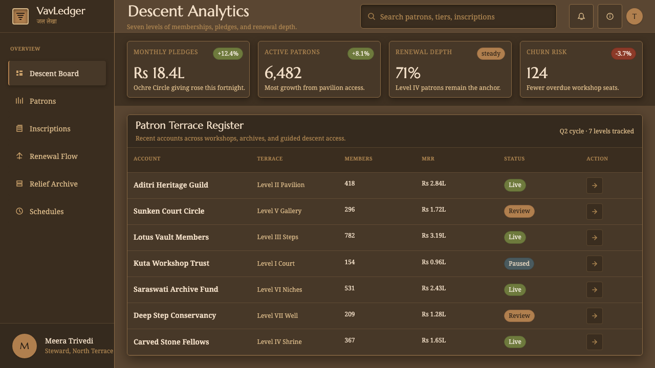
For web interfaces, dashboards and pricing pages benefit from the same terracing logic applied to layout structure: distinct horizontal sections stacked with clear hard-edged boundaries, a dark recessed base layer, and ochre accents reserved for the elements that most need attention — pricing tiers, primary actions, key metrics. Cards and panels should carry a carved, relief-like quality at their edges rather than a soft floating shadow; this reinforces the sense of a solid surface with material carved out of it rather than objects placed on top of a flat background.
For editorial and marketing work, the style suits long-form storytelling about heritage, craft, and permanence particularly well. Full-bleed sections can alternate between the deepest recessed dark and slightly lighter terrace tones, with pull quotes or headers rendered in the carved-serif treatment. Marketing pages benefit from treating each scroll section as its own terrace — a distinct level the reader descends into — rather than a single continuous scroll of undifferentiated content.
A common mistake when applying this style is reaching for literal Indian temple iconography — domes, literal deity imagery, or saturated 'exotic' color — instead of the structural principles the system actually encodes: shadow, terracing, carved relief, and a muted ochre-on-dark palette. The style is about the logic of descending into stone, not a decorative skin borrowed from a specific religious context; used correctly it should feel austere and architectural rather than themed.
Indian Stepwell — FAQ
What exactly is a stepwell, and why does it look like this?
A stepwell (vav in Gujarati) is a well accessed by a long descending staircase rather than a simple vertical shaft, built to reach groundwater that sits well below the surface in regions with seasonal, unreliable monsoon rainfall. Because reaching the water meant walking down through many storeys, builders in Gujarat and Rajasthan turned that descent into an architectural and devotional experience — carving the walls of the staircase with the same density and ambition as a temple, so that fetching water and performing an act of worship became the same journey.
Why does this design system use shadow and darkness instead of the bright, saturated colors often associated with Indian design traditions?
This system is drawn from one very specific structure — an underground stone stepwell, not the broader palette of Indian textile, miniature painting, or festival traditions that are typically associated with bright saturated color. Rani-ki-Vav is quarried sandstone sitting in a shaft the sun only reaches at a low angle for part of the day; its actual visual character is shadow, stone, and the ochre tones of carving catching what little light reaches it. Treating this style as an excuse for generically 'Indian' bright color would misread the specific monument it comes from.
How is this different from other historical or 'ancient' design styles in the library?
Most historical styles in a design library organize themselves around a flat surface — a facade, a manuscript page, a painted panel. This one organizes itself around a descent through physical space, which is why terracing and layered depth are central rather than incidental. It is closer, structurally, to systems built around strata or elevation than to systems built around a single decorated plane; the defining move is going down, not laying out.
What kinds of products or brands does this style suit, and where does it not fit?
It suits products that want to communicate heritage, permanence, and depth — cultural institutions, craft and material-focused brands, editorial platforms telling long-form historical stories, or products positioning themselves as substantial and enduring rather than fast-moving. It fits less well in contexts that need to feel light, quick, or playful — consumer apps built around speed and immediacy, children's products, or anything where a dark, weighted, slow-reveal aesthetic would work against the product's actual pace.
Does this style require literal architectural or temple imagery to work?
No — and leaning on literal imagery is the most common way to misapply it. The system works through structural principles (terracing, recession into shadow, carved-relief surface treatment, a muted ochre-on-dark palette) that can organize a dashboard, a slide deck, or a marketing page without a single picture of the actual stepwell appearing anywhere. The goal is to make an interface feel like it was carved and descended into, not to decorate it with photographs of Gujarat.
Related design styles
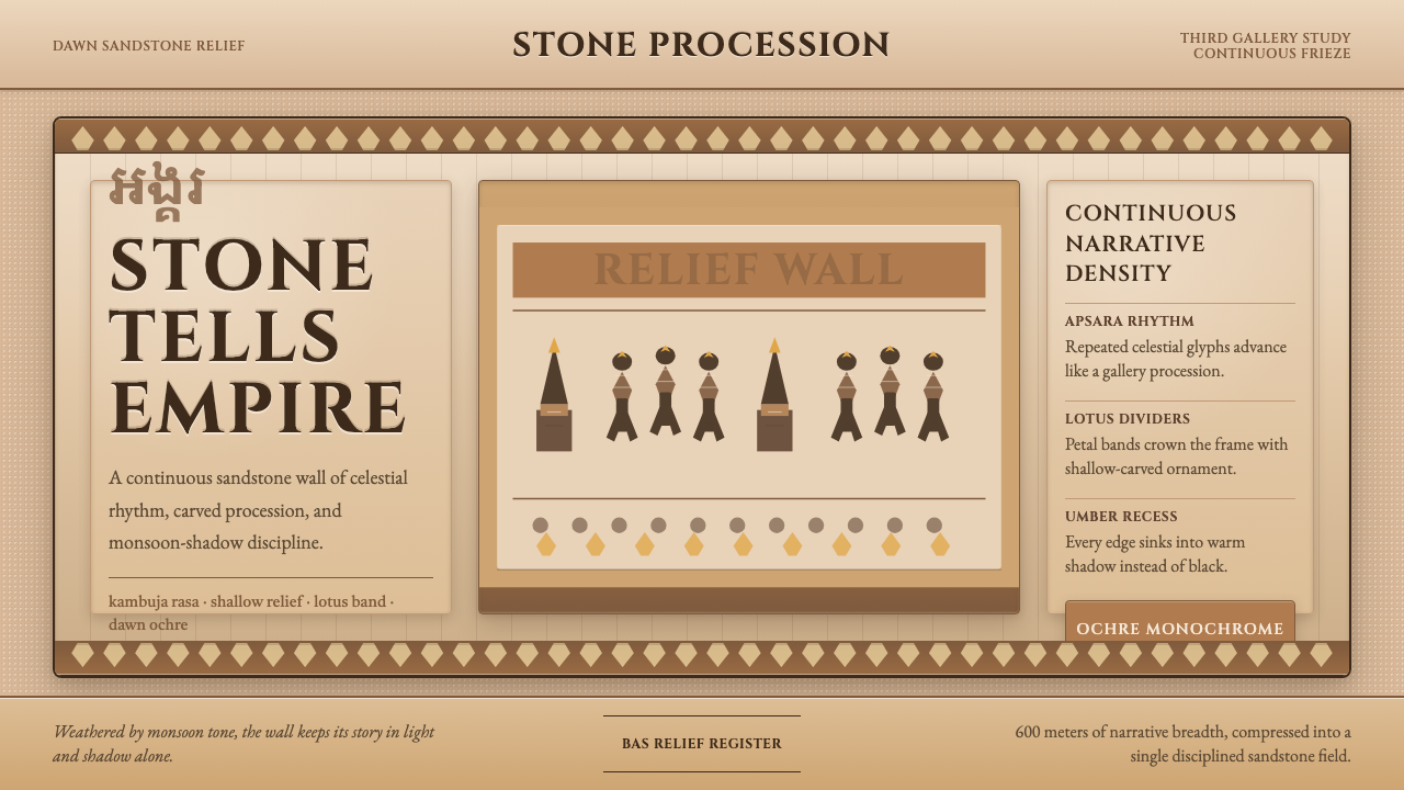 Khmer Angkor Wat ReliefStone remembers everything. Ochre friezes, Cinzel capitals, and lotus bands h…
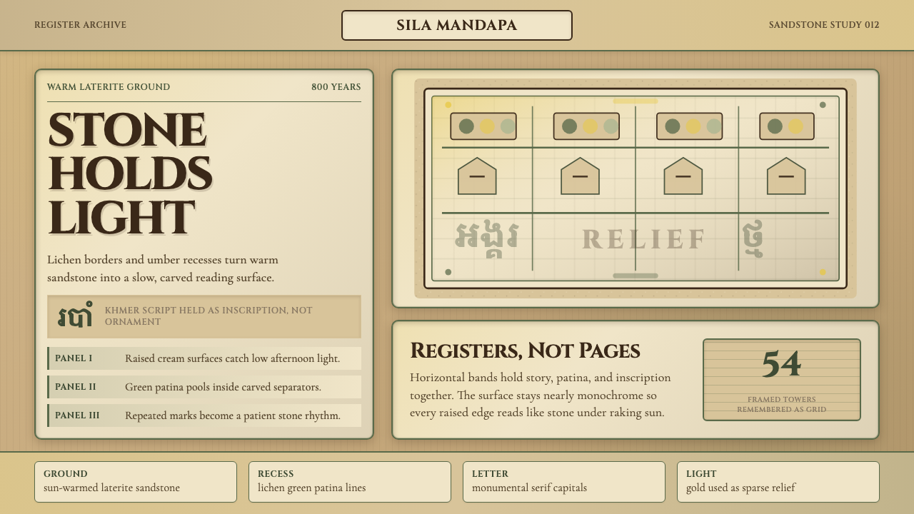 Khmer Apsara Relief (Bayon)Contemplative stone weight. Cinzel capitals sit on sandstone registers with l…
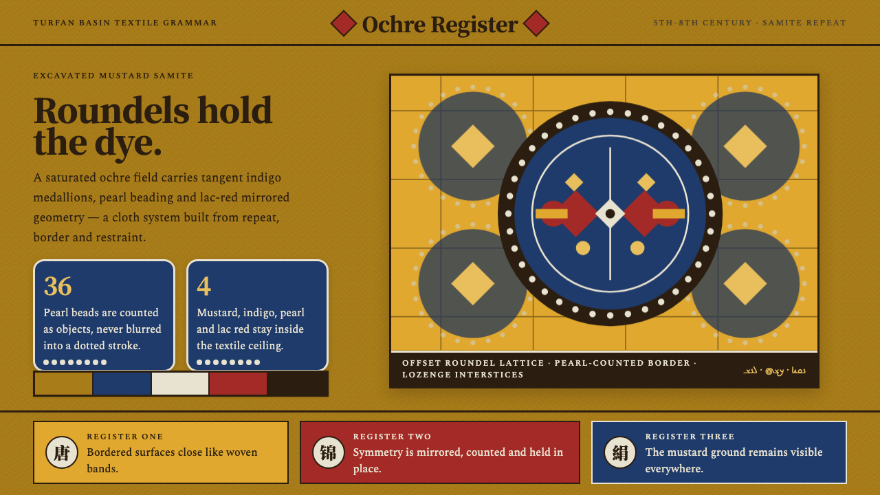 Astana Tomb SilksDye survives as structure. Mustard ground, indigo roundels and pearl beads lo…
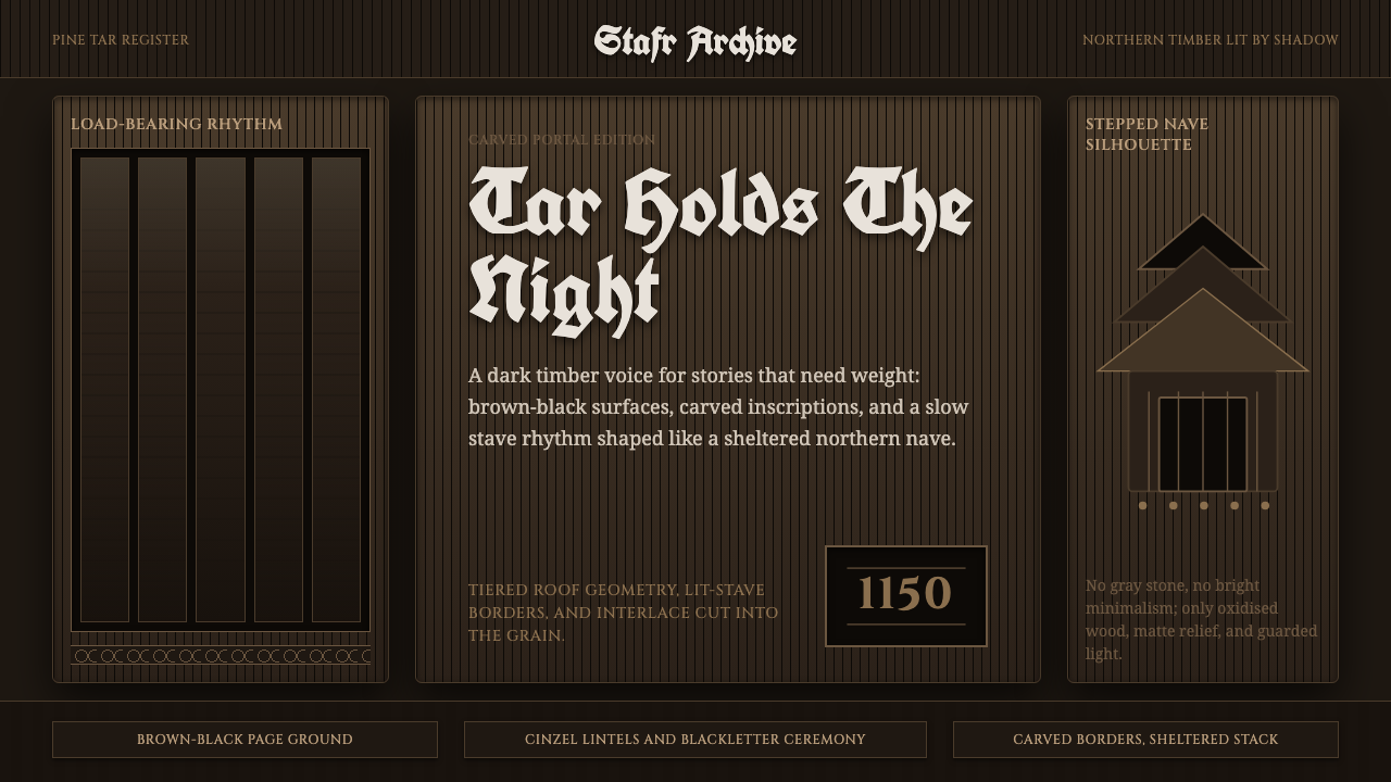 Norwegian Stave ChurchTar makes the sacred heavy. Brown-black fields, Cinzel inscriptions, tiered t…
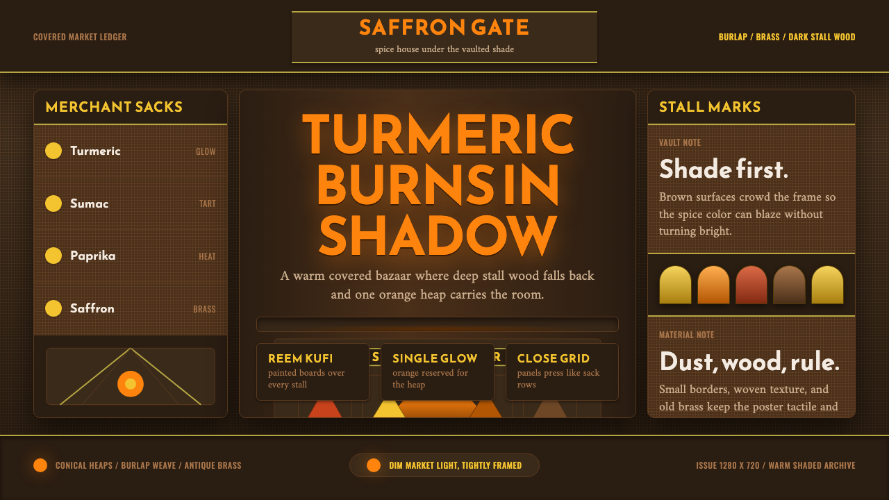 Spice Souk BazaarShade carries the heat. Turmeric orange glows through brown grids and Kufi si…
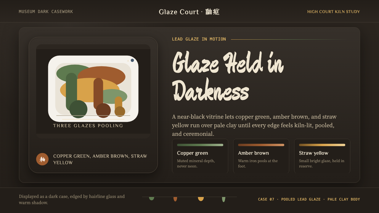 Tang Sancai 唐三彩Museum-dark and molten. Copper green, amber, and straw pools glow in bordered…