Design style guide设计风格指南
What is Qatari Souq Waqif Pearl Quarter?什么是 Qatari Souq Waqif Pearl Quarter?
Souq Waqif distills pre-oil Gulf commerce into a design language built from ochre plaster, sidr wood, indigo velvet, and the warm amber light of a lantern at dusk.瓦其夫集市将石油时代之前的海湾商贸文明,凝练为一套由赭石灰泥、棘枣木、靛蓝丝绒与黄昏灯笼琥珀光构成的设计语言。
Qatari Souq Waqif Pearl Quarter in briefQatari Souq Waqif Pearl Quarter 速览
The Qatari Souq Waqif Pearl Quarter style draws its visual logic from the restored merchant quarter of Doha — a labyrinthine market whose pre-oil typology of ochre plaster walls, studded wooden doors, and palm-frond ceilings survived into the twentieth century and was carefully rebuilt in the early 2000s. The aesthetic is warm, layered, and materially specific: every surface carries the weight of plaster and timber rather than the reflective neutrality of glass and chrome.卡塔尔瓦其夫集市珍珠区风格,其视觉逻辑源自多哈被修复的商业老区——一座迷宫般的市场,以赭石灰泥墙壁、铆钉木门与棕榈叶天花板为特征的石油前建筑类型,在二十世纪得以留存,并于2000年代初被精心重建。这套美学是温暖的、层叠的、有明确材料来源的:每一个界面都承载灰泥与木材的重量,而非玻璃与铬钢的反射中性。
At its core, this is a style about warmth made structural. The ochre ground is not a decorative choice but a material fact — the color of Gulf earth mixed into lime plaster under direct sun. Against it, sidr-brown woodwork reads as shadow and frame, while indigo and midnight blue emerge as the prestige accent, echoing the velvet trays on which pearl merchants displayed their wares. Brass geometry — lantern grilles, door studs, hinge plates — introduces metallic warmth without coolness or shine.这套风格的核心,是将温暖感转化为结构性力量。赭石色底面并非装饰选择,而是材料事实——海湾土地的颜色混入石灰灰泥,在直射阳光下形成的色相。在它的衬托下,棕枣木色的木作读取为阴影与框架,而靛蓝与午夜蓝则作为尊贵强调色浮现——呼应着珍珠商人铺陈珍珠时所用的丝绒托盘。黄铜几何——灯笼格栅、门扇铆钉、铰链板——引入金属温度,却无凉意与炫光。
The system sits between two traditions without fully belonging to either: it is too warm and ornamental for modernist minimalism, yet too structured and geometry-driven to be read as pure regional folk craft. It occupies the specific register of refined mercantile taste — the aesthetic sensibility of a trading civilization that valued quality materials, disciplined geometry, and the quiet luxury of a well-made object presented without ostentation.这套系统处于两种传统之间而不完全归属于任何一方:它对现代主义极简主义而言过于温暖与装饰性,对纯粹的地区民间工艺而言又过于结构化和几何驱动。它占据一个特定的审美区间——精炼的商贸品位,一个重视优质材料、严谨几何与低调呈现精良器物的贸易文明所形成的感知方式。
See the Qatari Souq Waqif Pearl Quarter design system →查看 Qatari Souq Waqif Pearl Quarter 完整设计系统 →
Where does Qatari Souq Waqif Pearl Quarter come from?Qatari Souq Waqif Pearl Quarter 从何而来?
The Souq Waqif — its name translates as the standing market, a reference to merchants who traded on foot rather than from fixed stalls — was the commercial center of Doha for generations before Qatar's oil economy transformed the city. The market's built form in the 1850s consisted of pearl-trader warehouses, falconer stalls, spice merchants, and textile dealers arranged around a central wadi. The architectural typology that served this commerce was practical and climatically intelligent: thick plaster walls moderated heat, projecting timber balconies created shade, and danchal ceilings of woven palm fronds allowed air circulation while filtering harsh Gulf sunlight into diffuse amber warmth.瓦其夫集市——其名意为「站立的市场」,指的是流动叫卖而非坐拥固定摊位的商人——在卡塔尔石油经济改变多哈面貌之前,数代人间一直是这座城市的商业中心。1850年代,市场的建筑形态由珍珠商人仓库、猎鹰摊位、香料商与布料商围绕中央旱沟排列而成。服务于这一商业活动的建筑类型兼具实用性与气候智慧:厚实灰泥墙调节热量,出挑的木质阳台制造荫蔽,棕榈叶编成的丹切尔天花板在促进空气流通的同时,将强烈的海湾阳光过滤为漫射的琥珀暖光。
The pearl trade, which sustained Qatar's economy from roughly the seventeenth century until the 1930s when Japanese cultured pearls collapsed the natural pearl market, left deep marks on the region's visual culture. Pearl diving required specialized vessels, tools, and equipment; the merchants who financed the fleets accumulated wealth that expressed itself in refined domestic and commercial interiors. The souq's aesthetic — the indigo velvet display cloth, the brass-fitted wooden chest, the oil lantern hanging from a carved bracket — is the material record of that mercantile prosperity.珍珠贸易从约十七世纪起支撑着卡塔尔的经济,直至1930年代日本养殖珍珠的兴起令天然珍珠市场崩溃。这一贸易在该地区视觉文化中留下深刻印记。采珠业需要专门的船只、工具与装备;为珠船提供资金的商人积累了财富,并将其表达于精致的室内与商业空间中。集市的美学——靛蓝丝绒展示布、镶黄铜配件的木箱、挂在雕花托架上的油灯——正是那段商贸繁荣的物质记录。
By the mid-twentieth century, Souq Waqif had deteriorated significantly, its original plaster and timber structures partially replaced with concrete. The restoration project, initiated under Sheikh Hassan bin Mohamed bin Ali Al Thani and carried out between approximately 2003 and 2008, was undertaken by architect Mohamed Ali Abdullah and his team with a commitment to recovering the pre-oil building typology rather than constructing a simulacrum. Issa Al-Mannai and Mohammed Faheem were among those involved in the documentation and reconstruction process. Original construction techniques were studied, artisans trained in traditional plastering and carpentry were employed, and the material palette was returned to ochre lime plaster, sidr wood, and hand-forged brass hardware.到二十世纪中期,瓦其夫集市已严重衰败,原有的灰泥与木材结构部分被混凝土替代。修复项目由谢赫·哈桑·本·穆罕默德·本·阿里·阿勒萨尼主导,大约在2003年至2008年间实施,由建筑师穆罕默德·阿里·阿卜杜拉及其团队承担,致力于恢复石油时代之前的建筑类型,而非建造一个仿制品。伊萨·阿尔-曼纳伊与穆罕默德·法希姆等人参与了文献整理与重建过程。项目研究了原始建造工艺,雇用了掌握传统灰泥抹面与木工技艺的工匠,并将材料色板恢复为赭石石灰灰泥、棘枣木与手工锻造的黄铜构件。
The restoration established the Souq Waqif quarter as the primary surviving demonstration of Qatari pre-oil mercantile architecture in an urban context, and the aesthetic it embodies — warm earth tones grounded in material authenticity, geometry drawn from Islamic decorative tradition, the specific drama of lantern light against plaster at dusk — became the visual reference point for a broader strand of Gulf design that seeks to preserve cultural continuity in the face of rapid modernization.这一修复工程将瓦其夫集市区确立为卡塔尔石油前商贸建筑在城市语境中最重要的现存样本,它所体现的美学——以材料真实性为根基的温暖大地色调、源自伊斯兰装饰传统的几何纹样、黄昏时分灯笼光映在灰泥上的特殊戏剧感——成为更广泛的海湾设计潮流的视觉参照点,这一潮流致力于在急速现代化的压力下保存文化延续性。
What defines the Qatari Souq Waqif Pearl Quarter look?Qatari Souq Waqif Pearl Quarter 的视觉特征是什么?
Color Palette色彩体系
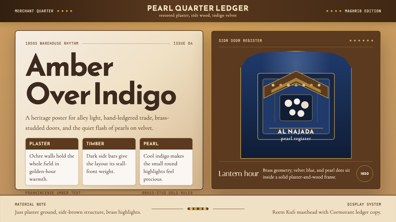
The palette anchors itself in ochre — a warm yellow-brown that reads as sunbaked earth — as its dominant ground tone, with sidr brown as the structural shadow and frame color. Against these two warm neutrals, indigo and deep midnight blue function as the prestige accent, rare enough to signal value. Brass and aged gold appear as metallic warmth within geometric motifs. Cream and aged parchment serve as reading surfaces. The palette avoids cool grays entirely; every neutral leans warm.这套色板以赭石色——一种温暖的黄棕色,读取为日晒土地的颜色——作为主导底面色,以棘枣木棕作为结构性阴影与框架色。在这两种温暖中性色的衬托下,靛蓝与深邃午夜蓝作为尊贵强调色,出现频率之低本身即传递价值。黄铜与做旧金色在几何纹样中引入金属温度。奶油色与做旧羊皮纸色服务于阅读界面。整套色板完全回避冷灰调;每一种中性色都偏暖。
Geometry and Pattern几何与纹样
Geometric decoration draws from the Islamic mashrabiya and muqarnas traditions: interlocking star polygons, arabesques resolved to their angular outlines, and lattice grilles that repeat at multiple scales. Critically, pattern in this system is always structural — it appears on surfaces that would otherwise need articulation (screens, door panels, ceiling coffers) rather than as applied decoration. Pattern density is high within its designated zones and absent outside them, creating a strong figure-ground contrast between ornamented and plain surfaces.几何装饰汲取自伊斯兰木格窗(mashrabiya)与钟乳石拱顶(muqarnas)传统:相互交错的星形多边形、被简化为棱角轮廓的阿拉伯蔓藤纹,以及在多个尺度上重复的格栅。关键在于,这套系统中的纹样始终是结构性的——它出现在否则需要有所表达的界面上(格栅屏风、门板、天花藻井),而非作为附加装饰。纹样在其指定区域内密度极高,在区域之外则完全缺席,在装饰面与素面之间创造出强烈的图底对比。
Texture and Material Surface质感与材料表面
Unlike flat digital or modernist aesthetics, this style is built on tactile surface variation. Lime plaster carries visible hand-troweled texture; wood grain is present and legible; woven palm fiber shows its interlace. In screen contexts, this translates to subtle surface treatments — a barely visible grain on background fields, a slight relief suggestion on panel borders — that carry material memory without becoming photorealistic simulation. Texture is implied rather than rendered, present as tone variation rather than elaborate effect.与平面数字美学或现代主义美学不同,这套风格建立在触感性的表面变化之上。石灰灰泥留有可见的手工抹刀痕迹;木纹清晰可辨;编织棕榈纤维展现其交织结构。在屏幕语境中,这转化为细微的表面处理——底面色域上隐约可见的纹理颗粒,面板边框上轻微的浮雕暗示——既承载材料记忆,又不沦为照片级模拟。质感是被暗示的而非被渲染的,以色调变化而非精密效果呈现。
Light and the Lantern Effect光线与灯笼效果
The defining atmospheric quality of this style is the lantern at dusk: a warm amber point source surrounded by a soft halo that bleeds into the surrounding ochre surface. This quality translates into a lighting vocabulary that favors warm glows rather than clean floods, halos around primary interactive elements rather than flat ambient fills, and shadow that is warm-toned rather than cool-gray. The visual system reads richest in conditions of moderate contrast — neither the flat-lit clarity of a noon marketplace nor the invisibility of full night, but the golden-hour interval between them.这套风格最具定义性的大气品质,是黄昏时分的灯笼:一个温暖的琥珀色点光源,被柔和的光晕所环绕,光晕向周围的赭石色表面渗透蔓延。这种品质转化为一套偏好温暖发光而非清冷泛光的照明词汇:主要交互元素的光晕而非平铺的环境光填充,暖色调而非冷灰色的阴影。这套视觉系统在中等对比度的条件下呈现最丰富的效果——既非午间集市的平光清晰,也非深夜的全然隐没,而是两者之间的黄金时段。
Typography Register字体排印基调
Type in this system tends toward generosity — open letterforms with ample interior space, set with comfortable line spacing, never compressed. The register is that of a merchant's handwritten ledger made formal: unhurried, legible, and projecting quiet confidence rather than urgency. In mixed Arabic and Latin contexts, the Arabic script's calligraphic weight should feel native rather than decorative, given equal visual authority to the Latin type rather than subordinated as ornament. Thin hairline type would feel anachronistic; bold slab or heavy geometric type would feel wrong in register; the appropriate weight sits comfortably in the middle.这套系统中的字体倾向于宽裕——内部空间充足的开放字形,以舒适的行距排列,从不压缩。基调如同商人手写账簿的正式化版本:从容、易读、投射出安静的自信而非紧迫感。在阿拉伯文与拉丁文混排的语境中,阿拉伯书法的字重应感觉是原生的而非装饰性的,与拉丁字体享有平等的视觉权威,而非被降格为点缀。纤细细线体会显得时代错乱;粗重粗衬线或粗重几何无衬线会显得基调失准;适宜的字重舒适地居于两者之间。
Ornament as Boundary, Not Fill装饰作为边界而非填充
The souq tradition does not ornament everything — it concentrates decoration at thresholds and transitions. Door frames are elaborated; walls are plain. Ceiling borders are patterned; ceiling fields are plain whitewash. This principle of threshold ornamentation provides a useful rule for screen design: decorative elements belong at the borders between zones (header-to-content, sidebar-to-main, section-to-section) rather than scattered throughout. The eye reads the border elaboration and understands the transition without needing explicit structural dividers.集市传统并不装饰一切——它将装饰集中于门槛与过渡处。门框被精心处理;墙面保持素净。天花边框有纹样;天花主体则是素白灰泥。这种「门槛装饰」原则为屏幕设计提供了一条有用的法则:装饰性元素属于区域之间的边界(页头与内容之间、侧边栏与主区域之间、段落与段落之间),而非散布全局。眼睛读取边界处的精心处理,无需明确的结构分隔线便能理解过渡。
Restraint in Precious Accent贵重强调的克制
The pearl, in this visual economy, is never abundant — it is singular, set against velvet, presented as the point of maximum attention in an otherwise spare composition. This translates to a principle of precious scarcity: the indigo accent, the brass detail, the ornamental motif should appear sparingly and with deliberate intention, each occurrence earning its presence. A layout that deploys indigo freely loses the prestige signal; a layout that reserves it for one or two moments per screen retains the mercantile logic of the original material culture.在这套视觉经济体中,珍珠从不丰沛——它是唯一的,安放在丝绒之上,呈现为一个在其他方面保持简朴的构图中最大注意力的焦点。这转化为一条「贵重稀缺」的原则:靛蓝强调色、黄铜细节、装饰性纹样应当稀少而有意识地出现,每次出现都以自身赢得存在的正当性。自由使用靛蓝的版面失去了尊贵信号;将其保留给每屏一两个时刻的版面,则保留了原始物质文化中商贸逻辑的精髓。
See the Qatari Souq Waqif Pearl Quarter design system →查看 Qatari Souq Waqif Pearl Quarter 完整设计系统 →
Who shaped Qatari Souq Waqif Pearl Quarter?谁塑造了 Qatari Souq Waqif Pearl Quarter?
The architect who led the physical restoration of Souq Waqif between roughly 2003 and 2008, Mohamed Ali Abdullah approached the project as an act of material recovery rather than historic pastiche. His team's commitment to pre-oil construction techniques — lime plaster over rubble masonry, sidr-wood carpentry, palm-frond danchal ceilings — established the definitive reference for what authentic pre-modern Qatari mercantile architecture looks like when executed with full material fidelity. The restored souq became the primary source material for this design system.建筑师穆罕默德·阿里·阿卜杜拉于约2003年至2008年间主导了瓦其夫集市的实体修复工程,他将这一项目视为材料层面的复原行动,而非历史仿制。他的团队对石油前建造技艺的坚守——碎石砌体上的石灰灰泥、棘枣木木工、棕榈叶丹切尔天花板——建立了真实的前现代卡塔尔商贸建筑在全材料还原状态下的权威参照。修复后的集市成为这套设计系统的首要素材来源。
The patron behind the Souq Waqif restoration initiative, Sheikh Hassan provided the institutional will and resources to undertake a project that prioritized cultural authenticity at significant cost and complexity. His role exemplifies the broader Qatar Museums Authority-era commitment to establishing a visual identity rooted in pre-oil Gulf heritage rather than generic Gulf modernism. Without institutional patronage of this scale, the souq's pre-oil typology would likely have been lost entirely to mid-century concrete replacement.作为瓦其夫集市修复项目的幕后推动者,谢赫·哈桑提供了机构意志与资源,支撑起一个以文化真实性为优先、代价高昂且复杂的项目。他的角色体现了卡塔尔博物馆管理局时代更广泛的承诺:以石油前海湾遗产而非通用的海湾现代主义为根基,确立一套视觉身份。若无这种规模的机构赞助,集市的石油前建筑类型很可能已被二十世纪中期的混凝土改建完全消除。
Mohammed Faheem contributed to the documentation and reconstruction process of the Souq Waqif project, working to ensure that the recovered building techniques and material specifications were recorded accurately. This documentation work is what allows the restoration to function as a reliable visual reference rather than an approximation — the specificity of the ochre plaster tone, the proportions of the sidr-wood balcony screens, and the geometry of the brass door hardware all have documented precedents in the project's archival record.穆罕默德·法希姆参与了瓦其夫集市项目的文献整理与重建工作,致力于确保被复原的建造技艺与材料规格得到准确记录。这项文献工作使得修复成果能够作为可靠的视觉参照,而非近似物——赭石灰泥色调的具体性、棘枣木阳台格栅的比例,以及黄铜门件的几何形式,都在项目档案记录中有据可查。
Involved in the Souq Waqif restoration alongside Faheem, Al-Mannai represented the expertise in traditional Gulf construction knowledge that made the project possible. The restoration's credibility rests on practitioners who understood both the historical typology from local knowledge and the practical requirements of adapting it to contemporary use — a balance between authenticity and function that the design system itself inherits. Their involvement ensured that the restored souq was a living market, not a museum exhibit.伊萨·阿尔-曼纳伊与法希姆共同参与了瓦其夫集市修复,代表着使这一项目得以实现的传统海湾建造知识专长。修复项目的可信度,有赖于既从本地知识理解历史建筑类型、又具备将其适应当代使用实践能力的从业者——这种真实性与功能性之间的平衡,正是这套设计系统所继承的品质。他们的参与确保了修复后的集市是一个活跃运转的市场,而非博物馆展品。
How do you use Qatari Souq Waqif Pearl Quarter today?今天怎么用 Qatari Souq Waqif Pearl Quarter?
The Souq Waqif Pearl Quarter style transfers most naturally to contexts that want to communicate warmth, craft quality, cultural specificity, and quiet luxury — premium hospitality, artisanal product brands, cultural institutions, travel and heritage platforms, and any project where the warmth of human making is a core value proposition. It is less suited to contexts requiring high-energy urgency, technical authority, or the cool neutrality of enterprise software.瓦其夫集市珍珠区风格最自然地转化于希望传达温暖感、工艺品质、文化特殊性与低调奢华的场景——高端酒店与餐饮、手工产品品牌、文化机构、旅行与遗产平台,以及任何以人工制造的温度为核心价值主张的项目。它不太适合需要高能量紧迫感、技术权威性或企业软件冷静中性气质的场景。
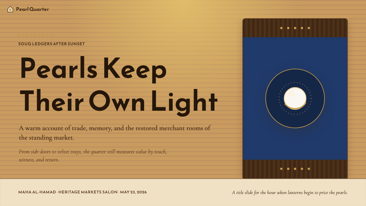
For presentation slides, the style works well on both cover and section divider pages. A cover framed in the ochre ground with a geometric mashrabiya motif concentrated in one corner and the title set in generous, unhurried type immediately reads as both premium and regionally grounded. Content slides should treat the ochre as a warm alternative to white, using sidr brown for structural lines and heading rules, reserving indigo exclusively for the single most important data point or call-out per slide. Avoid applying the geometric pattern as a background field — its density would compete with data; instead, use it as a narrow border or corner accent. Data charts should use the warm earth palette for series coloring, with brass-gold reserved for the primary series.在演示文稿中,这套风格尤其适合封面与章节分隔页。以赭石色为底,将几何木格窗纹样集中在一个角落,标题以宽裕从容的字体排列,这样的封面立即读取为既高端又有地域根基。内容页应将赭石色作为白色的温暖替代底面,以棘枣木棕作为结构线与标题规则,将靛蓝严格保留给每张幻灯片中最重要的那一个数据点或引用。避免将几何纹样用作背景填充——其密度会与数据产生竞争;应将其作为窄边框或角落点缀。数据图表应使用暖色大地色板为系列着色,黄铜金色保留给主系列。
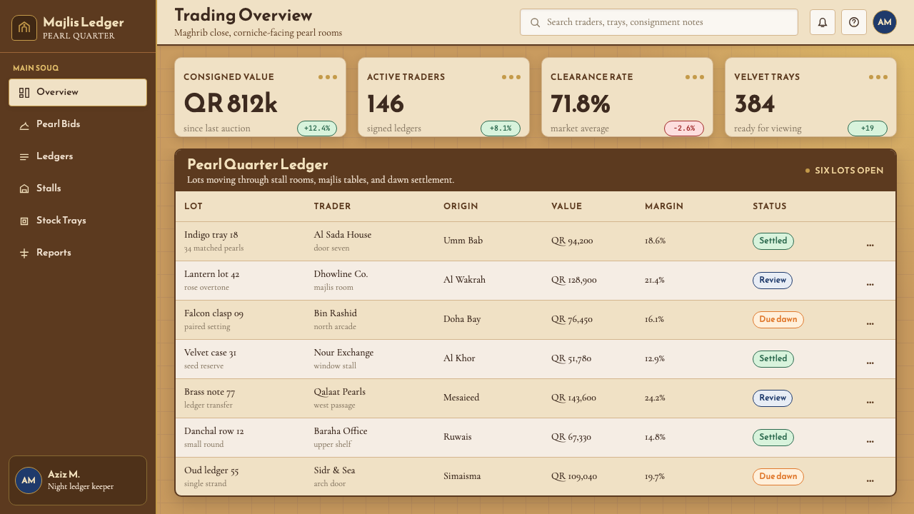
For web interfaces, this style suits editorial-forward layouts, cultural platform dashboards, and premium e-commerce product pages. The principle of threshold ornamentation translates directly to UI: section dividers can use a thin geometric rule or a brief repeating pattern segment rather than a plain line, navigation headers can carry a narrow pattern strip as their bottom border, and cards can use a warm-toned shadow rather than a cool-gray drop shadow. Interactive states should use the indigo accent — it is striking enough against ochre to signal affordance clearly without needing additional animation. Background fields should stay in the cream-to-ochre range; pure white would feel too clinical and break the material warmth.对于网页界面,这套风格适合编辑导向的版面、文化平台仪表板以及高端电商产品页面。「门槛装饰」原则直接转化为界面设计语言:区段分隔线可以使用细小的几何规则或一段简短的重复纹样,而非素净直线;导航页头可以用一条窄纹样条纹作为下边框;卡片可以使用暖色调阴影而非冷灰色投影。交互状态应使用靛蓝强调色——它在赭石底面上足够醒目,无需额外动画即可清晰传达可操作性。背景色域应保持在奶油色到赭石色的范围内;纯白色会显得过于临床化,破坏材料温度感。
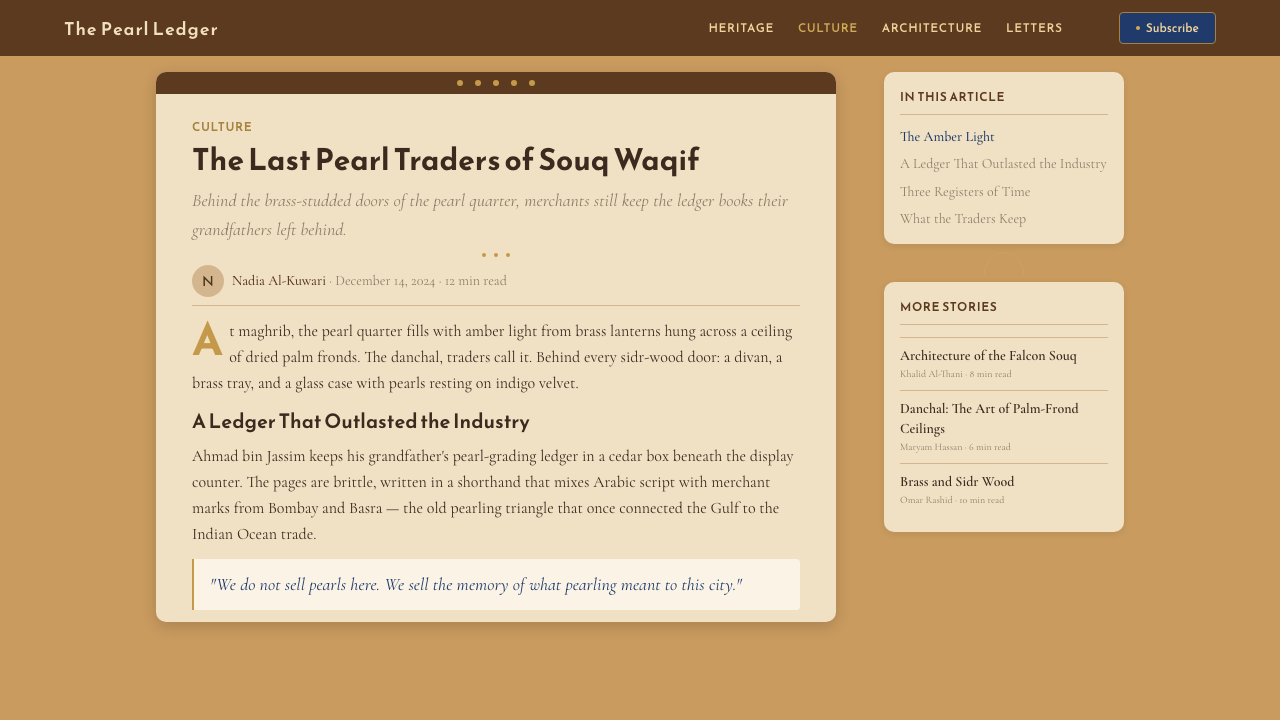
For editorial and marketing work, the style supports rich, layered compositions in which type, pattern, and atmospheric photography coexist. A marketing hero section works well with a full-bleed photography background desaturated toward warm amber tones, overlaid by a semi-opaque ochre wash, with geometric pattern elements framing the central content area. Marketing copy in this register should feel unhurried and confident — short declarative sentences with room to breathe, not stacked bullet lists. The indigo accent should appear exactly once in a hero composition, on the primary call-to-action element, never repeated elsewhere on the same screen.对于编辑与营销内容,这套风格支持文字、纹样与大气摄影共存的丰富分层构图。营销主视觉区域适合全出血的摄影背景,向暖琥珀调去饱和,叠加半透明的赭石色洗,以几何纹样元素框定核心内容区。这一基调下的营销文案应感觉从容而自信——简短的陈述句搭配充足的呼吸空间,而非堆叠的项目符号列表。靛蓝强调色在主视觉构图中应恰好出现一次,在主要行动号召元素上,同一屏幕内不在其他位置重复。
A common mistake is applying this style by layering pattern everywhere and calling the result Arabian-inspired. Authentic execution requires precisely the opposite discipline: pattern is precious and concentrated at thresholds, while the majority of surfaces remain warm and plain. A second common error is substituting any warm yellow-brown for the specific ochre character — a golden yellow reads as festive, a beige reads as bland, and neither carries the solar, earthen quality of the original material. The third error is using cool-gray shadows, which immediately break the warmth logic of the entire palette. Every shadow in this system should lean warm.一个常见错误是通过在各处叠加纹样来应用这套风格,并将结果称为「阿拉伯风格」。真实的执行需要恰恰相反的纪律:纹样是珍贵的,集中于边界处,而大多数表面保持温暖素净。第二个常见错误是以任何暖黄棕色替代赭石色的特定品质——金黄色读取为节庆,米色读取为平淡,两者都无法承载原始材料那种太阳晒过的土地质感。第三个错误是使用冷灰色阴影,这会立即破坏整套色板的温暖逻辑。这套系统中的每一处阴影都应偏暖。
See the Qatari Souq Waqif Pearl Quarter design system →查看 Qatari Souq Waqif Pearl Quarter 完整设计系统 →
Qatari Souq Waqif Pearl Quarter — FAQQatari Souq Waqif Pearl Quarter · 常见问题
How does this style differ from generic Middle Eastern or Arabian aesthetics?这套风格与通用的中东或阿拉伯美学有何不同?
Generic Arabian-inspired design typically leans on heavy ornamental pattern, gold and jewel tones, and a maximalist approach to decoration that treats the entire surface as an opportunity for embellishment. The Souq Waqif system is more restrained and materially specific: it derives from a particular Qatari mercantile building tradition rather than a pan-regional decorative vocabulary, and its essential quality is warmth grounded in specific materials — ochre lime plaster, sidr wood, palm fiber — rather than ornamental density. The style is also architecturally motivated: its pattern appears where the building's structural logic demands articulation, not as applied decoration. Using it well requires understanding this restraint.通用的阿拉伯灵感设计通常倚重繁密的装饰纹样、金色与宝石色调,以及将整个表面视为装饰机会的极繁主义手法。瓦其夫集市系统则更为克制,材料来源也更为具体:它源自特定的卡塔尔商贸建筑传统,而非跨地区的装饰词汇,其本质品质是基于特定材料的温暖感——赭石石灰灰泥、棘枣木、棕榈纤维——而非装饰密度。这套风格也是建筑驱动的:其纹样出现在建筑结构逻辑要求有所表达的地方,而非附加装饰。善用它需要理解这种克制。
Can this style work for dark-mode or dark-background applications?这套风格能用于深色模式或深色背景的应用吗?
A dark inversion is possible but requires careful calibration. The natural dark analogue to ochre-on-cream is not a simple color inversion but rather a shift toward the night-souq register: a deep warm near-black ground (not pure black — it reads too neutral) with ochre used sparingly as the primary surface accent, and indigo promoted to a more prominent role as a structural mid-tone. Brass and gold motifs read particularly well against dark warm grounds. The lantern-glow vocabulary of warm amber halos becomes even more literal in dark mode, which suits it naturally. The main risk is losing the texture contrast that makes the light-mode version feel materially rich; the dark version needs surface treatments that maintain that tactile quality.深色反转是可行的,但需要仔细校准。赭石底面的自然深色对应物并非简单的颜色反转,而是向夜间集市的基调转移:以深沉温暖的近黑色作为底面(不是纯黑色——那读起来过于中性),以赭石色节制地用于主要表面强调,靛蓝则升格为更突出的结构中间调。黄铜与金色纹样在深色暖底面上的表现尤为出色。温暖琥珀色光晕的灯笼发光词汇在深色模式下变得更加字面化,这种模式天然契合它。主要风险是失去浅色模式中赋予其材料丰富感的质感对比;深色版本需要维持这种触感品质的表面处理。
Is this style appropriate for technology or software products?这套风格适合科技或软件产品吗?
It depends entirely on what the technology product is trying to communicate. For a travel app, a heritage platform, an artisanal marketplace, or a hospitality booking interface, this style can be highly effective — it adds warmth and cultural specificity that cold technology aesthetics rarely achieve. For developer tools, data analytics platforms, enterprise software, or any context where users need to project rational authority and technical precision, the style creates tension: its warmth signals the opposite of machine efficiency. The key test is whether the product's core value proposition includes warmth and material quality, or whether those qualities are irrelevant or actively counterproductive to user trust.这完全取决于科技产品希望传达什么。对于旅行应用、遗产平台、手工艺品市集或酒店预订界面,这套风格可以非常有效——它引入了冷静的科技美学极少能达到的温暖感与文化特殊性。对于开发者工具、数据分析平台、企业软件,或任何用户需要投射理性权威与技术精确性的场景,这套风格制造张力:它的温暖感传递的信号与机器效率相反。关键测试是:产品的核心价值主张是否包括温暖感与材料品质,或者这些品质对用户信任而言无关紧要甚至适得其反。
How should Arabic script be treated within this design system?在这套设计系统中,阿拉伯文应如何处理?
Arabic script is not an optional or decorative addition in this system — it is native to the cultural tradition the style draws from. When used in bilingual contexts, Arabic should be treated with full visual authority: sized and weighted to match the Latin type in visual presence, laid out in its own correct right-to-left reading direction without being subordinated to a Latin layout logic. The calligraphic tradition of Gulf Arabic script, which tends toward rounded Naskh or Thuluth forms, has its own warmth and flow that complements this style's register well. Avoid treating Arabic as a logo-like wordmark while Latin carries the running text, or using stylized calligraphy as pure decoration detached from readable meaning.在这套系统中,阿拉伯文不是可选的装饰性添加物——它是这套风格所汲取的文化传统的原生语言。在双语语境中,阿拉伯文应享有完整的视觉权威:字号与字重应在视觉存在感上与拉丁字体相匹配,以其自身正确的从右到左阅读方向排列,不被从属于拉丁版面逻辑。海湾阿拉伯语书法传统偏向圆润的纳斯赫体或苏鲁斯体,具有其自身的温度与流动感,与这套风格的基调高度契合。避免将阿拉伯文作为标志性词标处理而由拉丁文承担正文内容,或将程式化书法用作脱离可读意义的纯装饰。
What distinguishes the pearl-trade visual references from generic luxury cues?珍珠贸易的视觉参照与通用奢侈品符号有何不同?
Generic luxury design tends toward cool metals (platinum, silver, brushed aluminum), pure white or near-black grounds, and the minimal-clean vocabulary associated with European high fashion or Swiss watchmaking. The pearl-trade reference in this system is warm rather than cool, earthy rather than pristine, and its luxury signal comes from material specificity and restraint in deployment rather than from high-contrast minimalism. A pearl on indigo velvet reads as precious because of the velvet's depth and the singular focus on the object — not because the composition is stripped bare. This is abundance through quality and concentration, not scarcity through reduction.通用奢侈品设计倾向于冷色金属(铂金、银、拉丝铝)、纯白或近黑底面,以及与欧洲高级时装或瑞士制表相关联的极简整洁词汇。这套系统中的珍珠贸易参照是温暖而非冷静的,是土地质感而非纯净无瑕的,其奢华信号来自材料的特殊性与使用上的克制,而非来自高对比度的极简主义。珍珠安放在靛蓝丝绒上,之所以读取为珍贵,是因为丝绒的深度与对这件器物的专注聚焦——而不是因为构图被剥离得一无所有。这是通过品质与专注而得的丰盈,而非通过削减而得的稀缺。
Related design styles相关设计风格
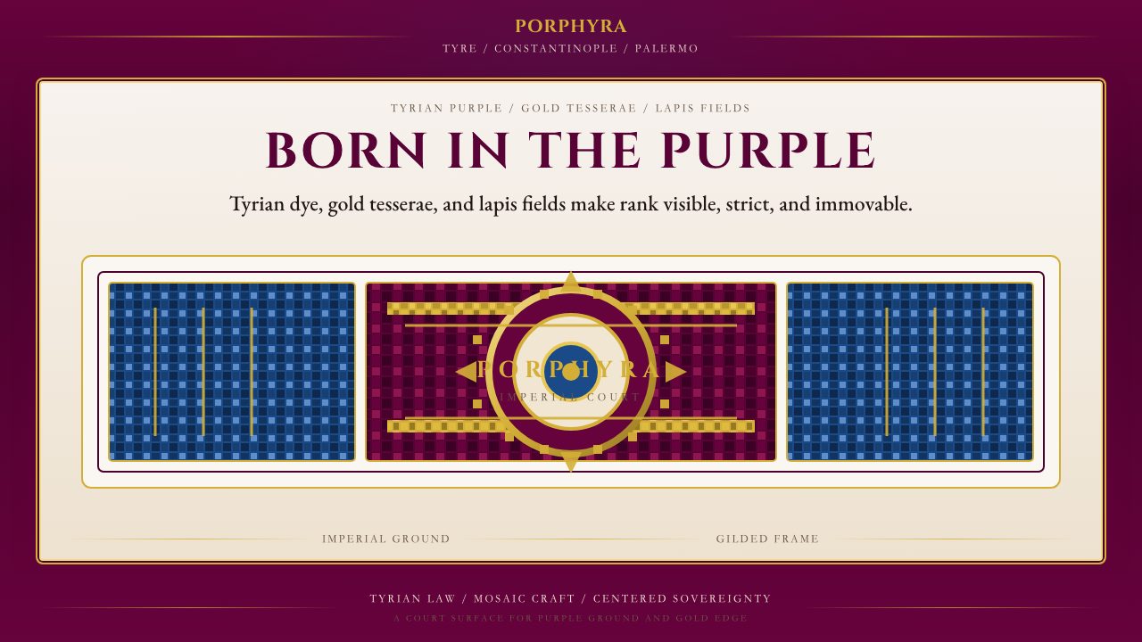 Byzantine Tyrian Purple (Imperial Court)Imperial rank made visible. Tyrian purple, gold tesserae, and centered symmet…帝国权威可见化:泰尔紫、金镶嵌与居中对称。
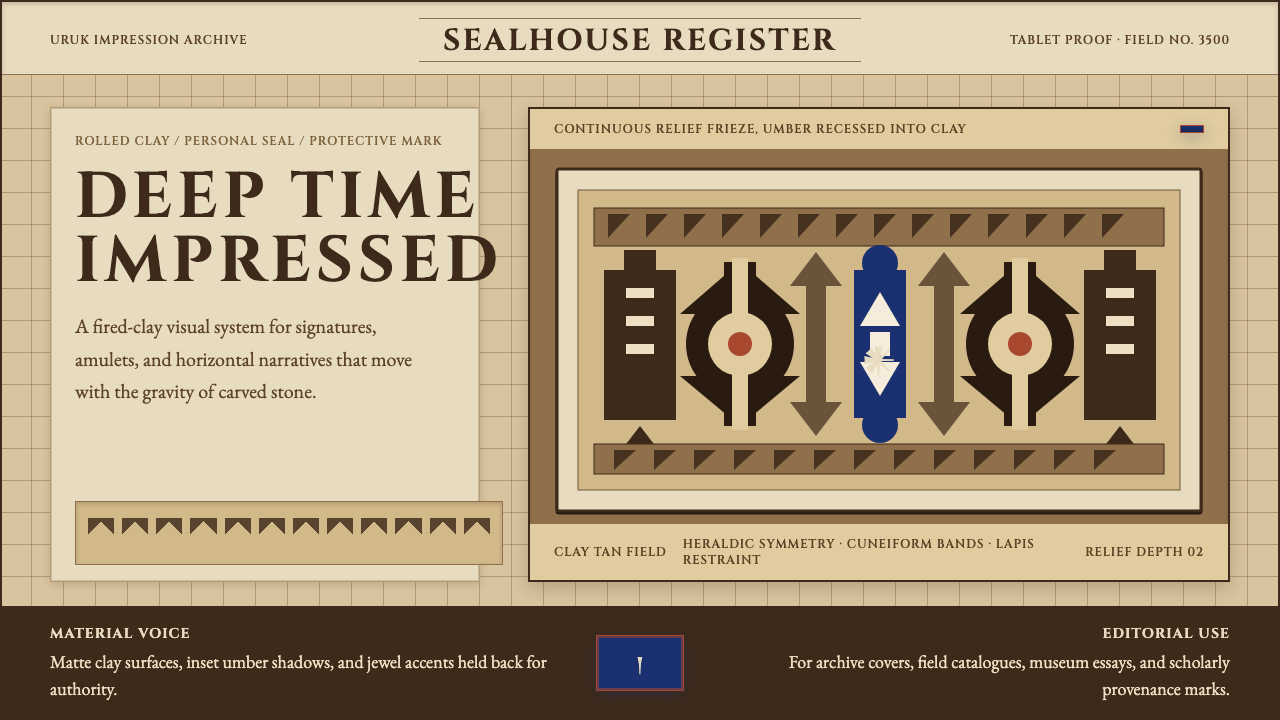
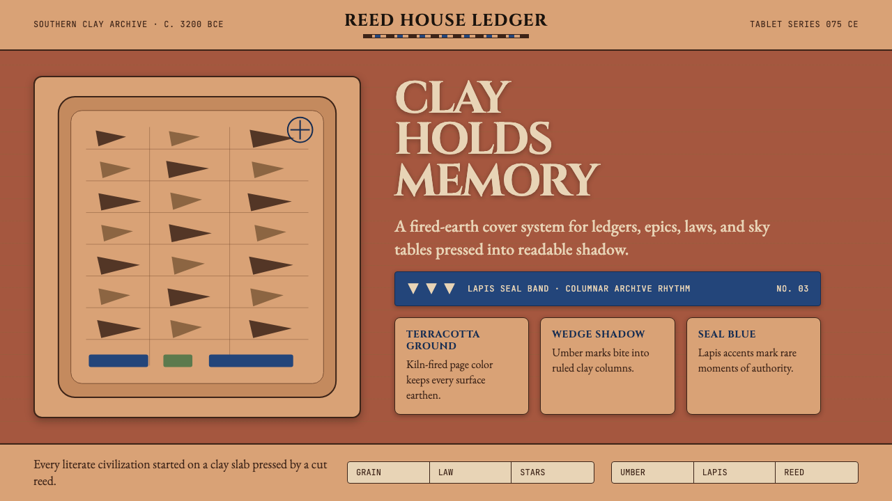 Mesopotamian Cuneiform TabletsWritten memory feels fired. Terracotta, umber wedges, and lapis bands build t…书写记忆如烧陶:赤陶底、深棕楔痕与青金石蓝带构成档案感。
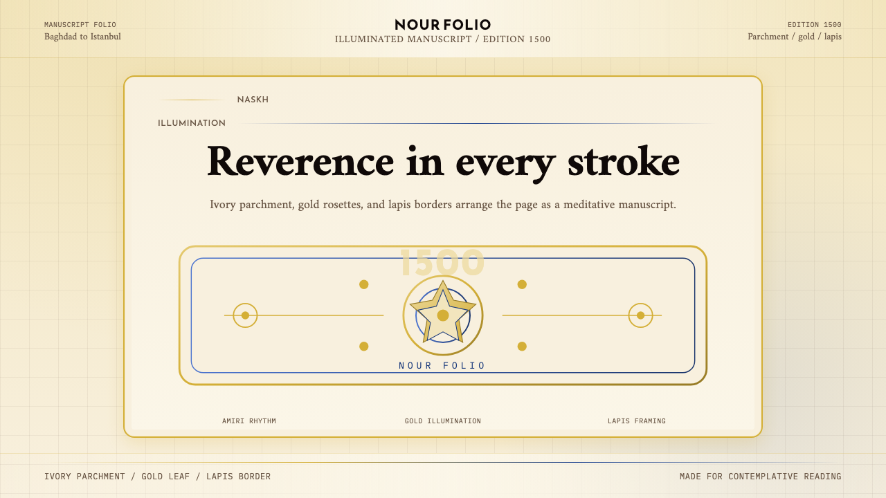 Naskh Quranic (1500)Reverence in every stroke. Ivory parchment, gold rosettes, and lapis framing.每一笔都庄重。象牙纸、金箔花饰与青金石边框。
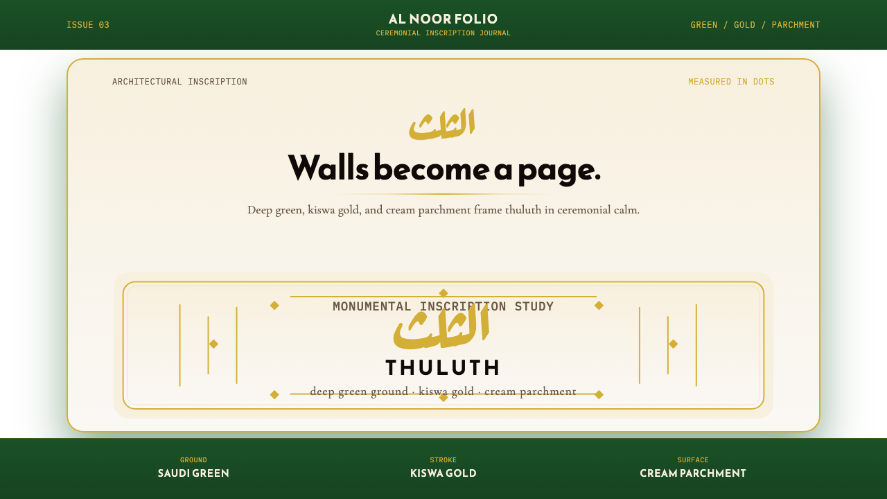 Saudi Thuluth CalligraphyMonumental calm in gold. Deep green, thuluth type, and cream parchment symmet…金色庄严。深绿底、苏鲁斯体与奶油纸面形成对称构图。
 Sumerian Cylinder SealAncient weight, pressed in clay. Cinzel caps and cuneiform wedges cut umber i…古老而沉重。Cinzel 大写与楔形纹把深褐压入陶土。
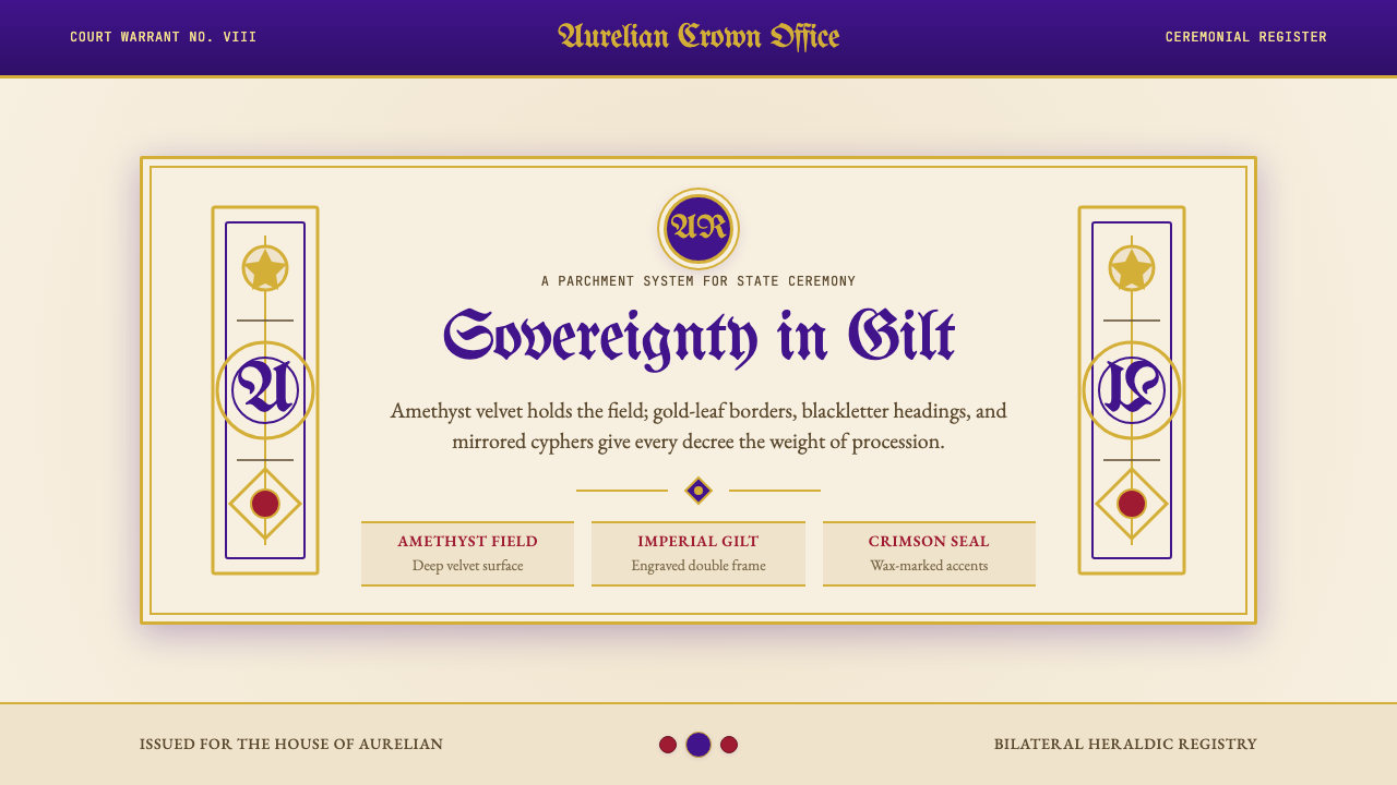 British Royal MonarchyCeremony becomes structure. Amethyst panels, gilt borders, blackletter, mirro…仪式成为结构:紫晶面板、鎏金边框、哥特黑体与镜像纹章。