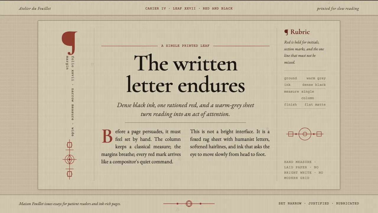
About Garamond Old-Style French Serif
Garamond is the archetypal French humanist Old-Style serif, cut by Claude Garamont in Paris in the 1530s and codified in the 1592 Egenolff-Berner specimen. Its structure is calligraphic and pen-drawn — inclined oblique stress, a small aperture, letters that read as written before they were cut. This system dresses those forms in their authentic ground: aged laid rag book paper, a muted foxed warm-grey sheet darker than fresh cream, printed in dense black ink with rubricated red for initials and section marks. The page is a single justified column with wide margins, drop initials and running heads — a Renaissance leaf, not a webpage pretending to be one.
- Origin
- Paris, France (French Renaissance printing)
- Era
- romans cut mid-1530s–1540s; definitive Berner specimen composed 1592
- Key figures
- Claude Garamont · Egenolff-Berner foundry
- Movements
- French humanist Old-Style serif · Renaissance red-and-black printing
Garamond Old-Style French Serif design spec
Colors
Typography
The other 11 sections — buttons, cards, spacing, motion, techniques and more — open once you unlock. Download the DESIGN.md or send it to your AI in one click. Unlock once, yours forever.
Sign up nowStyles similar to Garamond Old-Style French Serif
Also inspired by print & type, with a close feel.
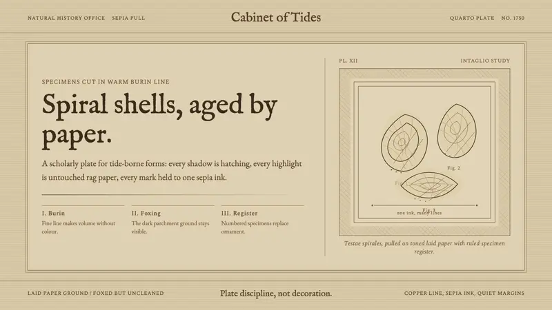 Conchology Shell PlateAged paper is the hero. Sepia Fell type and burin spirals make science feel antique.
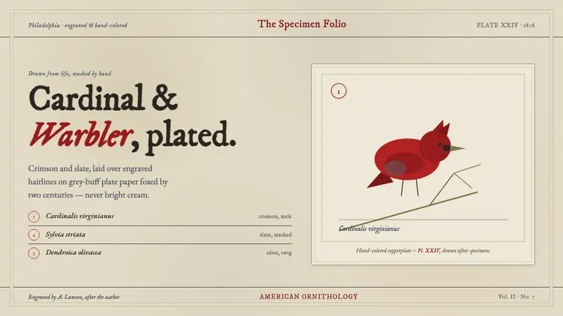 Wilson Ornithology PlateAn 1808 ornithology plate reborn. Cardinal crimson and slate, washed over engraving on foxed paper.
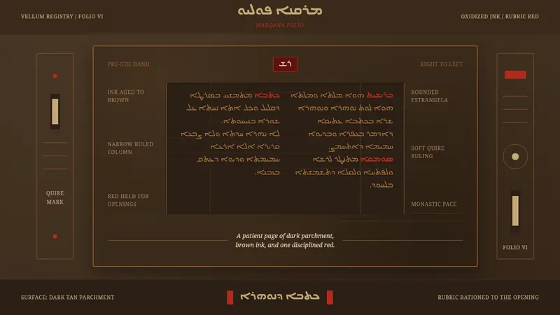 Syriac EstrangelaAncient warmth survives. Brown parchment, right-to-left columns, rationed rubric red.
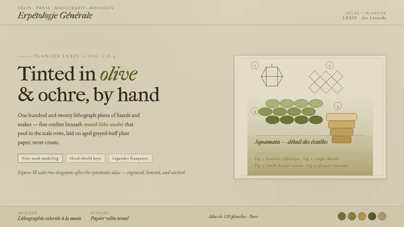 Herpetology Scale PlateA 19th-century herpetology atlas, digitized. Olive-and-ochre litho washes on buff plate paper.