What is Caslon English Text Serif?
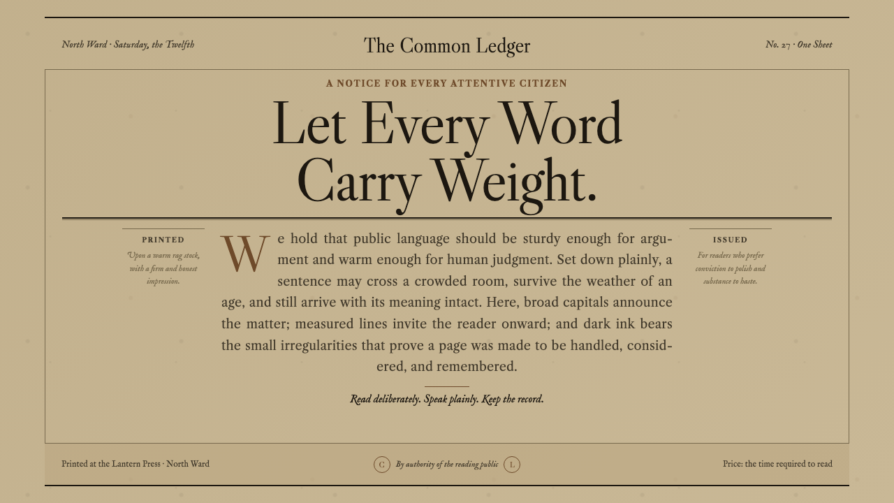
Caslon gives authority a human temperature — sturdy English serif capitals, period-black ink, and a weathered amber-grey sheet that makes every heading feel pressed into history.
Caslon English Text Serif in brief
Caslon English Text Serif is built around the sturdy, warm English Old-Style serif cut by William Caslon I in London from 1722. Its character is neither courtly ornament nor modern neutrality. The letters feel made for the press: substantial without heaviness, formal without becoming remote, and shaped to hold their authority even when printed in dense passages. The old printers’ maxim, When in doubt, use Caslon, captures the face’s central promise: dependable judgment with a distinct human grain.
The system’s visual world begins with the sheet rather than the screen. A tanned rag paper, darkened across centuries into muted amber-grey, carries period-black ink with enough bite to feel impressed rather than merely displayed. Engraved rules divide the field with the severity of a printed form, while Caslon capitals rise above the page as proclamations. The result is deliberately not cream-white, pure white, or digital beige. It is the color of an old notice that has remained legible because its material was built to endure.
Caslon works through the tension between warmth and authority. Its serif forms make long reading feel grounded, while its capitals create a public voice suited to declarations, titles, and formal announcements. The style does not imitate age through random distress or nostalgic decoration. It constructs a coherent print language: paper establishes time, ink establishes force, rules establish order, and typography establishes rank. Read together, these elements make a page feel like a document with consequences rather than a webpage asking for attention.

Where does Caslon English Text Serif come from?
The history of this style begins in London with William Caslon I and the first sizes of his English Old-Style serif in 1722. The supplied record places Caslon inside the world of the foundry and the press, where letterforms were not neutral containers but physical instruments for making language durable. His face became associated with a practical confidence: when a printer needed a typeface that could carry authority without theatrical excess, Caslon was the settled choice.
A foundry specimen sheet from 1734 marks an important stage in that history. A specimen is not simply a catalogue of letters; it presents the face as a working system, showing how its forms behave when arranged, repeated, and compared. That idea matters to the contemporary reconstruction. Caslon English Text Serif is not treated as an isolated font selection. It is treated as a complete typographic environment in which capitals, text, rules, ink, and paper cooperate to produce the feeling of a printed proclamation.
The style’s second historical coordinate is Revolutionary Philadelphia and the colonial American letterpress. The most famous impression associated with Caslon is the Dunlap Broadside, the first printed Declaration of Independence, produced in Philadelphia in July 1776. That connection gives the face a particular public charge. Caslon is not merely old English type transplanted into an antique interface; it is also part of a colonial American printing memory in which the page carried civic urgency and circulated words meant to be read beyond a private room.
This system rebuilds those conditions as a visual ground. The amber-grey rag sheet suggests a document preserved through use, while period-black ink and engraved rules keep the page disciplined rather than picturesque. The dramatic hierarchy of display capitals recalls the broadside’s public address, but the surrounding text remains sturdy and readable. The result belongs to the historical line of English Old-Style serif and colonial American letterpress without pretending to reproduce a particular surviving sheet.
What defines the Caslon English Text Serif look?
Caslon Letterforms
The letterforms are sturdy, warm, and unmistakably old-style. Serifs give the text a settled base, while the overall drawing retains enough softness to avoid bureaucratic coldness. Caslon should feel cut and pressed, not mechanically assembled. Its authority comes from proportion, rhythm, and accumulated trust rather than from exaggerated weight.
Display Capitals
Capitals carry the public voice of the system. They should read as proclamation, title, or formal announcement, with enough presence to organize the page before the reader reaches the body text. Their scale may be dramatic, but the effect must remain typographic rather than theatrical: the letters command because they belong to a document with purpose.
Amber-Grey Paper
The ground is a weathered rag sheet darkened into muted amber-grey. This is not a decorative cream background and not a neutral white canvas. It gives every mark a material context, softens the contrast without weakening legibility, and makes the page feel preserved rather than freshly rendered. The sheet is the first historical signal the reader encounters.
Period-Black Ink
Black is not merely a text color here; it is ink with bite. The darkest marks should feel pressed into the sheet and capable of surviving handling. This creates a firm counterweight to the warm paper. The relationship is less about stark digital contrast than about the meeting of a dark, decisive impression with a ground that has gathered time.
Engraved Rules
Rules divide the page with the authority of a printed form. They are structural marks, not ornamental flourishes: they separate a heading from its evidence, a statement from its supporting detail, or one section of a broadside from another. Their engraved character should remain precise and restrained, allowing the paper and type to carry the atmosphere.
Document Hierarchy
The hierarchy moves from proclamation to explanation. Large capitals establish the public statement, rules clarify its boundaries, and sturdy text supplies the reading body. Every level should feel like part of the same printed artifact. The design becomes convincing when hierarchy is created by typographic authority and spatial pause rather than by many competing colors or interface effects.

Who shaped Caslon English Text Serif?
William Caslon I cut the English Old-Style serif in London from 1722, establishing the letterform foundation on which this system rests. His importance here is not only historical authorship but the practical confidence attached to the face: Caslon became the type printers reached for when they needed dependable authority, warmth, and legibility in the same impression.
John Dunlap is associated with the Dunlap Broadside, the first printed Declaration of Independence, produced in Philadelphia in July 1776. His place in this system connects Caslon’s English foundry origin to colonial American letterpress and gives the typeface a public, civic register rather than leaving it as a purely English historical reference.
The Dunlap Broadside is the system’s most important printed reference: a wide public sheet whose association with the Declaration of Independence turns typography into an instrument of announcement. Its legacy explains the emphasis on dramatic capitals, disciplined rules, dark ink, and a paper ground that feels capable of carrying consequential language.
English Old-Style serif names the movement and typographic lineage surrounding Caslon. In this system it means more than using a serif font: it means preserving a sense of cut metal, printed pressure, sturdy reading texture, and formal continuity. The movement supplies the historical grammar through which the paper, ink, capitals, and rules remain coherent.
How do you use Caslon English Text Serif today?
Caslon is most convincing when treated as a document system rather than as an antique filter. Start with the ground, establish the dark ink, then let the type create authority through contrast between display capitals and sturdy reading text. The style benefits from restraint: a narrow reading measure, generous pauses around major statements, and rules used only where a printed document would need a visible boundary.
For presentation slides, the cover should behave like a broadside. Use a weathered amber-grey field, a commanding capitalized title, and a small number of engraved rules to establish the page as an announcement. Content slides should reduce the drama without abandoning the voice: Caslon text carries the argument, headings remain formal, and the paper ground keeps every slide within the same printed world. Data slides can use rules, labels, and strong typographic grouping to make information feel recorded and issued rather than displayed as a software dashboard.
For web interfaces, the style suits dashboards and pricing pages that need trust, record, or institutional warmth. Use the amber-grey ground as the persistent context, period-black for essential text, and Caslon capitals for page-level announcements or category names. Cards should feel like set pieces on a printed sheet rather than floating glass surfaces. Tables, price summaries, and status notes benefit from clear rules and generous spacing, while interaction should remain quiet enough that the document-like hierarchy survives.
For editorial and marketing work, Caslon supports announcements, cultural programs, publishing, archival products, historical organizations, and brands that want authority without corporate chill. A feature page can place a proclamation-like title against a broad sheet, follow it with dense but readable text, and use engraved rules to mark transitions. Marketing copy works best when it sounds declarative and specific. The style’s power comes from making a modest statement feel officially printed, not from adding decorative nostalgia around it.
The common mistake is confusing historical atmosphere with sepia decoration. A tan background, a serif font, and a few ornamental lines do not create Caslon English Text Serif if the hierarchy remains casual or the page behaves like a contemporary interface underneath. Another mistake is making every heading enormous and every line equally dark. The system needs contrast: capitals announce, rules separate, body text explains, and the paper gives all of them a shared material home.

Caslon English Text Serif — FAQ
Is Caslon English Text Serif simply an old-fashioned serif style?
No. Its historical basis is the English Old-Style serif cut by William Caslon I from 1722, but the system depends on more than age cues. The warm letterforms, period-black ink, amber-grey rag sheet, engraved rules, and proclamation-like hierarchy must work together. Remove that relationship and the result becomes generic vintage styling rather than a coherent Caslon print language.
Why is the paper ground so important?
Because the style’s authority is material as well as typographic. A pure white ground makes the page feel newly rendered, while the amber-grey rag sheet suggests a document that has passed through time and handling. The paper also balances the darkness of the ink, keeping the composition warm without making it soft. It establishes the historical condition before the reader interprets a single word.
Can this style be used for modern dashboards and pricing pages?
Yes, when the product benefits from trust, record, and institutional warmth. Caslon can make pricing tiers, tables, notices, and summaries feel deliberate and accountable. It works less well when the interface depends on glossy futurism, playful informality, or a very dark visual field. The important point is to translate the document logic into interaction rather than merely placing a vintage typeface on modern cards.
How should the capitals relate to the body text?
Capitals should announce; body text should explain. The title may be dramatic and formal, but the paragraphs need the sturdy, warm texture that makes Caslon useful for sustained reading. Rules can clarify the boundary between the two. If every element speaks with the same volume, the page loses its document hierarchy and begins to feel like a poster made entirely of headlines.
What is the biggest mistake when applying the style?
The biggest mistake is treating age as a surface effect. Random stains, excessive ornament, weak hierarchy, or a generic brown palette can make a page look nostalgic while losing Caslon’s sturdy authority. The system should feel printed because its material ground, ink, rules, and typography agree. It should never feel old merely because it has been decorated to look old.
Related design styles
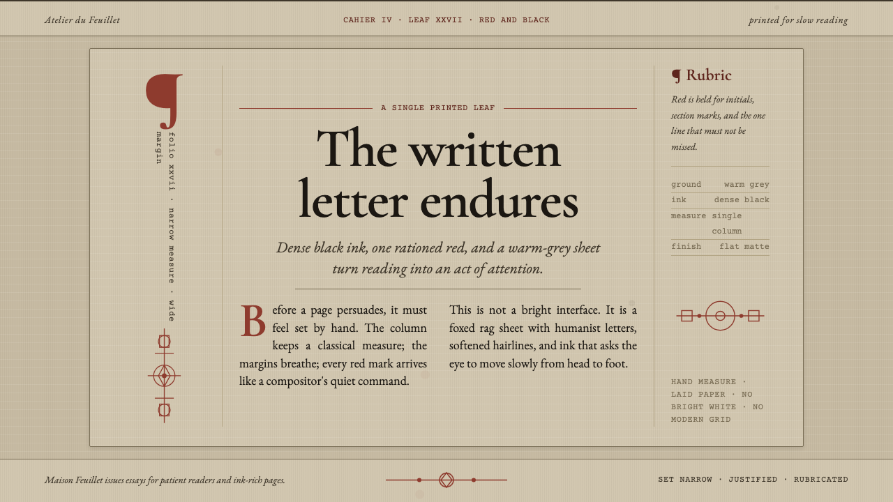 Garamond Old-Style French SerifInk ages with grace. Warm-grey rag paper, Garamond columns, and red rubric ma…
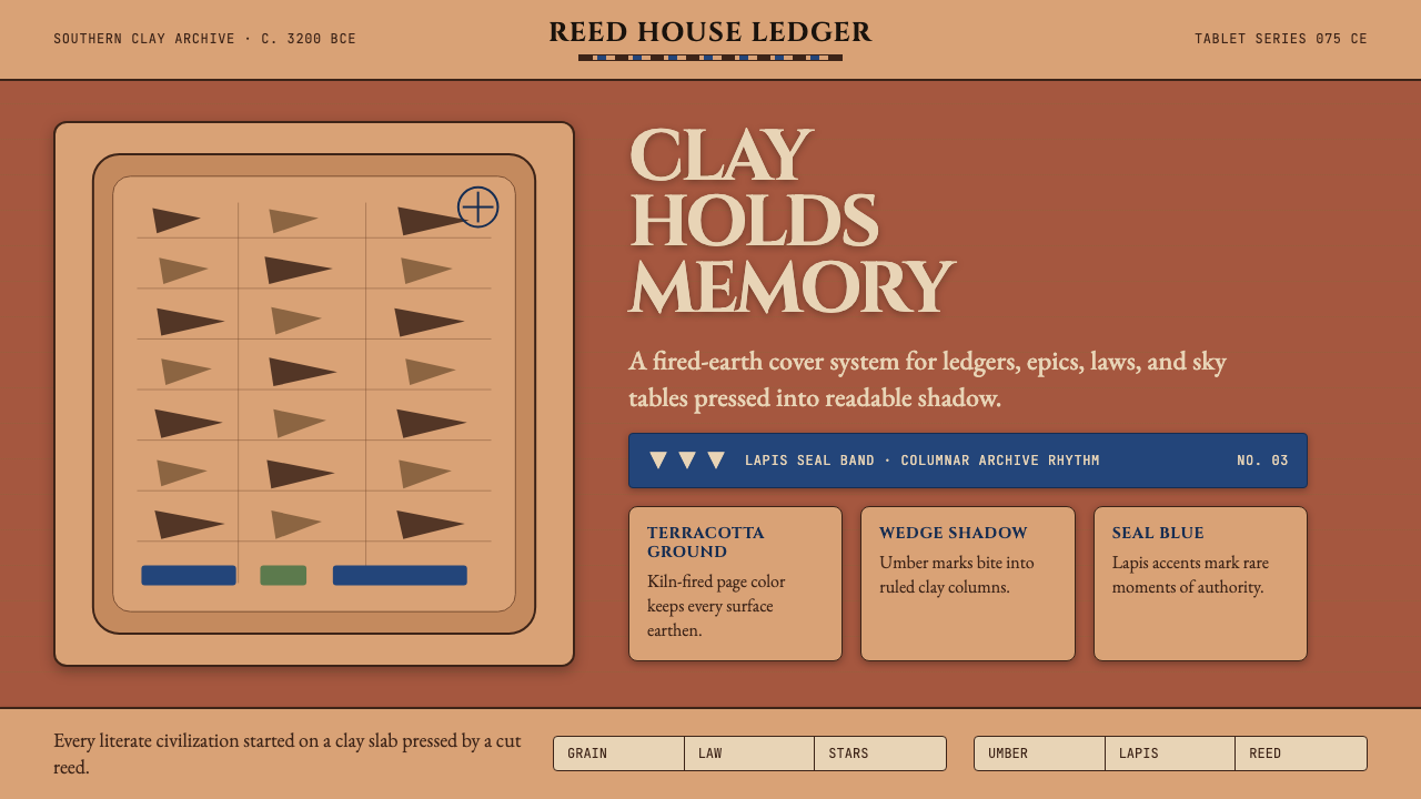 Mesopotamian Cuneiform TabletsWritten memory feels fired. Terracotta, umber wedges, and lapis bands build t…
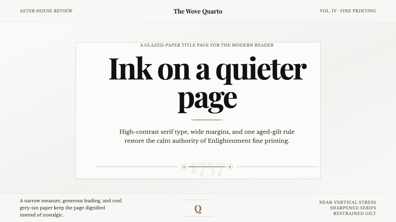 Baskerville Transitional SerifCalm authority in print. Glazed grey-tan paper, sharp serif contrast, one age…
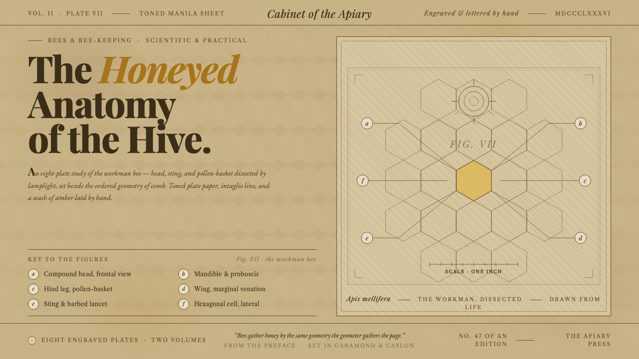 Honeybee Anatomy PlateAn 1886 beekeeping manual, reopened. Amber wash over engraved anatomy, letter…
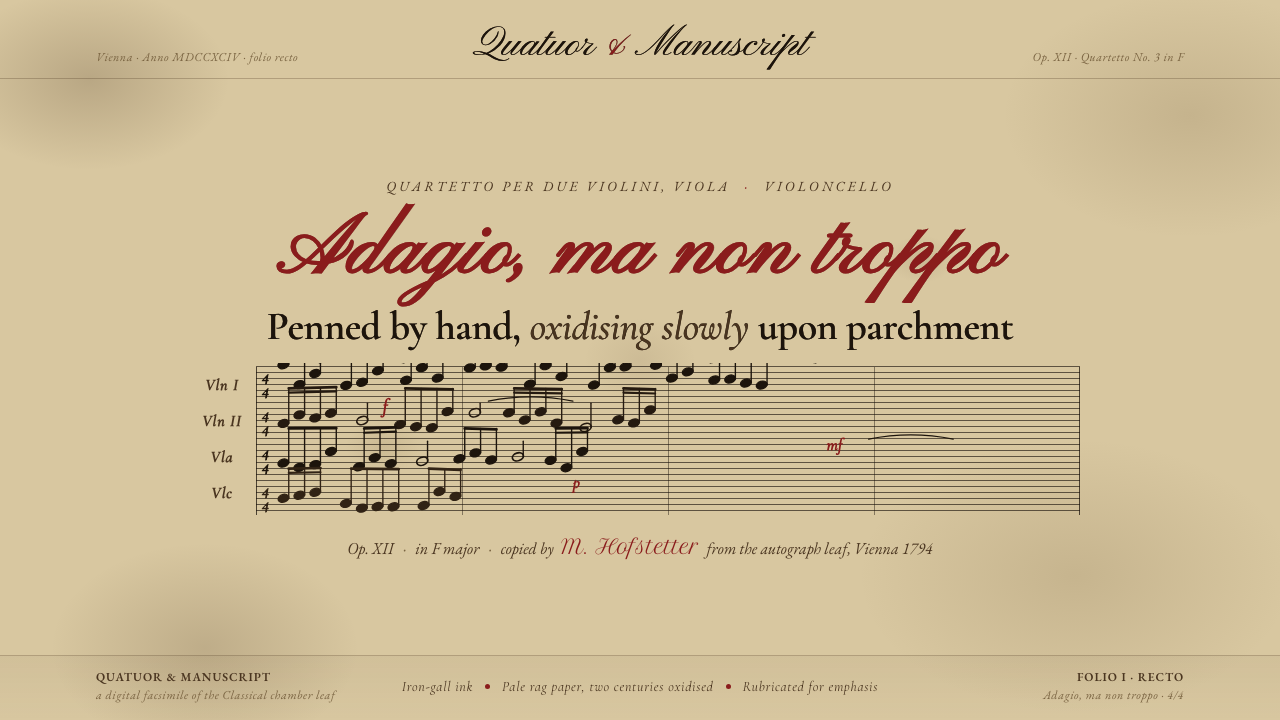 String Quartet ScorePenned by hand, oxidising slowly. Iron-gall ink browned on deep aged parchmen…
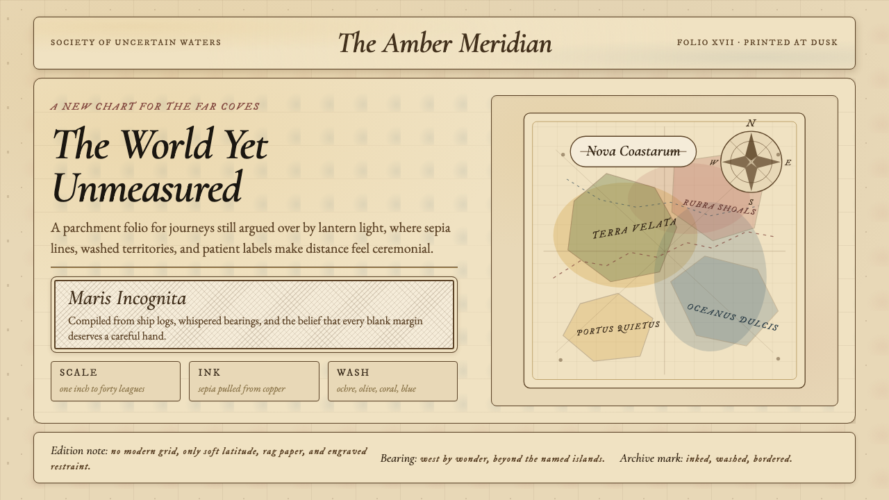 Vintage CartographyDiscovery feels ceremonial. Sepia copperplate on aged parchment, framed by co…