What is Gutenberg 42-Line Bible?
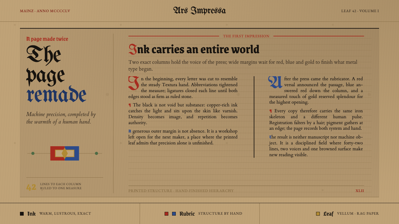
Two columns of dense black type, justified to the millimetre — then handed to a rubricator to finish in red, blue, and gold.
Gutenberg 42-Line Bible in brief
The Gutenberg 42-Line Bible is the visual language of the book that inaugurated printing in the West: two justified columns of dense Gothic blackletter type, forty-two lines to a column, set on a page large enough to hold a full spread of Latin scripture. Its defining tension is between two kinds of labor that never fully separate — the machine-cut regularity of cast metal type, and the freehand color work added afterward by hand.
Nothing about the page was left casual. Line lengths, word spacing, and letterform width were all adjusted so that every column would justify flush on both sides, an effect manuscript scribes achieved slowly with a pen and printers had to solve with a limited set of cast letterforms, ligatures, and abbreviations. The type itself imitates the most prestigious handwritten book hand of its moment — a dense, vertical, heavily abbreviated Gothic script — so closely that early buyers reportedly could not tell it from a manuscript at a glance.
The finished object is not the black-and-white page most people picture when they hear 'printing press.' Wide, deliberately empty margins surround the type block, left there so a rubricator could add oversized initials, paragraph marks, and chapter headings by hand in red, blue, and sometimes gold leaf after the sheets came off the press. Five and a half centuries of aging have since turned the ground itself — vellum or heavy rag paper — a warm, browned parchment tone, and the ink has kept an unusual glossy sheen that flat carbon ink does not have.
Where does Gutenberg 42-Line Bible come from?
The book takes its name from Johannes Gutenberg's Mainz workshop, where printing with movable metal type was developed and proven between roughly 1450 and 1455. Gutenberg adapted the mechanical action of a wine or oil press to drive an inked, cast-metal forme against paper or vellum, and — the harder problem — invented a system for casting hundreds of identical, interchangeable letterforms so that a page of type could be composed, printed, broken apart, and reused for the next page. The Bible that resulted, roughly 180 copies with forty-five on hand-burnished calfskin vellum and the remainder on Italian linen-rag paper, was not a small pamphlet or a trial run: at 1,288 pages set two columns to a leaf, it was, from its first sheet, a deliberate act of matching and then exceeding the standard of the finest handwritten Bibles of its day.
That ambition explains why the type looks the way it does. Gutenberg and his workshop did not design a plain, legible letterform for maximum efficiency; they cut a version of Gothic Textualis, the dense, angular book-hand used for the most prestigious devotional manuscripts of the German lands, complete with the ligatures and abbreviations scribes used to save space and speed their writing. The forty-two-line column was itself a refinement — the earliest surviving pages of the project were set at forty lines before the workshop tightened the measure, packing more text per sheet of the expensive vellum and paper without sacrificing the manuscript illusion the whole project depended on.
Printing the black text was never meant to finish the book. The oversized margins on every leaf were left empty on purpose, a space reserved for a second, separate craft tradition: the Rhenish rubrication and illumination workshops that had long finished handwritten liturgical books. After the press run, a rubricator worked through each copy by hand, adding large decorated initials, running headings, and paragraph marks in red and blue ink, with some copies receiving further illumination in gold leaf and painted borders. No two surviving copies were finished identically, because this stage remained entirely a manual craft even though the text beneath it was mechanically identical across every copy.
The workshop itself did not survive its own achievement intact. Gutenberg had financed the venture with a substantial loan from the Mainz financier Johann Fust, and in 1455 — the same year the Bible was completed — Fust sued him over the unpaid debt and won control of the press, the type, and the partially finished stock. Fust then partnered with Peter Schöffer, a scribe and former Paris university copyist who had joined Gutenberg's workshop and likely played a direct hand in cutting and setting the Bible's type. Schöffer married Fust's daughter, continued printing in Mainz under the Fust-Schöffer imprint, and became the figure who carried the workshop's typographic standards into the following decades of European printing, refining and issuing further editions long after Gutenberg's own role in the business had ended.
What defines the Gutenberg 42-Line Bible look?
Color
The base palette is a single deep black for the printed text, produced by an unusually durable ink that carried a higher proportion of copper and lead than typical manuscript inks. Every other color on the page arrives after printing, applied by hand: red for initials, headings, and paragraph marks (rubrication, from the Latin for 'red'), a cooler blue used to alternate with red on decorated capitals, and gold leaf reserved for the most elaborate copies. The rule is strict — the press produces black only, and every non-black mark is a separate, hand-finished layer.
Typography
The letterforms are a cut version of Gothic Textualis, the dense, vertical, heavily abbreviated hand used for the finest devotional manuscripts of the German lands. Strokes are angular and closely spaced, with minimal open space inside each letter, and the type includes numerous ligatures and scribal abbreviation marks carried over directly from manuscript practice, rather than the more open, evenly spaced letterforms that later Roman-style typefaces would favor.
Grid and Justification
Every column carries exactly forty-two lines, set two to a page, and every line is justified flush on both the left and right edges — an effect scribes achieved slowly by adjusting letter spacing with a pen, and which the workshop had to solve within a fixed set of cast letterforms, abbreviations, and variant widths. The measure itself was tightened during production, moving from an initial forty-line column to the denser forty-two-line standard that gives the book its name.
Ground and Surface
Two grounds were used side by side within the same edition: hand-burnished calfskin vellum for a minority of copies, and Italian linen-rag paper for the rest. Five and a half centuries of aging have since browned both surfaces to a warm, mottled parchment tone, closer to tea-stained than to the bright white associated with a fresh printed page.
Margins and Ornament
The type block occupies only the center of each leaf; the surrounding margin is unusually wide and was left deliberately blank by the printer, reserved space for the rubricator's hand-added initials, headings, and marginal marks. Ornament in this system never comes from the press — it is always a second pass, layered on top of a mechanically identical black foundation.
Ink Quality
The black ink itself behaves unlike ordinary carbon-based writing or printing ink. Its unusually high metal content — copper and lead — gives it a glossy, almost varnished sheen that sits faintly raised on the page rather than lying flat and matte, a texture that later, purely carbon-based printing inks could not reproduce.
Who shaped Gutenberg 42-Line Bible?
Gutenberg developed and financed the printing method that produced the 42-Line Bible, adapting the mechanical press and, more decisively, inventing a reliable system for casting large quantities of identical, interchangeable metal type. His Mainz workshop treated the Bible as a direct competitor to the finest handwritten books of its era rather than a cheaper substitute, which is why the type imitates high manuscript style so closely. He lost control of his own workshop, press, and type to his creditor in 1455, the same year the Bible was completed, and did not personally profit from the invention's later spread across Europe.
Fust was the Mainz financier whose loan made Gutenberg's printing venture possible in the first place. When Gutenberg could not repay the debt, Fust sued in 1455 and won the press, the cast type, and the partially completed Bible stock through the courts, effectively taking over the operation at the moment of its greatest success. He then went into partnership with Peter Schöffer to continue printing under his own name.
Schöffer was a trained scribe and former university copyist in Paris who joined Gutenberg's workshop and is thought to have had a direct hand in cutting and setting the Bible's type, given his professional calligraphic training. After Fust's legal victory, Schöffer married Fust's daughter and became his printing partner, carrying Mainz's typographic standards forward into subsequent decades and outlasting both Gutenberg's and Fust's direct involvement in the business.
How do you use Gutenberg 42-Line Bible today?
This system carries specific cultural weight — printing, scripture, deep history — and works best in contexts that want to borrow that weight deliberately, not decoratively. Applying it well means understanding the discipline underneath the ornament: a mechanically regular black foundation doing all of the structural work, with hand-touched color reserved for a small number of meaningful marks.
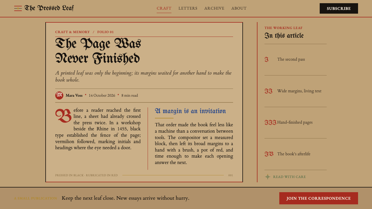
On presentation slides, this system works as a deliberate signal of gravitas and permanence rather than speed — appropriate for a cover slide introducing a history, archive, heritage, or scholarly topic, where a dense block of Gothic-inspired display type set on a warm, browned ground immediately reads as old and authoritative rather than as a generic dark theme. Content slides should resist the temptation to fill the whole frame with heavy blackletter-style type, which becomes illegible fast at speaking distance; instead, use the two-column justified structure as an organizing device — a narrow measure, tight line spacing, one accent color reserved for headings or callouts — while keeping body copy in a plain, highly legible face. Data should be treated the way the rubricator treated the page: black carries the substance, a single accent color marks what matters, and nothing is gradient-filled or softly shadowed.
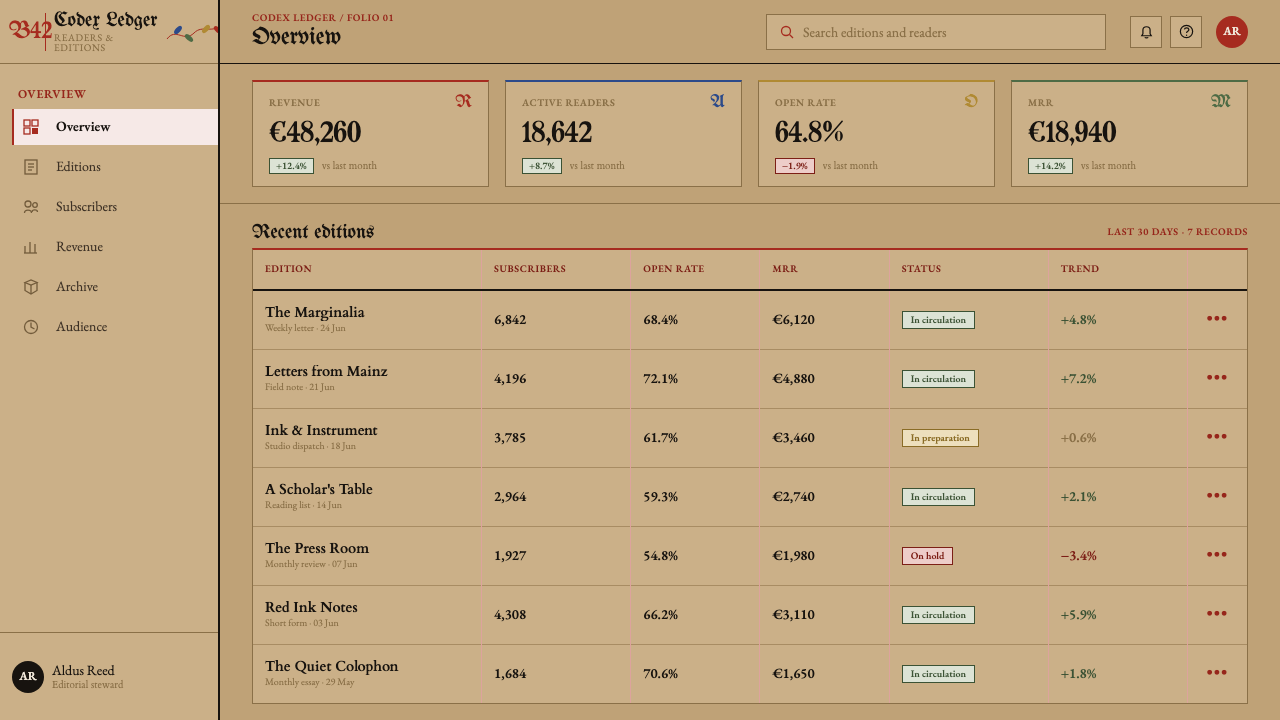
For web interfaces, the system's real strength is in editorial and long-form reading contexts — archival projects, museum and library sites, rare-book or publishing-history features — where a warm parchment-toned background, a single strong accent color used sparingly for links and headings, and a disciplined two-column or narrow-measure grid can carry real reading weight without becoming a costume. It is a poor match for dashboards, transactional flows, or anything that needs to communicate quickly and casually; the visual grammar signals permanence and ceremony, which reads as friction in a checkout flow or a settings page.
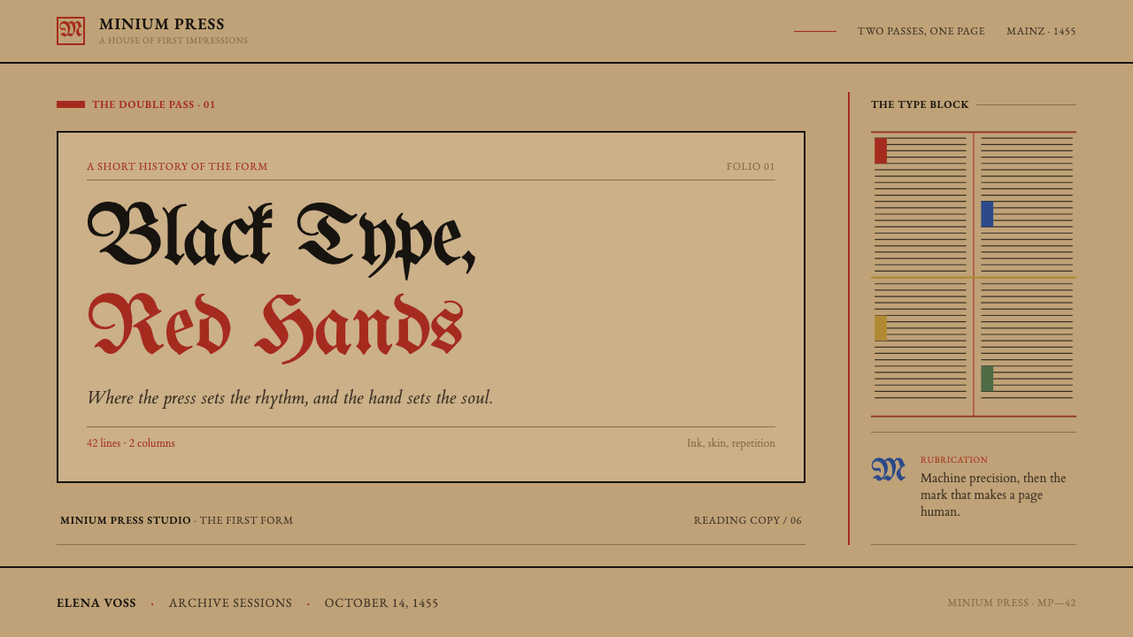
In editorial and marketing contexts, the strongest move is contrast between an intentionally sparse, mechanically regular typographic base and a small amount of hand-touched ornament — a single decorated initial letter opening an article, one accent-color rule or mark used consistently, wide margins used for pull quotes or captions rather than left empty by accident. Marketing collateral for heritage brands, publishers, universities, or archives can use the browned-ground, black-and-accent palette as a shorthand for authenticity and craft lineage, provided the accent color is used the way rubrication was used historically: sparingly, and only to mark what the reader should notice.
The most common misapplication is decorative overreach — filling the page with more accent color than the historical system ever used, or applying gold and red simultaneously across large areas instead of treating them as rare, hand-finished touches on an otherwise disciplined black-on-parchment ground. A second common mistake is choosing an illegible display blackletter for body text; the historical system reserved its most ornate letterforms for a scholarly, unhurried readership, and contemporary applications need a legible companion face for anything meant to be read quickly.
Gutenberg 42-Line Bible — FAQ
Is this the same as a generic 'medieval' or 'old book' aesthetic?
No — the defining feature here is a specific structural tension, not a decorative theme. The system is built around a mechanically identical black foundation (justified columns of Gothic type, produced by a press and repeatable exactly on every copy) that is then finished by hand, differently, on every single copy. A generic 'old book' treatment usually just adds parchment texture and a decorative typeface; this system is really about the visible seam between the machine-made and the hand-made, and both halves need to be present for it to read correctly.
Why does the black ink look glossy instead of flat?
The historical ink carried an unusually high proportion of copper and lead compared to ordinary manuscript or later printing inks, which gives it a raised, almost varnished sheen rather than a dead-flat matte black. In a design system, this translates to treating black as a rich, slightly reflective surface rather than a pure, flat void — closer to lacquer than to charcoal.
Can this system work on a clean white background instead of the browned, aged ground?
It loses most of its identity if you do. The browned, mottled ground is not incidental discoloration to be corrected — it is the visual record of five and a half centuries of aging, and it is what makes the black ink and the red-and-blue rubrication read as historical artifacts rather than as a fresh print run. A crisp white background paired with Gothic type and rubrication colors tends to read as a generic 'medieval fantasy' look instead; keeping the warm, uneven ground is what anchors the system in its specific source rather than a costume version of it.
Does applying this style require using actual Gothic blackletter type throughout?
No, and doing so usually backfires. The historical Gothic Textualis letterforms were dense, heavily abbreviated, and designed for a patient, scholarly reader working through a sacred text slowly — they are genuinely hard to read quickly at length. The more effective contemporary approach is to reserve blackletter-inspired display type for headlines, titles, or decorative openings, where its density reads as gravitas, while setting any body copy meant to be read quickly in a plain, highly legible typeface that still respects the tight column measure and justified alignment of the original system.
Why do surviving copies of the source book look so different from each other, if they were printed from the same type?
Because printing only produced the black text — every copy left the press with the same words in the same positions, but the color work was added afterward, copy by copy, by rubricators and illuminators working freehand. Some copies received simple red-and-blue initials; others were fully illuminated with gold leaf and painted borders by a wealthier owner's chosen workshop. In a design system built on this history, that variability is a feature to reference, not an inconsistency to standardize away — a family of related pieces can share an identical black structure while each carries a distinct, deliberately hand-finished accent treatment.
Related design styles
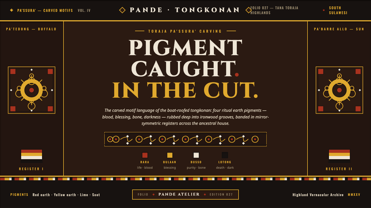 Toraja Pa'ssura CarvingPigment caught in the cut. Red, yellow, lime, soot rubbed into ironwood groov…
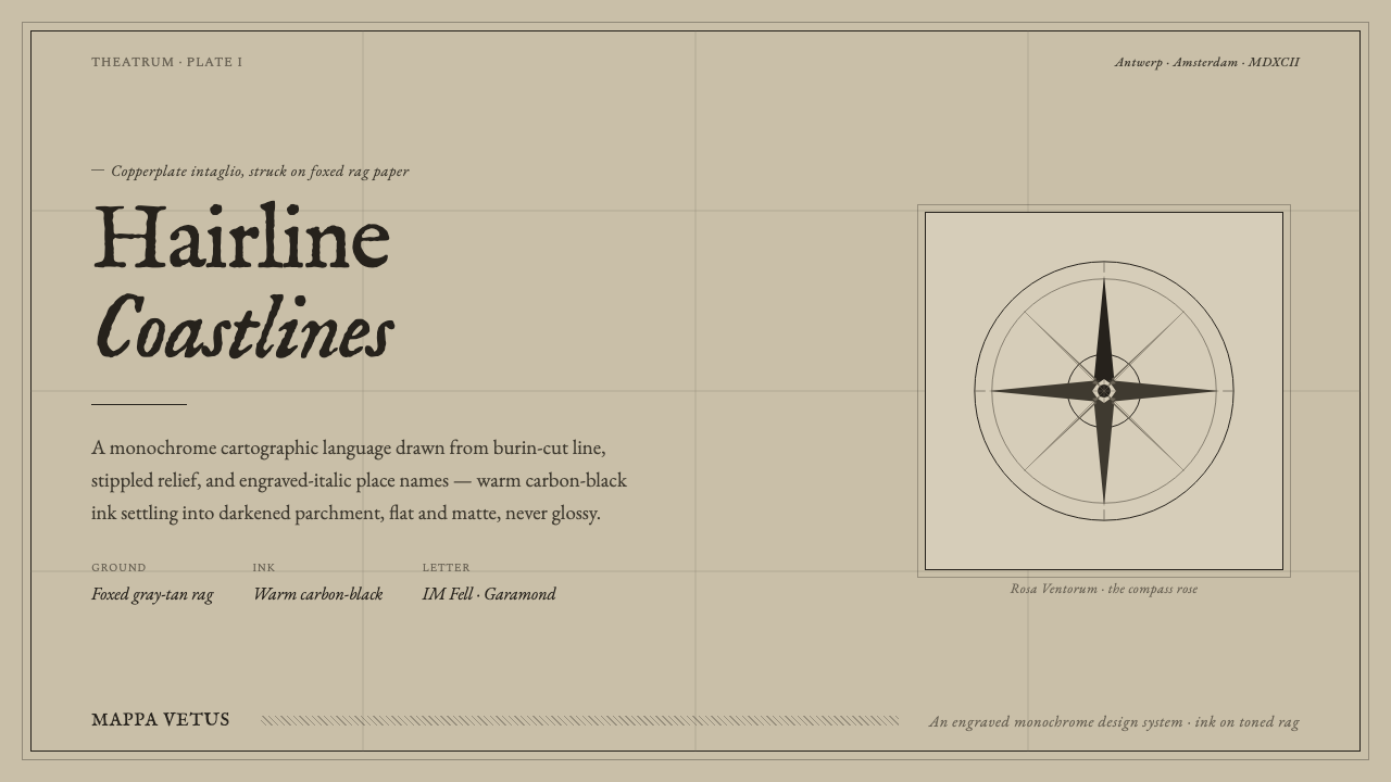 Engraved Monochrome MapThe gravity of an old printed sheet. Warm carbon-black ink on foxed rag paper…
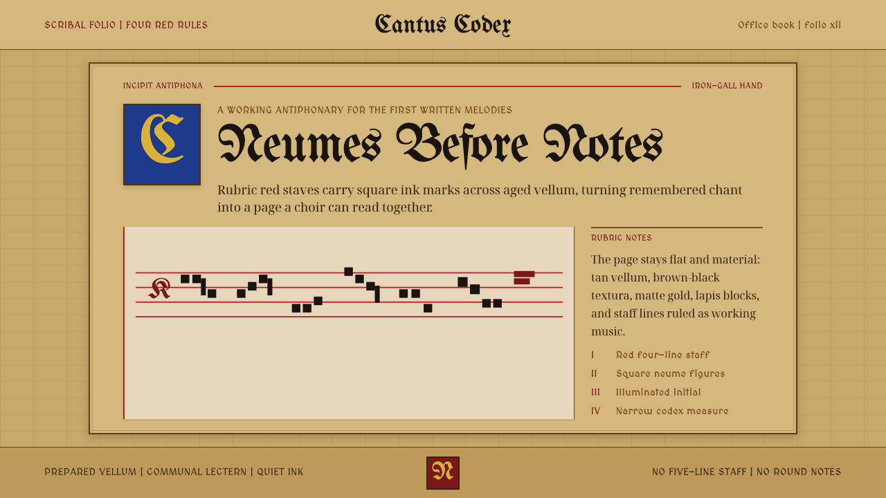 Gregorian Chant NeumesNotation becomes scripture. Rubric red staff lines and square neumes sit on t…
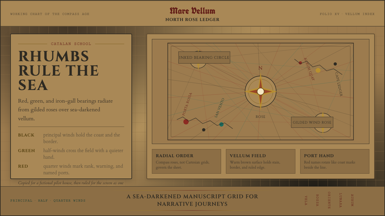 Portolan Rhumb ChartNavigation feels ceremonial. Rhumb lines cross dark vellum with red ink and g…
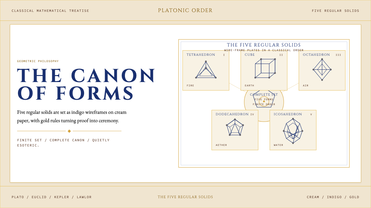 Sacred Geometry Platonic SolidsGeometry feels ritual. Cream paper, indigo wireframes, gold rules stage the f…
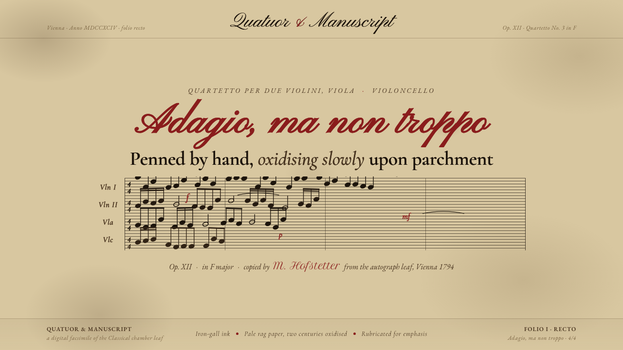 String Quartet ScorePenned by hand, oxidising slowly. Iron-gall ink browned on deep aged parchmen…