What is Portolan Rhumb Chart?
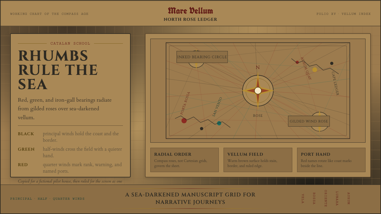
The portolan chart is the working drawing of the age of the compass — sea-darkened vellum webbed with rhumb lines radiating from gilded compass roses, once inked by hand for sailors who trusted their lives to it.
Portolan Rhumb Chart in brief
A portolan chart is a medieval navigational map, drawn by hand on a whole sheet of prepared sheepskin and covered with a web of straight lines radiating outward from a series of compass roses. Those lines are rhumb lines — lines of constant compass bearing — and a navigator would lay a straightedge along the one nearest their intended course, read off the heading, and steer by it. The chart is not a picture of the world so much as a tool for extracting a bearing from it.
Visually, the system pairs a warm, sea-darkened tan ground — the color aged vellum takes on after repeated handling at sea — with a restrained, code-like ink palette: black for the principal coastline, red for the more important rhumb lines and major ports, and green or blue for the remaining bearing lines, a color convention that let a navigator's eye sort information at a glance the way a modern legend sorts a map's categories. Coastlines are drawn tight and scalloped, almost lace-like, while the open interior of continents is left largely blank, since portolan charts were built to serve coastal and maritime navigation rather than to describe inland territory.
The great cities along the coast are marked not with plain labels but with small gilded vignettes — a tower, a flag, a walled silhouette — turning the chart into an object that is functional first and decorative second, but decorative nonetheless. Lettering runs in Roman capitals set perpendicular to the shoreline, so that a port's name always reads as if standing up out of the sea toward the viewer, a convention practical for a chart meant to be read from any angle aboard a moving ship.
Where does Portolan Rhumb Chart come from?
Portolan charts emerged in the Mediterranean in the late thirteenth century, coinciding with the spread of the magnetic compass among European sailors. The earliest surviving example, the Carta Pisana, dates to around 1290 and already displays the full mature system: compass roses, rhumb-line webs, and a scalloped coastline drawn with a precision that puzzled later scholars, since no comparable land-surveying technology existed at the time to explain the accuracy of the coastal outlines.
The craft reached its most celebrated expression in the workshops of Majorca in the fourteenth century, a hub that benefited from the island's position at the crossroads of Christian, Jewish, and Muslim Mediterranean trade networks. The Cresques family workshop there — Abraham Cresques and his son Jehuda Cresques — became renowned across the Mediterranean; Abraham Cresques is traditionally credited as the principal author of the Catalan Atlas of 1375, commissioned for the King of France, a lavishly illustrated multi-sheet chart that folded portolan navigational science together with encyclopedic geographic and cultural knowledge of Africa and Asia gathered from merchant and traveler accounts.
After the expulsion of Jews from the Crown of Aragon and later Iberian territories, Jehuda Cresques is thought by some historians to have converted and continued chart-making under Portuguese patronage, one thread among several that carried the Majorcan-Catalan cartographic tradition into the Portuguese and Genoese workshops that would go on to supply the ships of the Age of Discovery. Genoese and later Venetian workshops developed their own house styles within the same basic system, and chartmakers such as Gabriel de Vallseca and Petrus Roselli, both active in the fifteenth century, produced charts whose surviving copies remain some of the finest examples of the mature tradition.
By the sixteenth century, as oceanic navigation extended voyages far beyond the reach of a single sheet of Mediterranean-scaled rhumb lines and as printed maps built on projected coordinate grids began to supplant hand-drawn charts, the portolan tradition gradually receded from active use in navigation and survived instead as a prized decorative and diplomatic object — a chart commissioned to be admired in a royal library as much as consulted at sea.
What defines the Portolan Rhumb Chart look?
Color
The ground is a warm, sea-aged tan reminiscent of handled vellum, against which a restrained heraldic ink palette does all the coding work: black for the principal coastline, blood-red for major ports and the more important rhumb lines, and muted green or blue for secondary bearing lines, with gold leaf reserved for compass roses and city vignettes.
Radiating Geometry
Composition is organized around a network of compass roses, each spraying straight rhumb lines outward at regular angular intervals across the whole sheet. Unlike a rectangular grid, this geometry has no fixed horizontal or vertical axis — every line is a bearing, and structure radiates rather than stacks.
Typography
Place names are set in Roman capitals and period serif letterforms, oriented perpendicular to the coastline rather than horizontally across the page, so that lettering always appears to rise up out of the sea toward whoever is reading the chart, regardless of which direction they are facing aboard ship.
Scalloped Coastlines
Coasts are rendered as tight, repeating scalloped curves rather than smooth or naturalistic outlines, a drafting convention that produced a lace-like texture at the chart's edges while remaining fast to draw by hand and legible at the small scale a working chart demanded.
Gilded Vignettes
Major cities are marked with miniature illustrated icons — a tower, a flag, a walled silhouette — picked out in gold leaf. These vignettes function as a rank-signaling system: their size and elaborateness scale roughly with a city's importance, turning the chart's decoration into an information hierarchy.
Sparse Interior
Land beyond the coast is left largely empty or lightly filled, since the chart's purpose was maritime bearing-taking rather than territorial description. This emptiness is not an oversight but a deliberate economy: detail is spent entirely on what a navigator actually needs to read.
Who shaped Portolan Rhumb Chart?
Head of the celebrated Majorcan chart workshop and traditionally credited as principal author of the Catalan Atlas of 1375, commissioned for the King of France. His workshop's synthesis of navigational rhumb-line science with encyclopedic geographic illustration set the standard for what a portolan chart could be.
Son of Abraham Cresques and a chartmaker in his own right, Jehuda is thought by some historians to have continued the family craft under Portuguese patronage after the expulsion of Jews from Aragonese territories, one of the threads that carried Majorcan chartmaking technique into the Iberian workshops of the Age of Discovery.
A fifteenth-century Majorcan chartmaker whose surviving works are counted among the finest examples of the mature portolan tradition, demonstrating the continued vitality of the Catalan school more than a century after the Cresques workshop's original innovations.
Another fifteenth-century chartmaker working within the Catalan-Majorcan tradition, whose charts are prized for their precision and decorative refinement, illustrating how the portolan style continued to be practiced as both a navigational tool and a prestige object.
How do you use Portolan Rhumb Chart today?
Applying the portolan aesthetic well means treating it as a system of radiating information, not simply a vintage-map filter. The compass rose is the organizing device: content should spray outward from a central point in straight lines, echoing rhumb-line structure, rather than sitting on a conventional rectangular grid.
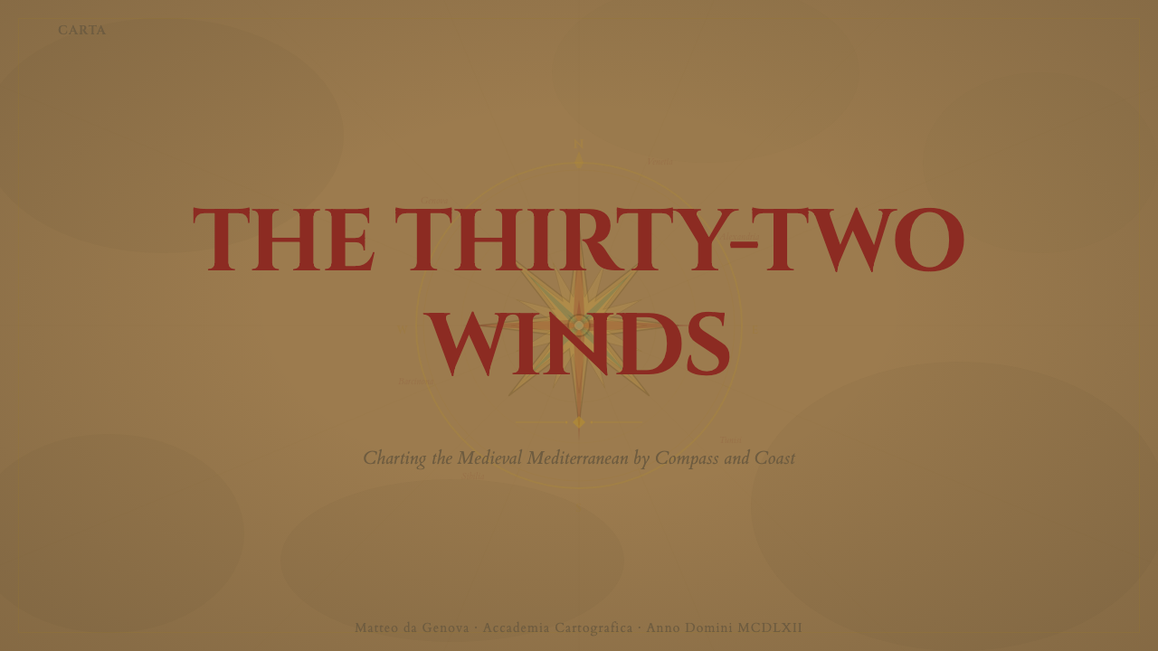
For presentation slides, a cover page benefits enormously from a single large compass rose as a focal graphic, with the title set in perpendicular capitals along one radiating line, echoing a coastal place name. Content slides can use short radiating rules as section dividers, and data slides suit the system surprisingly well: a radial chart or compass-style diagram reads as native to this visual language in a way a conventional bar chart does not.
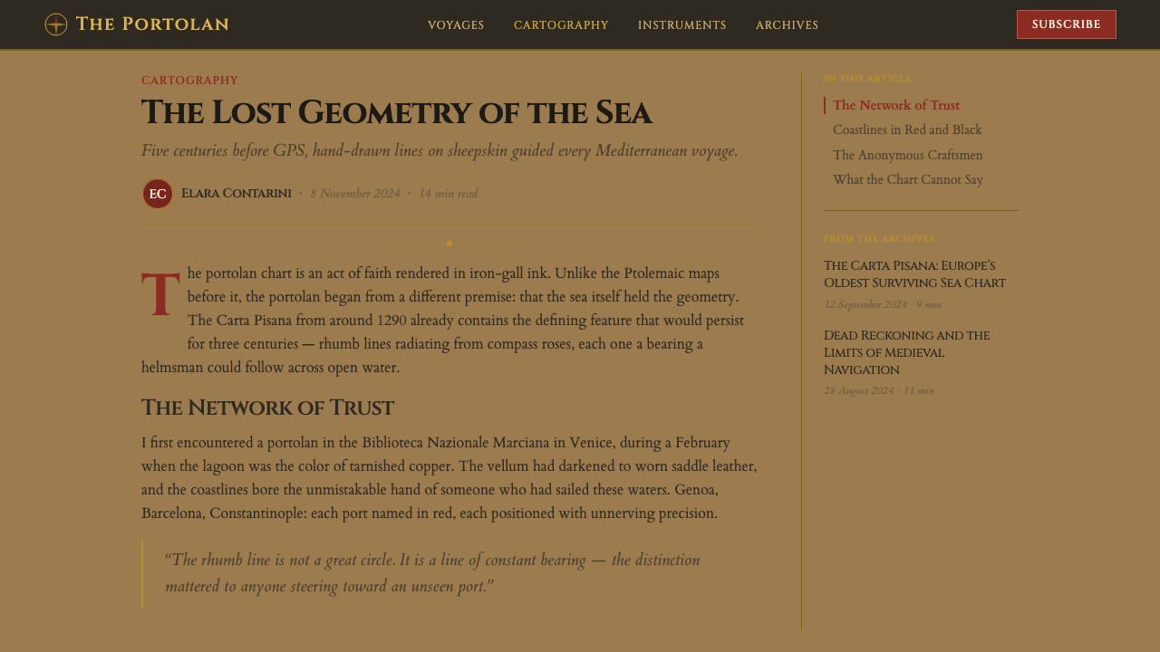
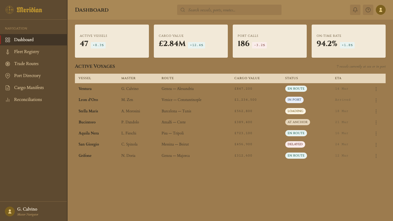
For web interfaces, the style suits editorial storytelling, travel and hospitality products, and any brand built on themes of exploration, heritage, or craftsmanship. A vellum-toned background with black-and-red hierarchy for text and a single gilded accent for premium calls to action carries the mood without requiring literal map imagery on every screen.
For editorial and marketing work, the aesthetic works especially well for long-form narrative pieces about history, geography, or travel, where perpendicular capital lettering can be used sparingly for section headers or pull quotes to evoke the chart's coastal typography without becoming illegible at length.
A common mistake is over-illustrating the style with literal ship, compass, or sea-monster clip art, which tips the system into costume rather than craft. The authentic effect comes from the restrained ink-on-vellum color logic and the radiating rhumb-line geometry, not from decorative nautical iconography layered on top.
Portolan Rhumb Chart — FAQ
What exactly is a rhumb line, and why does it matter to the visual system?
A rhumb line is a line of constant compass bearing — following it means holding a single fixed heading rather than the shortest curved path over the globe. Portolan charts are covered with webs of these lines precisely so a navigator could read a bearing directly off the page, which is why the geometry radiates from compass roses rather than sitting on a rectangular grid: the lines themselves are the content, not a background device.
Why do portolan charts leave the interior of continents blank?
Because their purpose was coastal and maritime navigation, not land surveying or territorial claim-making. Detail, ink, and gold were spent entirely on what a ship's navigator needed — coastlines, ports, and bearing lines — while inland territory, largely irrelevant to a sailor's task, was left sparse or empty.
How accurate were these charts, really?
Mediterranean coastlines on the best portolan charts are remarkably accurate for their era, accurate enough that historians still debate exactly how they were surveyed, since no comparable land-based triangulation method is documented from the period. Accuracy declined the further a region lay from well-traveled Mediterranean shipping lanes, with more speculative or schematic detail appearing for remote coasts.
Why is red used for some rhumb lines and not others?
The color convention functioned like a modern legend: red typically marked the eight principal wind directions and their associated primary rhumb lines, while the more numerous secondary and tertiary bearing lines were rendered in black or green, letting a navigator's eye quickly distinguish the major reference lines from the finer subdivisions covering the sheet.
Does this style only suit historical or nautical subject matter?
Not at all — the radiating compass-rose structure and restrained ink-on-vellum palette translate well to any brand built around themes of direction, exploration, precision, or heritage, including travel technology, wayfinding products, and educational platforms, as long as the geometry and color logic are kept faithful rather than reduced to decorative map clip art.
Related design styles
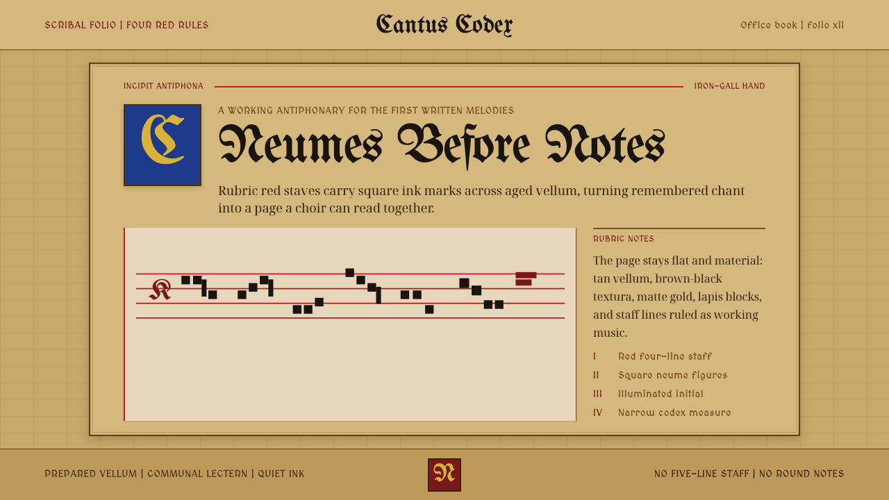 Gregorian Chant NeumesNotation becomes scripture. Rubric red staff lines and square neumes sit on t…
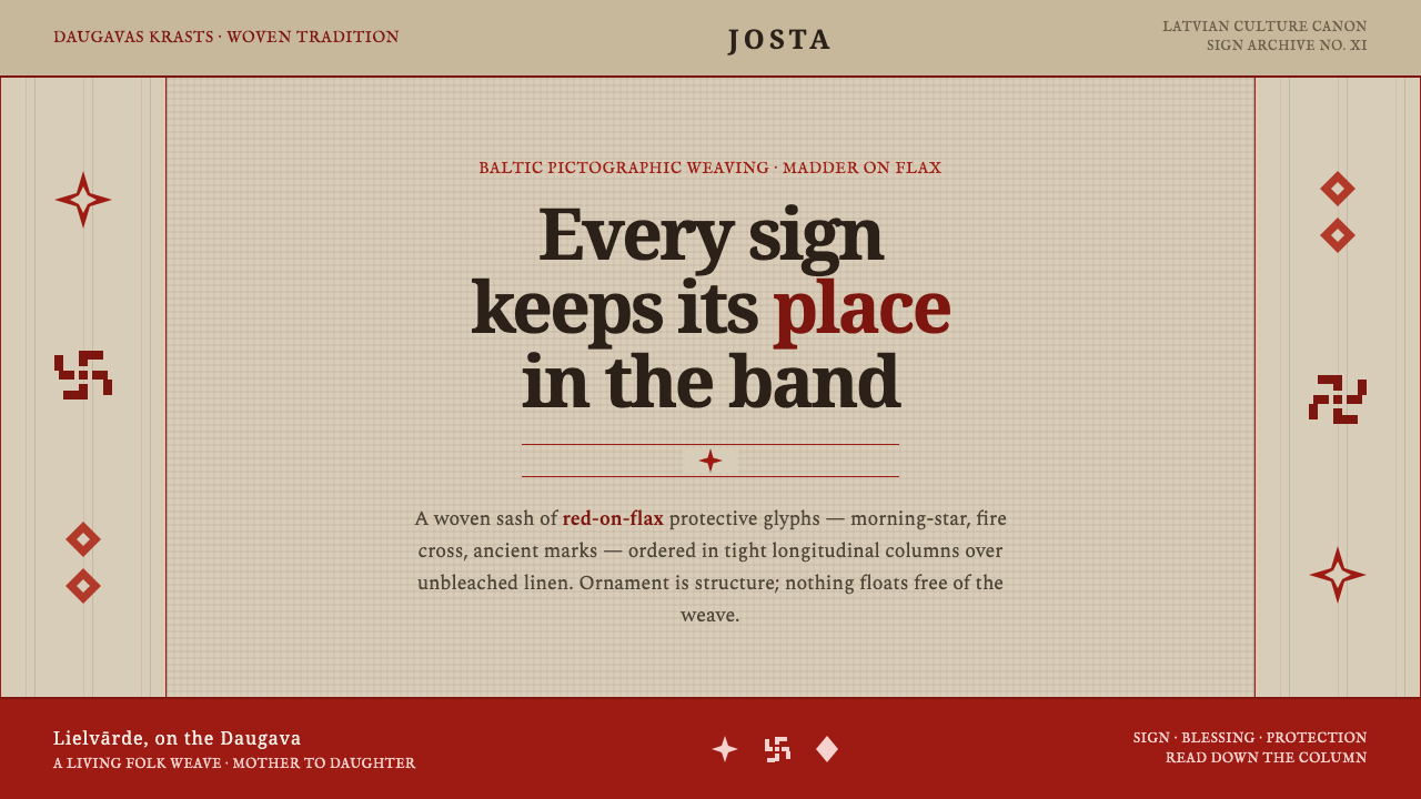 Latvian Lielvārde BeltOrnament is structure. Madder-red Baltic glyphs in tight longitudinal bands o…
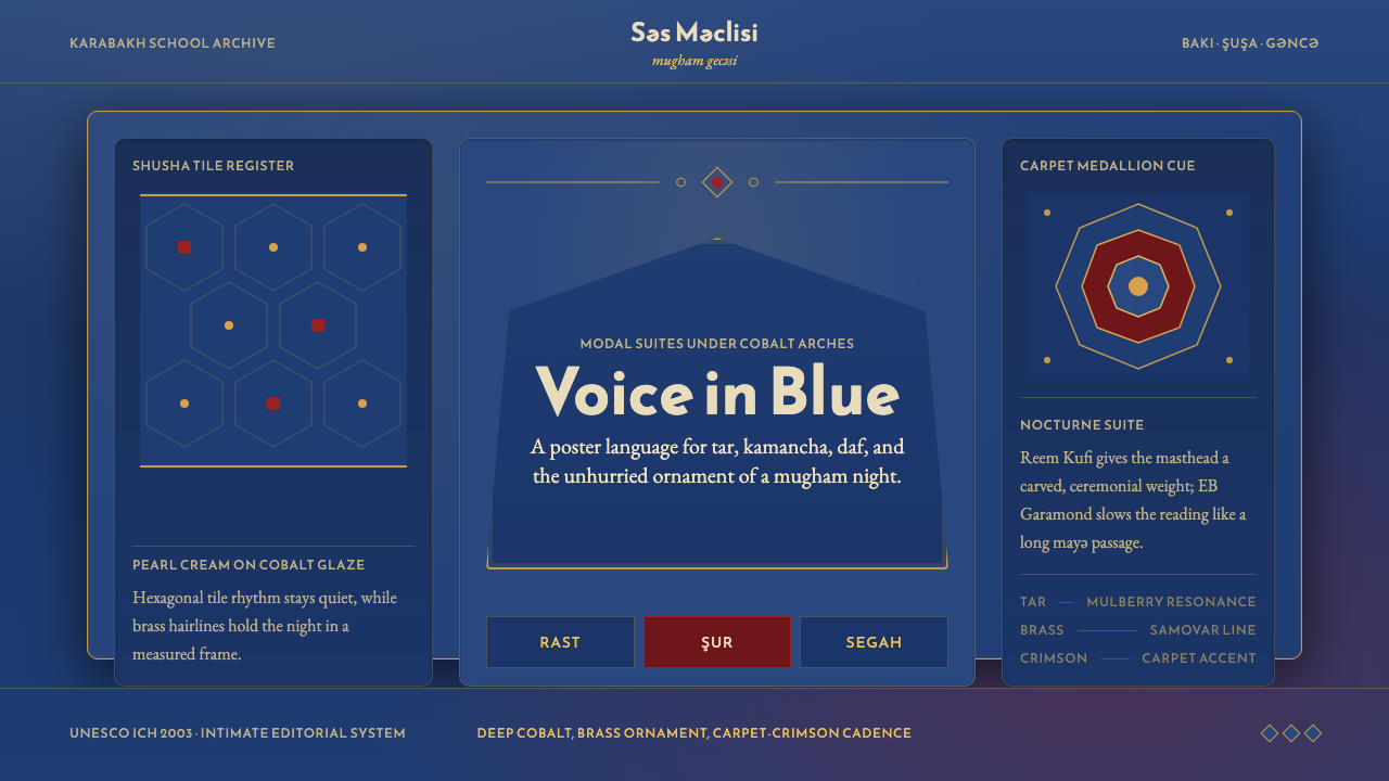 Azerbaijani Mugham Saz BlueMugham night, deeply tiled. Cobalt ground, brass hairlines, arched editorial…
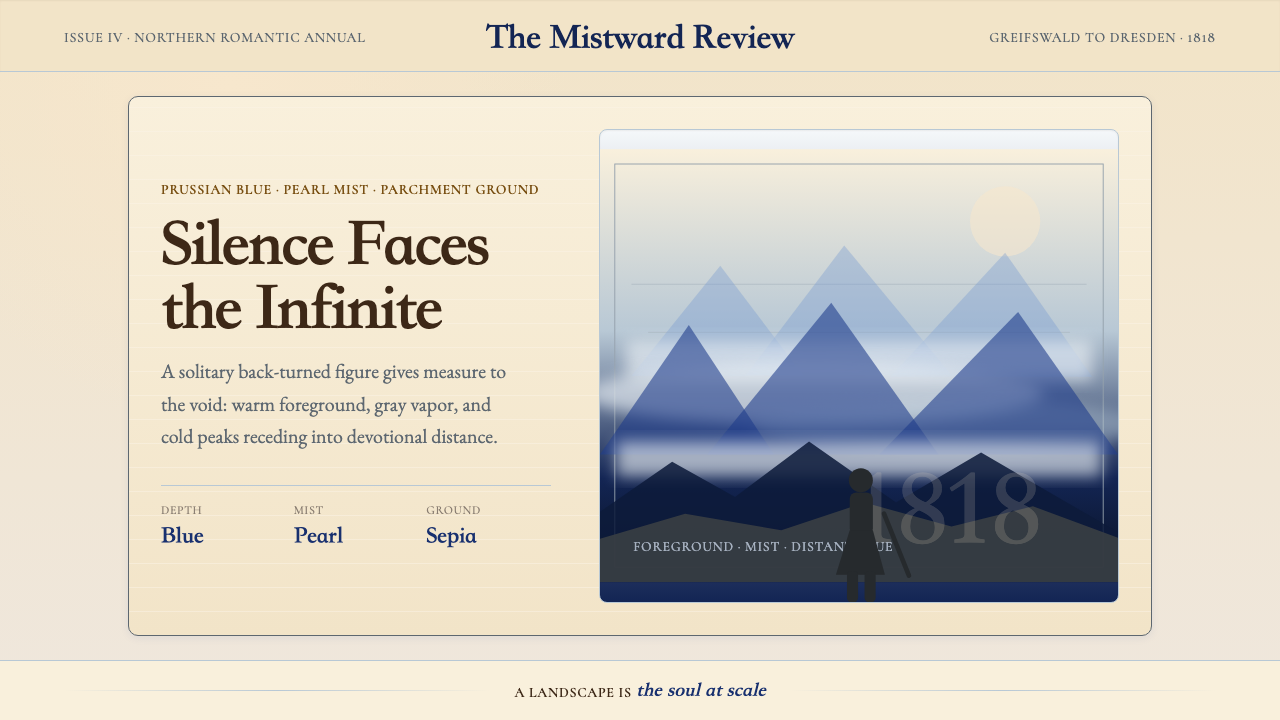 Caspar David FriedrichSilence becomes vast. Prussian blue depth, pearl mist, and parchment framing…
 Degas Ballet PastelsBackstage glamour is labor. Jade walls, rose footlights, cropped serifs on cr…
 Dürer WoodcutInk remembers everything. Fraktur titles, rag-paper cream, and cross-hatched…