What is Gregorian Chant Neumes?
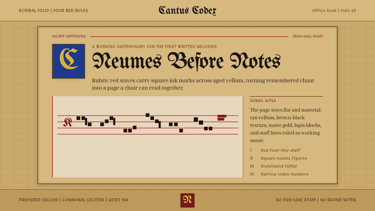
Gregorian chant neumes turn the page itself into a devotional object — rubric red rule lines, square black notation, and gilded initials on tan vellum, built for a monk's hand rather than a designer's screen.
Gregorian Chant Neumes in brief
Gregorian chant neume notation is the visual system of the medieval liturgical chant book: square and diamond-shaped ink marks (neumes) ruled across a small number of red staff lines on tan or cream vellum, punctuated by illuminated initials in gold leaf and lapis blue. It predates the modern five-line staff and round notehead by centuries, and it looks nothing like modern sheet music — it looks like a sacred manuscript that happens to also encode pitch and rhythm.
The system is not decorative in the way a border or a flourish is decorative. Every mark on the page has a job: the red lines fix pitch reference points, the black neumes trace the rise and fall of a melodic line in clusters and ligatures, and the rubrics (literally, the red-ink instructions) tell the singer what feast, hour, or mode is being observed. Illumination — the gold and blue capitals — marks structure, not ornament for its own sake: it announces where a new chant begins the way a headline announces a new article.
Visually, the aesthetic reads as warm, dense, and hand-wrought. The vellum ground is not paper-white but a saturated tan, aged and organic. Ink is not a flat digital black but an iron-gall brown-black that bites into the surface. Gold is matte and hand-burnished rather than glossy or reflective. Nothing about the system is engineered for legibility at a glance from across a room — it rewards close, unhurried reading, the way a chant itself unfolds slowly rather than announcing its point immediately.
Where does Gregorian Chant Neumes come from?
Gregorian chant takes its name from Pope Gregory I (r. 590–604), to whom medieval legend credited the entire repertoire — a dove was said to have dictated the melodies into his ear. Modern musicology treats this as pious myth rather than history: the chant repertoire actually took shape gradually across the Frankish kingdoms from roughly the eighth through tenth centuries, as Carolingian rulers worked to unify liturgical practice across their territories. The name stuck regardless, and by the high medieval period — the era this design system draws from, roughly 1000 to 1300 — chant was the sonic backbone of monastic and cathedral worship across Western Europe.
For the first several centuries of its existence, chant was transmitted orally, memorized by singers who might use simple in-air hand gestures or rudimentary marks as memory aids. The neume — from a Greek word for gesture or sign — began as exactly that: a small squiggle placed above a word to remind a singer who already knew the melody which direction it moved, not a self-sufficient notation a stranger could sight-read. Early neumes floated above the text with no fixed reference lines at all, encoding contour but not precise pitch.
The decisive technical leap came from Guido of Arezzo, an Italian Benedictine monk working in the early eleventh century. Guido is credited with popularizing the four-line staff — the direct ancestor of the modern five-line staff — which gave neumes a fixed vertical reference and let a trained singer determine exact pitch from the page rather than needing the melody already in memory. He is also associated with solmization, the do-re-mi system of naming pitches, derived from a hymn to John the Baptist. This is the technical scaffolding this design system sits on: red lines were typically used to mark the pitch F, and sometimes yellow for C, giving singers fixed anchors within an otherwise freely spaced page.
These chant books were not printed; they were produced one at a time in monastic scriptoria, the dedicated writing rooms of religious houses, by monks trained as scribes and illuminators. A single antiphonal or gradual (the technical names for chant books organized by liturgical function) represented weeks or months of skilled labor: ruling the lines, writing the text and neumes in a careful gothic hand, then handing the page to an illuminator to add rubrics in red ink and capital letters in gold leaf and pigment. The result was simultaneously a practical choir-book, meant to be propped open and sung from daily, and a devotional object worthy of the sacred words it carried.
What defines the Gregorian Chant Neumes look?
Ground
The page itself is not white but a warm, saturated tan — the color of cured calfskin vellum, aged rather than pristine. This ground is not neutral scaffolding the way a white background is in modern design; it reads as material, almost tactile, and every other color in the system is chosen to sit against it rather than against paper white.
Rubric red
Red is functional before it is beautiful: the ruled staff lines and the rubric text (feast names, liturgical instructions) are rendered in a strong, slightly brick-toned red rather than a bright signal red. It is used sparingly and purposefully — to mark structure and pitch reference — never as a broad decorative fill.
Neume ink
The notation itself sits in a brown-black rather than a flat digital black, consistent with iron-gall ink that has aged into the vellum over centuries. Neumes are square, diamond, and hook-shaped clusters — angular rather than round, closer in feeling to calligraphic strokes than to the printed noteheads of modern sheet music.
Illuminated initials
Structural capitals are picked out in gold leaf and a deep lapis or ultramarine blue, often with fine decorative patterning inside the letterform itself. The gold is matte and hand-burnished, never glossy or metallic-bright in the way a modern gold gradient would render. These initials function exactly as a large drop-cap or section header does in editorial design: they announce the start of a new unit and nothing else.
Textura letterforms
Body text is set in gothic textura — a dense, angular blackletter hand where vertical strokes dominate and the page reads almost as a woven texture at a distance, hence the name. It is heavier and more rhythmic than any humanist or sans-serif letterform, and it was written, not typeset: every letter carries the small irregularities of a scribe's hand.
Ruling and structure
A small number of red horizontal lines rule each page at wide, consistent intervals, giving the layout a quiet, disciplined regularity underneath what otherwise looks like free-flowing script. This ruling is the one purely systematic, repeatable element on the page — everything else is drawn or written by hand within its constraint.
Wear and material presence
Because these were working choir books handled daily, the aesthetic includes a sense of soft wear — slightly uneven vellum, ink that has settled unevenly into the grain of the skin, gilding that has dulled just slightly with handling. This is not distress applied for effect; it is the honest residue of an object built to be used, which gives the whole system a warmth that a pristine, untouched surface would not have.
Who shaped Gregorian Chant Neumes?
Gregory I (r. 590–604) gave the chant repertoire its traditional name, though the melodies attributed to him were mostly compiled centuries after his death by Frankish cantors consolidating regional traditions. His legendary status — the dove dictating melody into his ear is a recurring image in later manuscript illumination — made him the symbolic author of the entire tradition this notation system exists to preserve, even though his actual role was more administrative than musical.
Guido, an Italian Benedictine monk active in the early eleventh century, is the single most consequential figure in the technical history of this notation. His popularization of the four-line staff turned neumes from a memory aid into a genuinely sight-readable system, and his solmization syllables (the ancestor of do-re-mi) gave singers a spoken vocabulary for pitch relationships that survives, essentially unchanged, in music education today.
The anonymous generations of cantors working under Carolingian rule in the eighth and ninth centuries did the foundational work of standardizing chant across a fragmented set of regional practices, in service of Charlemagne's broader project of religious and administrative unification. Their work predates fixed pitch notation entirely — they preserved and transmitted the melodies this system would later learn to write down.
The anonymous scribes and illuminators of high medieval scriptoria are collectively the most direct authors of this visual system, even though almost none are individually named in the historical record. A single scribe typically ruled lines and wrote text and neumes; a separate illuminator, sometimes a specialist brought in for the finest commissions, added rubrics and gilded capitals. Their division of labor is itself encoded in the visual system's separation between structural black notation and decorative red-and-gold marking.
How do you use Gregorian Chant Neumes today?
This style transfers to modern work through restraint, not literalism: the goal is to borrow its warmth, material weight, and calm hierarchy, not to make something look like a museum scan. Applying it well means understanding that every mark in the original had a job, and finding equivalent jobs for color and type in a modern layout rather than pasting on gold flourishes for their own sake.
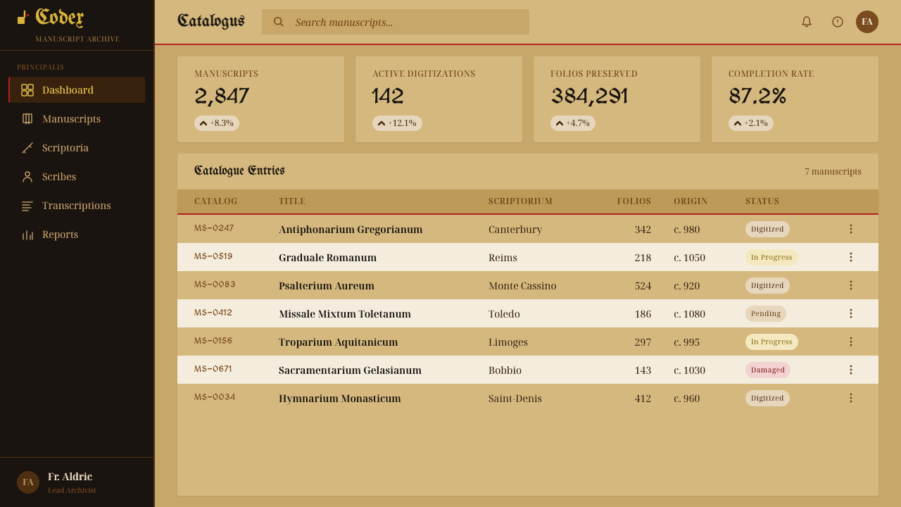
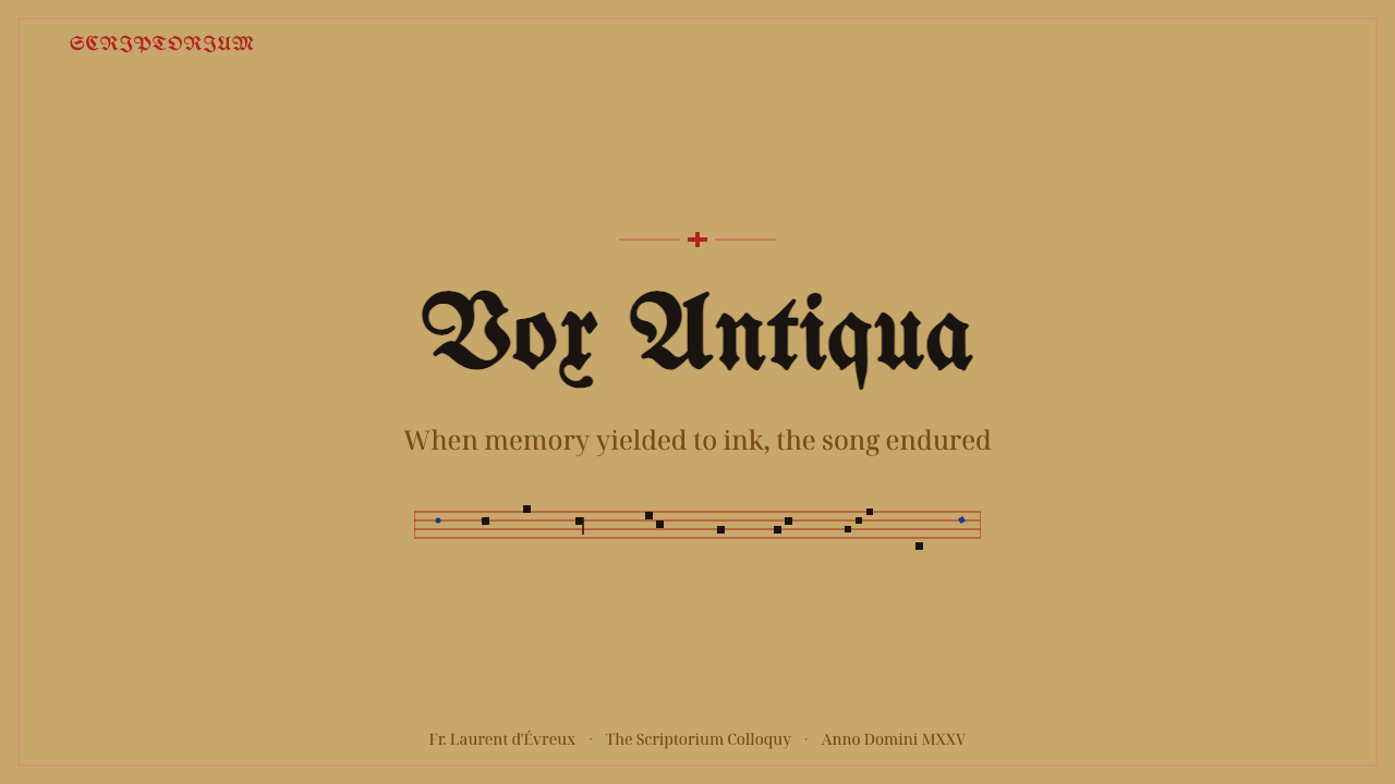
For presentation slides, the style suits a cover page built around a warm tan or parchment-toned field, a single strong rubric-red rule or accent element, and one large, dignified initial-style treatment for the deck's title — echoing the illuminated capital without literally reproducing calligraphy. Content slides should stay quiet: sparse red used only to mark section starts or key labels, generous space around blocks of text, and a restrained hierarchy built from scale and weight rather than color variety. Data slides work best when charts are treated as understated, almost hand-drawn diagrams rather than glossy dashboards — thin rule lines, muted ink tones, no bright gradients.
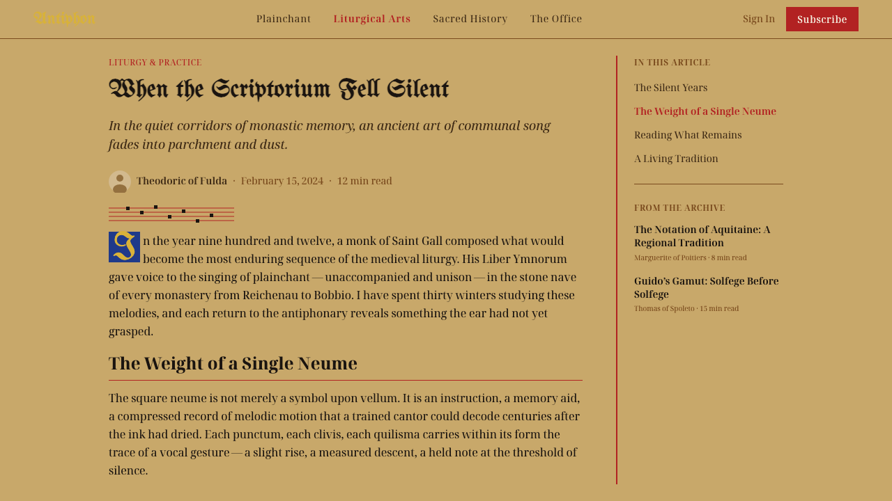
For web UI — dashboards and pricing pages in particular — the palette translates into a warm neutral background instead of clinical white, a single rubric-red used consistently for one class of meaningful action (an alert, a highlighted tier, a primary call to action) and nowhere else, and a quiet, structured grid underneath that gives the page the same calm regularity the ruled staff lines gave the manuscript page. Card borders and dividers should feel drawn rather than default-rendered; heavy or purely decorative iconography works against the style's spirit of restraint.
For editorial and marketing work, the style is a natural fit for anything that wants to feel considered, historical, or crafted rather than mass-produced: long-form articles, brand stories, or premium product pages benefit from a warm parchment-toned background, a dignified initial capital opening the first paragraph, and rubric-red used sparingly for pull quotes, section labels, or a single call-out per page. Marketing pages should resist the urge to gild everything — one gold accent element per composition reads as considered; three or more reads as costume.
The most common mistake is treating this as a generic 'old manuscript' skin — dumping in serif fonts, brown tones, and gold everywhere until the page feels cluttered and antique rather than calm and legible. The source material is disciplined: a limited palette of ground, ink, rubric red, and gold, deployed with a clear structural logic where every accent marks something specific. The moment gold or red is used purely to decorate rather than to signal, the system stops working and starts reading as costume rather than considered design.
Gregorian Chant Neumes — FAQ
Are neumes the same thing as modern musical notes?
Related but not identical. Early neumes recorded melodic contour — whether the pitch went up, down, or stayed level — without fixing exact pitch, since they were memory aids for singers who already knew the tune. Only after Guido of Arezzo's four-line staff gave neumes a fixed vertical reference could a singer determine precise pitch from the page alone. Rhythm, too, was never notated with the precision of modern rhythmic notation; chant rhythm is still a subject of scholarly debate. So neumes are an ancestor of modern notation, sharing its basic purpose, but built on a different and in some ways less exact set of assumptions.
Why is red used for the staff lines instead of black?
The red line served a specific functional purpose: it was conventionally used to mark a fixed pitch reference, most commonly the pitch F, giving the singer a stable anchor point within the notation. A second line, when present, was often drawn in yellow to mark C. Using a different color from the black notation ink made the reference line instantly distinguishable at a glance, functioning much like a color-coded key line in a modern diagram rather than being a purely aesthetic choice.
Were these chant books read by ordinary worshippers, or only by trained singers?
These were specialist choir books, not congregational materials. They were produced for and used by trained monastic or cathedral singers who had already spent years learning the chant repertoire and its notational conventions; an untrained reader of the period could not have sight-read from one. The scale and format of the books reflects this — many were large enough to be propped on a stand and shared by a group of singers standing together, rather than sized for an individual worshipper to hold.
Does this style only work for religious or historical subject matter?
No — its underlying values (warmth, material presence, calm and deliberate hierarchy, restraint in how many accent colors are used at once) transfer well beyond religious content. It suits any brand or product that wants to feel crafted, considered, and unhurried rather than slick or mass-produced: premium editorial content, heritage or craft-focused brands, educational material that benefits from a sense of gravity. It is a poor fit for anything that needs to feel fast, casual, or playful, since the style's entire character depends on patience and weight.
How is this different from a generic 'medieval' or 'parchment' design theme?
A generic parchment theme usually just swaps a white background for a beige texture and calls it done. This system is built on a specific functional logic: a limited palette where every color has a job (ground, structural ink, rubric red for instructions and pitch reference, gold for structural markers), an angular calligraphic letterform rather than a generic serif, and a disciplined, sparse use of gilding tied to genuine structural moments rather than scattered for atmosphere. The difference between the two is the difference between a period costume and a real, working object — the neume system still reads as something built to be used daily, not staged to look old.
Related design styles
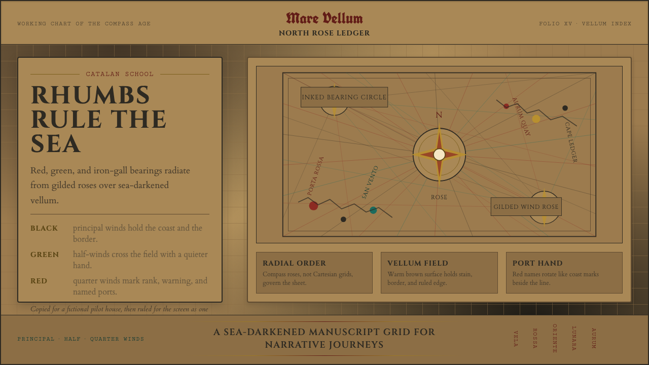 Portolan Rhumb ChartNavigation feels ceremonial. Rhumb lines cross dark vellum with red ink and g…
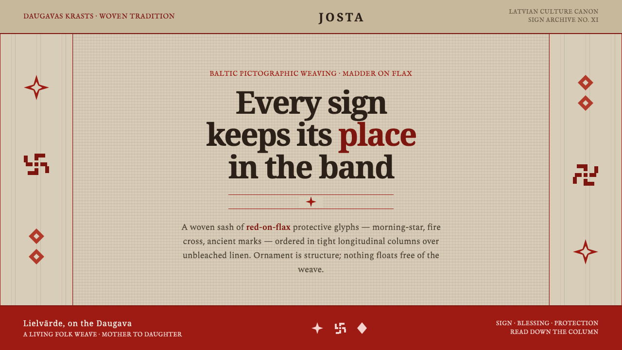 Latvian Lielvārde BeltOrnament is structure. Madder-red Baltic glyphs in tight longitudinal bands o…
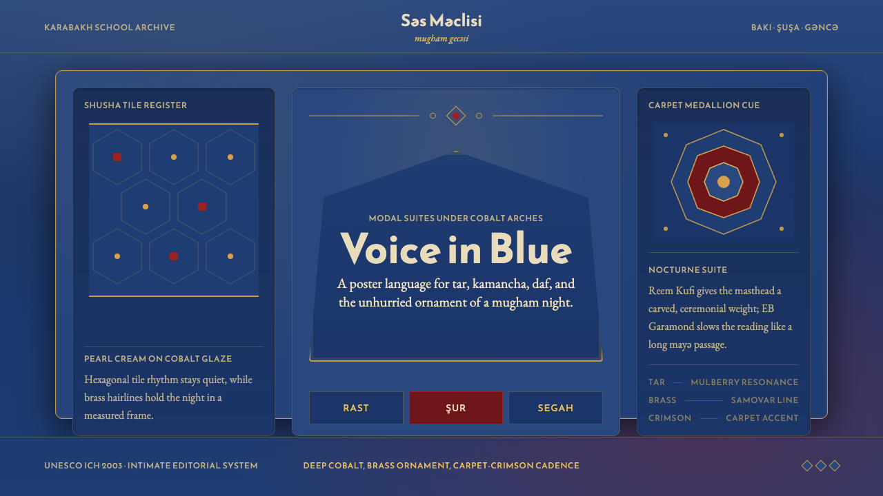 Azerbaijani Mugham Saz BlueMugham night, deeply tiled. Cobalt ground, brass hairlines, arched editorial…
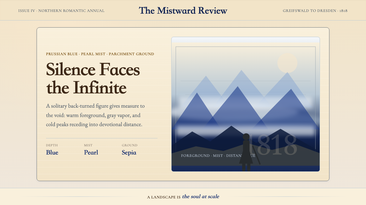 Caspar David FriedrichSilence becomes vast. Prussian blue depth, pearl mist, and parchment framing…
 Degas Ballet PastelsBackstage glamour is labor. Jade walls, rose footlights, cropped serifs on cr…
 Dürer WoodcutInk remembers everything. Fraktur titles, rag-paper cream, and cross-hatched…