What is Grammar of Ornament?
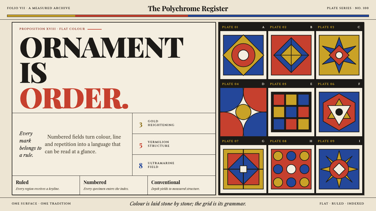
In 1856 Owen Jones flattened the world's ornament onto a hundred numbered plates, and handed designers a system in which pattern is structure and colour is a disciplined triad.
Grammar of Ornament in brief
Grammar of Ornament is the design language of Owen Jones's celebrated 1856 folio, in which he surveyed the ornament of Egypt, Greece, the Alhambra, Persia, India, Byzantium and the Celts and reproduced it across one hundred chromolithographic plates. It is both a reference book and a way of seeing: a grid of self-contained, numbered panels in which each motif is isolated, flattened and keyed to a note.
The visual rules are simple and strict. Colour is the primary triad of vermilion, ultramarine and gold, laid flat with no modelling and used in a proportion Jones stated himself, with blue the largest share and yellow the smallest. Ornament is never illustration: there is no light, no perspective and no trace of drawing from life. Panels sit on warm buff plate paper, set tightly together in a grid, each framed by a ruled rectangle, with the explanatory notes set in Caslon.
What makes the style useful today is the way it makes density feel orderly. A page packed edge to edge with colourful pattern does not read as chaos, because every item sits in a numbered cell and the palette is limited to three hues plus neutrals. Ornament becomes structure rather than decoration, which is why the system can organise a page as well as embellish it.
Where does Grammar of Ornament come from?
Owen Jones published The Grammar of Ornament in London in 1856 through Day & Son, the firm that also handled its chromolithographic printing. The scale of the project was extreme. The book comprises one hundred plates, reportedly printed from some seven hundred lithographic stones, with a single plate sometimes needing as many as twenty colour passes and some adding gold and silver. It was a technical achievement as much as a pattern catalogue, proof that mass colour printing could carry the finest ornament faithfully.
The book belongs to the Victorian design reform movement, the mid-century effort to raise the quality of British manufactured design by returning to principles. Jones held that ornament should decorate a surface rather than imitate nature, and that the great historical styles shared underlying rules of repeat, proportion and colour which could be learned. The Grammar is organised accordingly: it presents ornament by culture and period, but treats each tradition as a source of rules rather than as a costume to be copied.
A major stream of material came from the Islamic world, especially the Alhambra, which Jones had surveyed with the French architect Jules Goury, and the Moresque and Islamic revival of the period gave that source particular prestige. At the Crystal Palace in 1851 Jones had already applied his colour doctrine to a vast interior, a project the source groups under Crystal Palace polychromy: bold primary colours deployed in disciplined bands. The Grammar is the distilled form of those experiments.
Draughtsmen and designers both fed the book and drew from it. Francis Bedford is listed among the key figures, and Christopher Dresser, who became one of the leading designers of the next generation, belongs to its circle of influence. After 1856 the folio became a standing resource for architects, decorators, textile and ceramic designers and teachers, a shared vocabulary of pattern that turned the world's ornament into a source of principles.
What defines the Grammar of Ornament look?
Numbered panels
Each motif lives in its own ruled rectangle and carries a number keyed to a note. The panel is the unit of design: self-contained, equal in rank and complete in itself, so that a page reads like a catalogue and any item can be referred to by its number.
Primary triad in a fixed proportion
Colour runs on vermilion, ultramarine and gold, the primary triad, in a proportion Jones stated himself: blue is the largest field, red the middle and yellow the smallest, with neutral tones separating them. The principle is balance by quantity, a small amount of the lightest colour set against a large amount of the darkest.
Flat colour, no modelling
Colours are laid flat. There is no shading, no gradient, no highlight and no perspective; shape is conveyed by outline and by the juxtaposition of colour fields. This is a core principle of the book: ornament decorates a surface, and does not pretend to open a hole in it.
Ornament as structure
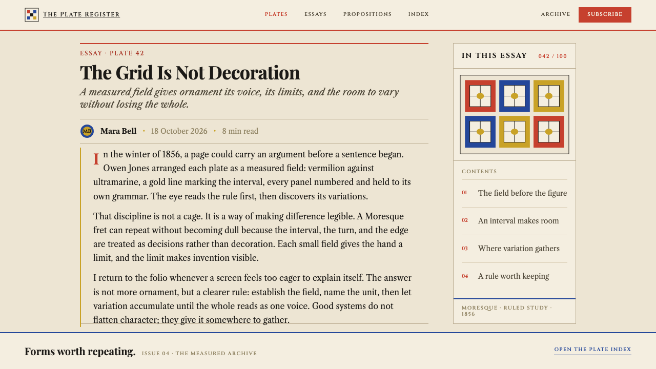
Pattern is not applied over a layout; it is the layout. Repeats, borders, bands and rosettes organise the page, and any figure or text sits within the pattern's logic rather than on top of it. Decoration and construction are one decision.
Warm buff plate paper
The ground is a warm buff, like old plate paper, not pure white. The colours are chosen to sit on this tone, so the hues look printed, slightly mellow and archival, and the page feels like a bound folio rather than a screen.
Notes set in Caslon
Notes and captions are set in Caslon, a classic old-style serif, in modest sizes. Type plays a supporting role: it describes and numbers, while the plates carry the visual force. The effect is scholarly and calm, with the text never competing with the pattern.
Dense grids across cultures
The grid is tight, with panels packed up to their edges, so the page appears full. The consistent frame is what lets motifs from different continents and centuries sit side by side as equals, which gives the system its calm authority despite the richness of colour.
Who shaped Grammar of Ornament?
Architect, designer and author of the Grammar, Jones wrote the numbered propositions that open the book, set out the principles of ornament and stated his own proportions for colour. His work on the Alhambra, his colour scheme for the Crystal Palace and the Grammar itself made him the central figure of Victorian design reform.
A French architect who worked with Jones on the study of the Alhambra, Goury stands for the first-hand survey of Islamic ornament that fed the Grammar's most admired plates. He died young in the course of that work, and Jones carried the project on, which is part of why the Alhambra holds such a personal place in the book.
Bedford is listed among the key figures of the book's circle, as one of the draughtsmen associated with preparing its plates. His name stands for the drawing labour that stood behind the Grammar: every flat, numbered panel had first to be traced, simplified and made ready for the lithographer's stones.
A designer of the next generation, Dresser belongs to Jones's circle of influence and carried the reform principles of flat, structured, non-naturalistic ornament into later industrial design. He represents how the Grammar's rules left the folio and entered the practice of manufacture.
How do you use Grammar of Ornament today?
Grammar of Ornament is one of the few historical styles designed explicitly as a system of rules, so it translates well into design systems. The rules do the work: flat triad colour, ruled panels, a numbered grid and sober type. Applied faithfully, it reads as rich yet disciplined; applied loosely, it collapses into generic Victorian decoration.
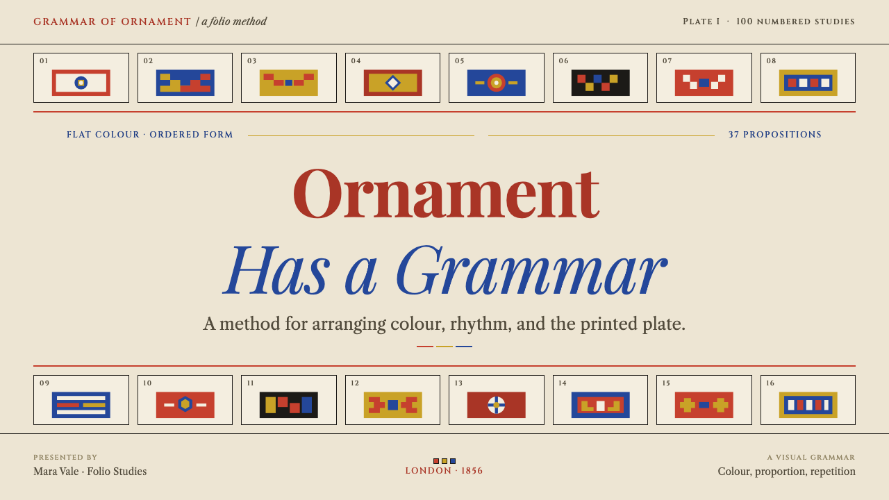
For slides, a cover can present a single large plate-like panel, a ruled rectangle on buff ground with the title in a Caslon-like serif and a small plate number in the corner. Content slides become grids of panels, each with its own number, caption and one idea, so that a deck turns into a folio. Data slides use the triad to separate categories, charts in flat vermilion, ultramarine and gold, with ruled panel frames around each chart and notes beneath.
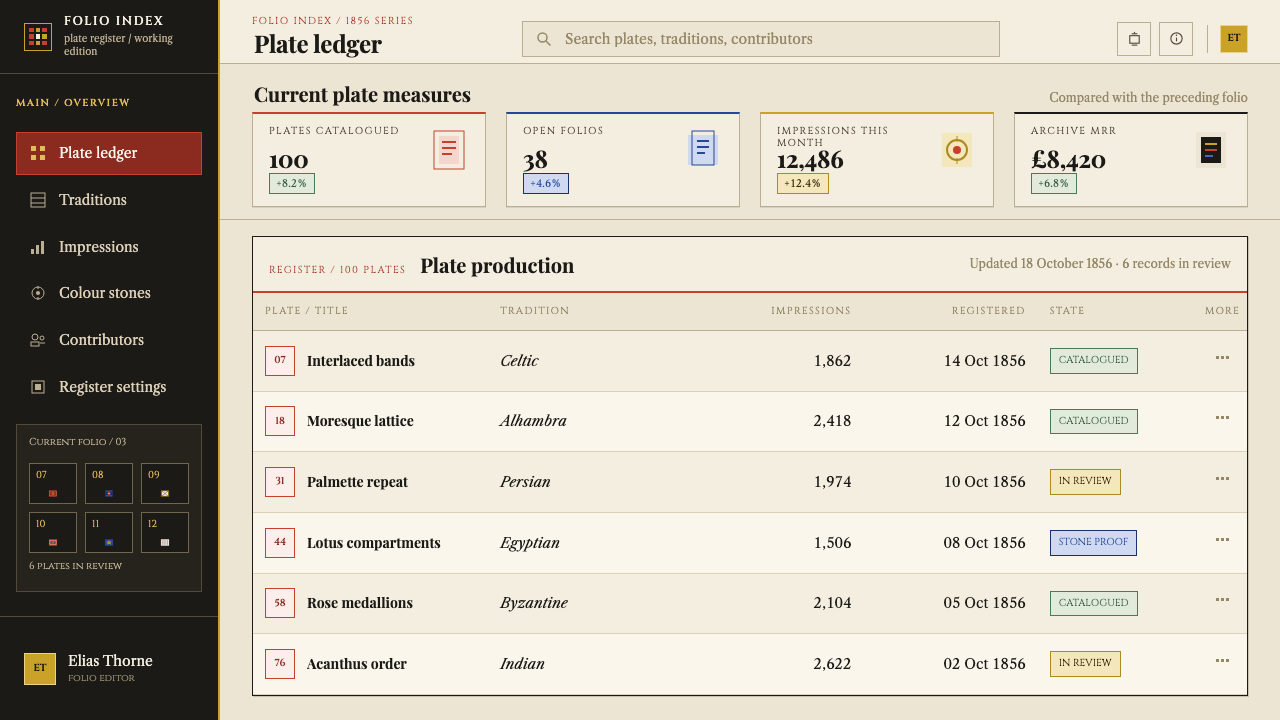
For web interfaces the style suits documentation hubs, pattern libraries, educational products, museum collections and any interface with many comparable items. Build a card grid from ruled panels rather than shadowed cards, use buff backgrounds, and give the triad jobs such as categories, status and links. Numbered items give users fixed references. Keep controls flat, and let hover states change colour fields rather than lift elements.
For editorial and marketing work it fits catalogues, archives, cultural publications, heritage brands and educational material. A page can lay out specimens as a plate: images or motifs in ruled frames, numbered, with small serif captions. Marketing pages can alternate buff plates with saturated panels while holding to the triad and the numbered grid.
The most common mistake is to read the triad as 'primary colours, fine' and then add gradients, drop shadows or extra hues. The system works because colour is laid flat and the proportion is controlled, with blue dominant and yellow smallest. Another is to use ornament as background wallpaper: in this style, pattern is organised in panels and carries the structure, so scattering it behind text breaks the grid. Finally, avoid vague labels such as 'oriental'. The source is a catalogue of specific traditions, and each panel should stay faithful to the one it came from.
Grammar of Ornament — FAQ
Is Grammar of Ornament only for pattern-heavy designs?
No. The pattern is the most visible layer, but the structure underneath, ruled numbered panels, flat triad colour and buff ground, works on sparse layouts too. A page can use one panel with a single motif and a short note and still read as part of the system. Pattern is optional; the framing and the discipline are what hold it together.
Why does the style use a primary triad rather than a full palette?
Because that was Jones's doctrine. He argued that a limited triad, balanced by stated proportion and separated by neutrals, gives harmony, and the Crystal Palace interior was a large-scale test of it. The restriction is also practical: with only three hues, flat colour reads as ordered even on a dense page, and any extra hue would break the balance.
What is the role of the numbering?
The numbers turn a page of pattern into a catalogue. Each panel is keyed to a note, so the page can be read, cited and cross-referenced. In interface terms this gives users stable handles on items and gives the layout a quiet rhythm, since each cell announces itself in the same small way.
Is it the same as Victorian or Art Nouveau style?
No. It sits inside Victorian design reform, which was partly a reaction against naturalistic, heavily shaded ornament. Jones favoured flat, geometric, conventionalised pattern. Art Nouveau, with its flowing natural curves, is a later and different direction, so a Grammar of Ornament page should feel structured and geometric, not organic.
Can it be used for modern, minimal products?
Yes, if you take the discipline rather than the density: three colours, flat fills, ruled panels and a numbered grid. A minimal product can use one framed panel per feature on warm paper and a single accent hue. What it cannot do is lose the ornament's logic entirely, because without the frame and the flat colour it becomes generic.
Related design styles
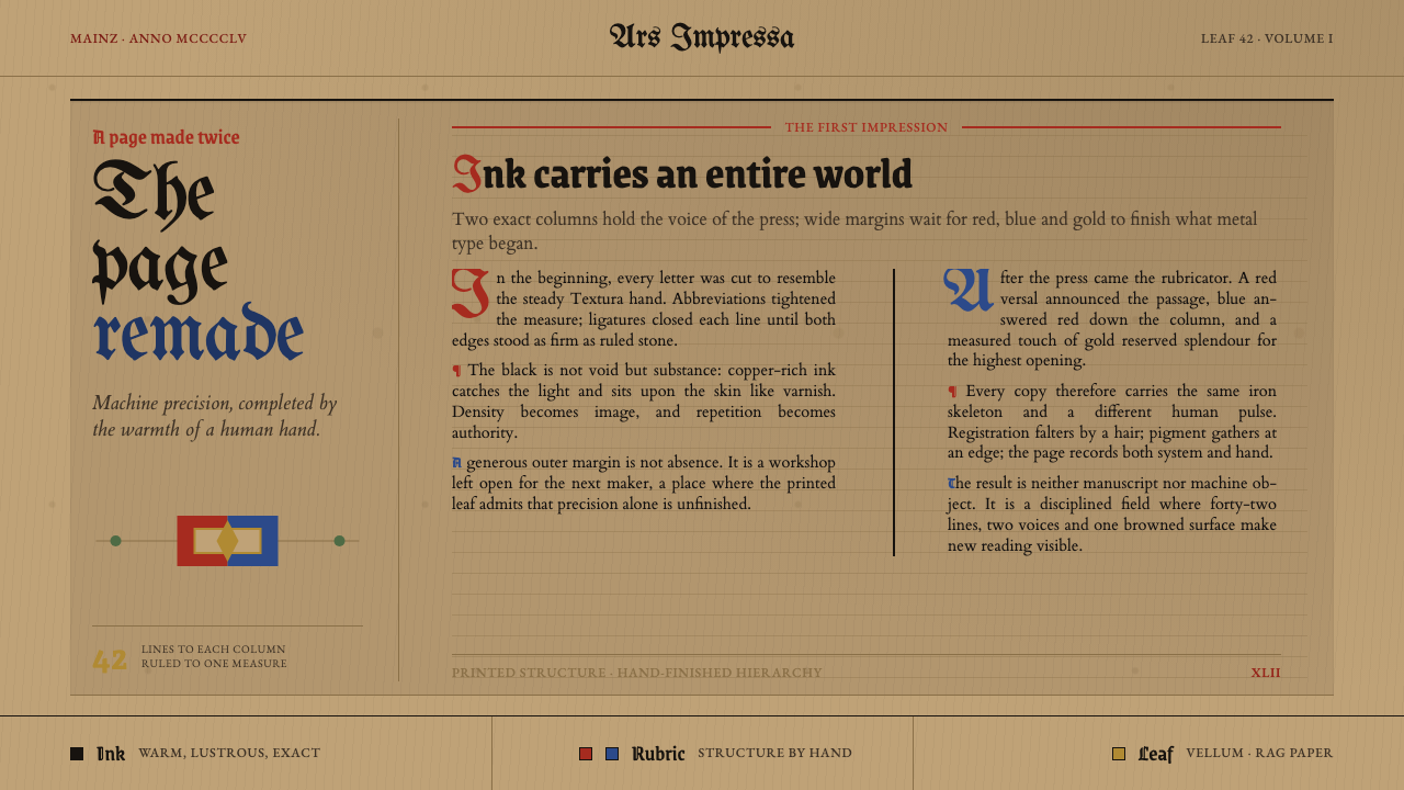 Gutenberg 42-Line BiblePrecision awaits the hand. Dense black columns open into red, blue and gold o…
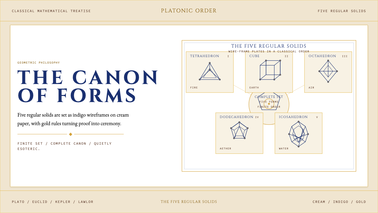 Sacred Geometry Platonic SolidsGeometry feels ritual. Cream paper, indigo wireframes, gold rules stage the f…
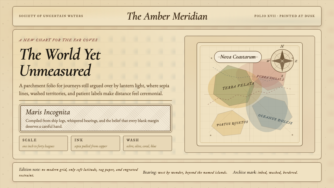 Vintage CartographyDiscovery feels ceremonial. Sepia copperplate on aged parchment, framed by co…
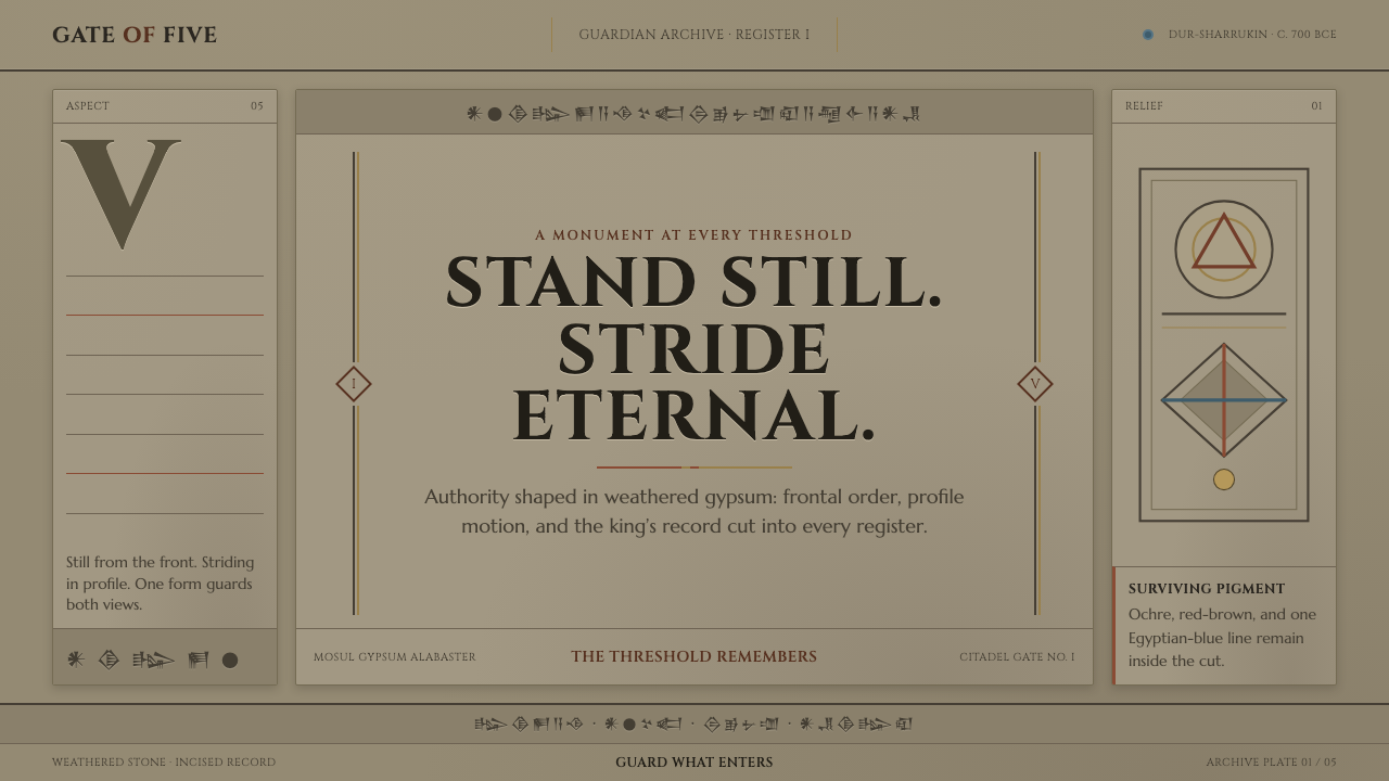 Assyrian Lamassu ReliefAuthority carved into silence. Buff-gray stone, monumental capitals, and cune…
 Brihadeeswarar Temple GraniteStone that glows at dawn. Weathered ochre grounds, amber relief edges, inscri…
 British Royal MonarchyCeremony becomes structure. Amethyst panels, gilt borders, blackletter, mirro…