What is Assyrian Lamassu Relief?
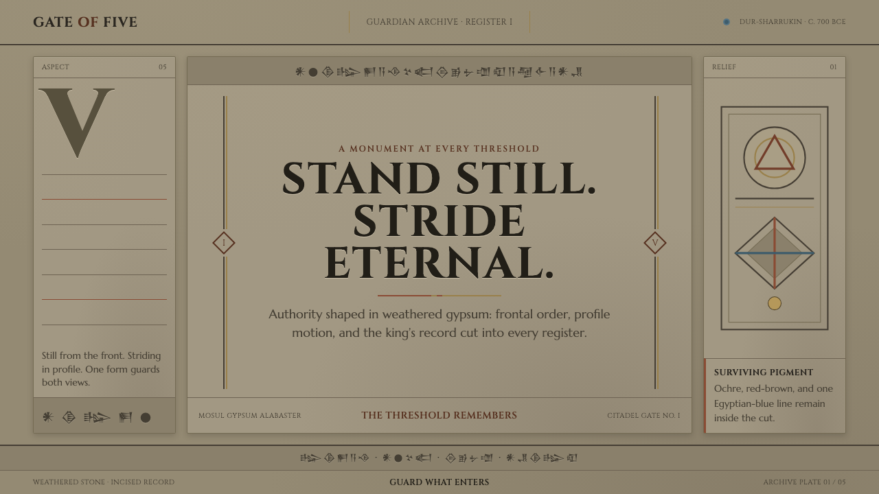
Assyrian Lamassu Relief turns authority into architecture: weathered stone, monumental capitals, chiselled bodies, and cuneiform that reads as a continuous field of power.
Assyrian Lamassu Relief in brief
Assyrian Lamassu Relief is a visual system derived from the colossal human-headed winged bulls placed at the citadel gates of Sargon II. Carved from Mosul gypsum alabaster, these guardians were designed to govern the approach to power before a visitor entered the palace. Their visual language is not decorative in the modern sense. It is monumental, dense, frontal, and deliberate: a stone surface carries anatomy, wings, inscriptions, and architectural authority at once.
The lamassu are especially compelling because they resolve two viewpoints in one body. Seen head-on, the guardian stands still and confronts the viewer; seen from the side, it advances. Its five legs make that double reading possible. A design inspired by this structure should therefore feel stable without becoming inert. Large forms hold the composition in place, while directional carving, text bands, and repeated marks create controlled movement across the surface.
Its material character begins with aged gypsum rather than pristine white stone or soft cream paper. The ground should feel buff-gray, dry, worn, and excavated, with the quiet variation of a carved surface exposed to time. Monumental Latin capitals coexist with authentic cuneiform, while the remaining sense of color is restrained: ochre, red-brown, and traces of Egyptian blue appear as surviving pigment, not as contemporary decoration. The result is solemn rather than nostalgic, and archaeological rather than rustic.

Where does Assyrian Lamassu Relief come from?
The historical source is Neo-Assyrian palace relief sculpture from Dur-Sharrukin, now known as Khorsabad, in northern Mesopotamia. Around 700 BCE, during the reign of Sargon II, colossal lamassu were cut from Mosul gypsum alabaster for the citadel gates. Their location matters to the style: they belonged to thresholds, not private interiors. They were made to be encountered at a transition between outside and inside, ordinary passage and royal space.
Sargon II is the named ruler associated with these gate guardians, while the individual palace sculptors remain unnamed in the approved material. That anonymity is meaningful for a design interpretation. The system should not imitate the signature-driven language of a personal illustration or luxury logo. It should feel produced by an institutional hand: disciplined, cumulative, and attached to a larger architectural order rather than to the personality of a single maker.
The surviving objects also preserve an important tension between original making and present appearance. Their gypsum alabaster was close to white when newly carved, but weathering has shifted the material toward buff-gray. Their paint was once more vivid, yet what remains today is fragmentary: ochre, red-brown, and Egyptian-blue traces. This makes restraint historically appropriate. A contemporary application should evoke what survives on stone, allowing age, abrasion, and inscription to carry the visual charge.
What defines the Assyrian Lamassu Relief look?
Weathered Gypsum Ground
The dominant field is buff-gray gypsum alabaster as it appears after weathering: dry, muted, mineral, and faintly irregular. It must avoid both fresh-cut white and cream warmth. Surface variation should suggest carved stone and age, never soft paper grain, polished marble, or a decorative distressed effect.
Monumental Capitals
Latin lettering should be set as monumental capitals with a carved, architectural presence. The letters are not delicate labels floating above the composition; they are weight-bearing marks. Use them for titles, names, or declarations that need to read as inscriptions cut into a public threshold.
Cuneiform Registers
Real cuneiform script forms dense horizontal registers across the surface. These bands are not filler texture. They establish rhythm, historical scale, and the sensation that language itself has become material. Keep them legible as script where possible, and place them with the continuity of a carved inscription rather than as scattered symbols.
Chiselled Anatomy
Forms should carry the disciplined physicality of chiselled musculature, feather masses, and animal structure. Edges are cut and planar rather than inflated or glossy. When figures or objects appear, treat them as carved volumes emerging from a shared stone field, not as independently rendered illustrations.
Threshold Symmetry and Motion
The frontal guardian establishes a commanding bilateral presence, while the side view introduces procession and advance. Layouts can use this tension productively: a centered mass creates authority, then bands, profile forms, or directional details lead the eye across it. Stillness should always contain the possibility of movement.
Surviving Pigment
Color appears as archaeological evidence rather than a full contemporary palette. Ochre can warm a carved detail, red-brown can deepen an inscription or contour, and Egyptian blue can register as a rare cool trace. These colors work best in fragments and interruptions, as if pigment has endured unevenly on stone.
Who shaped Assyrian Lamassu Relief?
Sargon II is the Neo-Assyrian ruler associated with the citadel gates at Dur-Sharrukin and with the lamassu carved for them around 700 BCE. In this visual system, his role is not a portrait subject but the source of the work's political scale: the guardian is inseparable from royal architecture, controlled entry, and the public projection of authority.
The palace sculptors named by the source material are collective rather than individual figures. Their work joins carving, inscription, anatomy, and architectural placement into one surface. A faithful design response should preserve that integration: typography, image, and texture should appear governed by one carved logic, not assembled as unrelated layers.
The lamassu itself is the defining figure of the style: a colossal human-headed winged bull with five legs, able to stand guard when viewed from the front and stride when viewed from the side. Its hybrid body demonstrates how symbolic authority can be made spatial and directional without relying on naturalistic representation.
How do you use Assyrian Lamassu Relief today?
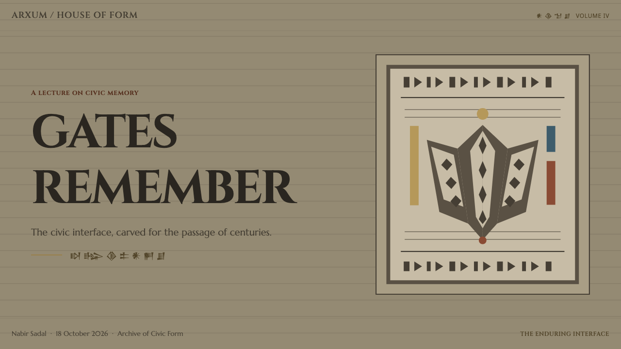
For presentation covers, use the lamassu system as an entrance. A broad weathered-stone field can carry one monumental title, a cropped guardian silhouette or carved anatomical fragment, and a restrained inscription band. The composition should feel like a gate encountered at distance. Avoid filling the cover with explanatory motifs; authority comes from a few large, materially convincing elements.
For presentation content and data slides, establish a calm stone ground and use cuneiform registers as structural separators rather than ornamental borders. Content should move from one carved heading into compact explanatory groups. Data visualizations can borrow the relief logic: strong contours, incised labels, and a limited set of surviving-pigment accents make categories feel embedded in a shared surface rather than floating as generic charts.
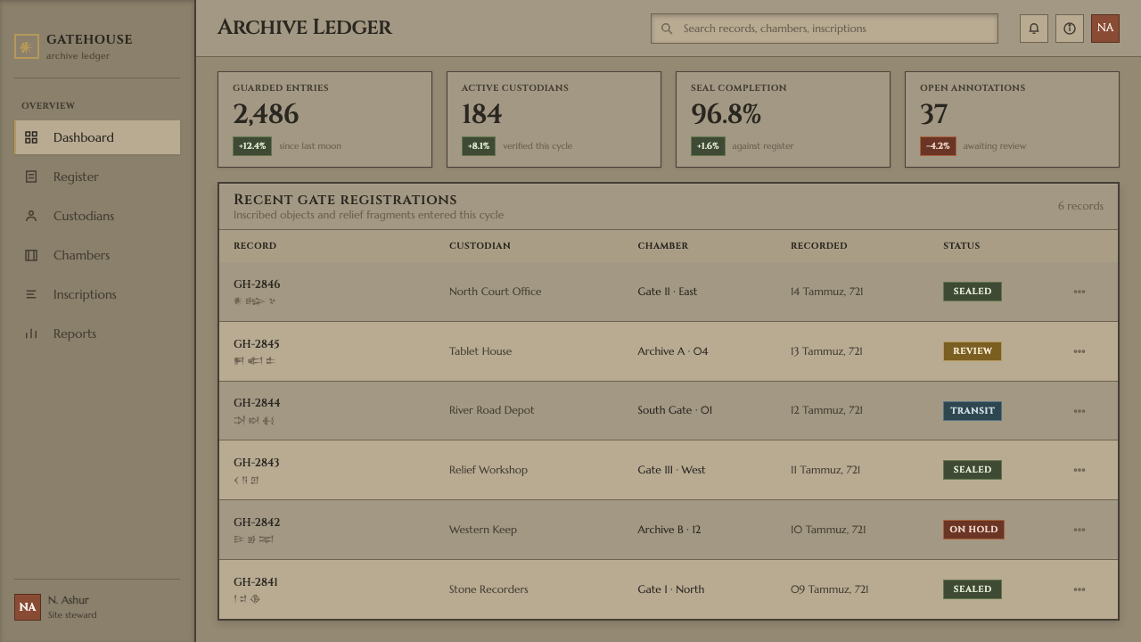
For web interfaces, the style works best where trust, permanence, and controlled access are useful values: archival platforms, collections, institutional dashboards, or high-level reporting views. Use monumental type for section titles and a quieter reading voice for utility content. Panels should feel inscribed or recessed into a continuous ground. Cuneiform can mark navigation zones, metadata bands, or section boundaries, but should not obstruct everyday reading.
For editorial and marketing work, treat the page as a carved tablet rather than a collage. Long-form articles benefit from wide breathing areas around major headings, image crops that privilege profile, wing, or muscular contour, and recurring text bands that bind sections together. Campaign material can frame a product or event as a threshold: one enters a field of knowledge, a collection, or a civic institution under the gaze of a guardian.
The common mistake is turning Assyrian reference into generic ancient-world decoration. Random wedge-like marks, bright blue-and-gold luxury palettes, faux parchment, and fantasy creature imagery all break the source logic. The style depends on weathered gypsum, real cuneiform, monumental restraint, and the specific relationship between guardian sculpture and palace gate. If an element does not strengthen material gravity, inscriptional rhythm, or threshold authority, it is probably excess.
Assyrian Lamassu Relief — FAQ
Is Assyrian Lamassu Relief simply an ancient or archaeological style?
No. Its historical reference is archaeological, but its governing idea is architectural authority. The key question is not whether a layout looks old; it is whether it feels placed at a consequential threshold. Weathered gypsum, carved text, and guardian forms should organize access, hierarchy, and attention. A surface full of generic antiquity cues without this structural purpose is only costume.
Can modern Latin typography be used without cuneiform?
Yes, but the style loses one of its strongest material rhythms. Monumental Latin capitals can carry the architectural voice on their own, especially in interfaces that need straightforward reading. When cuneiform is omitted, compensate with inscriptional grouping, carved dividers, and a stone-ground hierarchy. Do not replace it with invented pseudo-cuneiform; authenticity matters more than surface resemblance.
How should the surviving pigment colors be used?
Use them as evidence of what remains, not as a decorative palette spread across every component. Ochre, red-brown, and Egyptian blue are most convincing when they interrupt the mineral ground in small, purposeful places: an emphasized contour, a key label, a narrow band, or a selected data category. Their scarcity gives them authority.
Does the style work for contemporary dashboards and data products?
It can, particularly for institutional, archival, analytical, or access-controlled products. Its strength is hierarchy: large headings establish authority, inscription bands separate systems, and restrained accents identify what matters. It is less suitable when the product needs playful intimacy, rapid visual novelty, or an atmosphere of softness. The user should feel oriented by the structure, not overwhelmed by historical reference.
Related design styles
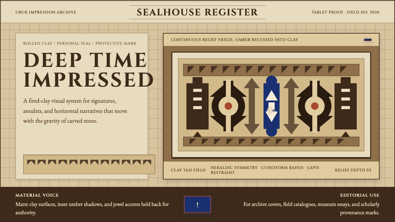 Sumerian Cylinder SealAncient weight, pressed in clay. Cinzel caps and cuneiform wedges cut umber i…
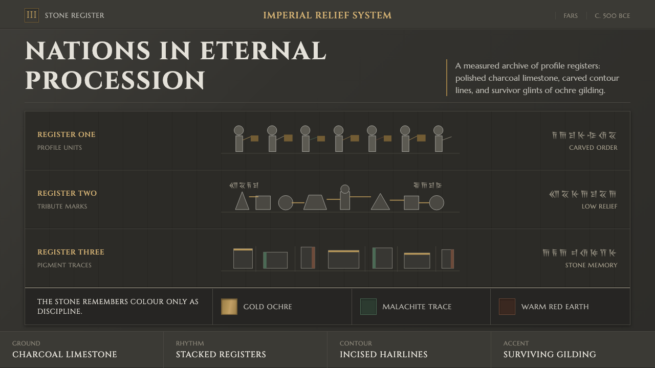 Achaemenid Persepolis ReliefImperial restraint in stone. Charcoal registers carry ochre, green, and red p…
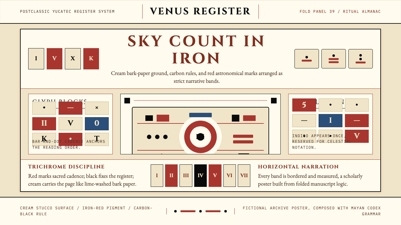 Mayan Dresden CodexSacred astronomy, measured. Cream registers, iron-red glyphs, carbon rules.
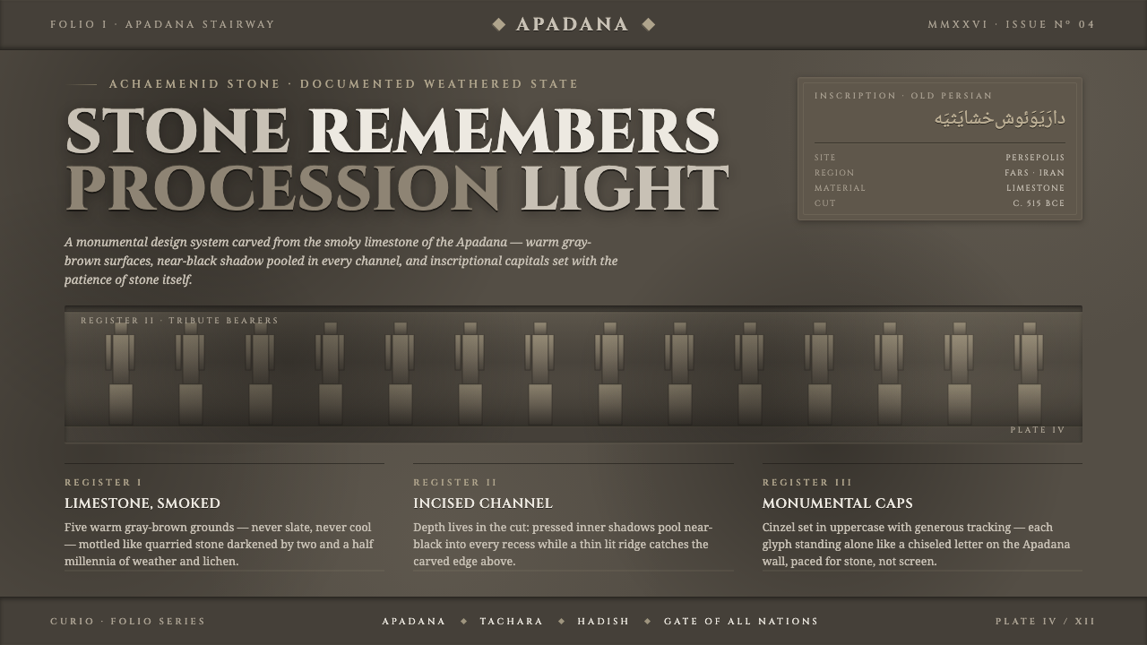 Persian Gray Stone ReliefStone remembers. Smoky weathered limestone, near-black shadow in every channe…
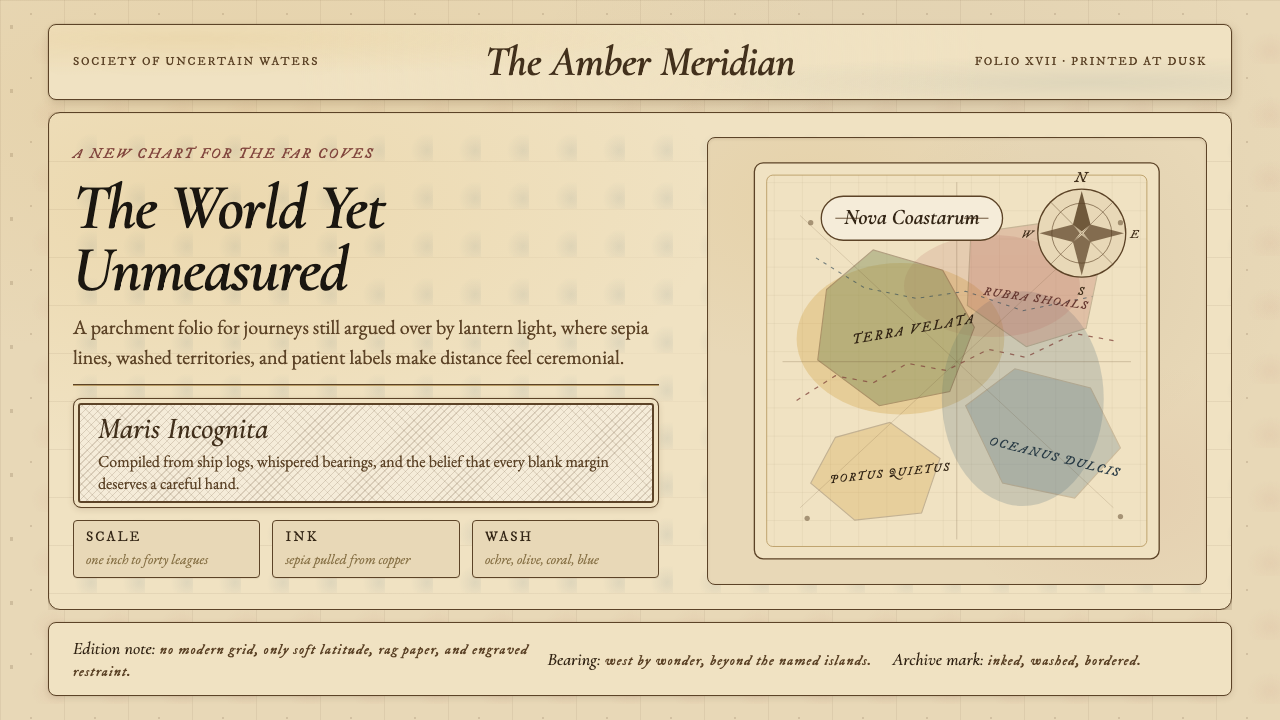 Vintage CartographyDiscovery feels ceremonial. Sepia copperplate on aged parchment, framed by co…
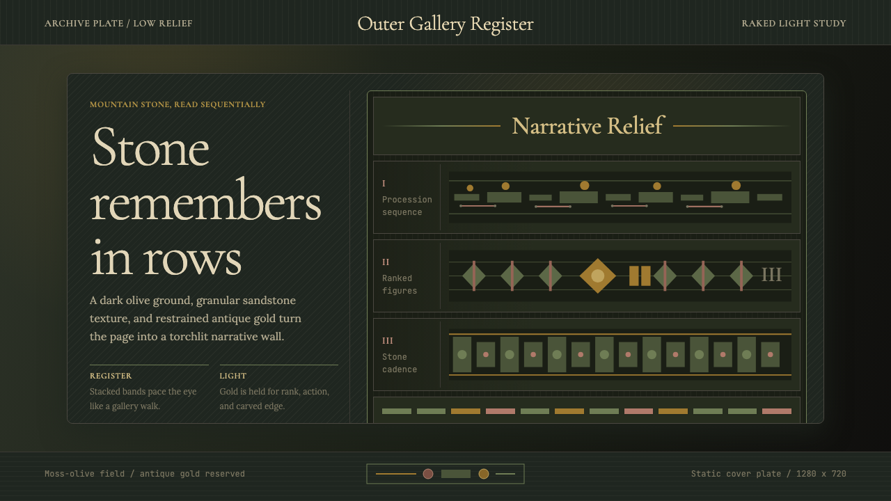 Cambodian Angkor Bas-ReliefStone speaks in shadow. Olive registers and antique gold carve a torchlit arc…