What is Achaemenid Persepolis Relief?
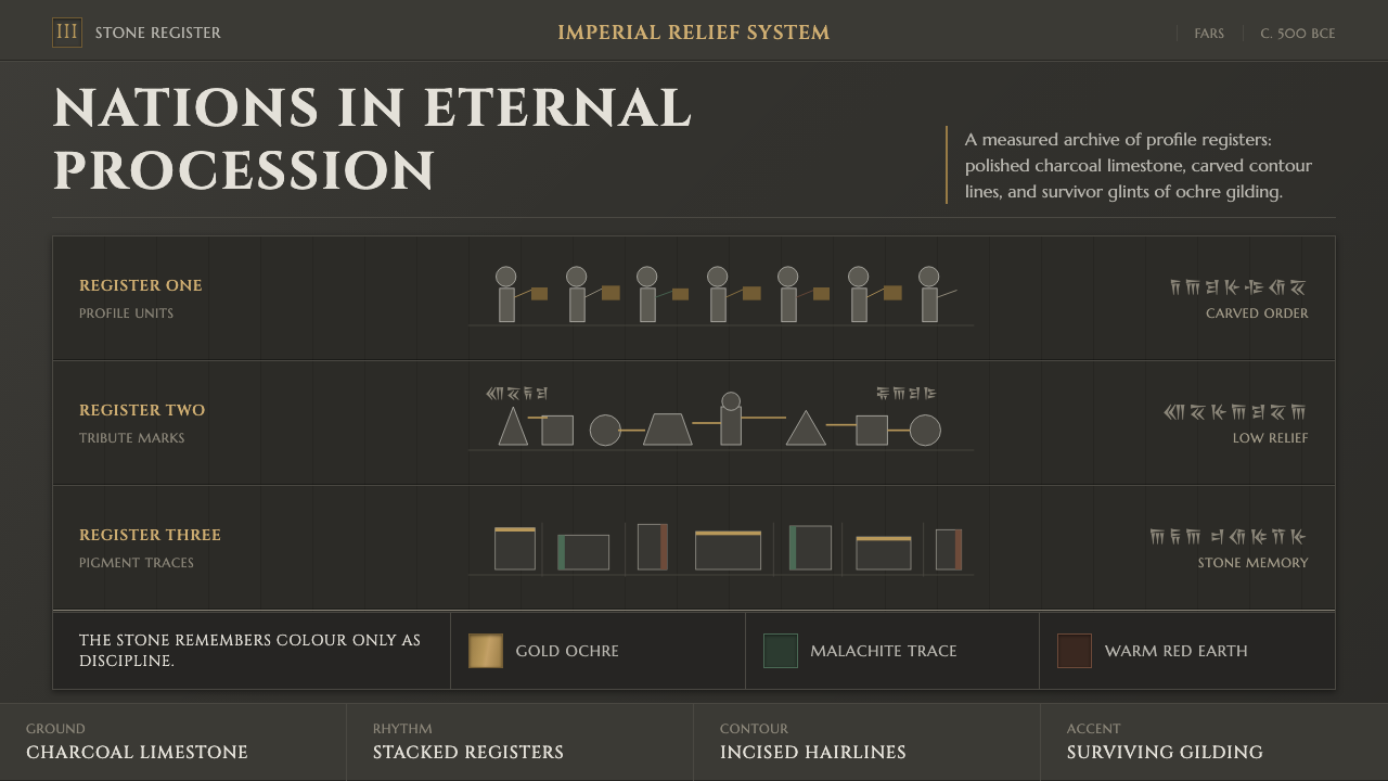
Achaemenid Persepolis Relief turns imperial procession into a design language of carved restraint, dark stone, and unbroken ceremonial order.
Achaemenid Persepolis Relief in brief
Achaemenid Persepolis Relief is a style derived from the staircase friezes of the Apadana at Persepolis, where delegations of nations move in an enduring procession toward the Achaemenid court. Its defining visual device is the register: figures are organized in long horizontal bands, shown in disciplined side profile, with every contour contributing to a collective rhythm rather than individual drama.
The style treats the image as a carved surface, not as an open window onto a scene. Chiselled outlines, compressed depth, and repeated silhouettes make the composition feel permanent and ceremonial. The eye moves laterally across attendants, garments, offerings, and gestures, reading rank through sequence, spacing, and restraint.
Its palette follows the stone’s surviving memory: a deep charcoal ground associated with polished limestone, interrupted by restrained traces of gilded ochre, malachite green, and warm brown-red pigment. These colors do not compete for attention. They appear as evidence, emphasis, and continuity within a dark, ordered field.
Where does Achaemenid Persepolis Relief come from?
The source of the style is Persepolis in Fars, Achaemenid Persia, in present-day Iran. The relief language belongs to the court sculpture associated with the reigns of Darius I and Xerxes I, around 500 BCE. Its public face is neither a loose narrative nor a single isolated emblem: it is an ordered encounter between imperial center and the nations represented in procession.
The Apadana staircase friezes provide the essential compositional lesson. Delegations do not rush, collide, or dissolve into background activity. They file across banded stone in profile, carrying tribute and moving through a shared ceremonial direction. Repetition is therefore not decorative repetition; it is the visual expression of an empire made legible through order.
Darius I and Xerxes I anchor the historical frame supplied by this visual world. Their reigns place the reliefs within an Achaemenid court culture whose authority is communicated through continuity, measured hierarchy, and the controlled presentation of many peoples within one procession. The resulting image has an imperial scale without needing visual excess.
For contemporary interpretation, the important inheritance is not archaeological imitation. It is the relief’s method: establish a dark, durable ground; organize information into horizontal registers; reduce forms to clear profile contours; and let restrained pigment traces activate the stone rather than overwhelm it. The outcome should feel composed, ceremonial, and materially grounded.
What defines the Achaemenid Persepolis Relief look?
Charcoal Stone Ground
The foundation is deep charcoal, understood as polished limestone rather than empty blackness. It should feel dense, mineral, and slightly ceremonial: a surface that receives carving, contour, and pigment trace. Large light fields weaken the style’s sense of carved permanence.
Profile Procession
Figures and symbols are most convincing when arranged as a side-facing procession. The profile is not merely historical decoration; it establishes direction, continuity, and mutual discipline. Each form should appear to belong to a larger movement across the surface.
Horizontal Registers
Banded registers organize the composition into calm, readable strata. They are useful for grouping information, but should remain firm and architectural rather than becoming ordinary dividers. A register gives content a ceremonial route through the layout.
Chiselled Contour
Edges should read as incised or cut: deliberate, hard, and structurally meaningful. Curves may describe garments, offerings, or figures, but they should never become soft illustration. The contour carries much of the style’s authority because it makes each element feel set into stone.
Pigment Traces
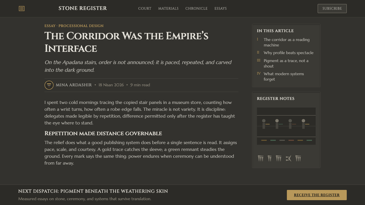
Ochre, green, and warm brown-red function as surviving traces, not broad decorative floods. They should appear selectively against charcoal, suggesting gilding, malachite, and remembered pigment. Their power comes from rarity and placement, not saturation or abundance.
Imperial Restraint
Nothing in the system needs to shout. Hierarchy is carried by procession, scale relationships, contour density, and the controlled return of color. The desired mood is not luxury as accumulation, but authority as calm, sustained order.

Who shaped Achaemenid Persepolis Relief?
Darius I is one of the two rulers named in the historical frame of the Persepolis relief tradition. In a style guide derived from this material, his significance is structural: the procession is read as courtly order made visible, with delegated peoples and tribute presented through disciplined continuity rather than spectacle.
Xerxes I shares the period associated with the relief language of Persepolis. His presence keeps the style tied to an Achaemenid imperial court rather than an abstract ancient pattern. The visual vocabulary therefore asks for ceremony, hierarchy, and a measured sense of collective representation.
The Apadana staircase friezes are the direct formal source: banded stone, strict profiles, and delegations advancing in an eternal procession. They demonstrate how repeated human forms can carry information, rhythm, and ceremonial weight while preserving an unusually calm overall surface.
How do you use Achaemenid Persepolis Relief today?
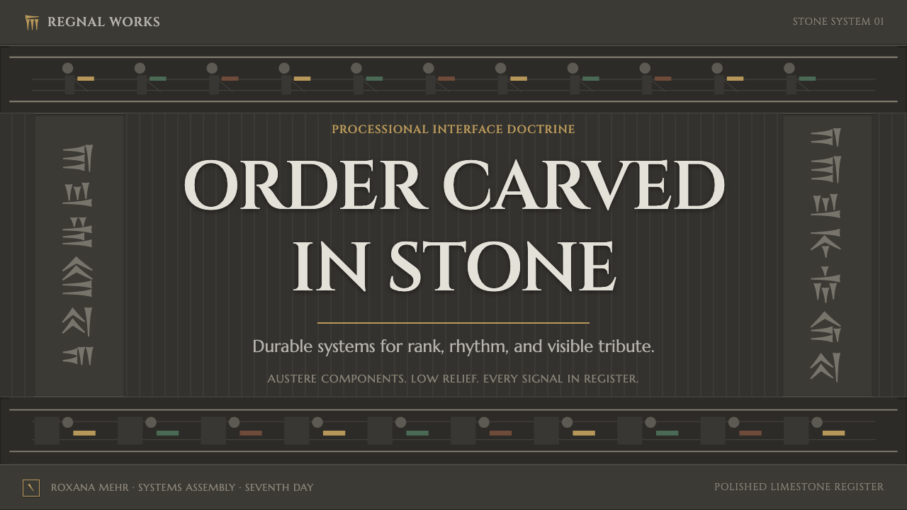
For presentation covers, use the charcoal ground as the primary field and establish one decisive processional direction. A cropped profile silhouette, a long ruled register, or a restrained tribute-like object can anchor the title. Keep the headline formal and spare; ochre, green, or brown-red should mark one important point rather than decorate every corner.
For content slides, treat each section as a carved register. Align headings, notes, and supporting elements so that the eye travels laterally with little interruption. On data slides, translate categories into ordered bands or repeated profile-like marks, using the pigment colors to distinguish a meaningful emphasis while allowing charcoal and stone-like negative space to carry the structure.
For web interfaces, the style is strongest in dashboards, archives, collections, and pricing pages that benefit from calm authority. Use banded navigation, firm contour boundaries, and a clear direction of reading. Cards and panels should feel inset or carved from one continuous surface, not like soft floating objects placed above it.
For editorial and marketing work, this language supports cultural programming, exhibitions, premium collections, and long-form stories that need gravitas. Let a horizontal procession carry metadata, chapters, contributors, or product features. Imagery should be tightly cropped and subordinated to the register, so the page retains the disciplined, stone-bound quality of the source.
The common mistake is to turn the style into a generic dark luxury treatment. Polished charcoal alone is not enough, and lavish use of gold-like color quickly breaks the restraint. Avoid noisy ornament, atmospheric softness, and unrelated ancient motifs. The system works when profile, band, contour, and sparse pigment traces all reinforce the same ceremonial order.
Achaemenid Persepolis Relief — FAQ
Is this style simply an ancient Persian ornament theme?
No. Its strongest idea is organizational, not ornamental. The Apadana source uses profile figures, horizontal bands, and repeated procession to make courtly order visible. A successful contemporary application borrows that compositional discipline rather than scattering ancient-looking details over an otherwise unrelated layout.
Why is the background so dark?
The charcoal field is tied to the description of polished limestone and gives the system its carved, durable character. It also lets the surviving ochre, green, and warm brown-red pigment traces read as deliberate evidence. A pale background can be used only with great care, because it removes much of the stone-bound atmosphere.
How should color be distributed?
Keep charcoal dominant, then use ochre, malachite green, and warm brown-red as sparse traces with specific duties: focus, category, ceremonial emphasis, or a small signal within a register. Their restraint matters more than exact balance. When every element is colorful, the sense of recovered pigment disappears.
Can photography work with Achaemenid Persepolis Relief?
Yes, if photography behaves like part of the carved system. Crop it firmly, favor profile or processional direction, and place it within a register rather than allowing it to become an immersive scene. The photograph should support contour, sequence, and material gravity instead of introducing unrelated softness or visual noise.
Where does this style work best?
It is most appropriate where ceremony, continuity, collection, or institutional authority are central: cultural interfaces, archival systems, exhibition communication, premium editorial work, and data views that need ordered hierarchy. It is less suitable when the product depends on casual warmth, playful spontaneity, or a bright and weightless atmosphere.
Related design styles
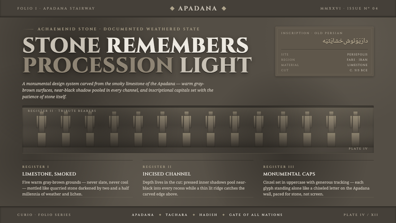 Persian Gray Stone ReliefStone remembers. Smoky weathered limestone, near-black shadow in every channe…
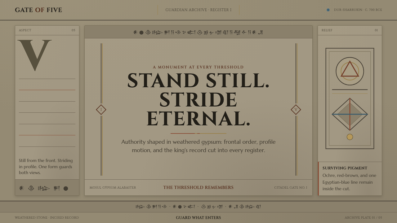 Assyrian Lamassu ReliefAuthority carved into silence. Buff-gray stone, monumental capitals, and cune…
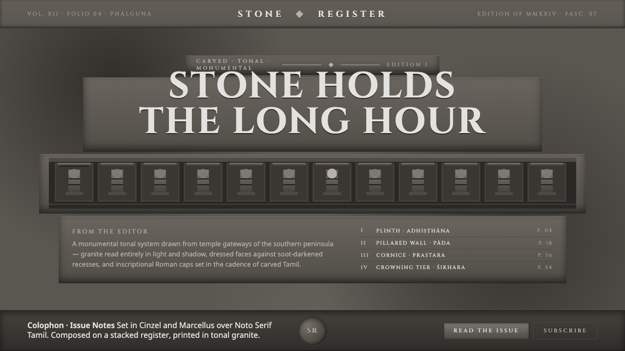 Dravidian Granite GrayscaleRead entirely in grayscale. Soot-dark recesses against dressed granite, Cinze…
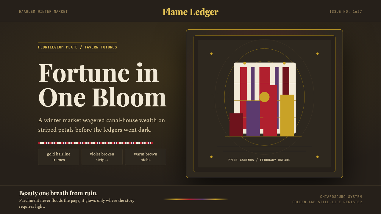 Dutch Tulip ManiaSpeculation burns in shadow. Flame red petals, violet stripes, gold frames on…
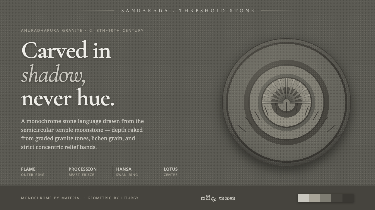 Sandakada Pahana MoonstoneDepth carved from shadow, never hue. Weathered-granite grays in concentric mo…
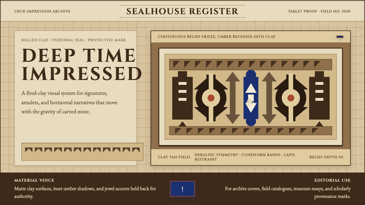 Sumerian Cylinder SealAncient weight, pressed in clay. Cinzel caps and cuneiform wedges cut umber i…