What is Sandakada Pahana Moonstone?
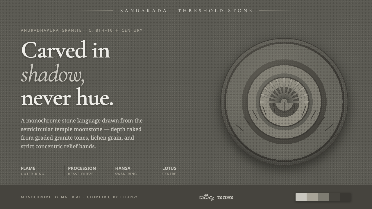
The Sandakada Pahana turns weathered granite into a language of thresholds — depth carved from shadow, geometry gathered into concentric motion, and silence made tactile.
Sandakada Pahana Moonstone in brief
The Sandakada Pahana is the carved granite semicircle placed at the foot of temple stairways in Anuradhapura-era Sri Lanka. Its form is both architectural threshold and visual composition: concentric bands of flame, a procession of elephant, horse, lion, and bull, a ring of hansa swans, and a central half-lotus are cut into weathered granite in low relief.
This design system translates that stone threshold into a digital language of value, texture, and measured depth. Gray tones replace hue, moving from lichen-darkened shadow toward worn-stone light. Relief is created through soft directional shadow and restrained highlights rather than color contrast, while grain gives surfaces the visual memory of carved material.
The result is solemn without being heavy. Strict semicircular geometry establishes order, repeated bands create rhythm, and the absence of color accents keeps attention on form and illumination. Nothing depends on decorative brightness. The system asks the viewer to read depth slowly, as if light were passing across an ancient carved surface.
Where does Sandakada Pahana Moonstone come from?
The name sandakada pahana refers to the semicircular moonstone laid at the base of temple stairways in Anuradhapura, Sri Lanka. Its architectural position matters: the stone is encountered at a moment of passage, where the visitor moves from an outer approach toward a sacred interior. The design therefore joins structure and symbolism without requiring ornament beyond the carved surface itself.
The tradition belongs to Sinhalese Buddhist temple architecture and to the granite relief-carving culture of the Anuradhapura period. The source material places its carving tradition broadly in the pre-1900 historical record, with a particularly important phase around the eighth to tenth centuries. The surviving visual language is inseparable from granite: dense, durable, weathering slowly, and capable of holding shallow relief while accumulating lichen-darkened variation over time.
The composition is organized through concentric semicircular bands. Flames occupy an outer register, followed by the animal procession of elephant, horse, lion, and bull, then the hansa swan ring, with a half-lotus at the center. This arrangement creates a movement from the outer edge toward the middle, yet the stone remains stable and frontal. Repetition provides rhythm; the threshold shape provides containment.
The makers are not identified as individual named artists in the approved source. Instead, the tradition is associated with Anuradhapura-era temple stone-carvers and anonymous Sinhalese master masons. That anonymity is part of the design lesson: authorship is carried by discipline, material knowledge, and continuity of form. The digital system follows the same principle by making surface, geometry, and light do the expressive work.
What defines the Sandakada Pahana Moonstone look?
Grayscale Value
The palette is built from weathered-granite grays, from deep lichen-darkened recesses to pale worn surfaces. Hue has no role as an accent or emotional signal. Hierarchy comes from value contrast: the darkest tones establish depth, middle grays carry structure, and lighter planes catch the imagined rake of light across the carving.
Concentric Geometry
The semicircle is the governing silhouette, and its internal bands remain strictly concentric. Each register feels carved into the same threshold rather than placed as an independent decoration. Repetition creates ceremonial rhythm, while the central half-lotus gives the composition a quiet point of return.
Directional Relief
Depth is communicated through a soft directional relief shadow, paired with restrained highlights on raised edges. The lighting should feel as though it is passing across carved granite from a consistent side, revealing the difference between plane, recess, and ridge without theatrical glow.
Stone Grain
Texture is subtle, irregular, and subordinate to the carving. A fine stone grain prevents gray surfaces from becoming sterile digital panels, while patches of darker weathering suggest age without becoming an illustrated landscape. The material should feel dense and quiet, never glossy or synthetic.
Low-Relief Hierarchy
The visual hierarchy stays close to the surface. Elements are distinguished by shallow changes in elevation, shadow, and tonal separation rather than by floating cards or dramatic depth effects. This keeps the interface unified, as though information has been carved into one continuous slab.
Threshold Rhythm
The system should feel like an approach rather than a collection of isolated screens. Outer framing establishes arrival, repeated bands guide movement inward, and the central mark provides resolution. Transitions, dividers, and section changes should preserve this rhythm: entering, passing through, and arriving at a composed center.
Who shaped Sandakada Pahana Moonstone?
These unnamed carvers are the primary human reference behind the system. Their work joined architectural placement, granite behavior, shallow relief, and concentric symbolism into a single threshold object. The digital interpretation honors that approach by treating every surface decision as part of a larger material and spatial structure.
The anonymous master masons represent the continuity of Sinhalese Buddhist stone craft rather than a single biography. Their significance lies in accumulated knowledge: how a durable stone receives relief, how repeated bands remain legible, and how a sacred threshold can be both functional and deeply composed.
The moonstone itself is the central figure of the style. It is not merely a source of motifs but a model for how an object can organize movement, material, and meaning at a point of passage. Its semicircular body gives the digital language a disciplined frame; its worn granite gives that frame memory and weight.
How do you use Sandakada Pahana Moonstone today?
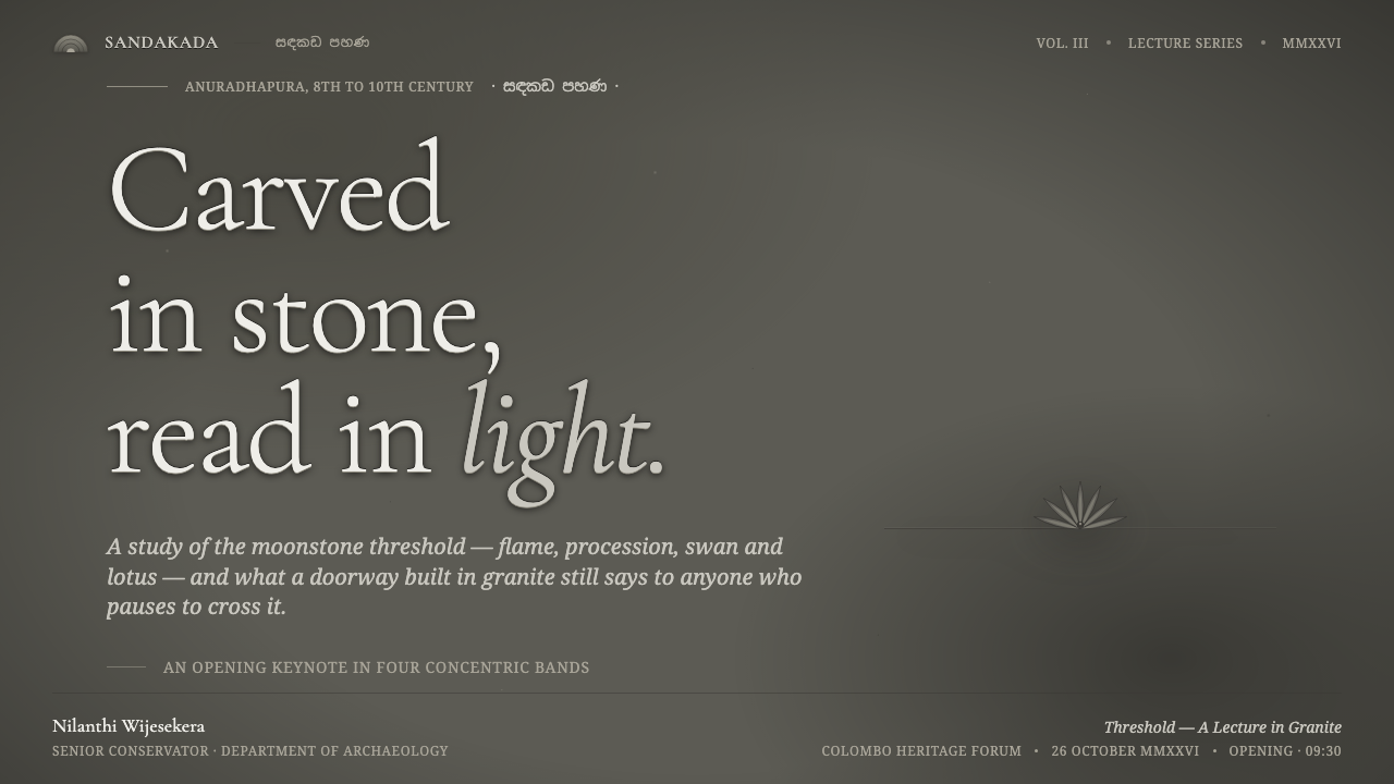
For presentation covers, use the semicircular threshold as a quiet architectural anchor rather than a decorative emblem. Let a broad field of dark stone-gray hold the title, with a restrained relief form entering from an edge or rising behind the heading. Content slides should preserve the same logic: clear bands, calm hierarchy, and tonal contrast that separates information without introducing colored accents. Data slides can treat charts as carved registers, using depth and light to distinguish layers while keeping the overall composition stone-like and ceremonial.
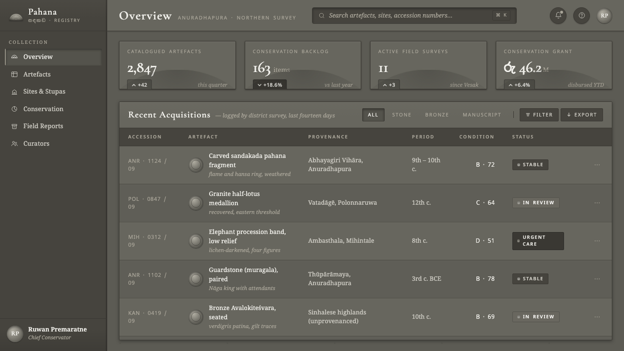
For web interfaces, the system suits dashboards and pricing pages that need gravity, focus, and strong structural hierarchy. Panels can read as adjoining slabs, with shallow relief separating active, inactive, and secondary information. Controls should appear embedded or lightly raised rather than glossy or floating. On pricing pages, plan differences are better expressed through changes in tonal depth, framing, and central emphasis than through bright badges or competing colors. The interface should feel discovered in stone, not assembled from decorative components.
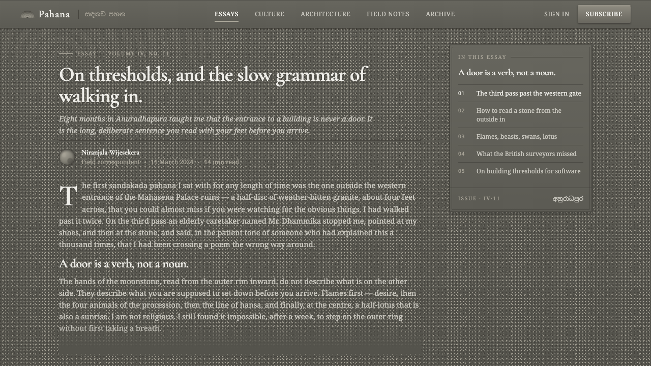
For editorial work, the style supports subjects connected to culture, architecture, history, craft, ritual, and material practice. A long-form article can use concentric section logic, with outer framing for context, denser middle bands for evidence, and a central visual or conclusion that resolves the reading journey. Pull quotes, captions, and metadata should remain quiet and closely integrated with the page. Marketing applications benefit from the style's sense of permanence: a restrained stone field, a carefully lit relief, and a message that feels placed rather than shouted.
For brand or campaign work, the moonstone language is strongest when it establishes a threshold or invitation. A landing page can begin in shadow, reveal information through successive tonal layers, and gather the final call to action around a composed center. Imagery should be cropped and treated as material evidence, with enough darkness and grain to belong to the same world. The system is especially effective when the product wants to communicate patience, heritage, depth, or considered craft.
The common mistake is to imitate the subject with excessive ornament: adding literal flames, animals, lotus motifs, and stone textures everywhere at once. The deeper lesson is structural. Use the semicircular logic, the disciplined repetition, the restrained grayscale, and the directional relief first; borrow individual motifs only when they clarify the composition. Another failure is making the gray interface flat and lifeless. Without carefully controlled shadow, highlight, and grain, the style loses its carved depth and becomes merely monochrome.
Sandakada Pahana Moonstone — FAQ
Is the Sandakada Pahana style simply a monochrome interface?
No. Monochrome is only its visible starting condition. The defining idea is that depth, hierarchy, and rhythm are all produced through material suggestion and directional light. A flat gray interface can be monochrome without feeling carved. The Sandakada Pahana system requires a relationship between surface grain, relief shadow, raised edges, repeated bands, and the semicircular threshold form. Its restraint is structural, not merely chromatic.
Why are colored accents excluded?
The source concept defines depth as something carved from shadow rather than hue. Introducing a bright accent would create a competing route to attention and weaken the material discipline. The system can still achieve emphasis through tonal separation, framing, relief, and position. This keeps the viewer focused on the imagined passage of light across granite and on the hierarchy created by the carved form.
How should the animal procession be used in contemporary layouts?
Treat it as a rhythm and sequence before treating it as literal illustration. The elephant, horse, lion, and bull procession can inspire repeated content states, ordered steps, or a continuous band that guides attention inward. Literal animal imagery should remain selective. If every screen repeats the full procession, the reference becomes decorative and loses the quiet authority of the original threshold composition.
Can this style work for products that need warmth or playfulness?
It can, but only with deliberate interpretation. The source language is dark, weathered, solemn, and materially restrained, so it naturally supports qualities such as heritage, patience, ritual, and craft. It is less naturally suited to cheerful brightness or informal play. A product that needs warmth can use softer relief and more open tonal transitions while preserving the stone grain and concentric structure, but it should not pretend that the underlying character has become lighthearted.
Related design styles
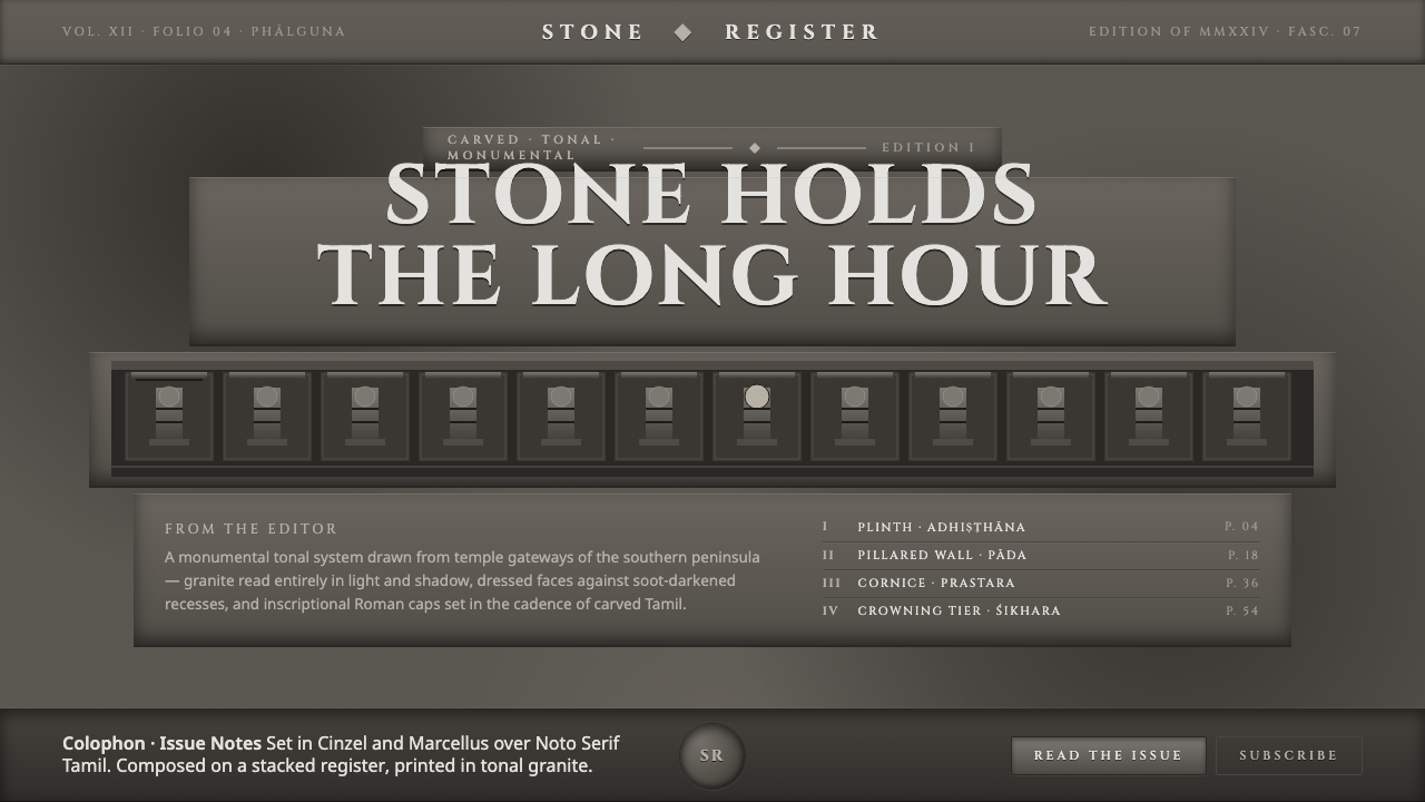 Dravidian Granite GrayscaleRead entirely in grayscale. Soot-dark recesses against dressed granite, Cinze…
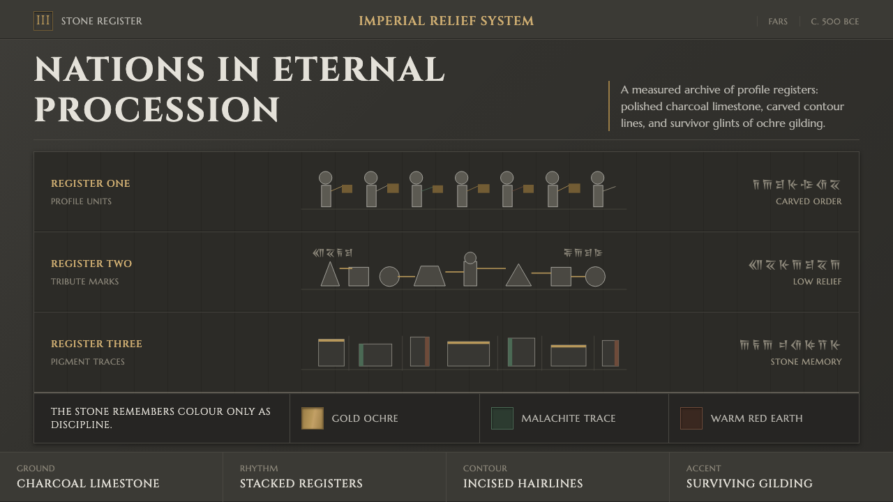 Achaemenid Persepolis ReliefImperial restraint in stone. Charcoal registers carry ochre, green, and red p…
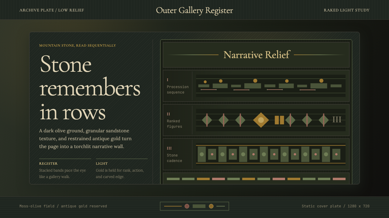 Cambodian Angkor Bas-ReliefStone speaks in shadow. Olive registers and antique gold carve a torchlit arc…
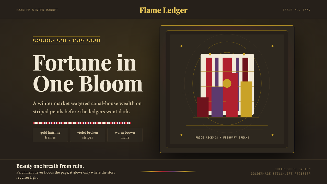 Dutch Tulip ManiaSpeculation burns in shadow. Flame red petals, violet stripes, gold frames on…
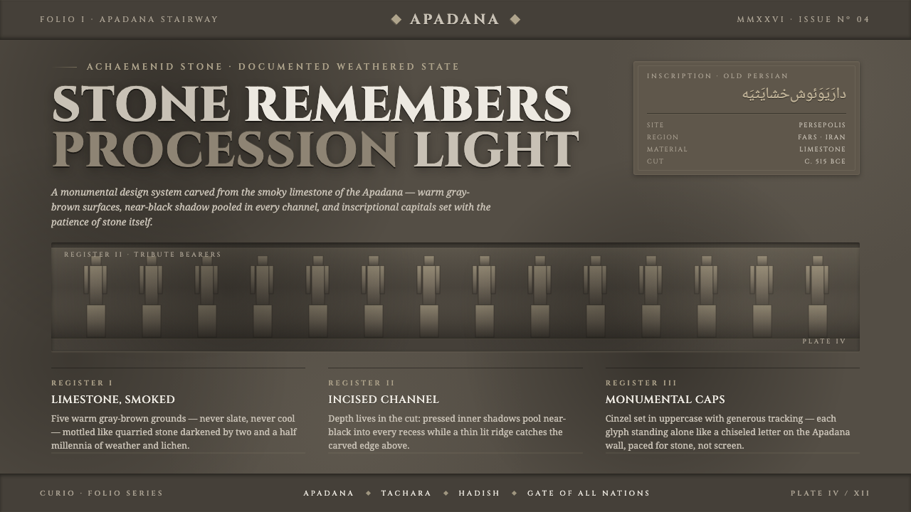 Persian Gray Stone ReliefStone remembers. Smoky weathered limestone, near-black shadow in every channe…
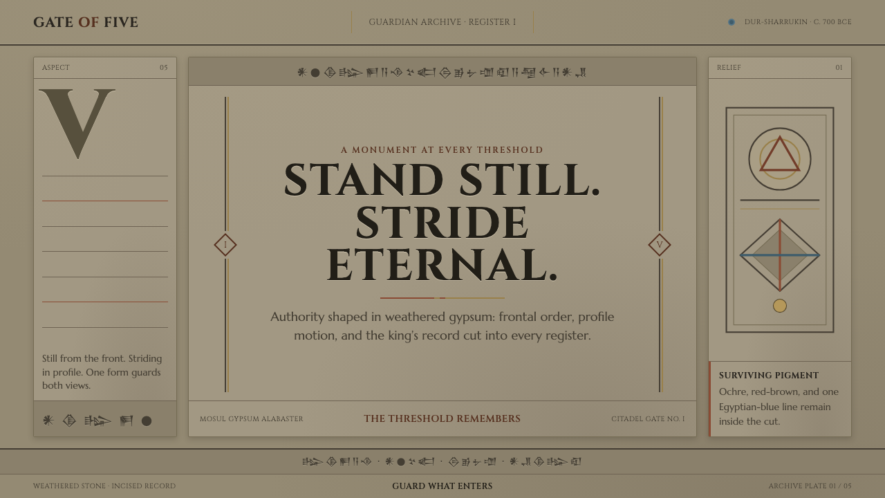 Assyrian Lamassu ReliefAuthority carved into silence. Buff-gray stone, monumental capitals, and cune…