What is Dravidian Granite Grayscale?
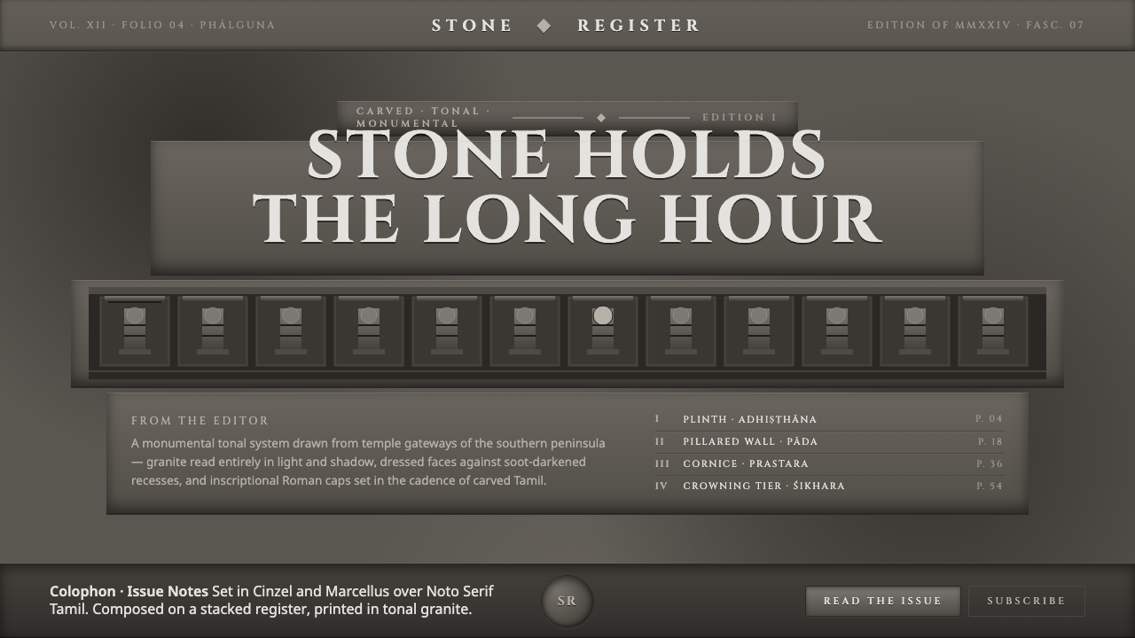
Dravidian Granite Grayscale turns the gopuram into a visual grammar — soot-dark recesses, dressed granite planes, and inscriptional type carrying the weight of a thousand-year stone gateway.
Dravidian Granite Grayscale in brief
Dravidian Granite Grayscale draws from the towering gopurams of South India, especially the temple traditions associated with Brihadeeswarar, Gangaikondacholapuram, and Madurai Meenakshi. Its visual world is built entirely from stone tones: near-black recesses where soot and lichen have collected, warm-neutral mid-gray faces where granite has been dressed, and lighter raised forms where light catches carved figures.
This is a maximal tonal system rather than a colorful one. Its richness comes from the grain, relief, and accumulated weight of quarried rock. Light is directional and consequential: it reveals figures on projecting surfaces while allowing shadow to pool in incised channels. Nothing is softened into atmosphere. Every tonal change describes a plane, a cut, a cavity, or the pressure of time.
Typography and layout extend the architectural logic. Cinzel capitals behave like carved inscriptions, while the page rises through stacked bands and vertical sequences instead of unfolding as a loose horizontal field. The overall impression is dense, solemn, and monumental: a design language for surfaces that should feel built, weathered, and capable of outlasting its immediate use.
Where does Dravidian Granite Grayscale come from?
The source tradition belongs to Tamil Nadu in South India and reaches back to the Chola temple-building era beginning around 1000 CE. It is part of Dravidian temple architecture, a monumental architectural language in which the gateway is not treated as a neutral entrance but as a vertical field of accumulated form. The visual system takes its cues from that field: carved density, strong silhouettes, and the sense that construction is also an act of inscription.
The gopuram gateway tradition continued through the seventeenth century, preserving the image of stacked tiers rising through repeated carved figures. Each tier reads as both a structural band and a visual register. Seen through a grayscale lens, the arrangement becomes especially legible: raised forms gather light, channels gather darkness, and the entire tower resolves into a layered mass rather than a collection of isolated ornaments.
Brihadeeswarar, Gangaikondacholapuram, and Madurai Meenakshi provide the architectural horizon for the style. They are not used here as literal illustrations to be copied element by element. Instead, they establish the governing atmosphere: quarried granite, towering verticality, repeated relief, and the visual tension between dressed faces and deeply shadowed cuts.
The material character is inseparable from age. Centuries of soot and lichen have darkened the recessed portions of carved stone, while exposed and dressed surfaces remain visibly lighter. The source also names Rajaraja Chola I, Kunjaramallan Rajaraja Perunthachan, and Vishvakarma sthapatis as key figures in the tradition behind the system. Together, these names point toward patronage, building intelligence, and the skilled making that turns heavy stone into an ordered gateway.
What defines the Dravidian Granite Grayscale look?
Grayscale Tonality
The palette is entirely grayscale, but it is not flat or neutral in feeling. Near-black soot-dark recesses establish depth, while dressed granite occupies a warm-neutral middle range. Lighter tones are reserved for raised faces, exposed edges, and surfaces that appear to receive light. The hierarchy comes from tonal placement rather than hue: darkness marks incision and accumulation, middle gray carries the mass of the stone, and pale gray indicates relief catching illumination.
Stone Grain
Surface should suggest dressed granite rather than a generic gray fill. Texture is quiet but present, giving the field a geological resistance. It should never become decorative noise or a photographic background competing with the carved forms. The ideal impression is a worked surface whose grain is felt through variation and density. Even a simple panel should seem capable of bearing inscription, relief, and the slow evidence of weathering.
Relief and Shadow
Depth is expressed through the relationship between projection and recess. Raised figures are not modeled with soft atmospheric shading; they are revealed by a firm separation between the lit plane and the incised channel. Shadows should feel pooled, accumulated, and architectural. This makes depth read as excavation rather than illusion. The eye should sense that a form has been cut from a heavy surface, not merely drawn above it.
Inscriptional Type
Cinzel capitals provide the typographic voice. Letterforms should feel carved, formal, and meant to be read as part of architecture. Headlines carry monumental presence, while supporting text remains restrained so the display type can act as an anchor. Typography is not a soft layer placed over the stone; it is another cut into the surface. Spacing should preserve the dignity and legibility of an inscription rather than imitate casual editorial text.
Tiered Verticality
Composition rises through stacked sections, repeated bands, and clear vertical progression. A page can feel like a gateway when its information is arranged in architectural registers: a commanding upper mark, a dense middle field, and supporting details gathered below. Repetition is useful when it establishes ascent and order. The structure should feel accumulated rather than scattered, with each band adding weight to the whole.
Monumental Density
This style is maximal in detail but disciplined in material language. Density comes from repeated relief, layered framing, and tonal accumulation, not from mixing unrelated effects. Large quiet areas are still important because they give the carved elements something solid to push against. The balance is between abundance and mass: enough detail to suggest a populated gateway, enough restraint for the structure to remain legible.
Who shaped Dravidian Granite Grayscale?
Rajaraja Chola I is named as a key figure in the Chola temple-building context from which this system draws. Within the style, his presence functions as a historical anchor for monumental construction and the cultural authority of the temple gateway. He is represented less through portraiture than through the visual qualities associated with the tradition: vertical ambition, carved permanence, and the conviction that architecture can carry memory across centuries.
Kunjaramallan Rajaraja Perunthachan appears among the named figures behind the architectural tradition. The design language treats that name as a reminder that monumental stone is never only an abstract image: it depends on planning, proportion, carving, and the disciplined conversion of material into structure. In this system, the figure stands for the intelligence of making that allows density to remain ordered rather than collapsing into visual excess.
Vishvakarma sthapatis are named as a craft tradition rather than a single individual. Their place in the system emphasizes skilled authorship: the hand, tool, and accumulated knowledge behind a carved gateway. This is why the style gives such importance to grain, incision, relief, and the difference between a dressed face and a dark recess. The visual language honors making as much as appearance, allowing every surface to feel worked rather than merely decorated.
How do you use Dravidian Granite Grayscale today?
Dravidian Granite Grayscale works when the product needs to feel enduring, architectural, and materially serious. Apply the system through tonal hierarchy and physical implication: let near-black recesses establish depth, let granite gray carry the main field, and reserve the lightest tones for relief, type, or edges that need to emerge. The design should feel assembled from stone planes and carved channels, not from a collection of ornamental filters.
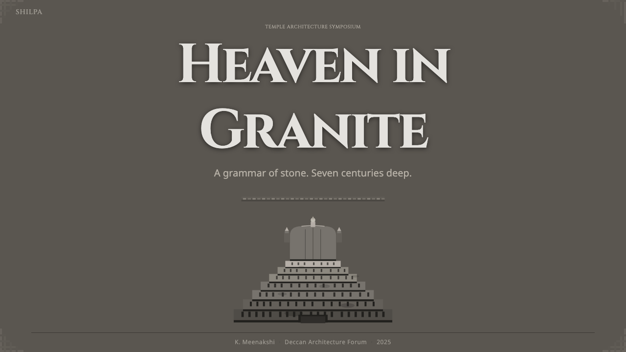
For presentation slides, use the style most strongly on the cover, then let the content pages behave like architectural registers. A cover can place a monumental Cinzel title against a dark granite field, with a carved or stepped visual anchor rising beside it. Content slides should move through clear stacked bands, using tonal contrast to distinguish heading, explanation, and supporting detail. Data slides should treat charts as engraved diagrams: strong silhouettes, restrained labels, deep recesses for secondary information, and lighter raised marks for the principal finding.
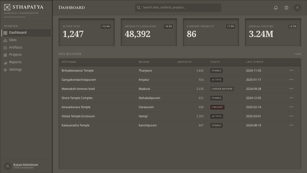
For web interfaces, the system suits dashboards and pricing pages that want to project authority and permanence. Panels can read as dressed stone surfaces, while active or selected states can appear as illuminated relief against darker channels. Tables, filters, and metrics should be organized in tiered blocks with strong vertical rhythm. Pricing cards benefit from an architectural hierarchy: a commanding plan name, a dense but disciplined body, and a clearly raised action. Avoid making every panel equally dark; the system needs a readable difference between mass, recess, and emergence.
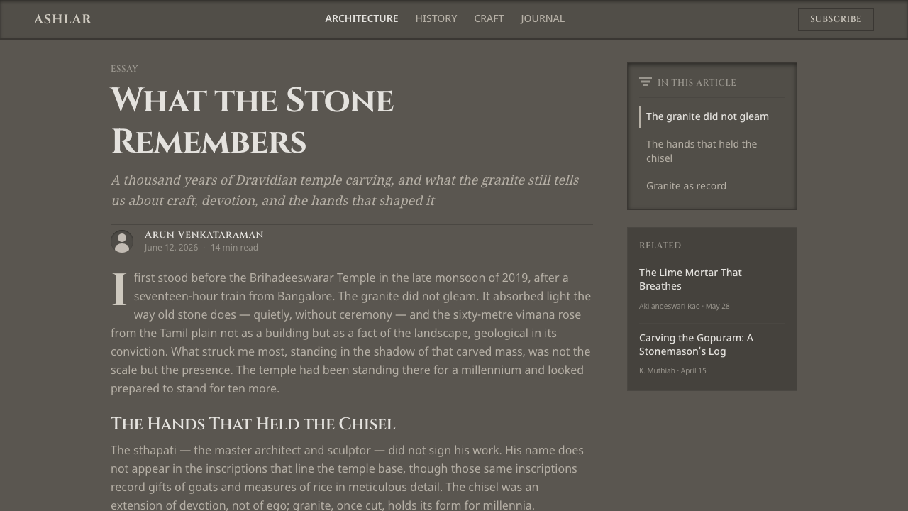
For editorial and marketing work, the style supports cultural, architectural, historical, and institutionally minded subjects. Articles can use a narrow reading field surrounded by darker structural bands, with section openings treated like inscriptions and pull quotes placed as carved markers. Marketing pages can alternate between broad granite fields and soot-dark framing, allowing a single headline or figure to emerge like raised relief. The strongest applications make the material metaphor carry the message rather than using temple imagery as surface decoration.
The common mistake is confusing maximal detail with indiscriminate complexity. Adding color, soft atmospheric effects, playful rounded forms, or unrelated textures weakens the stone logic. Another failure is making every element equally heavy: when all type, borders, panels, and imagery compete at the same tonal intensity, nothing feels carved forward. Keep a clear distinction between recess and relief, use Cinzel as an anchor rather than a blanket treatment, and let quiet granite surfaces provide the pressure that makes dense detail readable.
Dravidian Granite Grayscale — FAQ
Is Dravidian Granite Grayscale simply black and white?
No. It is entirely grayscale, but its tones are materially differentiated. Near-black belongs to soot-dark recesses and deep incisions; warm-neutral mid-gray belongs to dressed granite; lighter gray belongs to raised surfaces catching light. The distinction is important because the system depends on the feeling of stone relief. A flat black-and-white treatment may be stark, but it loses the geological weight and carved depth that define this style.
Why does the system favor a dark visual field?
The dark field represents the accumulated shadow of carved recesses, where soot and lichen have gathered over centuries. It is not darkness used only for drama; it is part of the material story. Dressed granite then appears as a middle-gray mass, while raised forms emerge through light. This relationship gives the interface or page the feeling of a gateway viewed through relief, with depth created by excavation and accumulation.
Can I introduce a colored accent into the style?
A colored accent would move the work away from the approved system, whose identity depends on being read entirely in stone tones. Contrast should come from depth, surface, and tonal placement rather than hue. If an element needs emphasis, make it emerge as a lighter raised mark, place it against a soot-dark recess, or give it a stronger inscriptional presence. The result will remain more coherent when the drama comes from stone and light.
How should Cinzel be used within the layout?
Cinzel should function as monumental inscriptional type. Use its capitals for titles, section openings, plan names, and other moments that need architectural authority. Supporting text should remain quieter so the display lettering can act as a carved anchor. The type should be given enough space to retain dignity and legibility, while the surrounding layout provides the stacked, vertical rhythm of a gateway. It works best as a structural voice, not as decoration applied to every line.
Where does this style work best, and where can it struggle?
It works best for cultural, architectural, historical, editorial, institutional, and analytical contexts where permanence and authority are useful values. It also suits dashboards and pricing pages that need strong hierarchy and a sense of durable structure. It can struggle where the product depends on lightness, bright color, playful softness, or intimate warmth. The style asks the viewer to accept density and weight, so it should be chosen when those qualities support the subject rather than contradict it.
Related design styles
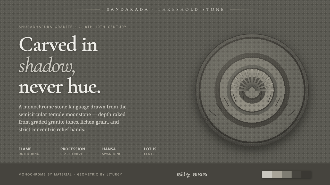 Sandakada Pahana MoonstoneDepth carved from shadow, never hue. Weathered-granite grays in concentric mo…
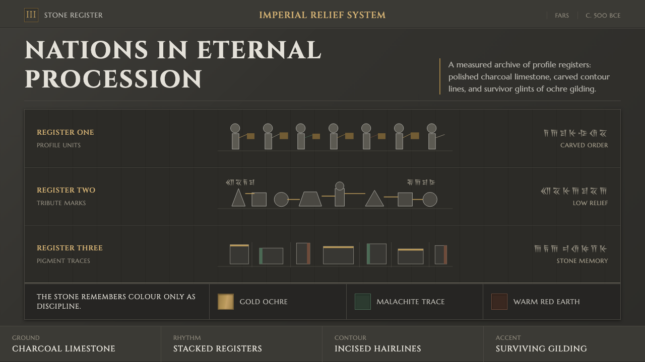 Achaemenid Persepolis ReliefImperial restraint in stone. Charcoal registers carry ochre, green, and red p…
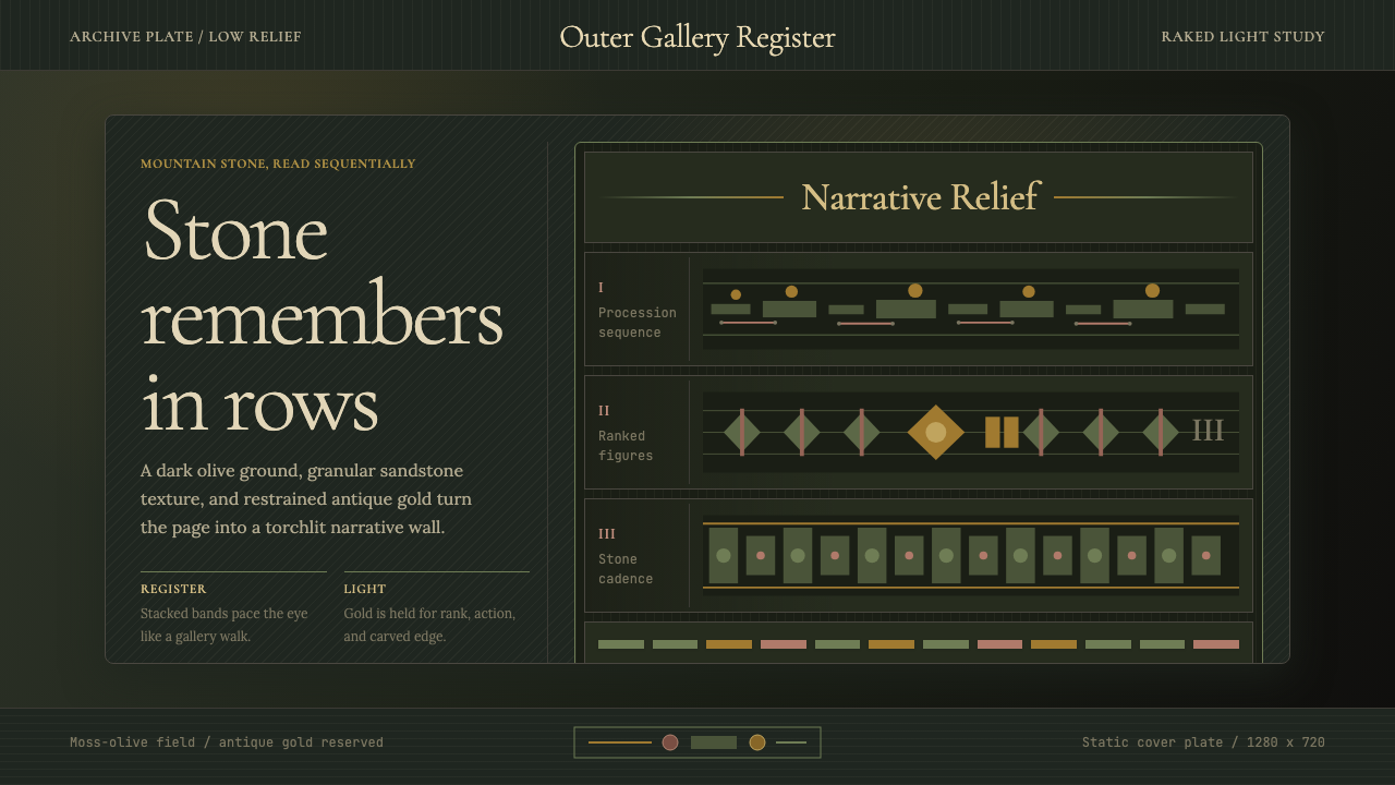 Cambodian Angkor Bas-ReliefStone speaks in shadow. Olive registers and antique gold carve a torchlit arc…
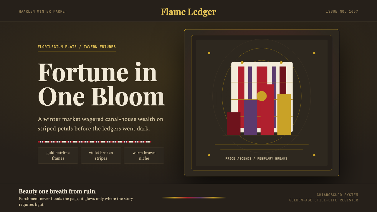 Dutch Tulip ManiaSpeculation burns in shadow. Flame red petals, violet stripes, gold frames on…
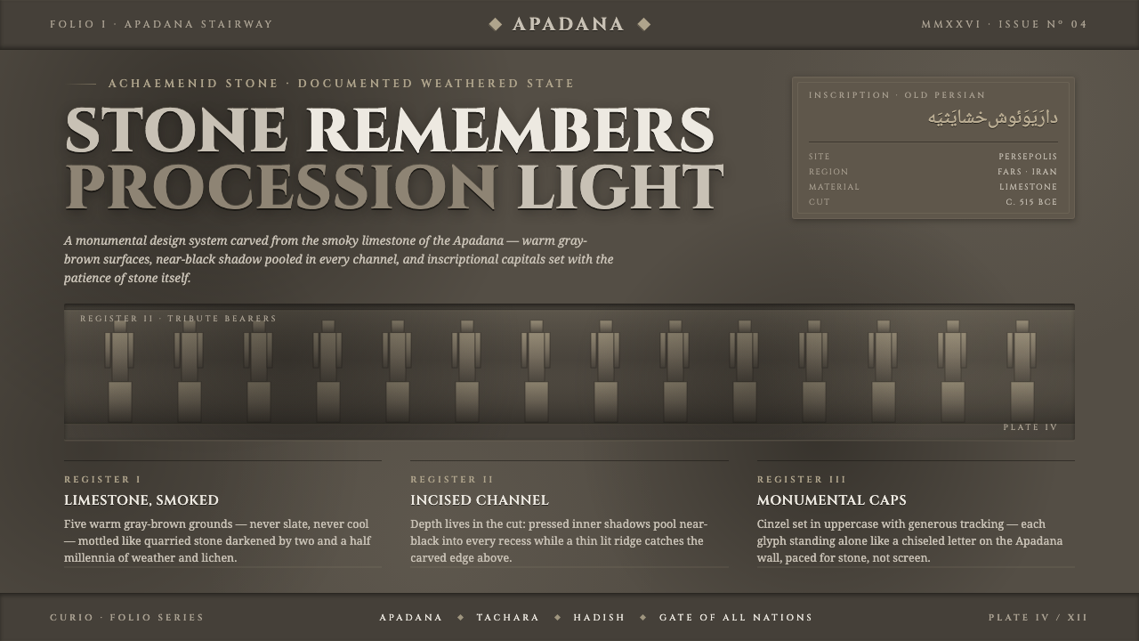 Persian Gray Stone ReliefStone remembers. Smoky weathered limestone, near-black shadow in every channe…
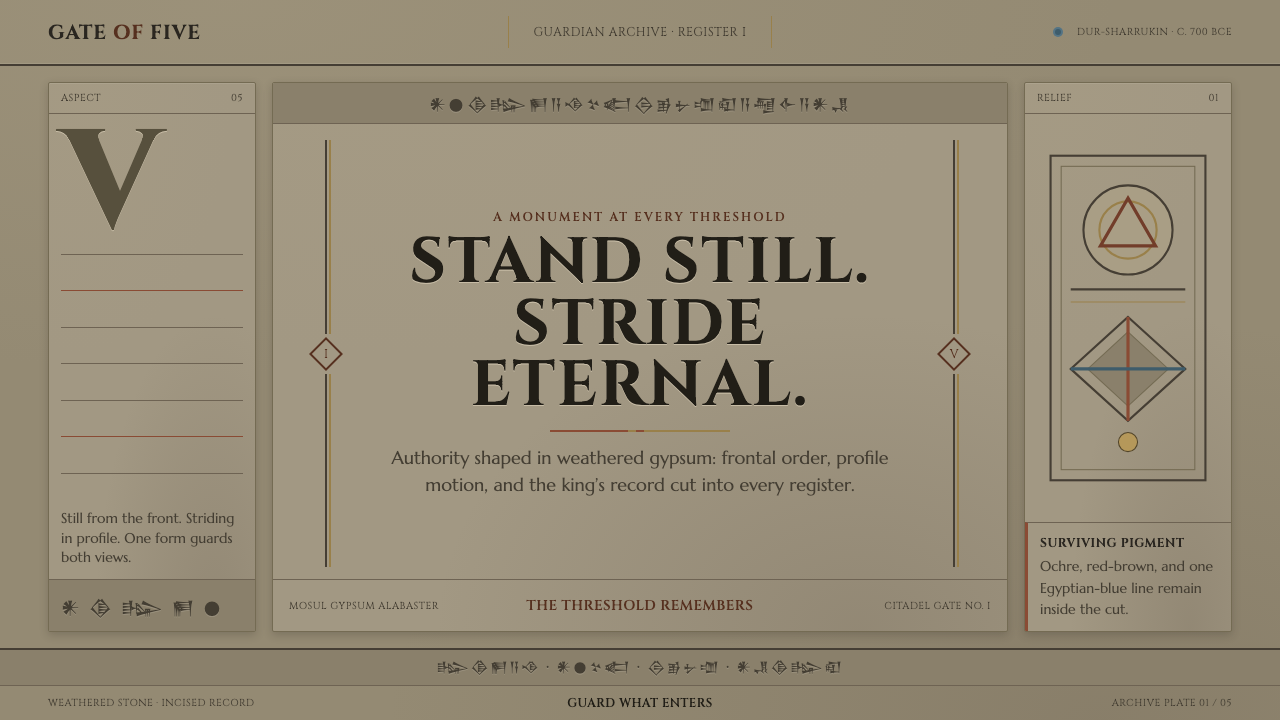 Assyrian Lamassu ReliefAuthority carved into silence. Buff-gray stone, monumental capitals, and cune…