What is Persian Gray Stone Relief?
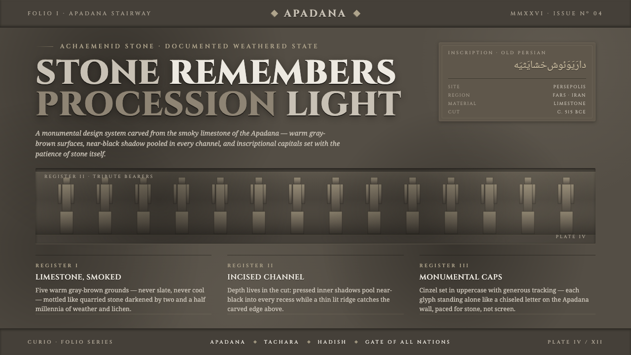
Persian Gray Stone Relief makes the interface feel excavated rather than assembled — weathered limestone, blackened incisions, and monumental capitals carrying the memory of an empire.
Persian Gray Stone Relief in brief
Persian Gray Stone Relief draws from the bas-reliefs of Persepolis, especially the Apadana stairway and the Gate of All Nations, where processions of tribute-bearers were incised into locally quarried Achaemenid limestone. Its visual authority comes from the physical persistence of the artifact: stone that has endured exposure, softened at the surface, and retained near-black darkness in its deepest channels.
This is a style of archaeological gravity rather than decorative antiquarianism. Its palette stays within warm limestone gray, smoky gray-brown, and deep incised shadow. Surfaces feel mottled and mineral, while composition moves horizontally in bands, like a carved frieze. The result is dark, solemn, and tactile without pretending to restore the reliefs original color.
Typography completes the translation. Monumental serif capitals, specifically the carved character of Cinzel used as caps, stand in for inscriptions cut into stone. Text should feel placed within a structure of bands and channels, with hierarchy created through scale, contrast, and spacing rather than interface ornament.
Where does Persian Gray Stone Relief come from?
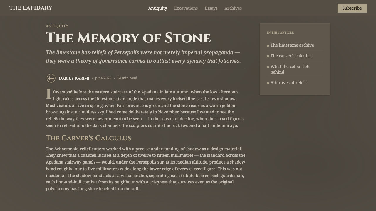
The source is Achaemenid Persia, centered on Persepolis in Fars, Iran. The style looks backward to an imperial relief tradition associated with the citys processional architecture: the Apadana stairway and the Gate of All Nations. These sites used locally quarried limestone as both building material and historical surface, turning architecture into a record of ordered movement and tribute.
The historical setting reaches back to the Achaemenid period, around 515 BCE. Darius I and Xerxes I are the named imperial figures connected to the tradition honored here, while the stone carvers themselves supplied the essential visual intelligence. Their work was not merely an image applied to a wall. It was a disciplined arrangement of bodies, garments, gestures, and repeated procession, all made legible through shallow carving and horizontal organization.
Millennia of exposure changed the appearance of that carved limestone. The surface weathered toward smoky gray-brown, while recesses and channels gathered much darker shadow. Persian Gray Stone Relief treats this weathered state as its primary reference. It does not reconstruct the original polychromy or present the stone as pristine. Age is part of the visual language: unevenness, abrasion, and darkness give the system its authority.
The design translation therefore combines two conditions of the artifact. First is the material condition: warm mineral gray, mottled surface, and near-black depth. Second is the compositional condition: long bands, frieze-like alignment, and monumental capitals that seem cut rather than typed. Together they produce a system that feels ceremonial and architectural, with every element carrying the weight of something preserved.
What defines the Persian Gray Stone Relief look?
Weathered Limestone
The foundation is a warm, smoky gray-brown limestone field rather than a clean neutral gray. Its surface should feel mineral and lightly mottled, with variation that suggests age without becoming a decorative texture. The material reads as dense, quiet, and exposed to time.
Incised Shadow
Depth is represented by near-black shadow gathered in channels, recesses, and separations between bands. The darkness is not a soft atmospheric effect; it behaves like the interior of a cut. This gives the style its carved quality and makes contrast feel structural rather than luminous.
Frieze Composition
The layout prefers horizontal movement. Content is organized in long visual bands that can carry headings, figures, navigation, or sequential information. Bands should relate to one another like parts of a procession, creating continuity across the page instead of isolated card fragments.
Monumental Capitals
Typography is led by carved serif capitals, with Cinzel used as the clearest expression of the reference. Letterforms should feel architectural and ceremonial, especially in titles and labels. Supporting text can remain quieter, but it should preserve the sense that language belongs to a durable surface rather than a casual interface.
Mottled Surface
Variation is essential, but it must remain subordinate to the carved structure. Slight differences in tone can suggest worn stone and uneven exposure. The surface should never become glossy, polished, or richly ornamental; its purpose is to support the impression of an artifact that has survived.
Ceremonial Restraint
The style is dark and imposing, yet its restraint keeps it from becoming theatrical. Ornament should come from alignment, repetition, carved depth, and the dignity of the capitals. Avoid playful interface decoration, soft lifestyle imagery, or effects that compete with the stone memory at the center of the system.

Who shaped Persian Gray Stone Relief?
Darius I is one of the imperial figures honored by this system through the Persepolis stonework tradition. His name connects the style to the monumental Achaemenid setting in which procession, architecture, and carved limestone were brought into a single public language.
Xerxes I represents the continuation of the imperial stone tradition associated with Persepolis. In this design reference, his presence is felt through the solemn scale, ordered procession, and durable architectural surface rather than through a portrait or literal historical scene.
The Achaemenid stone carvers are the most direct makers behind the visual language. Their disciplined relief work transformed locally quarried limestone into bands of legible figures and repeated movement. The design system follows their logic by making material, incision, and horizontal sequence do the expressive work.
How do you use Persian Gray Stone Relief today?
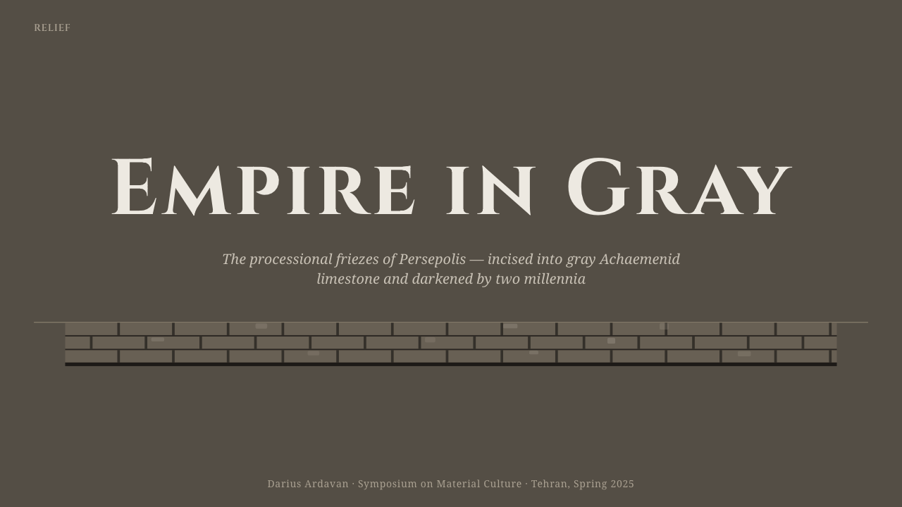
For presentation slides, use the cover as an architectural threshold: a dark limestone field, a monumental capital title, and a horizontal relief-like band that establishes the subject. Content slides should preserve that banded rhythm, with headings and supporting text arranged as ordered zones. Data slides can treat charts as carved diagrams, using deep shadow for the structural base and restrained gray variation to distinguish categories.
For web interfaces, the style suits dashboards, analytical tools, and pricing pages that want authority and historical weight. Use the stone field as a continuous surface, organize panels into horizontal sections, and let near-black incisions define boundaries. Pricing tiers can feel like successive carved registers, with one dominant title treatment and clear tonal separation instead of bright promotional color.
For editorial and marketing work, the relief reference gives long-form pages a strong sense of procession. An article can begin with a monumental heading, continue through horizontal bands of text and metadata, and use short call-outs as inset inscriptions. Marketing pages benefit from the contrast between dark stone atmosphere and quiet mineral type, especially when the product is positioned as durable, considered, or rooted in craft.
The system also works well for cultural institutions, architecture, heritage, and research-oriented communication. Use imagery sparingly and crop it with the same horizontal discipline as the reliefs. When a figure or object appears, let it behave as part of the stone narrative rather than as a glossy promotional photograph.
The common mistake is turning the style into generic dark luxury branding. Black backgrounds, gold accents, and ornate type would move it away from the reference. Another mistake is adding excessive texture until the interface feels distressed. Authenticity depends on restraint: warm limestone gray, incised darkness, monumental capitals, and a clear procession of bands should remain the dominant evidence.
Persian Gray Stone Relief — FAQ
Is Persian Gray Stone Relief meant to recreate the original Persepolis colors?
No. The system honors the documented weathered artifact as it appears today, not the lost polychromy of the original reliefs. Its identity comes from smoky limestone, dark channels, mottled exposure, and carved capitals. Reintroducing strong historical color would change the reference from weathered stone to reconstruction.
Why does the style rely so heavily on horizontal bands?
The horizontal structure comes from the processional reliefs of Persepolis. Bands make movement, sequence, and hierarchy visible at the same time. In an interface, they prevent content from becoming a collection of unrelated cards and instead create the feeling of an architectural narrative that unfolds across the page.
Can the style use light backgrounds?
It can, but the result will be less faithful to the dark reference. A pale limestone field may work when the surface remains warm and mineral, while incised separation and monumental type preserve the relief logic. The key is not darkness alone; it is the contrast between a weathered material plane and a deeper carved channel.
Why use Cinzel as capitals?
Cinzel provides the monumental carved-serif character required by the reference. Capitals make headings feel like inscriptions or architectural labels rather than ordinary interface copy. It should therefore lead titles, section markers, and prominent labels, while quieter supporting text preserves readability and does not compete with the ceremonial display.
What separates this style from generic distressed or ancient design?
Its structure is specific. The reference is not simply old-looking: it is locally quarried limestone weathered into smoky gray-brown, with near-black depth in carved channels, processional bands, and monumental capitals. Remove those relationships and the result becomes generic ruin imagery. Preserve them and the design remains recognizably tied to Persepolis relief sculpture.
Related design styles
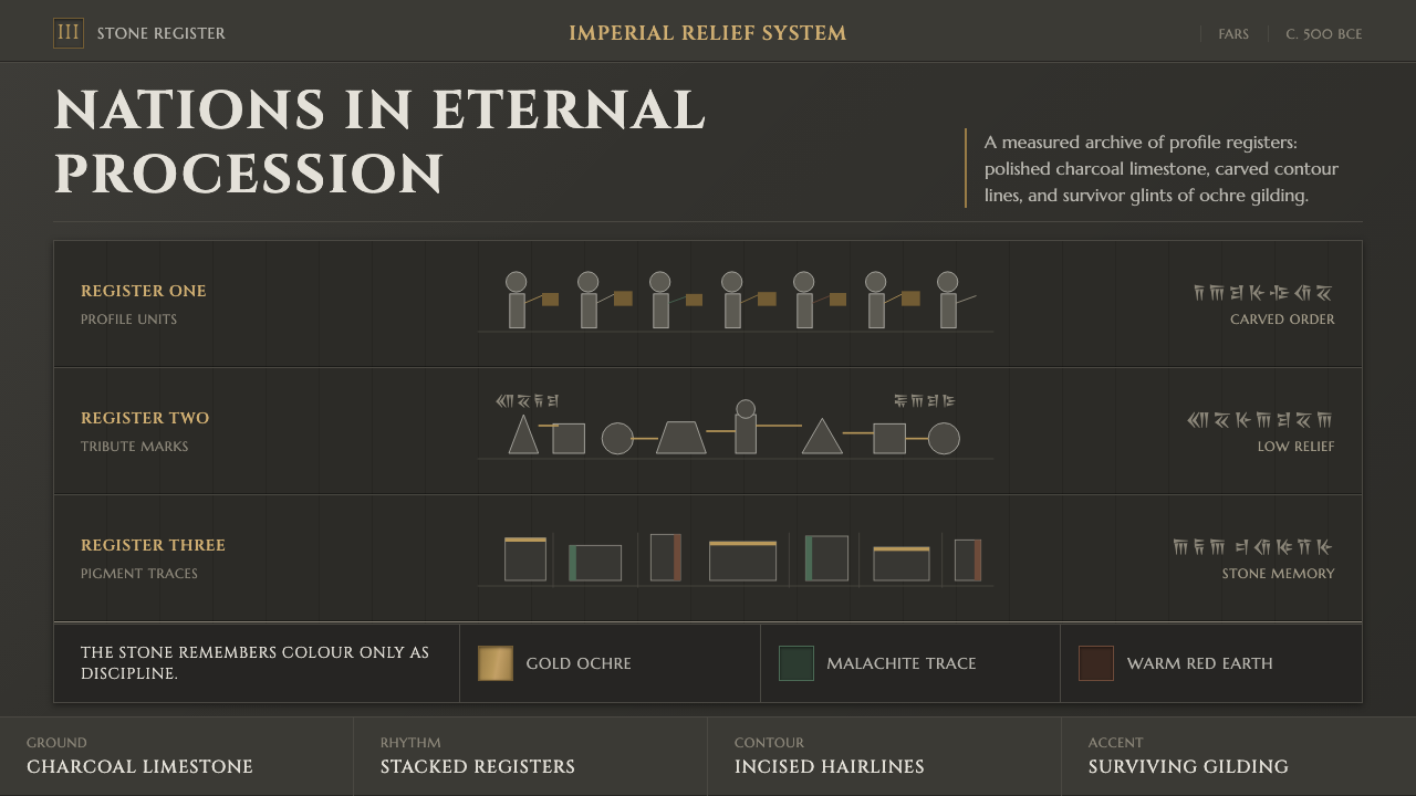 Achaemenid Persepolis ReliefImperial restraint in stone. Charcoal registers carry ochre, green, and red p…
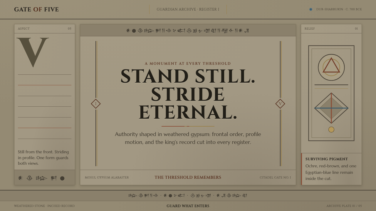 Assyrian Lamassu ReliefAuthority carved into silence. Buff-gray stone, monumental capitals, and cune…
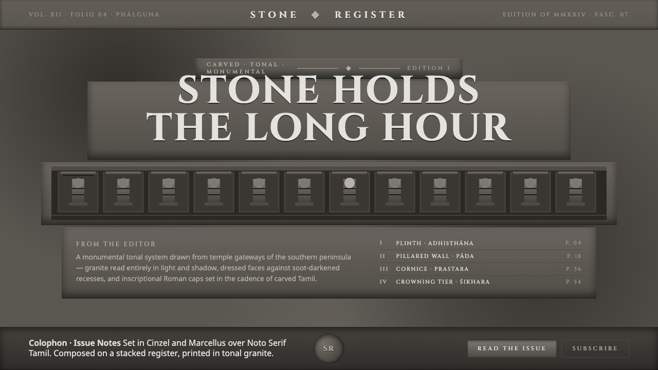 Dravidian Granite GrayscaleRead entirely in grayscale. Soot-dark recesses against dressed granite, Cinze…
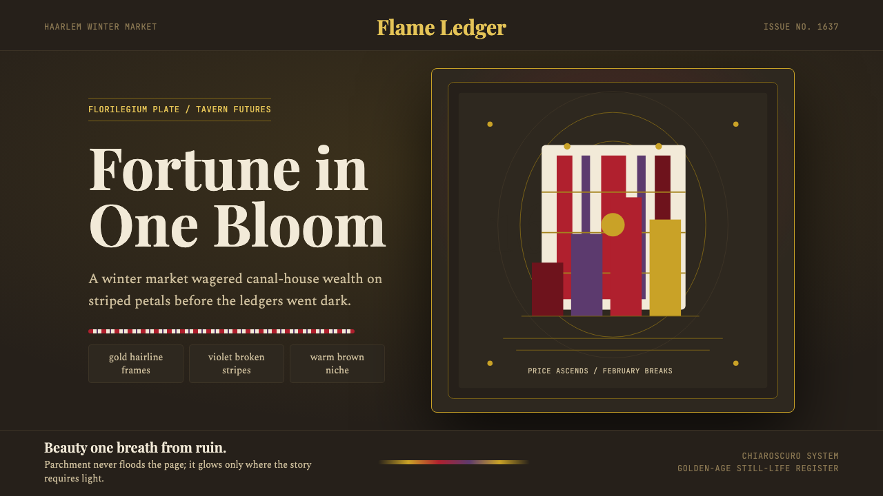 Dutch Tulip ManiaSpeculation burns in shadow. Flame red petals, violet stripes, gold frames on…
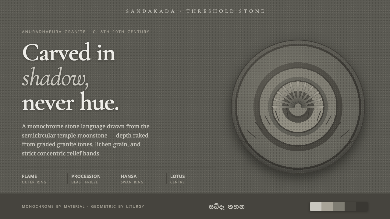 Sandakada Pahana MoonstoneDepth carved from shadow, never hue. Weathered-granite grays in concentric mo…
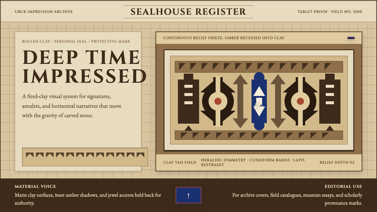 Sumerian Cylinder SealAncient weight, pressed in clay. Cinzel caps and cuneiform wedges cut umber i…