What is Brihadeeswarar Temple Granite?
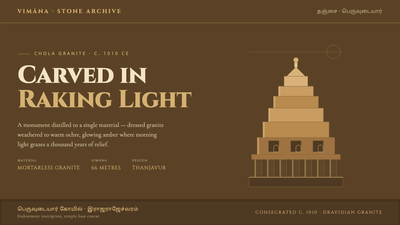
Brihadeeswarar Temple Granite brings the warmth of weathered Chola stone into digital space: deep ochre shadow, amber relief, and typography that feels cut rather than printed.
Brihadeeswarar Temple Granite in brief
Brihadeeswarar Temple Granite is a dark, monumental design language derived from the dressed granite of the Brihadeeswarar Temple in Thanjavur, Tamil Nadu. The temple, consecrated around 1010 CE under Rajaraja Chola I, is a supreme monument of Dravidian architecture, crowned by a towering vimana. Its stone does not read as inert gray material. Time and climate have brought it toward a warm ochre and golden-brown presence, especially when low light catches projecting carved surfaces.
The digital system translates that condition rather than reproducing the temple literally. Deep ochre grounds establish mass and enclosure; golden-tan highlights suggest worn relief edges, inset niches, and surfaces struck by raking light. The resulting interface should feel excavated from a single heavy material, with content appearing as inscription, recess, or raised carving instead of floating as unrelated panels.
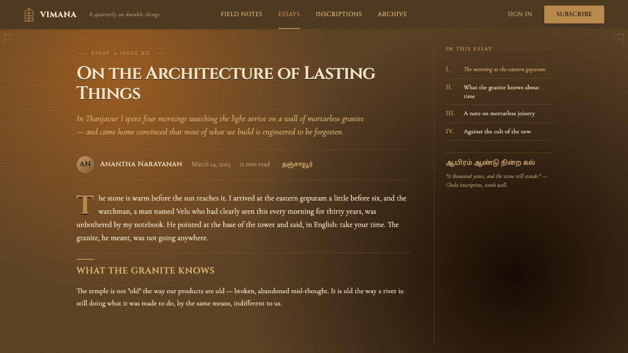
Its visual rhythm comes from the tiered and niche-framed architecture associated with gopuram and mandapa. Repeated framed intervals, vertical ascent, and measured recesses give screens a ceremonial order. Cinzel capitals supply the inscriptional note: display text should seem formal, chiseled, and enduring, while supporting text remains quiet enough to let the stone-like hierarchy carry the page.
Where does Brihadeeswarar Temple Granite come from?
The source is specific: the Brihadeeswarar Temple at Thanjavur in South India, within present-day Tamil Nadu. It was raised in mortarless granite around 1010 CE under the Chola empire and Rajaraja Chola I. The absence of mortar is central to the design imagination behind this style. It suggests fitted mass, deliberate joints, and a structure whose authority comes from material, alignment, and accumulated weight rather than surface disguise.
The temple belongs to Chola temple architecture and to the broader Dravidian architectural tradition. Its towering vimana establishes a dominant vertical silhouette, while the architecture's tiered framing creates a repeated progression between projection and recess. In a digital interpretation, this is not a cue to make every component ornate. It is a cue to organize information as a sequence of structural thresholds: outer field, framed opening, inner content, and emphasized edge.
South Indian relief sculpture supplies the second essential idea. Carved stone becomes legible through light falling across its raised and recessed planes. The most convincing digital equivalent is not a soft, atmospheric simulation. It is restrained contrast between dark field and warmer edge, so that a border, title, or active region seems to emerge from the same surface that contains it.
The temple's weathered ochre golden-brown granite supplies the palette's emotional register. It is solemn without becoming lifeless, luminous without becoming glossy, and ancient without relying on decorative imitation. The system therefore treats age as material depth: warm highlights are sparse signs of contact with light, while dark areas preserve the sense of enclosure, gravity, and monumental scale.
What defines the Brihadeeswarar Temple Granite look?
Ochre Ground
The base is dark ochre rather than neutral black. It should feel mineral, sun-warmed, and dense enough to hold lighter content as if that content has been carved into it. Empty space is not emptiness here; it is the uncut body of stone surrounding an inscription or recess.
Amber Relief
Highlights are warm golden-tan, used as the illuminated edge of a raised form or the lip of a niche. They should appear selectively, with enough contrast to clarify hierarchy but not enough to turn the surface metallic or glossy. The aim is worn relief under oblique daylight.
Inscriptional Type
Cinzel capitals give major titles an inscriptional authority. Use them for names, section markers, and decisive statements rather than continuous reading. Their formal, cut-stone character becomes more persuasive when surrounded by generous quiet space and paired with restrained supporting text.
Tiered Framing
Frames should read as nested architectural thresholds rather than decorative boxes. A darker outer field, a warmer boundary, and a quieter inner plane can establish the sensation of a niche. Repetition creates rhythm, but the hierarchy must remain legible: each layer has a structural reason to exist.
Carved Depth
Depth is expressed through recess, edge, and contrast, not through airy translucency. Panels may feel inset; active elements may feel slightly raised; dividers may act as incised seams. This keeps the interface tactile and heavy, preserving the impression that every visual decision belongs to one continuous stone surface.
Measured Ornament
The style invites architectural richness, but it should never dissolve into indiscriminate ornament. Repeated niches, ruled borders, and ceremonial titles are strongest when they frame information or establish sequence. If a motif neither guides reading nor reinforces the stone construction, it weakens the monumentality it seeks to evoke.
Who shaped Brihadeeswarar Temple Granite?
Rajaraja Chola I is the sole named historical figure in this system's source material. The temple was raised under his rule around 1010 CE, making his patronage inseparable from the style's sense of imperial scale, material confidence, and enduring architectural order.
The temple is the material and visual reference, not a decorative motif bank. Its mortarless granite, weathered warm stone, towering vimana, and niche-framed rhythm define the system's decisions about mass, contrast, hierarchy, and light.
The vimana supplies the style's vertical and tiered logic. In digital work it need not be illustrated literally; its influence appears when headings, sections, and framed zones form a deliberate ascent from broad foundation to concentrated focal point.
How do you use Brihadeeswarar Temple Granite today?
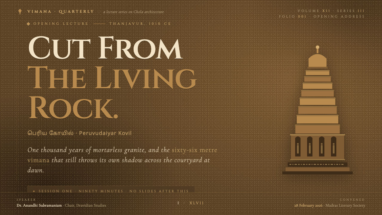
For presentation covers, use the style as a single monumental statement. Let a deep ochre field establish the page, then place one inscriptional title within a framed or relief-like zone. A warm highlight can define the title edge or a small architectural marker. Avoid filling the cover with illustrative temple imagery; the effect is stronger when material, hierarchy, and silence do the work.
Content slides should use tiered framing to separate title, argument, and supporting detail. Treat each section as a carved register rather than a stack of generic cards. Data slides benefit from the same discipline: charts should emerge from a quiet dark field, with amber emphasis reserved for the most important series, threshold, or takeaway. Lines and labels should feel incised and deliberate.
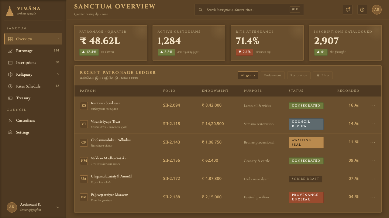
For web interfaces, this language fits dashboards, knowledge tools, archives, premium product areas, and pricing pages that need gravity and high-information clarity. Use dark grounds to establish enclosure, framed regions to group related controls, and warmer relief edges to distinguish selected states or key metrics. Navigation works best when it is direct and typographic, with each destination treated as a marked threshold rather than a floating icon.
In editorial and marketing work, use the style to make long-form material feel authored and ceremonial. Open sections with inscriptional headings, give pull quotes or captions a niche-like enclosure, and let warm dividers mark changes in subject. Marketing pages can alternate between expansive stone fields and focused framed propositions, but the copy must remain as disciplined as the visual system: concise claims have more force than decorative abundance.
The common mistake is confusing monumentality with maximum darkness, maximum texture, or constant ornate framing. The reference is weathered granite under light, not a fantasy ruin. Too many glowing edges make the interface glossy; too many frames make it busy; too much display type makes every statement sound equally important. Preserve darkness for mass, reserve warmth for relief, and use ornament only where it clarifies structure.
Brihadeeswarar Temple Granite — FAQ
Is this style simply an Indian temple texture applied to a dark interface?
No. The useful transfer is structural: mortarless mass, weathered ochre stone, carved relief, tiered framing, and inscriptional hierarchy. Literal texture overlays or indiscriminate temple imagery usually reduce the reference to scenery. A successful application makes information feel fitted into a coherent material system.
How should Cinzel capitals be used without harming readability?
Reserve it for short, high-importance text: product names, page titles, section openings, or concise declarations. Let supporting copy use a quieter reading voice and preserve clear spacing between inscriptions and body text. The contrast between ceremonial display type and restrained utility text is part of the style's hierarchy.
Can the style support data-heavy dashboards?
Yes, if the carved-stone idea is used to clarify rather than decorate. Group metrics inside calm framed zones, use warm relief emphasis for the current priority, and keep secondary information recessed and quiet. The system is especially effective when the product benefits from a sense of permanence, record, or institutional weight.
Why should highlights remain restrained?
The reference is raking light on weathered granite, where illumination reveals selected edges instead of flooding every surface. If warm highlights appear everywhere, they stop reading as relief and become generic decoration. Their scarcity gives them the authority of light discovering a carved form.
Related design styles
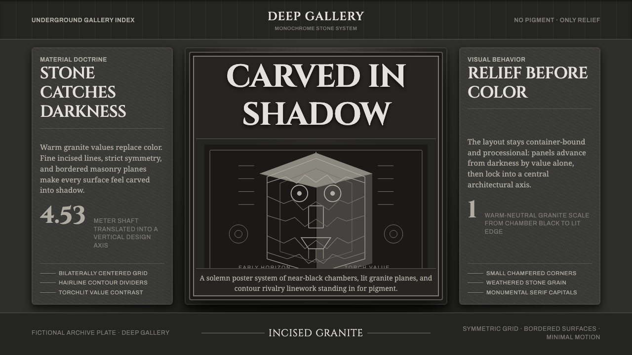 Chavín Lanzón Stone ReliefStone emerges from darkness. Granite grays, incised lines, and torchlit symme…
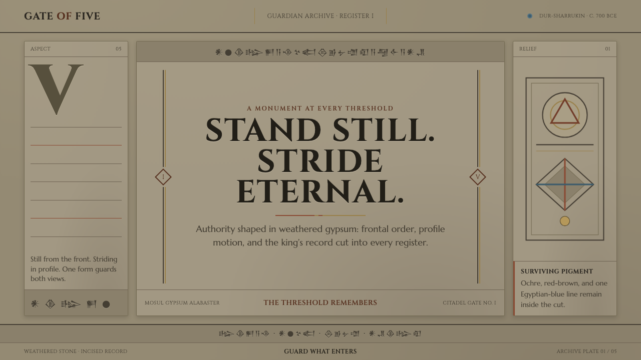 Assyrian Lamassu ReliefAuthority carved into silence. Buff-gray stone, monumental capitals, and cune…
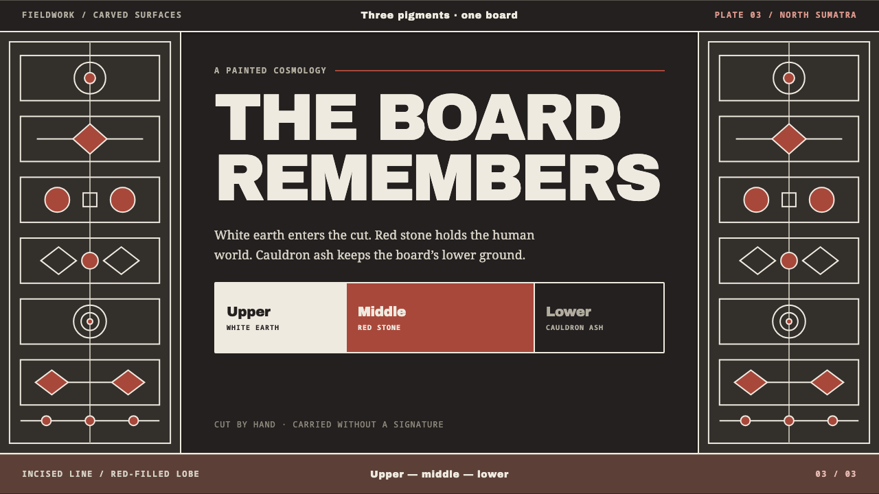 Batak GorgaCosmology cut into wood. Chalk-white lines and batu hula red hold a blackened…
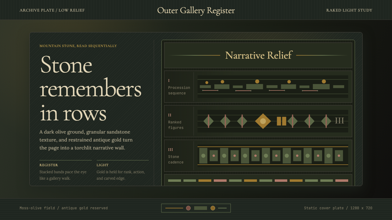 Cambodian Angkor Bas-ReliefStone speaks in shadow. Olive registers and antique gold carve a torchlit arc…
 Deccan Basalt TempleMonumental shadow, carved. Near-black basalt, Cinzel capitals, and relief gri…
 Dravidian Granite GrayscaleRead entirely in grayscale. Soot-dark recesses against dressed granite, Cinze…