What is Chavín Lanzón Stone Relief?
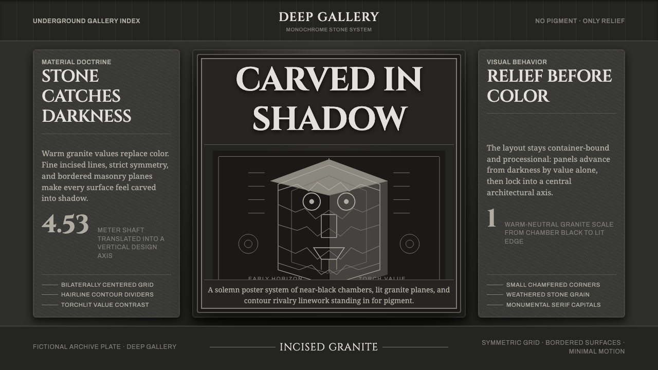
Stone emerges from darkness: granite gray, incised line, and torchlit symmetry turn restraint into authority.
Chavín Lanzón Stone Relief in brief
The Chavín Lanzón Stone Relief is a design language built from the encounter with a monumental granite shaft in the darkness beneath the Old Temple at Chavín de Huántar. Its power does not come from pigment, ornament, or scenic color. It comes from cool stone emerging against near-black shadow, from lines cut into the surface, and from small areas of raised relief catching a narrow beam of light.
The visual system is severe but not empty. A fanged deity occupies the stone as a dense field of eyes, teeth, lips, hair, eyebrows, serpents, whorls, and contour lines. The triangular prism gives the composition an architectural body, while symmetry and repetition hold the visual tension in place. Every mark feels carved, deliberate, and physically accountable.
Applied to contemporary design, the style should feel discovered rather than decorated. The background establishes darkness; granite gray carries the primary field; line work creates identity; and light reveals only the features that deserve attention. The result is solemn, tactile, and controlled, with authority created through material, structure, and restraint.

Where does Chavín Lanzón Stone Relief come from?
The Lanzón belongs to the Chavín culture of the Early Horizon, dated approximately from 900 to 200 BCE, at Chavín de Huántar in the Andean highlands of Peru. It stands inside the cruciform underground gallery of the Old Temple, a setting where darkness is not a background detail but part of the work’s visual condition.
The object is a tall granite shaft carved as a triangular prism. Its deity grins through fanged teeth, while the hair and eyebrows twist into serpentine forms. The surface carries no paint or applied color. Instead, the image depends on incised lines that travel across the stone and on restrained relief at the eyes, nose, lips, and teeth.
This visual language belongs to Chavín cult iconography and to a broader practice of incised low-relief granite sculpture. Its distinctive contour-rivalry line style allows one carved path to suggest several connected features at once. Hair can become serpent, eyebrow can become movement, and ornament can become anatomy without breaking the overall symmetry.
The anonymous Chavín stone-carvers and the Old Temple cult architects are therefore central to the style’s origin. One group gave the stone its dense, controlled surface; the other established the architectural setting in which stone, darkness, and torchlight could work together. The design system draws its authority from that union rather than from any single decorative motif.
What defines the Chavín Lanzón Stone Relief look?
Granite and Shadow
The palette is nearly extinguished: near-black shadow, cool granite gray, and the faint brightness of torchlit relief. Gray should feel mineral rather than neutral, with a hard, cold presence that suggests a carved surface. Black is not merely a background color; it creates the depth from which the stone seems to emerge. Brightness must remain scarce so that every revealed feature carries visual weight.
Incised Line
Line is the principal expressive tool. It should look cut into the surface, not drawn above it. Contours may curl, split, and rejoin, allowing a single path to carry the suggestion of hair, serpent, eyebrow, or architectural boundary. Lines are dense where identity is formed and quiet where space must remain legible. Their irregularity should feel carved and purposeful, never sketchy or casual.
Torchlit Relief
Depth is selective rather than modeled everywhere. Most of the image remains incised and close to the stone plane, while the eyes, nose, lips, and teeth rise just enough to catch light. This creates a visual hierarchy based on revelation: the viewer sees what the light finds first. Avoid smooth dimensional rendering. The strongest effect comes from narrow transitions between darkness, line, and raised surface.
Symmetric Tension
The composition is solemn because its symmetry is active rather than decorative. Paired eyes, teeth, brows, and lateral line systems create a central authority, while serpentine distortions keep the image from becoming static. Balance should feel ritualized and architectural, not soft or ornamental. When asymmetry appears, it should be contained within the larger order, like a carved disturbance inside a stable stone structure.
Triangular Structure
The triangular prism is more than a historical object shape; it is the system’s organizing body. Three planes imply rotation, concealment, and partial revelation. A composition can therefore distribute related information across adjoining faces while preserving a single carved identity. Shapes should feel faceted, compressed, and structural. Curves are welcome when they behave like lines cut across planes, not when they soften the object into organic decoration.
Solemn Authority
The mood is architectural, subterranean, and concentrated. It should feel as though the design has weight and occupies a chamber rather than a screen. Text, controls, and imagery must submit to the same atmosphere: quiet surfaces, restrained contrast, and a clear central order. The style is not theatrical darkness for its own sake. Its authority comes from the sense that every visible mark has survived a process of removal.

Who shaped Chavín Lanzón Stone Relief?
The Lanzón is the central presence of the system: a tall granite shaft in the underground gallery of the Old Temple, carved with a grinning, fanged deity. Its triangular stone body, serpent-like hair and eyebrows, incised contours, and torch-catching facial relief provide the complete visual vocabulary. It should be treated less as an illustration than as the governing object from which the palette, line, depth, and atmosphere are derived.
The anonymous Chavín stone-carvers represent the discipline of making line carry form. Their contribution is visible in the dense incisions, compressed facial features, serpentine transformations, and carefully limited relief. The design lesson is patience under constraint: a surface can become richly expressive without pigment when every contour is placed with structural intent and every raised edge is reserved for the light.
The Old Temple cult architects represent the spatial intelligence behind the encounter. By placing the Lanzón inside a cruciform underground gallery, they made darkness and torchlight active participants in perception. Their role in the visual system is therefore not ornamental but environmental: they establish the chamber, the axis, the concealment, and the controlled revelation that allow the carved stone to become an architectural experience.
How do you use Chavín Lanzón Stone Relief today?
For presentation covers, begin with a near-black field and let a single granite-gray form emerge from one side or from the center. The title should feel incised rather than pasted on, using restrained lettering, generous darkness, and a strong vertical axis. Content slides should preserve the same logic: one central organizing structure, quiet surfaces, and line-based dividers that behave like cuts in stone. Data slides can treat charts as carved diagrams, revealing only the most important bars, paths, or nodes through selective brightness.
For web interfaces, the style suits dashboards and pricing pages that need gravity, hierarchy, and a sense of controlled access. Use near-black as the architectural ground, granite gray for panels and surfaces, and small light accents for active states or essential values. Cards should feel like stone planes rather than floating glass. Navigation can use a central axis and restrained contour marks, while status changes appear as revealed edges or lit relief instead of loud color shifts.
For editorial and marketing work, the system supports subjects that benefit from mystery, authority, and material presence. Articles can open with a large dark field, a carved-looking title, and a narrow column of quiet explanatory text. Section breaks should resemble incised channels or architectural seams. Marketing pages can alternate between deep shadow and mineral surfaces, using close crops, symmetrical compositions, and selective highlights to make the product feel discovered inside a chamber.
The style is especially effective when imagery is treated as evidence of surface rather than as decoration. Use stone texture sparingly, preserve large areas of darkness, and allow line work to organize the page. A campaign image, diagram, or product detail should appear as though light has found it. The combination of severe restraint and concentrated revelation can make a small amount of content feel substantial.
The common mistake is turning the style into generic dark luxury by adding glossy surfaces, dramatic gradients, excessive metallic effects, or many unrelated ornamental lines. That approach loses the Lanzón’s discipline. The system depends on near-black shadow, granite gray, incised contours, selective relief, and symmetry working together. If every element is equally bright or equally detailed, nothing feels carved, hidden, or revealed.

Chavín Lanzón Stone Relief — FAQ
Is the Chavín Lanzón style simply a dark theme?
No. Darkness is only the spatial condition. The distinctive system also requires granite gray, incised line work, controlled symmetry, triangular structure, and selective relief. A generic dark interface can be glossy, soft, or decorative; the Lanzón approach should feel carved, mineral, and architecturally ordered. Its identity comes from the relationship between what remains hidden and what the light reveals.
Why is color so limited in this style?
The source object has no paint or applied color. Its visual force comes from granite, incised marks, darkness, and torchlight. A restrained palette preserves that material logic. If many colors are introduced, the design begins to behave like an illustrated surface rather than a carved object. Light and line should carry hierarchy, while gray and near-black maintain the sense that the image belongs to stone.
How should line work be used without making a layout feel busy?
Treat line as structure, not texture. Let it define a face, axis, boundary, or connection, and allow large quiet areas around it. Dense contour systems should be reserved for the places where identity is concentrated. Elsewhere, a single incision or partial path can carry more authority than a field of repeated decoration. The key is variation between compression and silence.
What kinds of products suit this visual language?
It suits products that want to communicate depth, authority, concentration, and controlled discovery. Analytical dashboards, cultural platforms, specialist tools, research interfaces, and editorial systems can benefit from its architectural seriousness. It is less suitable when the product depends on bright friendliness, playful variety, or soft organic warmth. The style works best when the product’s character can support darkness, material discipline, and a clear central order.
Related design styles
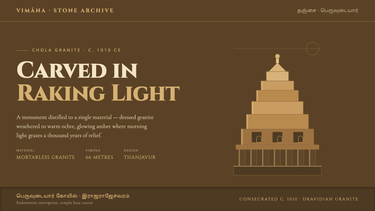 Brihadeeswarar Temple GraniteStone that glows at dawn. Weathered ochre grounds, amber relief edges, inscri…
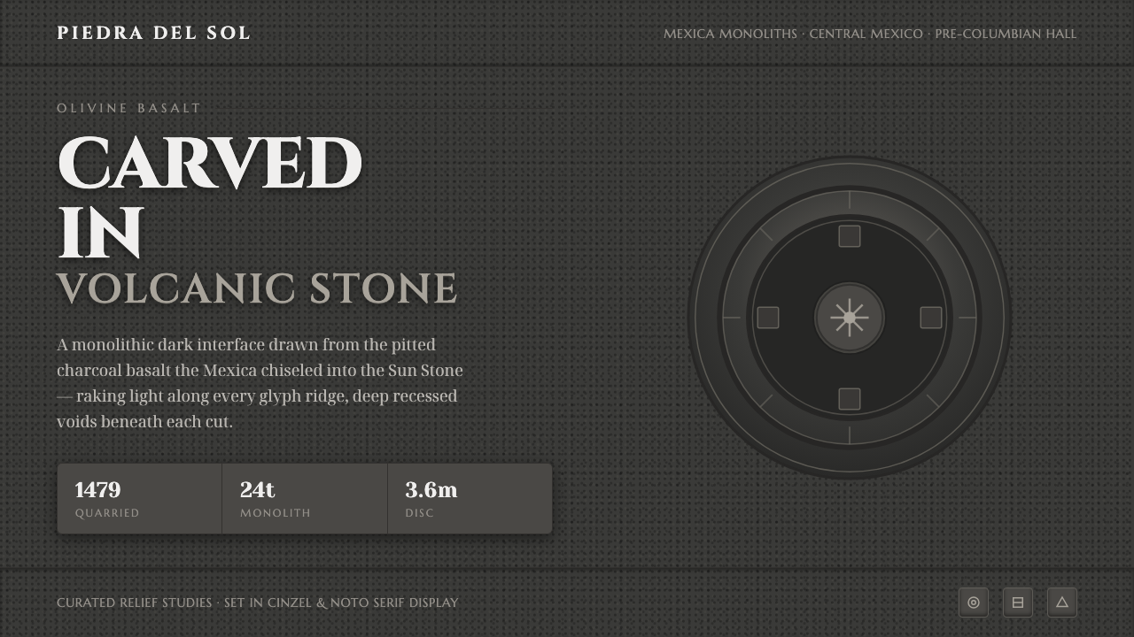 Mexican Volcanic StoneCarved, not floated. Pitted charcoal basalt, raking-light glyph relief, monum…
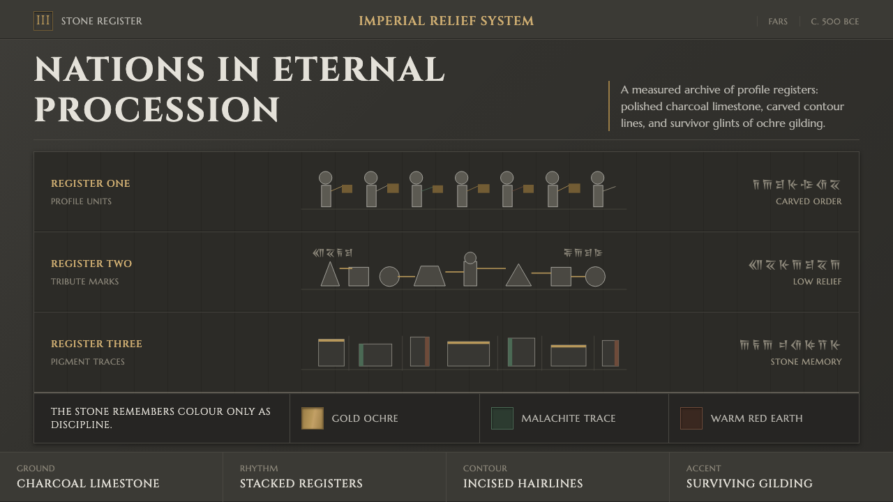 Achaemenid Persepolis ReliefImperial restraint in stone. Charcoal registers carry ochre, green, and red p…
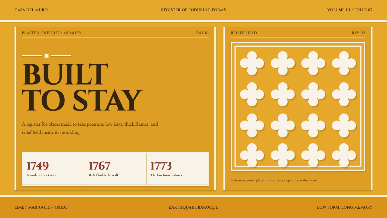 Antigua Guatemala BaroqueBuilt to endure. Marigold bays hold white relief in heavy, low-set frames.
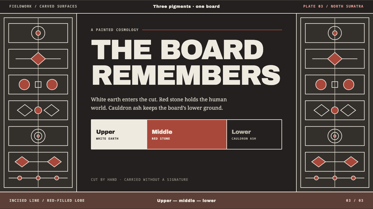 Batak GorgaCosmology cut into wood. Chalk-white lines and batu hula red hold a blackened…
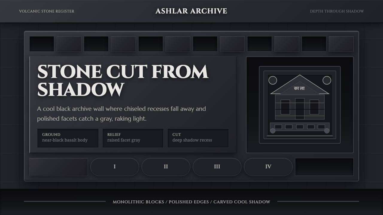 Deccan Basalt TempleMonumental shadow, carved. Near-black basalt, Cinzel capitals, and relief gri…