What is Antigua Guatemala Baroque?
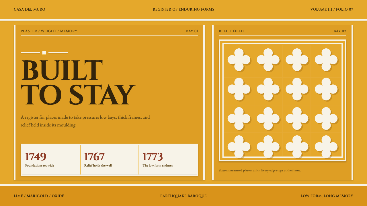
Antigua Guatemala Baroque is ornament that knows its place: marigold walls, white relief held inside heavy frames, and proportions kept low because the earthquakes took the tall ones.
Antigua Guatemala Baroque in brief
Antigua Guatemala Baroque is a warm, dense, deliberately squat design system drawn from the facade of the Iglesia de La Merced in Antigua Guatemala. Its ground is an intense marigold yellow, the colour of lime stucco painted on the front of a church. Its ornament is white: scrolls, shells and leaves in low relief that sit on the yellow wall, cast a real shadow, and stop exactly where the frame around them begins.
The proportions are the point. The towers are low, the walls are thick, the arches are broad and flat, and the cornices are heavy enough to look load-bearing. Nothing soars, because soaring is what the 1773 earthquakes took down. Translated into design, this means layouts that are wide rather than tall, panels that look set into a wall, and frames that carry real visual weight.
What distinguishes the system from other ornate styles is discipline. It is full of decoration, but the decoration is contained. Every relief panel has an edge, every frame has a purpose, and between the panels the wall is left bare. The effect is richness with order: dense, framed, warm and built to endure rather than to impress from a distance.
Where does Antigua Guatemala Baroque come from?
Antigua Guatemala, once Santiago de los Caballeros, lies in the Sacatepéquez department of Guatemala, in a valley among volcanoes. It was the colonial capital of the region, and in 1773 the Santa Marta earthquakes destroyed most of it. The capital was later moved to a new site, and the old city became the place now called Antigua, preserved among its ruins. The Iglesia de La Merced stands where most of that colonial capital fell, and its front is the most complete face of what is often called Earthquake Baroque.
The source gives the building's dates precisely. Construction began in 1749 under Juan de Dios Estrada, and the church was dedicated in 1767. In 1773 it survived the earthquakes that levelled much of the city around it. The reason is part of the design story: it was never intended to be tall. Its low towers, thick walls and broad flat arches were a response to a place where the ground moves, and the result is a building whose proportions are as much engineering as style.
The front is lime stucco painted an intense marigold, with every scroll, shell and leaf of the white ornament picked out in relief. This kind of plaster ornament is called ataurique, a word whose roots reach back to Arabic and to the Mudéjar decoration that crossed the Atlantic with the colonists. In Guatemala, it grew into its own form: stucco rather than carved stone, and set on a bright wall. The source places the building among several overlapping labels: Spanish Colonial Baroque, Churrigueresque, Earthquake Baroque and ataurique plasterwork.
The design system inherits the discipline rather than the iconography. It does not reproduce the scrolls or shells of the church, and it should not be used as a pattern to stamp onto layouts. What it takes is the logic of the front: a strong ground colour, white ornament that sits on the wall and stays inside its frame, and low, thick, load-bearing proportions. It is a structural idea about how decoration and stability can coexist.
What defines the Antigua Guatemala Baroque look?
Marigold ground
The walls are a dense, sun-warmed marigold yellow, the colour of painted lime stucco rather than a pale butter shade. Yellow is the ground, not an accent, so large areas are filled with it and the rest of the system is read against it. It should feel baked and mineral, warm without turning orange and strong without glowing like a light source.
White relief ornament
Scrolls, shells and leaves are picked out in white against the yellow, in low relief that reads as plaster standing proud of the wall. The ornament is plant-like and curling, built from repeated small forms, and clearly secondary to the wall it sits on. White is used for ornament and for nothing else, which keeps it special.
Ornament stops at the frame
The defining rule: relief fills a panel and stops at its frame. It never spills into the next area or fades into the wall. This means every decorative zone is a bounded rectangle or arch with a clear edge, and the density of ornament inside is high while the surrounding wall is calm. It is the opposite of a pattern that tiles endlessly.
Low, squat proportions
Everything is set low and wide. Towers are short, arches are broad and flat, and blocks sit horizontally rather than stretching upward. Vertical emphasis is deliberately suppressed. In layout terms, this means wide panels, short headers, generous horizontal rhythm and a general preference for stability over aspiration.
Heavy cornices and frames
Frames and cornices are thick, to the point of looking structural. They are the main device for dividing space, taking the role that thin rules play in lighter systems. A heavy band at the top of a block and a heavier base beneath it give each panel the look of a masonry bay, and make the page feel as if it could carry weight.
Real cast shadow
Because the ornament stands out from the wall, it casts a genuine, directional shadow. Shadows are short, crisp and warm-dark, falling consistently to one side. They are what make white relief read as three-dimensional on a flat yellow ground. There is no diffuse glow, and no shadow appears under anything that would not physically stand proud of the wall.
Stucco surface
The finish is matte and slightly textured, like hand-applied lime stucco. Edges of relief are crisp, but the large walls have a faint unevenness that keeps them from looking digital. There is no gloss, no metallic sheen and no glassy effect. The material is plaster, paint and age, and that gives the system its warmth.
Who shaped Antigua Guatemala Baroque?
Estrada is the figure the source credits with starting construction of La Merced in 1749, ahead of its dedication in 1767. He is the only person named among its key figures, which is fitting for a style that is more about a building's logic than about an individual's signature. What matters for design is the result: a front that survived.
The church is the direct model. Its stucco front, painted marigold and picked out in white relief, stands where most of the colonial capital fell. It shows how a building can be both richly ornamented and sturdy, and it is the clearest surviving statement of Earthquake Baroque.
The earthquakes are the event that explains the style's shape. They took down what soared and left what was low and thick. For a designer, they supply the reason behind the proportions: the system is squat on purpose, because in this tradition height was a risk and mass was the answer.
Ataurique is the plasterwork tradition of curling plant ornament, tracing its word to Arabic and its decoration to the Mudéjar tradition that came with the colonists. In Guatemala it became stucco relief on bright walls. It supplies the system's decorative vocabulary of repeated scroll, leaf and shell forms, always held within a frame.
How do you use Antigua Guatemala Baroque today?
Antigua Guatemala Baroque works best when you want warmth, richness and durability in the same breath. Decide early which areas are the wall and which are the framed relief, and keep that distinction through every page. The system fails when ornament is everywhere, and succeeds when bare yellow wall surrounds a few dense, well-bounded panels.
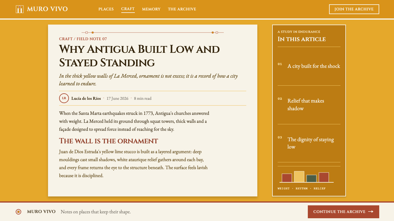
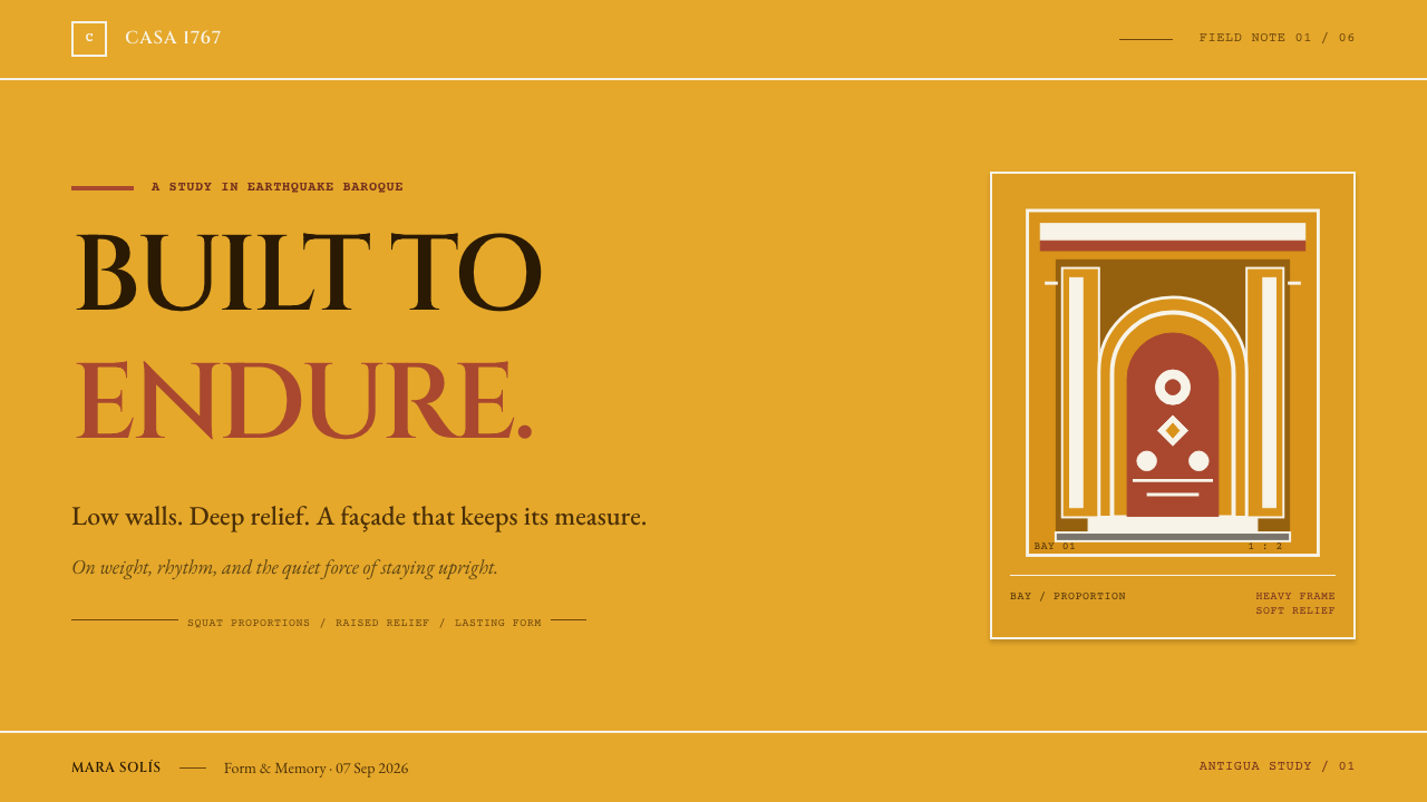
For presentation slides, a cover can be a marigold field with a heavy low band at the base, one framed panel of white ornament as the focal point, and the title set in a weighty, grounded manner beneath or beside it. Content slides divide the field into broad horizontal bays separated by thick frames, with text in the calm wall areas and ornament only in the headers. Data slides suit wide, short bars and solid blocks that feel like masonry, and a chart can sit inside a frame as if set into the wall.
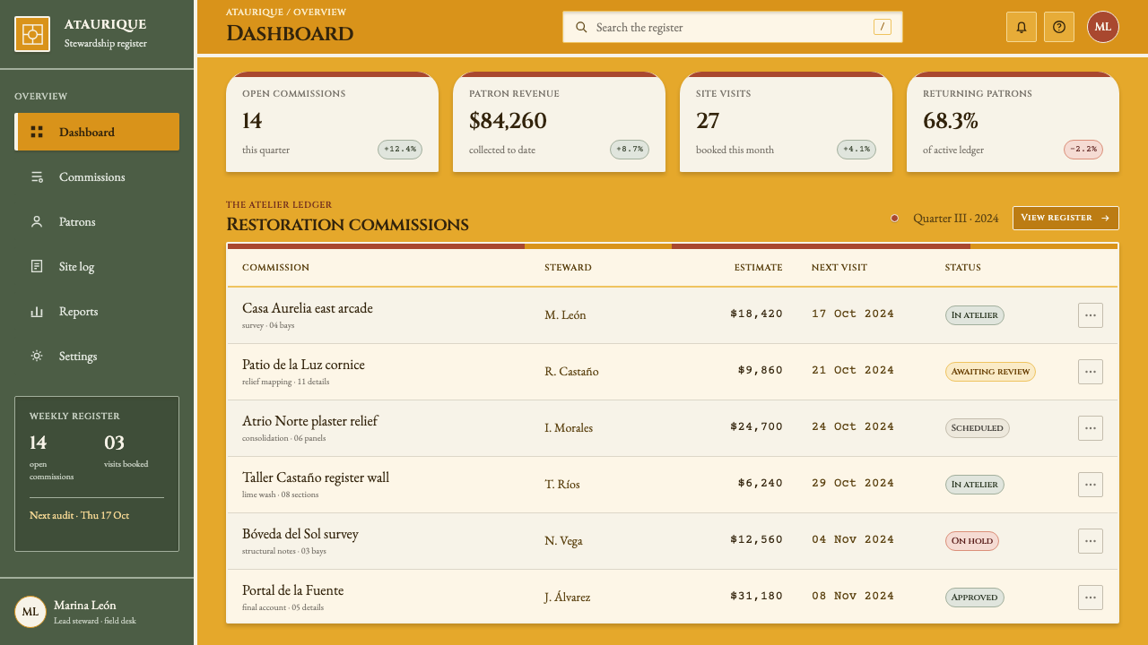
For web interfaces, the style is strongest on culture, travel, food, craft and hospitality products, where warmth and a sense of place matter. Cards become recessed or raised panels with thick frames, navigation sits in a heavy cornice-like band, and buttons are wide, squat and solid. Pricing pages work well with low, broad plan blocks set side by side, each with one framed ornamental header. Keep the ornament confined to headers, dividers and empty states so that content areas stay legible.
For editorial and marketing work, the system suits heritage features, destination guides, restaurant and hotel identities, festival programmes and anything about architecture or colonial history. Photography of stone, plaster and sunlit walls pairs naturally with it. Because the style comes from a colonial-era building, give context when you write about it, and treat the ornament as a craft with a history rather than as a generic Latin American motif.
The most common mistake is letting the ornament escape its frame, either by bleeding to the page edge or by fading into the background. That removes the central discipline. Others include stretching layouts tall and thin, washing the marigold out into pale butter yellow, giving the white relief soft glowing shadows, and covering every surface with decoration so that no bare wall remains. The wall is what makes the ornament mean something.
Antigua Guatemala Baroque — FAQ
What is Earthquake Baroque?
Earthquake Baroque is the name for the low, thick-walled version of Spanish colonial baroque that developed in and around Antigua Guatemala, where earthquakes repeatedly destroyed tall buildings. Its towers are short, its walls heavy and its arches broad and flat. The Iglesia de La Merced, completed in 1767 and surviving the 1773 earthquakes, is its clearest surviving face.
What is ataurique?
Ataurique is a form of plaster ornament made of curling plant shapes such as scrolls and leaves. The word has roots in Arabic, and the decoration comes from the Mudéjar tradition that travelled to the Americas with the colonists. At La Merced it appears as white stucco relief on a marigold wall, always held within a frame.
Why is the system so low and wide?
Because the building it comes from was designed not to soar. Height was what the 1773 earthquakes destroyed, so the tradition favours low towers, thick walls and heavy cornices. In design terms, it prefers stable horizontal layouts and weighty frames over tall, light, floating structures.
How do I keep the ornament from becoming clutter?
Contain it. Put ornament only inside defined frames, and leave bare yellow wall between them. Limit it to headers, feature panels and dividers, and keep text on calm areas. If every region is decorated, nothing stands out. The contrast between dense relief and quiet wall is what gives the style its richness.
When is this style a poor fit?
Avoid it for minimal, airy or highly technical products, and for anything that depends on a tall, slender or floating look. It is also a poor fit for contexts that want a neutral, quiet background, since the marigold ground is strong. It suits warm, rich, place-based subjects, and it asks for context when the subject is colonial heritage.
Related design styles
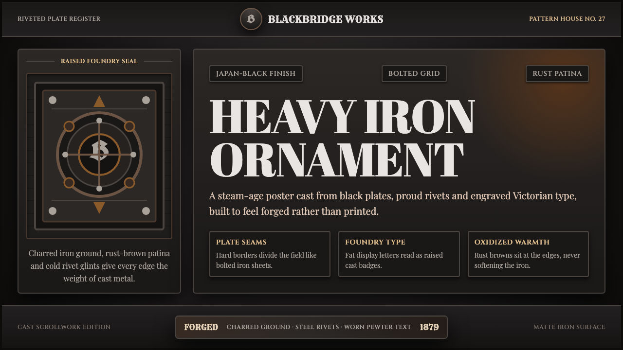 Victorian Cast Iron FoundryHeavy ornament, forged dark. Japan-black plates, rivets and rust-brown border…
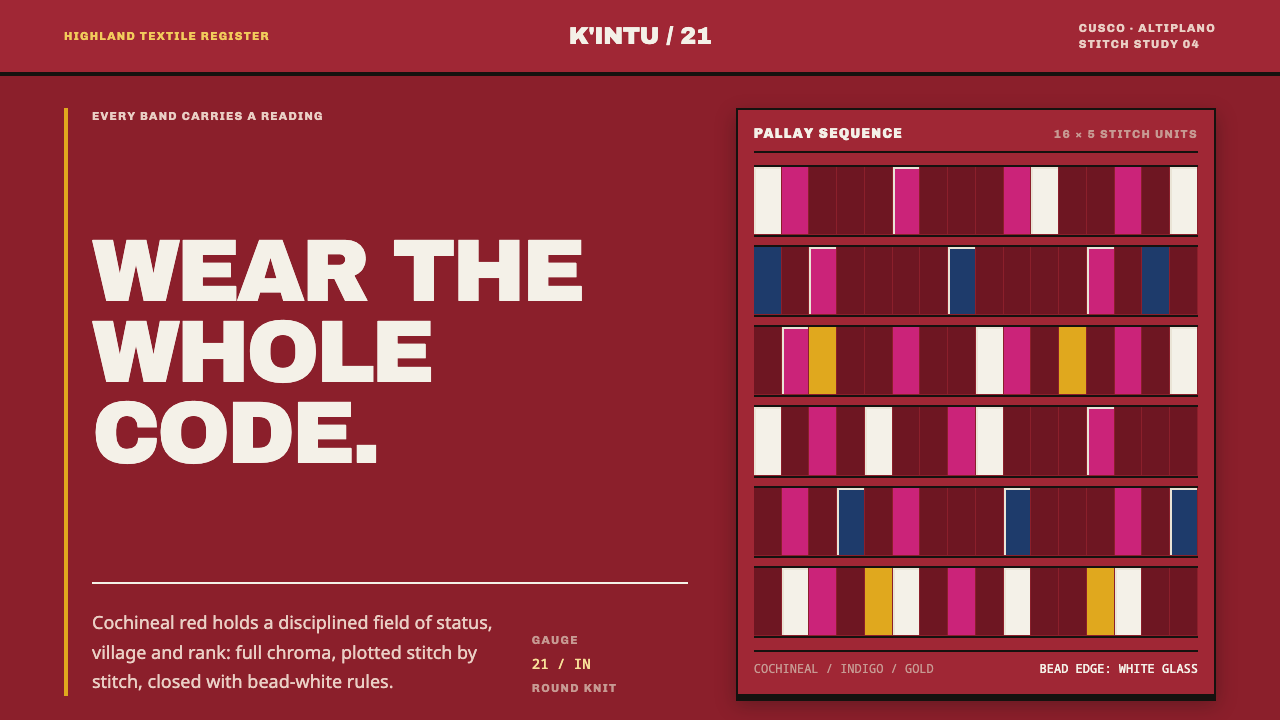 Andean ChulloOrnament carries a code. Cochineal red stacks strict stitch bands with bead-w…
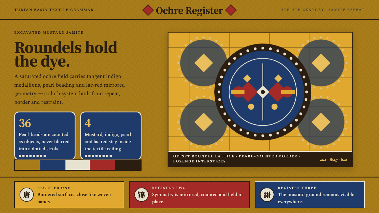 Astana Tomb SilksDye survives as structure. Mustard ground, indigo roundels and pearl beads lo…
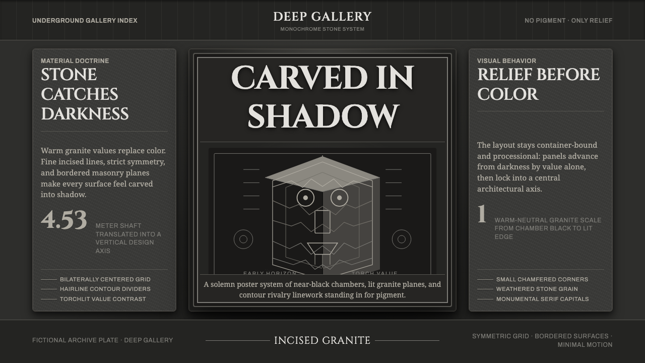 Chavín Lanzón Stone ReliefStone emerges from darkness. Granite grays, incised lines, and torchlit symme…
 Emberá JaguaA living stain, never a print. Blue-black diamond bands press across copper s…
 Qatari Souq Waqif Pearl QuarterWarmth has weight. Ochre plaster, sidr-brown bars, indigo velvet, brass geome…