What is Emberá Jagua?
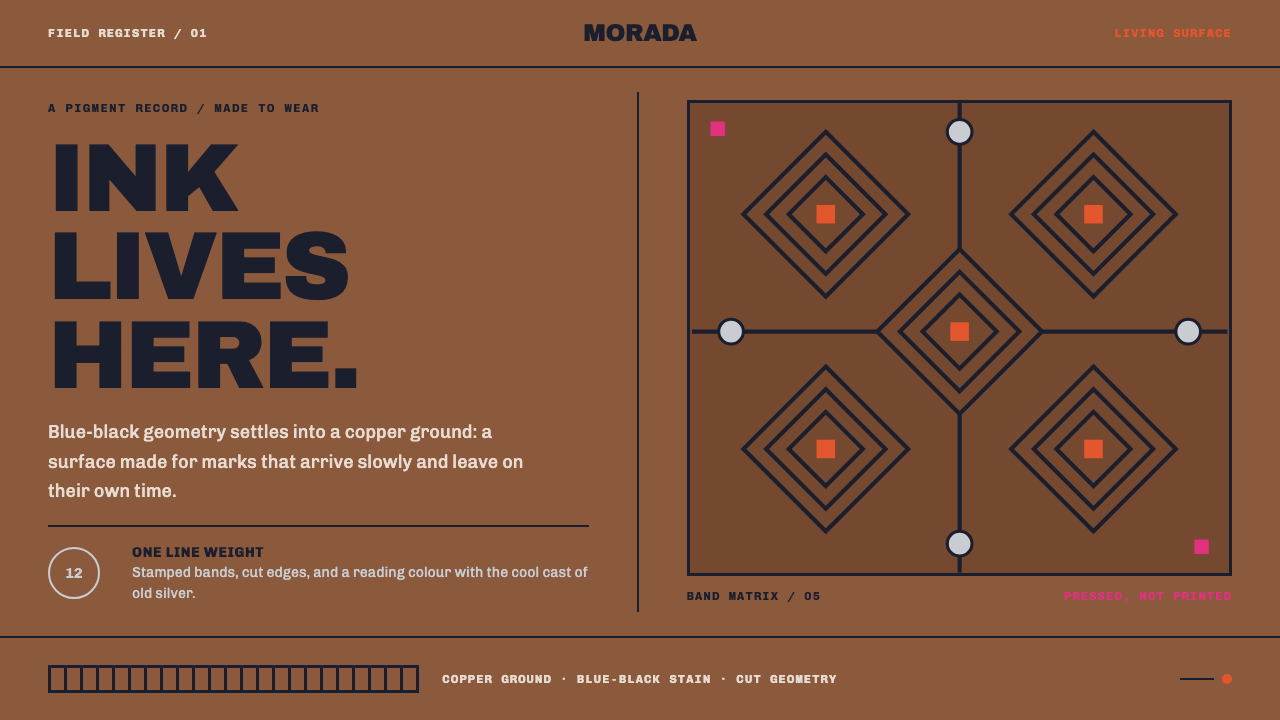
Emberá jagua is ornament drawn on living skin — a blue-black stain that arrives nearly colourless, darkens over days and is gone in a couple of weeks, so the whole aesthetic is about pattern that is worn rather than printed.
Emberá Jagua in brief
Emberá jagua painting is the body-decoration practice of the Emberá and Wounaan peoples of the Darién and the Chocó rainforest, in which blue-black geometric patterns are pressed across the torso, arms and face with a dye made from the unripe fruit of Genipa americana. As a design reference it is unusual for one reversal: the page is not a blank white sheet but warm, coppery skin, and the ornament is a thin overlay of stain laid on top of it.
The idea that governs everything else is impermanence with discipline. Jagua juice goes on almost colourless, develops into a deep blue-black over several days, and stays for one to two weeks before it leaves with the skin itself. It is a living stain, never a print. Pattern in this tradition therefore sits in the surface rather than on it: it has no raised edge, no sheen, no highlight, no cast shadow. It is simply a darker region of the same material.
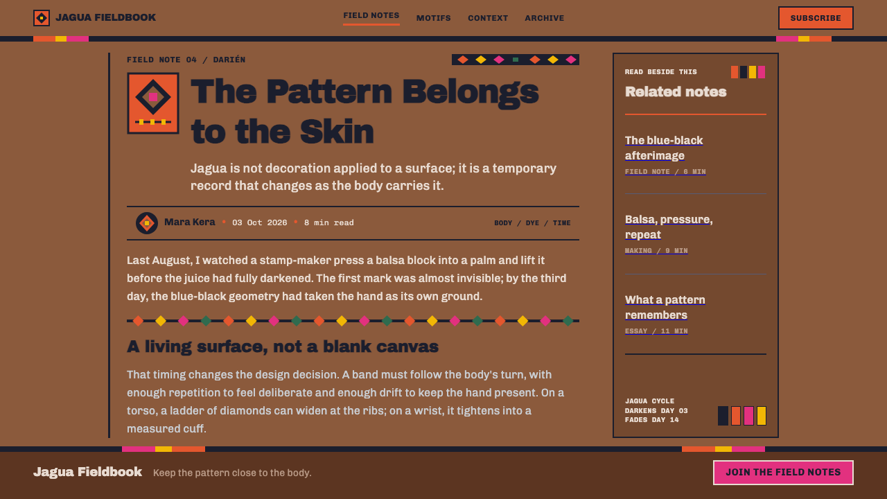
Visually, the style reads as bands of repeated geometric units — diamonds above all — wrapping a body the way a stamp would, drawn with one constant line weight and filled flat. The ground stays dark and warm, the blue-black overlay is tonal and quiet rather than loud, and a few colours — achiote orange, the magenta and yellow of a paruma wrap, the greyed white of old silver coins — appear only where a body would actually wear them.
Where does Emberá Jagua come from?
The Emberá and the Wounaan are neighbouring peoples whose communities live in the Darién, the forested region of eastern Panama, and in the Chocó rainforest of northwest Colombia. The practice described here has pre-1900 origins and, by every account in the source material, has continued without a break through the 2020s. That matters for how the style should be understood. It is not a revival, a rediscovery or a museum category. It is a living tradition, and anything built on it should speak about it in the present tense.
The dye comes from a single plant. The unripe fruit of Genipa americana, known locally as jagua, yields a juice that is nearly colourless when applied. Over the following days it darkens on the skin into a blue-black that lasts one to two weeks and then fades as the outer layer of skin sheds. Every formal property of the style follows from this chemistry. You cannot see the finished pattern at the moment of making; you cannot layer wet tones into each other; and because the colour is inside the surface layer of skin, nothing about it can look raised, glossy or lit from a particular direction.
The pattern itself is applied with stamps. Communities in the Darién and the Chocó carve blocks from balsa wood and press geometric designs across the torso, arms and face, and the pattern set changes with the occasion. Stamping explains why the visual language is modular and banded: a carved block is a repeating unit, and repeating units naturally become bands that wrap around a limb or a chest. This article does not assign meanings to individual motifs; those belong to the communities who use them, and the source material does not claim them.
Beside jagua sit two other kinds of colour that belong to the body. Achiote, a red-orange pigment, is used as face paint and is listed among the traditions this system draws on. The paruma, a wrapped garment worn in magenta and yellow, and silver coins worn as ornament contribute the remaining accents. The design system keeps these colours deliberately scarce and tied to the places a person would actually wear them, so that the overlay of blue-black remains the main event and the rest feels like adornment rather than decoration.
What defines the Emberá Jagua look?
Skin as the Page
The ground is warm coppery brown, deep enough that the whole surface reads as dark. It is not a neutral to be filled; it is the material the ornament lives in. Panels, cards and sections all share this one ground, and separation comes from where bands fall rather than from boxes, borders or contrasting fills.
Jagua Blue-Black
The ornamental layer is a single blue-black, the colour jagua becomes on skin. Against the copper ground it is a tonal shift more than a stark contrast: patterns are clearly visible, but they sit quietly, the way a stain would. Because it is the only ornamental colour, it carries all the structural work — bands, diamonds, rules — and never needs a partner to make its point.
Bands and Diamonds
Geometry is built from repeating units arranged in bands. The diamond is the signature unit, but what matters is the band: a strip of identical units that wraps its subject and then stops. Bands mark the top and bottom of a section, frame a header, or run across a data block. Their rhythm is regular, as a carved stamp would make it.
One Line Weight
Every line in the ornament is the same thickness, from the smallest diamond to the widest band. There is no thick-and-thin modulation, no emphasis by weight, no hairline detail. This is what a stamp or a brush charged with one loading of dye naturally produces, and it gives the system a calm, even texture. Hierarchy has to come from spacing, position and scale of the units, not from changing how heavy the line is.
Flat as a Stain
Fills are flat. There are no gradients, no highlights, no bevels and no drop shadows, because a stain has no depth to catch light. Where something needs to feel nearer or more important, it is made larger, more densely patterned or placed higher, never given a glossy edge. This restraint is what keeps the style from drifting into a generic tribal or tattoo look, which usually leans on heavy blacks and dramatic contrast.
Occasion-Specific Patterns
In the tradition, a different occasion calls for a different pattern set. The design translation is a small family of related band patterns, each kept for a particular context — one for the page header, another for the footer, another for a highlighted block — and used consistently. The reader learns the set through repetition. Mixing every motif everywhere would flatten the idea that pattern is chosen for a reason.
Accents Where a Body Would Wear Them
Achiote orange, the magenta and yellow of a paruma and the grey-white of old silver coins are the only other colours, and each appears in a place that corresponds to something worn: face paint, a wrapped garment, a piece of metal ornament. In an interface this means accent colours are reserved for items that read as adornments — a badge, a highlighted tag, a call-to-action — rather than spread across body text or large regions.
Who shaped Emberá Jagua?
The Emberá communities of the Darién, in eastern Panama, are among the keepers of jagua body painting and the balsa-stamp method that carries it. Their practice, in use from before 1900 into the 2020s, is the direct source of the banded geometry and the habit of changing pattern with the occasion. A design that borrows from it is borrowing from a present-day community, not from an archive.
The Wounaan communities of the Chocó, in the rainforest of northwest Colombia, share the practice of stamping jagua patterns across torso, arms and face. Their presence alongside the Emberá is a reminder that the style belongs to more than one people, and credit should name both.
The unripe fruit of Genipa americana is the dye's source. Its juice is the reason the style exists in the form it does: nearly colourless on application, blue-black after days, gone after one to two weeks. Every design decision in the system that rejects gloss, depth and permanence traces back to what this fruit does when it meets skin.
The carved balsa block is the tool that makes the pattern modular. Each block is a repeating geometric unit with crisp edges, pressed along a limb or across a chest until it becomes a band. In the design system, it stands for the idea that ornament should be a reusable unit applied with consistent pressure — the same stamp, the same weight, the same edge — rather than something redrawn each time.
How do you use Emberá Jagua today?
Emberá jagua is most useful when a project wants to feel handmade, warm and grounded without being rustic, and when it can commit to a dark, skin-toned surface. It rewards restraint: one overlay colour, one line weight, a small set of band patterns. Before applying it, remember that it comes from a living tradition, so it fits best in work that names its source rather than using the pattern as anonymous texture.
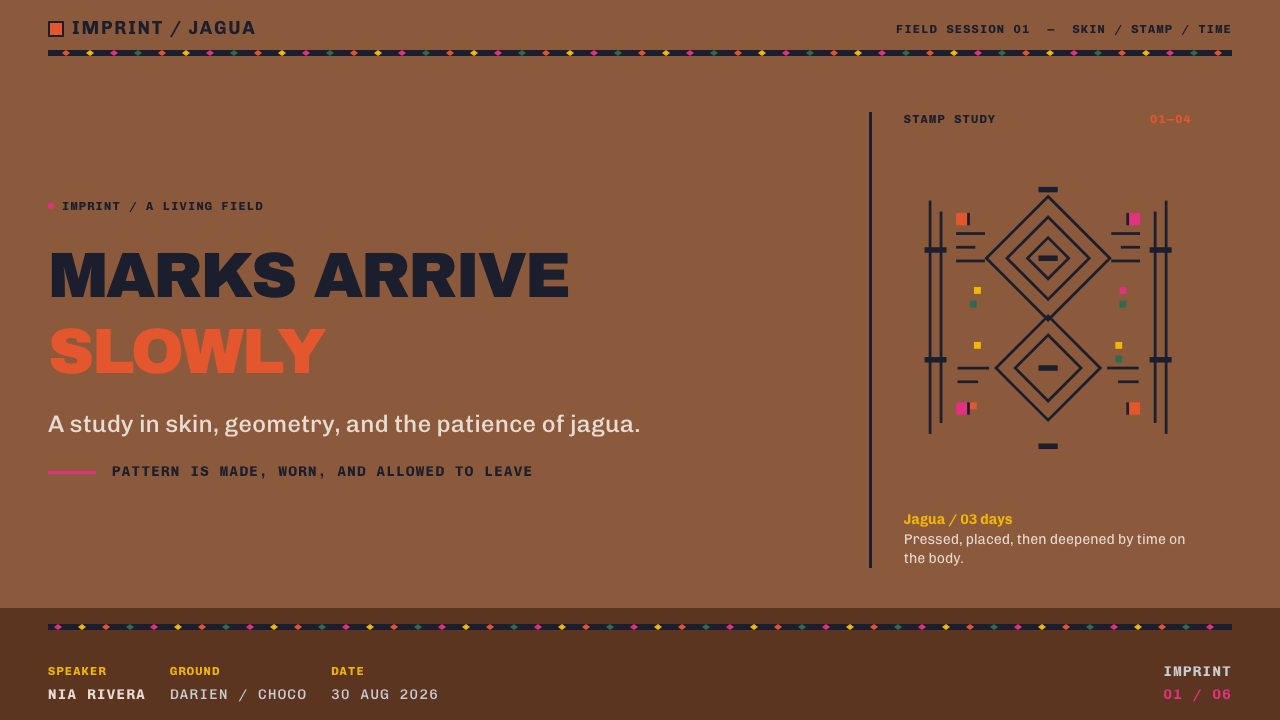
For presentation slides, the cover is the natural place for a full band: a wide strip of repeated diamonds crossing the lower or upper edge, with the title set plainly above it on the copper ground. Content slides keep a narrow band as a header or footer and leave the middle empty for text. Data slides should keep charts flat and single-weight — bars filled with the blue-black, axis lines the same thickness as the pattern lines — and reserve achiote orange for the one value the audience must notice.
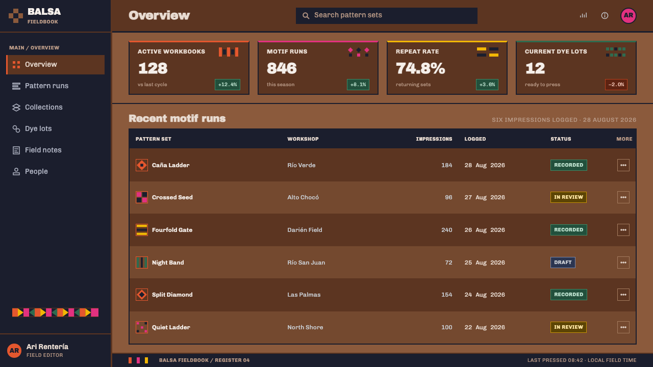
For web interfaces, the style suits dashboards, portfolios and cultural or community sites that benefit from a calm, continuous surface. Use the dark copper ground everywhere, mark section boundaries with a band rather than a card border, and keep component outlines the same weight as the ornament. Pricing tiers can be separated by pattern variants, not by shadows. Accent colours belong on small, adornment-like components: a badge, a selected tab, a primary button.
For editorial and marketing work, bands make excellent chapter markers and pull-quote frames, and the flat, shadowless look reproduces cleanly in print, on screens and in single-colour output alike. A campaign page can alternate full-width bands with generous empty copper, letting the pattern pace the reading rather than competing with the text.
The most common mistake is to treat the blue-black as a licence for heavy, high-contrast, tattoo-style black ornament, with gradients, glows or embossed edges added for drama. That is the opposite of a stain. The second mistake is scattering all the accent colours across the layout at once; they should appear only where a body would wear them. A third is to describe the style with a vague label such as tribal. Name the Emberá and Wounaan, and name jagua.
Emberá Jagua — FAQ
Is this a tattoo style?
No. A tattoo is permanent and usually high-contrast, with deep black and crisp shading. Jagua is a stain that begins nearly colourless, darkens to blue-black over several days and fades after one to two weeks. The design system takes that literally: flat fills, one line weight, no highlights or gradients, and a tonal rather than stark relationship between ornament and ground. If your design looks like a tattoo flash sheet, it has drifted away from the source.
Why is the background a warm brown rather than white or black?
Because the page in this tradition is skin. Jagua is painted on people, not on paper, so the ground is the warm coppery brown of the body and the ornament is a thin overlay on top of it. A white ground would turn the pattern into print; a black ground would remove the sense of warmth and the tonal softness that makes a stain read as a stain. The brown is the whole point of the reversal.
Can I use the diamond bands in any project?
Technically yes, but the pattern comes from the Emberá and Wounaan peoples and from a practice that is still alive. The respectful approach is to use it where it genuinely fits the tone of the project, avoid turning it into a generic ethnic filler, and credit the source in captions, about pages or documentation. Do not invent meanings for individual motifs; those belong to the communities that use them.
How should I use the accent colours?
Treat them as things a person would wear. Achiote orange suits face-paint-like highlights, the magenta and yellow of a paruma suit large wrapped fields used sparingly, and the grey-white of old coins suits metallic-feeling details such as small icons or dividers. Use at most one of them in any single component. The blue-black overlay should always remain the dominant ornamental colour, with the others as occasional adornment.
Does this style work for data-heavy dashboards?
Yes, within limits. Its flat fills, single line weight and absence of shadows make charts easy to read and easy to reproduce, and bands give dashboards a clear way to separate sections without boxes. The limitation is contrast: because the overlay is tonal rather than stark, very small text and fine gridlines need extra care. Keep body text light enough to read on the dark ground, and use the one accent colour for the number that matters.
Related design styles
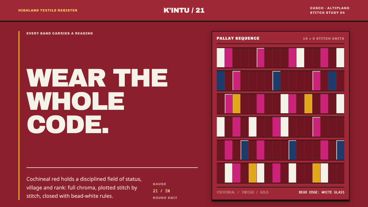 Andean ChulloOrnament carries a code. Cochineal red stacks strict stitch bands with bead-w…
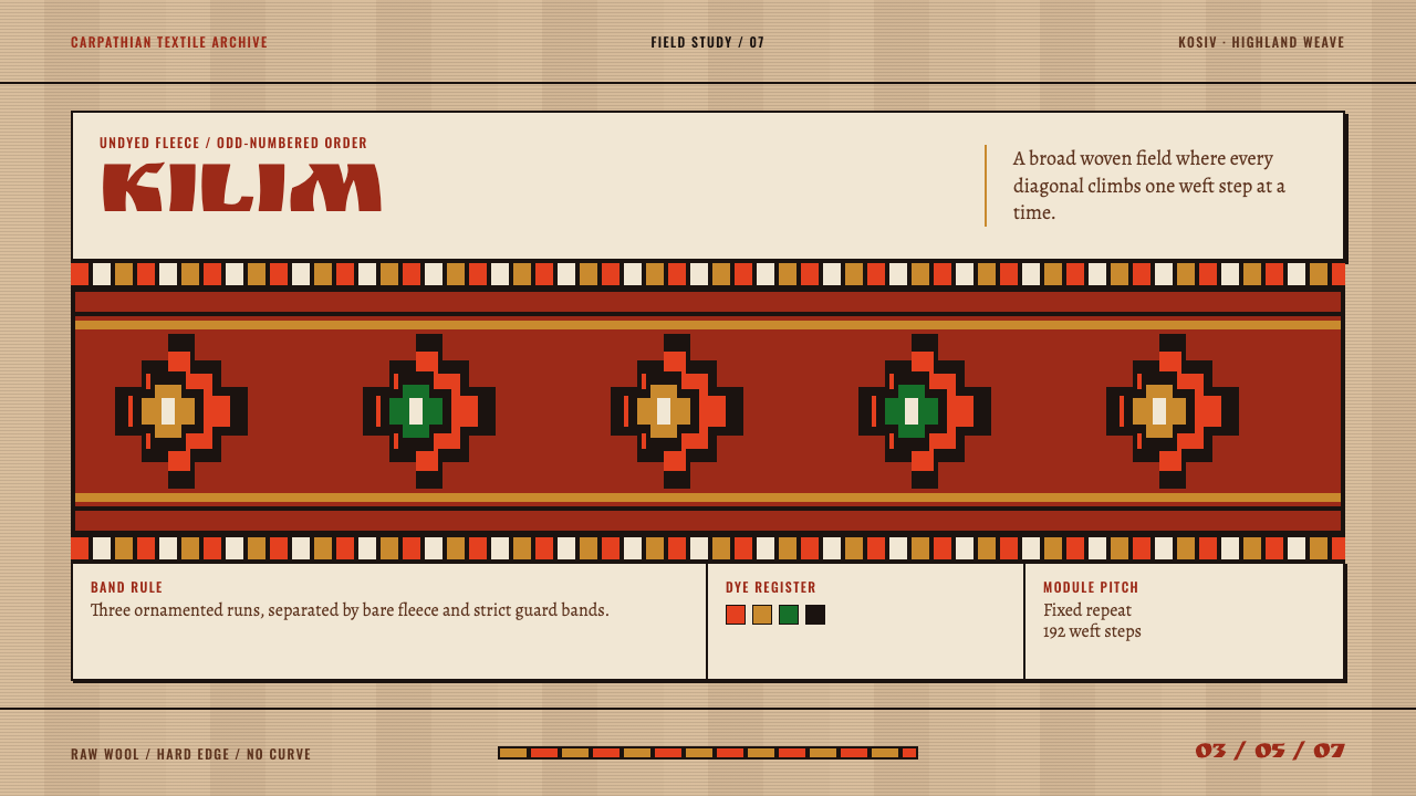 Hutsul KilimGeometry is the craft. Hot red stepped rhombs repeat across raw fleece bands.
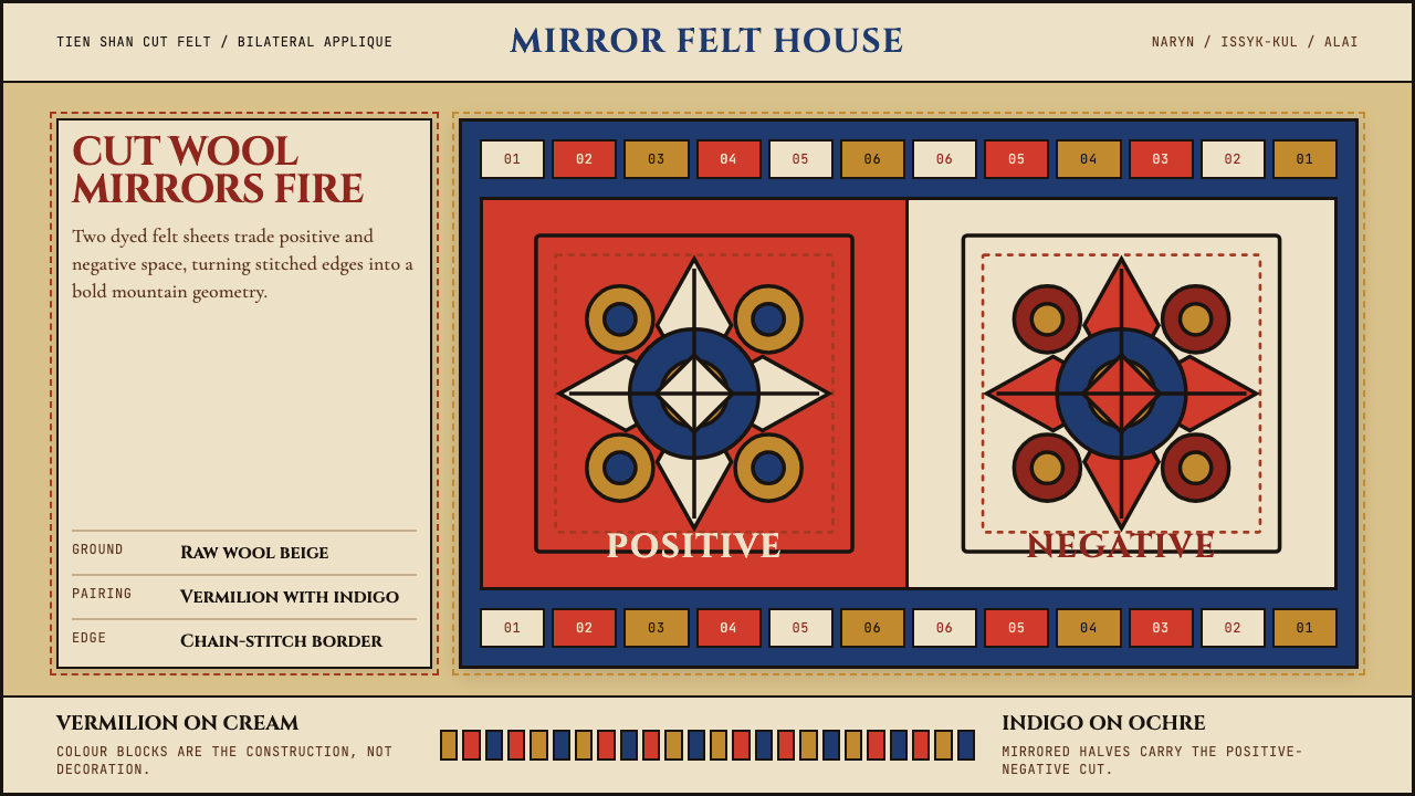 Kyrgyz Shyrdak Felt RugCut felt becomes structure. Vermilion-indigo mirror blocks stitch positive to…
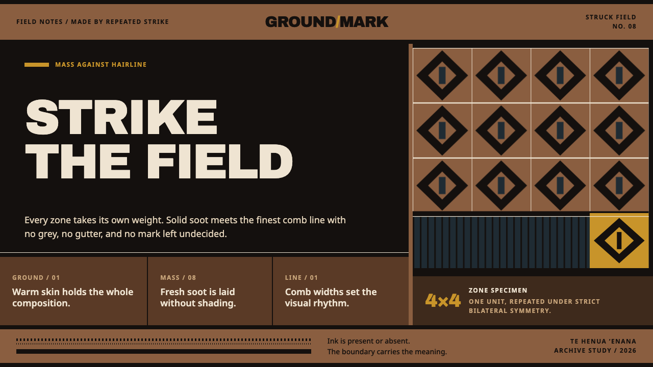 Marquesan PatutikiSoot meets skin without compromise. Solid black zones collide with comb-struc…
 Tongan Kupesi TapaRubbed, never painted. Koka red and tongo black soak into beaten tan bark as…
 Emirati Sadu WeavingMemory runs in bands. Madder steps cross dusty goat-hair black with no curve…