Design style guide设计风格指南
What is Kyrgyz Shyrdak Felt Rug?什么是 Kyrgyz Shyrdak Felt Rug?
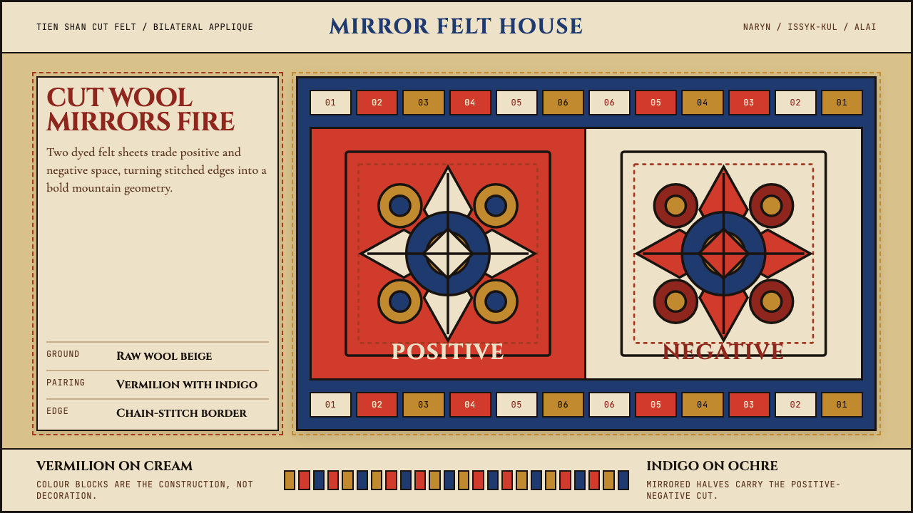
The shyrdak turns a single cut into two patterns at once — the wool you remove becomes the decoration you keep.什尔达克让一刀裁出两种图案——剪去的羊毛,恰好成为留下的装饰。
Kyrgyz Shyrdak Felt Rug in briefKyrgyz Shyrdak Felt Rug 速览
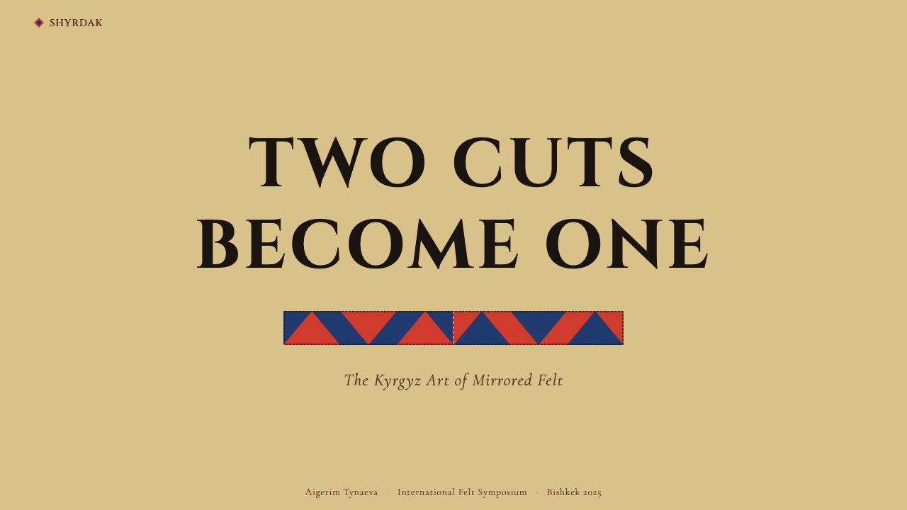
Shyrdak is a Kyrgyz mosaic felt rug made by cutting two contrasting sheets of dyed wool felt into matching mirrored shapes and stitching the halves together in reverse — the positive silhouette of one colour becomes the negative ground of the other. The result is a seamless interlocking composition where no shape exists without its complement. Every panel is simultaneously figure and ground, foreground and frame.什尔达克是吉尔吉斯拼贴毡毯:将两片对比色染色羊毛毡按镜像裁剪,再将正形与负形交换缝合——一种颜色的实形剪影,恰好成为另一种颜色的镂空底面。最终呈现的是一幅无缝咬合的构图,每一个形状都离不开它的互补部分,每一块色域同时是图形,也是背景。
The visual language is bold and unambiguous: strong two-tone palettes anchored in vermilion-on-cream, indigo-on-ochre, or deep crimson-on-black; motifs derived from the mountain landscape and nomadic life — ram-horn spirals called kochkor müiz, butterfly silhouettes, four-petal flowers, and angular fret borders; surfaces that are dense with pattern yet structurally ordered through strict bilateral symmetry. Nothing about shyrdak is accidental. Even the thick woollen ground carries meaning: the warmth and weight of pressed felt connects every object to the yurt floor it was made to cover.其视觉语言大胆而明确:朱红配乳白、靛蓝配赭黄、深绯红配黑色这样的强烈双色调;取材于山地景观与游牧生活的母题——公羊角旋纹(kochkor müiz)、蝴蝶剪影、四瓣花,以及折线边框;图案密集却因严格的双边对称而保持结构秩序。什尔达克里没有偶然:连厚实的毡制底面本身也承载意义,压制羊毛的重量与温度,将每件作品与它本来要铺盖的毡房地面相连。
As a design system, shyrdak channels that cut-and-stitch clarity into a set of rules: colour blocks are the entire design, not a coating applied over it; geometry is always bilateral and mirrored rather than free-form; every edge is defined by the stitched join between two contrasting fields rather than by a drawn line. The chain-stitch embroidery that reinforces those seams adds a secondary texture without softening the graphic force of the main shapes.作为设计系统,什尔达克将这种剪贴式的明快提炼为一套规则:色块就是全部的设计,而不是覆盖在其他结构之上的涂层;几何形态始终双边对称镜像,而非自由舒展;每一条边缘由两个对比色域之间的缝合处定义,而非由绘制的线条勾勒。加固接缝的链式绣线引入了第二层质感,却不会削弱主体形状的图形张力。
See the Kyrgyz Shyrdak Felt Rug design system →查看 Kyrgyz Shyrdak Felt Rug 完整设计系统 →
Where does Kyrgyz Shyrdak Felt Rug come from?Kyrgyz Shyrdak Felt Rug 从何而来?
The shyrdak belongs to the broader Central Asian felt-rug family — a textile tradition stretching from the Kazakh steppe to the Pamir highlands — but it is most precisely associated with the mountain women of Kyrgyzstan's Naryn, Issyk-Kul, and Alai regions, where the Tien Shan range provided both the harsh winters that made felt essential and the flocks of fat-tailed sheep whose wool is particularly suited to dense felting. The technique of cutting and interlocking contrasting felts is old enough that its origins cannot be precisely dated, but the craft is documented in historical accounts from the eighteenth century and likely predates them substantially.什尔达克属于更广泛的中亚毡毯家族——这一纺织传统从哈萨克草原延伸至帕米尔高原——但最具体地与吉尔吉斯斯坦纳伦、伊塞克湖和阿赖地区山区妇女相关联。天山山脉既带来了使毡毯不可或缺的严冬,也提供了适合密实毡制的肥尾羊群。裁剪并咬合对比色羊毛毡的技艺历史久远,其起源无法精确追溯,但这一工艺已在十八世纪的史料中留有记载,实际历史很可能更为悠久。
Shyrdaks were made for specific purposes within nomadic life: as floor coverings for yurts, as gifts at weddings and births, and as markers of household status. A bride's trousseau customarily included several shyrdaks she and her female relatives had made over years. The colour combinations and motif repertoire varied by region and family, giving rugs a local and sometimes personal signature without departing from the shared visual grammar. The kochkor müiz motif — the ram-horn spiral — was among the most widespread, carrying associations with strength, fertility, and the vitality of the herds on which nomadic life depended.什尔达克在游牧生活中各有其用:铺盖毡房地面、在婚礼与诞生时作为礼物,以及标示家户地位。按照习俗,新娘的嫁妆中应包括她与女性亲属多年制作的数张什尔达克。色彩搭配与母题选择因地区和家族而异,赋予毡毯地方乃至个人的特征,却不偏离共同的视觉语法。公羊角旋纹(kochkor müiz)是流传最广的母题之一,承载着力量、生育与畜群活力的象征意涵——而畜群正是游牧生活的根基。
The Soviet era transformed shyrdak production in complex ways. Collectivisation disrupted the pastoral economy and the domestic craft context, but Soviet craft promotion simultaneously institutionalised shyrdak-making as a recognised Kyrgyz national folk art, channelling production into workshops and cooperatives and exposing the rugs to wider audiences through exhibitions and export. After independence in 1991, the collapse of Soviet-era support structures threatened many traditional crafts, but shyrdak experienced a revival through women's cooperatives — organisations like the Altyn Kol Women's Handicraft Cooperative in Naryn — that rebuilt production networks and connected rural craftswomen directly with international buyers.苏联时期以复杂的方式改变了什尔达克的生产面貌。集体化打乱了畜牧经济与家庭手工艺的传承语境,但苏联的工艺推广政策同时将什尔达克制作作为公认的吉尔吉斯民族民间艺术加以制度化,将生产引入工坊与合作社,并通过展览与出口将毡毯推向更广泛的受众。1991年独立后,苏联时代支援结构的瓦解威胁到许多传统工艺,但什尔达克却借助妇女合作社实现了复兴——纳伦的「金手」(Altyn Kol)妇女手工艺合作社等组织重建了生产网络,将农村手艺人与国际买家直接连通。
UNESCO's inscription of shyrdak-making on the List of Intangible Cultural Heritage in Need of Urgent Safeguarding in 2012 marked international recognition of both the craft's cultural significance and the precarity of its transmission. Researchers including ethnographer Stephanie Bunn, who conducted sustained fieldwork with Kyrgyz felt-makers, documented the technical and symbolic dimensions of the tradition in detail, contributing to both preservation efforts and the wider scholarly understanding of Central Asian textile culture. The Kyrgyz Felt Centre in Bishkek has become a hub for training young practitioners and promoting the craft to designers and collectors outside the region.2012年,联合国教科文组织将什尔达克制作工艺列入《急需保护的非物质文化遗产名录》,既是对这一工艺文化意义的国际认可,也是对其传承危机的正视。民族志学者斯蒂芬妮·邦恩(Stephanie Bunn)对吉尔吉斯毡制工匠进行了深入田野调查,详细记录了这一传统的技术与象征维度,为保护工作与更广泛的中亚纺织文化学术研究均作出了贡献。比什凯克的吉尔吉斯毡制中心已成为培训年轻传承人、向区域外设计师与藏家推广这一工艺的重要基地。
What defines the Kyrgyz Shyrdak Felt Rug look?Kyrgyz Shyrdak Felt Rug 的视觉特征是什么?
Cut-and-Inlay Color剪嵌色块
Color in shyrdak is not painted or printed — it is the felt itself. Two contrasting sheets of dyed wool are cut simultaneously into complementary shapes, then each half is swapped into the other's ground, producing a composition where both hues cover exactly equal area. The classic pairings are vermilion against cream, indigo against ochre, and deep crimson against black, chosen for their maximum contrast rather than tonal harmony. Because the colors are structural rather than applied, they never fade or bleed at the edges; the boundary between fields is always a sharp, physical seam.什尔达克的色彩不是涂抹或印刷而成的——色彩本身就是羊毛毡。两片对比色染色毡料同时裁剪成互补形状,再将各自的剪出部分嵌入对方的底面,形成两种色调各占完全相等面积的构图。经典搭配是朱红配乳白、靛蓝配赭黄、深绯红配黑色,选择标准是最大对比度,而非色调和谐。由于颜色是结构性的而非附加的,边缘处永远不会褪色或渗染;两个色域之间的分界始终是一条清晰的实体缝合线。
Bilateral Mirror Symmetry双边镜像对称
Shyrdak compositions are almost always bilaterally symmetrical along one or two axes. A motif that spirals left on one half of a panel is answered by an identical spiral turning right on the other. This mirroring is not merely decorative — it is a structural consequence of the cut-and-swap technique itself: when you cut two layers together and redistribute the pieces, perfect symmetry is the natural result. The visual effect is one of disciplined inevitability, as though the pattern could not have been any other way.什尔达克的构图几乎总是沿一条或两条轴线呈现双边对称。面板一侧向左旋转的母题,必然由另一侧向右旋转的相同母题呼应。这种镜像并非单纯的装饰选择——它是剪裁交换技法本身的结构性结果:将两层同时裁剪再互换拼入时,完美对称是自然而然的产物。视觉效果呈现出一种有纪律的必然性,仿佛图案本来只能是这个样子。
Ram-Horn and Geometric Motifs公羊角与几何母题
The motif vocabulary draws on the nomadic environment rather than botanical or figurative traditions. The kochkor müiz — a spiral that echoes the curve of a ram's horn — is the most iconic, appearing as a primary centerpiece or a repeated border element. Related forms include the butterfly silhouette, the four-petal flower (derived from the top opening of the yurt), and angular step-fret patterns that echo mountain ridgelines. All motifs are geometrised to the point where their natural origins recede: the ram's horn becomes an abstract double spiral, the butterfly becomes a symmetrical lozenge.母题词汇来源于游牧环境,而非植物或具象传统。公羊角旋纹(kochkor müiz)——呼应公羊角曲线的螺旋形——是最具标志性的母题,可作为构图中心,也可作为重复边框元素。相关形态还包括蝴蝶剪影、四瓣花(源自毡房顶部开口的形状),以及呼应山脊轮廓的折线步阶纹。所有母题都经过几何化处理,自然原型退居幕后:公羊角成为抽象的双螺旋,蝴蝶成为对称的菱形。
Chain-Stitch Seam Embroidery链式绣线接缝
The join between the two contrasting felt fields is reinforced with a line of chain-stitch embroidery in a third color — typically a warm mustard, a vivid grass green, or a bright white — that runs precisely along the boundary. This embroidered seam serves a structural function, binding the pieces securely, and a visual one: it introduces a fine linear element that articulates every edge without interrupting the bold color-block reading. The stitch line is never heavy enough to dominate, but its presence gives the composition a hand-crafted intimacy that raw seams alone could not provide.两个对比色毡料区域之间的接缝,以第三种颜色的链式绣线加固——通常是温暖的芥末黄、鲜亮的草绿或明亮的白色——精确沿边界走线。这条绣线接缝同时具有结构功能(将各部分牢固缝合)与视觉功能:它引入了一条细线性元素,在不打断大色块整体阅读感的前提下,清晰勾勒每一条边缘。绣线的分量从不足以压倒主体,但它的存在赋予构图一种手工制作的亲密感,是裸露接缝单独无法提供的。
Tactile Wool Ground羊毛毡触感底面
Unlike woven textiles or printed media, shyrdak is built from pressed and compressed wool — a material with visible surface texture, a slight nap, and a warmth that reads even in photographs. The background tone is typically the natural off-white of undyed wool rather than a stark white, which gives the palette an inherent earthiness. This material warmth differentiates shyrdak from other geometric or high-contrast traditions: even at its most graphic, the style retains the soft-edged quality of a handmade object, never achieving the cold precision of machine-reproduced geometry.与机织面料或印刷媒介不同,什尔达克由压实的羊毛毡构成——一种表面可见纹理、带有轻微绒毛感、即便在照片中也能感受到温度的材料。底面色调通常是未染羊毛的天然米白,而非纯白,赋予整体色板一种本质上的大地气息。这种材料温度使什尔达克有别于其他几何或高对比度传统:即便在最具图形感的状态下,这种风格仍保留着手工制品的柔边质感,绝不呈现机器复制几何图形那种冰冷的精确。
Dense Surface with Ordered Structure密实表面与有序结构
A finished shyrdak panel leaves almost no empty ground visible — motifs fill the field from edge to edge, with borders and interior blocks arranged in a strict hierarchy. Yet the composition never reads as chaotic because the bilateral symmetry and the two-color constraint impose an underlying order. The density is a feature rather than a failing: in a yurt interior, where walls, floor, and furnishings were all textile, a pattern that held visual weight at close range was more effective than one that required distance to resolve.完成的什尔达克面板几乎不留任何空白底面——母题从边缘到边缘填满整个区域,边框与内部色块按严格的层级排布。然而构图从不显得混乱,因为双边对称与双色约束施加了潜在的秩序。这种密实是特性而非缺陷:在毡房内部,墙面、地面与家具全都是织物,一件在近距离也能保持视觉重量的图案,远比需要退后才能读懂的图案更为有效。
Two-Palette Discipline双色板纪律
Each shyrdak panel is built on exactly two dominant hues — one warm and one cool, or one saturated and one neutral — plus the narrow embroidery accent. This constraint is not timidity but structural logic: the cut-and-swap method produces two equal halves of the same shape, so introducing a third major color would require a separate panel or a fundamentally different technique. The discipline forces every design decision into the question of which motif shape best serves the two tones available, producing compositions of concentrated visual intensity.每块什尔达克面板严格建立在两种主色之上——一暖一冷,或一饱和一中性——加上细窄的绣线强调色。这种约束并非保守,而是结构逻辑:剪裁交换技法产生两块形状相同、面积相等的半片,引入第三种主色意味着需要另起一块面板或采用根本不同的技法。这种纪律将每一个设计决策都逼向同一个问题:什么形状的母题最能服务于现有的两种色调?由此产生的构图具有高度集中的视觉强度。
See the Kyrgyz Shyrdak Felt Rug design system →查看 Kyrgyz Shyrdak Felt Rug 完整设计系统 →
Who shaped Kyrgyz Shyrdak Felt Rug?谁塑造了 Kyrgyz Shyrdak Felt Rug?
A master shyrdak-maker from the Naryn region whose work has been exhibited internationally and documented by researchers studying the living transmission of Kyrgyz felt craft. Chytyrbaeva represents the generation of craftswomen who maintained production through the post-Soviet transition period and whose expertise became foundational to the cooperative revival movement, training younger practitioners in both the technical process and the symbolic grammar of traditional motifs.纳伦地区的什尔达克大师,其作品在国际上展出,并被研究吉尔吉斯毡制工艺活态传承的学者所记录。她代表了在苏联解体后过渡时期坚持生产的一代女性手艺人,其专业技艺成为合作社复兴运动的根基——她既向年轻传承人传授技术过程,也传授传统母题的象征语法。
A British ethnographer and textile scholar who conducted sustained fieldwork among Kyrgyz felt-makers over many years, producing some of the most detailed English-language documentation of shyrdak technique, symbolism, and social context. Bunn's research — collected in her book on Kyrgyz felt — bridges the gap between technical craft analysis and anthropological understanding of the objects' roles in nomadic social life, and has been instrumental in bringing the tradition to the attention of the international design and heritage communities.英国民族志学者与纺织品研究者,多年来对吉尔吉斯毡制工匠进行了持续田野调查,留下了英语文献中对什尔达克技艺、象征意涵与社会语境记录最为详尽的成果之一。邦恩的研究——集结于她关于吉尔吉斯毡制的专著中——弥合了技艺分析与人类学理解之间的鸿沟,展示了这些物品在游牧社会生活中的角色,并对推动国际设计界与遗产保护界关注这一传统发挥了重要作用。
Founded after Kyrgyzstan's independence, the Altyn Kol (Golden Hand) cooperative in Naryn became one of the most significant organisations in the post-Soviet revival of shyrdak production. By connecting rural craftswomen directly with fair-trade markets in Europe and North America, the cooperative made shyrdak economically viable as a livelihood for the first time since the collapse of Soviet export structures. Its model — community-owned, skill-training-focused, and market-linked — was later replicated by other cooperatives across the region.吉尔吉斯斯坦独立后成立的「金手」(Altyn Kol)合作社位于纳伦,成为苏联解体后什尔达克生产复兴最重要的组织之一。通过将农村女性手艺人与欧洲及北美公平贸易市场直接对接,合作社使什尔达克在苏联出口体系崩溃后首次作为一种谋生方式重新具备经济可行性。其模式——社区所有、以技能培训为核心、与市场相连接——此后被该地区其他合作社效仿。
A Bishkek-based institution that functions as a training centre, exhibition space, and commercial outlet for Kyrgyz felt crafts including shyrdak. The Centre has played a key role in connecting traditional rural practitioners with urban and international audiences, fostering dialogue between heritage craft and contemporary design practice. It serves as a point of contact for designers and researchers interested in engaging with shyrdak aesthetics, and has supported efforts to document and standardise the technical vocabulary of the craft for educational purposes.位于比什凯克的机构,兼具培训中心、展览空间与吉尔吉斯毡制工艺(包括什尔达克)商业销售点的功能。该中心在连接传统农村手艺人与城市及国际受众方面发挥了关键作用,推动了遗产工艺与当代设计实践之间的对话。它是有意探索什尔达克美学的设计师和研究者的联络节点,并支持了为教育目的记录和规范这一工艺技术词汇的工作。
How do you use Kyrgyz Shyrdak Felt Rug today?今天怎么用 Kyrgyz Shyrdak Felt Rug?
Shyrdak is a high-contrast, pattern-dense style with a strong cultural specificity, which means it transfers well when its structural logic is understood and followed, but poorly when it is treated as a surface texture to be layered onto an otherwise unrelated layout. The core transferable logic is: two dominant tones, bilateral symmetry, motifs defined by their silhouette rather than by internal detail, and a ground that is warm and material rather than stark or clinical.什尔达克是一种高对比度、图案密集、文化特殊性强烈的风格——当其结构逻辑被理解并遵循时,它的迁移效果极佳;若只是将其作为表面纹理叠加于无关版面之上,效果则会大打折扣。核心可迁移逻辑是:两种主色调、双边对称、以轮廓而非内部细节定义母题,以及温暖而有材质感的底面——而非冷峻或临床感的底面。
For presentation slides, shyrdak works most powerfully on cover and section-divider pages where a single strong image can carry the full visual weight. A cover built in this style uses one of the classic two-tone pairings — vermilion against off-white, or deep indigo against warm ochre — with a single large centered motif drawn from the geometric vocabulary: a ram-horn spiral, a four-petal flower, or an angular border grid. The motif should fill most of the field, leaving only a structured margin. Content slides benefit from the style's border tradition: a narrow geometric frame around each slide creates visual containment without competing with the information inside. Data slides work well when chart elements — bars, segments, areas — are rendered in the two dominant tones only, with no intermediate shades.在演示文稿中,什尔达克在封面和章节分隔页上最具感召力——这些场合允许一张强烈的视觉图像承载全部视觉重量。以这种风格制作的封面,选用经典双色搭配——朱红配米白,或深靛蓝配暖赭黄——在页面中央放置一个取材于几何词汇的大型主体母题:公羊角螺旋、四瓣花,或折线边框网格。母题应填满大部分版面,仅留有序的边距。内容页可借用这种风格的边框传统:为每张幻灯片加一个窄几何框架,形成视觉包围感而不与内页信息竞争。数据页适合仅用两种主色调——无中间色——呈现图表元素:柱条、扇形、面积。
For web interfaces, shyrdak is best suited to editorial contexts, landing pages, and marketing sections where visual impact and cultural distinctiveness are valued over interface efficiency. The approach requires discipline: commit to two background-level tones, use the embroidery-accent color sparingly for interactive elements and highlights, and resist the temptation to introduce photographic imagery or gradient fills, which will immediately undercut the flat, tactile quality the style depends on. Pricing pages and dashboards can adopt shyrdak border motifs as structural dividers — a repeating angular step-fret pattern as a section separator, for instance — without committing the entire interface to the full two-tone density.在网页界面中,什尔达克最适合编辑性场景、落地页和营销板块——这些地方重视视觉冲击力与文化辨识度,而非界面效率。方法要求纪律:只使用两种底面级色调,绣线强调色仅用于交互元素和高亮标记,并抵制引入摄影图像或渐变填充的冲动——这些会立即消解风格所依赖的平面触感质量。定价页和仪表板可以采用什尔达克边框母题作为结构性分隔线——例如以重复折线步阶纹作为区块分隔符——而不必让整个界面承受完整的双色高密度。
For editorial and marketing work, the style supports ambitious full-bleed feature sections and campaign headers. A marketing page built around this aesthetic uses the two dominant tones to alternate between sections — one section rendered with the warm color as ground, the next reversing to the cool — while the motif vocabulary provides recurring graphic elements that create visual continuity across the page. Physical and printed applications — event programs, packaging, textile-adjacent product branding — suit the style particularly well because the warm, material quality of the original craft reads more naturally in printed ink on uncoated stock than on a backlit screen.在编辑与营销内容中,这种风格支持有雄心的全出血特写区块和活动主视觉。围绕这一美学建构的营销页面,用两种主色调在区块之间交替——一个区块以暖色为底面,下一个反转为冷色——而母题词汇提供在页面上制造视觉连贯性的反复图形元素。实体与印刷应用——活动手册、包装、与纺织品相关的产品品牌——尤其适合这种风格,因为原始工艺的温暖材质感在非涂布纸上的印刷墨水中,比在背光屏幕上更自然地呈现。
A common mistake is treating shyrdak as a general-purpose geometric or ethnic pattern resource, pulling isolated motifs out of context and scattering them decoratively over an otherwise unrelated design. This produces pastiche rather than coherent style application. The two-color constraint is not optional — introducing multiple accent colors simultaneously dissolves the structural logic that makes shyrdak compositions readable. Similarly, softening the palette with gradients or tints, or reducing the motifs to a small-scale repeat on a white ground, strips away the density and visual weight that distinguish the style. When the contrast ratio drops, so does the identity.一个常见错误是将什尔达克当作通用几何或民族图案素材库,把孤立的母题抽离语境,装饰性地散布在与之无关的设计上。这产生的是拼贴,而非连贯的风格应用。双色约束不是可选项——同时引入多种强调色会瓦解使什尔达克构图可读的结构逻辑。同样,用渐变或浅色调软化色板,或将母题缩小为白底上的小尺度重复图案,都会剥去使这种风格与众不同的密度与视觉重量。对比度一旦下降,风格辨识度也随之消失。
See the Kyrgyz Shyrdak Felt Rug design system →查看 Kyrgyz Shyrdak Felt Rug 完整设计系统 →
Kyrgyz Shyrdak Felt Rug — FAQKyrgyz Shyrdak Felt Rug · 常见问题
How does shyrdak differ from other Central Asian rug traditions?什尔达克与其他中亚毡毯传统有何不同?
The defining feature of shyrdak is its cut-and-inlay construction: two sheets of contrasting felt are cut together and reassembled with the pieces swapped, so that every shape is simultaneously present in both colors. This is different from woven rugs like Azerbaijani kilims or Turkmen carpets, which build pattern through the interlacing of different-colored threads, and from printed or painted felt traditions, where color is applied to a pre-existing ground. The result is a flat, graphic, structurally symmetric composition that has no direct equivalent in other Central Asian textile families. The related Kazakh syrmak uses a similar cut-and-appliqué logic but typically features more complex layering and different regional motifs.什尔达克的决定性特征是其剪裁嵌入的构造:两片对比色毡料同时裁剪、互换拼合,使每一个形状同时以两种颜色呈现。这与阿塞拜疆基里姆地毯或土库曼地毯等机织毡毯不同——后者通过不同颜色纱线的交织构建图案;也与印染或彩绘毡制传统不同——后者在既有底面上施加颜色。结果是一种平面、图形性、结构对称的构图,在其他中亚纺织品家族中没有直接对应物。相关的哈萨克syrmak使用类似的剪裁贴布逻辑,但通常呈现更复杂的层叠与不同的地区母题。
Can shyrdak aesthetics work in dark-mode interfaces?什尔达克美学能用于深色模式界面吗?
Yes, and the tradition itself supplies the precedent: deep crimson-on-black and indigo-on-near-black are authentic shyrdak palette pairings used when the ground felt is dark-dyed rather than natural. Adapting shyrdak to a dark interface is a matter of selecting one of these historically grounded pairings rather than inverting a light scheme arbitrarily. The warm tones — crimson, ochre, mustard — read well against dark grounds at the saturations traditional rugs use. What does not work is replicating the vermilion-on-cream palette with its values inverted to cream-on-vermilion — the two colors change perceptual weight dramatically when switched, and the structural balance the motifs depend on breaks.可以,且传统本身已有先例:深绯红配黑色、靛蓝配近黑色是正宗的什尔达克色板搭配,用于底面毡料经过深色染色(而非保留原色)的情形。将什尔达克适配深色界面,关键在于从这些有历史依据的搭配中选取,而非随意将浅色方案反转。暖色调——绯红、赭黄、芥末黄——在深色底面上以传统毡毯所用的饱和度呈现时效果良好。不起作用的是将朱红配乳白的色板反转为乳白配朱红——两种颜色互换后感知重量发生显著变化,母题所依赖的结构平衡因此破裂。
Is the shyrdak style too culturally specific to use in unrelated design contexts?什尔达克风格是否文化特殊性太强,不适合用于与之无关的设计场景?
The question is less about permission than about execution. Shyrdak's structural principles — two-tone interlocking geometry, bilateral symmetry, edge-defined by the boundary between fields — are transferable formal properties, not cultural content. When applied as a visual system with those properties intact, the result is coherent and distinct without requiring the viewer to recognise the source tradition. The difficulty arises when shyrdak elements are applied as exotic surface decoration without understanding the rules they follow: isolated motifs floating on unrelated grounds, palette borrowed but symmetry abandoned, or a thin sprinkling of ram-horn shapes on an otherwise generic layout. The style works when its logic is honoured; it reads as pastiche when only its appearance is borrowed.这个问题与其说是关于是否被允许,不如说是关于如何执行。什尔达克的结构原则——双色咬合几何、双边对称、以色域边界而非绘制线条定义边缘——是可迁移的形式属性,而非文化内容。当以保留这些属性的方式将其作为视觉系统应用时,结果是连贯而独特的,不需要观看者认出其来源传统。困难在于:若不理解所遵循的规则而将什尔达克元素作为异域表面装饰应用,问题就会出现——孤立母题漂浮于无关底面,借用色板却放弃对称,或在一个普通版面上点缀几个公羊角形状。当遵循其逻辑时,风格奏效;当只是借用其外观时,读来像是拼贴。
Why does shyrdak always use exactly two dominant colors rather than a broader palette?为什么什尔达克总是使用恰好两种主色,而不是更宽泛的色板?
The two-color constraint is not a stylistic preference but a technical consequence of the cut-and-swap construction method. When you cut two felt layers simultaneously and redistribute the pieces, you get exactly two sets of shapes — one from each original sheet — and no more. Introducing a third color requires either a third sheet and a more complex reassembly, or a separate appliqué technique that changes the nature of the object. Traditional shyrdak-makers worked within this constraint not because it was the only way to make felt rugs, but because the interlocking symmetry it produces — and the visual intensity of a palette reduced to exactly two competing tones — was understood to be the point. The constraint is the style's engine, not its limitation.双色约束并非风格偏好,而是剪裁交换构造方法的技术性结果。将两层毡料同时裁剪再重新分配时,你得到的恰好是两组形状——各来自一张原始毡料——仅此而已。引入第三种颜色要么需要第三张毡料和更复杂的重组,要么需要改变物品性质的另一种贴布技法。传统什尔达克工匠在这一约束内工作,并非因为这是制作毡毯的唯一方式,而是因为它所产生的咬合对称——以及色板恰好缩减为两种相互竞争色调的视觉强度——被理解为这种工艺的精髓所在。这一约束是这种风格的引擎,而非其局限。
How should shyrdak motifs be adapted for a digital interface without losing their character?如何为数字界面改编什尔达克母题,同时保留其特质?
The key is to retain what makes the motifs structurally distinctive: bilateral symmetry along at least one axis, silhouette-based definition with no internal detail or gradient, hard edges with no anti-aliasing softening, and scale bold enough to read at the resolution of the interface. The ram-horn spiral and four-petal flower translate well to vector paths and SVG, where they can be redrawn at any size without loss of fidelity. What degrades the character fastest is adding drop shadows, corner rounding, or inner glow effects to individual motif elements — these introduce a dimensionality that conflicts with the craft's flat, fabric-flush aesthetic. Motifs used as structural elements — borders, dividers, corner treatments — maintain their integrity better than motifs used as standalone icons, because they preserve the edge-defining function they serve in the original rugs.关键在于保留使母题在结构上与众不同的特质:沿至少一条轴线的双边对称、以轮廓为基础的定义(无内部细节或渐变)、无抗锯齿柔化的硬边,以及足以在界面分辨率下清晰呈现的粗大尺度。公羊角螺旋和四瓣花能很好地转化为矢量路径和SVG,可在任何尺寸下无损重绘。最快速破坏特质的是为单个母题元素添加投影、圆角或内发光效果——这些引入了与工艺平面、贴合织物美学相冲突的立体感。用作结构性元素——边框、分隔线、角部处理——的母题比用作独立图标的母题更能保持其完整性,因为前者保留了母题在原始毡毯中所履行的边缘定义功能。
Related design styles相关设计风格
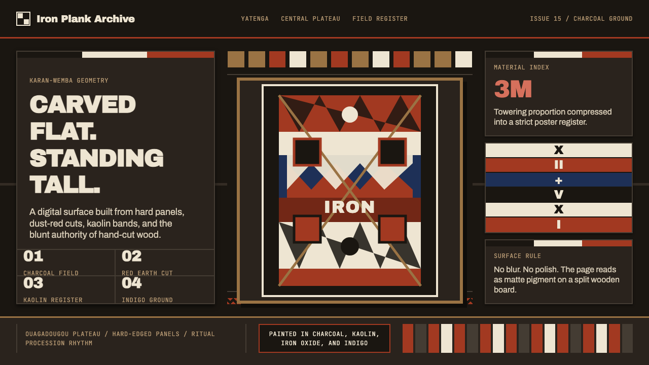 Mossi Burkina Plank MaskCarved, not rendered. Charcoal fields, dust-red cuts, and kaolin bands stack…像雕凿而非渲染:炭黑底、尘红切面与白土色带层叠成板。
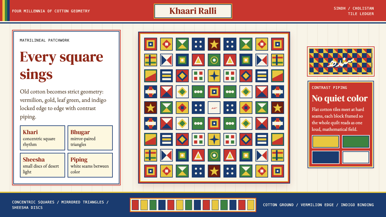 Sindhi Ralli QuiltSings in squares. Vermilion, gold, green, and indigo lock into piped tile rhy…方块在合唱:朱砂、金黄、叶绿与靛蓝,被白色镶边锁成拼布节奏。
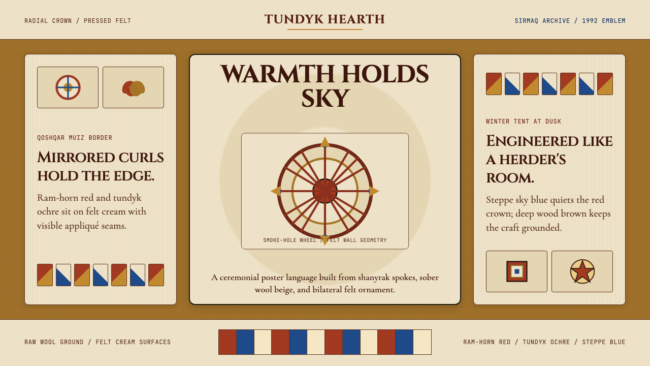 Kazakh Shanyrak Yurt FeltDomestic warmth, engineered. Ram-horn red felt curls around a radial shanyrak…居家暖意如工程般精密。羊角红毡纹环绕沙尼拉克轮。
 Bulgarian Shevitsa Folk EmbroideryVillage-bright code. Deep indigo carries shevitsa red crosses and gold-cord b…村舍般明亮:深靛蓝承托红色太阳十字与金线边框。
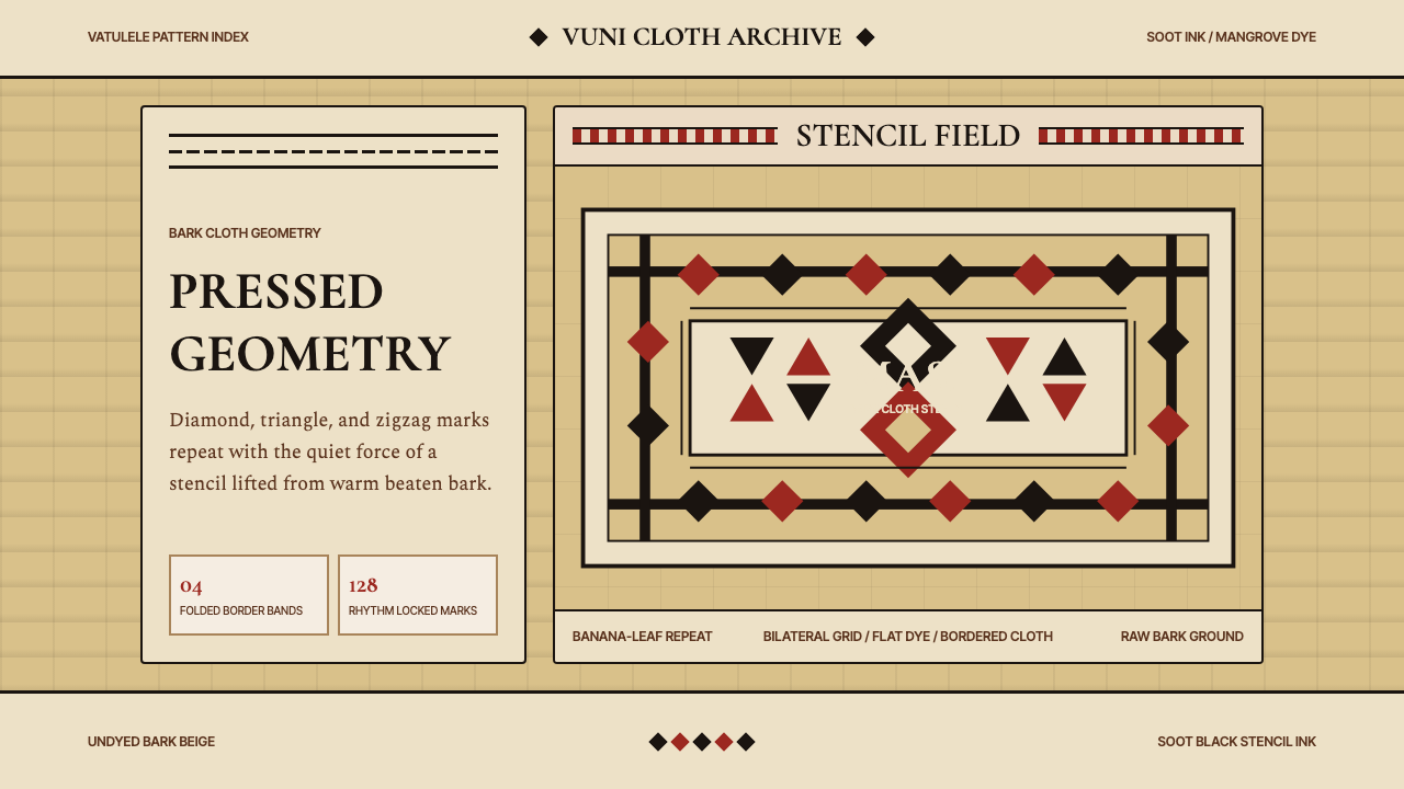 Fijian Masi Tapa StencilGeometry keeps ceremony. Soot-black diamonds repeat on bark beige with rust-r…几何守住仪式感:树皮米黄上,烟黑菱形与锈红边带反复压印。
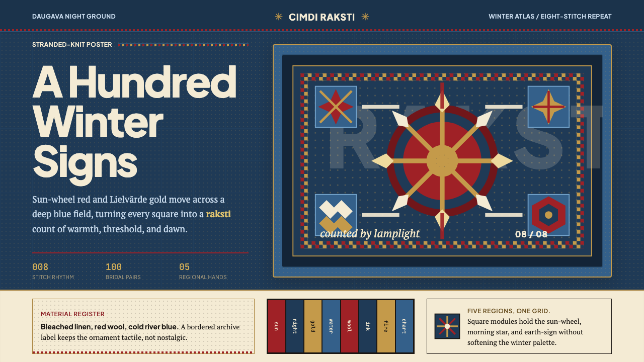 Latvian Knitted MittensWinter craft glows. Sun-wheel red and Lielvarde gold lock into an 8-stitch bl…冬夜手作发光。太阳红与利耶尔瓦尔德金锁进八针蓝格。