What is Mossi Burkina Plank Mask?
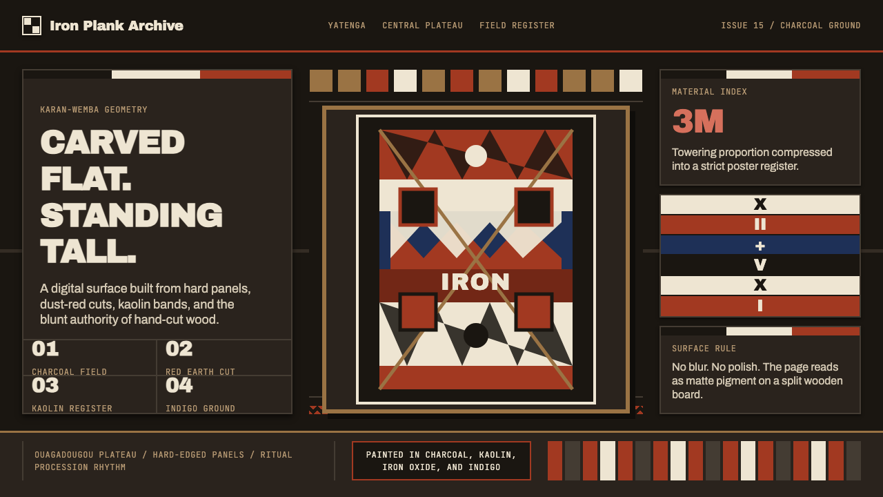
The Mossi plank mask carved by Burkina Faso's iron-age societies channels architectural boldness into a design language that feels hewn from raw material rather than rendered on a screen.
Mossi Burkina Plank Mask in brief
Mossi Burkina Plank Mask is a design system rooted in the karan-wemba — the towering flat-plank ceremonial masks carved by the Mossi people of Burkina Faso's central plateau. These masks stand far taller than a human figure, painted in stark horizontal bands of black, white, and deep earth red that alternate with the mechanical precision of a hand-carved rule. The digital design system channels that visual vocabulary: extreme verticality, unapologetic flatness, and geometric panel logic applied to cards, dividers, and typographic structure.
Where most heritage-derived design systems soften their source into decorative motif, this one preserves the mask's essential character — structural weight without warmth, rhythm without ornament, color without gradation. Every interface element echoes the hand-cut plank: rectangular cards that read as stacked sections of carved wood, zigzag dividers borrowed from the mask's transitional bands, and a palette of charcoal, dust-red, and kaolin white that refuses to be decorative. The result is a brand language that reads as carved rather than rendered, ritual rather than aesthetic.
Visually, the style occupies a category between sacred artifact and architectural drawing. It shares the plank mask's refusal to simulate depth or softness. Nothing fades. Nothing glows. Surfaces are flat, transitions are angular, and emphasis is achieved through scale and tonal contrast rather than shadow or gradient. This makes it one of the few historically grounded design systems that translates directly into digital interfaces without losing its integrity.
Where does Mossi Burkina Plank Mask come from?
The Mossi are the largest ethnic group in Burkina Faso, with a continuous political history stretching back to the 15th-century Mossi kingdoms centered on the Yatenga and Riziam regions of the central plateau. Their society was organized around a highly stratified chieftaincy system under the Mogho Naba — the paramount ruler — whose ritual authority was expressed through elaborate ceremonies, regalia, and masquerade traditions. The plank mask tradition developed within this context as a form of ancestral mediation: the masks were not decorative objects but active ritual participants, worn in dances that connected the living community to the spirits of founders and recent dead.
The karan-wemba — literally the mask that stands upright — is distinctive within the broader West African plank-mask tradition of the Voltaic or Gur language-family cultures. While related forms appear among the Nuna, Bwa, and Winiama peoples of the same region, the Mossi version is characterized by its extreme height, its reliance on three-color geometric banding rather than representational imagery, and its carved facial features that sit at the base of a soaring painted superstructure. The geometric panels — alternating horizontal bars of black, white, and red — are not merely decorative; each color zone carries meaning in the context of Mossi cosmology and ancestral belief, though the specific interpretation varies by clan and occasion.
The art historian Christopher Roy, who conducted extensive fieldwork among the Voltaic mask traditions in the latter decades of the twentieth century, documented the regional and lineage-based variations in plank-mask form with unusual precision. Roy's records reveal that the production of karan-wemba was controlled by specific carving lineages — families whose craft knowledge was transmitted across generations and who occupied a distinct social role within Mossi communities. The masks were not privately owned in the modern sense but belonged to the community and lineage; their creation, upkeep, and use were governed by obligation rather than commerce.
The Sirigu community on the southern edge of the Mossi cultural zone is also noted for its women's tradition of geometric wall painting — using the same black, white, and red palette in angular registers on mud-brick compound walls. Though the mask and wall-painting traditions are functionally distinct, their shared visual grammar reveals a coherent regional aesthetic system in which geometric banding, flat color, and angular rhythm operate as a common visual language across different media and different social contexts. This underlying consistency is what gives the design system derived from it such unusual formal coherence.
What defines the Mossi Burkina Plank Mask look?
Color
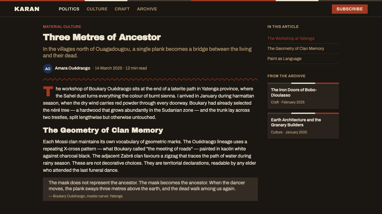
The palette is restricted to three ancestral tones: charcoal black, kaolin white, and dust-red earth — each applied in flat, unmodulated fields with no blending or transition between them. Black dominates as the ground, establishing depth through its sheer absorption. Dust-red operates as the primary cut — a signal color that divides and energizes. Kaolin white provides the structural counterpoint, appearing in bands and angular marks that read almost as light carved into darkness. No secondary hues appear; the palette's power comes from the precision of its limitation.
Geometry
Rectangular forms dominate absolutely, drawn from the plank mask's fundamental shape: tall, narrow, and vertical. Panels stack rather than overlap — each color zone reads as a discrete architectural layer, not as a composition of blended elements. Zigzag transitions between bands echo the carved grooves between mask sections, providing angular rhythm without introducing curvature. The visual system has no circles, no diagonal grids, no organic forms. Every line is either fully vertical or fully horizontal, or cuts at a strict forty-five-degree angle in the zigzag transitions.
Flatness
The mask surface was painted directly onto carved wood with mineral pigments — no layering of transparent washes, no tonal blending, no suggestion of dimensional form through shadow. The digital system inherits this absolute flatness: no gradients, no soft shadows, no glows, no ambient depth effects of any kind. What appears to be a raised panel is simply a color field placed in proximity to a darker field. Depth is achieved entirely through the ordering and scale of flat elements, not through simulation of light.
Verticality
The karan-wemba's defining physical characteristic is its soaring height — a mask might stand two or three times a person's height, with most of that vertical dimension given over to the painted superstructure. This verticality is embedded in the design system's approach to layout and component proportions. Cards are tall rather than wide. Navigation columns are narrow and full-height. Section dividers interrupt horizontally but do not compete with the dominant vertical reading direction. The overall composition asks the eye to travel up rather than across.
Rhythm and Division
The mask achieves its visual power through the strict alternation of its color bands — not through variety, but through repetition with variation. Black is always the ground; red and white alternate as the figures above it. The design system applies the same logic: interfaces are organized as sequences of clearly bounded zones rather than continuous flowing layouts. A pricing table is three vertical planks side by side. A feature section is stacked horizontal bands. The eye learns the rhythm and can predict the next beat — and that predictability is part of the system's authority.
Typography
Type in this system takes its cues from the mask's carved inscriptions and the bold incised lettering of Voltaic craft traditions — blocky, with strong stroke contrast, and set with generous leading that respects the vertical rhythm of the surrounding bands. Headings should be heavy and tall, seated inside the dark ground like text carved into stone rather than printed onto paper. Body text sits inside lighter panels as a deliberate tonal contrast. No decorative ligatures, no calligraphic forms — the letterform should read as incised, not drawn.
Texture Suggestion
Despite the system's commitment to flatness, it carries a strong material suggestion: the visual impression is of carved wood and mineral paint, not of digital pixels. This is achieved not through texture overlays but through the weight and precision of its geometric decisions. A color field that abuts another at a perfectly clean edge reads differently from one that fades or blurs — the clean edge implies a tool cut, a physical boundary. Maintaining the sharpness of every edge and the opacity of every color field is essential to preserving this material quality without introducing actual texture.
Who shaped Mossi Burkina Plank Mask?
The Mogho Naba — literally 'chief of the world' — was the paramount ruler of the Mossi kingdom and the ultimate authority over its ritual life, including the ceremonial traditions in which plank masks played a central role. The Mogho Naba institution, which dates to the founding of the Mossi kingdoms in the 15th century, provided the political framework within which the mask-carving tradition was maintained and transmitted. The masks were not merely artistic objects but instruments of chiefly power, their use governed by protocols that reinforced the social hierarchy the Mogho Naba represented.
An art historian at the University of Iowa, Christopher Roy devoted much of his career to documenting the mask traditions of the Voltaic language-family cultures of Burkina Faso and neighboring countries. His fieldwork in the latter decades of the twentieth century produced detailed photographic and descriptive records of regional and lineage-based variations in plank-mask forms — including the Mossi karan-wemba — that might otherwise have remained inaccessible to comparative study. His publications brought rigorous scholarly attention to a tradition that had received far less international documentation than masks from the coastal West African cultures.
The Sirigu community on the southern edge of Mossi territory is notable for a distinct but related visual tradition: the geometric wall paintings created by women on the exterior walls of family compounds. Using the same restricted palette of black, white, and earth red, and the same angular geometric register, these murals demonstrate that the visual language of the plank mask was not confined to a single medium or a single specialist tradition but was a widely shared aesthetic system. The Sirigu painters — working in a domestic rather than ritual context — show the same formal discipline: flat color, angular transitions, and additive banding logic.
The Voltaic or Gur language family — comprising dozens of ethnic groups across the Sahel and savanna belt from Burkina Faso into northern Ghana, Mali, and Côte d'Ivoire — shares a broader visual tradition of which the Mossi plank mask is one particularly well-documented expression. Related plank-mask forms appear among the Nuna, Bwa, Winiama, and Kurumba peoples. Taken together, this tradition represents one of the most formally coherent indigenous aesthetic systems in West Africa, and its design logic — geometric banding, tricolor palette, flat carving, additive vertical structure — is consistent enough across groups to function as a genuine regional style.
How do you use Mossi Burkina Plank Mask today?
Mossi Burkina Plank Mask is not a style that softens to fit any context — it arrives with strong formal commitments, and applying it correctly means understanding what those commitments are and working with them rather than against them. The system is best suited to products that want to project authority, cultural depth, and a kind of principled severity: independent creative platforms, documentary or archival brands, cultural institutions, and technology products positioning themselves as foundational rather than fashionable.
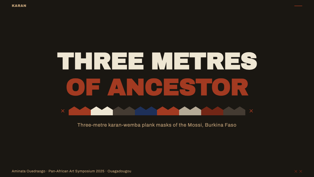
For presentation slides, the style works powerfully on cover pages where impact matters most. A cover built in this system should commit to a near-black ground, with the title text set in a pale tone — kaolin or cool white — as a large, vertically dominant typographic block. A single dust-red horizontal band can divide the title from a subtitle or date. Content slides should be treated as organized bands: body text inhabits a clearly bounded light panel, section headers occupy a darker or red band above. Data slides adopt a diagrammatic posture — bar charts become stacked plank-like rectangles, colored in the three-tone palette, with no rounded corners and no soft data labels. The visual discipline of the mask's panel logic transfers directly to table layouts and comparison charts.
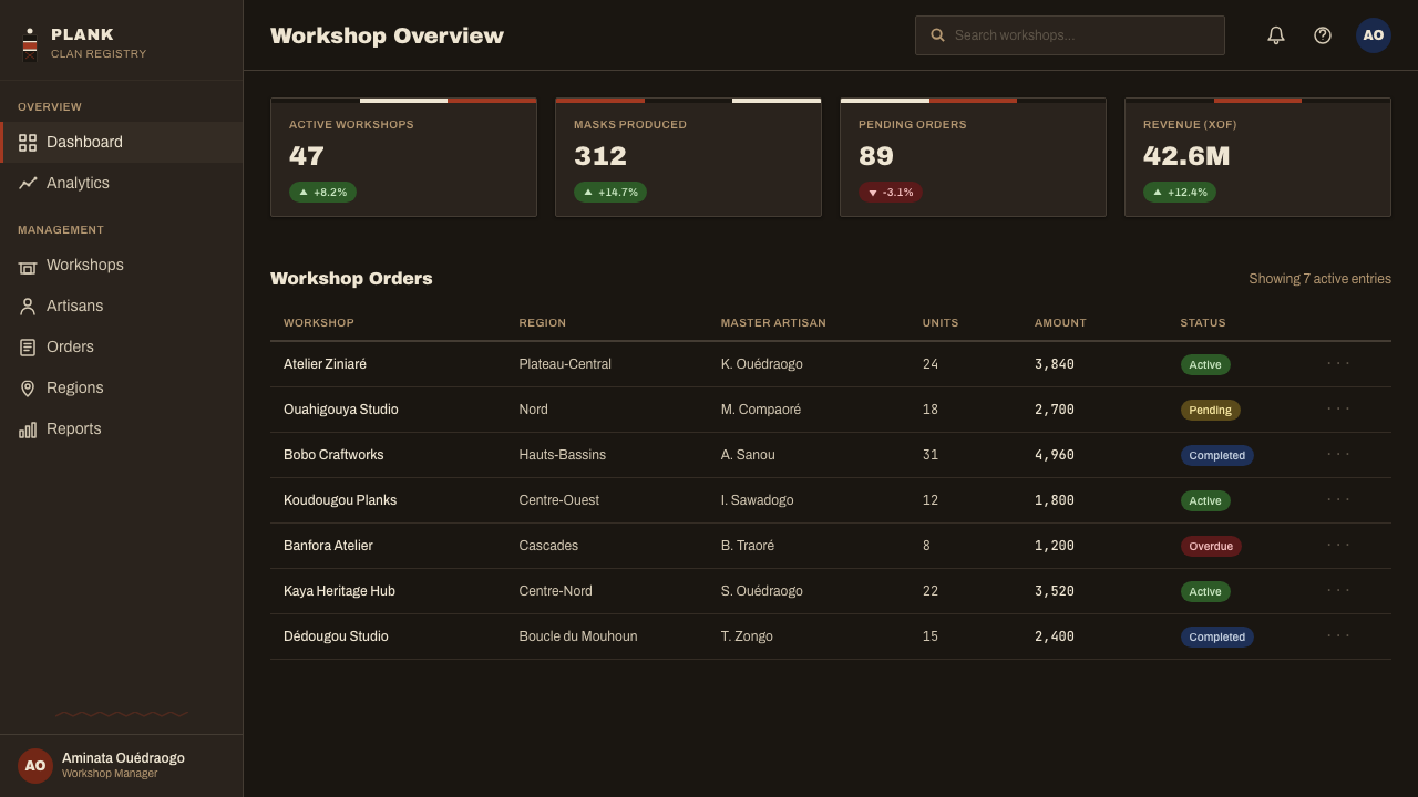
For web interfaces, the style is most effective in dashboards, documentation pages, and pricing tables where scannability and structure are the primary values. The approach requires a strict vertical grid — components are tall and narrow rather than wide and shallow. Navigation should run full-height on one side, visually analogous to a plank stack, with section labels as the only navigational affordance. Pricing tiers can be rendered as three side-by-side vertical panels in charcoal, dust-red, and kaolin, with the recommended tier occupying the red panel. Interactive states — hover, focus, active — should be expressed through a shift in the color band rather than through a soft shadow or glow: a charcoal element becomes red on hover, not lighter or elevated.
For editorial and marketing work, the system's poster-like directness translates well to campaign graphics, social cards, and hero sections with strong visual hierarchy. A hero built in this system uses a full-bleed dark ground with a single large headline in kaolin white, a thin red rule as a horizontal divider, and a secondary line of smaller text in a cooler gray. Photography, if used at all, should be treated as a flat panel — cropped to a rectangle, desaturated or treated in a high-contrast two-tone process, never as a softly lit atmospheric image. The mask tradition had no use for naturalistic imagery, and the design system is most coherent when it honors that refusal.
The most common mistake when applying this style is treating its three-color palette as a license to use all three tones simultaneously at equal weight across an interface. In the mask itself, black is always the dominant ground — it occupies the largest surface area — and red and white appear as figures against that ground, not as competing equals. In digital application, this means charcoal should cover the majority of the surface, with dust-red reserved for a single emphatic band or interactive element per view, and kaolin white used for text and one or two structural lines. A second common error is rounding corners on any element — a subtle radius that would be invisible in other styles immediately destroys the carved-plank logic on which the whole system depends. Every corner in this system is ninety degrees.
Mossi Burkina Plank Mask — FAQ
Is this style appropriate for consumer-facing products, or only for cultural or institutional contexts?
It can work in consumer contexts, but it requires careful calibration. The style's formal severity — its hard edges, dark grounds, and restricted palette — carries an authority that reads well for products positioning themselves as principled, premium, or culturally grounded. It is less well suited to contexts that depend on warmth, approachability, or sensory pleasure: food brands, children's products, wellness applications, and social products where emotional openness is the primary user experience value. The style does not inherently exclude consumers, but it does select for a specific kind of audience — one that reads severity as quality rather than coldness.
How does this style handle light-mode versus dark-mode interfaces?
The style is fundamentally dark-ground: the mask itself is painted on a charcoal base, and inverting to a light ground significantly changes the system's character. A light-mode variant is possible but requires treating kaolin white as the dominant surface, with charcoal elements appearing as bold frames and typographic anchors rather than as the ground itself. Dust-red retains its function as the emphatic cut color in either mode. The deeper formal risk of a full light inversion is that the system can start to read as decorative rather than architectural — the dark ground is what gives it weight. If a light variant is needed, it works better as an accent zone within a primarily dark layout than as the layout's default state.
Can photography or illustration coexist with this style, or does it require pure geometric abstraction?
Photography can coexist with this style, but it must be treated as another flat panel rather than as a window into a scene. The practical approaches: crop photographs to tall rectangles that fit within the vertical plank logic, apply a high-contrast two-tone treatment that maps the image to two of the three palette tones, or silhouette the subject against a solid color field. Softly lit lifestyle photography — the kind that reads as naturalistic and warm — will immediately conflict with the system's material logic and should be avoided. Illustration, similarly, should be geometric and angular rather than organic or flowing. The mask tradition had no representational imagery; imported naturalism will always read as a foreign element.
Is it culturally appropriate to use this style for non-African brands and projects?
The question is real and worth thinking through carefully. The Mossi plank-mask tradition is a living practice — not a historical artifact — and the communities that maintain it have their own perspectives on how their visual culture is used externally. Using the style in a way that acknowledges its origins, avoids misrepresenting its ritual context, and does not reduce it to mere exotic decoration is more defensible than treating it as anonymous visual material. In practice, this means being transparent about the source when the style is named or described, avoiding the use of actual mask imagery in decorative ways, and applying the formal language — the geometry, the palette logic, the flatness — rather than attempting to reproduce sacred objects or ceremonial contexts. The formal system is what transfers; the specific sacred objects do not.
How do you distinguish authentic application of this style from surface-level 'tribal pattern' borrowing?
The difference lies in whether the formal system is understood and applied structurally, or whether visual elements are extracted and used decoratively. Surface-level borrowing typically lifts the zigzag motif or the tricolor palette and applies them as pattern overlays or accent decorations on an otherwise conventional layout — the underlying design logic remains Western and the African source functions as ornamentation. Authentic application means committing to the system's core formal commitments: the dark ground as the dominant surface, the vertical plank proportion as the governing shape, the flat unmodulated color, the absence of softening elements. If the system's underlying logic is not present, the visual elements borrowed from it will read as costume. If the logic is present, the source becomes structure rather than decoration.
Related design styles
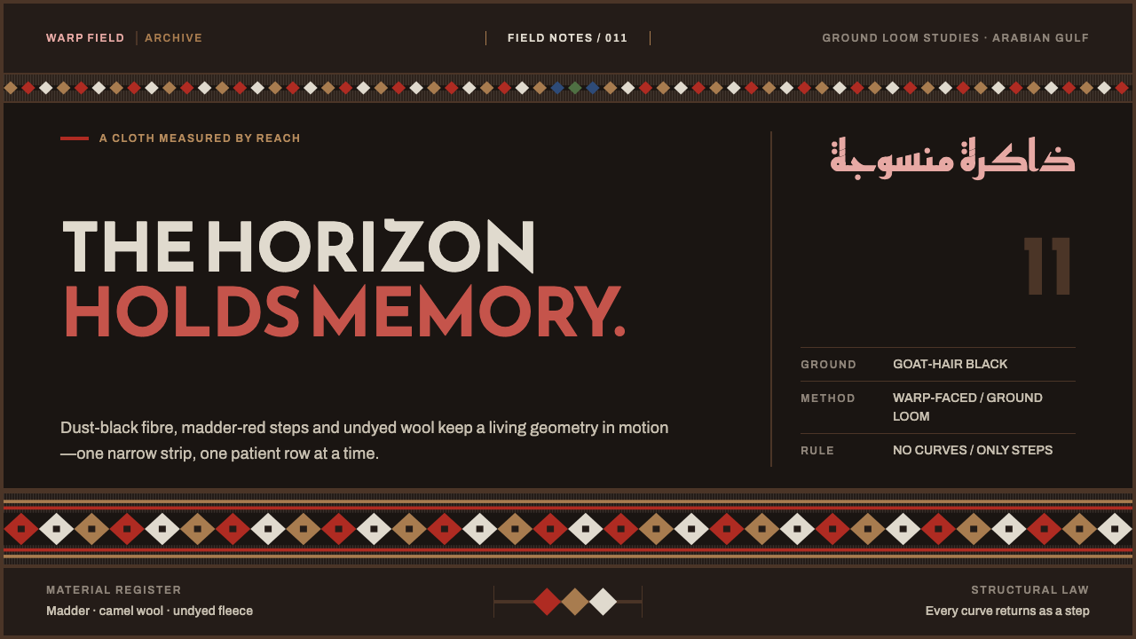 Emirati Sadu WeavingMemory runs in bands. Madder steps cross dusty goat-hair black with no curve…
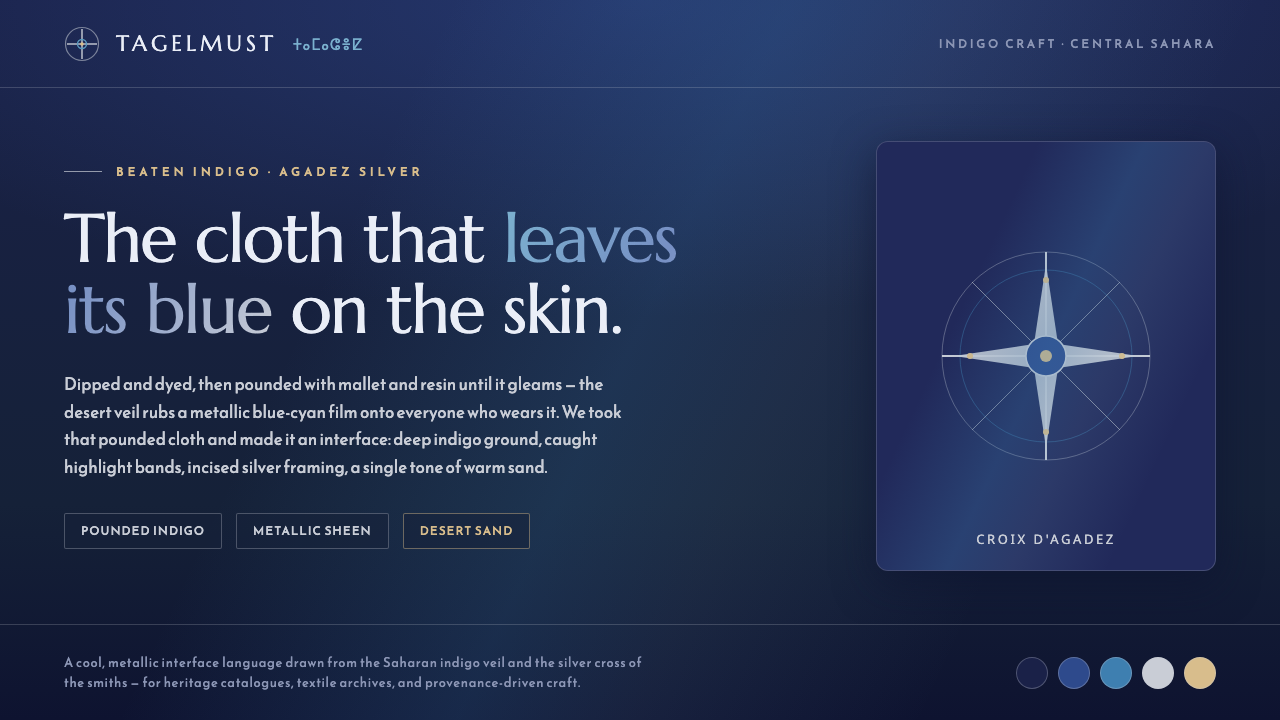 Tuareg Indigo VeilThe cloth that leaves its blue on skin. Pounded-indigo ground, metallic blue-…
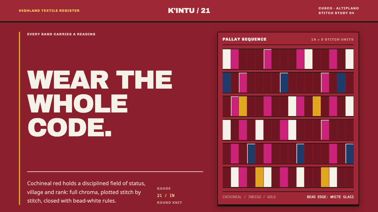 Andean ChulloOrnament carries a code. Cochineal red stacks strict stitch bands with bead-w…
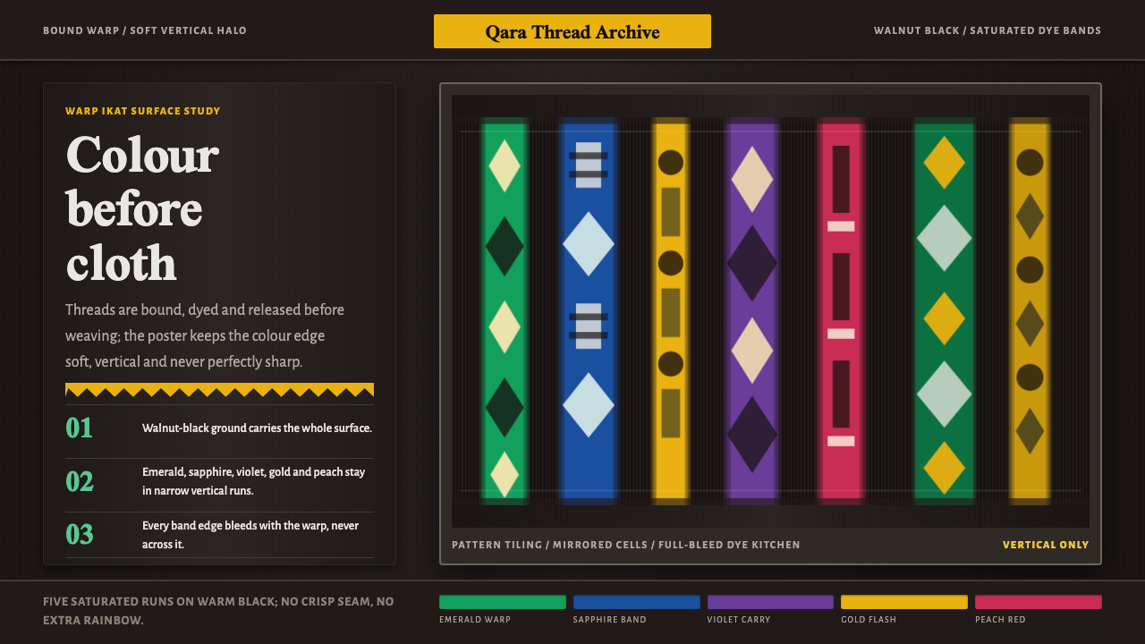 Atlas Silk (Etles)Soft before it is woven. Walnut-black silk holds vertical emerald and gold dy…
 Estonian Kihnu Island SkirtJoy is woven vertical. Madder red ground, Oswald stripes, black and green pin…
 Kyrgyz Shyrdak Felt RugCut felt becomes structure. Vermilion-indigo mirror blocks stitch positive to…