Design style guide设计风格指南
What is Kuwaiti Sadu Bedouin Weave?什么是 Kuwaiti Sadu Bedouin Weave?
Sadu weaving transforms the firelit warmth of a Kuwaiti majlis — deep carnelian bands, cream warp threads, and lamp-warm shadow — into a digital aesthetic that feels hand-crafted rather than screen-born.萨杜织造将科威特待客厅的灯火温暖——深朱砂条带、奶白经线与暖调阴影——转译为一种数字美学,让人感受到的是手工质感,而非屏幕冷光。
Kuwaiti Sadu Bedouin Weave in briefKuwaiti Sadu Bedouin Weave 速览
Kuwaiti Sadu Bedouin Weave is a design system rooted in the warp-faced weaving tradition of the Arabian Peninsula's Bedouin women. For centuries, this textile craft produced the geometric bands that furnished Bedouin tents, draped camel saddlebags, and padded the cushions of the majlis — the communal reception room that sits at the heart of Gulf hospitality culture. The digital translation preserves that sense of a carefully constructed, materially honest surface: every element looks woven rather than rendered.科威特萨杜贝都因织造风格是一套根植于阿拉伯半岛贝都因妇女经面织造传统的设计系统。几个世纪以来,这种纺织工艺产出的几何条带装饰着贝都因帐篷、覆盖骆驼鞍袋,垫入待客厅的坐垫——待客厅是海湾待客文化的核心空间。数字转译保留了那种精心构造、材料诚实的表面感:每个元素看起来都是织就的,而非渲染出来的。
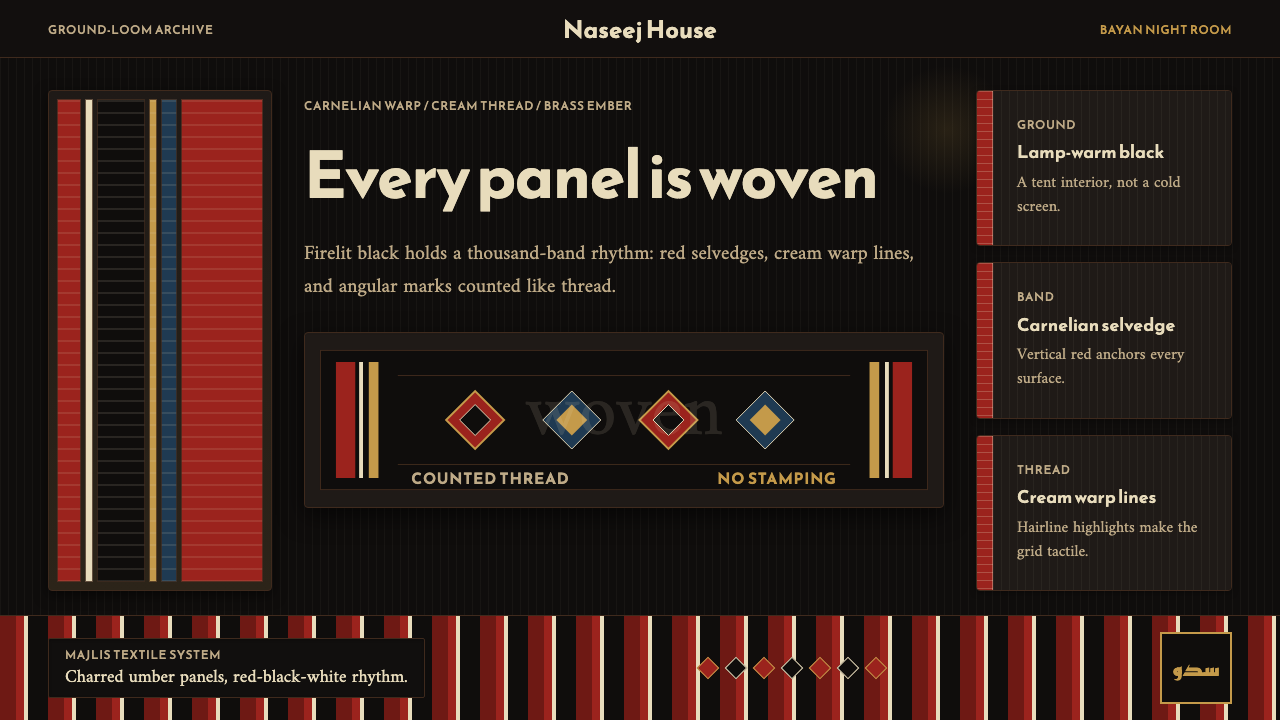
The visual language centers on a lamp-warm black ground — not the cold, flat black of modern dark-mode interfaces, but something closer to the interior of a tent at night, absorbing light rather than reflecting it. Against this ground, vertical carnelian-red bands run like the warp threads of a loom, punctuated by cream highlights that suggest the undyed wool threads that give authentic sadu fabric its structural rhythm. Brass-toned accents appear sparingly, evoking the dallah coffee pots and decorative metalwork that traditionally accompany the majlis setting.这套视觉语言以暖调黑底为核心——不是当代深色模式界面那种冷冽、均质的黑,而是更接近夜幕下的帐篷内室,吸收光线而非反射光线。在这个底面上,竖向的朱砂红条带如同经线般延伸,奶白色高光点缀其间,令人联想到真实萨杜织物中为结构节奏定性的本色羊毛线。黄铜色调的点缀元素克制出现,唤起传统上与待客厅相伴的达拉咖啡壶和装饰金属器。
What makes this aesthetic distinctive among dark-palette design systems is its directional, textile logic. Sadu patterns are not symmetrical in the decorative sense; they are repetitive in the way weaving is repetitive — a rhythm that carries meaning through accumulated unit. Applied to interfaces, this produces layouts where vertical structure dominates, negative space breathes between bands, and no element attempts to simulate the weightless flatness of contemporary minimalism.在众多深色调设计系统中,这套美学的独特之处在于其方向性的、纺织品式的逻辑。萨杜图案不是装饰意义上的对称,而是织造意义上的重复——一种通过累积单元传达意义的节奏。应用于界面时,这产生了以竖向结构为主导、留白在条带之间呼吸、没有任何元素试图模拟当代极简主义无重力平面感的版式。
See the Kuwaiti Sadu Bedouin Weave design system →查看 Kuwaiti Sadu Bedouin Weave 完整设计系统 →
Where does Kuwaiti Sadu Bedouin Weave come from?Kuwaiti Sadu Bedouin Weave 从何而来?
Sadu — the Arabic word for the craft — is a warp-faced flat weaving technique practiced by Bedouin women across the Arabian Peninsula, with Kuwait's tradition among the most thoroughly documented. The craft is pre-Islamic in origin, woven into the practical and social fabric of nomadic life long before the consolidation of Gulf city-states. A woman's proficiency at sadu marked her status within the community; the patterns she knew were familial and tribal inheritances, passed from mother to daughter through demonstration rather than written instruction.萨杜——这门工艺的阿拉伯语名称——是一种经面平织技法,由整个阿拉伯半岛的贝都因妇女传习,其中科威特的传统是有据可查最为详尽的。这门工艺起源于前伊斯兰时期,早在海湾城邦国家形成之前便已织入游牧生活的实践与社会肌理。一位女性的萨杜技艺标志着她在族群中的地位;她所掌握的图案是家族与部落的遗产,由母亲向女儿以示范而非文字的方式传授。
The loom itself is a ground loom — a horizontal frame pegged directly into the desert floor, low enough that the weaver sits cross-legged at its level and builds the textile incrementally, row by row, passing the weft through the raised warp threads by hand. The materials were historically what the desert provided: wool from sheep and goats, natural dyes derived from pomegranate rind (producing ochre and brown tones), indigo (blue), and madder root (the carnelian red that defines the palette). The weaving was not decorative in the European sense of embellishing an already-functional object; the sadu bands were structural — the carpet was the tent floor, the woven panel was the camel bag, the textile was the furniture.织机本身是一种地织机——一个水平框架直接钉入沙漠地面,低矮得让织造者盘腿坐在与之同高的地面,逐行、逐渐地构建织物,用手将纬线穿过撑起的经线。历史上的材料来自沙漠所能提供的一切:来自绵羊和山羊的羊毛、从石榴皮(产生赭色与棕色调)、靛蓝(蓝色)和茜草根(那定义这套色板的朱砂红)中提取的天然染料。这种织造不是欧洲意义上对已有功能物品的装饰;萨杜条带本身就是结构——毯子就是帐篷的地面,织造的面板就是骆驼袋,纺织品就是家具。
The twentieth century brought urbanization, oil wealth, and a rapid decline in active practice. By the 1970s, the craft was largely confined to older generations, with younger Kuwaiti women moving toward modern urban life. In 1979, Sheikha Altaf Salem Al-Ali Al-Sabah — a member of Kuwait's ruling family with a deep personal commitment to cultural preservation — founded the Al Sadu Society in Kuwait City. The Society established weaving workshops, collected historical samples, trained new practitioners, and began the documentation work that would eventually support an application to UNESCO.二十世纪带来了城镇化、石油财富,以及这门技艺的迅速衰落。到1970年代,这门工艺基本局限于老一代人,年轻的科威特女性逐渐融入现代都市生活。1979年,对文化保护有着深厚个人承诺的科威特王室成员谢赫·阿尔塔芙·塞勒姆·阿尔-阿里·阿尔-萨巴赫在科威特城创办了萨杜协会。协会建立了织造工坊,收集历史样品,培训新一代从业者,并开始了最终支持申报联合国教科文组织的文献整理工作。
That effort succeeded in 2020, when UNESCO inscribed traditional sadu weaving on its Representative List of the Intangible Cultural Heritage of Humanity, a designation shared jointly by Kuwait and Saudi Arabia. The inscription acknowledged not just the craft itself but the knowledge system surrounding it: the oral transmission of pattern names and meanings, the social context of communal weaving, and the ecological knowledge embedded in understanding which plants yield which dyes in which seasons. Practitioners including Hessah Al Suwaidan and researchers including Keireen Brown have contributed significantly to the documentation of the Gulf's sadu vocabulary, ensuring that the symbolic grammar of the geometric patterns — the diamond forms, the zigzag registers, the stepped triangles — can be read by future practitioners and designers alike.这一努力于2020年取得成果,联合国教科文组织将传统萨杜织造列入人类非物质文化遗产代表作名录,这一称号由科威特和沙特阿拉伯共同持有。这一认定不仅承认了织造技艺本身,也承认了围绕它的知识体系:图案名称与含义的口头传承、共同织造的社会情境,以及理解哪些植物在哪个季节产出哪种染料所蕴含的生态知识。包括赫萨·阿尔-苏瓦丹在内的从业者和包括基林·布朗在内的研究者为记录海湾萨杜词汇做出了重要贡献,确保这些几何图案的象征语法——菱形、锯齿纹、阶梯三角形——能够被未来的从业者和设计师解读。
What defines the Kuwaiti Sadu Bedouin Weave look?Kuwaiti Sadu Bedouin Weave 的视觉特征是什么?
Ground and Warmth底色与温度
The foundation is a deep, lamp-warm black — not the neutral, recessive darkness of a modern dark mode, but something with the absorbed quality of a tent interior lit by oil lamps. This warmth is achieved through the balance of surrounding elements: the carnelian reds and brass golds push the black toward amber rather than toward blue. The overall effect is a surface that feels sheltering rather than void.底色是深沉的、灯火暖调的黑——不是现代深色模式那种中性、退缩的黑暗,而是带有油灯照耀的帐篷内室那种吸光质感。这种温度感通过周围元素的平衡实现:朱砂红与黄铜金将黑色推向琥珀,而非蓝调。整体效果是一个令人感到遮蔽而非空洞的表面。
Vertical Band Structure竖向条带结构
Sadu patterns are organized along the vertical axis — the direction of the warp threads on the loom. In digital applications, this translates to a strong columnar rhythm: content is organized in vertical bands rather than horizontal rows, with the separations between bands carrying the visual weight of the textile's color-block transitions. This is fundamentally different from grid systems derived from the European typographic tradition, which reads left-to-right and horizontally.萨杜图案沿竖向轴线组织——这是织机上经线的方向。在数字应用中,这转化为强烈的列状节奏:内容以竖向条带组织,而非横向行列,条带之间的间隔承载着织物色块过渡的视觉重量。这与源自欧洲字体排印传统的网格系统有着根本性的不同,后者遵循从左到右、水平展开的阅读逻辑。
Carnelian and Cream朱砂与奶白
The palette is built around the contrast between deep red — the carnelian that natural madder root produces — and undyed cream or ivory. These two colors do most of the visual work. Cream appears as both the warp-thread highlights within red bands and as the ground of text-heavy panels, giving light content areas the quality of undyed natural wool against the darker woven field. Neither color approaches pure white or pure red; both carry the slight warmth of natural materials.色板围绕深红——天然茜草根产出的朱砂色——与本色奶白或象牙色之间的对比构建。这两种颜色承担了大部分视觉工作。奶白色既出现在红色条带内作为经线高光,也出现在以文字为主的面板底色上,赋予浅色内容区域以深色织造底面衬托下的本色天然羊毛质感。这两种颜色都不接近纯白或纯红;两者都带有天然材料的微妙暖意。
Geometric Motif Vocabulary几何母题词汇
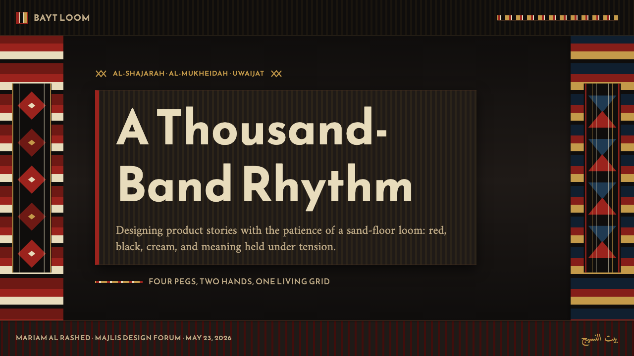
Authentic sadu patterns are built from a small vocabulary of geometric units — diamond forms, stepped triangles, zigzag registers, hourglass shapes — repeated and mirrored to fill the band width. Each unit has a name in Arabic and typically a meaning connected to the natural world or to tribal identity. Applied to digital design, these motifs appear as micro-patterns, dividers, or decorative borders, always used with structural intent rather than as surface decoration for its own sake.真实的萨杜图案由一套小型几何单元词汇构建——菱形、阶梯三角形、锯齿纹寄存器、沙漏形——通过重复与镜像填满条带宽度。每个单元在阿拉伯语中都有名称,通常与自然世界或部落身份相关联。应用于数字设计时,这些母题作为微图案、分隔线或装饰边框出现,始终以结构性意图使用,而非纯粹为表面装饰。
Brass Accent Restraint黄铜点缀的克制
The third accent color — a warm brass or burnished gold tone — appears far more sparingly than the carnelian and cream. It echoes the metalwork of the Gulf craft tradition: the dallah coffee pot, decorative clasps on camel bags, the inlaid details of antique chests. In interfaces, brass is reserved for the single most important interactive element on a surface — the primary call to action, a selected state, an achievement marker — used once per compositional unit so that its warmth reads as special rather than as ambient.第三种点缀色——温暖的黄铜或磨光金色调——出现的频率远低于朱砂与奶白。它呼应海湾工艺传统的金属器物:达拉咖啡壶、骆驼袋上的装饰扣环、古董箱柜的镶嵌细节。在界面中,黄铜保留给一个版面上最重要的单一交互元素——主要行动号召、选中状态、成就标记——每个构图单元内只出现一次,使其温度感读作特殊而非环境色。
Texture Without Noise无噪质感
The woven quality of the aesthetic is communicated through structure rather than through applied texture overlays. There are no photographic grain filters or canvas textures; instead, the interlocking of geometric bands and highlight threads creates a visual rhythm that the eye reads as textile. This is an important discipline: the temptation to add noise or grain to suggest materiality usually produces a muddy result, whereas allowing the band structure itself to carry the textile reference keeps the interface readable at all scales.这套美学的织造质感通过结构而非叠加纹理来传达。没有摄影颗粒滤镜或画布纹理;几何条带与高光线的交织创造出一种视觉节奏,眼睛将其解读为纺织品。这是一个重要的自律:添加噪点或颗粒以暗示材质感的冲动通常会产生混浊的结果,而让条带结构本身承载纺织品参照,则保持界面在任何尺度下都清晰可读。
Directional Light and Shadow方向性光影
Shadow in this system is directional and warm rather than ambient and diffuse — recalling the angled light of an oil lamp throwing shadows across a woven surface. Elevation is communicated through warm-tinted shadows that lean toward amber rather than toward gray-blue, and through subtle overlapping of the vertical band layers. The effect is depth that reads as physical layering — one textile panel resting on another — rather than depth that reads as digital drop-shadow.这套系统中的阴影是方向性的、温暖的,而非弥散的环境阴影——令人联想到油灯斜光投射在织造表面的影子。高度通过偏向琥珀而非蓝灰的暖调阴影,以及竖向条带层次的微妙叠压来传达。效果是读作物理层叠的深度——一块织物面板叠于另一块之上——而非读作数字投影的深度。
See the Kuwaiti Sadu Bedouin Weave design system →查看 Kuwaiti Sadu Bedouin Weave 完整设计系统 →
Who shaped Kuwaiti Sadu Bedouin Weave?谁塑造了 Kuwaiti Sadu Bedouin Weave?
A member of Kuwait's ruling Al-Sabah family, Sheikha Altaf founded the Al Sadu Society in 1979 at a moment when the craft was at genuine risk of disappearing within a single generation. Her intervention transformed what had been a private domestic practice into a publicly documented, institutionally supported tradition. Under her direction, the Society established weaving workshops that functioned as both production centers and living archives, collecting historical samples and creating structured pathways for younger Kuwaiti women to learn the craft. The foundation she built made possible both the UNESCO inscription and the contemporary design revival.作为科威特统治家族阿尔-萨巴赫的成员,谢赫·阿尔塔芙于1979年创办了萨杜协会,彼时这门工艺正面临在一代人之内消失的真实风险。她的介入将一种原本属于私人家庭的实践转变为一种有公开文献记录、有机构支持的传统。在她的主持下,协会建立的织造工坊既是生产中心,也是活态档案库,收集历史样品,为年轻的科威特女性学习这门工艺创造了有结构的路径。她奠定的基础使联合国教科文组织的认定和当代设计复兴都成为可能。
Among the most active contemporary practitioners and educators in the Kuwaiti sadu revival, Hessah Al Suwaidan has worked to bring the craft's symbolic vocabulary to wider audiences, including younger Kuwaiti designers seeking to reconnect with Gulf visual heritage. Her practice bridges the historical craft — in which pattern knowledge was oral and embodied — and contemporary documentation, contributing to the systematic recording of motif names, meanings, and regional variations that allows the sadu vocabulary to survive in an age when the oral transmission chains have weakened.赫萨·阿尔-苏瓦丹是科威特萨杜复兴运动中最活跃的当代从业者与教育者之一,致力于将这门工艺的象征词汇推广给更广泛的受众,包括寻求与海湾视觉遗产重新连结的年轻科威特设计师。她的实践架起了历史工艺——其图案知识是口传与身体化的——与当代文献记录之间的桥梁,为母题名称、含义与地区变体的系统性记录做出贡献,使萨杜词汇在口头传承链已经弱化的时代得以延续。
A researcher whose fieldwork and publications have contributed significantly to the English-language documentation of sadu weaving across the Gulf. Brown's work addresses not only the technical aspects of the weaving — structure, dye sources, loom types — but the social and cultural contexts in which the craft was embedded: the role of weaving in marking the seasons of nomadic movement, the way pattern choice communicated tribal affiliation to other travelers across the desert, and the gendered nature of textile knowledge as a form of women's intellectual heritage. Her research provides the scholarly foundation for contemporary designers who want to engage the tradition authentically.基林·布朗是一位研究者,其田野调查与出版物为海湾地区萨杜织造的英文记录做出了重要贡献。布朗的工作不仅涉及织造的技术层面——结构、染料来源、织机类型——也涉及这门工艺所嵌入的社会与文化情境:织造在标记游牧迁徙季节中的角色,图案选择如何向沙漠中其他旅人传达部落归属,以及纺织知识作为女性知识遗产的性别属性。她的研究为希望以真诚态度介入这一传统的当代设计师提供了学术基础。
Founded in Kuwait City in 1979, the Al Sadu Society functions as the institutional center of gravity for Kuwait's sadu preservation effort. Beyond running weaving workshops and maintaining a collection of historical textiles, the Society has been the primary force behind advocacy efforts at both the national and international level, culminating in the 2020 UNESCO inscription. The Society also bridges craft and contemporary design: its exhibitions and publications have introduced sadu's geometric vocabulary to graphic designers, architects, and product designers working across the Gulf region, making it the key institutional node in the transmission from historical practice to contemporary visual culture.萨杜协会于1979年在科威特城创办,是科威特萨杜保护工作的机构重心。协会除运营织造工坊、维护历史纺织品收藏外,还是在国家和国际层面推动倡导工作的主要力量,最终促成了2020年联合国教科文组织的认定。协会还架起了工艺与当代设计之间的桥梁:其展览与出版物将萨杜几何词汇引介给在海湾地区工作的平面设计师、建筑师和产品设计师,使其成为历史实践向当代视觉文化传递过程中的关键机构节点。
How do you use Kuwaiti Sadu Bedouin Weave today?今天怎么用 Kuwaiti Sadu Bedouin Weave?
The Kuwaiti Sadu Bedouin Weave aesthetic is well-suited to digital contexts that benefit from warmth, material depth, and cultural distinctiveness — but it requires the same discipline as any historically grounded style: the principles behind the palette and structure matter more than the surface details. Applying it correctly means understanding that the vertical band logic is the organizing spine of every layout, not a decorative frame applied over a conventional grid.科威特萨杜贝都因织造美学非常适合那些能够从温暖感、材料深度和文化独特性中受益的数字场景——但它与任何有历史根基的风格一样,需要同等的自律:色板与结构背后的原则比表面细节更重要。正确应用意味着理解竖向条带逻辑是每个版式的组织脊梁,而非叠加在传统网格上的装饰框架。
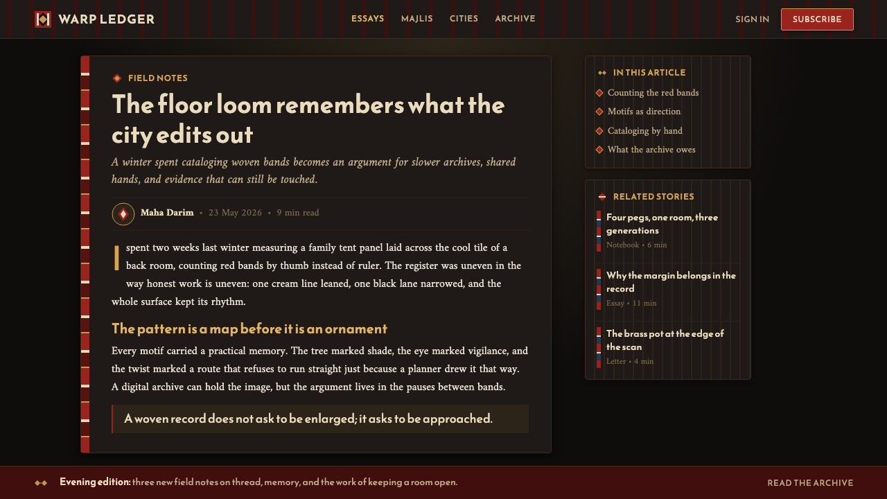
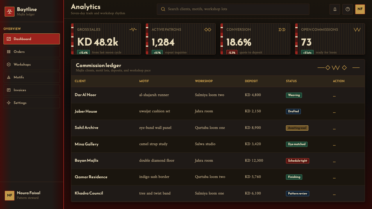
For presentation slides, the style works powerfully on cover pages where the dark ground and vertical carnelian bands create an immediate sense of atmosphere and cultural weight. A cover layout benefits from treating the slide as a woven panel: the title sits within or beside a dominant red vertical band, cream text against the dark field, with a single brass-toned accent marking the most important word or phrase. Content slides should maintain the band logic as subtle column divisions rather than visible lines — the whitespace between content groups echoes the cream warp thread between colored bands. Data slides take on the quality of a geometric register: charts rendered in the core palette where the carnelian serves as the primary data color and cream as the secondary, against the dark ground.对于演示文稿,这种风格在封面页上效果强烈,深色底面与竖向朱砂条带立即营造出氛围感与文化分量。封面版式适合将幻灯片当作一块织造面板处理:标题位于主导红色竖带之内或旁侧,奶白文字映衬深色底面,单一黄铜色调点缀标记最重要的词或短语。内容页应将条带逻辑保持为微妙的列分隔,而非可见线条——内容组之间的留白呼应彩色条带之间的奶白经线。数据页呈现几何纹寄存器的质感:图表以核心色板呈现,朱砂为主要数据色,奶白为次要色,映衬深色底面。
For web interfaces, the style is particularly effective on landing pages, product showcase pages, and cultural institution sites where heritage and craftsmanship are central values. The approach: treat the page as a series of vertical panels rather than horizontal sections, use the warm dark ground as the default background rather than as an accent, and reserve cream and white for dense text content areas where legibility demands a lighter field. Dashboard or tool interfaces can borrow the band structure for sidebar and panel organization, creating navigation areas with the visual rhythm of a woven textile without requiring the full dark palette.对于网页界面,这种风格在落地页、产品展示页,以及遗产与工艺感是核心价值的文化机构网站上尤为有效。方法是:将页面当作一系列竖向面板而非横向分区处理,以暖调深色底面作为默认背景而非点缀,将奶白与白色保留给密集文字内容区域——那里的可读性要求更亮的底面。仪表板或工具界面可以借用条带结构来组织侧边栏与面板,形成具有织造织物视觉节奏的导航区域,而不必要求完整的深色调色板。
For editorial and marketing work, the style supports rich, atmospheric storytelling. An editorial layout using this aesthetic treats the dark ground as the primary surface — body text in cream on dark, pull quotes or headlines in carnelian, brass used once per spread for the most emphatic element. Marketing pages work well with the style's inherent sense of craftsmanship and quality: the visual language signals depth and intentionality in a way that generic minimalism does not, making it appropriate for luxury goods, cultural programming, travel destinations in the Gulf region, and brands that want to signal connection to a specific heritage.对于编辑与营销内容,这种风格支持丰富的、具有氛围感的叙事。使用这套美学的编辑版式将深色底面作为主要表面——正文奶白色映衬暗底,引语或标题用朱砂色,黄铜色每个跨页只用一次标记最强调的元素。营销页面与这种风格固有的工艺感和品质感配合良好:这套视觉语言以一种通用极简主义做不到的方式传递深度与用心,适合奢侈品、文化活动、海湾地区旅游目的地,以及希望传达与特定遗产相连接的品牌。
A common mistake when applying this style is treating the dark ground as interchangeable with conventional dark mode. The distinction matters: conventional dark mode is about reducing eye strain and conserving battery, and its blacks are neutral or cool. Sadu-derived dark grounds should carry warmth — they should feel closer to firelight than to a switched-off screen. Similarly, over-using the carnelian red by applying it to every interactive element dissolves the tension between ground and band that makes the system work. The red earns its visual power by appearing within a defined structural role; spread everywhere, it becomes noise.应用这种风格时最常见的错误,是将深色底面与传统深色模式混为一谈。这一区别至关重要:传统深色模式旨在减少眼睛疲劳和节省电量,其黑色是中性或偏冷的。萨杜衍生的深色底面应当携带温度——它应当更接近火光,而非关闭的屏幕。同样,将朱砂红过度使用于每个交互元素,会消解底色与条带之间让这套系统得以运作的张力。红色的视觉力量来自于在特定结构角色内出现;铺满各处,它就变成了噪声。
See the Kuwaiti Sadu Bedouin Weave design system →查看 Kuwaiti Sadu Bedouin Weave 完整设计系统 →
Kuwaiti Sadu Bedouin Weave — FAQKuwaiti Sadu Bedouin Weave · 常见问题
Is this style only appropriate for brands or products with a connection to the Gulf region?这种风格只适合与海湾地区有联系的品牌或产品吗?
Not necessarily, but cultural grounding matters. The sadu aesthetic carries specific historical and cultural meaning, and using it well means engaging that meaning rather than simply extracting the palette and pattern. Brands or projects with genuine connections to Gulf culture, Islamic art traditions, or artisanal craft heritage are natural fits. Beyond that, the style works for any context where warmth, depth, and a sense of handcraft are valued — hospitality, luxury goods, cultural programming, design studios. What it does not suit is contexts where the visual language would appear arbitrary or appropriative without a meaningful cultural or thematic connection.不一定,但文化根基至关重要。萨杜美学承载着特定的历史与文化含义,良好地运用它意味着介入这种含义,而非简单地提取色板与图案。与海湾文化、伊斯兰艺术传统或手工艺遗产有真实联系的品牌或项目是天然契合的选择。在此之外,这种风格适合任何温暖感、深度感和手工感被重视的场景——待客业、奢侈品、文化项目、设计工作室。它不适合的,是在没有有意义的文化或主题联系的情况下,视觉语言看起来武断或不恰当挪用的场景。
How do you maintain legibility on such a dark ground?在如此深的底色上如何保持可读性?
Legibility on a warm dark ground depends on two things: sufficient luminance contrast and the right text weight. Cream or near-white text on the deep ground provides strong contrast — more than is typically needed for body text. The risk runs in the other direction: using medium-weight type at small sizes against the dark field can feel comfortable at first but fatigues readers quickly, while very light weights disappear. The optimal approach is to use moderately heavy weights for body text and reserve thinner weights for supplementary or decorative text where extended reading is not expected. For data visualization, labels placed directly on the dark ground should be cream or the lightest available tone; labels placed within a carnelian band should shift to a tone that maintains contrast against the band rather than the ground.深色暖调底面上的可读性取决于两件事:足够的亮度对比和合适的字重。奶白色或近白色文字映衬深色底面提供了强烈的对比——通常超过正文所需。风险来自另一个方向:小字号中等字重的文字在深色底面上初看舒适,但很快会让读者疲劳;而极细字重则会消失不见。最佳做法是为正文使用适中偏重的字重,将较细字重保留给不期望长时间阅读的补充性或装饰性文字。对于数据可视化,直接放置在深色底面上的标签应使用奶白或最亮的可用色调;放置在朱砂条带内的标签应转换为能够与条带而非底面保持对比的色调。
Can the sadu band structure work in a horizontal orientation?萨杜条带结构能以横向方向使用吗?
Technically yes, but it works against the logic of the tradition. Actual sadu patterns are warp-faced — the structural threads run vertically on the loom, and the geometric bands follow that axis. Rotating the system to horizontal bands produces something that superficially resembles sadu coloring but loses the vertical rhythm that gives the aesthetic its distinctive quality. Horizontal band applications tend to read more as generic stripe patterns than as textile-derived design. A considered exception: using a narrow horizontal band as a section divider or header element — analogous to the way a single decorative register might mark the edge of a woven panel — is appropriate when the overall layout maintains its vertical structure.技术上可以,但这与传统的逻辑相悖。真实的萨杜图案是经面的——结构性线程在织机上纵向延伸,几何条带沿这一轴线分布。将系统旋转为横向条带,产生出表面上类似萨杜配色但失去竖向节奏的东西,而正是这种竖向节奏赋予了这套美学其独特品质。横向条带的应用往往读作通用条纹图案,而非源自纺织品的设计。一个有道理的例外:将窄横向条带用作段落分隔线或页眉元素——类比于单条装饰性纹寄存器可能标记织造面板边缘的方式——在整体版式保持竖向结构时是恰当的。
How does this style differ from other Middle Eastern or Islamic design aesthetics?这种风格与其他中东或伊斯兰设计美学有何不同?
The sadu aesthetic is often confused with broader Islamic geometric design traditions — the arabesque, the intricate tilework of Moroccan zellige or Persian faience, the calligraphic traditions of Ottoman manuscript decoration. These share a common cultural geography but are distinct systems. Islamic geometric ornament is typically radially symmetrical, infinitely repeating in all directions, and applied as surface decoration over an architectural or object ground. Sadu is linearly repetitive, axis-specific (always following the warp direction), woven into rather than applied onto the surface, and derives from a nomadic rather than courtly tradition. The palette is also distinctive: where classical Islamic decoration often features the deep blues, turquoises, and greens of glazed ceramic and glass, sadu's palette comes from natural dyes on wool — warmer, earthier, and more muted.萨杜美学常与更广泛的伊斯兰几何设计传统相混淆——阿拉伯式花纹、摩洛哥zellige或波斯釉陶的繁复瓷砖工艺、奥斯曼手稿装饰的书法传统。这些共享同一文化地理,但各自是独立的系统。伊斯兰几何装饰通常是径向对称的、在所有方向上无限重复的,作为表面装饰叠加于建筑或器物底面之上。萨杜是线性重复的、轴线特定的(始终沿经线方向),织入表面而非叠加于上,并源自游牧而非宫廷传统。色板也是独特的:古典伊斯兰装饰常以釉陶与玻璃的深蓝、青绿和绿色为特征,萨杜的色板来自羊毛上的天然染料——更温暖、更质朴、更柔和。
What is the appropriate level of literal pattern use — does applying this style mean using actual sadu motifs?字面图案的使用程度应当如何把握——应用这种风格是否意味着使用真实的萨杜母题?
This is the most important judgment call when applying historically grounded design systems. The strongest applications of this aesthetic draw on the structural logic — the vertical band organization, the palette, the textile rhythm — rather than directly reproducing specific named motifs. Direct reproduction of specific tribal patterns raises both aesthetic and ethical questions: aesthetically, pasted motifs often look incongruous in digital interfaces; ethically, specific patterns carry meanings and ownership claims within the communities that developed them. Abstracted geometric forms derived from the sadu vocabulary — stepped shapes, diamond rhythms, zigzag registers — are more appropriate for digital application, and should be used with awareness of their origin rather than as generic decoration.这是应用有历史根基的设计系统时最重要的判断。这套美学最有力的应用,是借鉴其结构逻辑——竖向条带组织、色板、织物节奏——而非直接复制特定的具名母题。直接复制特定部落图案引发了美学与伦理两方面的问题:美学上,粘贴的母题在数字界面中常显突兀;伦理上,特定图案在发展它们的社群中承载着含义与所有权主张。从萨杜词汇中衍生的抽象几何形态——阶梯形、菱形节奏、锯齿纹寄存器——更适合数字应用,应当带着对其来源的认知使用,而非作为通用装饰。
Related design styles相关设计风格
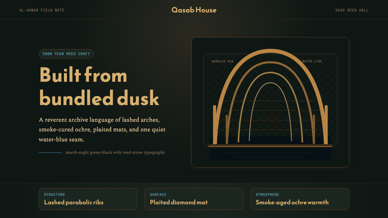 Iraqi Marsh Arab Mudhif ReedReverent reed darkness. Kufi arches, ochre lattice, and one water-blue line h…庄重的芦苇夜色。库菲拱线、赭黄格纹与一笔水蓝托住黄昏。
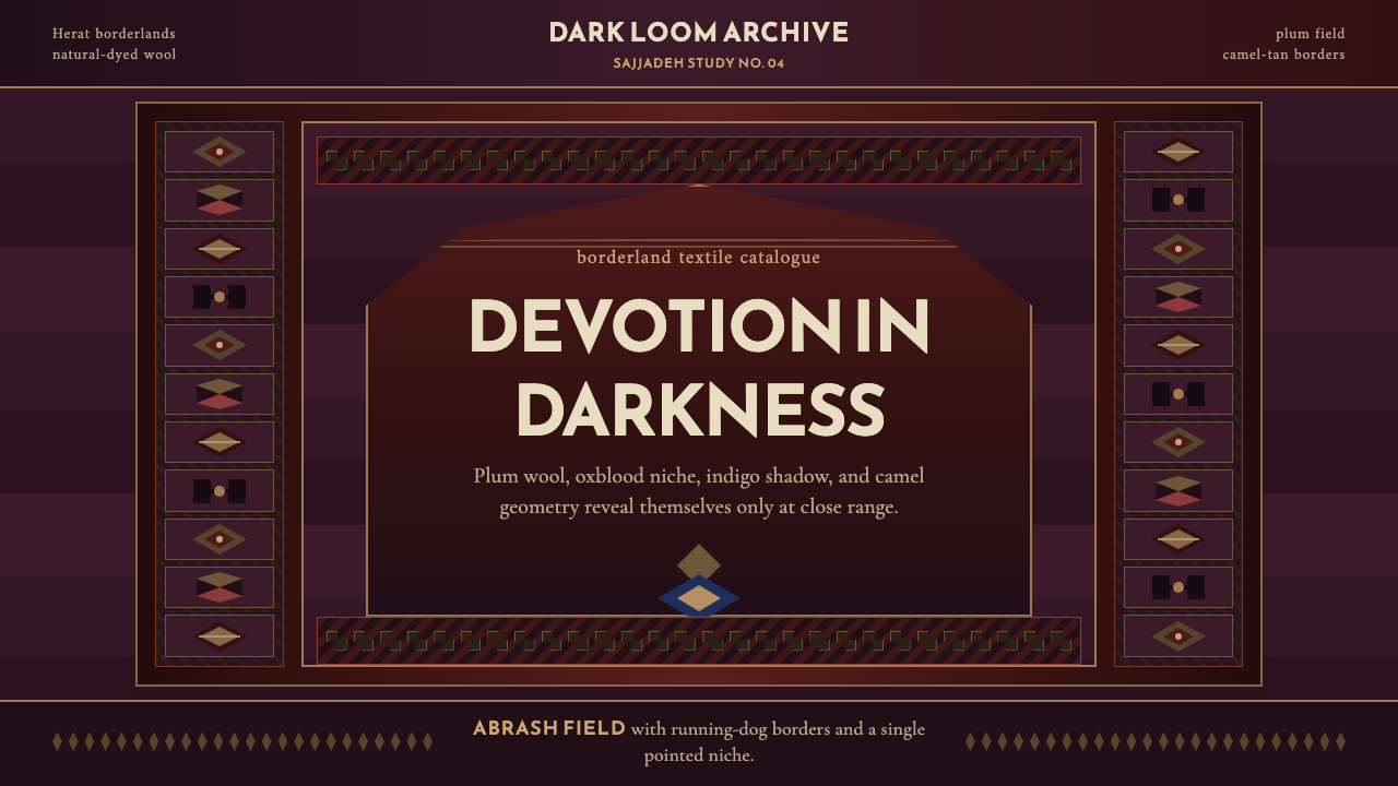 Afghan Baluchi Prayer RugDevotional darkness glows. Plum field, oxblood mihrab, and camel borders surf…虔敬暗色会发光:梅紫毯面、牛血红壁龛与骆驼棕边饰缓缓显影。
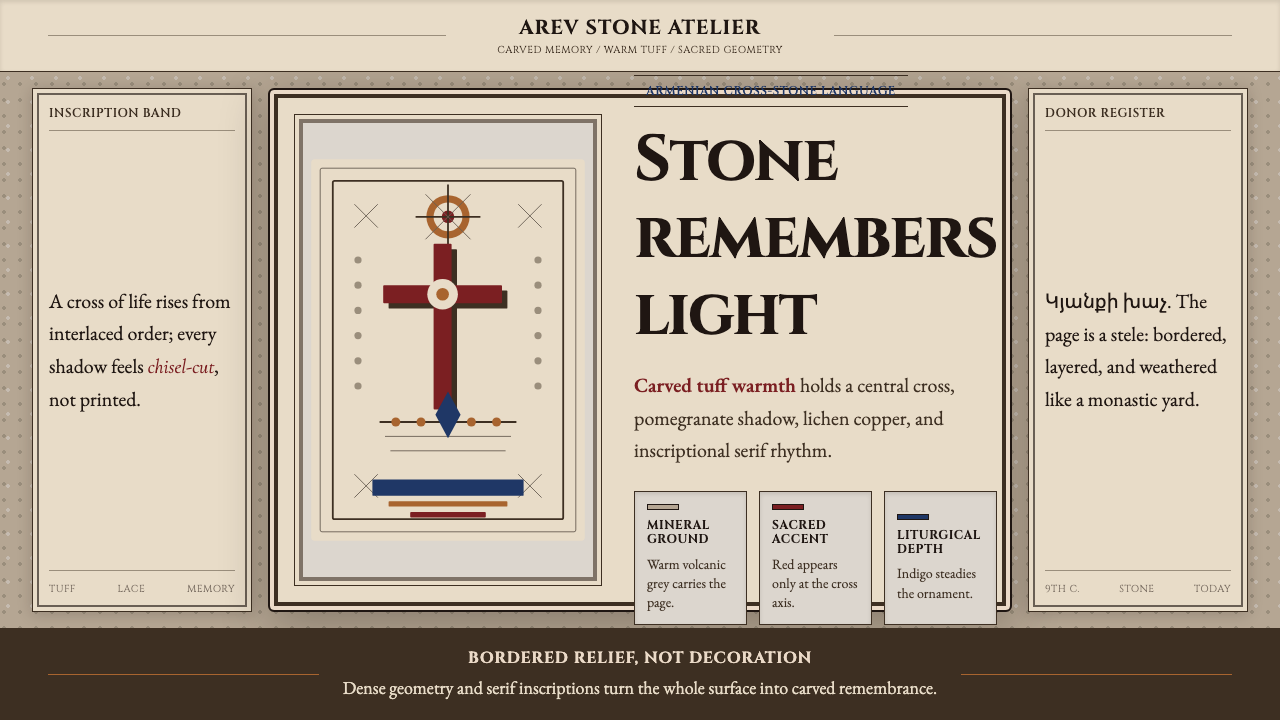 Armenian Khachkar Cross-StoneStone becomes memory. Tuff grey, pomegranate red, and carved borders hold the…石头成为记忆:凝灰岩灰、石榴红与刻痕边框托住十字中轴。
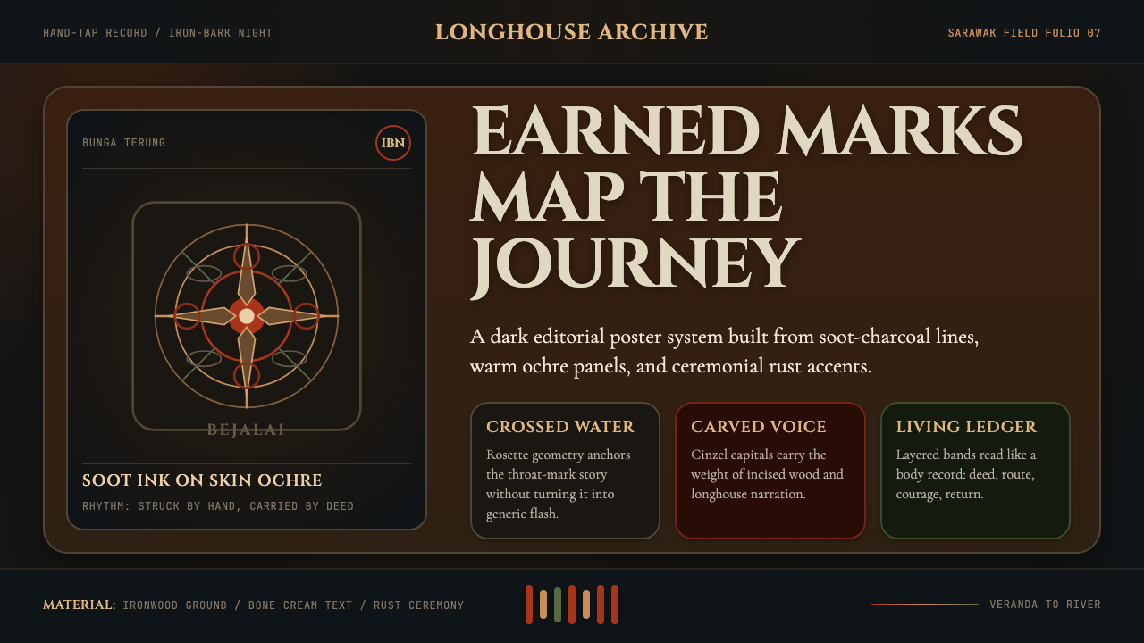 Dayak Borneo Tattoo (Iban)A living journey ledger. Soot lines, ochre panels, and rust rosettes feel han…身体成旅程账本。炭线、赭面与锈红莲座如手敲入肤。
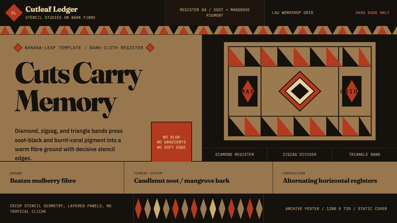 Fijian Masi (Bark Stencil)Stencil memory stays sharp. Soot black and burnt coral strike bark-fibre band…模板记忆锋利:烟黑与焦珊瑚红压入树皮纤维横带。
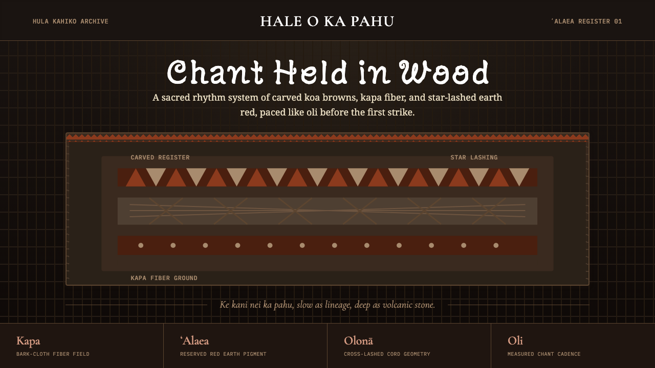 Hawaiian Hula Pahu DrumSacred weight, hand-marked. ʻAlaea red, kapa texture, and stacked carved regi…圣重而手作。ʻAlaea红、卡帕纹理与层叠雕刻带。