What is Tongan Kupesi Tapa?
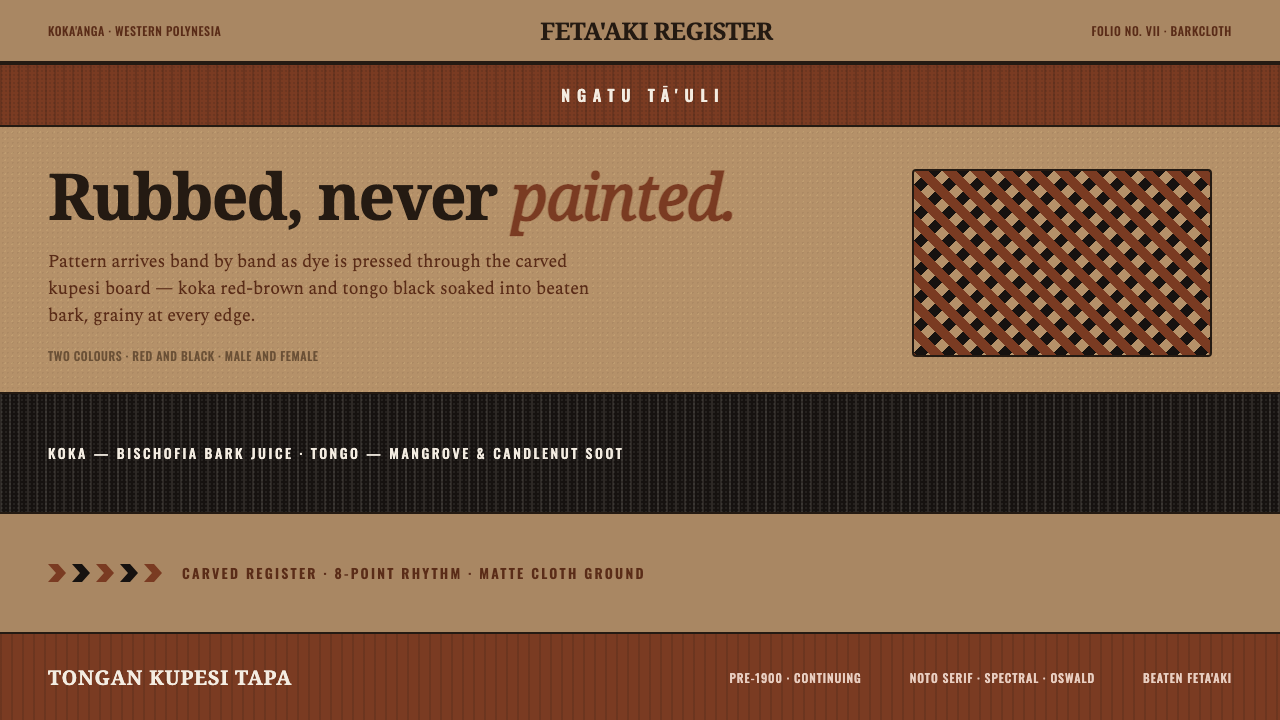
Tongan Kupesi Tapa brings the logic of ngatu into digital form: red-brown and black rubbed into a warm bark ground, where repetition records the pressure of making rather than the hand of painting.
Tongan Kupesi Tapa in brief
Tongan Kupesi Tapa is a digital design language distilled from ngatu, the barkcloth tradition of Tonga in Western Polynesia. Its defining image is not a painted illustration but a transferred surface: layers of paper-mulberry barkcloth laid over a carved kupesi design board, then rubbed with dye so the raised pattern emerges in grainy, repeated registers. The result carries an unmistakable physical logic. Motifs feel impressed, absorbed, and slightly uneven because the visual system begins with contact between cloth, board, pigment, and hand.
The palette is deliberately narrow. Red-brown koka, made from Bischofia bark juice, and tongo black, made from mangrove and candlenut soot, sit on a light tan bark ground. In the Tongan tradition, red and black are fundamental colors associated with male and female. In a digital application, that relationship should remain structural rather than merely decorative: the warm ground holds the composition, while the two dyes establish contrast, sequence, and symbolic presence.
The style is matte, tactile, and banded. Its visual energy comes from stacked horizontal fields, repeated kupesi-derived marks, porous edges, and the suggestion of beaten bark rather than smooth paper or polished screen material. It rejects clean white grounds, creamy neutrality, glossy effects, and smooth tonal fades. A successful interpretation should feel as though pigment has entered a fibrous surface, with density and imperfection controlled by rhythm rather than erased in pursuit of digital cleanliness.
Where does Tongan Kupesi Tapa come from?
The source tradition is Tongan ngatu, a continuing form of Polynesian tapa or barkcloth with roots before 1900. Ngatu is built from pasted feta'aki strips of paper-mulberry bark. That construction matters because it gives the finished cloth a layered, worked character before any pattern is transferred. The digital style should therefore begin from material suggestion: a tan ground that feels beaten and fibrous, not a blank neutral canvas waiting to be decorated.
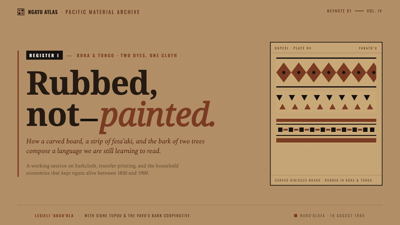
Kupesi transfer is central to the visual method. Carved kupesi design boards provide the pattern beneath the cloth. Dye is rubbed across the upper surface so that the pattern transfers through pressure and contact. The image is consequently registered in repeated, grainy bands rather than composed as a single continuous painted scene. Repetition is not an optional motif in this tradition; it is evidence of the transfer process and should remain visible in digital adaptations.
Two earth dyes carry the color language. Koka is the red-brown made from Bischofia bark juice. Tongo black comes from mangrove and candlenut soot. On light tan barkcloth, these colors establish the fundamental Tongan red-and-black system, associated with male and female. Their importance lies in their relationship to one another and to the bark ground, not in an expanded decorative palette or in a search for luminous color effects.
The tradition includes koka'anga women’s groups, kupesi board carvers, and ngatu tā'uli makers. These roles point to a practice made through collective making, patterned transfer, and specialized material knowledge. Ngatu tā'uli names black-overpainted ngatu within this wider tradition. For a public-facing digital style, the responsible lesson is not to simulate a generic tropical pattern, but to preserve the specific logic supplied here: barkcloth construction, kupesi transfer, rubbed pigment, restrained earth dyes, and repeated registers.
What defines the Tongan Kupesi Tapa look?
Rubbed Transfer
The governing gesture is rubbing, never painting. Marks should appear transferred through a surface rather than drawn directly onto it. Preserve slight granularity, interrupted coverage, and the sense that pigment meets resistance from fibers. Smooth vector-perfect illustration weakens the reference because it removes the physical action from which the pattern derives.
Earth-Dye Contrast
Use red-brown koka and tongo black as the active marks against a light tan bark ground. The colors should read as absorbed dyes with symbolic gravity, not as bright interface accents. Keep the relationship spare: one dye can establish the dominant band while the other interrupts, anchors, or clarifies the composition.
Banded Repetition
Arrange motifs in stacked registers that suggest repeated passes across cloth. Horizontal bands can carry changes in density, spacing, or motif emphasis, but they should remain part of one continuous textile field. Avoid isolated decorative icons floating independently; the pattern belongs to a sequence of transfers.
Beaten-Bark Ground
The ground is light tan, matte, and materially present. It should imply pasted bark strips and beaten fiber rather than polished paper, empty white space, or a glossy fabric simulation. Texture is useful only when it supports cloth structure; it should feel embedded in the surface, not applied as a visual filter.
Matte Imperfection
Edges may be porous, pigment may vary in pressure, and repeated marks may retain visible grain. These qualities are not damage to clean up. They make the design legible as a translation of rubbed barkcloth. Gloss, reflective highlights, and polished depth effects contradict the matte-cloth premise.
Structural Restraint
The style gains force from a limited material vocabulary: bark ground, two earth dyes, transferred pattern, and repeated bands. Do not add creamy white, pure white, decorative metallic effects, or smooth gradients to create richness. Richness comes from layering, pressure, grain, and the dialogue between red-brown and black.
Who shaped Tongan Kupesi Tapa?
Koka'anga women’s groups are named in the source tradition as key makers within Tongan ngatu. Their presence is a reminder that ngatu is not simply a visual style or a surface pattern. It is a living practice of material preparation, collective work, and the sustained transmission of barkcloth knowledge.
Kupesi board carvers create the carved design boards that make transfer possible. Their work supplies the patterned structure beneath the cloth, turning rubbing into a repeatable visual system. In digital interpretation, the importance of the kupesi board is expressed through ordered motifs and registers rather than through freehand decorative drawing.
Ngatu tā'uli makers are associated with black-overpainted ngatu, one of the named movements within the source material. Their inclusion foregrounds the significance of tongo black in the tradition. Black should therefore act as more than outline or neutral text color: it can carry density, grounding, and a strong counterweight to red-brown dye.
How do you use Tongan Kupesi Tapa today?
For presentation covers, treat the page as a barkcloth field rather than a poster placed on a blank background. Let a broad rubbed band or repeated kupesi-derived register establish the main visual mass, then place the title with enough open tan ground to remain readable. A cover can lead with red-brown or black, but the second dye should act as a deliberate counterweight. Keep imagery secondary to the transferred surface; the cover should announce material rhythm before it announces decoration.
For presentation content and data pages, use horizontal registers to organize information. A section title can occupy one band, explanatory copy another, and a chart or comparison a third. Data graphics should inherit the restricted dye logic: red-brown and black distinguish meaningful categories against the tan ground, while repeated marks and dividers clarify sequence. Do not convert every chart element into a patterned object. The barkcloth language works best when texture frames information and the data itself stays legible.
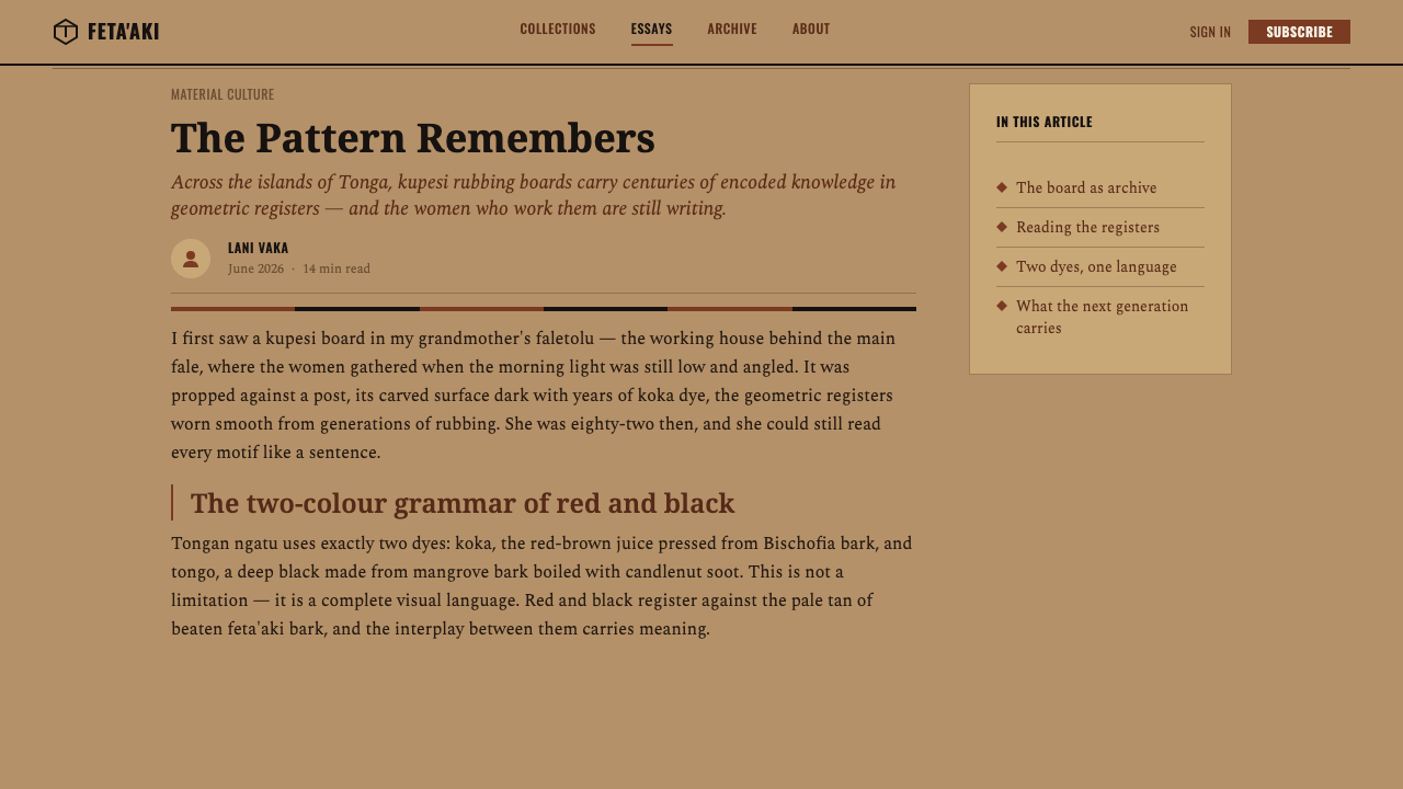
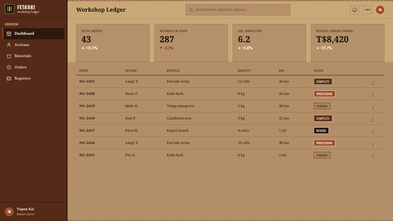
For web interfaces, the style is strongest in dashboards, collection pages, reports, and pricing experiences that benefit from an authored sense of hierarchy. Build broad content regions as bands, reserve the bark ground for the main field, and use red-brown and black to mark active states, category distinctions, or important actions. Inputs, tables, and navigation should remain clear and practical. The tactile surface can give these utilitarian areas identity, but it must not obscure scanning, reading, or comparison.
For editorial and marketing work, use repetition to create continuity across a long page or a campaign system. A hero area may introduce one rubbed register; section breaks can shift to a related register with altered density; quotations or product statements can sit in relatively open fields of tan. Marketing material should present the contrast between the dyes as a disciplined visual argument, not as rustic decoration. The best results retain a sense of making, material, and cultural specificity without pretending that the digital page is an original piece of ngatu.
The common mistake is to treat Tongan Kupesi Tapa as a generic tribal texture or to replace its tactile restraint with glossy tropical styling. Random symbols, rainbow palettes, smooth fades, pristine white grounds, and highly polished surfaces all break the system. Another mistake is making every area equally distressed. The grainy transfer needs quieter spaces around it, so that bands, pressure, and the red-brown-black relationship can do their work.
Tongan Kupesi Tapa — FAQ
Is Tongan Kupesi Tapa a painted pattern style?
No. The essential reference is kupesi transfer: dye is rubbed across barkcloth laid over a carved design board. The pattern is therefore understood as a result of contact and pressure, producing grainy repeated registers. Digital work can simplify this process, but it should preserve the feeling of transfer rather than imitate brush-painted ornament.
Why are red-brown and black so central?
Koka red-brown and tongo black are the two earth dyes named in the source tradition, used on a light tan bark ground. Red and black are fundamental Tongan colors associated with male and female. This is why the style should rely on their relationship, rather than treating them as interchangeable accents within a much larger palette.
Can the style use a pure white or glossy background?
It should not. The reference material specifies a light tan bark ground and a matte-cloth tradition, and explicitly rejects creamy white, pure white, and glossy gradients in its digital translation. A background should suggest beaten bark and pasted fiber, giving the rubbed dyes a material surface into which they can appear to sink.
How should texture be handled in a digital application?
Texture should communicate barkcloth construction, rubbed pigment, and repeated transfer. It belongs in the ground, the dye density, and the porous edge of a register. It should not become an all-over distress effect that makes every control, paragraph, or data point equally rough. Texture needs hierarchy just as typography and color do.
What is the most important way to avoid a generic imitation?
Keep the specific making logic visible. Work from the named materials and processes: tan barkcloth ground, koka red-brown, tongo black, carved kupesi boards, rubbing, and repeated registers. Do not substitute unrelated motifs or use the aesthetic as a loose tropical shorthand. The style becomes credible when its visual decisions remain accountable to ngatu rather than to a generalized idea of pattern.
Related design styles
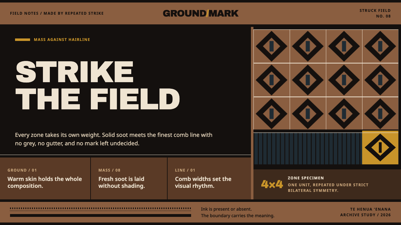 Marquesan PatutikiSoot meets skin without compromise. Solid black zones collide with comb-struc…
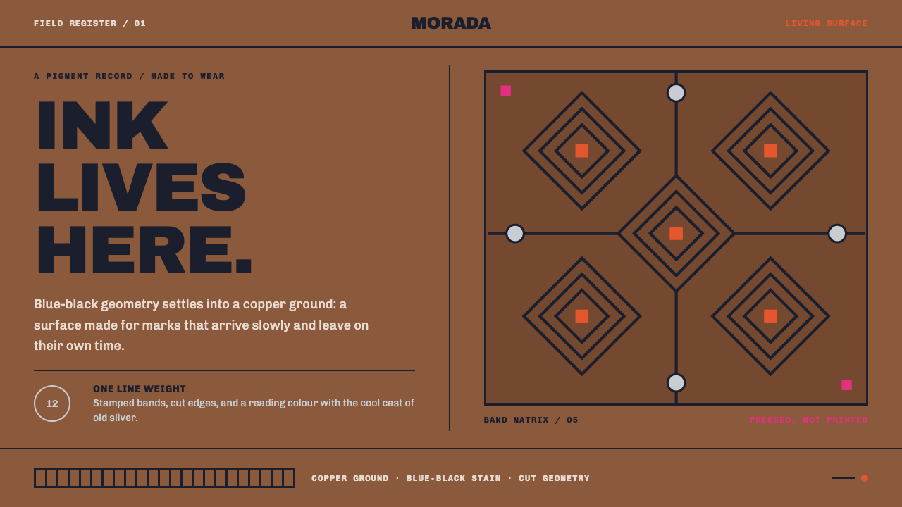 Emberá JaguaA living stain, never a print. Blue-black diamond bands press across copper s…
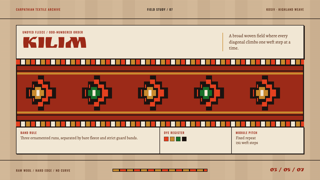 Hutsul KilimGeometry is the craft. Hot red stepped rhombs repeat across raw fleece bands.
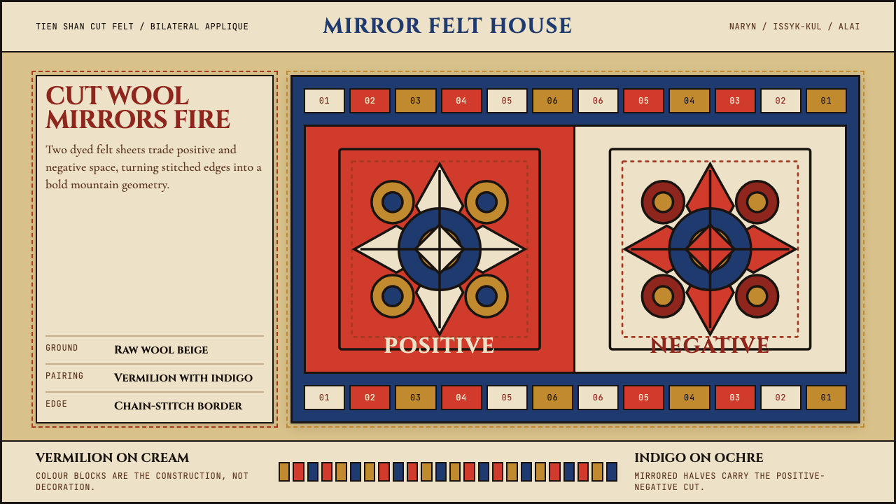 Kyrgyz Shyrdak Felt RugCut felt becomes structure. Vermilion-indigo mirror blocks stitch positive to…
 Andean ChulloOrnament carries a code. Cochineal red stacks strict stitch bands with bead-w…
 Emirati Sadu WeavingMemory runs in bands. Madder steps cross dusty goat-hair black with no curve…