What is Victorian Cast Iron Foundry?
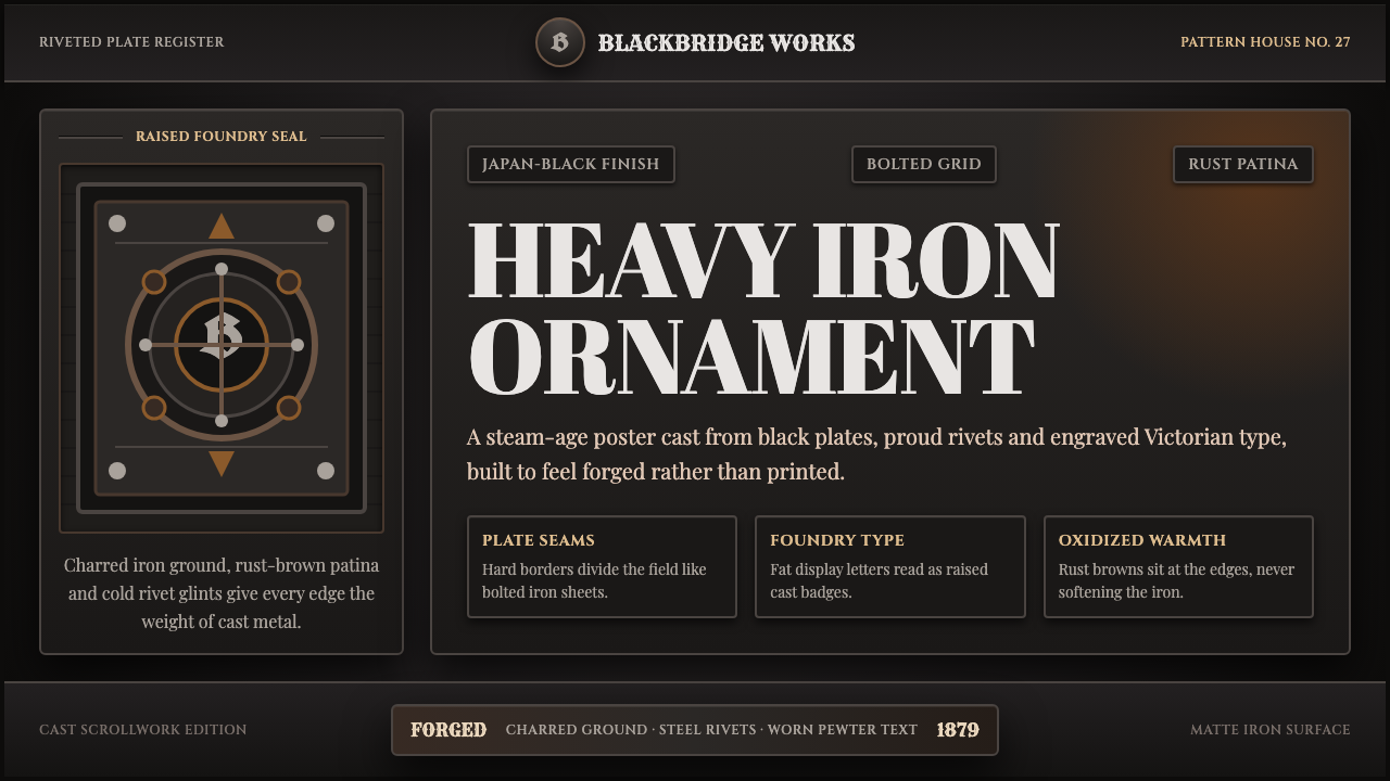
Victorian cast iron dressed the machine age in mourning colors — a language of dark, riveted metal that made factories, radiators, and railings look as permanent as monuments.
Victorian Cast Iron Foundry in brief
Victorian cast iron is the decorative language that grew up around Britain's nineteenth-century iron industry — the radiators, stove fronts, railings, lamp posts, and structural spans that made cast and wrought iron the defining material of the age. Its visual signature is dense, dark, and ornate: deep japan-black paint over gray-black castings, raised foundry scrollwork, riveted plate joints, and a surface that always reads as forged rather than drawn.
Unlike lighter industrial styles that came later, Victorian ironwork never treated mass production as a reason for restraint. The same casting process that made a radiator cheap to reproduce also let foundries stamp it with acanthus leaves, fleur-de-lis, and heraldic badges — ornament multiplied by the mold rather than hand-carved one at a time. The result is a material aesthetic that is simultaneously industrial and baroque: heavy, symmetrical, and unapologetically decorated.
As an interface language, this becomes charred-iron grounds, fluted and beaded borders that mimic cast trim, a patina of rust-brown at the edges where paint would have worn thin, and small points of cool steel glint standing in for polished rivet heads and bolt caps. Nothing in the system is meant to look flat or new — every surface implies weight, age, and a slow chemical history of oxidation.
Where does Victorian Cast Iron Foundry come from?
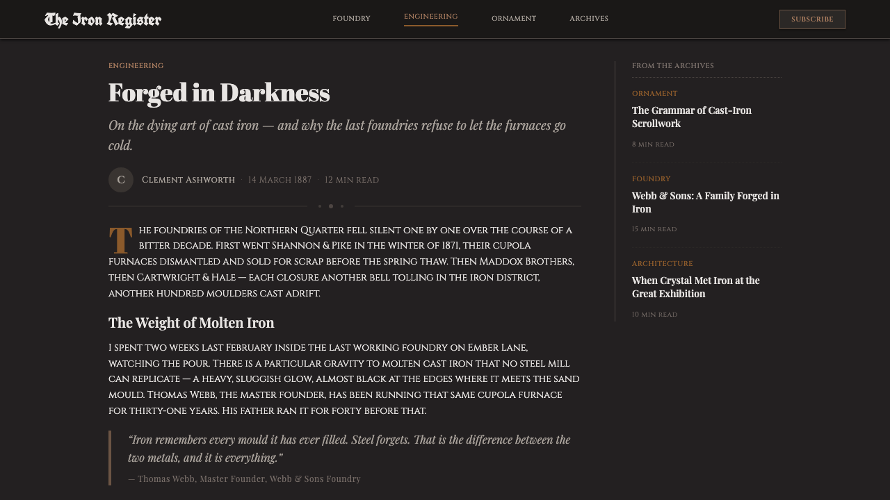
Cast iron had been used structurally since the eighteenth century, but it was the Victorian era — roughly 1837 to 1901 — that turned it into a full decorative vocabulary applied to everything from sewer covers to church railings. Britain's foundries, flush with coal, ore, and an expanding empire's demand for standardized parts, discovered that a single carved wooden pattern could be used to cast the same ornamental bracket, finial, or grille thousands of times. Ornament, once the most expensive part of any object, became the cheapest thing a foundry could add.
The style's defining public moment arrived in 1851, when Joseph Paxton designed the Crystal Palace for the Great Exhibition in London's Hyde Park. Paxton, a gardener and greenhouse architect by training, adapted the modular iron-and-glass logic of his conservatory designs to a building large enough to enclose full-grown elm trees. The Crystal Palace proved that cast and wrought iron could support vast ribbed spans of glass at a scale masonry could never achieve economically, and it made iron construction a matter of national pride rather than merely industrial necessity.
Foundries themselves became the era's engine of design distribution. The Coalbrookdale Company, based in Shropshire near the birthplace of English iron-founding, issued illustrated pattern catalogues so that architects, builders, and homeowners anywhere in the empire could order the same cast bench, fountain, or stove front by number. This catalogue system meant that a single decorative vocabulary — heavy scrollwork, foliate brackets, raised makers' badges — spread with a uniformity that hand craftsmanship never could, turning cast iron into arguably the first globally distributed design language.
By the century's end, the style had saturated everyday life: iron radiators heated middle-class parlours, iron railings enclosed London squares, iron stoves anchored kitchens, and iron balconies wrapped seaside terraces from Brighton to colonial outposts. The aesthetic faded as lighter steel framing and, later, Art Nouveau and Arts and Crafts sensibilities reacted against its density — but its dark, riveted, ornamented surfaces remain the clearest visual shorthand for the confidence, and the weight, of the steam age.
What defines the Victorian Cast Iron Foundry look?
Color
The palette is dominated by japan-black — the dense, near-lightless black lacquer foundries used to seal cast iron against rust — set against warm rust-brown at edges and joints where the paint has worn or the metal has begun to oxidize. Accents are cool and metallic: the dull steel glint of a polished rivet or bolt head standing in for gold or silver. There is no pastel range and no bright saturated hue; every color reads as a material state — painted, bare, or corroding — rather than a decorative choice.
Ornament and Casting Marks
Ornament in this style is never applied after the fact — it is cast into the surface, which means it always reads as raised, repeated, and slightly softened at the edges the way mold-cast relief is. Foliate scrollwork, foundry badges, and heraldic motifs recur as if stamped from the same pattern across many objects, echoing the way a single Victorian foundry mold produced thousands of identical brackets. Digitally, this translates into repeating border motifs and small raised-looking badges rather than one-off illustrations.
Border and Frame Treatment
Borders behave like cast trim rather than drawn lines: fluted (a series of parallel shallow grooves) or beaded (a row of small raised dots), always with enough implied depth that they could plausibly have been poured in a mold. A panel or card in this system is not simply outlined — it is framed the way a stove front or radiator panel is framed, with the border reading as a separate cast piece bolted or riveted to the surface behind it.
Weight and Symmetry
Compositions favor heavy, centered symmetry over asymmetric balance — a legacy of foundry patterns, which were carved once and then mirrored or repeated to fill a facade, a gate, or a fence run. Elements are large, dense, and anchored rather than light and floating; negative space is used sparingly, since the source material — cast iron architecture — rarely left large uninterrupted gaps. The effect should feel monumental rather than airy.
Surface and Texture Illusion
Nothing in this style should read as perfectly flat or perfectly new. Surfaces imply the slight unevenness of sand-cast metal, the sheen variation of aged paint, and the soft accumulation of rust at vulnerable edges — corners, hinges, screw heads. This is the opposite of a pristine digital surface: the style asks for a controlled, tasteful suggestion of wear, applied consistently rather than randomly, so the whole system reads as one object that has aged uniformly rather than a clean template with a rust filter dropped on top.
Typography as Foundry Signage
Lettering in this world behaves like a cast or embossed foundry badge rather than printed text: bold, slab-like letterforms with generous weight, often set within a raised or recessed plaque-like frame, evoking the makers' marks foundries pressed into their products. Display type should feel stamped rather than typeset — solid, geometric, and confident — while supporting text can be lighter, playing the role of an engraved label rather than a headline competing for the same weight.
Structural Motifs
Rivets, bolt heads, ribbed spans, and gridwork drawn from railings and glasshouse framing recur as structural punctuation rather than incidental decoration. A rivet is never placed at random — it appears where two cast or riveted plates would plausibly meet, echoing the way real Victorian ironwork bolted separately cast sections into a single facade. This gives the system an internal logic: every ornamental mark implies an actual joint or seam somewhere behind it.

Who shaped Victorian Cast Iron Foundry?
Paxton trained as a gardener and greenhouse designer before applying his modular iron-and-glass conservatory logic to the 1851 Crystal Palace, the single building most associated with Victorian iron's public triumph. His design proved that prefabricated cast and wrought iron components could be assembled at unprecedented speed and scale, turning an engineering solution born in the kitchen garden into a national architectural statement and cementing iron as the material of Victorian ambition.
Operating in Shropshire near the birthplace of English iron-founding, Coalbrookdale became the era's most influential distributor of cast-iron design through its illustrated pattern catalogues, which let architects and homeowners anywhere in the British Empire order identical benches, fountains, and stove fronts by number. The company's catalogue model turned a single decorative vocabulary into something closer to a mass-market visual standard, decades before mass media made such uniformity commonplace elsewhere.
The largely anonymous craftsmen who carved the wooden master patterns used to cast ornamental ironwork occupy an unusual position in design history: their single carving decision — a scroll, a leaf, a badge — was then multiplied mechanically across thousands of finished objects. This anonymous, repeatable authorship is central to why Victorian cast iron reads as both handmade-looking and industrially uniform at once, a tension the style still carries into any modern application of it.
How do you use Victorian Cast Iron Foundry today?
Victorian cast iron is a heavy, high-commitment style: it works best when a product wants to feel established, weighty, and historically grounded rather than light or approachable, so it should be reached for deliberately rather than applied as a generic dark theme.
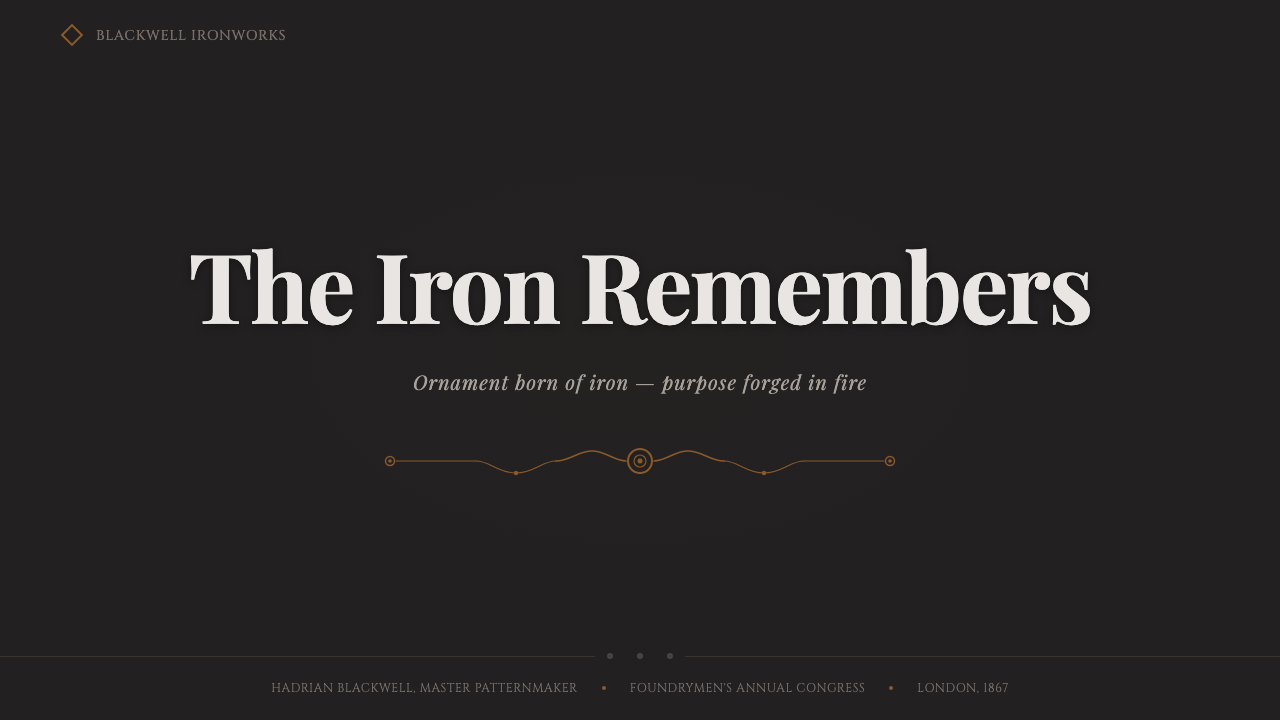
For presentation cover slides, the style rewards a centered, symmetrical composition — a large foundry-style badge or framed title plaque sitting on a charred-black ground, bordered with a fluted or beaded frame. Content and data slides should treat each panel as a cast plaque bolted to the page: a beaded or fluted border, a slightly raised-looking header treated like an embossed nameplate, and body text set plainly inside so the ornament stays at the edges rather than competing with the reading experience. Data visualizations read well as riveted panels or gauge-like readouts rather than airy modern charts.
For web UI, dashboards benefit from the style's implied structure: framed panels with cast-look borders for key metrics, rivet or bolt motifs marking panel corners, and a restrained rust-brown used only for warnings or secondary states so it does not overwhelm the japan-black base. Pricing pages suit the style's monumental symmetry particularly well — a centered plan comparison flanked by matching ornamental borders reads like a foundry catalogue page, which is precisely the historical reference point.
For editorial and marketing work, the style is well suited to storytelling about heritage, craft, engineering, or industrial history — long-form articles benefit from framed pull-quotes that look like cast plaques and section breaks marked by a riveted or beaded rule rather than a plain line. Marketing pages can use the style's confidence for heritage-driven or premium industrial products, where the density and weight of the ornament signal permanence rather than disposability.
The most common mistake is treating this as simply 'dark mode with texture' — flattening the japan-black ground and dropping in a generic grunge overlay without any of the structural logic of casting, riveting, or framing. Authentic use requires every ornamental mark to imply an actual material joint: a border reads as a cast piece, a rivet marks where two panels meet, a badge sits where a foundry would have stamped its name. Overusing rust-brown across large surfaces, rather than restricting it to edges and wear points, also collapses the style into simple decay rather than controlled patina.
Victorian Cast Iron Foundry — FAQ
Is Victorian cast iron the same as steampunk?
They overlap but are not identical. Victorian cast iron describes a real historical decorative language rooted in nineteenth-century foundry practice — radiators, railings, stove fronts, and structures like the Crystal Palace. Steampunk is a later fictional and speculative aesthetic that borrows Victorian industrial materials but adds invented technology, brass gadgetry, and a fantastical narrative layer that has no historical basis. This style stays closer to the documented, real material: dark japan-black iron, cast ornament, and rust patina, without the speculative machinery steampunk adds.
Why is the palette so dark? Wasn't Victorian decoration often colorful?
Victorian interiors could indeed be richly colored in wallpaper, textiles, and painted trim — but structural ironwork specifically was almost always finished in japan-black, a dense, quick-drying lacquer foundries used because it protected cast and wrought iron from rust cheaply and uniformly across thousands of units. This style follows that specific material tradition rather than the broader, more colorful Victorian decorative palette, which is why it stays dark and metallic rather than floral or pastel.
How much rust or wear should actually show in a design using this style?
Restraint matters more than intensity. Rust-brown should appear at logical wear points — corners, edges, hinges, screw and rivet heads — the places where paint would genuinely thin first on a real cast object, not scattered evenly across a whole surface. A small, consistent amount of patina reads as considered heritage; rust covering large flat areas reads as damage or neglect rather than age, which undermines the monumental, confident feeling the style is meant to convey.
Does this style work for light, airy or minimal products?
Not naturally. Victorian cast iron is built around density, weight, and centered symmetry — qualities that conflict directly with airy minimalism or generous negative space. It is best reserved for contexts where permanence, craft, or industrial heritage is the message: heritage brands, engineering and manufacturing products, premium hardware, or storytelling about industrial history. Forcing it onto a product that wants to feel light or fast will fight the style's core intent rather than complement it.
What's the difference between this and a generic 'dark mode' theme?
Generic dark mode is simply an inverted color scheme with no material logic behind it. Victorian cast iron requires every dark surface and every ornamental mark to imply an actual physical process — casting, riveting, framing, oxidizing. A border must read as a separate cast piece bolted to the surface behind it; a rivet must mark a plausible seam between two panels. Dark mode asks 'what color is the background'; this style asks 'what object is this surface pretending to be, and how was it made.'
Related design styles
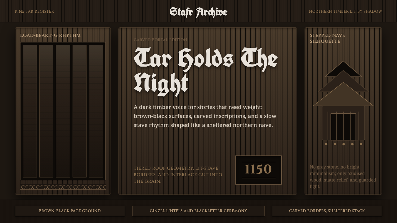 Norwegian Stave ChurchTar makes the sacred heavy. Brown-black fields, Cinzel inscriptions, tiered t…
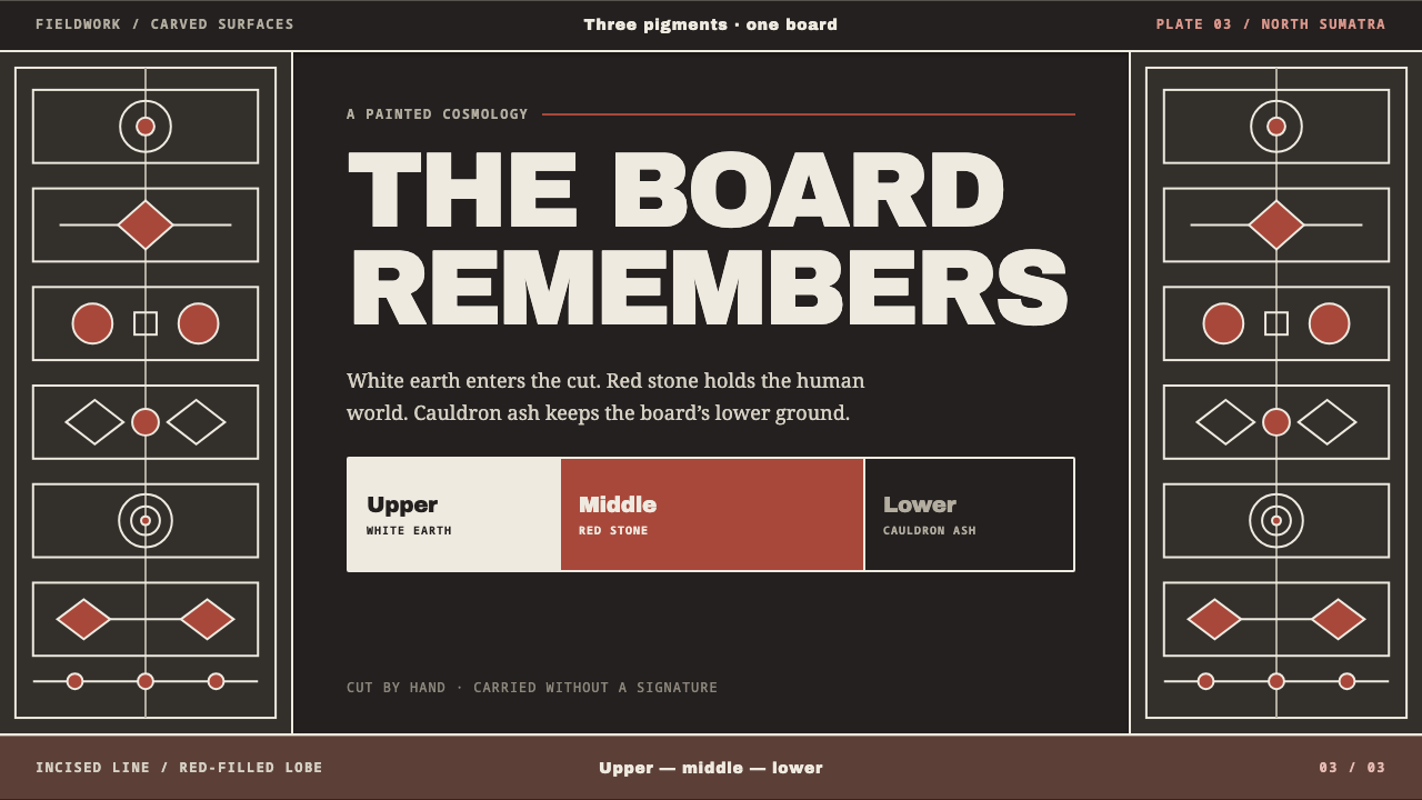 Batak GorgaCosmology cut into wood. Chalk-white lines and batu hula red hold a blackened…
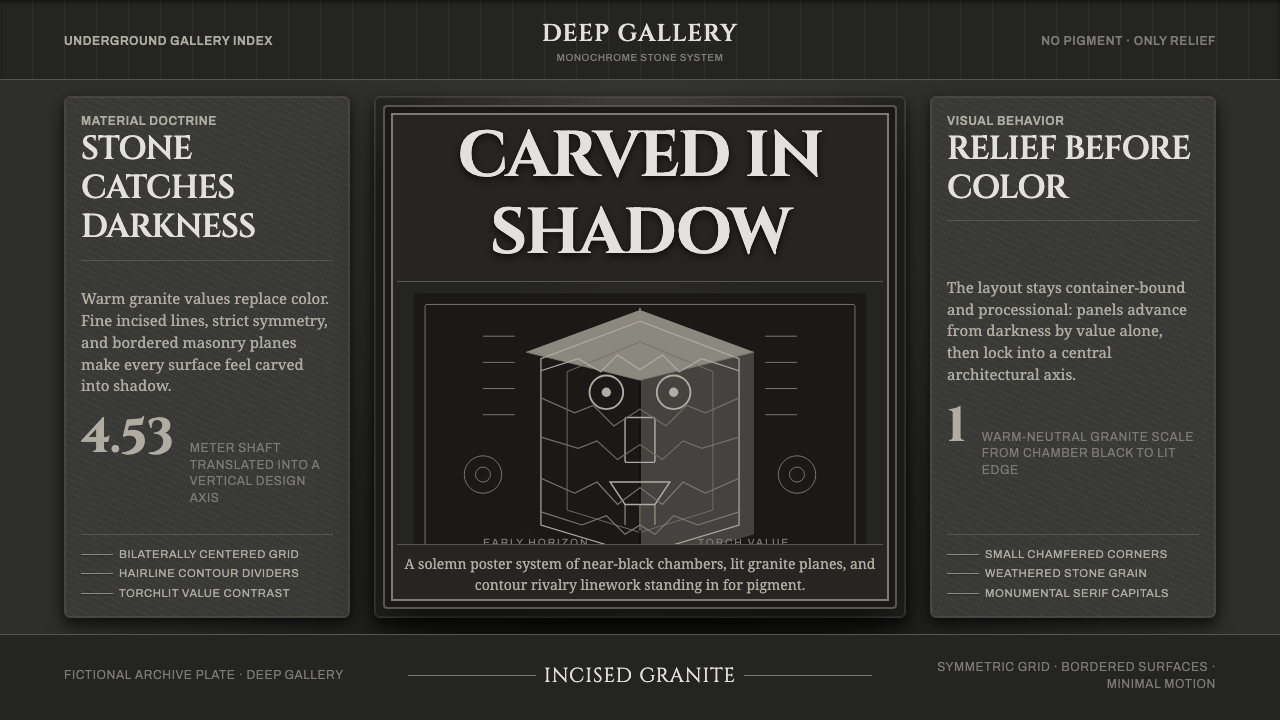 Chavín Lanzón Stone ReliefStone emerges from darkness. Granite grays, incised lines, and torchlit symme…
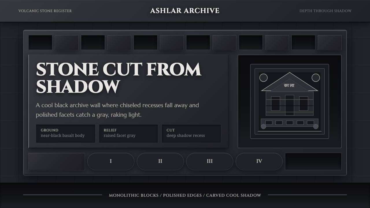 Deccan Basalt TempleMonumental shadow, carved. Near-black basalt, Cinzel capitals, and relief gri…
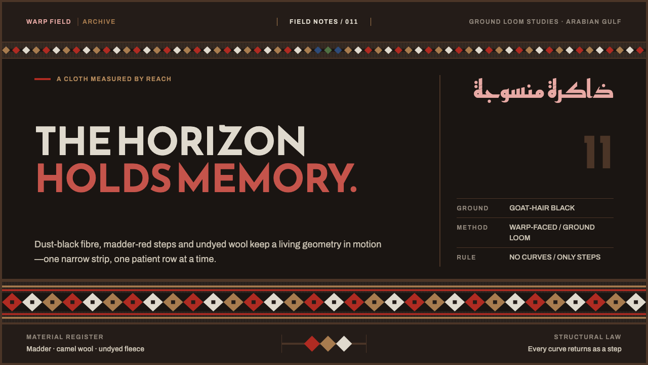 Emirati Sadu WeavingMemory runs in bands. Madder steps cross dusty goat-hair black with no curve…
 Gothic Rose WindowDarkness becomes light. Cobalt glass, ruby foils and black lead form a radial…