What is Gothic Rose Window?
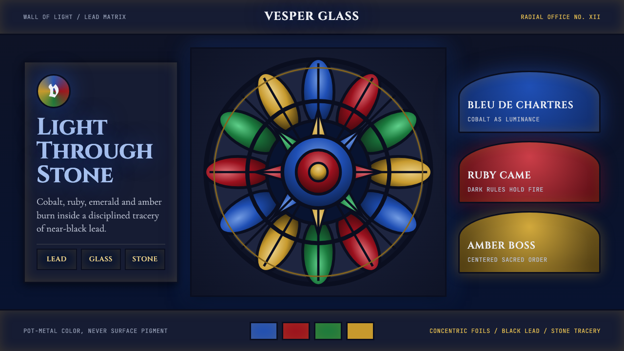
Gothic Rose Window turns a screen into stained glass — near-black structure holding jewel-toned color that reads as light, not pigment.
Gothic Rose Window in brief
Gothic Rose Window is a design system derived from the great circular stained-glass windows of High Gothic cathedrals, most famously Chartres. Its defining move is an inversion familiar to anyone who has stood inside a medieval nave at midday: the surrounding stone and lead is deliberately dark, almost black, so that the glass panels it holds appear to glow from within rather than sit as flat color on a surface.
The system carries that logic wholesale. A cathedral-dark ground — deep enough to read as shadow rather than mere gray — becomes the base against which cobalt blue, ruby red, forest-deep emerald, and warm amber all appear lit rather than printed. Nothing in this palette behaves like paint on paper; every hue is treated as if backlit, so saturated color reads as luminance pushing out of darkness.
Structurally, the system is radial rather than gridded. Where most design systems organize content in rows and columns, Gothic Rose Window organizes it in rings — a central medallion with concentric bands of smaller elements fanning outward, each ring separated by the visual equivalent of a lead came: a thin, dark, unambiguous dividing line. Typography follows the same historical register, pairing heavy blackletter-inspired display forms for headlines with plain Roman capitals for structural and labeling text.
Where does Gothic Rose Window come from?
The rose window reached its fullest expression at Chartres Cathedral in the Île-de-France region, built and glazed primarily across the late twelfth and thirteenth centuries — the heart of the High Gothic period. Chartres survived the fires and iconoclasms that destroyed so much medieval glass elsewhere in France, which is why its windows remain the reference point for the entire craft: more of its original glazing survives intact than at almost any comparable cathedral.
The people responsible for this achievement are, almost without exception, anonymous. Cathedral construction in this period was a collective, generational undertaking; a rose window like the ones at Chartres was the work of master glaziers coordinating with master masons over years, not the signed work of a single named artist. What survives is not a biography but a guild tradition — a body of technical knowledge about cutting, coloring, and leading glass passed from workshop to workshop across Western Europe.
The technique itself was called pot-metal glass: color was introduced into the glass while it was still molten in the pot, so the color runs through the full thickness of the material rather than sitting on its surface as a painted layer. This is the physical reason the glass reads as luminous rather than pigmented — light passes through the colored body of the glass, and the surrounding lead came, cut to follow the exact outline of each piece, does double duty as structural support and as the dark line isolating each color from its neighbors.
The radial geometry was not a decorative choice so much as a theological and architectural one. A circular window divided into radiating petals and foils around a central medallion let masons distribute enormous structural loads symmetrically around a single point, while the imagery itself — often built around a Marian or cosmological theme — used the circle's inherent focus toward the center to organize scenes into a legible, contemplative order. Sacred radial geometry of this kind became one of the signature achievements of Gothic architecture, alongside the pointed arch and the flying buttress that made such large window openings structurally possible in the first place.
What defines the Gothic Rose Window look?
Ground and Luminance
The base of the system is a ground dark enough to read as cathedral shadow — closer to black than to ordinary gray or navy. This darkness is not a backdrop to be filled but the entire point: it is what makes every saturated color placed on top of it appear to emit light rather than merely occupy space. Designers applying this system should resist the temptation to lighten the ground for 'readability' — doing so collapses the backlit illusion that is the style's whole reason for existing.
Jewel-Toned Color
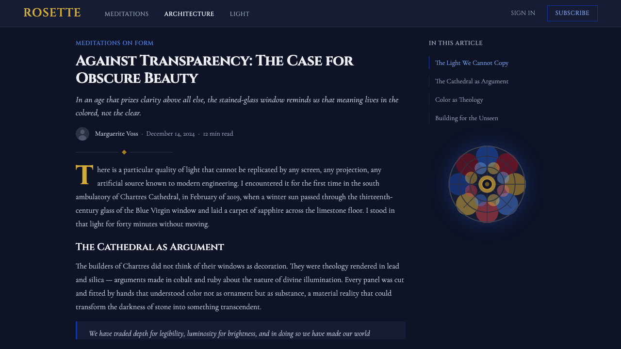
The palette is built from a small set of deep, saturated hues — cobalt blue, ruby red, emerald green, warm amber — each treated as a distinct glass color rather than blended into gradients. Colors sit next to each other in flat, bounded fields; there is no soft transition from one hue to the next, because stained glass has no way to blend two colors within a single pane. Each color patch is a complete, isolated decision, the way each piece of glass in a window is its own decision.
Lead Lines
Every colored field is outlined by a thin, dark, continuous line standing in for the lead came that physically holds stained glass together. This is more than a border: it is the mechanism that lets adjacent saturated colors sit next to each other without visually bleeding or clashing, because the eye reads the dark outline first and the color fields as separately lit panels second. In interface terms, this translates to firm, dark dividing lines between colored sections rather than soft shadows or blurred edges.
Radial Composition
Layout radiates outward from a central point in concentric rings, rather than stacking in rows or aligning to a rectangular grid. A focal element occupies the center — the equivalent of the central medallion — with supporting elements arranged in bands around it, each band a distinct ring at a consistent distance from the center. This is a genuinely different organizing principle from most contemporary interface systems, and it rewards content that has a natural hierarchy radiating from one dominant idea outward to supporting details.
Medieval Typography
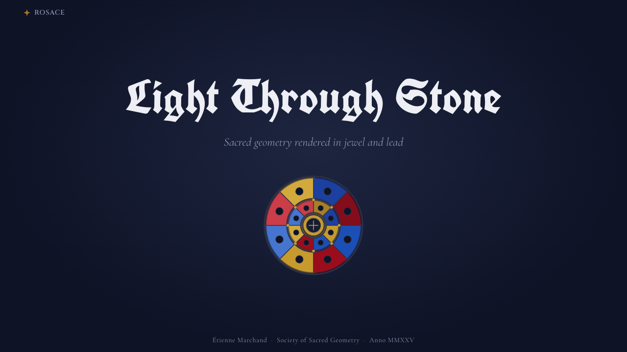
Two distinct typographic registers coexist. Display and headline text draws on blackletter — the dense, angular, vertically compressed letterforms associated with medieval manuscripts and early printing — used sparingly and only where a strong historical signature is wanted. Structural text, labels, and anything meant to be read quickly and clearly instead uses plain Roman capital letterforms, the same lineage of lettering carved into cathedral stonework. The contrast between the two registers mirrors the contrast between ornamental glass and load-bearing stone.
Foil and Petal Detailing
Smaller decorative units within the composition take the form of foils and petals — the trefoil and quatrefoil shapes carved into Gothic tracery, each a rounded lobe meeting its neighbors at a point. These shapes appear at a smaller scale than the main radial rings, used for secondary ornament, iconography, or small supporting graphics, always maintaining the lobed, curved-triangular silhouette rather than plain circles or rectangles. They are a recognizable signature detail that distinguishes this system from other radial or symmetrical layouts.
Depth Through Darkness, Not Shadow
Where most digital design systems create depth with drop shadows or elevation tokens, Gothic Rose Window creates depth through contrast between the near-black ground and the luminous color sitting on top of it. Elements do not appear to float above the surface; they appear lit from behind it. Mixing this with conventional soft-shadow elevation undermines the effect — the two languages read as visually incompatible.
Who shaped Gothic Rose Window?
The anonymous workshops responsible for glazing Chartres Cathedral across the late twelfth and thirteenth centuries perfected the technique of pot-metal glass and lead came construction that defines this entire aesthetic. Working without individual credit, in a guild tradition passed down through apprenticeship rather than signed authorship, they solved the core technical problem the style is built on: how to hold intensely saturated, backlit color within a structure dark and strong enough to bear the weight of stone tracery above it.
Working alongside the glaziers, the anonymous masons who cut and set the stone tracery made the radial window openings structurally possible in the first place. Their engineering — distributing enormous loads symmetrically around a circular opening — is the architectural precondition for the entire rose window form, and the gray stone ribs they carved became the visual model for the dark dividing lines that separate color fields throughout this system.
How do you use Gothic Rose Window today?
Gothic Rose Window is a high-drama, high-commitment style: it works best when a project wants to feel ceremonial, weighty, or historically grounded rather than light and casual, and it should be reached for deliberately rather than as a default choice.
For presentation cover slides, the style is extremely effective. A dark, near-black field with a single radial composition centered on the slide — title text in Roman capitals, a smaller blackletter accent for a subtitle — reads as immediately premium and distinctive. Content and data slides should preserve the ring logic where possible: a central statistic or key takeaway in the middle, supporting points arranged in a band around it, separated by thin dark dividing lines rather than whitespace alone. Because the palette is jewel-toned, data visualizations should use flat, bounded color fields for each series rather than gradient fills, so charts read as glass panels rather than conventional business graphics.
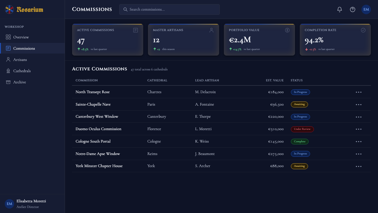
For web UI, dashboards and pricing pages can borrow the system's contrast logic without adopting the full radial layout: a near-black interface ground with cobalt, ruby, or amber used sparingly to mark active states, tier distinctions, or key metrics feels weighty and premium rather than merely 'dark mode.' The lead-line treatment translates well to card borders and table dividers — firm and continuous rather than soft or barely-there. Pricing tiers benefit especially from the jewel-tone palette, since one saturated color can mark the recommended tier the way a colored glass panel draws the eye within a window of otherwise similar shapes.
For editorial and marketing pages, the radial structure suits hero sections and feature announcements better than long-form body text, which should default to plain, highly legible Roman-derived letterforms rather than blackletter — blackletter is a display device, not a body typeface, and setting paragraphs in it will hurt readability. A marketing page can open with a full-bleed dark hero built around a radial or medallion-like composition, then transition into conventional left-aligned body copy, reserving the full stained-glass treatment for moments that deserve ceremony: a launch, a flagship feature, an anniversary.
A common mistake is lightening the background to improve perceived accessibility or make the design feel less severe. This defeats the style's central mechanism — the backlit illusion depends entirely on extreme contrast between a near-black ground and saturated color, and a mid-gray substitute just looks like a dim, unconvincing dark theme rather than stained glass. Equally common is using blackletter for body text, or overusing gradients where the style calls for flat, lead-bounded color; both quietly convert an authentic treatment into a generic 'medieval-flavored' dark theme.
Gothic Rose Window — FAQ
Is Gothic Rose Window the same as a generic 'dark mode' theme?
No, and treating it as one is the most common way this style gets diluted. Ordinary dark mode simply inverts a light interface to a mid-to-dark gray for reduced eye strain. Gothic Rose Window uses an intentionally near-black ground specifically so that saturated jewel tones placed on top of it appear to glow, the way colored glass glows against the dark stone of a cathedral interior. The darkness is not a neutral backdrop; it is the mechanism that makes the color scheme work at all.
Why does the layout use rings and radial composition instead of a conventional grid?
The radial structure is inherited directly from the physical form of a cathedral rose window, where a central medallion is surrounded by concentric bands of petals and foils. Structurally, this let Gothic masons distribute the enormous load of a large circular opening symmetrically around a single point. Aesthetically, it gives the composition a natural, contemplative focal hierarchy — the eye is drawn to the center and then invited to move outward through the rings. Content with one dominant idea and several supporting details tends to translate well into this structure; content that is naturally tabular or sequential often does not.
Where should blackletter type be used, and where should it be avoided?
Blackletter belongs to display and headline moments only — a title, a wordmark, a short ceremonial line of text where its dense, angular character reads as a deliberate historical signature. It should never be used for body copy, captions, form labels, or anything meant to be scanned or read at length: the letterforms are dense and vertically compressed in ways that slow ordinary reading. Structural and functional text throughout this system uses plain Roman capital letterforms instead, the same lineage of lettering found carved into cathedral stone.
How does this system create a sense of depth without drop shadows?
Depth here comes from luminance contrast rather than elevation. Instead of layering drop shadows or blurred panels to suggest that one element floats above another, Gothic Rose Window relies on the contrast between the near-black ground and the saturated color sitting on top of it — elements read as lit from behind, not lifted off the surface. Mixing in conventional soft-shadow elevation tends to undercut this effect, because the two depth languages read as visually incompatible within the same composition.
What kinds of projects should avoid this style?
Projects that need to feel light, casual, fast, or approachable are poor fits — the near-black ground and ceremonial typography inherently signal weight and formality, which reads as heavy-handed for a playful consumer app, a children's product, or anything meant to feel quick and disposable. It also demands real commitment to its contrast rules: if a project needs to soften the palette for broad accessibility across many contexts, or needs a layout that is fundamentally tabular and grid-based, the radial dark-ground system will fight the content rather than support it.
Related design styles
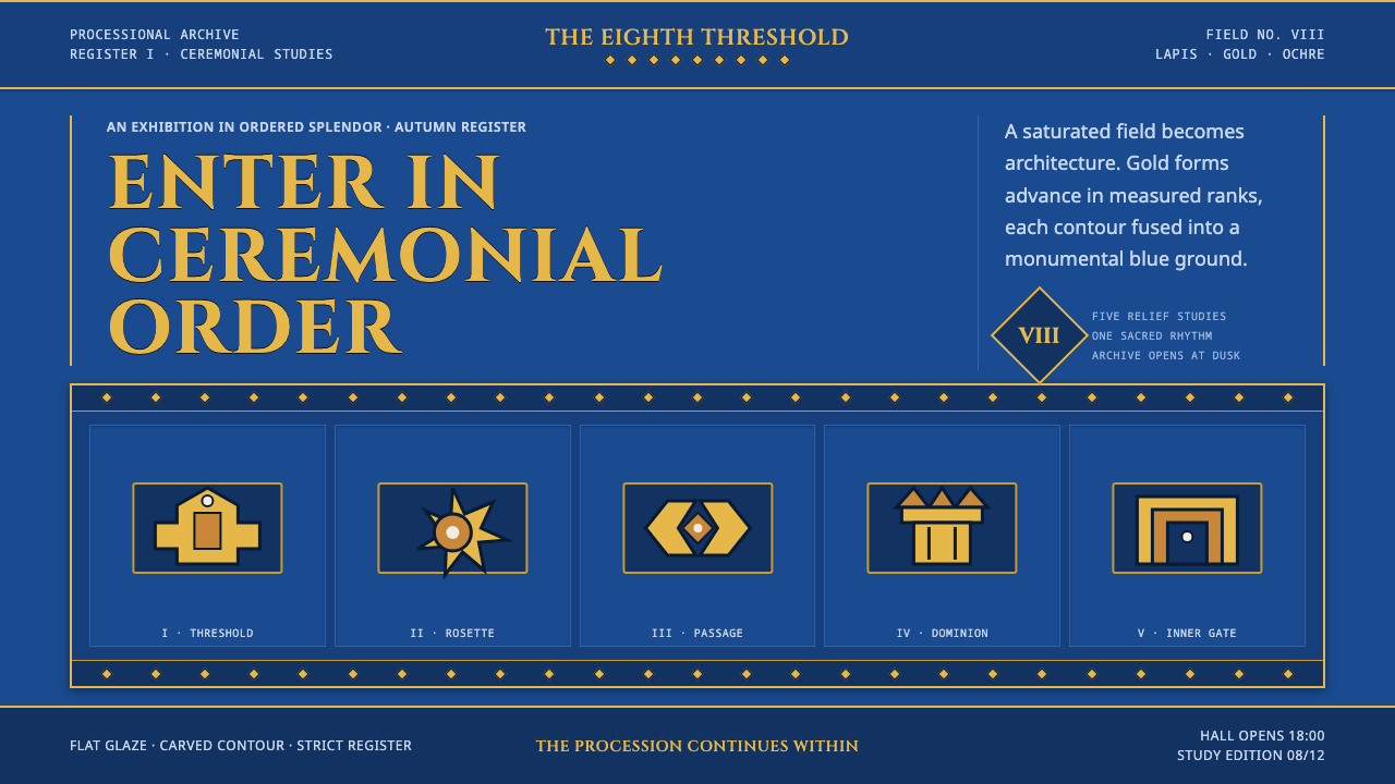 Babylonian Ishtar GateMonumental by procession. Lapis brick, gold registers, and carved capitals ho…
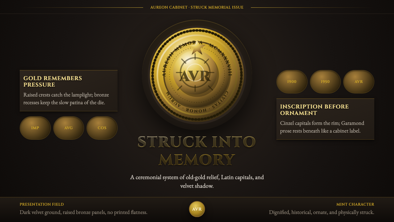 Commemorative CoinAuthority struck in metal. Old-gold relief, denticled rims, and Cinzel capita…
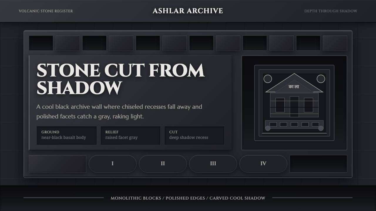 Deccan Basalt TempleMonumental shadow, carved. Near-black basalt, Cinzel capitals, and relief gri…
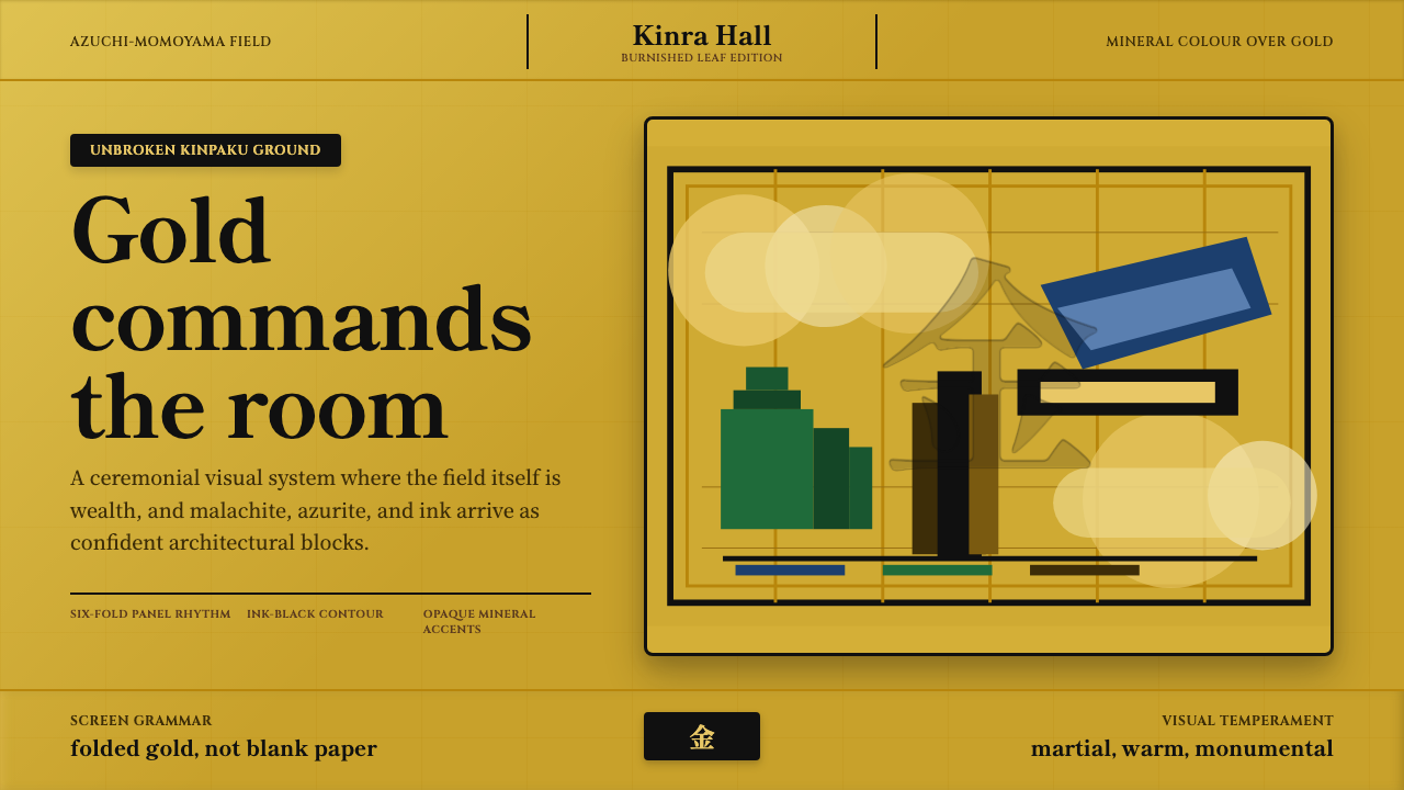 Momoyama Gold ScreenGold is the ground. Panel seams, ink contours, and mineral blocks make the fi…
 Qajar PersiaOpulence commands. Lacquer red, gilt borders, pearl dots, and lapis geometry.
 KaleidoscopeMathematics turns jeweled. Amethyst, brass, ruby, and emerald shards orbit on…