What is Rajasthani Meenakari Enamel?
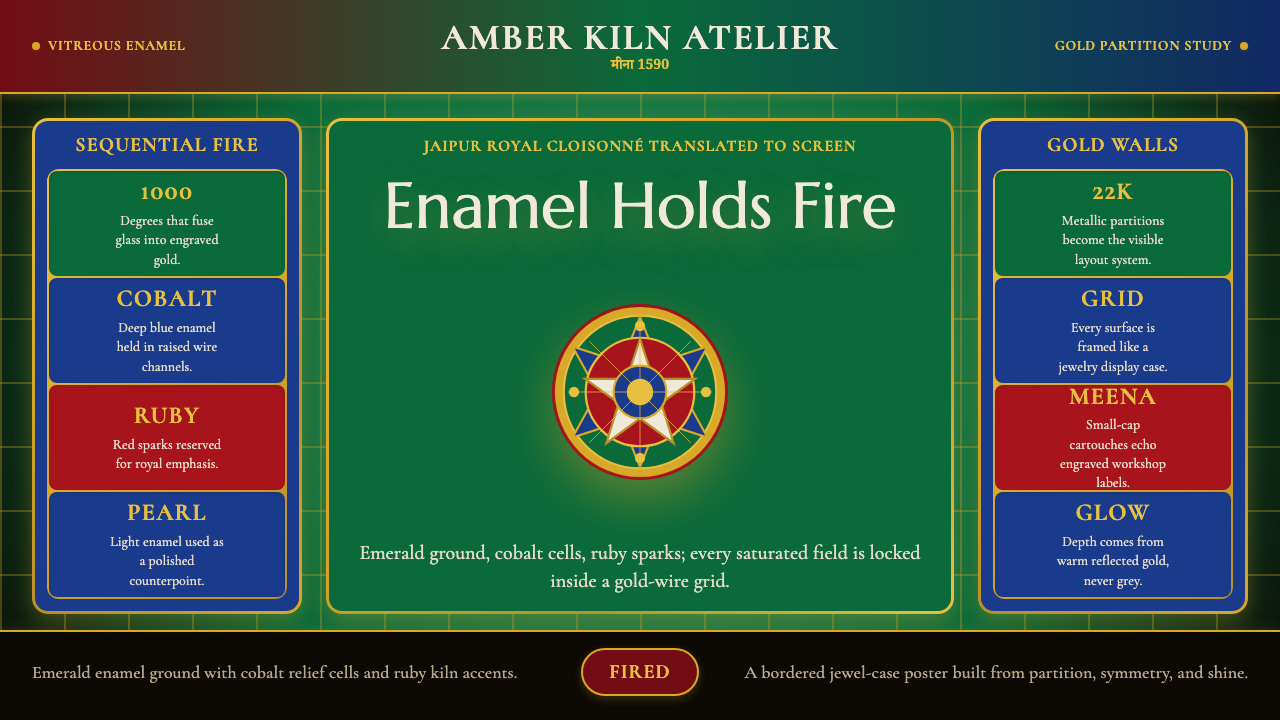
Meenakari is the art of the jewel-box made monumental — blazing enamel colors locked in gold wire, a tradition that turned Jaipur into the enamel capital of the world.
Rajasthani Meenakari Enamel in brief
Rajasthani Meenakari is the craft of fusing vitreous enamel into engraved metal — most prized when worked in gold — to create surfaces of extraordinary chromatic intensity. Each color cell is bounded by a raised wire or engraved wall, filled with powdered glass of a specific hue, and fired in a kiln until the glass melts, fuses, and sets into a gemstone-like surface. The process is repeated for every color, since each enamel fires at a different temperature and no two colors can enter the kiln at the same time without risk of contamination or collapse.
The visual character of meenakari is unlike any other decorative tradition. Where most enamel arts aim for translucency or gradation, meenakari pursues saturation to its absolute limit: emerald greens, cobalt blues, and ruby reds so dense they seem lit from within. Gold itself is not a background but an active structural element — the wire partitions between cells catch light differently from the enamel fields and give the surface a grid-like articulation that is at once geometric and organic. Floral arabesques, peacock motifs, and Mughal cartouche forms are the dominant imagery, rendered not as surface ornament but as load-bearing architecture that defines each color zone.
As a design language, meenakari translates this jewel-box intensity into a screen aesthetic built on extreme color saturation, gold structural lines, and dark grounds that make the jewel tones glow. It is one of the few historical styles where darkness serves luminosity rather than mourning: the deep background is not an absence but a velvet stage on which enamel colors perform.
Where does Rajasthani Meenakari Enamel come from?
The story of meenakari in Rajasthan begins not in Rajasthan but in Lahore, the Mughal provincial capital that was then the center of luxury craft production across northern India. Enamel work had long traditions across Persia and Central Asia, and Mughal emperors — who maintained an imperial court culture of extraordinary sophistication — patronized enamelers alongside weavers, jewelers, and illuminators as part of the same integrated luxury economy. When Raja Man Singh I, commander-in-chief of Emperor Akbar's army, was posted to Lahore in the late sixteenth century, he encountered this tradition directly and arranged for its transplantation.
Around the 1590s, Raja Man Singh brought a group of meenakari craftsmen from Lahore to his seat at Amber Fort, near what would become Jaipur. This act of deliberate cultural transfer was not unusual for the Mughal period: court-sponsored relocation of specialist artisans from one region to another was how luxury craft traditions propagated across the subcontinent. The craftsmen who arrived at Amber brought Mughal floral vocabularies, Persian color sensibilities, and kiln techniques for multi-color sequential firing. What they found in Rajasthan was a goldsmithing culture already steeped in kundan — the art of setting uncut gemstones in pure gold foil — and the two traditions fused naturally, producing the kundan-meena combination that would become the signature of Jaipur jewelry.
The craft's golden age came in the eighteenth century, when Maharaja Sawai Jai Singh II founded the city of Jaipur in 1727 and organized its artisan population into specific guilds, each assigned its own quarter of the city. The meenakari and jewelry quarter, concentrated in the area around Johari Bazaar, became the institutional home of the craft. Royal patronage was consistent and demanding: court commissions required not just technical perfection but innovation in design, and the competitive pressure among guild families drove both the refinement of firing techniques and the elaboration of the standard Mughal floral vocabulary into something distinctively Jaipuri — more exuberant, more layered, more saturated than its Mughal antecedents.
The British colonial period brought new pressures but also new markets. Jaipur's maharajas continued to commission major meenakari works, and the craft gained international visibility through exhibitions in London and Paris in the nineteenth and early twentieth centuries, where its chromatic intensity was admired as evidence of Indian artisanal virtuosity. Craft reformers and later the Indian government's support for traditional industries helped sustain the guild families through the economic disruptions of the twentieth century. Today, Jaipur meenakari holds a Geographical Indication certification, legally recognizing the city as the authentic source of the tradition.
What defines the Rajasthani Meenakari Enamel look?
Color
The palette is built around jewel tones at their maximum saturation: emerald green, cobalt blue, and ruby red are the three canonical enamel colors of the Jaipur tradition, with opaque white and translucent turquoise appearing as secondary notes. These are not colors chosen for harmony or restraint — they are the colors that vitreous enamel chemistry, pushed to its limit, can achieve. Gold plays the role of the neutral, not as a warm background but as an active structural element that separates and amplifies each color cell. On screen, the system extends this logic: deep, near-black grounds let the jewel tones glow at full intensity, never competing with each other because gold lines keep them separated.
Gold Structure
In physical meenakari, the gold wire or engraved channel is simultaneously a technical necessity and the dominant visual device. It defines the boundary of every color field, catches raking light differently from the enamel surface, and produces the characteristic grid of luminous lines that gives the work its sense of controlled complexity. The UI equivalent is a system of fine gold-toned borders, dividers, and rule lines that organize content into discrete zones — never decorative flourishes but structural partitions, exactly as the wire in a cloisonné piece holds each enamel field in place.
Floral and Arabesque Motifs
The imagery of meenakari is rooted in Mughal naturalism: stylized lotus flowers, peony-like blooms, pomegranate forms, and curling leaf arabesques rendered with a high degree of abstraction. Peacocks appear as prestige emblems, their tail feathers providing a natural framework for multiple color cells. These motifs are never purely decorative in the original craft — they are the structural templates that determine how the gold wire is laid and where each color field falls. In typographic translation, small-cap serif letterforms are preferred because they echo the compact, engraved quality of metal cartouche inscriptions.
Dark Grounds and Luminosity
Unlike many enamel traditions that place colors against white or cream, meenakari work — especially in its most prized Jaipur form — often uses a deep ground that makes the enamel colors appear to glow. This is partly a physical effect: light entering translucent enamel is reflected back from the polished gold beneath, producing a depth that opaque pigment cannot replicate. On screen, this translates to a preference for near-black backgrounds — not flat black but a deep warm or cool dark that allows jewel-tone colors to read with their full intensity, the way a gemstone reads best against dark velvet.
Layered Complexity
A finished meenakari piece is never simple: it contains multiple firings, multiple color zones, multiple levels of spatial recession, and a surface texture that rewards close examination. This quality of layered richness is the opposite of flat minimalism, and the design language that derives from it embraces density rather than avoiding it. Compositions are full, not sparse; hierarchy is established not by removing elements but by varying their scale, intensity, and position within an articulated structure. The craft tradition demonstrates that complexity and coherence are not opposites — they require each other.
Warmth of Craft
Every meenakari piece bears evidence of the human hand: slight variations in wire thickness, micro-irregularities in color fill, the individual quality of each bloom or arabesque. This is not a defect but the mark of authenticity — what distinguishes original craft from mechanical reproduction. In digital application, this quality is approached through deliberate imperfection: textures that suggest enamel surfaces, gold lines that have slight weight variations, compositions that are structured but not symmetrical in the mathematically rigid sense. The goal is warmth within discipline, not coldness masquerading as precision.
Contained Exuberance
Meenakari is simultaneously the most exuberant and one of the most disciplined of decorative traditions. The gold wire enforces containment: every color has its cell, every cell has its boundary, and within those constraints the enameler can achieve a richness that seems almost reckless. This paradox — maximum saturation within strict structure — is the visual logic at the heart of the style. Applied to design, it means that intensity is permitted, even celebrated, but only when every element occupies its correct position within a clearly articulated grid or compositional system.
Who shaped Rajasthani Meenakari Enamel?
As commander-in-chief of Emperor Akbar's forces and governor of Lahore, Raja Man Singh I was the single most important agent of meenakari's transplantation from Lahore to Rajasthan in the 1590s. His patronage of craftsmen across disciplines — architecture, textile, metalwork — made Amber Fort a court culture of unusual sophistication, and his decision to relocate meenakari families established the lineages that would define Jaipur enameling for the next four centuries.
The founder of Jaipur city in 1727, Jai Singh II organized the city's artisan guilds into specific quarters and provided the sustained royal patronage that allowed meenakari to develop from a court import into an established urban craft tradition. His planned city — the pink city of geometric streets and designated bazaars — created the institutional infrastructure within which the jewelry and enamel guilds could operate as an integrated industry serving both royal commissions and an emerging commercial market.
Among the most celebrated meenakari masters of the modern era, Kudrat Singh represented the senior lineage of Jaipur enamelers who maintained the classical techniques through the disruptions of the twentieth century. His work was recognized by the Indian government and by craft institutions for both its technical quality and its role in sustaining transmission: his training of the next generation of guild members ensured that the multi-firing sequential technique and the classic Mughal floral vocabulary remained living knowledge rather than historical record.
A contemporary Jaipur jewelry designer who has worked to bring meenakari aesthetics into dialogue with modern design sensibilities, Sunita Shekhawat has been instrumental in expanding the tradition's audience beyond the royal and bridal jewelry market. Her work — which often pairs traditional meenakari enamel with contemporary form — has been exhibited internationally and has influenced how the visual language of meenakari is understood by designers outside the craft tradition itself.
A leading scholar and curator of Indian jewelry, Usha Bala Krishnan's research and publications have done more than almost any other single effort to document meenakari's history, techniques, and iconography in a form accessible to designers, curators, and general audiences. Her scholarly work situates the Jaipur enamel tradition within the broader context of Indian court culture and Mughal luxury production, providing the historical framework through which the style can be understood as something more than surface decoration.
How do you use Rajasthani Meenakari Enamel today?
Meenakari is one of the few historical design systems that translates most powerfully to digital contexts where darkness is an asset rather than a liability. It belongs to a category of styles — alongside Byzantine mosaic and Japanese lacquerware — where the aesthetic logic depends on a dark ground making saturated color glow. This means it is naturally suited to dark-mode interfaces, premium product presentations, and any screen context where the goal is to signal richness rather than clarity. Knowing this directionality is the first step in applying it well.
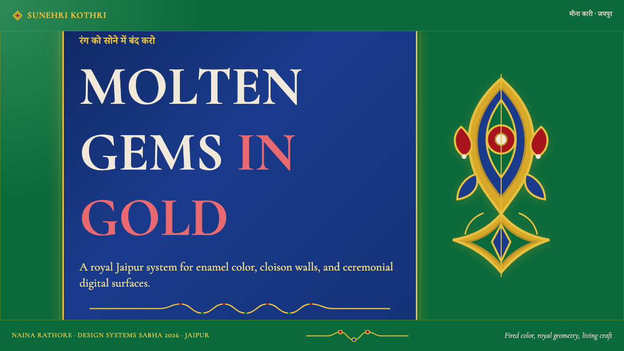
For presentation slides, meenakari works exceptionally well as a brand vehicle for luxury, cultural, or heritage contexts. A cover slide built in this system uses a deep, near-black ground, a single jewel-tone color field as the primary visual anchor, and a title set in a compact serif with fine gold-toned supporting lines. Content slides should resist the temptation to fill every cell with color: instead, one active jewel tone per slide — emerald for primary content, cobalt for data, ruby for calls to action — maintains the visual logic of the craft, where each color has its designated zone. Data visualizations take on a distinctive character when the chart elements become color cells against a dark ground, with thin gold gridlines replacing the usual gray rules.
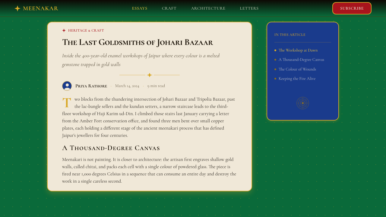
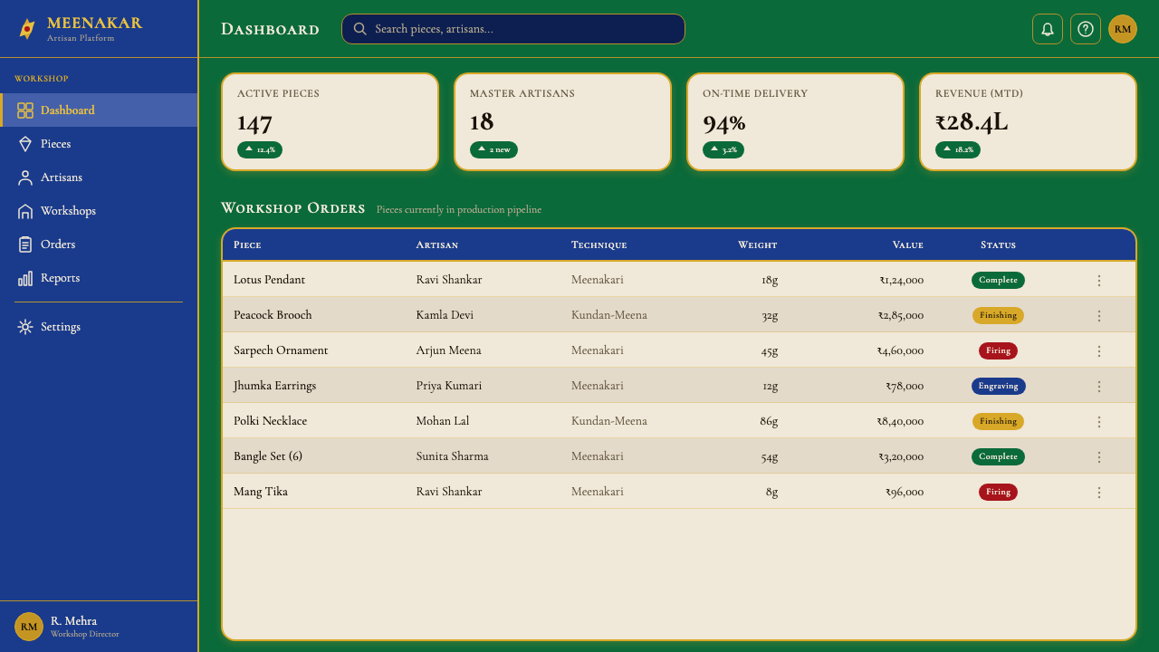
For web interfaces, the style is best suited to luxury e-commerce, cultural institution sites, jewelry and fashion brands, and premium subscription products that need to signal opulence without relying on photography alone. Dashboard applications can use the system selectively: a dark navigation panel with gold structural lines and jewel-tone status indicators borrows the meenakari logic while leaving the main content area in a lighter, more readable field. Pricing tiers differentiated by the three canonical enamel colors — green for the baseline tier, blue for mid, ruby for top — create a visual hierarchy that is immediately legible and unmistakably rich.
For editorial and marketing work, meenakari's poster-like intensity serves hero moments well. Full-width feature blocks with deep grounds and single jewel-tone color fields create impact without requiring large photography budgets. Pull quotes can be treated as jewel cells: a ruby-toned box with the quotation set in a light serif against it, bounded by fine gold rules, functions as both typographic emphasis and visual motif. The style is less suited to long-form reading environments where the dark ground and intense color create fatigue — reserve the full meenakari treatment for hero sections, covers, and high-impact moments, and allow the content body to breathe in a lighter register.
The most common mistake when applying meenakari is deploying all three jewel tones simultaneously at full saturation across a layout. In the original craft, each color has its designated cell and its correct neighbor — emerald next to cobalt is a compositional decision made by the master, not a default. In digital application, a hierarchy must be established: one primary jewel tone, one secondary, and the third reserved for accent moments only. A second frequent mistake is using the gold structural lines as mere decorative flourishes rather than actual organizers of content zones — when the gold has no structural job, the layout loses the containment logic that makes meenakari coherent rather than chaotic.
Rajasthani Meenakari Enamel — FAQ
Is meenakari the same as cloisonné?
They share the same fundamental technique — enamel filling cells bounded by metal wire — but differ in metal ground, cultural tradition, and aesthetic register. Cloisonné is most associated with Chinese and later European production, typically on copper or bronze, and tends toward a refined, somewhat symmetrical aesthetic. Meenakari is specifically Indian, worked most prized on gold, and tends toward a more exuberant, florally complex, and chromatically intense result. The Jaipur tradition is also distinguished by its integration with kundan gemstone setting — the same piece may combine enamel on one face with gemstone inlay on the reverse, a combination rarely seen in Chinese or European cloisonné.
Can meenakari work as a light-mode design system?
It is possible but works against the grain of the tradition. In physical meenakari, the depth and luminosity of the jewel tones depend significantly on their contrast with a dark or richly colored background — on a pure white ground, the same colors tend to look garish rather than gem-like. A light-mode adaptation works best when the background is not white but a warm ivory or parchment tone, when the gold structural lines are restrained rather than dominant, and when only one jewel tone is used as an accent against the lighter field rather than deploying all three at full strength. Even in this adaptation, some of the style's essential character will be muted.
How does meenakari differ from other rich South Asian textile or decorative traditions — like Banarasi weaving or Mughal miniature painting?
Each tradition captures a different dimension of Mughal luxury aesthetics. Banarasi silk weaving achieves richness through surface texture, the interplay of matte and sheen in different thread types, and pattern complexity that rewards long observation. Mughal miniature painting works through pictorial narrative, spatial depth, and a palette that is broader and more naturalistic — including flesh tones, landscape greens, and sky blues — than meenakari's jewel-tone canon. Meenakari is the most purely chromatic of the three: it sacrifices pictorial depth and tonal range in favor of color intensity at maximum saturation within a clearly bounded structure. As a design language, it is therefore the most immediately transferable to digital color systems, where saturation and contrast are the primary levers.
What contexts is meenakari wrong for?
Meenakari is wrong for any context where the primary values are lightness, openness, minimalism, or functional neutrality. Clinical interfaces — medical dashboards, productivity tools, government services — require a visual neutrality that meenakari's intensity actively contradicts. Children's products and playful consumer applications call for a different kind of color energy: warm, rounded, safe-feeling rather than gem-cold and precious. Long-form reading platforms find the dark ground and saturated color palette fatiguing at scale. The style also sits uneasily alongside photography: real-world photographic images almost always look washed out or incoherent against meenakari's maximalist color fields. When the product already has a strong photographic identity, meenakari should be applied only as a punctuation — hero moments, loading screens, accent elements — not as a pervasive system.
How should gold be used — and overused — in a meenakari-derived design?
In the original craft, gold is structural, not decorative. The wire exists because it must — it holds the enamel in place and defines the color cells. This is the governing principle for digital application: gold-toned elements should perform a structural job. Borders that define content zones, dividers that separate sections, rule lines that organize reading flow — these are correct uses of the gold function. Gold as background fill across large areas, gold as headline color, gold gradient overlays, or gold used on interactive elements where the user needs clear affordance cues — these are misuses that tip the style from rich into gaudy. One effective test: if the gold element were removed, would the layout lose structure, or would it only lose shimmer? If only shimmer, the gold is decorative and should be reconsidered.
Related design styles
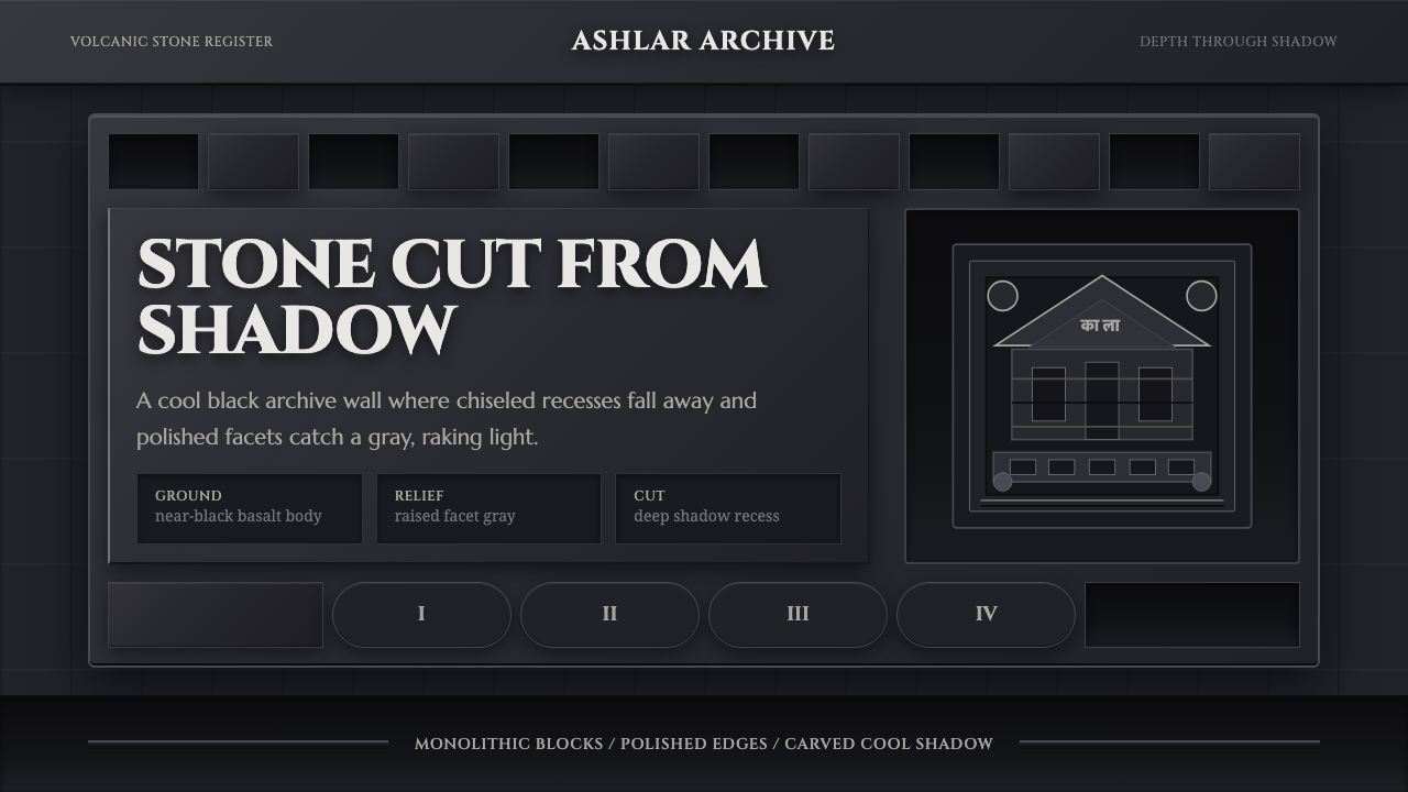 Deccan Basalt TempleMonumental shadow, carved. Near-black basalt, Cinzel capitals, and relief gri…
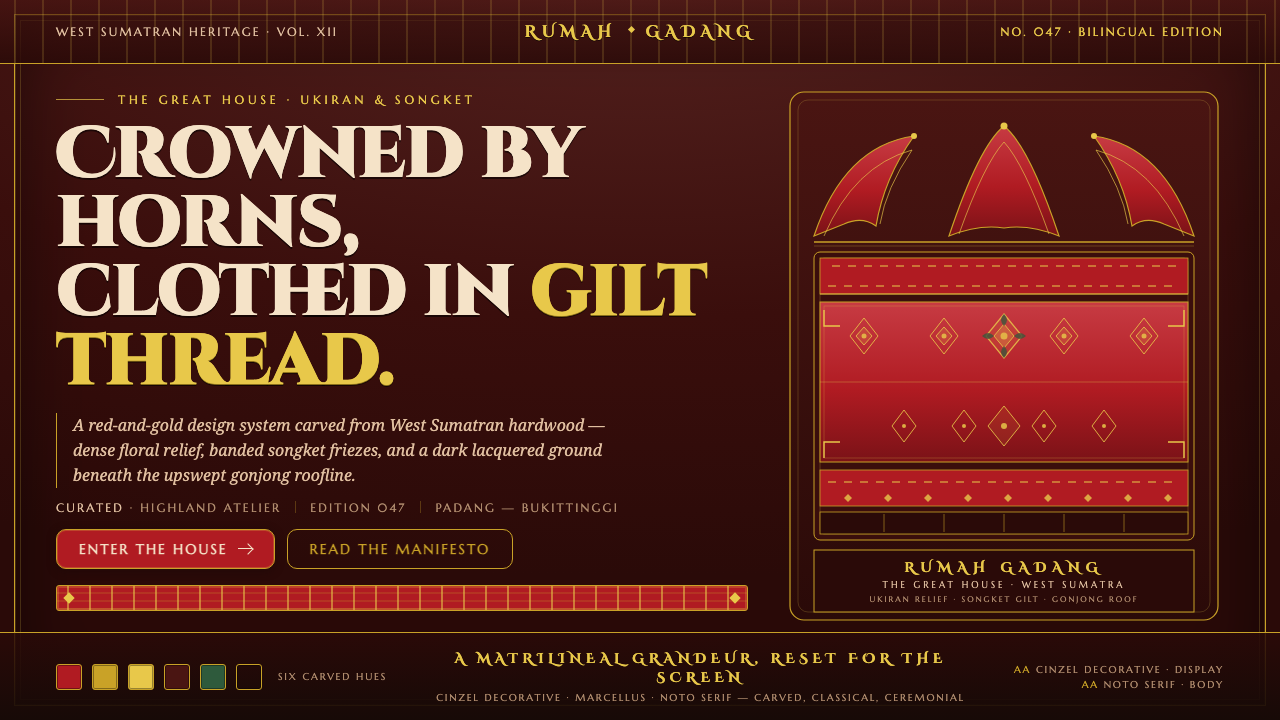 Minangkabau Rumah GadangMatrilineal grandeur, carved. Red-gilt ukiran relief on dark lacquered wood u…
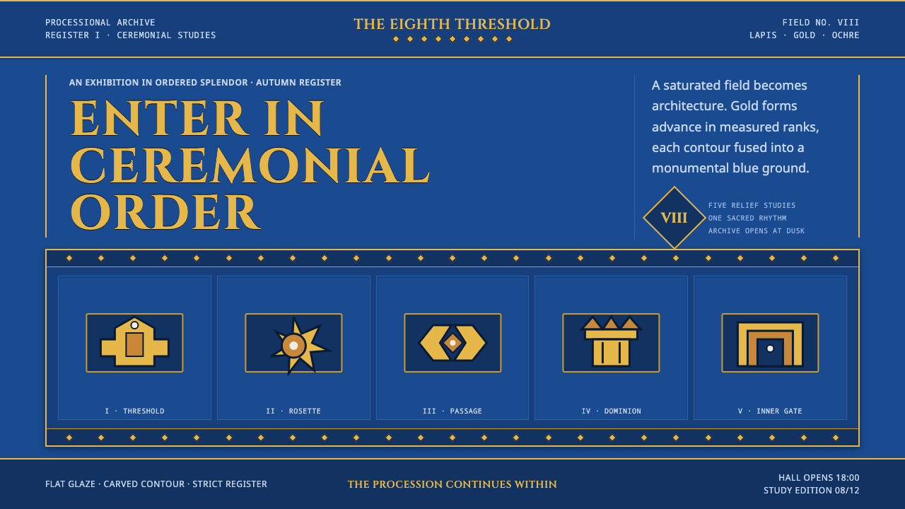 Babylonian Ishtar GateMonumental by procession. Lapis brick, gold registers, and carved capitals ho…
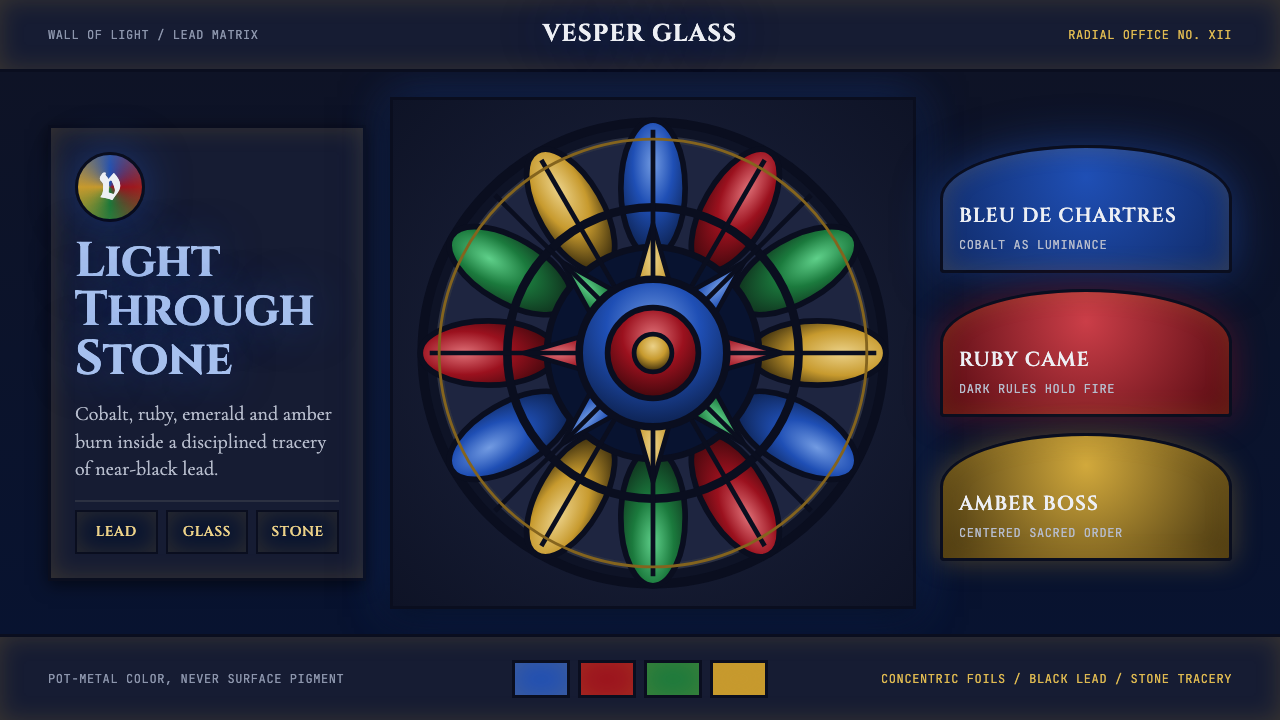 Gothic Rose WindowDarkness becomes light. Cobalt glass, ruby foils and black lead form a radial…
 Gucci Double-GOrnament rules here. Bodoni on cream, framed by green-red-green and gold hard…
 Kanchipuram Silk SareeRefuses to blend. Mulberry purple locked against peacock-blue korvai, every e…