What is Momoyama Gold Screen?
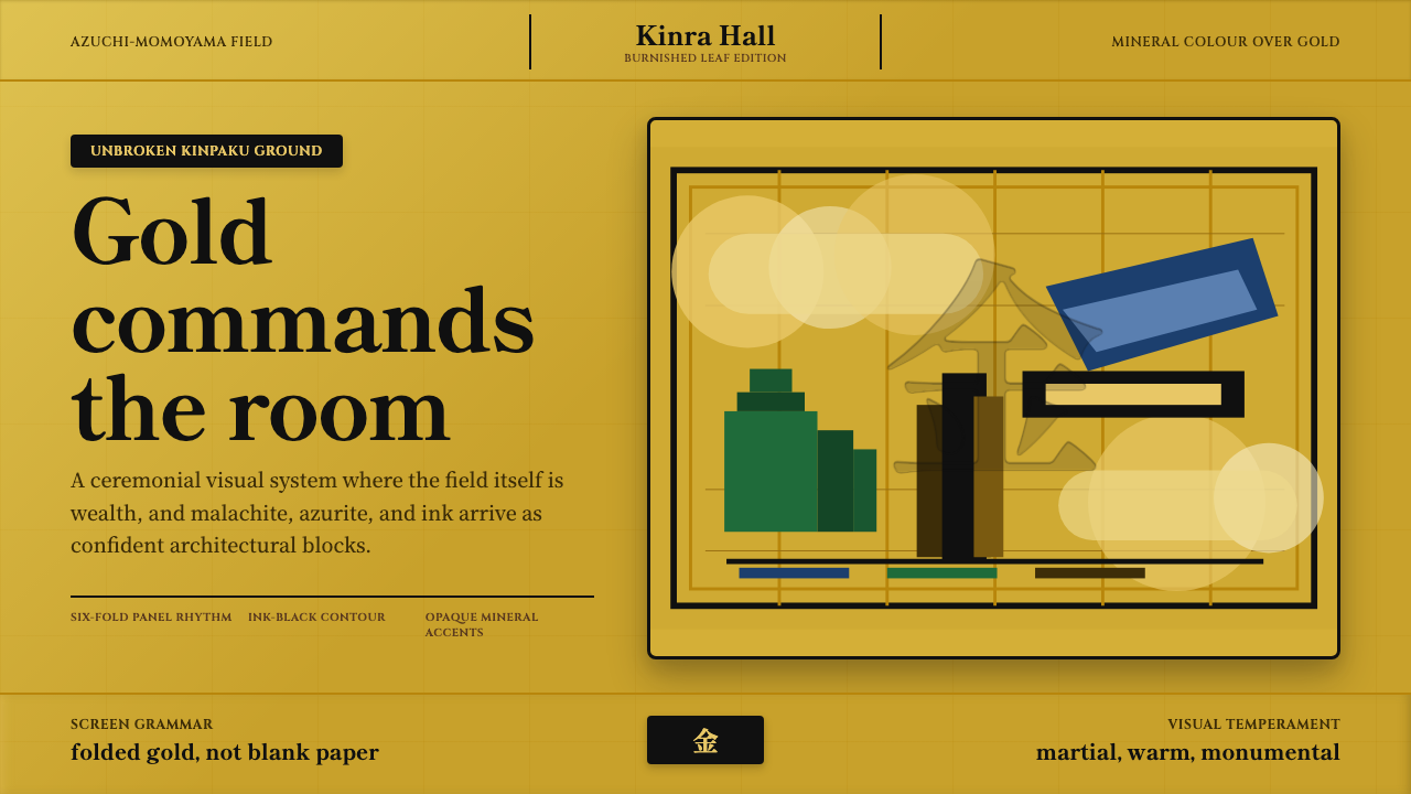
Momoyama Gold Screen treats gold not as an accent but as the ground itself — a warm field of light that monumental pines, tigers, and hawks stand on rather than sit against.
Momoyama Gold Screen in brief
Momoyama Gold Screen draws on kinpeki shōhekiga, the gold-ground wall and screen painting tradition of the late sixteenth century, most closely associated with the Kanō school of painters. The defining move is total: the entire ground of a folding screen or sliding door panel is covered in burnished gold leaf, applied sheet over sheet on paper, so that the surface reads as a continuous field of warm light rather than a painted background waiting for a subject.
Over that gold field, painters set large, confident forms — pines with trunks as thick as architecture, hawks caught mid-strike, tigers and lions rendered in dense, opaque mineral pigment rather than the thin ink washes of earlier painting traditions. Cloud-band shapes, stylized bands of gold mist that drift across the composition, frame and separate these subjects, creating negative space that is itself gilded rather than empty.
The scale of the work matters as much as its palette. These were not intimate objects meant for close study; they were architectural elements designed to be seen across the length of a great hall, in candlelight or by whatever daylight reached deep interior rooms. Everything about the style — the size of the forms, the density of the pigment, the totality of the gold ground — is calibrated to read as monumental at a distance, not delicate up close.
Where does Momoyama Gold Screen come from?
The Azuchi-Momoyama period, roughly 1573 to 1615, was a brief but decisive stretch of Japanese history in which the country was pulled out of more than a century of civil war and reunified under a succession of powerful warlords. Oda Nobunaga began the process of reunification and built Azuchi Castle as its architectural monument; after his death, Toyotomi Hideyoshi continued the project, building castles at Osaka and Fushimi on an even grander scale. These new castles needed to be decorated on the inside as forcefully as they projected power on the outside, and that need created an entirely new category of commission: vast interior surfaces — sliding doors and folding screens — that had to read as authority itself.
The Kanō school, a hereditary painting workshop that had served military and aristocratic patrons for generations, became the primary supplier of this new decorative language. Kanō Eitoku, the school's leading painter during this period, is credited with developing the bold, large-scale compositional approach the moment demanded — monumental trees, animals, and landscape elements rendered at a scale and density that could dominate an entire room, a sharp departure from the more restrained, intimate compositions of earlier eras. Eitoku's adopted successor, Kanō Sanraku, continued and refined this approach into the following decades, producing gold-ground screens that remain among the most celebrated works of the period.
Gold leaf itself was not merely decorative in this context — it was a direct, unambiguous declaration of wealth and martial success. Applying sheet after sheet of gold leaf across an entire screen or a full set of sliding doors required substantial material wealth, and warlords who commissioned these works were making that wealth visible to any visitor who entered the hall. The choice of subjects reinforced the message: pines and cranes signaled longevity and stability, hawks and tigers signaled martial power and dominance, and the sheer scale of every element signaled a patron who could command the labor and material to produce it.
Not every painter working in gold ground during this period was a Kanō. Hasegawa Tōhaku, a rival painter who challenged the Kanō school's dominance, produced his own celebrated gold-ground screens for temple and castle patrons, most famously a set of large-scale panels executed in mineral pigment against gold at Chishaku-in in Kyoto. His work confirms that the style was a shared visual language of the era, tied to a specific historical moment of reunification and display, rather than the exclusive property of a single workshop.
What defines the Momoyama Gold Screen look?
Color
Gold is the ground itself, not an accent applied over another color — the entire field a viewer sees behind every subject is burnished gold leaf. Against it, painters use dense, opaque mineral pigments in a small number of confident blocks: deep greens for pine needles, blacks and whites for animal fur and feather, occasional reds or blues reserved for specific symbolic elements. Nothing is diluted into a wash; every color reads as a solid, weighted mass.
Scale and Monumentality
Subjects are rendered at a scale meant to dominate an entire room rather than reward close inspection — a single pine trunk might span the full height of a screen, a tiger's form might occupy nearly an entire panel. This monumentality was a direct response to the architectural function of the work: it had to command a great hall, not decorate a page.
Cloud-Band Negative Space
Stylized bands of gold mist — cloud-band shapes that are themselves part of the gilded ground rather than painted objects — drift across the composition, framing and separating major subjects. This negative space is never empty in the sense of being unfinished; it is gold exactly like the rest of the ground, doing compositional work rather than serving as a gap.
Opaque Mineral Pigment
Subjects are painted in dense, layered mineral pigment rather than the transparent ink washes associated with earlier and more restrained Japanese painting traditions. This opacity gives forms real physical weight against the gold — a tiger's stripe or a pine needle cluster sits on the surface as a solid mass rather than a translucent gesture.
Subject Symbolism
Recurring subjects — pines, cranes, hawks, tigers, and lions — carry specific symbolic weight: longevity and stability on one hand, martial power and dominance on the other. Subject choice was never incidental; it was part of the message the patron was commissioning the work to send.
Zero Fussy Ornament
Despite the material extravagance of an entirely gilded ground, the style avoids fussy pattern or dense surface decoration. Color arrives in a small number of confident, large blocks rather than intricate repeating motifs — the extravagance is in the gold itself and the scale of the forms, not in ornamental density.
Who shaped Momoyama Gold Screen?
The leading Kanō-school painter of the Azuchi-Momoyama period, Eitoku is credited with developing the bold, monumental compositional approach that the era's new castle commissions demanded, producing large-scale gold-ground works that set the standard other painters of the period worked against.
Eitoku's adopted successor, Sanraku continued and refined the Kanō school's gold-ground approach into the following generation, producing screens celebrated for their combination of monumental scale and precise, confident mineral-pigment rendering.
A rival painter who challenged the Kanō school's dominance of the era's major commissions, Tōhaku produced his own celebrated gold-ground screens, confirming that the style was a shared visual language of the period rather than the property of a single workshop.
The warlord who continued Japan's reunification after Oda Nobunaga's death, Hideyoshi built castles at Osaka and Fushimi on a grander scale than his predecessor and commissioned much of the gold-ground screen painting that decorated their interiors, directly driving demand for the style at its height.
How do you use Momoyama Gold Screen today?
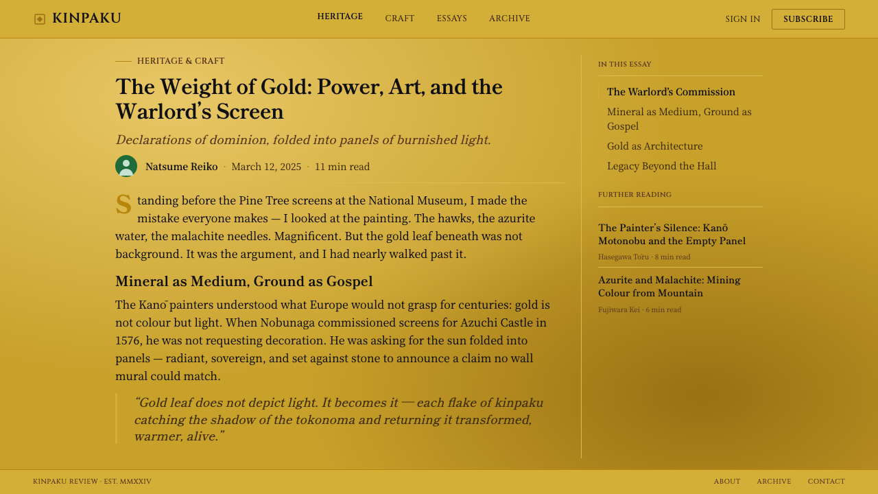
Momoyama Gold Screen is a style built on total commitment to a single material statement — gold as ground, not accent — and applying it well means resisting any urge to treat gold as a highlight color rather than a foundation. The system reads as authoritative and warm at once, which makes it well suited to contexts wanting to project confidence and substance rather than restraint.
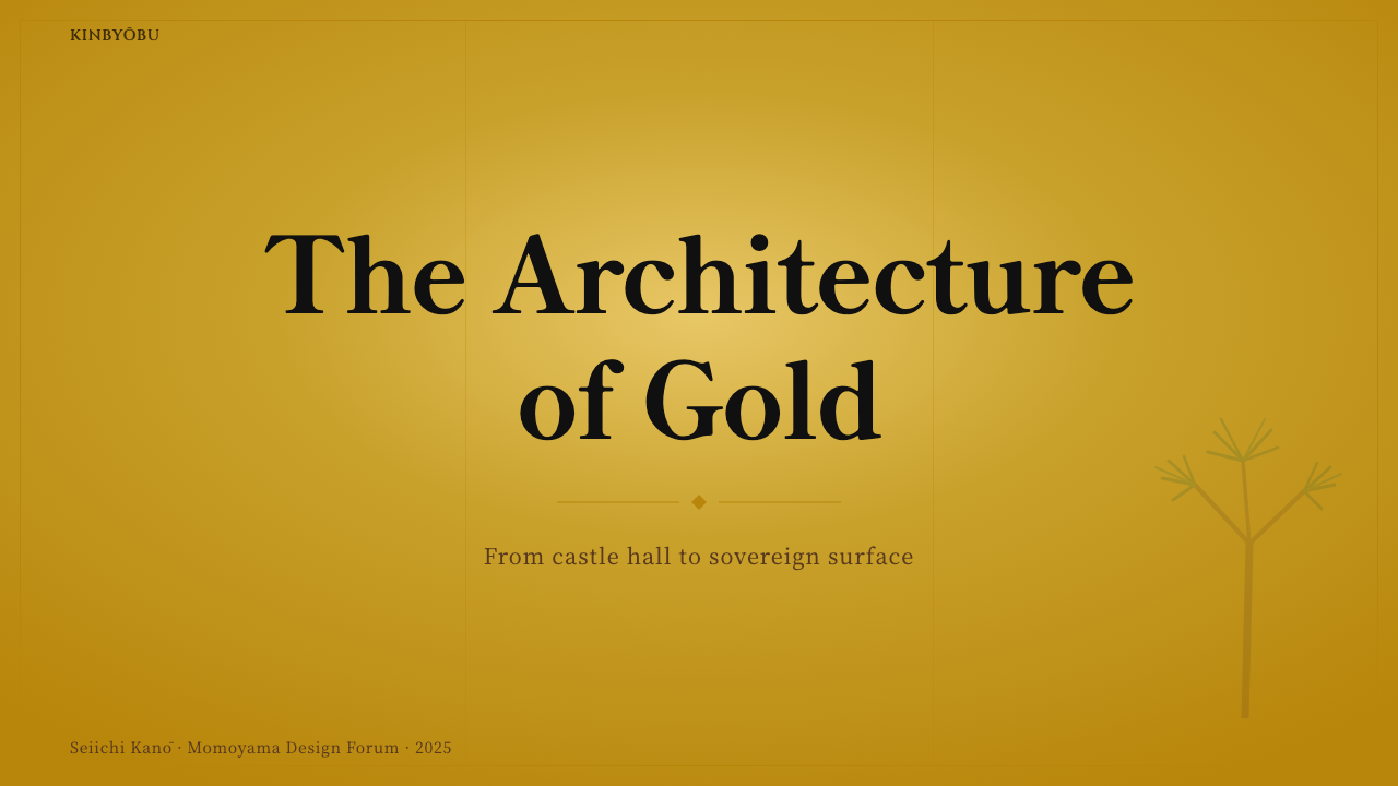
For presentation slides, a cover works well with a single monumental subject or icon rendered in dense, opaque color blocks against a full gold ground, echoing the scale and confidence of a hero pine or tiger on a historical screen. Content slides should keep the gold as the base layer throughout rather than confining it to a cover page, with cloud-band shapes doing the work of section dividers rather than plain rules or boxes.
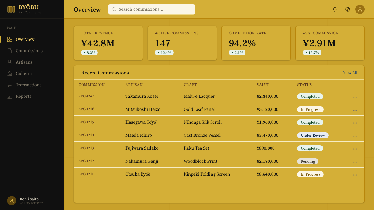
For web interfaces, the style suits premium brand pages, hospitality and luxury product pages, and cultural or heritage-focused sites more naturally than dense utility dashboards, since its strength is atmosphere and material confidence rather than information density. A gold-ground hero section with one or two large, confidently colored subject elements captures the discipline; interface chrome such as buttons and cards should stay restrained rather than competing with the ground.
For editorial and marketing work, the style rewards large-format hero imagery and generous scale: a masthead or feature image treated as a monumental subject against gold, with cloud-band shapes framing pull quotes or section breaks rather than conventional dividers. Marketing pages benefit from committing fully to the gold ground across a full section rather than using it as a small decorative strip.
A common mistake is treating gold as a background color to be used sparingly, the way a modern designer might use a single accent — this style requires the opposite discipline, a total commitment to gold as the entire ground. A second common mistake is adding intricate repeating pattern or fussy border ornament; the style's extravagance comes from the gold and the scale of a few confident forms, not from decorative density, and overloading it with pattern collapses the monumentality that makes it work.
Momoyama Gold Screen — FAQ
Is Momoyama Gold Screen just a gold-colored variant of general Japanese painting style?
No — it is a specific historical tradition tied to a particular moment, the reunification of Japan under Nobunaga and Hideyoshi and the new castles their power required. Its defining feature, a fully gilded ground treated as the base material rather than a color choice, distinguishes it sharply from ink-wash or lighter-ground Japanese painting traditions that came before and alongside it.
Why gold specifically, rather than another luxurious material or color?
Gold leaf required substantial material wealth to apply across an entire screen or set of sliding doors, making it an unambiguous, immediately legible signal of a patron's resources. It also had a practical function: gold reflects and diffuses whatever light reaches deep interior rooms, so a gold-ground screen actively brightened a hall in a way that a painted or plain wooden surface could not.
What is the function of the cloud-band shapes beyond decoration?
Cloud bands solve a compositional problem: how to let several large, unrelated subjects — a pine here, a hawk there — share one continuous surface without the composition feeling disjointed. By drifting across the gold ground and partially overlapping or framing each subject, they create rhythm and separation while remaining part of the same gilded field, rather than functioning as a border or a frame drawn around each element.
Can this style work with a lighter or more restrained color palette overall?
The gold ground itself is not optional — it is the single most defining element of the style, and diluting or replacing it undermines the entire system. What can vary is the density and choice of mineral pigment used for subjects on top of it; a composition can use fewer colors or a narrower palette for the subjects while still committing fully to the gold ground.
Does this style suit modern digital products, or is it strictly a historical reference?
It transfers well to any brand wanting to project luxury, confidence, and material substance — hospitality, premium consumer goods, cultural institutions — as long as the application respects the core discipline of gold as total ground rather than a decorative highlight. It is a poor fit for utility products where restraint, neutrality, or low visual weight are the actual goals.
Related design styles
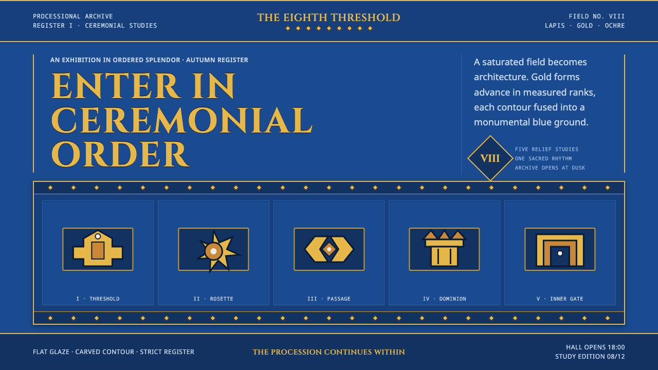 Babylonian Ishtar GateMonumental by procession. Lapis brick, gold registers, and carved capitals ho…
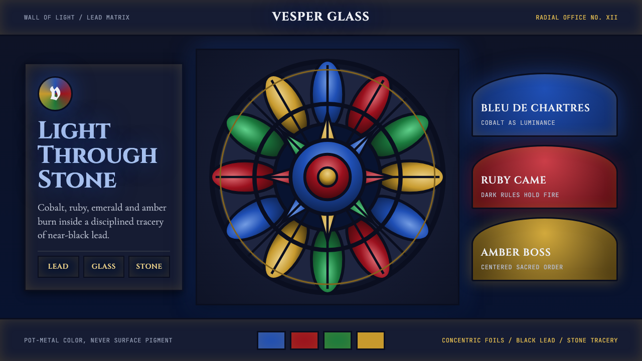 Gothic Rose WindowDarkness becomes light. Cobalt glass, ruby foils and black lead form a radial…
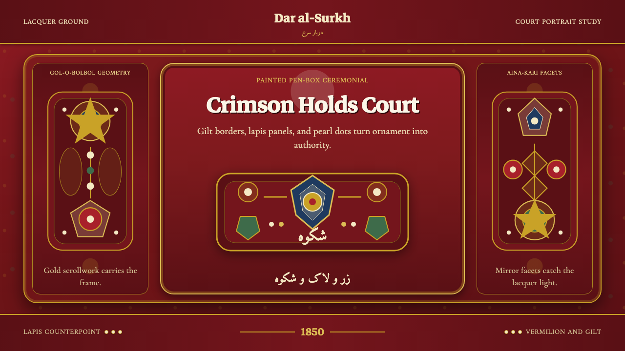 Qajar PersiaOpulence commands. Lacquer red, gilt borders, pearl dots, and lapis geometry.
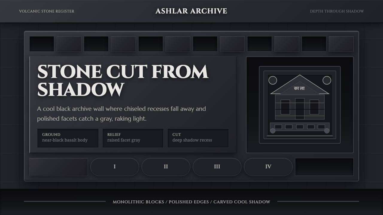 Deccan Basalt TempleMonumental shadow, carved. Near-black basalt, Cinzel capitals, and relief gri…
 Macau Grand Lisboa Casino GoldGold is the atmosphere. Cinzel type, jade inlay, and 2px rules glow on casino…
 Minangkabau Rumah GadangMatrilineal grandeur, carved. Red-gilt ukiran relief on dark lacquered wood u…